Blue Anniversary Logos
Blue Jays 50th Anniversary Logo
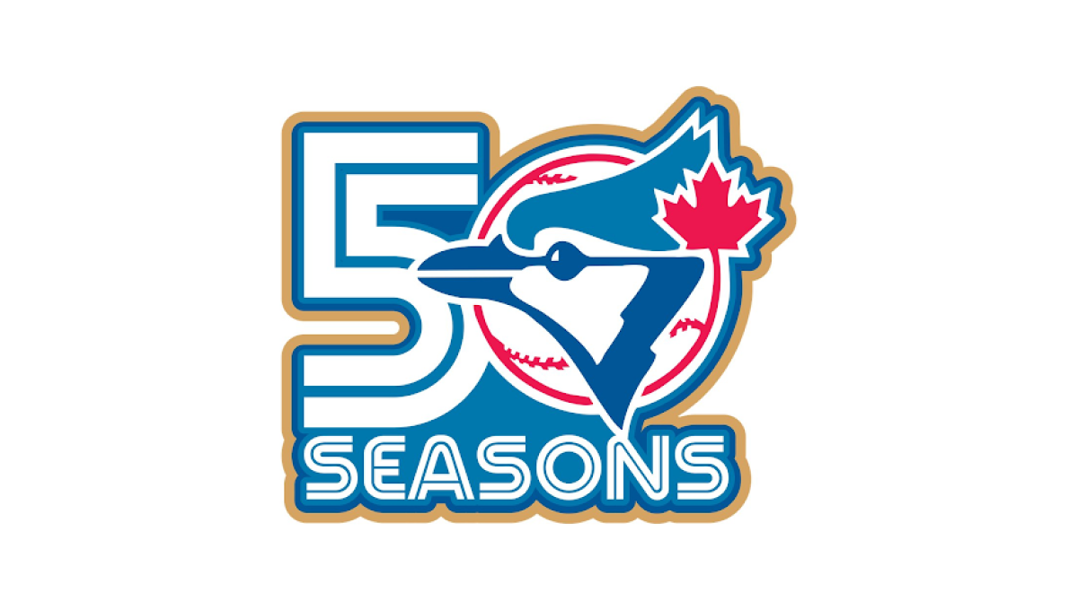
This anniversary logo has a bold and energetic design with a clean, sports-inspired style. The milestone number is the main focus, while a familiar team graphic is blended into the layout to create a unified and recognizable look. A limited color palette with a subtle accent color helps the design stand out without feeling overly busy. Overall, the logo presents the anniversary in a simple, memorable way that reflects tradition, pride, and a long history.
More Details →BYU Idaho 25th Anniversary Logo
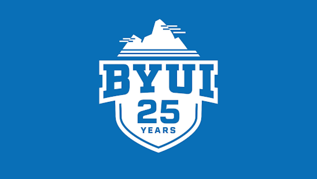
This anniversary logo has a simple, bold design with a clean and athletic appearance. A shield-shaped emblem provides a strong foundation, while large lettering and the anniversary number are arranged in a balanced, easy-to-read layout. A small graphic at the top adds visual interest without making the design feel busy. The limited color palette and crisp lines create a polished, recognizable look that celebrates the milestone in a modern and straightforward way.
More Details →Colorado 150th Anniversary Logo
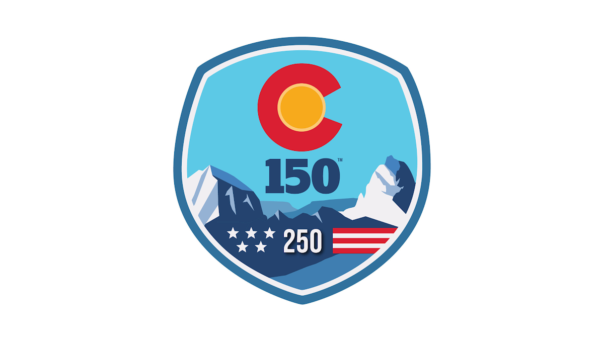
This anniversary logo uses a bold, badge-style design with a strong, recognizable shape. Bright colors and simple graphic elements create a memorable, outdoor-inspired look, while the anniversary number is placed prominently in the center to emphasize the milestone. Stylized landscape features and a few symbolic details add character without making the design feel crowded. Overall, the logo has a clean, confident appearance that celebrates a long history in a visually engaging way.
More Details →Hampton Roads Moving and Storage 35th Anniversary Logo
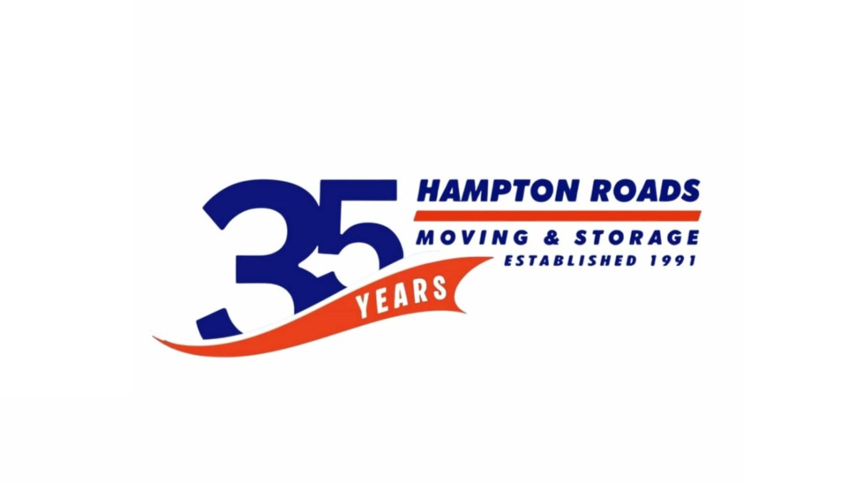
This anniversary logo uses a bold and simple layout with a large “35” as the main focus. The design combines dark blue and bright orange colors to create a strong but friendly look. Curved shapes and flowing lines give it a sense of movement and energy, while the text is clean and easy to read. Smaller details, like the establishment year and anniversary wording, help suggest experience and long-term service without making the design feel too busy or overly formal.
More Details →HellermanTyton 50th Anniversary Logo
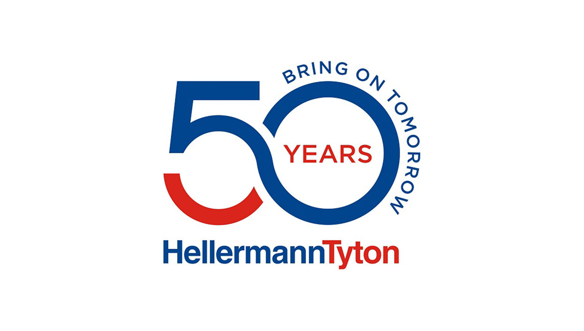
This anniversary logo uses a clean, modern style with bold shapes and clear text. The number “50” is large and flowing, forming a smooth, connected shape that feels forward-looking. Blue and red colors give it a strong, confident tone. The words “Bring on Tomorrow” suggest progress and optimism, while “Years” marks the milestone. Overall, the design feels professional, stable, and focused on long-term growth and experience.
More Details →Utah Shakespeare Festival 65th Anniversary Logo
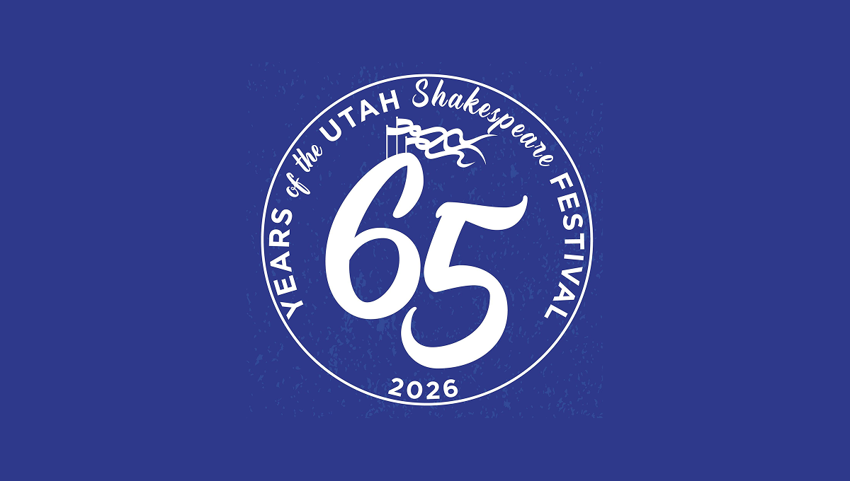
This anniversary logo has a bold, round design with a strong, classic feel. A large “65” sits in the center, standing out clearly and suggesting an important milestone. The words around the edge form a circular frame, giving the logo balance and unity. A small flag detail adds a subtle historical touch. The single color palette feels calm and timeless, while the slightly textured background gives it warmth and character. Overall, it feels celebratory, traditional, and respectful of history.
More Details →Guiness World Records 70th Anniversary Logo

This anniversary logo is a nice take on the traditional guinnes world records logo. They just placed a '7' of the same style in front of their logo-- and BAM! Anniversary logo! It works really well, with the traditional logo being a 0 and having all the classic elements as the normal logo. The classic blue color works well to mark an imporant milestone.
More Details →Sunday Night Football 20th Anniversary Logo
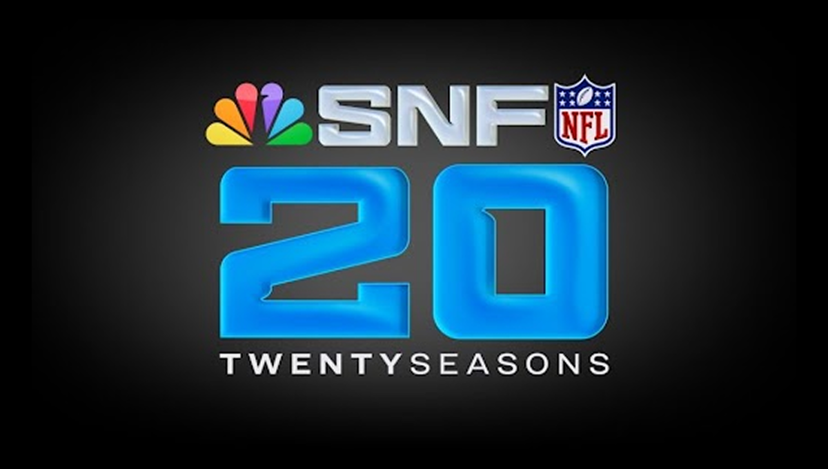
This anniversary logo has a bold, modern feel that highlights a major milestone. Large numbers sit at the center, giving the design a strong and confident look. Bright, glowing colors add energy and excitement, while familiar symbols suggest a well-known sports tradition. The layout feels polished and professional, with clean lines and balanced spacing. Overall, the design feels celebratory, current, and focused on marking an important moment in time.
More Details →Sun Valley 90th Anniversary Logo
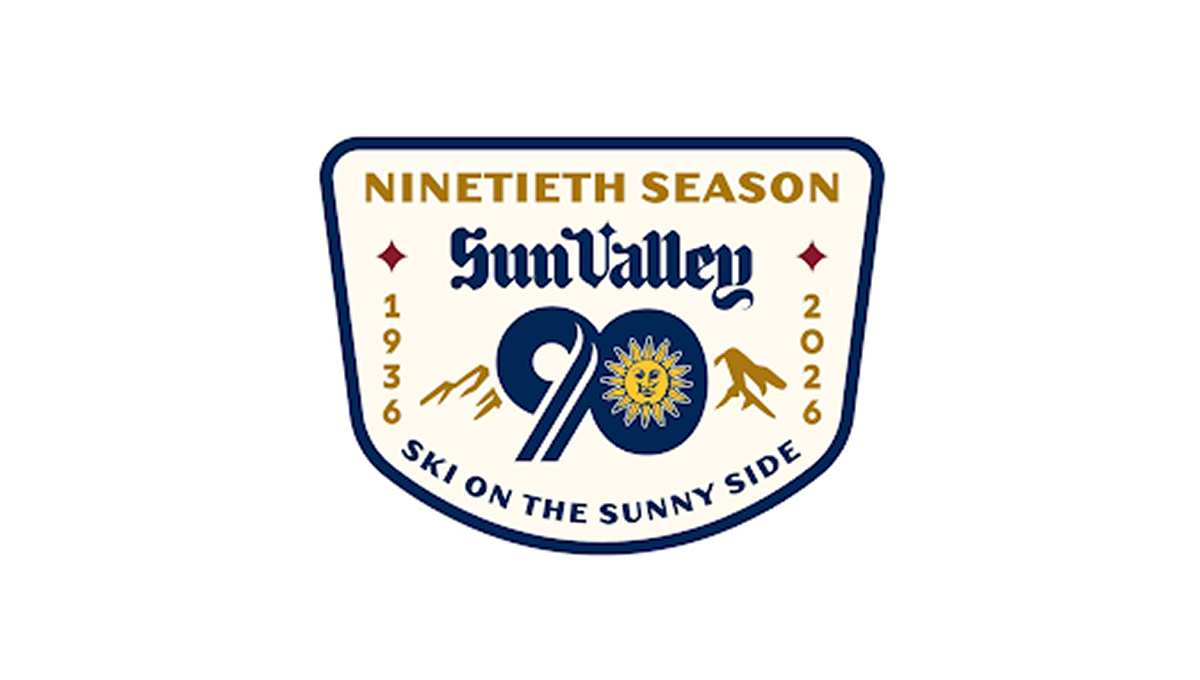
This anniversary logo has a classic, welcoming look that feels tied to tradition and place. The badge shape gives it a sturdy, established feel. A large number marks the milestone season, while mountain shapes and a bright sun suggest outdoor fun and warmth. The lettering feels timeless and confident. The colors are rich but friendly, and the overall design feels proud, cheerful, and quietly celebratory without being too bold.
More Details →Sugarloaf Mountain 75th Anniversary Logo
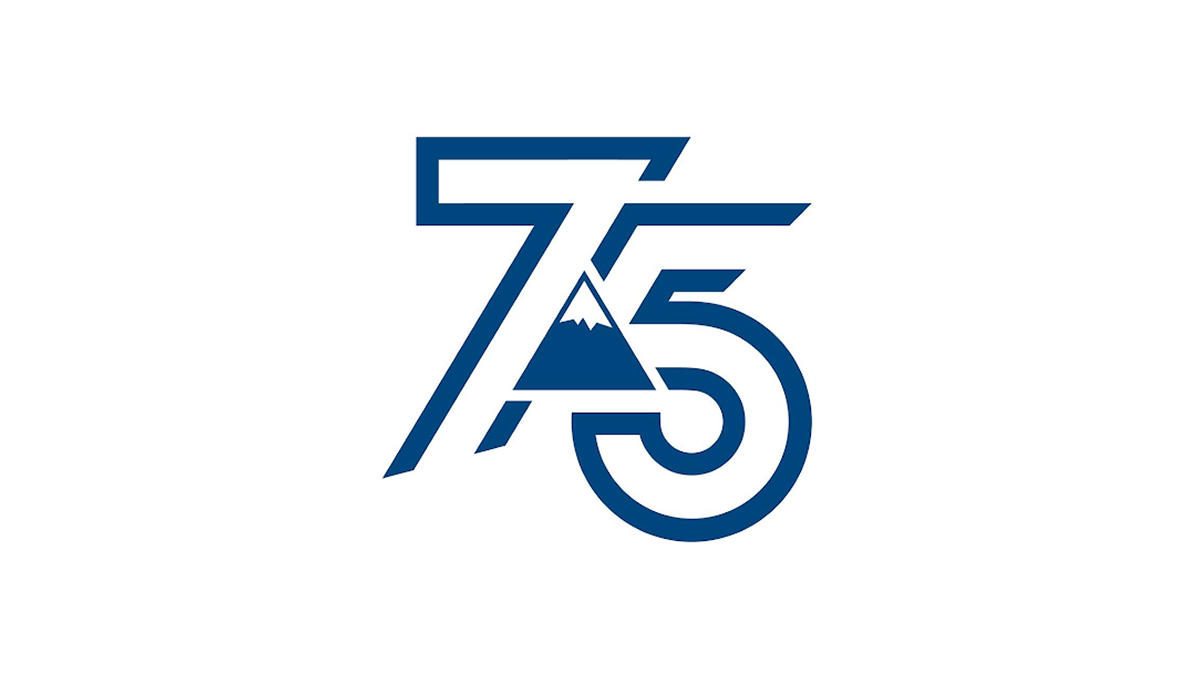
This anniversary logo shows the number 75 in a bold, clean style. The numbers are shaped with smooth, modern lines that feel strong and balanced. A simple mountain shape appears in the center, adding a quiet sense of place, history, or growth. The blue color gives it a calm and trustworthy feeling. Overall, the design feels modern but respectful, marking an important milestone without being too detailed or busy.
More Details →Diamond Peak 60th Anniversary Logo
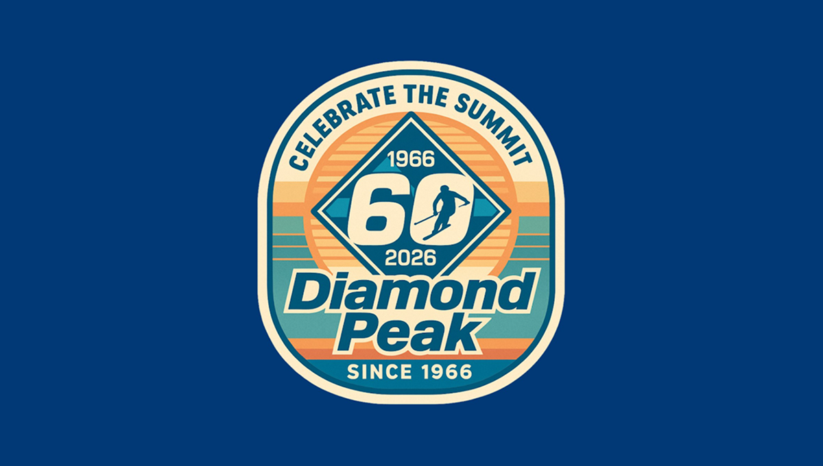
The anniversary logo has a rounded badge shape with layered colors and a vintage feel. In the center is a large 60, framed by a diamond shape, with dates above and below to mark the milestone. A small skier figure adds a sense of motion and outdoor spirit. The background uses soft stripes and warm tones, while the text curves around the design, giving it a balanced, classic look that feels celebratory and familiar.
More Details →Castle Mountain Resort 60th Anniversary Logo
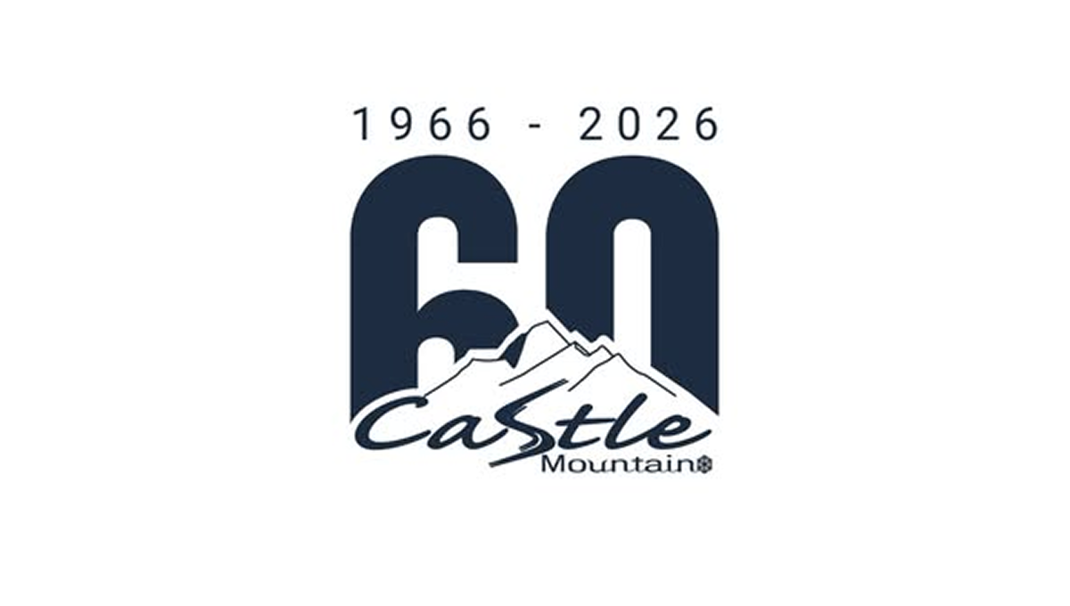
The anniversary logo shows a big 60 in dark block numbers with the years “1966 – 2026” above it, marking six decades. Below the numbers is a simple mountain shape and the name of the resort in a casual, flowing script. The style feels calm and grounded, with smooth edges and easy contrast between the bold numerals and the softer text and graphic, giving a clean and clear sense of time passing and celebration.
More Details →Napa Auto Parts 100th Anniversary Logo
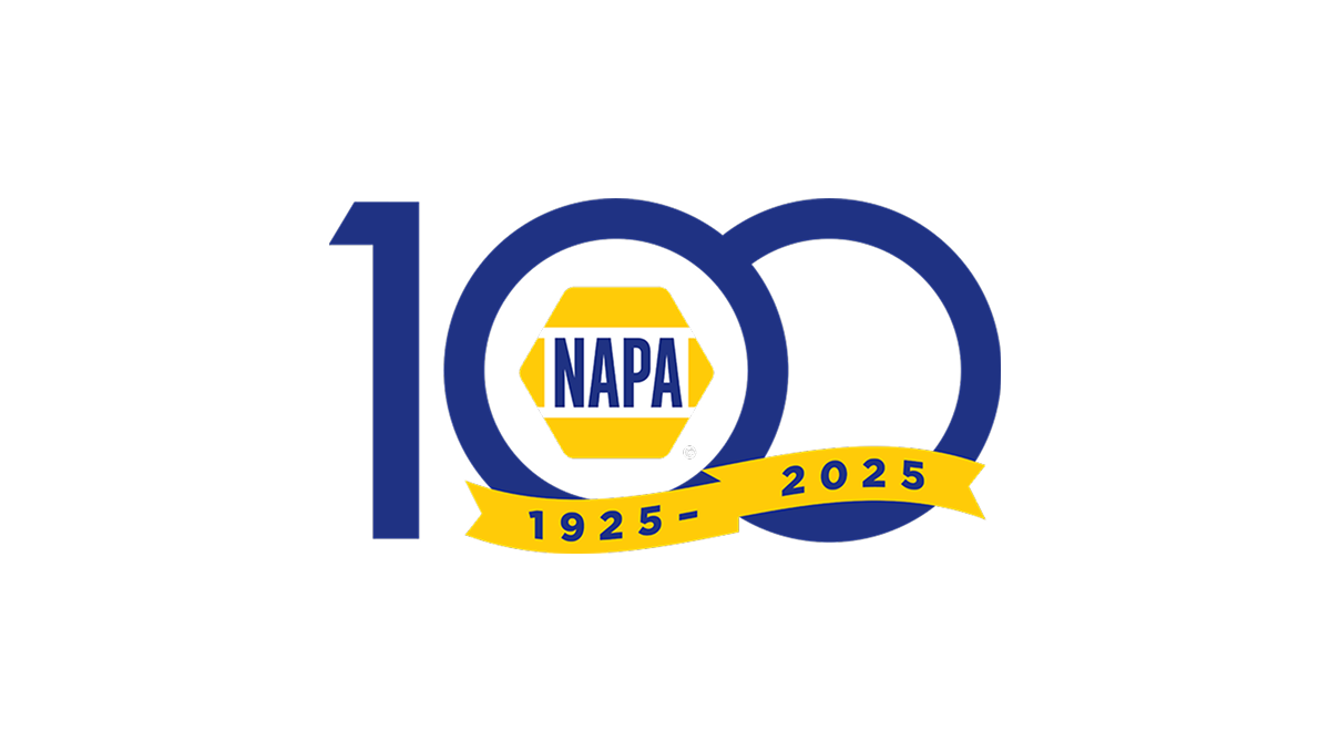
The anniversary logo shows a large, simple 100 with the classic NAPA badge sitting at the center in bright yellow and blue. Below that, a curved band has the years of the celebration in plain numbers. The basic colors and clear shapes give it a clean, straightforward look that marks an important milestone for the brand.
More Details →SMI Snowmakers 50th Anniversary Logo

This anniversary logo has a clean and simple look, with soft colors and a modern feel. The number “50” is the main focus, standing out in bold, simple lettering. A short message underneath states the anniversary. Overall, it gives off a calm, respectful tone—something that feels official but still warm and thoughtful, made to honor a meaningful milestone.
More Details →FC Barcelona 125th Anniversary Logo

The anniversary logo features a clean and modern design that blends tradition with a sense of celebration. It includes bold, simple shapes and a familiar crest, subtly updated to mark a special milestone. The colors are rich and meaningful, reflecting the identity of the group it represents. Numbers and symbols are placed thoughtfully, suggesting the passage of time and a proud history. Overall, the design feels respectful and strong, with a touch of elegance.
More Details →Tomy Toys 100th Anniversary Logo

Some logos seem to be well equiped to pair with a number of add-on to celebrate something like an anniversary logo and this is one of those. A rounded blue rectanged with the name of the company anchors the traditional logo on the left and by placing a stylized number 100 to the right - in this case by turning the zeros into an infinity sign - they've got a balance package that keeps the original logo as both the main element and the focal point of the design.
More Details →Lake Tahoe Community College 50th Anniversary Logo

This is a fairly simple but surprisingly unique anniversary logo lockup. Yes, it starts with the classic number fifty on the left and uses the word "years" in a short ribbon which are all common elements. But the flag extending from the right side of the zero to hold the college's traditional logo is something i haven't seen before. It's a nice little design that gives the school a nice little package to work with.
More Details →TASB 75th Anniversary Logo

I really like the way this logo works with the simple design and shape of the original word mark. Since their logo is all black, they added color behind the number 75 and their years of operation. And with a heavy weight to their original mark, they went vertically down from the logo with heavier squares to create a clean, square design that matches that original weight.
More Details →Minnesota Lynx 25th Anniversary Logo

There are so many shapes that appear in so many anniversary logos, that I love it when brands start with a more unique canvas for their design. This logo is a perfect example of that by adapting a diamong-like shape into a more arrow form with a large number 25 in the center, the team's mark at the top, and the word seasons in a ribbon at the bottom to create a unique, meaningful logo.
More Details →Washington Capitals 50th Anniversary Logo

We love a good retro logo and this is a perfect example of that. Old school styles, shapes, and colors are combined into a clean design that puts a large number 50 in red, a hockey stick in blue, classic starts below and the team's traditional logo at the top. The result is a really nice logo in a square shape that's easy to use across online and social channels.
More Details →Trollhaugen Recreation Area 75th Anniversary Logo

When your ski area has a name like Trollhaugen, you've gotta keep things a little bit playful in all of your marketing and they've extended that fun, causal vibe to this anniversary logo. With the common circle shape, they place an illustration of their mascot at the center, their name and anniversary above and below following the curve of the circle, and a blue ribbon holding their years of operation to tie it all together.
More Details →Patrick & Co 150th Anniversary Logo

This design combines all of the classic annivesrary logo elements into a neat, tidy package. Starting with a circular shape that holds the words marking the anniversary celebration, the original name set in the middle with horizontal lines to break the circle into two semi-circles, and a nod to the Golden Gate Bridge to tie it back to where this company calls home.
More Details →Alliance Technologies 15th Anniversary Logo

I love the minimalism of this anniversary logo design. Their original logo already had a circular shape so, instead of trying to reinvent the whole package, they simply curved an anniversary-themed message around an empty part of this circle. This subtle change is noticable, but not overpowering. The result is a logo that's easy to swap with their existing but doesn't compete with the power of folks repeatedly seeing their original logo.
More Details →Golden State Warrios 75th Anniversary Logo

This is a really creative logo that starts with a shape totally unique to the brand - a tall diamond - and places a large number 75 inside of that. Well, mostly inside as the designers let just a bit of the edges peek out the top to keep the shape in the center and large but also add depth. In the middle of the rounded part of the number five sits the original logo which also shows how well they've matched the lines of both the number and diamond to the original logo.
More Details →Camp Pasquaney 130th Anniversary Logo

Circles are a shape that feature in many anniversary logo designs and this one does the same to great effect. The name of the camp arcs over the top, the years of operation fill the center, and a simple set of graphics including a campfire at the center bottom fill out the shape and give it a little bit of weight to keep the design from feeling top-heavy, a common issue with round designs like this.
More Details →America 250 250th Anniversary Logo

You could take an anniversary logo for an idea as large as the United States in many directions, but the America 250 folks kept it simple and clean. A capitalized word in black sits above a number 250 made ot of a single, continuous red, white, and blue ribben with just a bit of rounding extension above and below the top and bottom of the normal number sizing. The result is really clean, balanced, and effective.
More Details →National Parks Service + America 250 250th Anniversary Logo

With the 250th anniversary of the United States coming up, the America 250 organization is not only doing their own anniversary logos for the country as a whole but also the groups that make up key parts of the American brand. The National Parks Service is one of those and this clean logo featuring a large 250 behind the Statue of Liberty and the word America is a clean, retro image seen on many NPS marketing assets.
More Details →Council Of Europe 75th Anniversary Logo

Using the same shape, color, and words of their original logo, this anniversary variation replaces the mark - a stylized letter C surrounded by yellow stars - with a large number 75 surrounded by fewer stars but in the same yellow hue. By using the exact same shape this mark would have been incredibly easy to swap out with their traditional logo both during and after the anniversary celebrations.
More Details →Battes of Saratoga 250th Anniversary Logo

Starting with a large number 250 in the center in the classic, handwritten style of the era it represents, this logo builds around it using a seal-style round shape that features the name and a small cannon icon. Wrapping around the bottom is a red ribbon with the tagline of this famous moment in United States history.
More Details →St Gabriel Catholic Church 250th Anniversary Logo

This clean logo features a three dimensional silhouette of this church's bell tower placed above a large number 250 below. Using only the traditional blue color of the church and their name at the bottom, this logo is as simple as it is effective and creates an elegant design that would look great in many different applications.
More Details →Millennium Challenge Corporation 20th Anniversary Logo

While this logo may seem simple and harder to recognize than other, well-known logos, the star shape containing an adaptaion of the American flag is the organizations original logo that is used across their marketing campaigns. With just a simple number 20 peeking out from the left side of that mark, they created a new mark that celebrates the occasion without overcomplicating the design.
More Details →Myrtle Beach Pelicans 25th Anniversary Logo

Featuring that classic sports sytling with a clear shape made out of baseball-themed elements, block numbers, and multiple layers, this logo sets a large number 25 in the center with the team's mascot integrated within that number. Around the edge sit a few stars, a pattern depicting the relationship to the sea, and the word seasons at the bottom to create a really strong, balanced logo.
More Details →New York Giants 100th Anniversary Logo
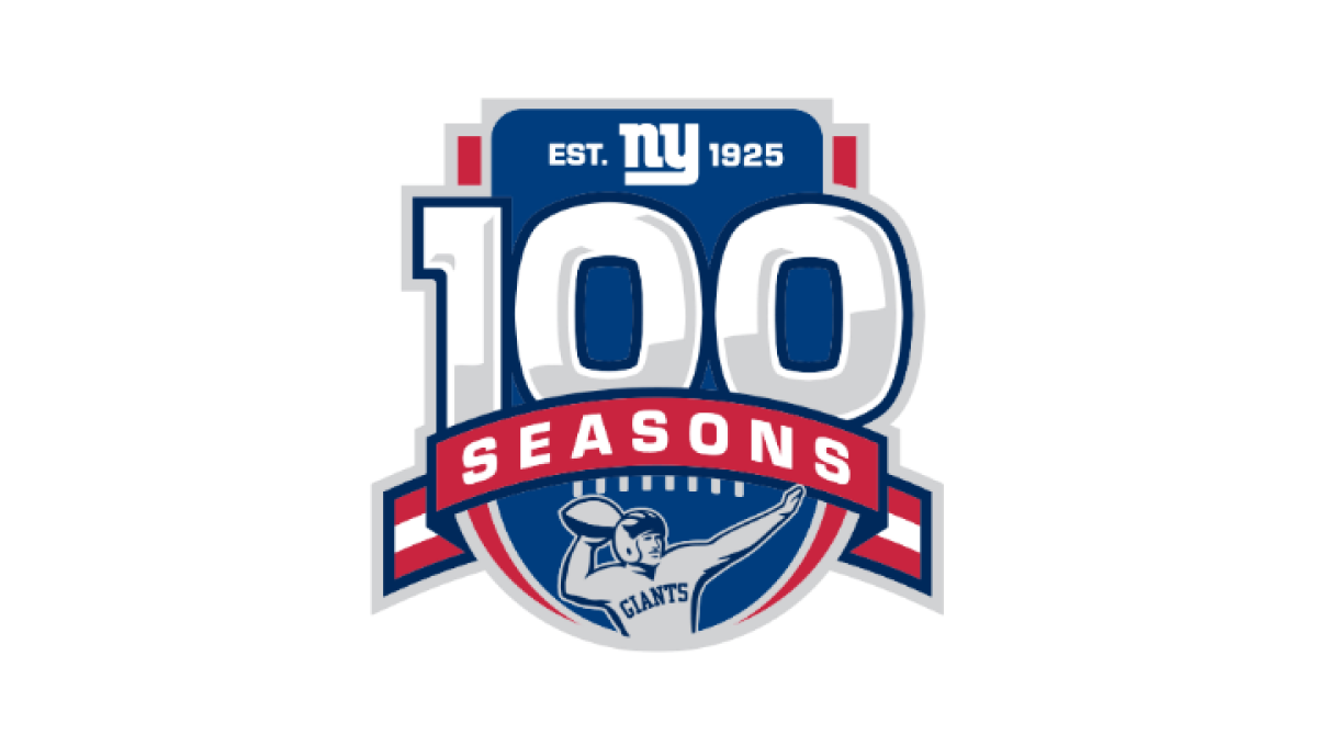
Anchored visually with a large number 100 inside a classic sports-style crest, this logo uses more classic sports vibes to created a logo that has depth and a cohesive design. At the top of the 100 sits the team's original logo, below sits a ribbon holding the word seasons, and a football icon at the bottom completes this logo.
More Details →National Arts Fesitval 50th Anniversary Logo
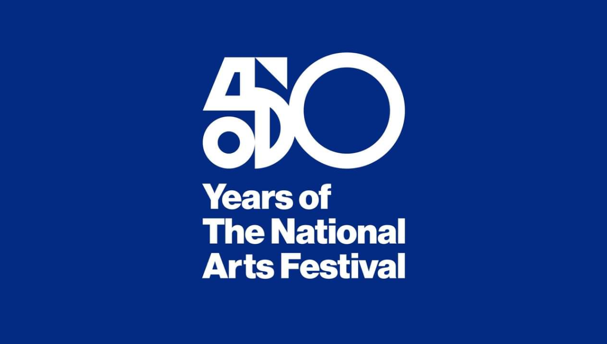
This logo was used primarily on this blue background and combines two nice designe elements to make the whole. The first is a combination of shapes to create a unique, creative number 5 that resembles a bit of modern art. The second is the classic helvetica-style font that is so common in art contexts. Together, this logo is clean, unique, and meaningful.
More Details →Mt Buller 100th Anniversary Logo
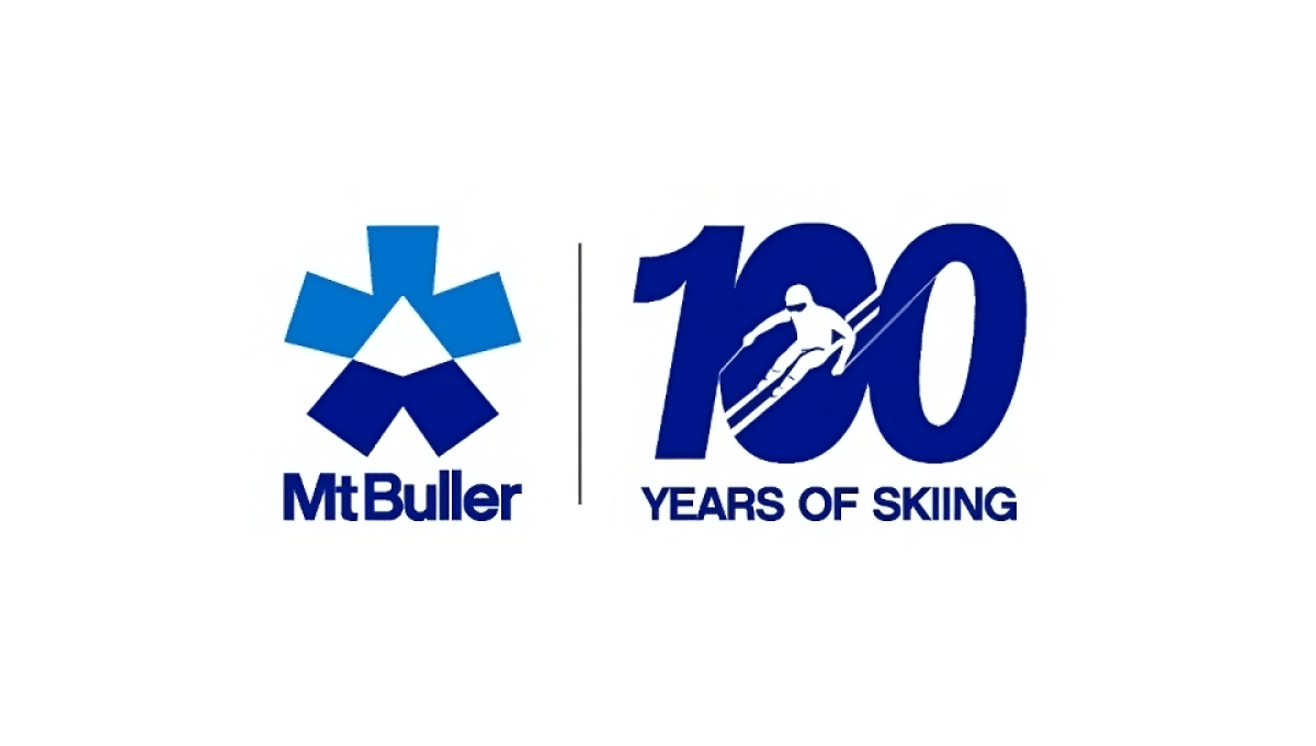
One of the smartest design trends in anniversary logos has been the simple, side-by-side concept that draws a vertical line in the middle, places the original logo on one side, and a simple number mark on the other. Mt Buller did this really wel with a nice "100 years of skiing" mark that makes for a nice, visual balance to the brand both visually and with the meaning they're aiming for.
More Details →Orlando Magic 35th Anniversary Logo
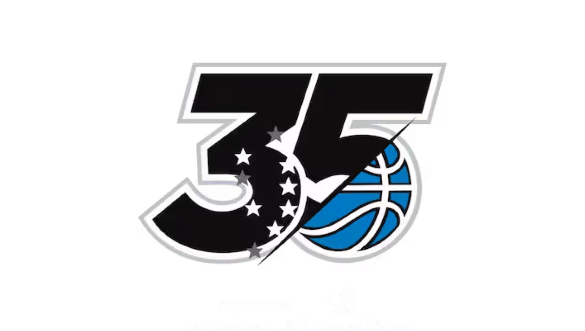
This logo has rarely been used outside of the context of the team's games, name, or traditional logo, so this minimal design that builds on a large number 35 does a great job of weaving the original blue basketball mark into the classic, block style lettering from sports to make a clean logo that looks great on everything form their home court to team swag.
More Details →FIS 100th Anniversary Logo
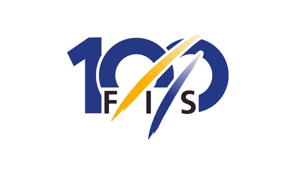
The organization behind professional skiing and ski racing, FIS started with a large number 100 in their classic blue color but added another of their brand colors, yellow, in two streats representing the tracks their members form down the mountain. With their traditional logo woven in at the bottom, this made for a really sharp, clean anniversary logo.
More Details →Boyne Mountain 70th Anniversary Logo
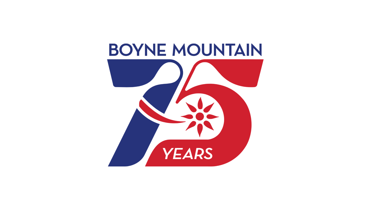
Retro was the name of the game as Boyne Mountain pulled visuals and colors from the early days of their history to create a number mark that was both easy to read but also neatly tied back to the original brand from all those years ago. Above that number mark is the name of the resort to complete the design. This logo as looked fantastic in all white on dark backgrounds and the shape lended itself well to use as social media avatars.
More Details →European Distance & E-Learning Network 30th Anniversary Logo

This brand found themselves in a unique position when designing an anniversary logo because their existing logo already resembed the shape of a number. By placing the number 3 above the "ED" with a similar width as those to letters combined and doing the same with the 0 and "EN", the acronym and number mark created a unique, balanced shape that incorportated their existing logo.
More Details →American Bakers Association 125th Anniversary Logo
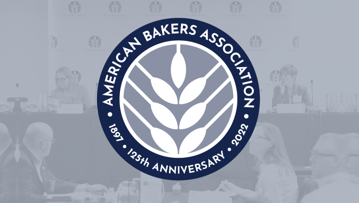
Using the round shape so often found in anniversary logos, this mark adds a clean, on-brand white silhouette of wheat in the center as the visual anchor for the design. Around the perimeter of the circle in a thick blue band wits the name of the organization, the years of operation, and the classic anniversary callout to complete the circle and add clarity to the reason for this separate mark.
More Details →Snowbasin 75th Anniversary Logo
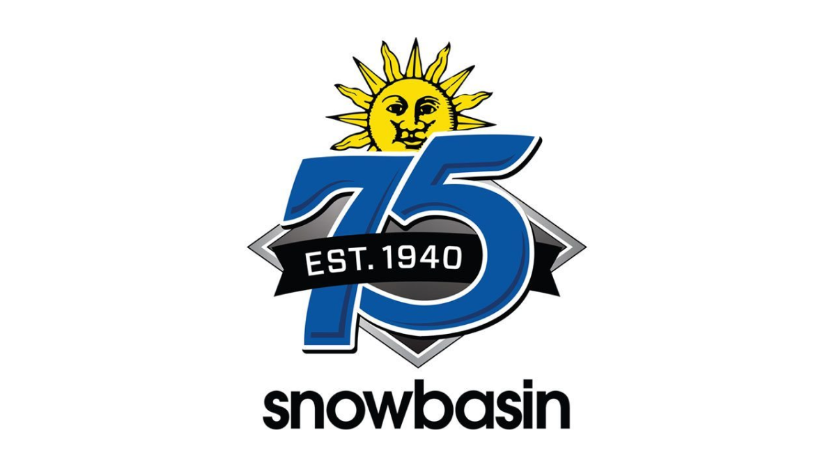
Featuring a large number 75 in the brand's usual blue, this logo adds a few simple elements in and around these digits. First, the brand's traditional mark peeks up from behind the 75. Next, a black ribbon holding the years of operation weave in and out of the main number mark. Finally, the traditional work mark for the resort sits at the bottom to make a fun, but recognizable design.
More Details →Wolf Bay 50th Anniversary Logo
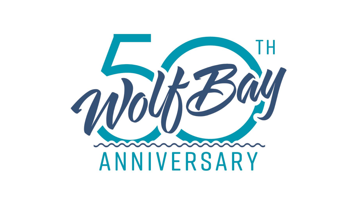
This logo may be simple, but it's also really clean and effective without having too many parts. A large number fifty sits behind with the traditional word mark of this restaurant cutting across at an angle with a little bit of padding around the edge to avoid bleeding. The word anniversary at the bottom clarifies the reason for the design and adds a bit of balance.
More Details →American Gymnastics Academy 30th Anniversary Logo
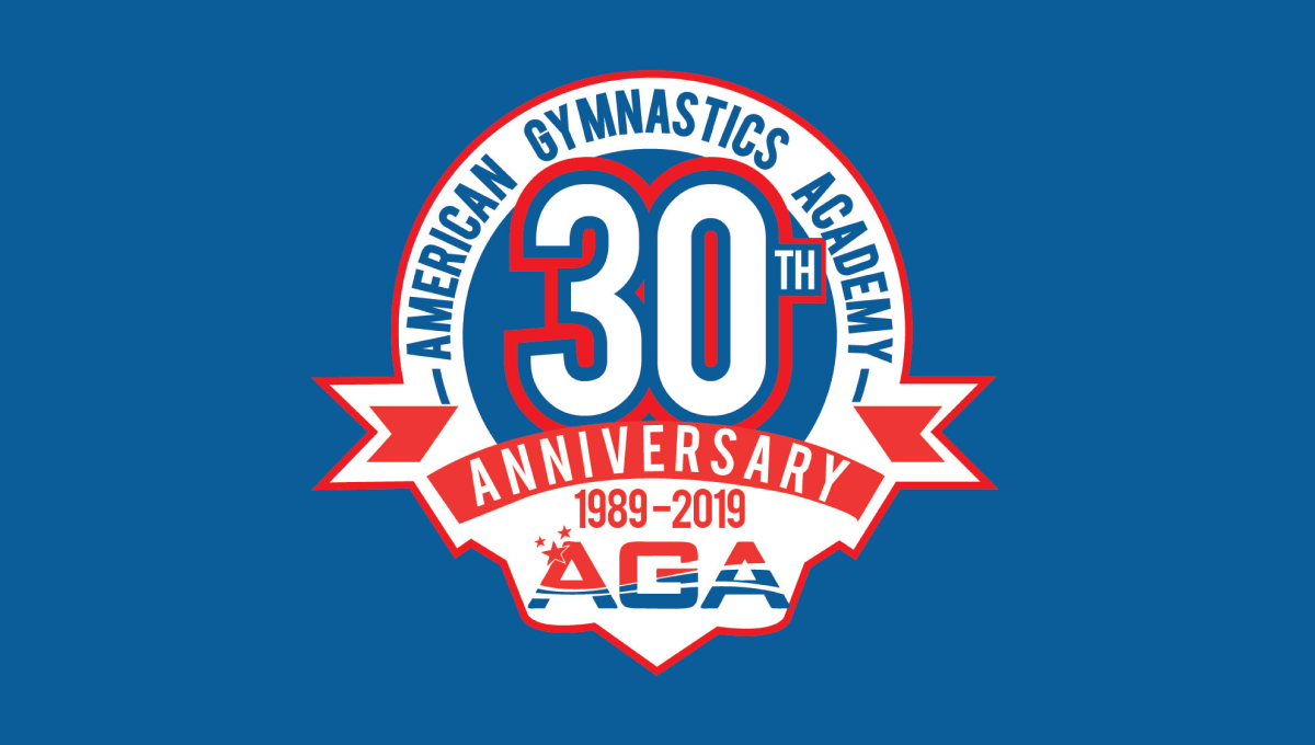
This classic logo combines a few common elements into a really tidy package. First, the logo uses a circle for the base with a large number 30 set in the upper middle of that circle. Next, a ribbon comming across the lower part of the circle holds the reason for the celebration. Finally, the organization's traditional logo sits below the ribbon with their name arching around the edge.
More Details →Pro Source Fitness 20th Anniversary Logo
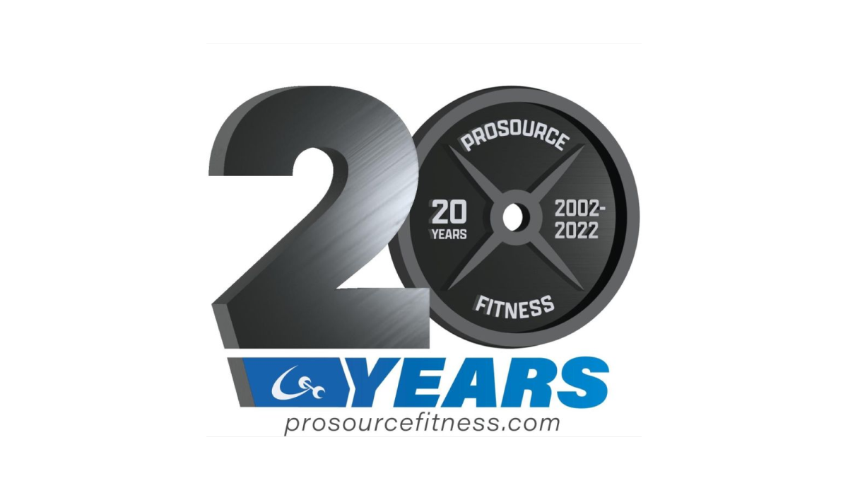
When you run a gym and you're celebrating an anniversary with a new logo, why not use a part of that gym that is both ubiquitous but also shaped like a zero? By using a plate as one digit and adding some metalic sheen to the number 2, this gym create a clever, on-brand mark. Below sits the name of the gym in the brand's primary blue colors.
More Details →IDEA Health & Fitness Association 40th Anniversary Logo
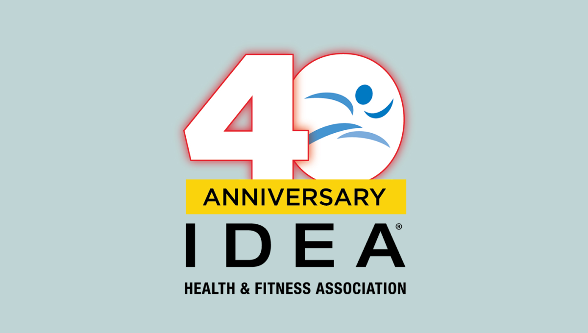
A large, block number 40 anchors this anniversary logo design. Both are outlined in red but the zero holds the blue mark that's traditionally used for this fitness organization's brand. Below is a yellow rectangle with a black word "anniversary" with the name of the organization sitting below to create balanced shaped that fits well in a square or circle avatar.
More Details →Blue Moon Brewing Company 20th Anniversary Logo
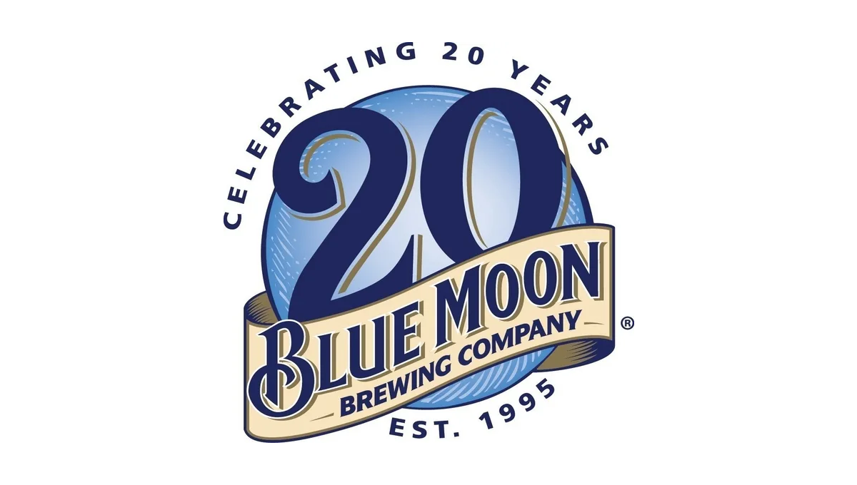
Blue Moon's famous blue circle and ribbon had all the elements the designers needed to adapt for an anniversary logo. By moving the ribbon down to expose more of the blue circle and placing a darker number 20 in the area left behind, this logo is easy to recognize but also being unique. Simple lettering above and below helped clarify the reason for celebration and round out this design.
More Details →Marek 75th Anniversary Logo
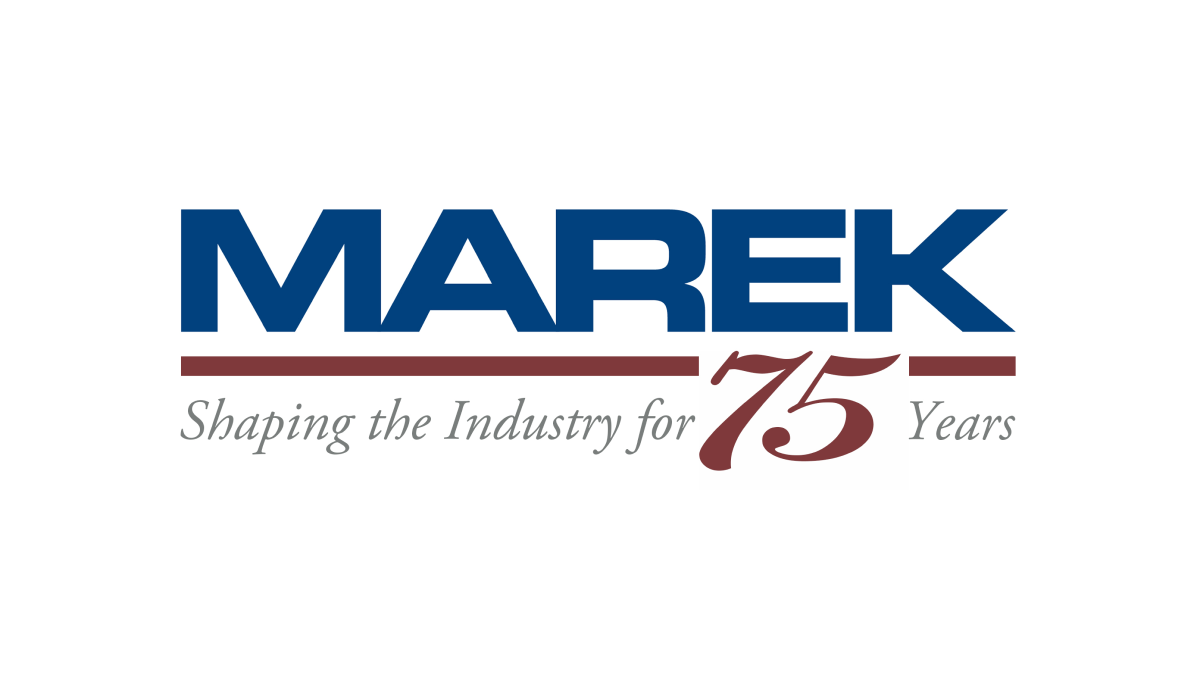
This mark always had a red line below a blue word, so this logo design simply worked with the existing horizontal elements in their traditional logo with the horizontal parts of the number 75. The result is a neatly integrated number that celebrates the occasion with a design that will be easily recognizable to their audience.
More Details →Apple France 40th Anniversary Logo
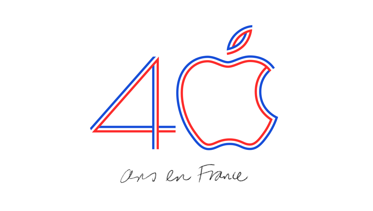
Using the classic Apple logo for the zero in the number 40, this logo uses the three colors of the French flag to create a line-art style logo that neatly combines both the traditional mark for this computer company and the colors that represent the branch of the company they were hoping to celebrate with this special design.
More Details →National Football League 100th Anniversary Logo
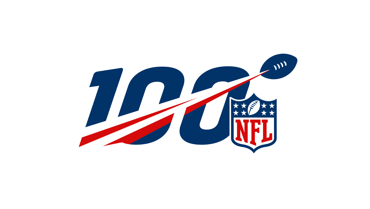
A logo that was seen time and time again by millions during the league's 100th anniversary, this mark features a large, block number 100 with a football streaking from the lower right to the upper left with a red line flowing behind. Finally, the league's traditional logo sits just to the bottom right to add balance and make the mark easy to recognize.
More Details →Adidas 60th Anniversary Logo
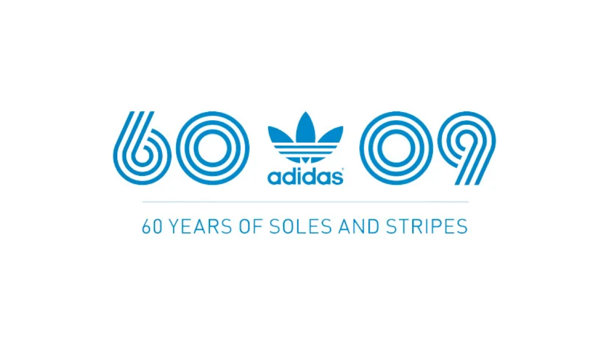
Three strips, classic blue color; that's about all Adidas needed to set the tone for a recognizable mark and they did exactly that. Three lines to form the anniversary they're celebrating and a 09 to mark the year of celebration. With the traditional mark placed in the middle, this logo is as simple as it is effective.
More Details →Goldenwest Credit Union 85th Anniversary Logo
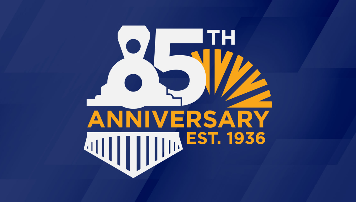
Goldenwest was originally founded as the Ogden Railway and Depot Company Employees Federal Credit Union, so on their 85th anniversary they tipped their hats to their rail-related roots by turning the number 8 into an illustration of a train engine. With their traditional mark peeking out from the side and the word anniversary across the middle, the design was a fun recognition of how far they've come.
More Details →United States Disc Golf Championship 25th Anniversary Logo
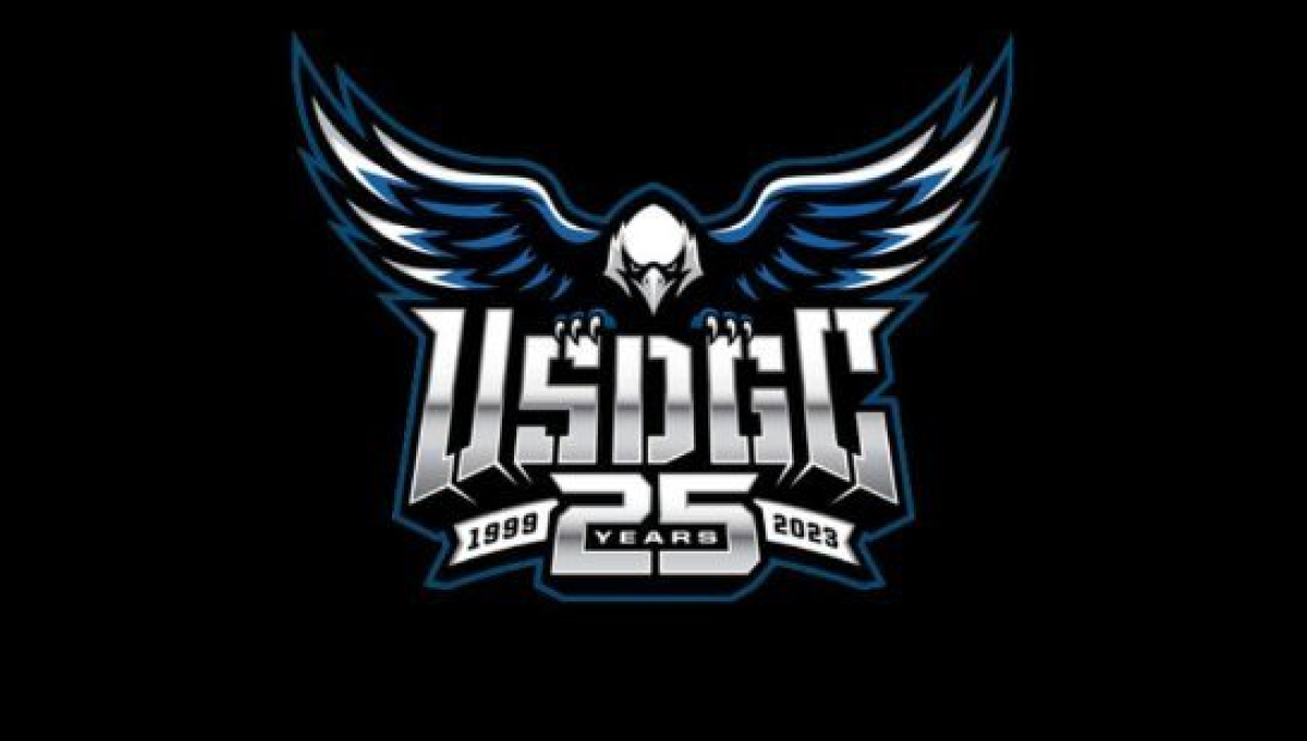
With the sport growing at a record pace, the United States Disc Golf Championship wanted to celebrate their 25th anniversary with a logo worthy of the sport's budding brand. With their traditional logo set in the center, a large bald eagle behind, and the number 25 below, the design adds a metalic sheen for a clean, classy finish.
More Details →Lincoln Memorial 100th Anniversary Logo
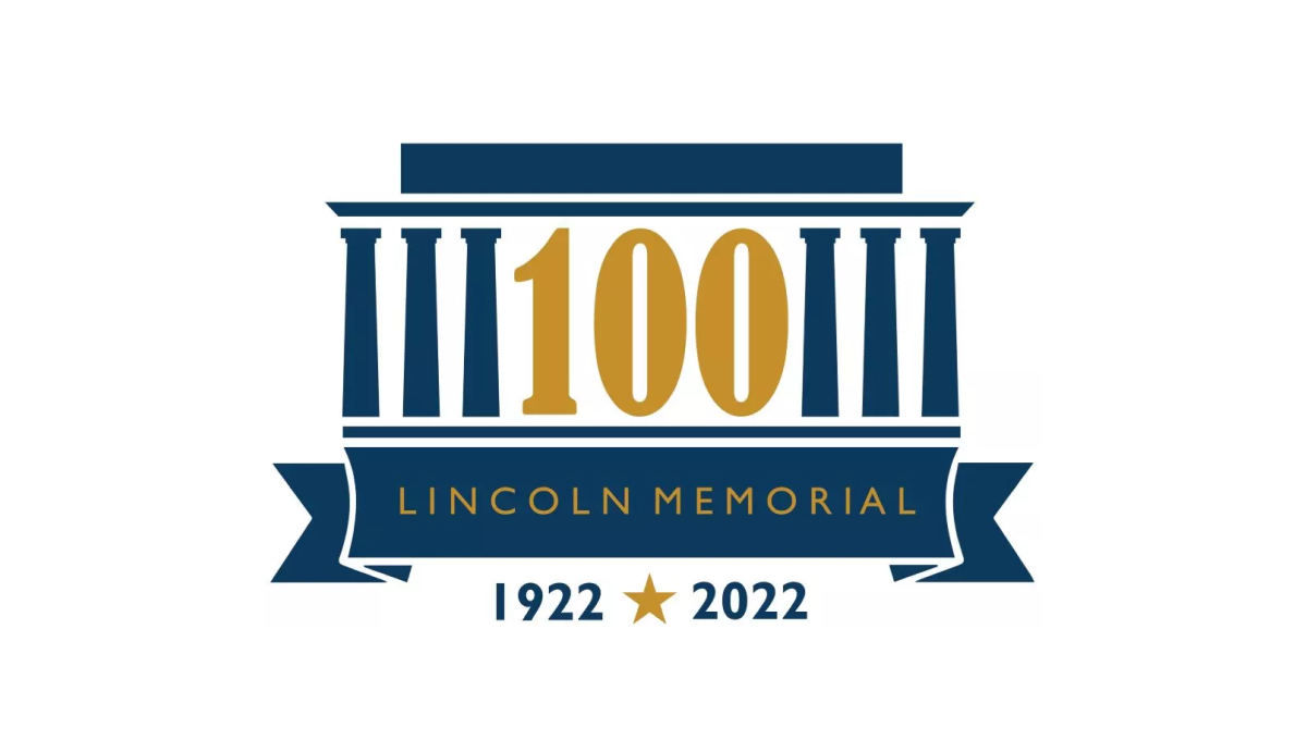
As one of the most recognizable monuments in the country, this logo leaned into this famous design for their anniversary logo. By replacing three of the pillars with a large, elongated number 100, the designers created a clean layout but also one that one easy to recognize even without the ribbon and dates along the bottom clarifying what is being celebrated and the years of operation.
More Details →City of Burien 30th Anniversary Logo
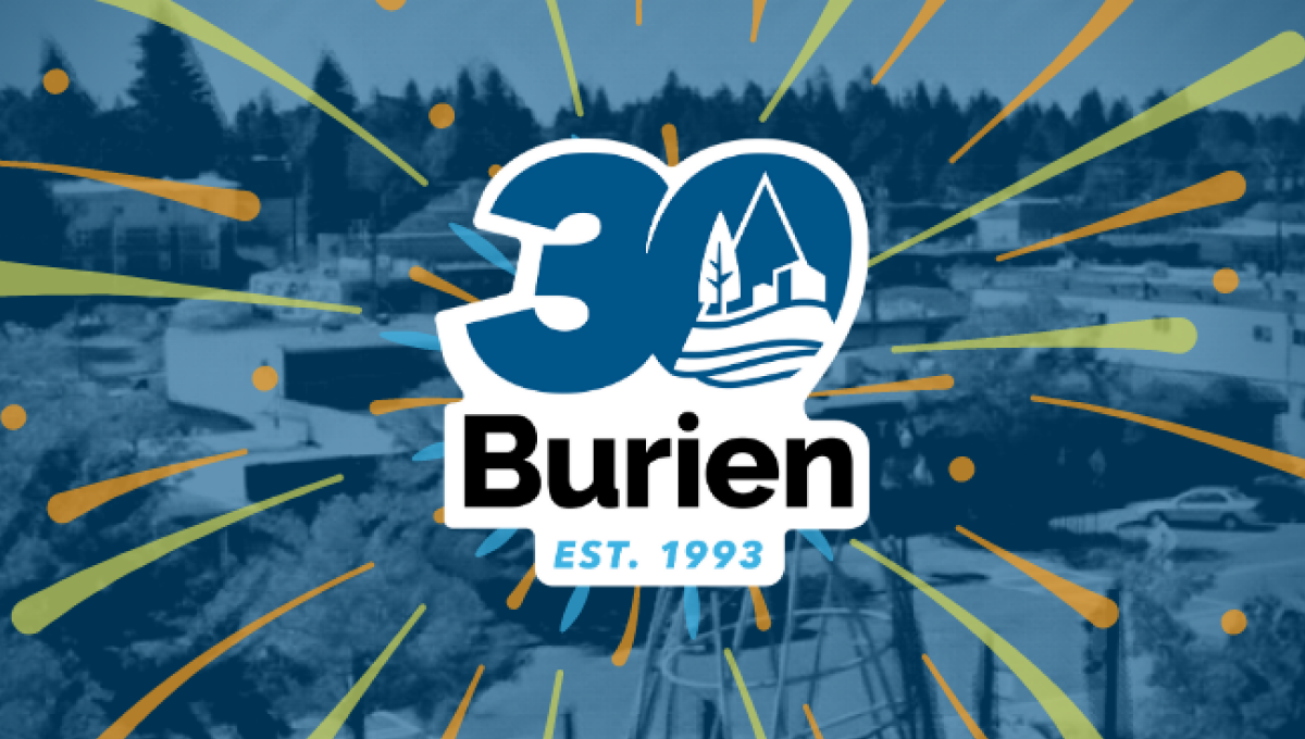
This clean, sticker-style logo starts with a large number 30 with a slight ilatic style in the city's traditional blue color. Inside the zero is place a white, line-art version of the city's main logo. Below that is the name of the city with the year it was established at the bottom. And by locking up this design with white padding, they were able to place it on any color including a fireworks-like design used on their website.
More Details →Smithsonian Institute 175th Anniversary Logo
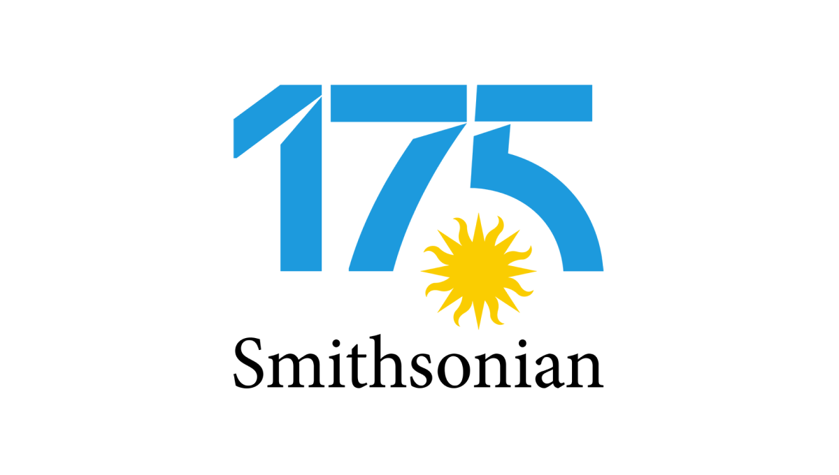
Normally the Smithsonian logo features a yellow sun on a blue circle. Wanting to keep the colors and shape of the original for their anniversary design, their team separated the blue from the yellow, placed the sun on it's own in the gap between the 7 and 5, and then used that backgroudn blue for the color inside the number in this logo. The traditional word mark on the bottom rounded it out and made it easy to recognize.
More Details →SESLOC Federal Credit Union 80th Anniversary Logo
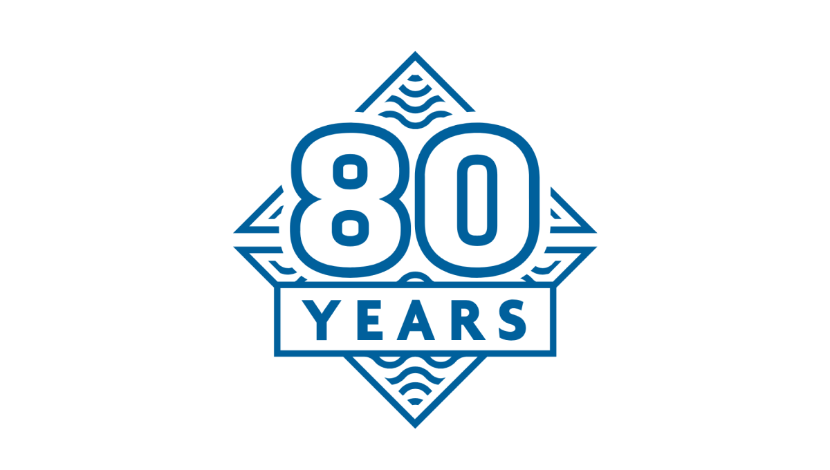
This mark was rarely used on its own, but because they stuck to the same blue color, shape, and style as the company's original logo, this design was a nice campanion to traditionally branded materials. The difference in this mark was a large number 80, unique line art behind, and a large word "YEARS" below the number. The design looked great and was used really well by this credit union during their anniversary.
More Details →Epec 65th Anniversary Logo
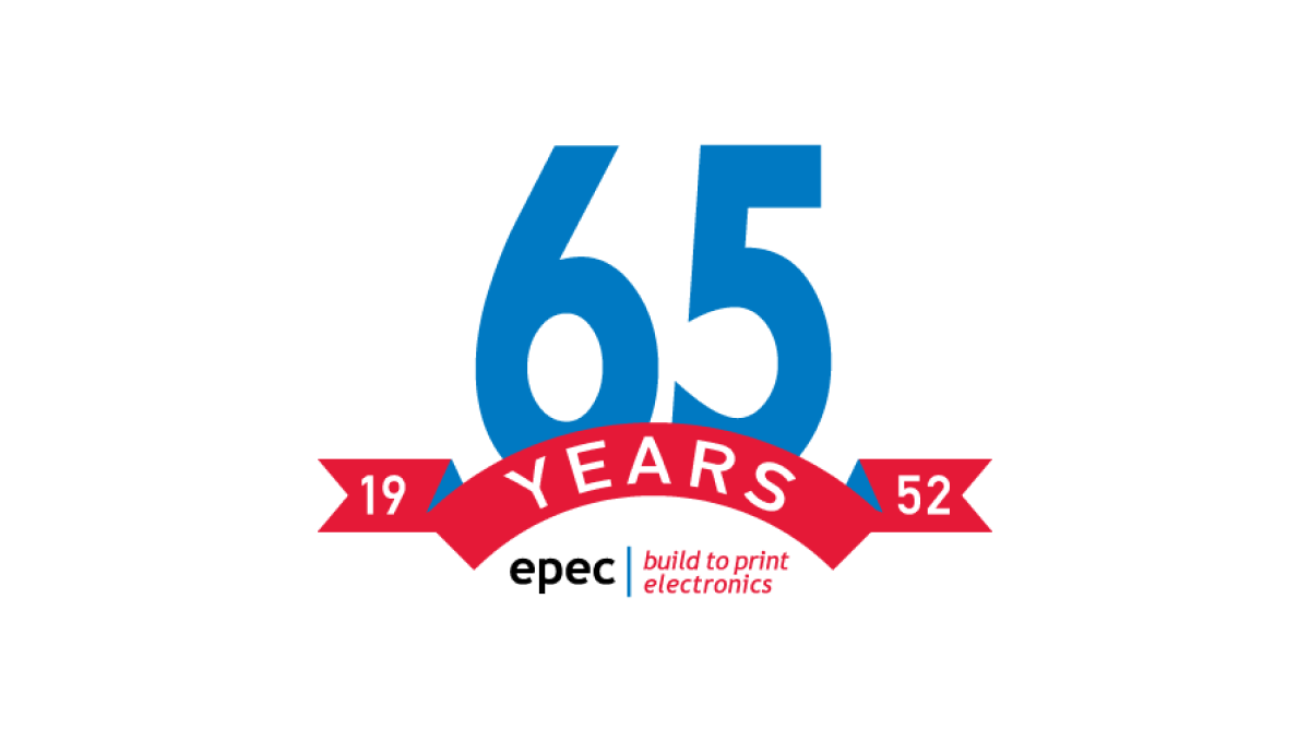
This simple logo uses the brand's primary blue and red colors - a large number 65 in blue rising up from behind a curved ribbon in red - to both spend the message and create a little bit of negative space at the bottom of this mark. In that mark they placed their usual logo for a simple mark that's both big and easy to use but also ties back to the original brand.
More Details →Battle of Normandy 80th Anniversary Logo
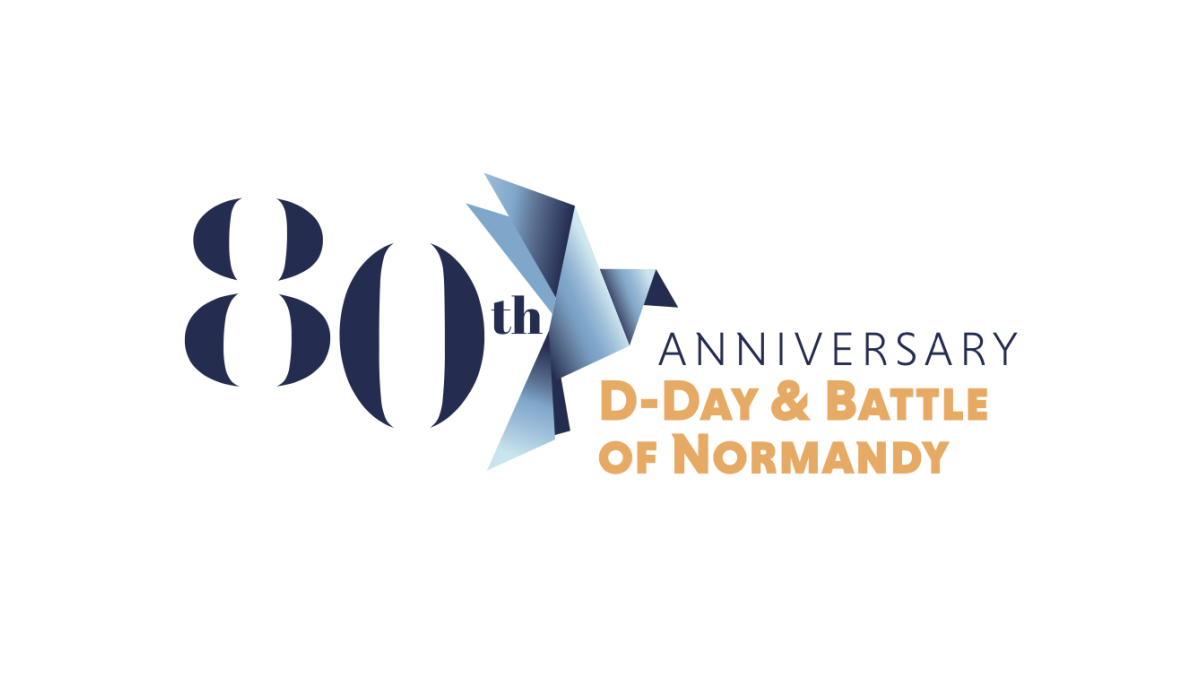
Marketing the anniversary of such an imporant but somber occassionan, this logo uses a clean serif font for a large number 80 that sits on the far left of the logo. Just to the right of that is a dove made of sharp angles and shapes using a few varieties of the same blue. Finally, words sit to the right of that clarifying the why and what of this anniversary.
More Details →Ruskin 65th Anniversary Logo
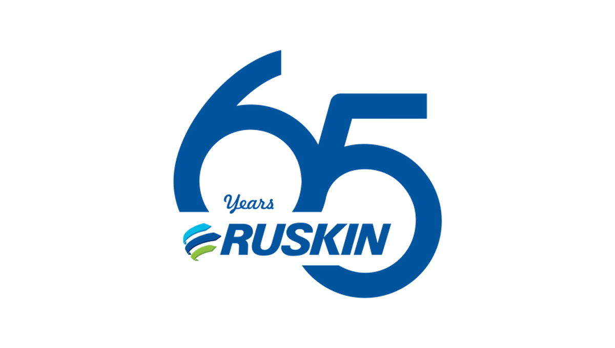
Ruskin's 65th anniversary logo starts with a large number to mark the reason for celebration with a slight offset and overlap. This number, in the brand's traditional blue color, creates the backdrop for the brand's primary logo to be placed across the bottom of the six and into the gap of the five. This creates a clean mark that's easily recognizable as relating to the normal brand.
More Details →Dialight 80th Anniversary Logo
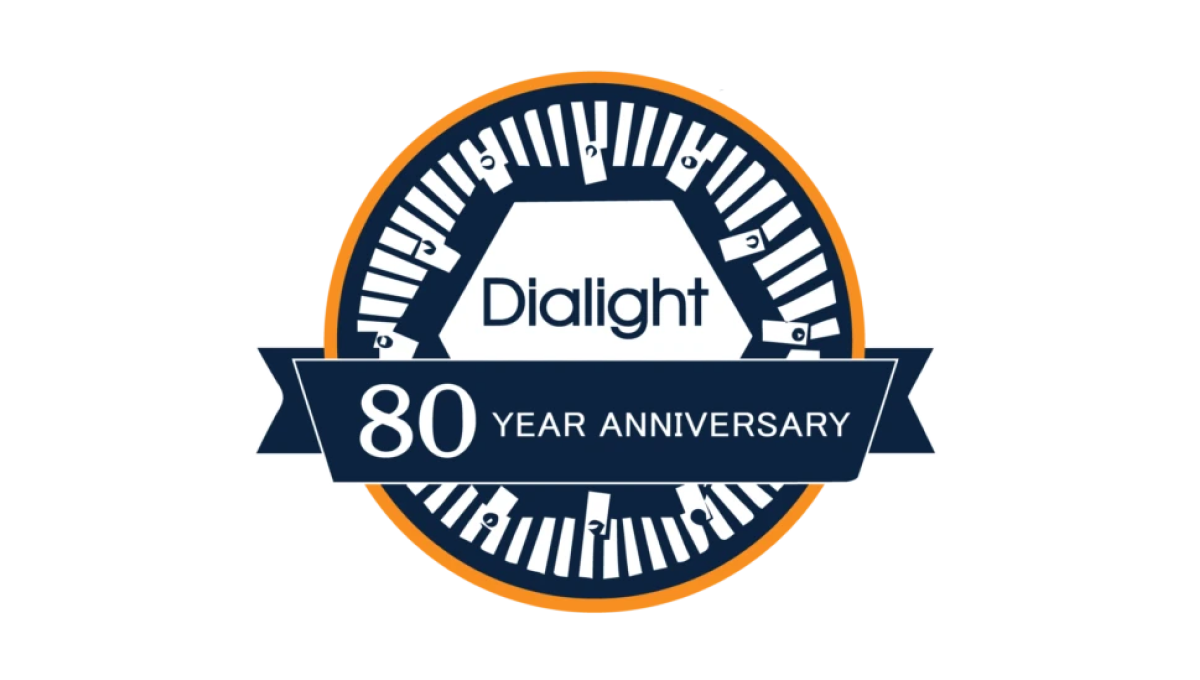
Starting with a classic circle shape, this mark doesn't use as many colors as the brand's traditional mark, but uses both a prominant, center placement of the usual logo with an illustration around the edges of the circle that adds visual cues back to their primary product which, in this case, is LED lighting. A ribbon across the bottom third holds the reason for celebration and creates a little bit of depth for this design.
More Details →South Coast Pediatric Dentistry 10th Anniversary Logo
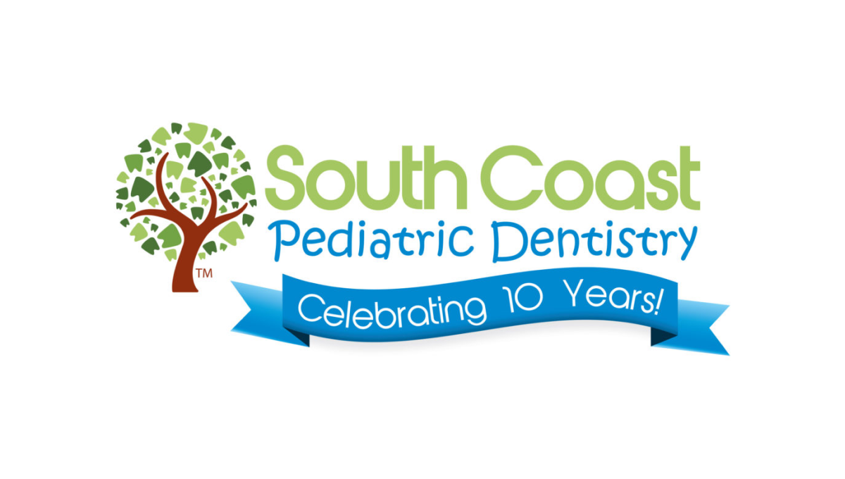
Instead of reinventing the wheel for their anniversary logo, this dentistry office simply added a clean blue banner below the words in their traditional mark. The banner is designed in a way to match the colorful, playful tone of the original mark and doesn't extend too far below the traditional logo's dimensions to make it easy to swap in and out of marketing collateral during and after the anniversary.
More Details →Perfect Teeth 20th Anniversary Logo
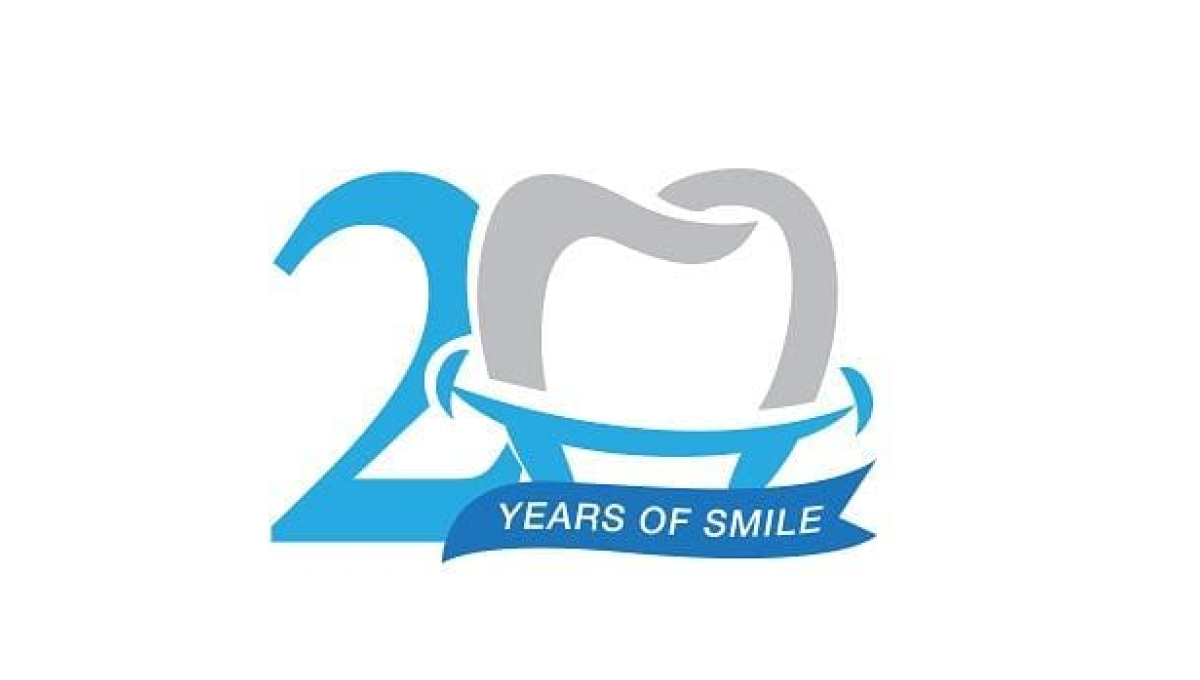
While this mark doesn't contain the name of the company celebrating their arrinversary, the clever use of the tooth shape as the number 0 is the 20th anniversary mark makes it clear what type of business is in question. And used only in places their original log would sit makes it easy to use this on-brand, playful mark without losing the tie to the original brand.
More Details →Gate City Bank 100th Anniversary Logo
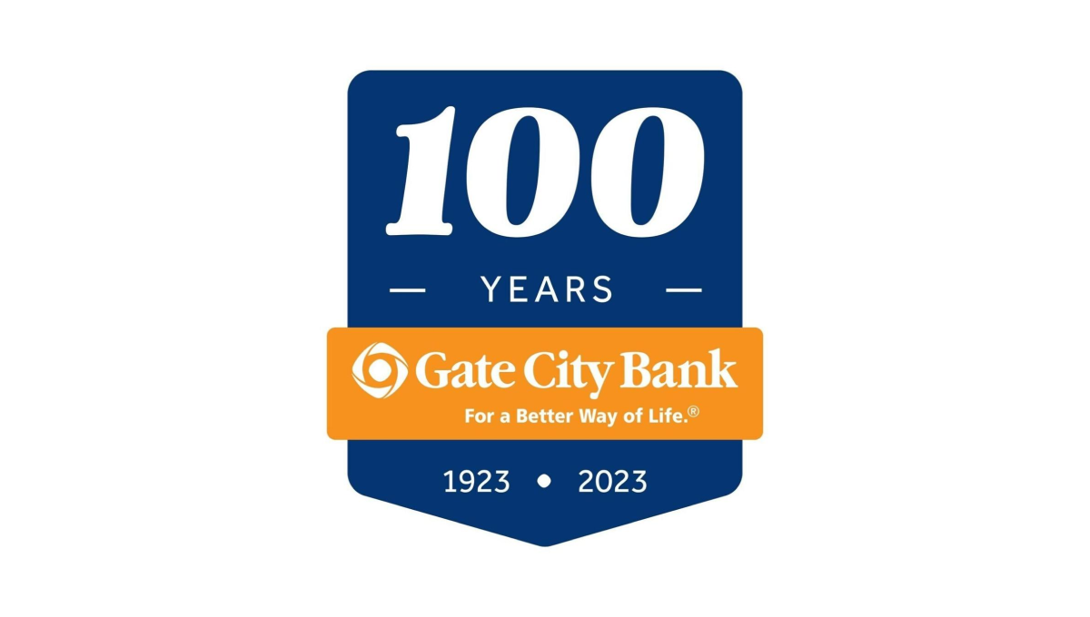
Using a clean banner shape, this badge-style logo uses a dark blue background to create contrast with the number of their annviersary and the years of operation. Between the two wraps an orange ribbon that holds the name of the and the company's tagline to make a clean, easy-to-recognize tie back to their original brand.
More Details →Fort Dodge 150th Anniversary Logo
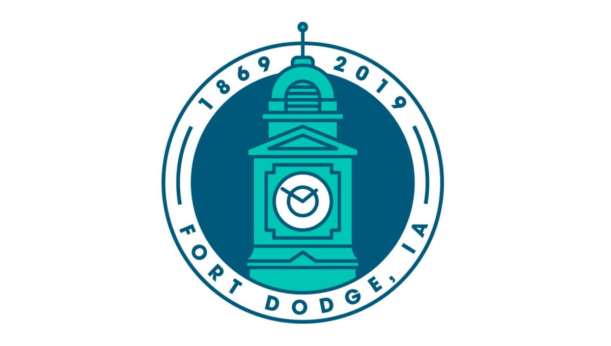
This clean, circular mark places the city's well-known clock tower in the center to establish a visual anchor. The clock tower comes up from behind the bottom part of the circle and overlaps the upper part of the circle. Around the rim of the circle sit the name of the city at the bottom and the years of existence, cleverly using the peak of the tower to separate the two years.
More Details →City of Thunder Bay 50th Anniversary Logo
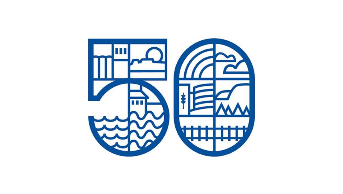
By dividing this number into a series of sections, this logo gave the designer lots of areas to work with as they highlighted many of the most popular, prominent landmarks in the city including the grain elevators, city hall, and the waterfront. By using a slightly thicker line for the number and thinner line for the line art in and around the number, it's easy to recognize the anniversary without the accompanying art distracting from that message.
More Details →City of Waukesha 125th Anniversary Logo
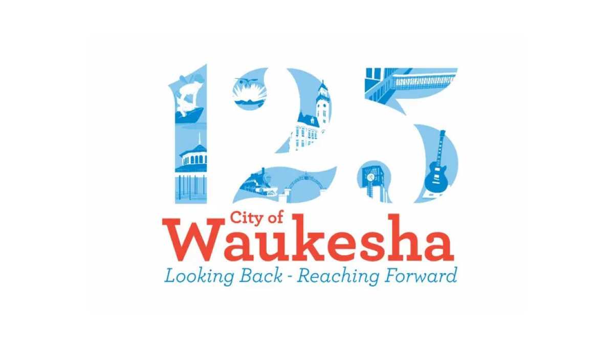
This logo places illustrations from many of the city's most notable landmarks in the number 125 to create a nice visual anchor for the city's anniversary. Complimenting the traditional red of the original logo, the number uses multiple shades of blue to keep the clear edges of the number but provide enough contrast to make each landmark easy to identify.
More Details →Hobart 125th Anniversary Logo
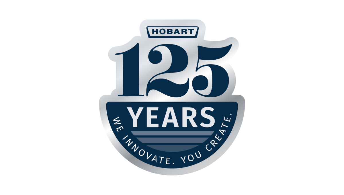
Using a look of the classic stainless steel material that many of their products are created from combined with the brand's traditional blue color, this clean mark places a large 125 and the main logo above a semicircle holding the word "years" and a tagline to celebrate the occasion and reinforce the company's main message, mission, and values.
More Details →Metairie Bank 70th Anniversary Logo
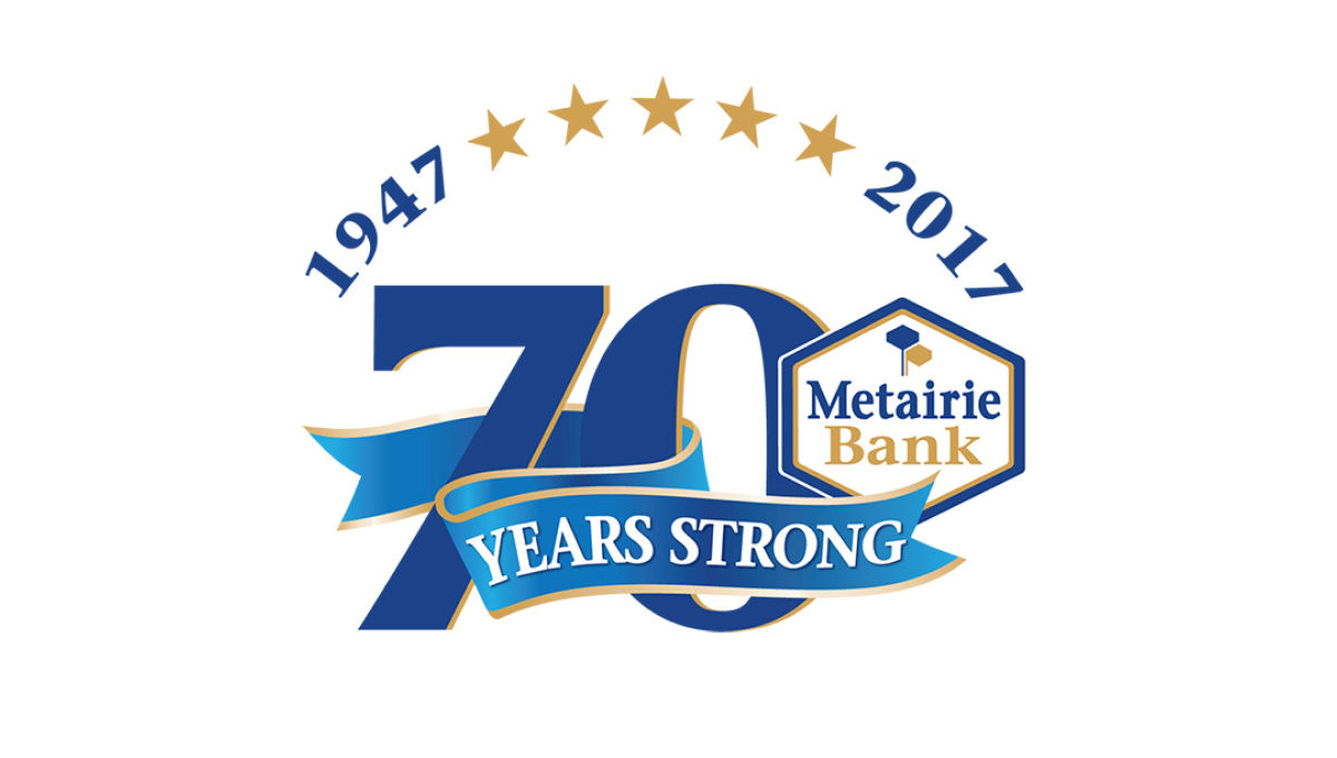
This design makes the number 70 in their brand blue the main visual feature, but also places many elements that sit layered above that logo. Curving above the number at the top sit a series of stars separating their years of operation, across the lower part of the number is a ribbon, with the original brand logo sitting in shape covering a portion of the remaining number.
More Details →Brookline Bank 150th Anniversary Logo
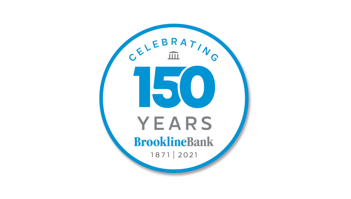
Round anniversary logos are easy to use on various channels including social media and this logo builds on that shape with a large number 150 to anchor the design visually in the banks' traditional brand blue. Above and below the number sit words to support that annivesary with the brank traditional logo at the bottom to help maintain brand recognition while the logo is in us.
More Details →Drexel University 125th Anniversary Logo
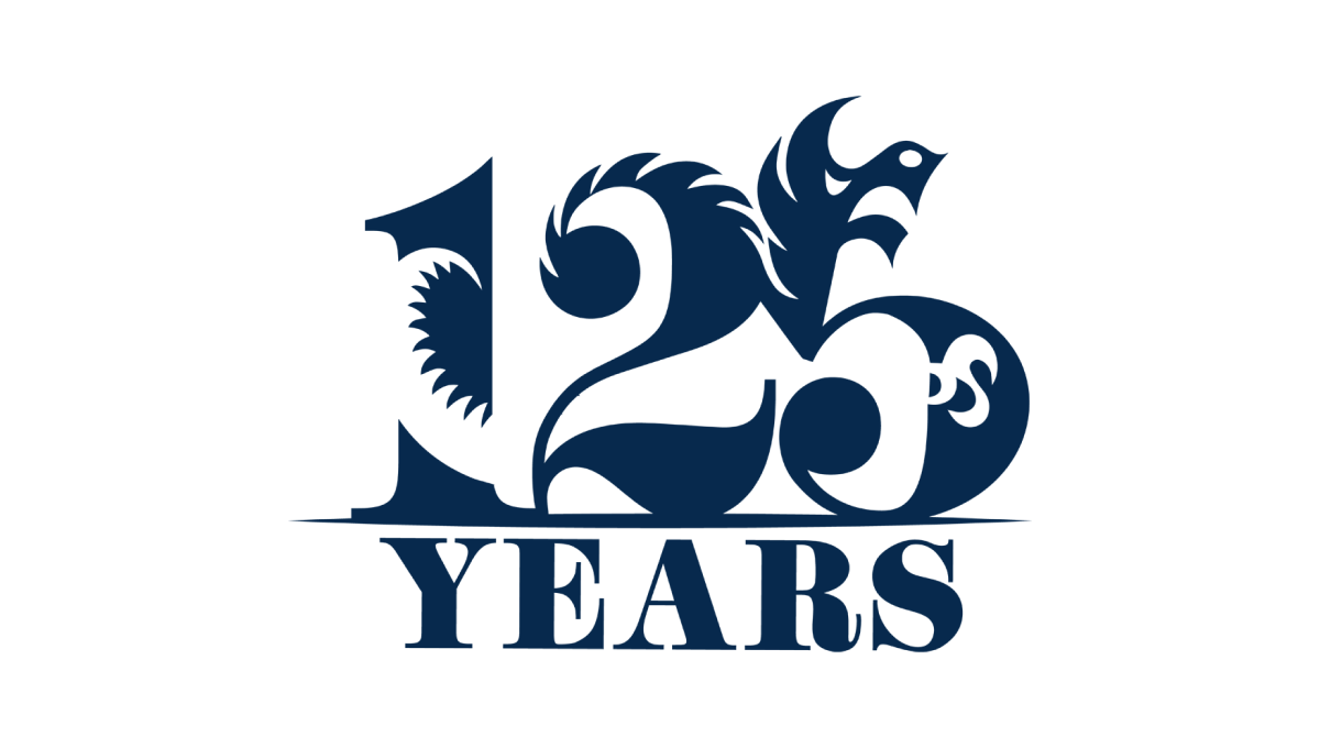
Designed by a student as part of a year-long project, this beautiful anniversary logo combines a large, block number 125 with the school's famous dragon logo to create a design that, remarkably, is easy to identify both elements within despite using a single color. With a block word "years" below, this is a beautiful example of design and art in a thoughtful, meaningful logo.
More Details →Attractions Ontario 40th Anniversary Logo
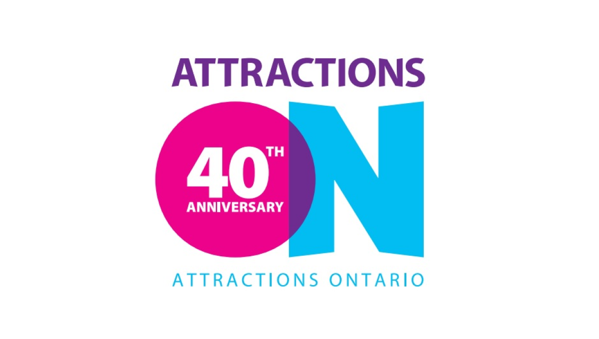
If you've visited a rest area in Ontario you've probably seen their simple logo that features an overlapping O and N. Given the large empty space that already existed in the first letter of their name, they simply placed text to signify their anniversary inside of that O and called it good. The original brand remains but the celebration is clearly visible.
More Details →DePaul University 125th Anniversary Logo
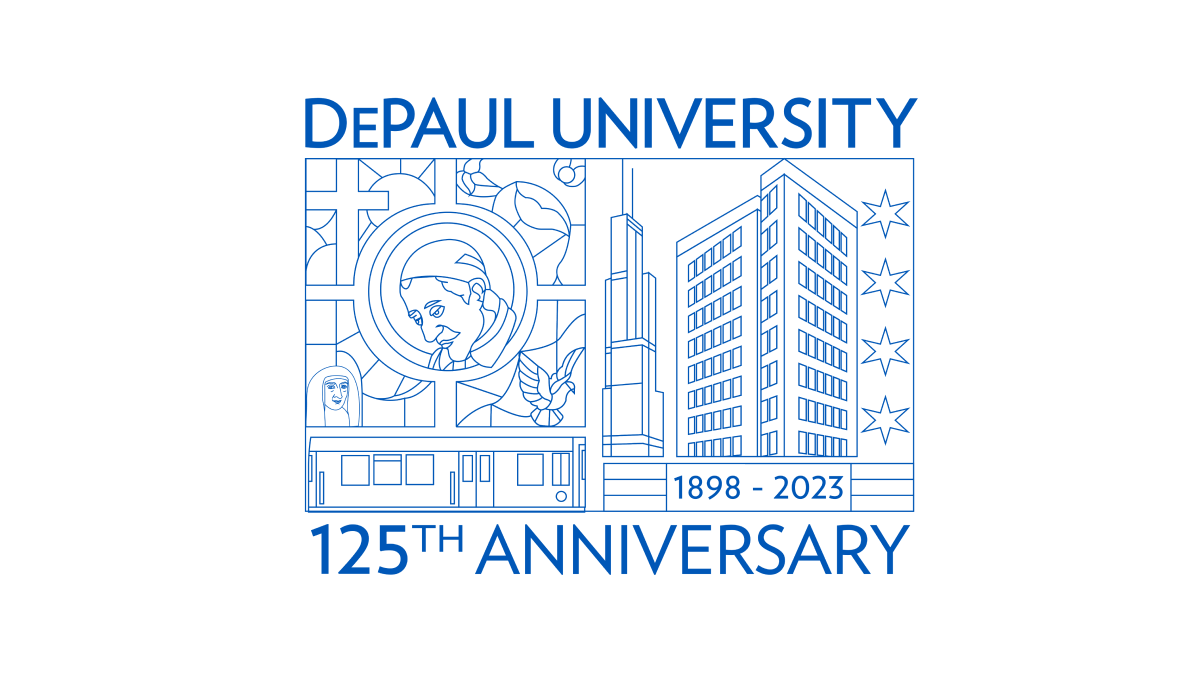
Using beautiful line art of the city in which this university is location and famous figures from their story and history, this annivesary logo is an incredible design that stands out from traditional annivesary logos. With this art at the center, playing the name of the school and the year that is being celebrated above and below in the same brand blue is all that was needed to balance out this design.
More Details →Cambridge Community Center 90th Anniversary Logo
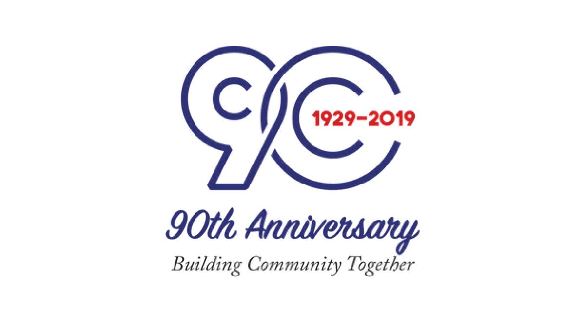
This line-art style logo starts with the year of the annversary in large, outline-style characters that slightly overlap to create a nice, compact shape. Inside the zero are the years of operation. Below the number sits a written recognition of the anniversary with the center's motto and goal written below to balance out the design.
More Details →Detroit Lions 90th Anniversary Logo
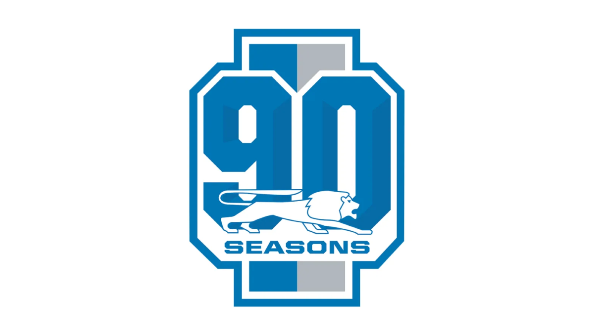
With a vertical rectangle as the backdrop that is divide into the brand's two primary colors, this mark then places a large, block number 90 in front those bars to create a unique, simple shape. Around the edge is the classic colored borders and white gap famous for sports logos. Finally, the original lion mark is placed overlapping the bottom of the 90 with the word seasons below that.
More Details →Sega 60th Anniversary Logo
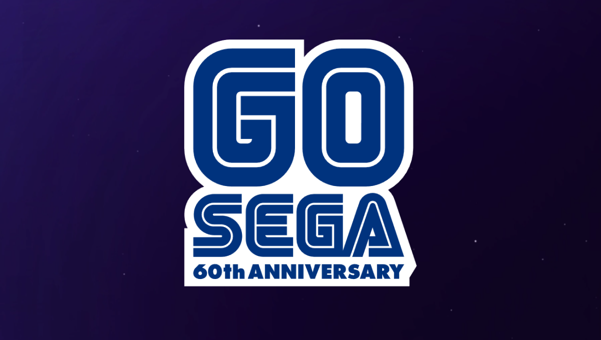
One of the most well-known aspects of the Sega brand are the block letters with a thin, inner-line creating a unique typeface that becomes even more easily recognized in their classic blue. In this case, they simple placed a large number 60 above their traditional word mark and the phrase "60th anniversary" below in the same typeface and color to create a nice mark that would work well in a variety of situations.
More Details →Los Angeles Dodgers 60th Anniversary Logo
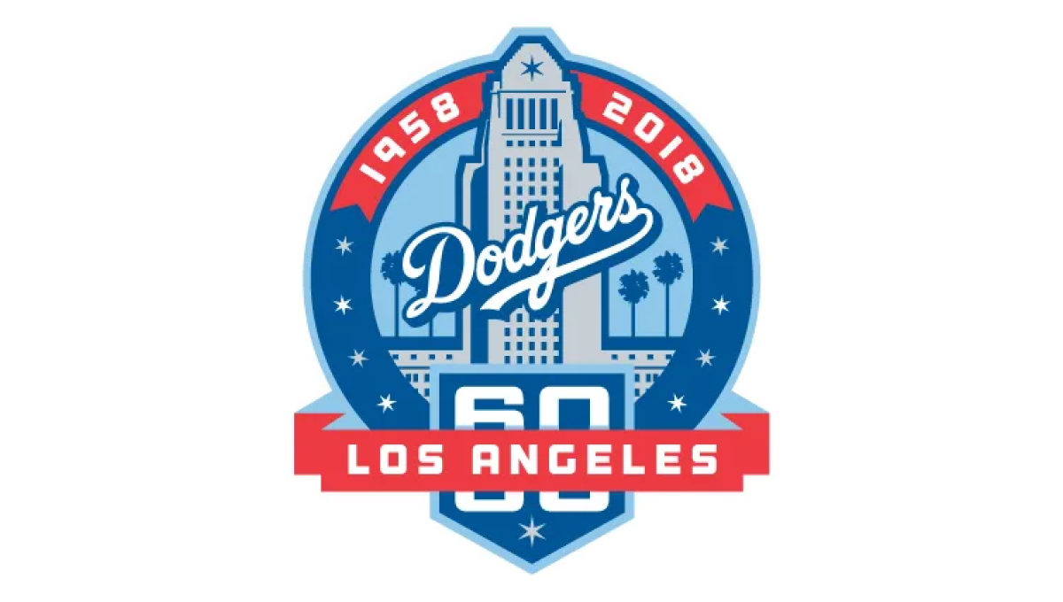
With the famous Los Angeles City Hall as the backdrop, this mark uses a blue circle for the main shape and places an illustration of that building in the center. Above that the years of operation wrap around the top edge of the circle. At the bottom a home-plate shape holds the number 60 with a ribbon holding the name of the city.
More Details →New York Mets 60th Anniversary Logo

Similar to other baseball teams who celebrate anniversary logos, this mark begins with a baseball field for the shape. In this case, the outline is in the team's famous orange and blue colors with a large blue sixty set in the center. At top of the field sits the team's original logo, at the bottom is the year the team was founded, with a ribbon holding the word "annivesary" set just below the number 60.
More Details →Buffalo Bills 60th Anniversary Logo
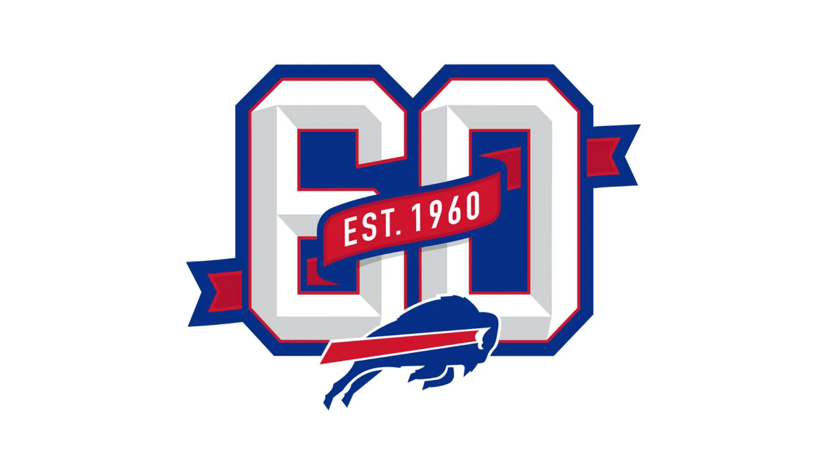
This logo builds on the classic shape, style, and format of the numbers you may see on a football jersey. Weaving in and out of both the number six and zero is a ribbon that identifies what year this footbal team was established. Below that sits the Bills' original mark to make it clear which team this logo is tied to which also reflects the colors used in the ribbon and numbers.
More Details →Samoa Independence 60th Anniversary Logo
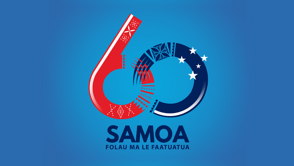
Designed for a light blue background, this logo starts with a large nuumber 60 with the ring of the six and the left side of the zero elegantly overlapping using patterns and shapes tied to the Samoan culture. At the bottom sits the name of the country with a series of starts just above and to the right of the zero to create balance and add extra meaning.
More Details →Fountain Valley 60th Anniversary Logo
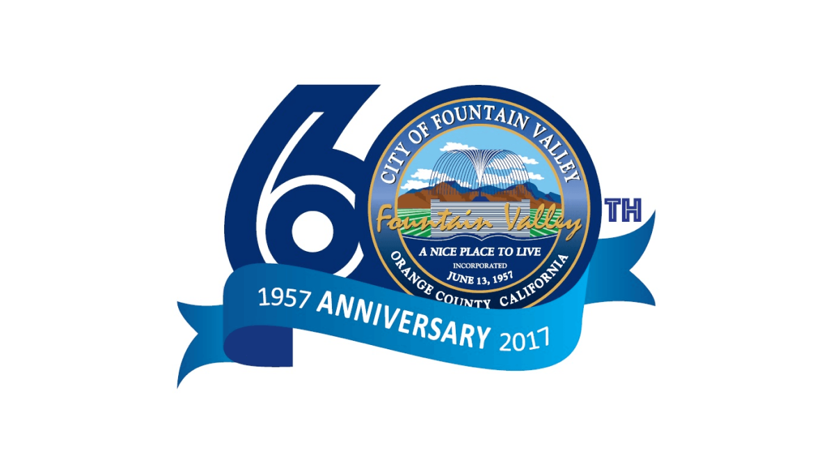
This logo starts with a large number sixty in a dark blue color. In the number zero, an illustration of a foundation sits inside a small seal-style shape with the town's name, motto, and location. Below that a lighter blue ribbon holds the word anniversary with the year the city was founded on one side and the year of this anniversary on the other.
More Details →Cedar Hills Community Church 60th Anniversary Logo
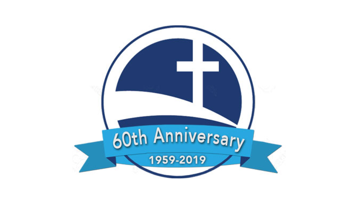
Some logos spend a lot of time creating space for text and names, but this logo keeps it super simple by simply placing the mark for the church - a cross on a sloping curve - inside of a circle. Then in front of that circle placing a blue ribbon that holds the reason for the celebratio and the years of operation.
More Details →The Landings Association 50th Anniversary Logo
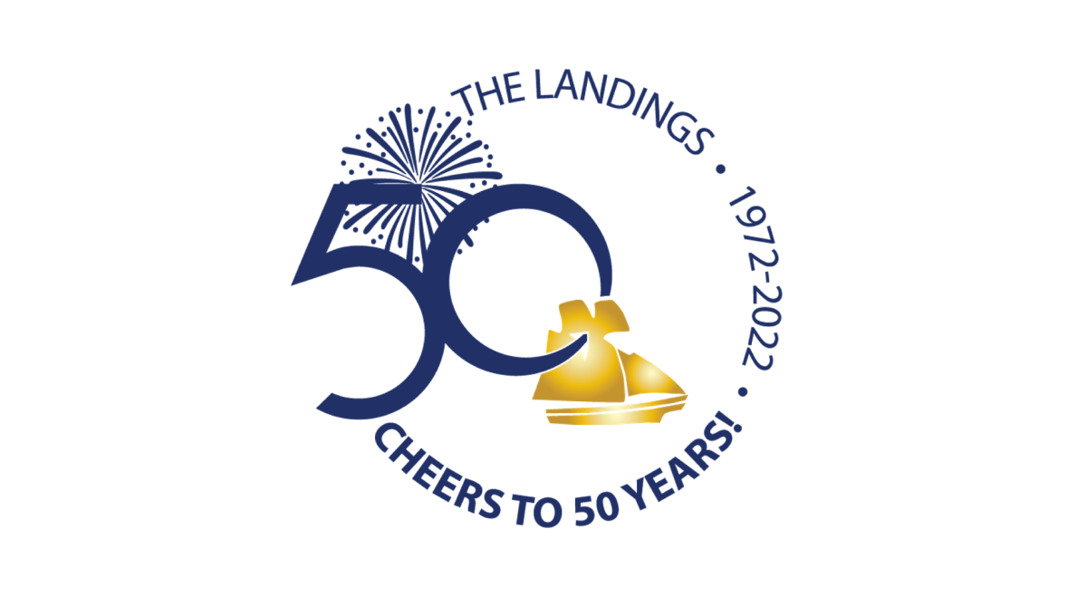
Keeping it simple, this logo places the name of the organization, the years of operation, and a celebratory message in a curving circle of words to create the rough shape. On the left side, the remaining gap in the words is filled with a large number fifty and an illustration of fireworks behind. In the center, a ship representing the orgnaization's main brand sits just in front of and below the number.
More Details →First Bible Baptist Church 25th Anniversary Logo
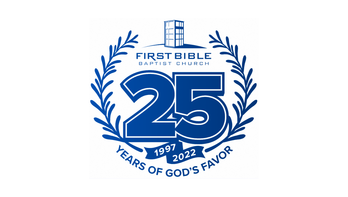
With laurel leaves curing upward to form the shape and the church's traditional logo at the top, this logo then places a large number 25 in the center to add balance. The number also features a solid shadow and outline for depth plus a ribbon below holding their years of operation. Below that, the church's tagline sits to round out this logo.
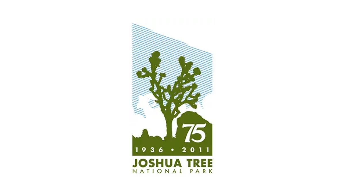
More Details →Joshua Tree National Park 75th Anniversary Logo
Joshue Tree is a unique national park and this logo carries that feeling with a unique shape and design. First, a vertical rectangle holds a line-hard depiction of blue sky, white clouds, and a green silhouette of the famous trees found in the park. Below that sits the name of the park and inside the green area is placed the milestone and years of celebration. However, by adding a downward angle across the top of the rectangle, the designers gave this logo a sharp, striking look that stands apart from other anniversary designs.
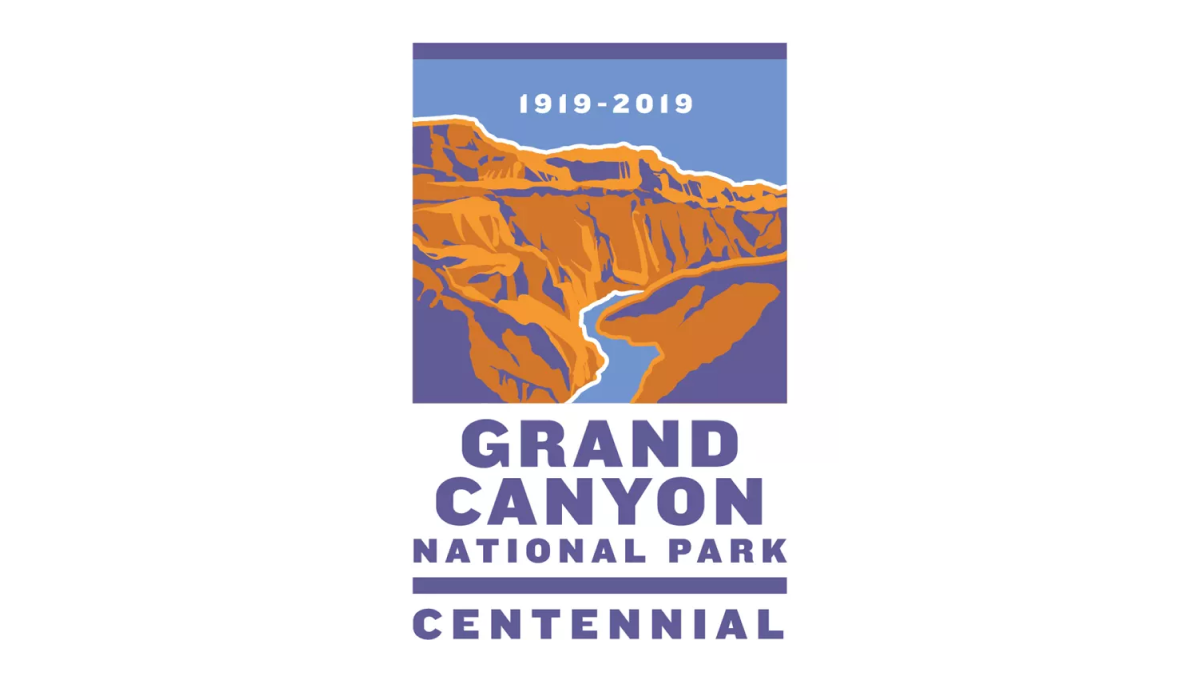
More Details →Grand Canyon National Park 100th Anniversary Logo
This logo sits within a vertical rectangle shape. The top two thirds holds an illustration of the famous canyon in a classic WPA poster style. In the blue sky area at the top sits the years of operation. Below sits the name of the park and the word "Centennial" to clarify the reason for this special design.
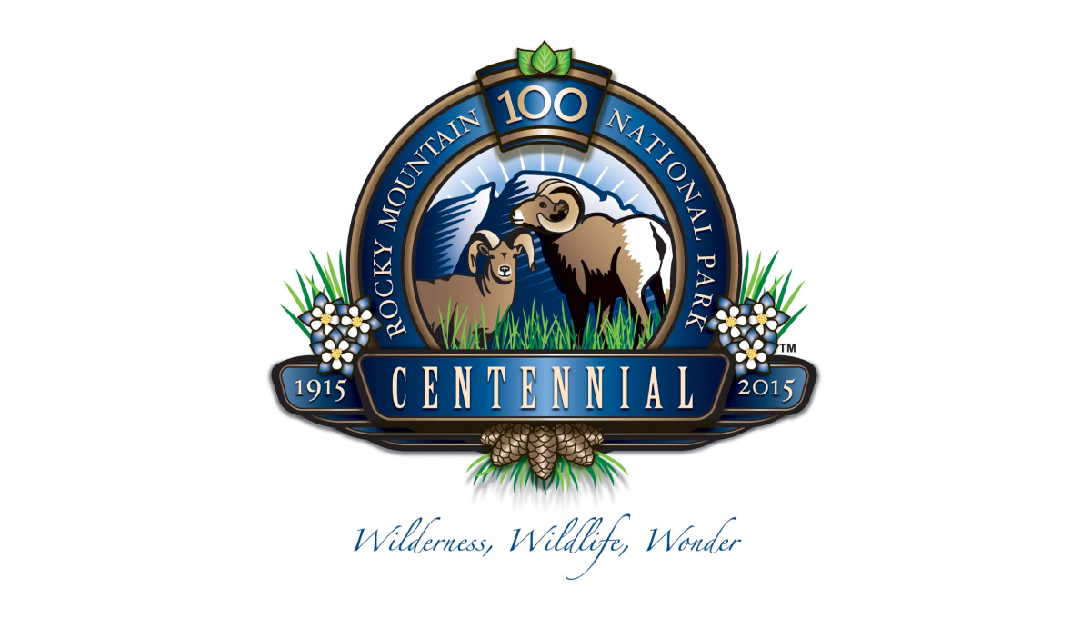
More Details →Rocky Mountain National Park 100th Anniversary Logo
This detailed anniversary logo uses a seal-style design to hold many unique elements related to the park. In the rim sits the name with a keystone shape holding the number 100 at the top. Across the front sits a ribbon holding the word "centennial" and the years of operation. Inside the seal are illustrations of wildlife with flowers and plants below and to the sides of the seal.
More Details →Hot Springs National Park 100th Anniversary Logo
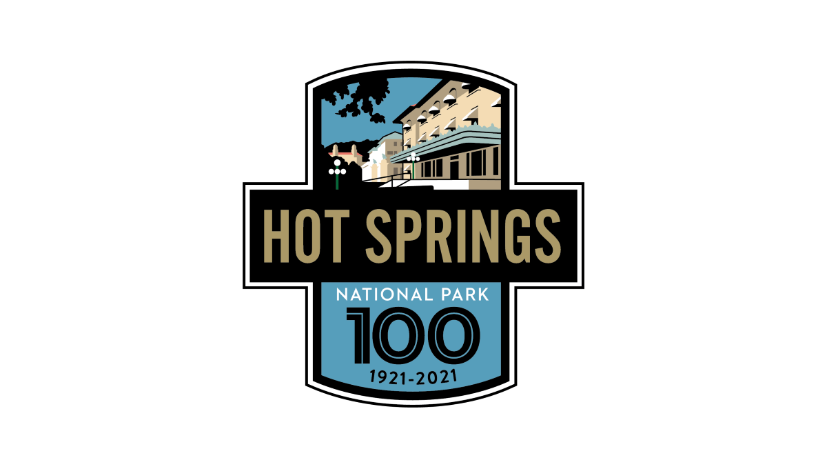
This logo starts with two overlapping rectangles, one placed vertically and the other horizontally. The horizontal rectangle is filled with black and gold letters of the park's name sit inside. In the vertiacl rectangle, the part sticking up from behind the name of the park holds a depiction of the park's famous architecture with the bottom holding a large number 100, the years of operation, and the words national park with blue behind.
More Details →Maryland Hospital Association 50th Anniversary Logo
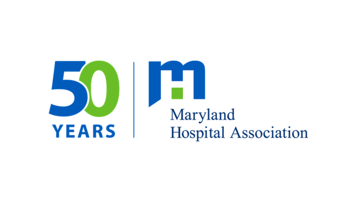
If you want a simple, effective anniversary logo then take note of what the MHA and many other brands are doing. This organization took their original logo, drew a vertical line to the left side, and on the other side of the line placed a simple number mark in their brand colors. The result is effective, balanced, and doesn't require the level of design and planning as a logo that starts from scratch.
More Details →MLB All Star Game 50th Anniversary Logo
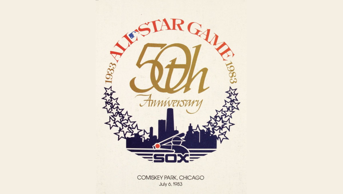
This mark was featured on a poster and sets a few elements into a clean, round shape with a "50th" in gold in the center. On the bottom sits a blue silhouette of the Chicago skyline with blue shares curving up and to the side of the skyline to begin forming the circling. On the top is red lettering signifying the occasion with the start and current years in gold connecting the two and completing the circle.
More Details →Bay Shore Inn 100th Anniversary Logo
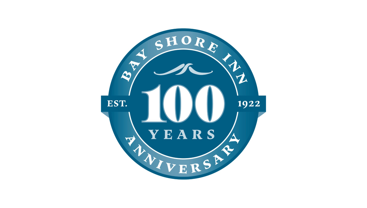
Building on the classic vibe of a lake or water themed brand, this logo uses a round seal-style shape as the foundation. Two tones of the brand's classic blue color make an inner circle and thick, outer rim. In the center is a large number 100 with the word "years" and a small wave icon set above and below to fill the circle. In the rim is the name of the inn and the word "anniversary" with a simple ribbon holding the year the inn opened.
More Details →United Way of the Midlands 100th Anniversary Logo
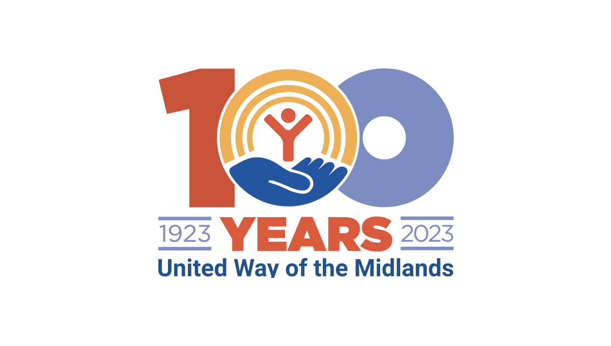
Like other United Way anniversary logos, this logo uses the classic red, gold, and blue colors of the original brand with a large, block number 100 in the center to anchor the logo. The United Way logo sits neatly in the center zero with the word "years" bloe and tha date range on either side to add balance. Finally, the name of the chapter is displayed at the bottom for a clean, on-brand logo.
More Details →Yankee Stadium 100th Anniversary Logo
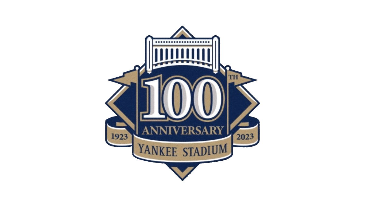
This logo starts with the classic baseball diamond shape as the base and adds a large number 100 in the center to begin. Above that sits an illustrtion representing the landmark's famous architechture. To either side of the 100 sit the famous flags - the right one containing the "th" for the year - which also frame the number nicely. Below, a ribbon holds the years of operation and the name of the stadium to comlete the design.
More Details →Columbia International University 100th Anniversary Logo
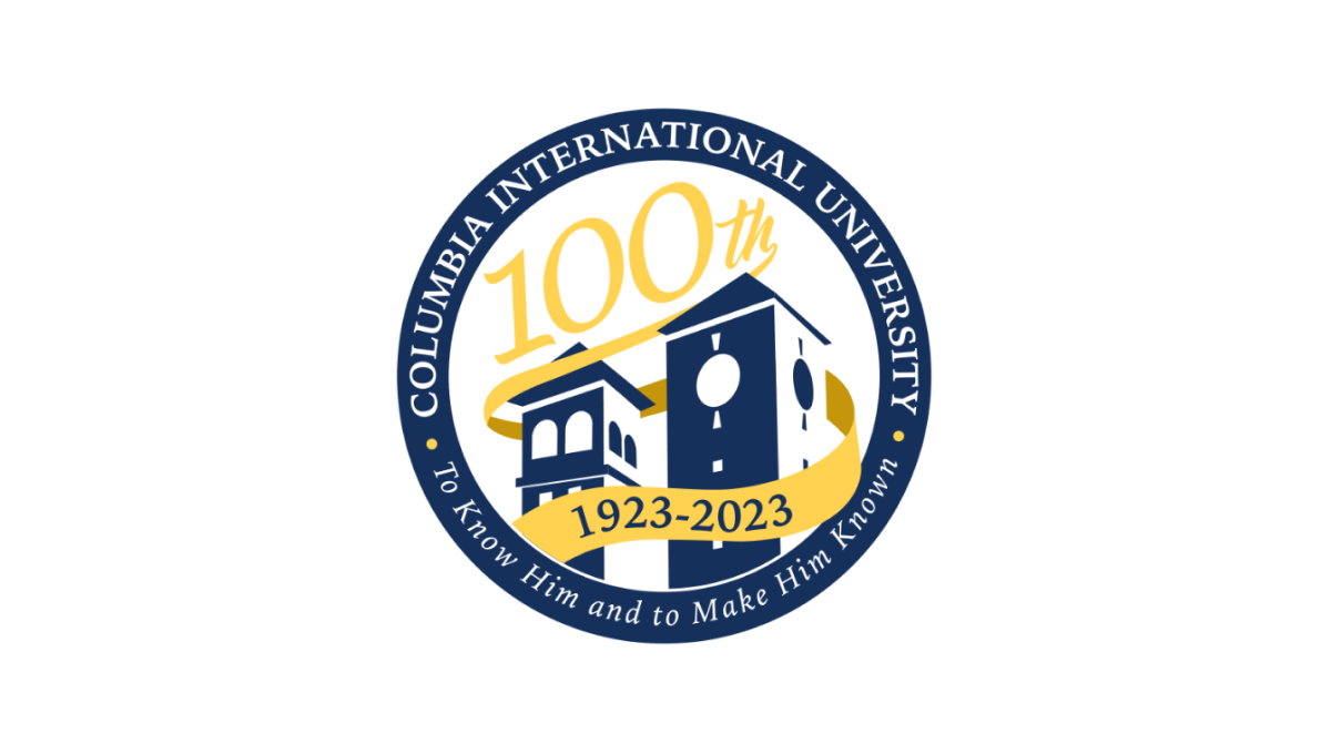
This logo uses a circle with a thick, navy blue border as the foundation. Inside that rim sit the name and mission statement of the school. Inside, a three dimensional silhouette of the school's famous buildings fills in the lower half of the space with a large number 100 in yellow following the angle of the buildings to neatly use the rest of the area inside the circle. A ribbon wrapping around the buildings then completes the design and contains the years of operation.
More Details →Sonic the Hedgehog 30th Anniversary Logo
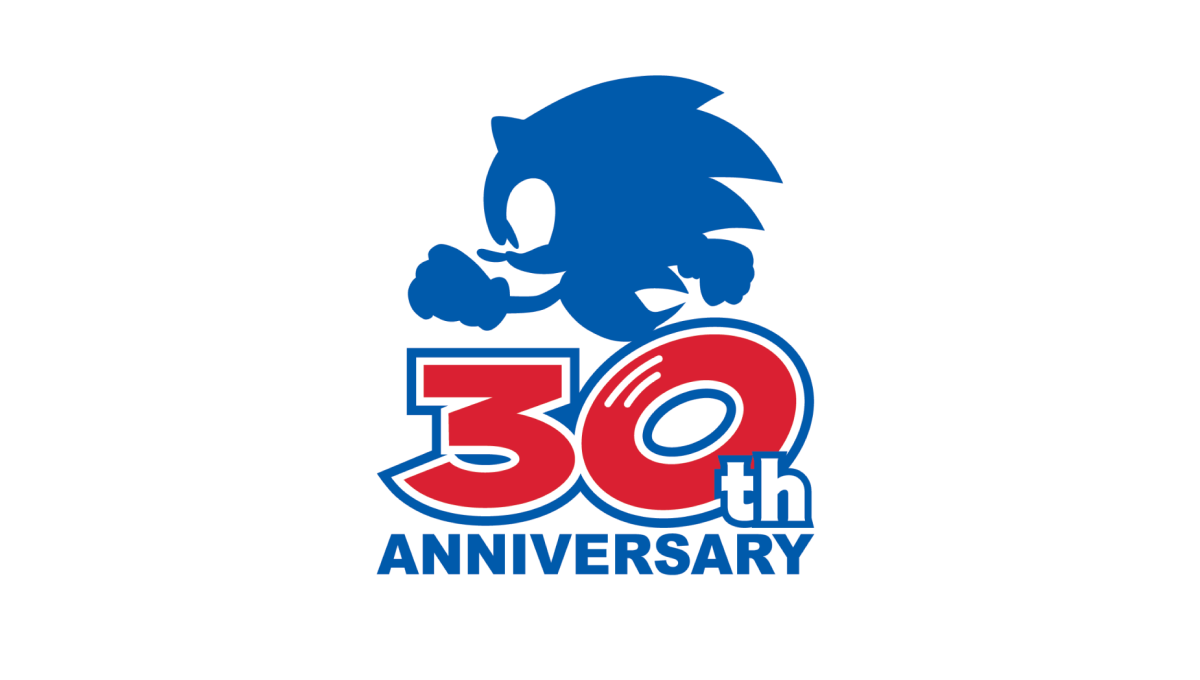
Sonic the Hedgehog's 30th anniversary logo starts with a large number 30 in red. With a white outline on that number followed by a blue outline, they gave the number added weight and a color that could blend neatly into a blue silhouette of their famous character above. At the bottom, the word "anniversary" in that same blue clarifies the meaning of the number and balances the red with blue above and below.
More Details →Warner Bros. 100th Anniversary Logo
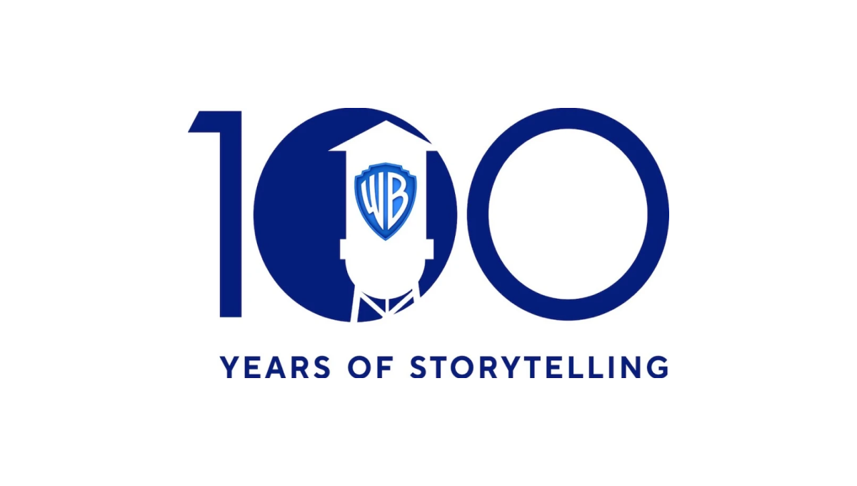
Starting with a large, block number 100, this logo fills in the first zero to create a canvas for their design. Next, the famous Warner Bros. watertower is placed inside that first zero with a slightly different blue color holding their traditional WB badge. Below the number 100 the words "years of storytelling" give the 100 context and reinforce what their brand is all about.
More Details →Aggie Ice Cream 100th Anniversary Logo
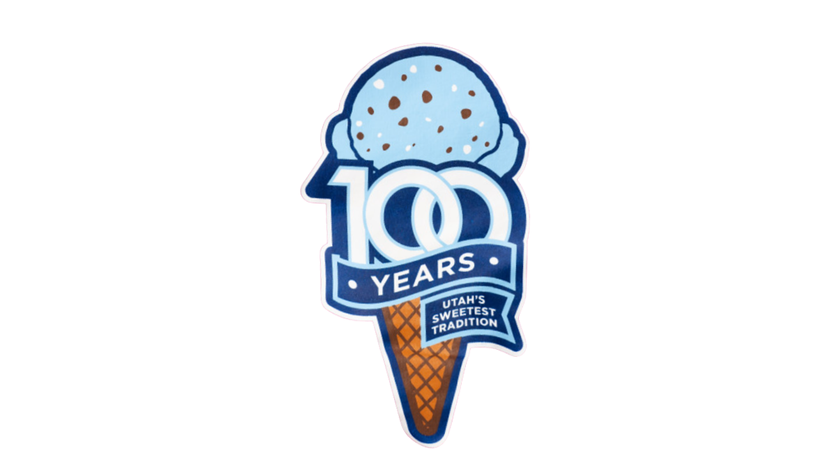
A stable of Utah State University's history, the ice cream shop within this school's campus wanted to celebrate their famous treats with a logo. So they started with an icre cream cone in the classic aggie blue, added a block number 100 in front of that with a ribbon below that wrapped below to contain the words "years" and "Utah's sweetest tradition." The logo was featured in the shop and on logo t-shirts and hats available in the store and online.
More Details →Sisters of Charity Hospital 10th Anniversary Logo
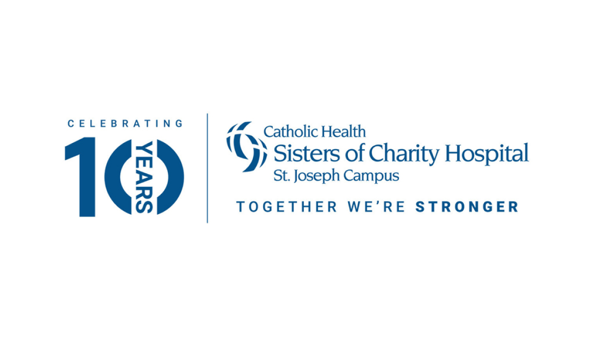
In a style that's become a bit more common, this anniversary logo takes the traditional logo and places a vertical line between it and an anniversary graphic to the left. This anniversary graphic uses a block number 10 in the brand's traditional blue color with a vertical word "year" through the zero and the word "celebrating" above. This gives them a clean lockup for their anniversary without having to redesign the original logo.
More Details →DC Hospital Association 40th Anniversary Logo
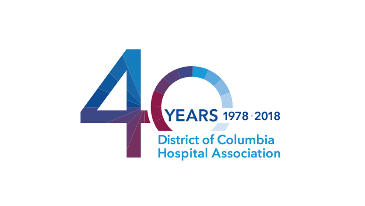
With the organization's name is light blue normal text and the word "years" with a date range above late, this logo takes a large number 40 and places it to the side and behind of that block of text. This makes the 40 easy to read by keeps the logo compact and balanced. Multiple colors used in this brand's identify break up the number 40 and add a slight gradient going left to right.
More Details →Anderson Hospital 45th Anniversary Logo
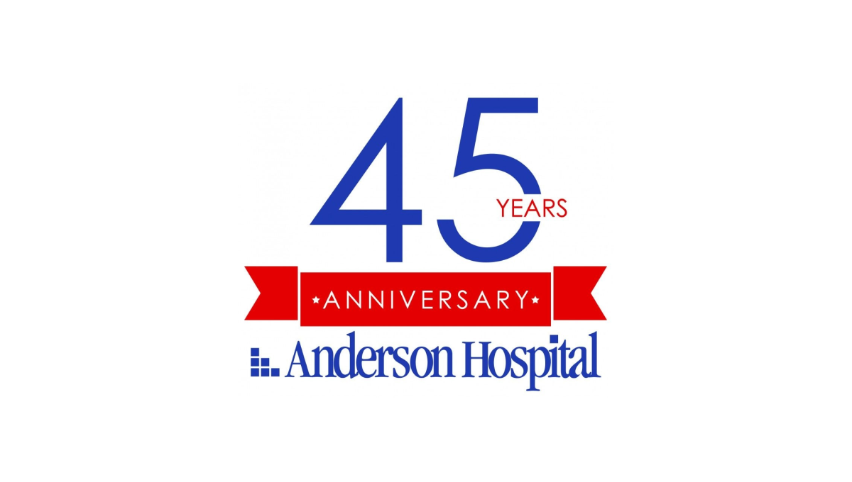
Keeping it simple, Anderson Hospital started with their traditional logo in the classic dark blue color as a base and built vertically from there. First came a red banner holding the word "anniversary" with the number 45 in brand blue above that. To keep balance, the word "years" is inset within the number 5 to avoid it sticking too far out to the side of the number which provides the focal point and primary visual weight for the logo.
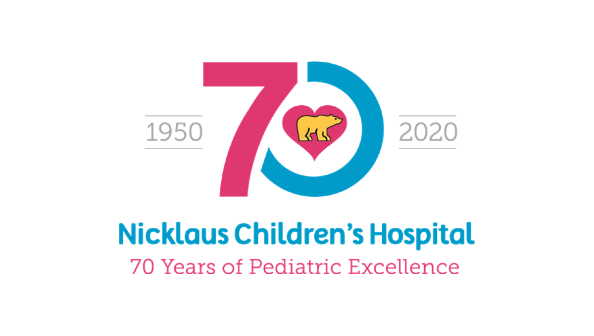
More Details →Nicklaus Children's Hospital 70th Anniversary Logo
This hospital has a very recognizable logo with a golden bear (Jack Nicklaus' famous nickname and mark) inside a pink heart. By using that mark as the focal point and building a blue and pink number 70 around it, this created a tie back to the traditional brand and gave them space to add wording below and to the sides of the logo, clarifying the name for those not as familiar with the original.
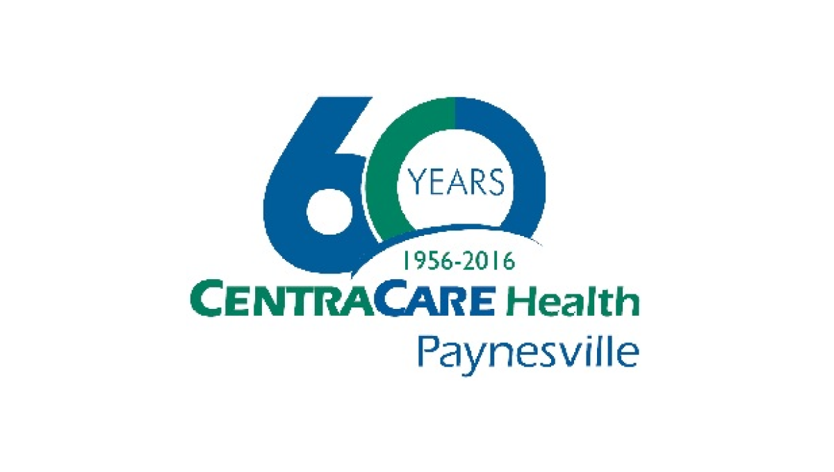
More Details →Paynesville Hospital 60th Anniversary Logo
One of the strongest ways to build an anniversary logo is to start with a large, block-lettered versio of the anniversary year. Instead of a "th" this logo opts for the word "years" inside the 0 while this mark rises up from behind the traditional logo and adds a little carved out space to include the years of operation. With everything matched to the original blue and green brand colors, it ties back nicely to the original.
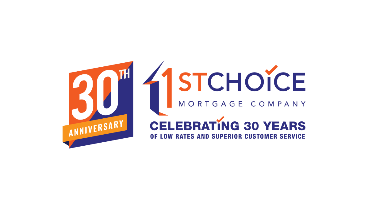
More Details →1st Choice Mortgage 30th Anniversary Logo
This adaptation of their original logo adds a two-color badge to the left side of their traditional logo that leans into the two primary colors of the brand as well as a third color to add contrast. With a word-heavy original logo, more text below that, and a new shape introduced with the badge, there's a lot going on with this logo but it all ties together nicely.
More Details →Memorial City Medical Center 50th Anniversary Logo
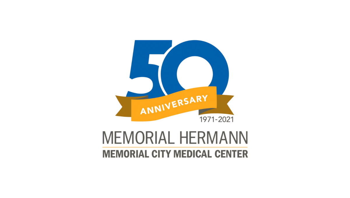
This hospital logo puts their name in dark, block letters at the bottom and simply adds a clean garphic above that to highlight the occasion for this adaptation of their brand. A large, block number 50 in blue is covered on the bottom third by an orange ribbon that contains the word "anniversary" and sits just narrower than the words below for a nice, vertically tapered shape that would work great on a website, swag, or social media avatar.
More Details →NHS Retirement Fellowship 45th Anniversary Logo
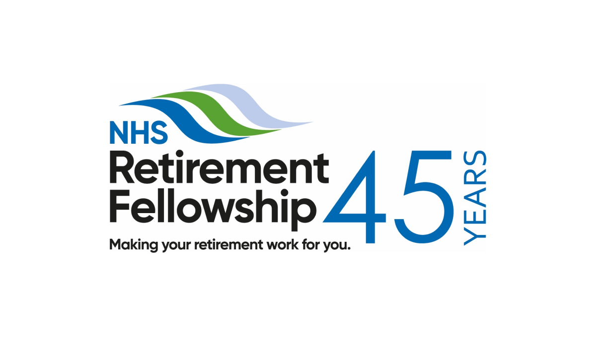
This logo keeps it simple by adding a number 45 to the right of their traditional logo. By putting that number in the brand's traditional blue and a vertical word "years" to the side, they created a simple, effective logo that doesn't stray from the original brand and doesn't add too much complexity around their hope to celebrate this milestone.
More Details →U of R Dept of Psychiatry 75th Anniversary Logo
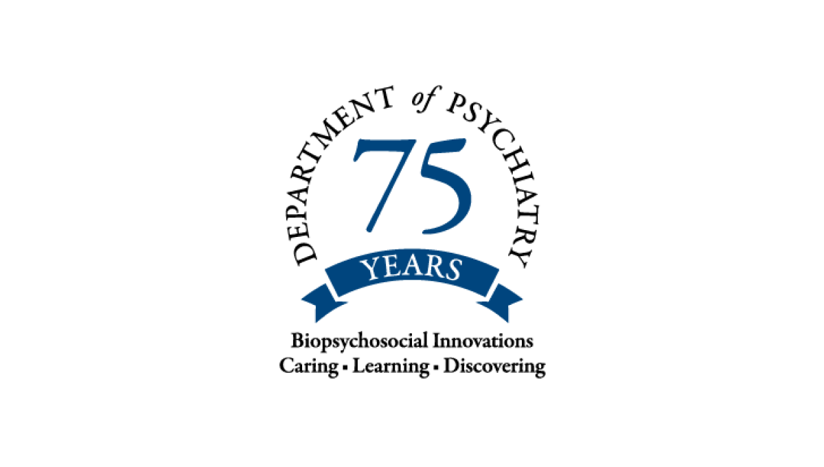
Never inteneded to stand on its own, this mark only appears on university-branded marketing like their anniversary web page, so it focused only on the department of the school. This name wraps in a circle around the number 75 with their brand values covering two lines below to reinforce their identify even as they expand it with this anniversary logo.
More Details →Wordpress 20th Anniversary Logo
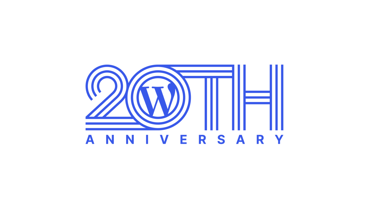
Wordpress learned into their classic brand color and well-known "W" mark for this anniversary logo. Line art style characters forming "20th" created a distinctive shape that could then hold their traditional mark inside the 0. Below that, the word anniversary in sans serif, capital letters go edge to edge for a simple, but effective, design.
More Details →SportsLogos.net 25th Anniversary Logo
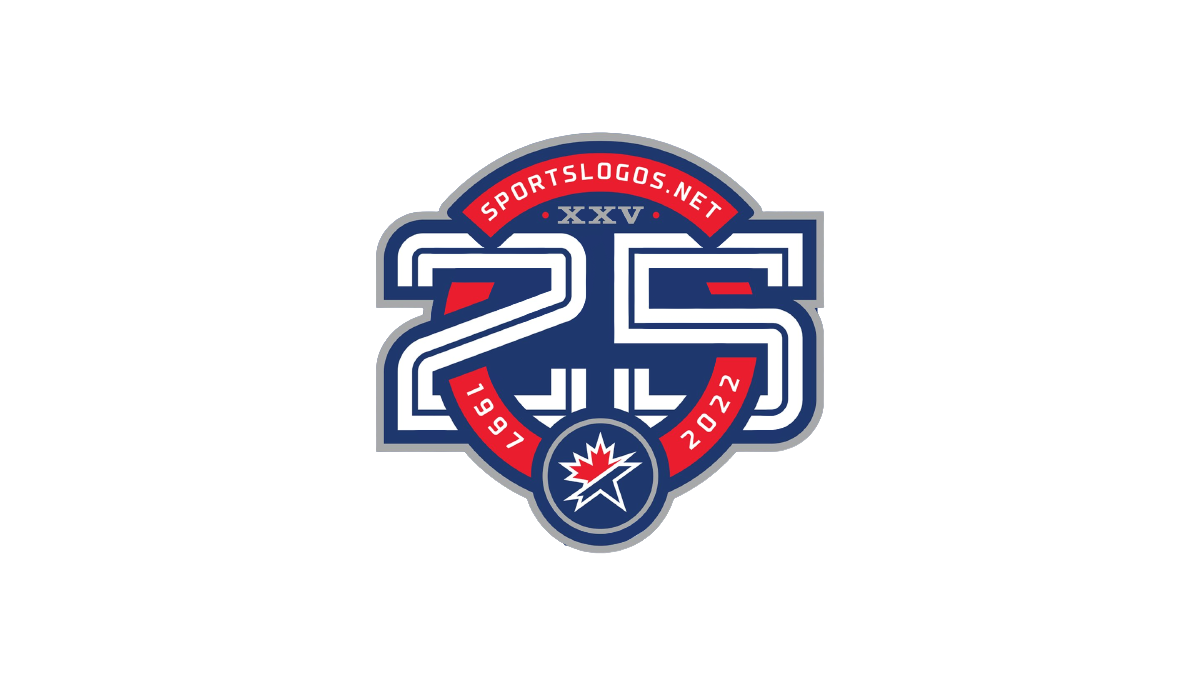
As a site that celebrates sports logos, this mark sets a high bar for anniversary logo designs. Starting with a circle in the brand's traditional red, it then cleverly weaves the number 25 in front of and behind the background to create a sharp three dimensional look. The site name and years are then set into the remaining red of the background with the original mark set in the bottom of the ring to make a clean connection to the original brand.
More Details →Snow Trails 60th Anniversary Logo
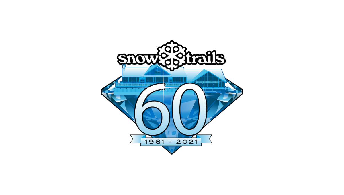
With a diamond anniversary on the calendar, Snow Trails began their design with that exact shape as a backdrop. Building on their brand blue color and adding in a stylized version of their base lodge inside the diamond, a large number 60 sits above the diamond with a small ribbon containing the years below that. Finally, the brand's original logo sits at the top to make the mark easy to recognize.
More Details →Mt Hood Meadows 50th Anniversary Logo
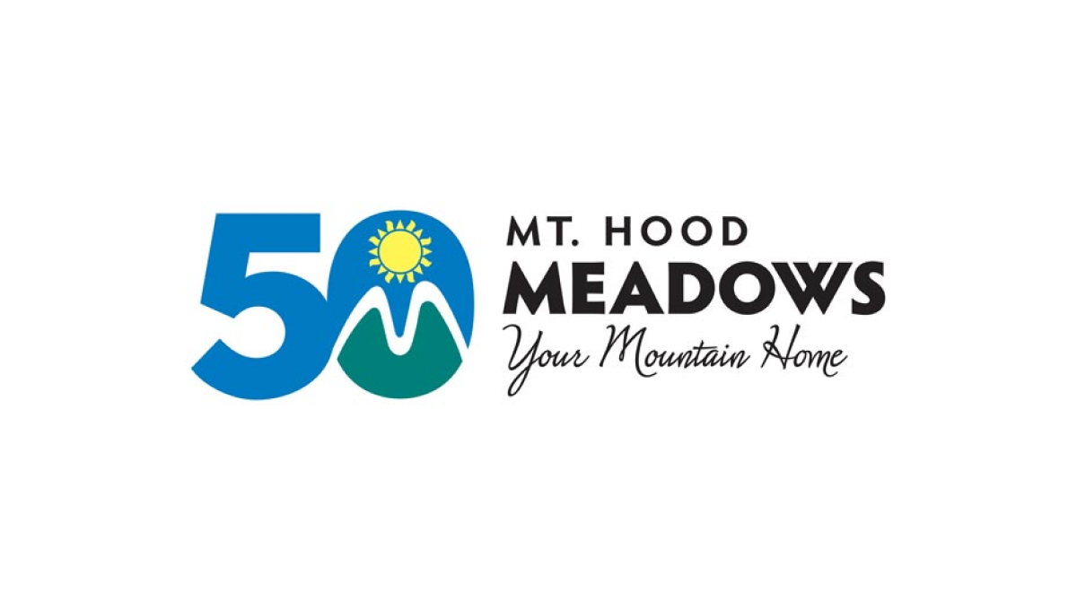
The resort's green, blue, and yellow mark normally sits in a crest-style shape to the left of the word mark. To transition to the anniversary design, the resort simply placed that mark inside the 0 of the number 50 similarly to the left of the word mark. This made their logo both unique to the celebration but also easy to recognize by their audience.
More Details →Lakeshore Chinooks 10th Anniversary Logo
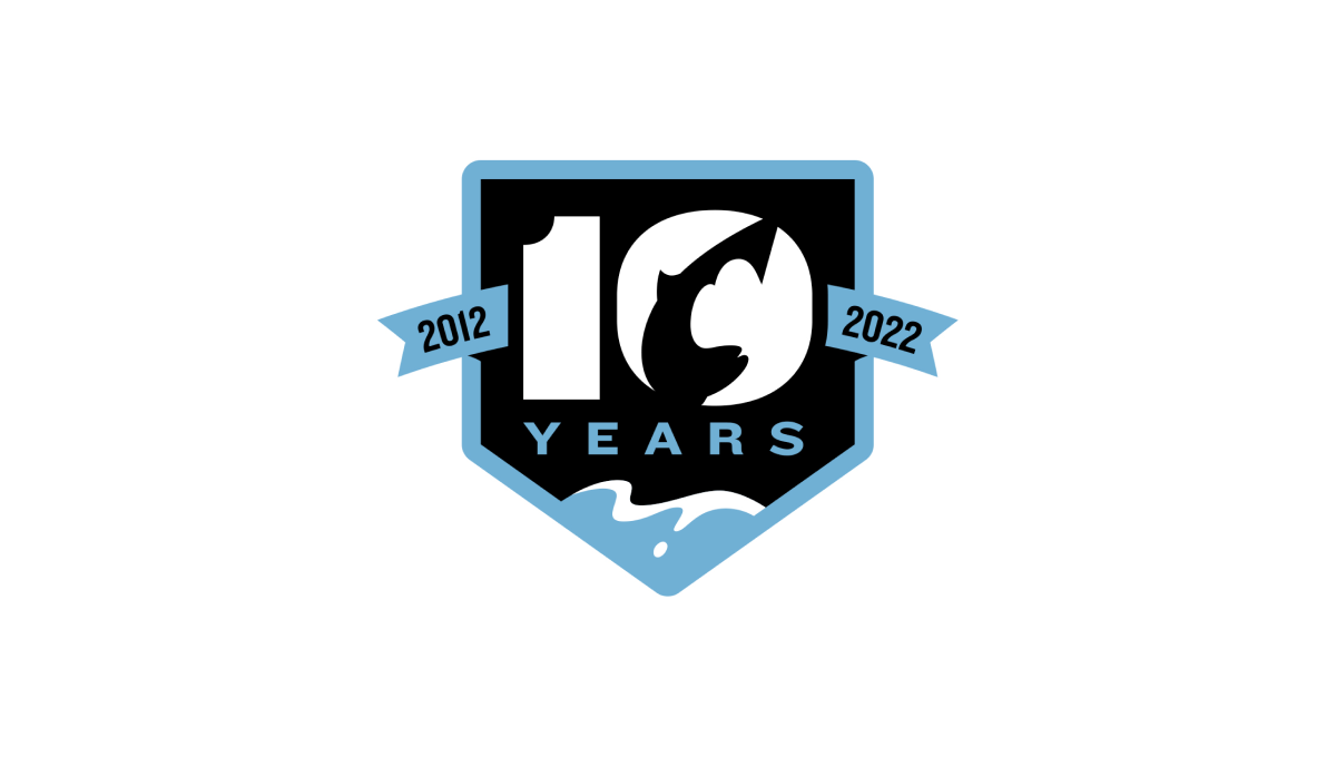
This logo combines a few clever elements within this baseball team's brand. First, it sets the base of the logo with a homeplate hape. Second, a fish jumping in reference to the Chinook Salmon featured in their original logo. Third, a blue lake at the bottom that wraps the homeplate shape as a border and extends to a ribbon holding the years this team has existed to create a clean, meaningful design.
More Details →King Pine 60th Anniversary Logo
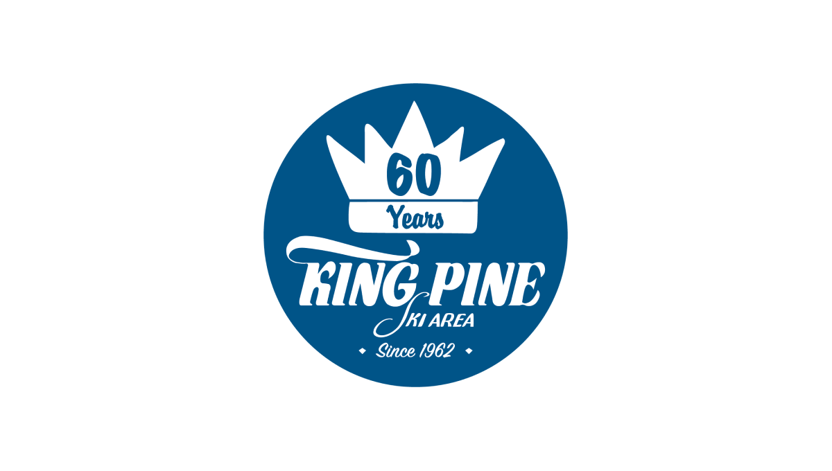
King Pine started with a filled circle in their brand blue color and placed a white version of their logo / word mark in the bottom center to tie back to their original brand and anchor the rest of the design. Above that a crown - referencing back to the "King" portion of the name - with the annversary number in the center balances to the top, with a "since" label at the bottom creates clean balance for the rest.
More Details →Greek Peak 65th Anniversary Logo
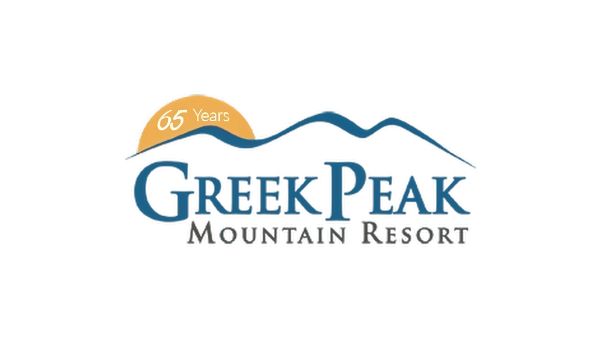
Greek Peak kept their annversary logo simple and clean when they recently reached their 65th anniversary. A simple orange circle peeking up from behind the ridgeline of mountains that make up the original mark hold the number 65 and marks the only chance to this brand. This simplicity made this logo extremely easy to swap with their existing logo during its year of use.
More Details →Blacktail Mountain 25th Anniversary Logo
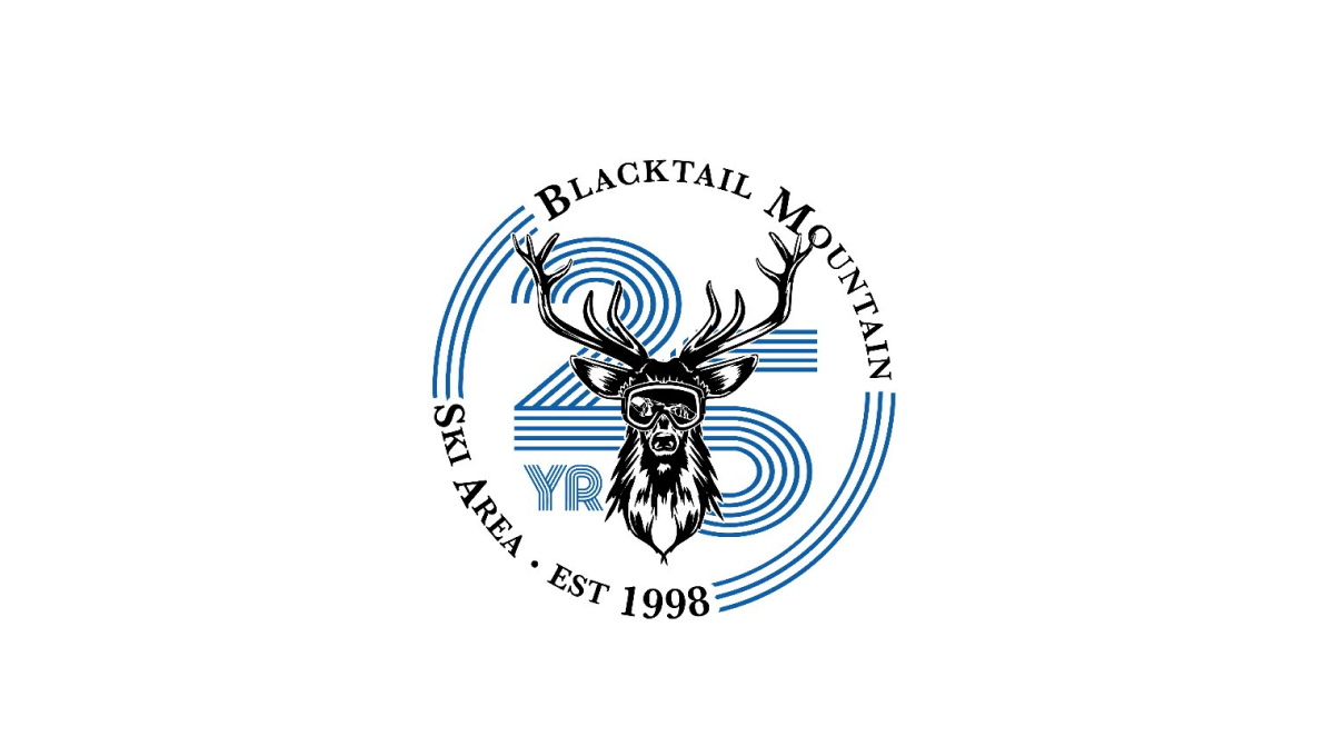
Blacktail Mountain went away from their primary logo with this mark and used a retro, line-art style number with a classic circular bar of text around and deer graphic to tie it all together and back to the core brand. It's a nice, clear, simple design and the retro feel of the number gives it a unique feel that's easy to recognize and remember.
More Details →Amstrong Air & Space Museum 50th Anniversary Logo

This badge-style logo features a prominent number wrapped in imagery and colors that align with the airforce, space, etc. theme that the museum - named after Neil Armstrong - is known for. A wrapped ribber contains the years of operation with an off-white background so set it apart from any white backgrounds it's used on.
More Details →