Company Anniversary Logos
Hampton Roads Moving and Storage 35th Anniversary Logo
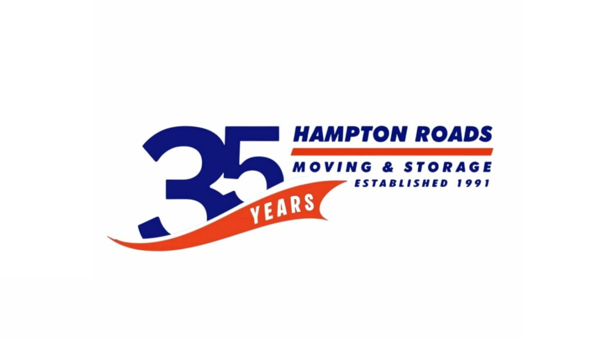
This anniversary logo uses a bold and simple layout with a large “35” as the main focus. The design combines dark blue and bright orange colors to create a strong but friendly look. Curved shapes and flowing lines give it a sense of movement and energy, while the text is clean and easy to read. Smaller details, like the establishment year and anniversary wording, help suggest experience and long-term service without making the design feel too busy or overly formal.
More Details →Kahuna 25th Anniversary Logo
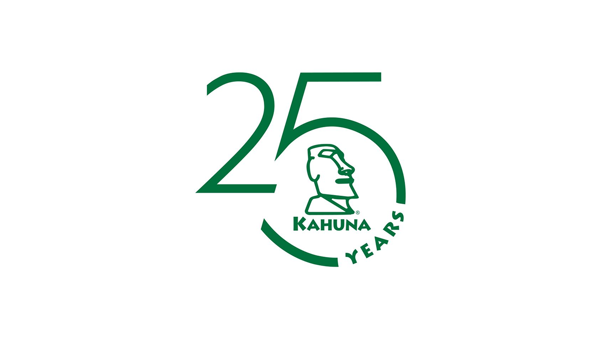
This anniversary logo has a clean and modern look with a simple green color theme. The large “25” design creates the main shape, while a curved circle element gives it a balanced and connected feel. In the center, there is a stylized island-inspired figure that adds character and brand identity without too much detail. The “Years” text follows the curve in a subtle way, helping the overall design feel smooth, professional, and celebratory while still staying minimal and easy to recognize.
More Details →HellermanTyton 50th Anniversary Logo
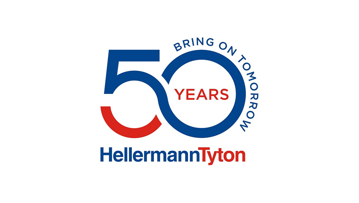
This anniversary logo uses a clean, modern style with bold shapes and clear text. The number “50” is large and flowing, forming a smooth, connected shape that feels forward-looking. Blue and red colors give it a strong, confident tone. The words “Bring on Tomorrow” suggest progress and optimism, while “Years” marks the milestone. Overall, the design feels professional, stable, and focused on long-term growth and experience.
More Details →Napa Auto Parts 100th Anniversary Logo
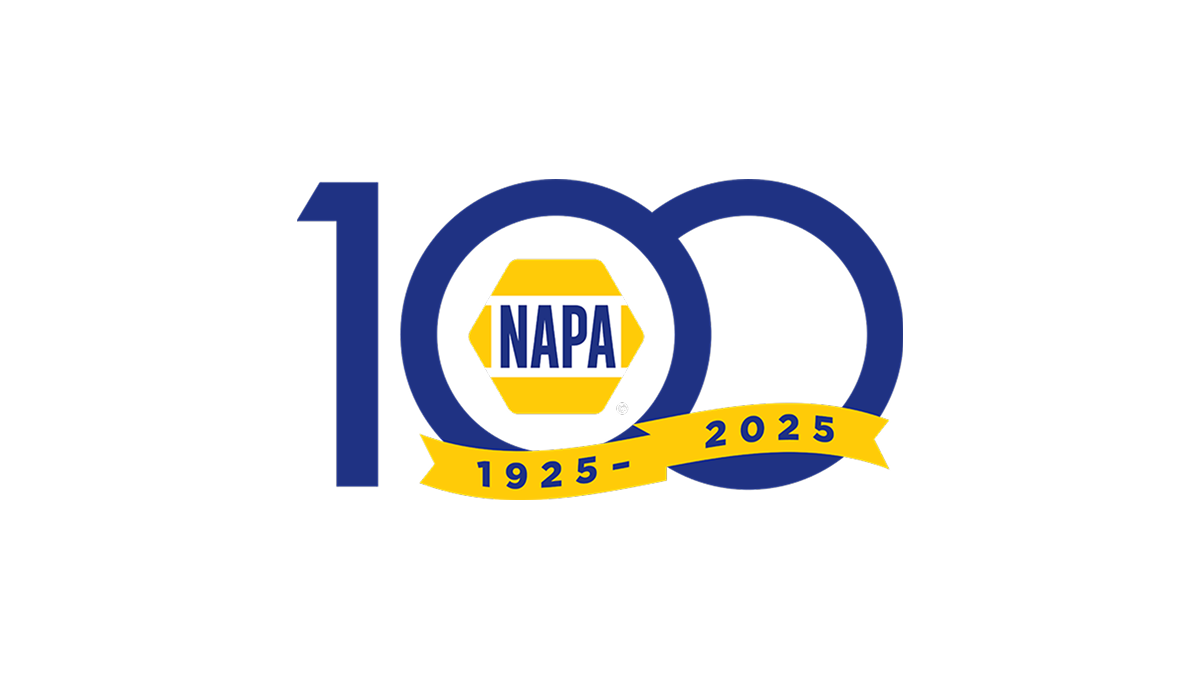
The anniversary logo shows a large, simple 100 with the classic NAPA badge sitting at the center in bright yellow and blue. Below that, a curved band has the years of the celebration in plain numbers. The basic colors and clear shapes give it a clean, straightforward look that marks an important milestone for the brand.
More Details →Peninsula Hot Springs 20th Anniversary Logo

The anniversary logo has a clean, simple look with a modern feel. It uses soft colors and smooth shapes that give it a calm and celebratory vibe. A large number stands off to the side, marking an important milestone, while the surrounding elements show the company's name. There’s a gentle blend of old and new in the design, with just enough detail to feel meaningful without being too busy. It feels thoughtful, yet light.
More Details →Trimac 80th Anniversary Logo

Trimac’s 80th anniversary logo combines retro and modern styling to reflect the company’s 80-year legacy and how far it has come. The overall design was inspired by a road (it’s a trucking company after all) to symbolize continuous movement and the “road” ahead, with the three lines representing the company’s founders: J.R. “Bud” McCaig, Roger McCaig and Maurice McCaig. Central to the design is a bold “80,” shaped like an infinity to reflect limitless potential, unity and the collective strength of its people, customers and communities. The logo uses Trimac’s primary brand colours, maroon and red, and is anchored by the company’s original logo for use across various applications, like truck fleet branding, merchandise, print media and digital platforms.
More Details →Golf Digest 75th Anniversary Logo

This 75th anniversary logo has a classic and neat look, with dark and light colors creating a strong contrast. The number “75” is big and placed front and center, with the words “Golf Digest” above it in a clean font. The overall style is simple but firm, with a traditional tone that feels respectful and suited for a lasting milestone.
More Details →SMI Snowmakers 50th Anniversary Logo

This anniversary logo has a clean and simple look, with soft colors and a modern feel. The number “50” is the main focus, standing out in bold, simple lettering. A short message underneath states the anniversary. Overall, it gives off a calm, respectful tone—something that feels official but still warm and thoughtful, made to honor a meaningful milestone.
More Details →Vanguard 50th Anniversary Logo

This anniversary logo is made up of a large number "50" with the signature V in the center of the 0, for Vanguard. The logo is made in a clean, bold red color, making it stand out from the white background. The font is simple and bold, giving it a strong look. In conclusion, the logo is a simple, creative way to celebrate this company's anniversary.
More Details →Brock Built 40th Anniversary Logo

This anniversary logo features a clean, modern design with a bold number "40" that stands out clearly. The company name is displayed in a strong, straightforward font underneath, giving it a solid and professional feel. The colors are simple and balanced, creating a calm and confident look. Overall, the design feels respectful and steady, marking the anniversary in a clear and tasteful way.
More Details →Uni Watch 25th Anniversary Logo

With a sports/university theme, I love that this logo kept that vibe int he design as well. In this case, a large number 25 sits in the center in the classic sports lettering. Below sits imagery associated with their original brand. Around the edge is a thick green circle to hold the description of the brand the reason for the celebration.
More Details →Geissler's Supermarket 100th Anniversary Logo

This logo design brings a clean, traditional approach to this supermarket chain's usual logo. Placing their red word mark in the center and wrapping it with a simple shape that adds some unique corners instead of a standard rectange, their then add a shiny, gold circle behind with the words commemorating the occasion and filling out this seal-style concept.
More Details →Poynter 50th Anniversary Logo

Simple doesn't have to mean boring as this anniversary logo from Poynter proves. Yes, it's a simple number fifty with the usual word mark sitting above. But by adding just a little bit of depth to create the appearance of a three-dimensional, fading and twisting surface to that number? They created a really simple, but clean, design that matches the tone of the company overall without overcomplicating the design.
More Details →Boudin Bakery 175th Anniversary Logo

I love this logo because it's a reminder that a logo should work for your needs, not just fit the criteria of what everyone else has done. In this case, their logo combines local landmarks and colors into a banner-style graphic that ties the year, the history, and the original mark into a design that would be easy to place on banners outside the bakery and labels, print materials, and labels inside.
More Details →Patrick & Co 150th Anniversary Logo

This design combines all of the classic annivesrary logo elements into a neat, tidy package. Starting with a circular shape that holds the words marking the anniversary celebration, the original name set in the middle with horizontal lines to break the circle into two semi-circles, and a nod to the Golden Gate Bridge to tie it back to where this company calls home.
More Details →Bousfields 50th Anniversary Logo

The original logo for this brand features a matching circle in the upper left area as you see in the bottom right. By keeping the bottom right circle as a zero and adapting the top left into a number 5, the difference was both easy to spot but neatly subtle. They get to keep building brand recognition by using something close to their usual logo but also highlight their milestone.
More Details →Alliance Technologies 15th Anniversary Logo

I love the minimalism of this anniversary logo design. Their original logo already had a circular shape so, instead of trying to reinvent the whole package, they simply curved an anniversary-themed message around an empty part of this circle. This subtle change is noticable, but not overpowering. The result is a logo that's easy to swap with their existing but doesn't compete with the power of folks repeatedly seeing their original logo.
More Details →Tolsa 65th Anniversary Logo
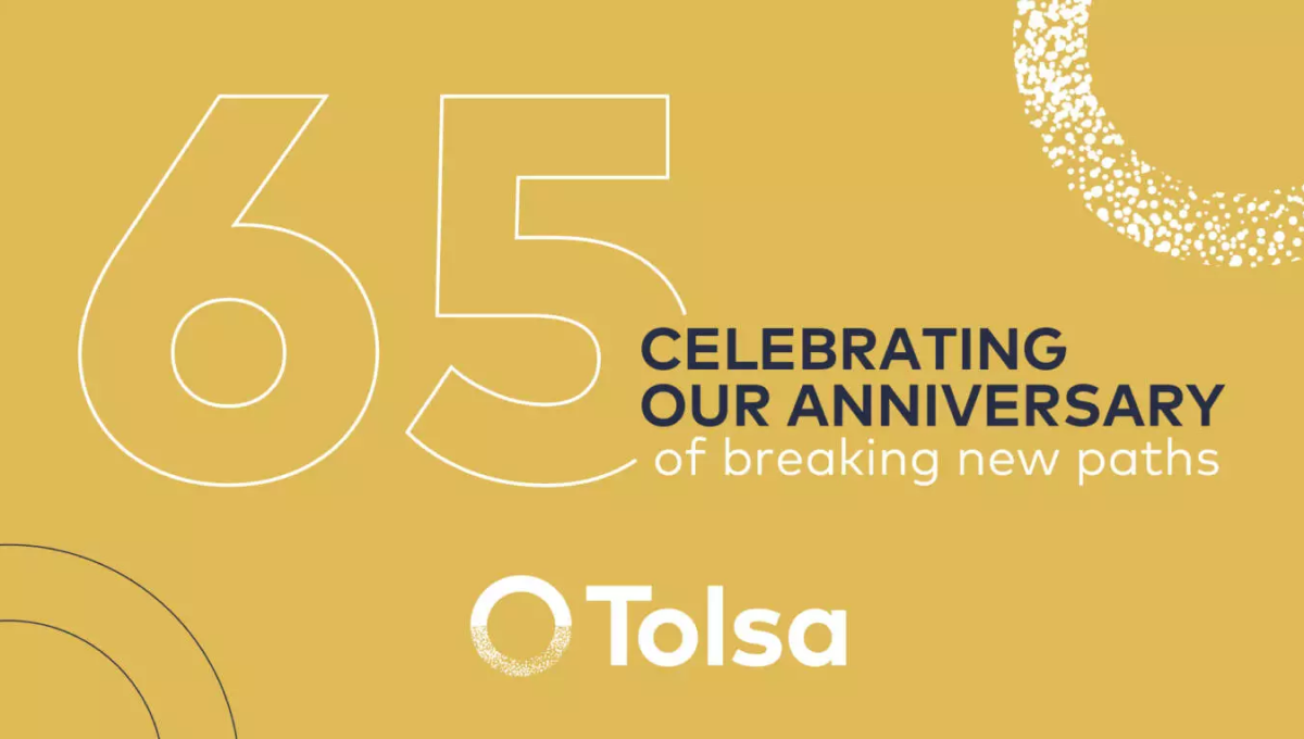
Sometimes what you need isn't a logo as much as a graphic. So while this graphic may no fit the traditional rules of a logo, it does serve its purpose really well. With a background in the brand's gold color, the logo at the bottom, an enlarged mark in the top right, and the number and reason for celebration in the middle, this graphic worked well on thier website as a content block and on social media.
More Details →Truly Nolen 85th Anniversary Logo
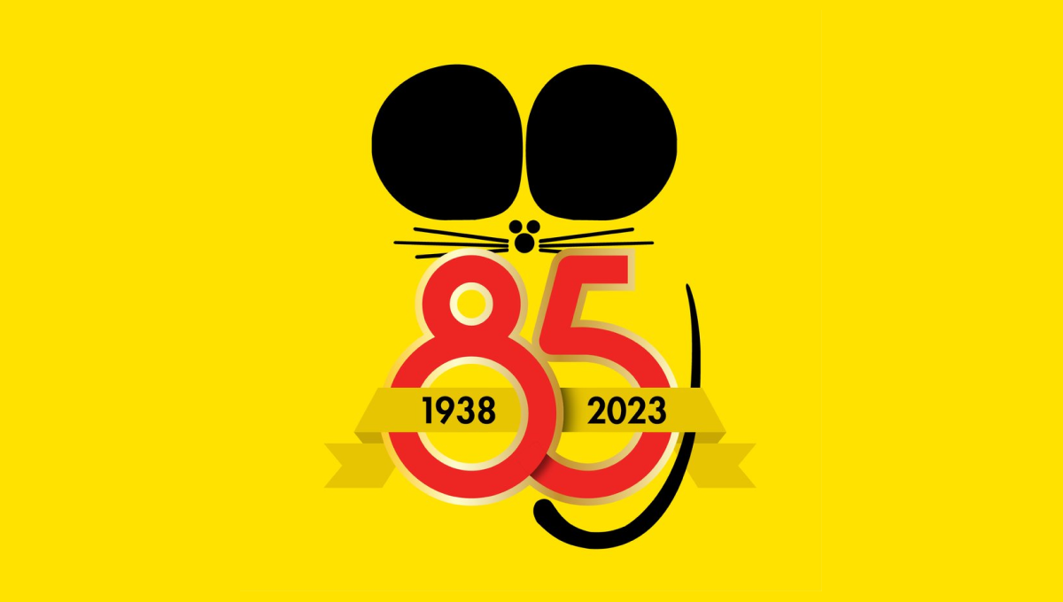
Famous for the black ears that are seen throughout their branding and products, Truly Nolen used the same concept as the starting point for their anniversary logo. A large block number 85 below the ears specified the year, a ribbon held the years of operation, and a thin, black tail made this mark easily recognizable.
More Details →Harley-Davidson 120th Anniversary Logo
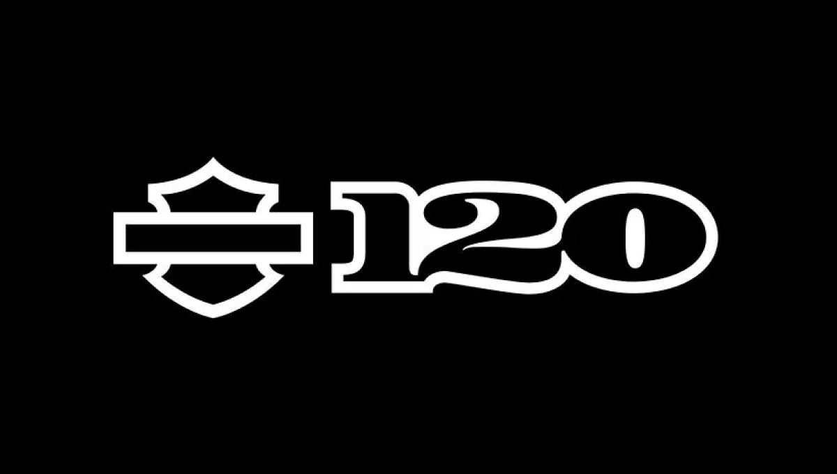
When you have a brand as famous as Harley-Davidson, using just the shape or your mark is more than enough for the general public to recognize it. Adding a clean number 120 to the right of this mark in their classic font all on a black background created a clean, simple design that was easy to recognize and neatly on-brand.
More Details →Lux International 120th Anniversary Logo
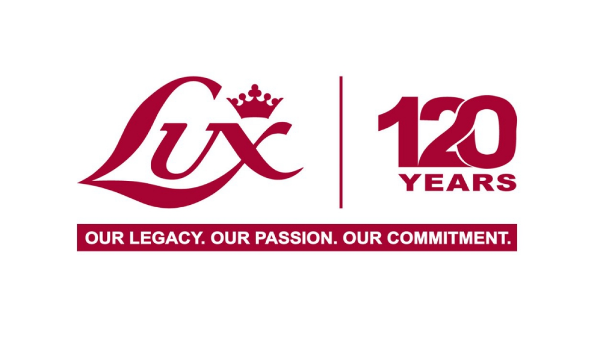
In a style that is becoming more and more common, this logo simply takes the traditional Lux logo in red, draws a vertical line to the right, and on the other side of that line places a stylized number 120 with an overlapping and intertwined 2 and 0. These logos are simple, convey the meaning clearly and simply, but also look sharp and balanced.
More Details →Goya 85th Anniversary Logo
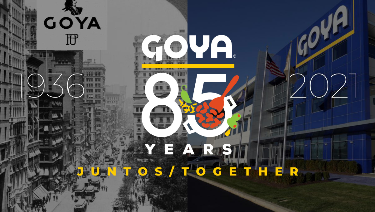
Starting with the company's original logo at the top, this design uses that logo's already existing yellow underline to create separate and shape for the rest of the logo. Below that sits a large number 85 with small illustrations of the fruits famously used in their foods with the word "years" at the bottom to complete the shape. In various lockups like the one pictured, they've also included the years of operation on the sides and a tagline at the bottom.
More Details →Epec 65th Anniversary Logo
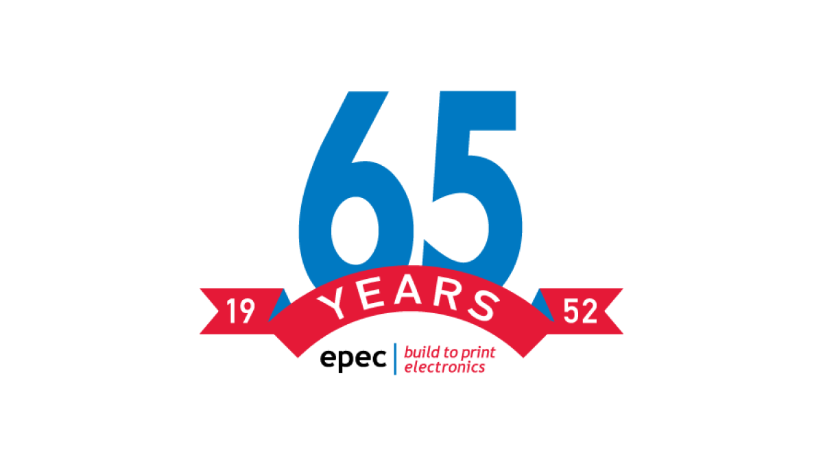
This simple logo uses the brand's primary blue and red colors - a large number 65 in blue rising up from behind a curved ribbon in red - to both spend the message and create a little bit of negative space at the bottom of this mark. In that mark they placed their usual logo for a simple mark that's both big and easy to use but also ties back to the original brand.
More Details →Bay Shore Inn 100th Anniversary Logo
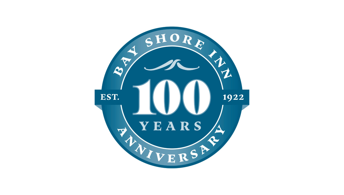
Building on the classic vibe of a lake or water themed brand, this logo uses a round seal-style shape as the foundation. Two tones of the brand's classic blue color make an inner circle and thick, outer rim. In the center is a large number 100 with the word "years" and a small wave icon set above and below to fill the circle. In the rim is the name of the inn and the word "anniversary" with a simple ribbon holding the year the inn opened.
More Details →Komori America Corp 100th Anniversary Logo
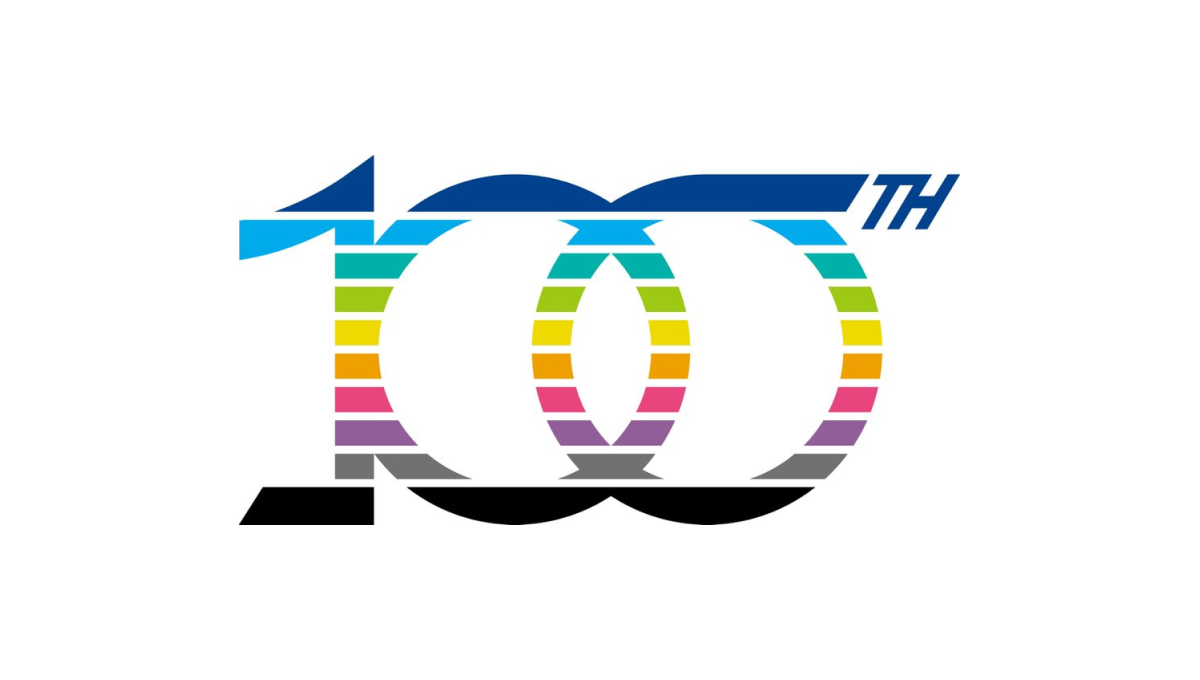
This mark is full of meaning. First, the ten horizontal bars that make up the design represent the 10 decades they've been in business. Next, the color palette points to the industry they work in - printing - and all the possibilities those various colors can represent. Finally, a few upward-turning points symbolize progress and advancement going forward.
More Details →Market Mentors 20th Anniversary Logo
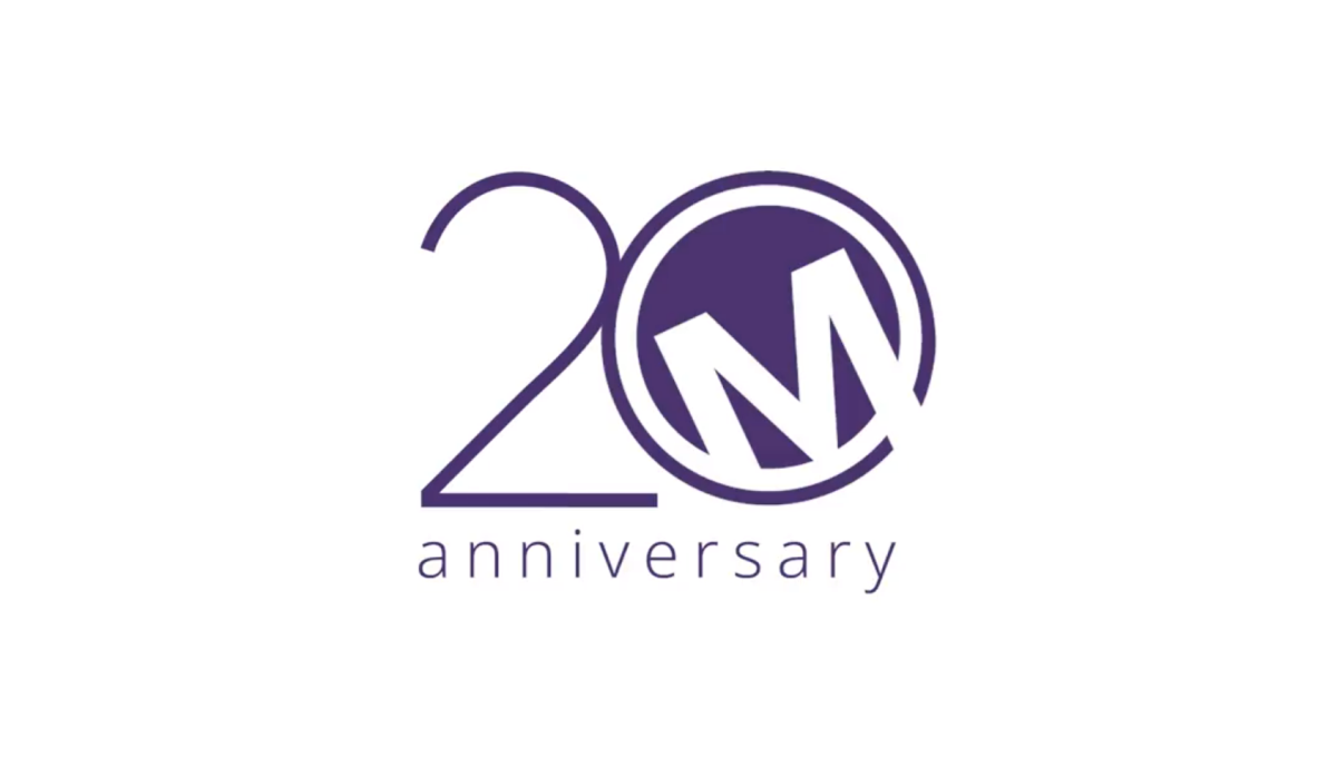
Sometimes a brand has to force their mark into the 0 of their anniversary number, but not Market Mentors. Their traditional mark - a tilted M contained in a purple circle - was a perfect match for this design style and that's exactly what they did. With a thin number 2 to the side and the word anniversary below, this logo is clean, simple, effective, and ties nearly back to their original brand.
More Details →Wordpress 20th Anniversary Logo
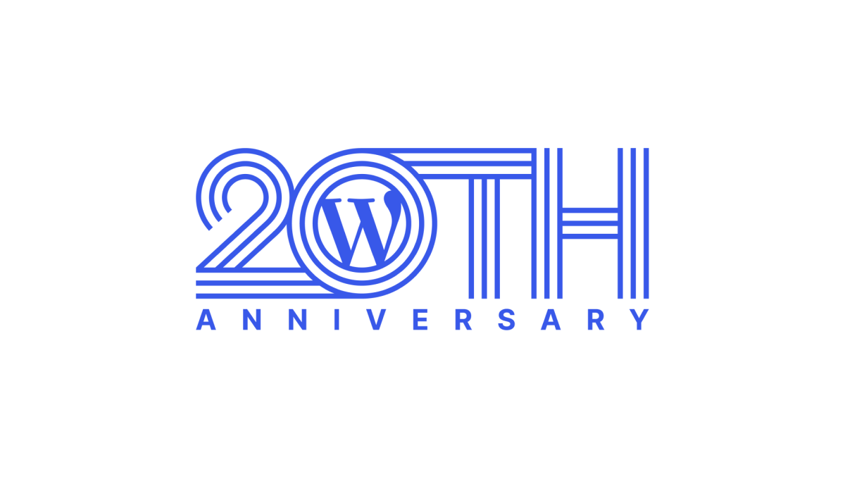
Wordpress learned into their classic brand color and well-known "W" mark for this anniversary logo. Line art style characters forming "20th" created a distinctive shape that could then hold their traditional mark inside the 0. Below that, the word anniversary in sans serif, capital letters go edge to edge for a simple, but effective, design.
More Details →SportsLogos.net 25th Anniversary Logo
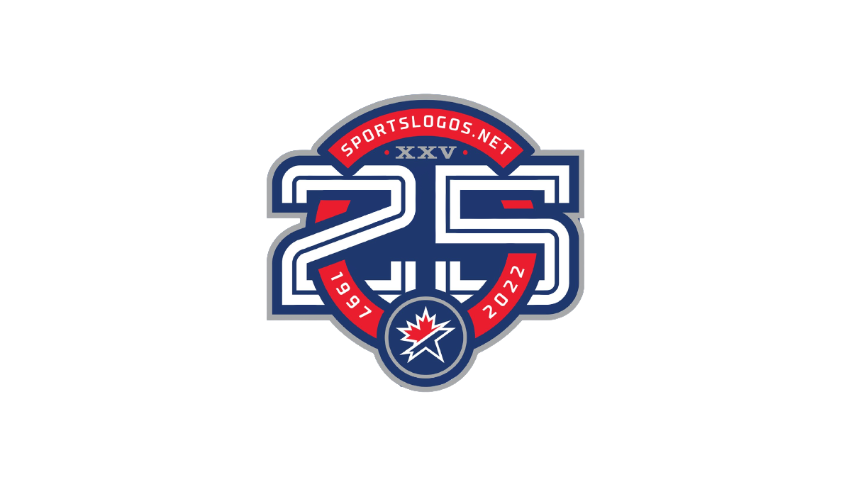
As a site that celebrates sports logos, this mark sets a high bar for anniversary logo designs. Starting with a circle in the brand's traditional red, it then cleverly weaves the number 25 in front of and behind the background to create a sharp three dimensional look. The site name and years are then set into the remaining red of the background with the original mark set in the bottom of the ring to make a clean connection to the original brand.
More Details →Red Fern Farm Services 50th Anniversary Logo
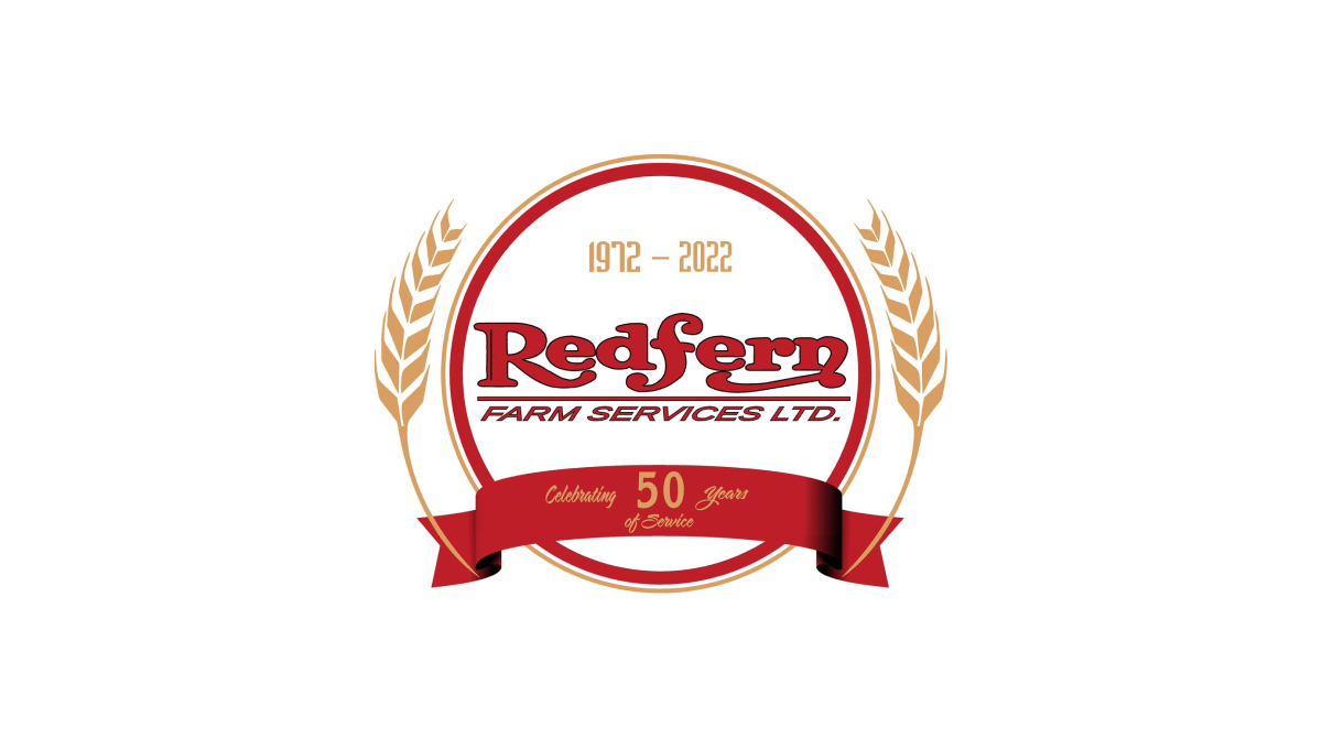
WIth a classic round shape to start, Red Fern added a ribbon with language pointing to the reason for the celebration. Inside the circle, the company's original logo was placed with their years of operation set in a lighter color just above. Similar to laurel leaves that flank the marks of film festival icons, the logo then adds curving stalks of wheat to add a final touch.
More Details →