City Anniversary Logos
Winnepeg 150th Anniversary Logo

The Winnipeg 150th Anniversary logo is a rich tapestry of symbolism reflecting the city's heritage and Indigenous roots. At its core, the design features the outline of a turtle shell, representing Turtle Island, overlaid with the current footprint of Winnipeg. Elements such as the North Star, the Red and Assiniboine rivers forming the profile of Mother Earth, a crocus (part of the city crest), and sage and tobacco crops are intricately woven into the logo. This emblem encapsulates Winnipeg's journey, celebrating its shared stories and future aspirations.
More Details →New Port Richey 100th Anniversary Logo

As much as we love simple logos, I love complex logos that aren't simply adding elements for fun but using intricate imagery that beautifully represents the things being celebrated. In this case, the anniversary logo is a beautifully drawn scene of the town's most famous architecture and locations. The colors are perhaps my favorite part, with the creamy, sand color used both in the imagery and the default background.
More Details →Clarendon Hills 100th Anniversary Logo

This design adds a little more detail that wer're used to seeing in anniversary logos. A gold circle holds artwork that is close to the actual appearance of a famous landmark instead of using the more common silhouette or line-art depiction seen in other logos. Below sits the name of the village stacked to align to the width of the design. The result looks really sharp and likely works just fine on most situations aside from places where limits on colors may come into play like screen printing or embroidery.
More Details →Fair Lawn 100th Anniversary Logo

When you're hitting a big number, I love designs that really put that front and center. In this case, a large number 100 in yellow sits behind a simple graphic of a prominent landmark. To the left flies a banner with the word "anniversary" and below sits the name of the town that's celebrating the occasion. It's a simple, clean, and on-brand design that would work in a lot of situations.
More Details →City of Burien 30th Anniversary Logo
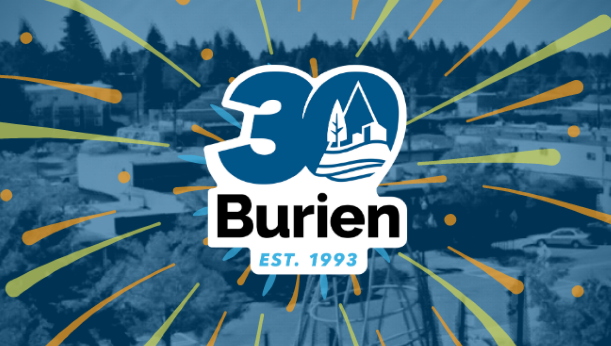
This clean, sticker-style logo starts with a large number 30 with a slight ilatic style in the city's traditional blue color. Inside the zero is place a white, line-art version of the city's main logo. Below that is the name of the city with the year it was established at the bottom. And by locking up this design with white padding, they were able to place it on any color including a fireworks-like design used on their website.
More Details →City of Huntington Indiana 175th Anniversary Logo
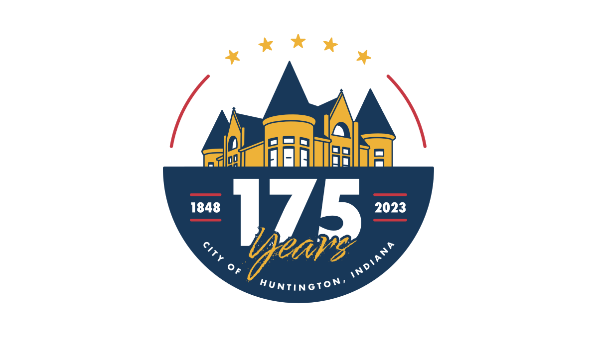
This logo starts with a circle that is divided exactly in half horizontally. On the top is placed a simple line-art drawing of a famous building in the city's downtown, while the bottom features a large number 175, the years of operation, and the name of the city. Curving along the top of the circle are placed 5 stars to round out the design.
More Details →Battle of Normandy 80th Anniversary Logo
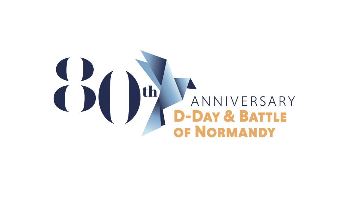
Marketing the anniversary of such an imporant but somber occassionan, this logo uses a clean serif font for a large number 80 that sits on the far left of the logo. Just to the right of that is a dove made of sharp angles and shapes using a few varieties of the same blue. Finally, words sit to the right of that clarifying the why and what of this anniversary.
More Details →Fort Dodge 150th Anniversary Logo
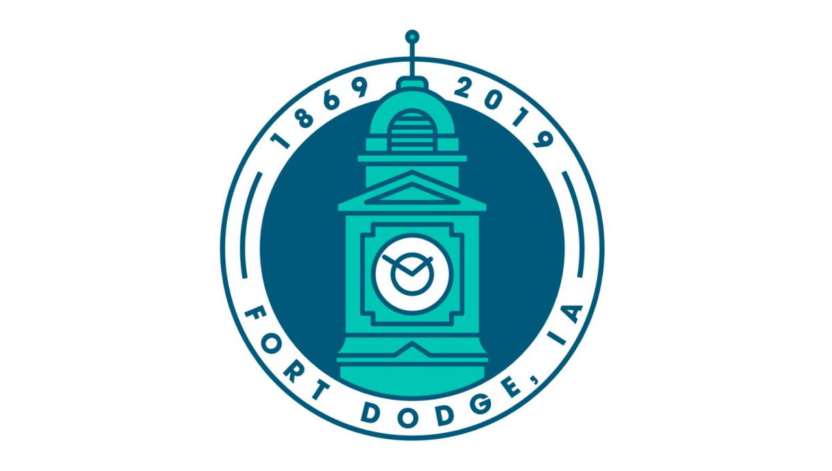
This clean, circular mark places the city's well-known clock tower in the center to establish a visual anchor. The clock tower comes up from behind the bottom part of the circle and overlaps the upper part of the circle. Around the rim of the circle sit the name of the city at the bottom and the years of existence, cleverly using the peak of the tower to separate the two years.
More Details →City of Thunder Bay 50th Anniversary Logo
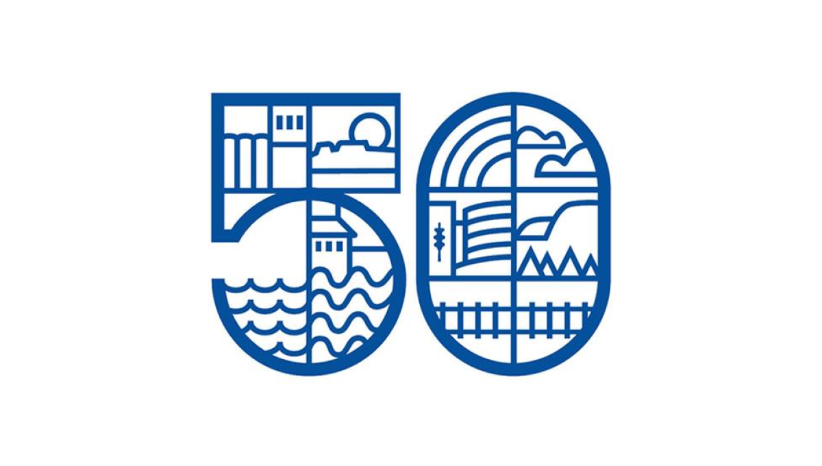
By dividing this number into a series of sections, this logo gave the designer lots of areas to work with as they highlighted many of the most popular, prominent landmarks in the city including the grain elevators, city hall, and the waterfront. By using a slightly thicker line for the number and thinner line for the line art in and around the number, it's easy to recognize the anniversary without the accompanying art distracting from that message.
More Details →City of Waukesha 125th Anniversary Logo
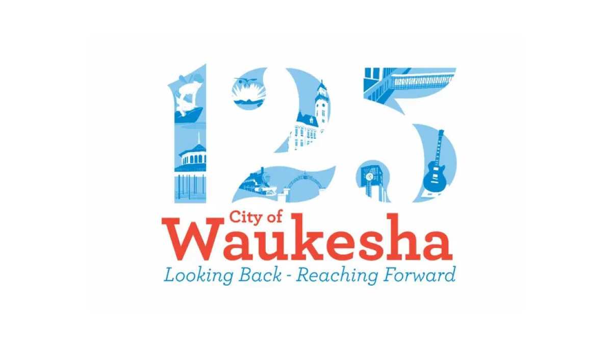
This logo places illustrations from many of the city's most notable landmarks in the number 125 to create a nice visual anchor for the city's anniversary. Complimenting the traditional red of the original logo, the number uses multiple shades of blue to keep the clear edges of the number but provide enough contrast to make each landmark easy to identify.
More Details →City of Virginia Beach 60th Anniversary Logo
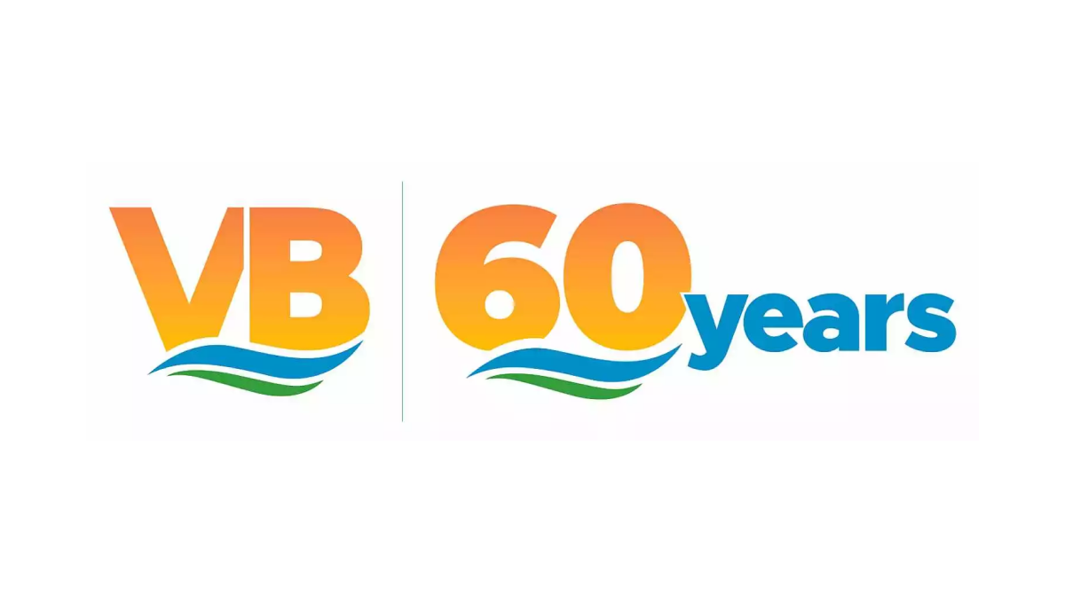
Borrowing from the city's well-known VB mark, this anniversary logo uses the same orange gradient of the VB in the original mark for the number sixty in the anniversary version. Below the same blue waves of the original mark sit with a large word "years" just to the right of this mark in the same blue as the wave. This logo also features the original mark just to the left of this new mark for an easy-to-recognize lockup.
More Details →Fountain Valley 60th Anniversary Logo
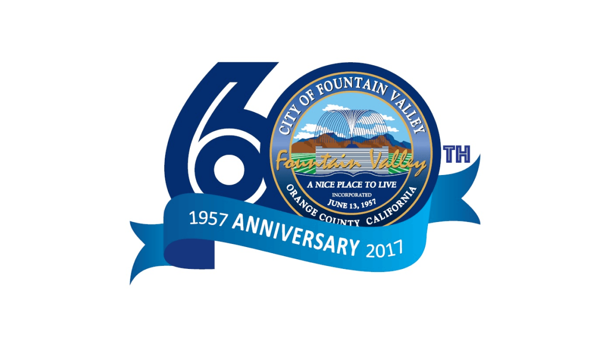
This logo starts with a large number sixty in a dark blue color. In the number zero, an illustration of a foundation sits inside a small seal-style shape with the town's name, motto, and location. Below that a lighter blue ribbon holds the word anniversary with the year the city was founded on one side and the year of this anniversary on the other.
More Details →Sugar Land Texas 60th Anniversary Logo
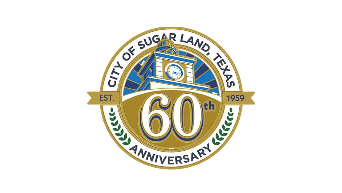
With a seal-style shape to start, this logo places the name of the town, the word anniversary, and laurel leaves in an arc between the outer edge and inner ring. Inside the smaller circle sits an illustration of city hall with a large number 60 sitting just below than on a gold background. A smaller ribben between the number and the illustration holds the years the city was founded and the current year of celebration.
More Details →