Rainbow Anniversary Logos
KUER 90.1 65th Anniversary Logo
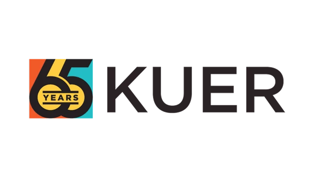
This anniversary logo features a clean, modern design with a mix of bold and light text. It highlights the number "65" to mark a special milestone, standing out in large, simple lettering. The colors are soft but eye-catching, giving the design a fresh and balanced look. The layout feels organized and clear, combining the station's name with the anniversary number in a way that looks both professional and easy to read. It gives a sense of history and progress.
More Details →US Open 125th Anniversary Logo

This 2025 U.S. Open logo has a clean, traditional look with a touch of elegance. The text is clear and spaced out, with “125th U.S. Open” and “Oakmont” standing out. At the center is a simple image of a squirrel, adding a classic feel. It feels formal and steady, fitting for a long-standing and respected event.
More Details →Rubik's 50th Anniversary Logo

When your brand is one built around a toy (even a challenging one), it's not surprising to see so much color and a playful vibe in their original logo. So when Rubik's celebrated an anniversary they took that same colorful angle, turned their normally 3D shape into a 2D figure to better stand in place of the number zero, and added a number 5. That's all they need for a simple, effective mark.
More Details →Bahamas Development Bank 50th Anniversary Logo

It can be tricky to design an anniversary logo when your original logo has so much color, but the designers for this bank did a great job of both choosing a gold that would compliment that palette but also using similar depth, shading, and styles of that original mark to make the combination of the two match really nicely. Set alongside their traditional word mark, this design adds a lot of visual weight to the original but does so with purpose and balance.
More Details →Lexington Kentucky 250th Anniversary Logo
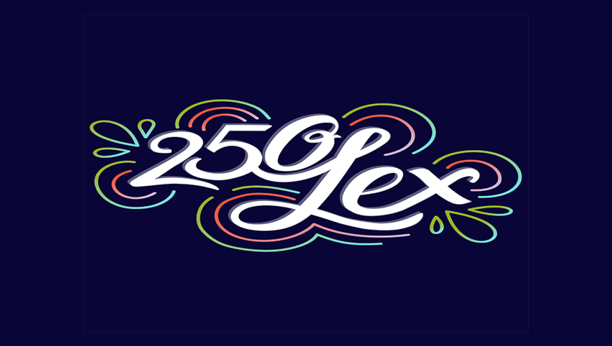
This design is fairly unique among anniversary logos. It features a scripted number 250 nestled up against the word Lex in white centered on the designs. Around the design are concentric rings in the city's colors that also feature leaf-like shapes on either end. The design is clean, unique, but also puts the name and year front and center for easy recognition.
More Details →Millennium Park 20th Anniversary Logo
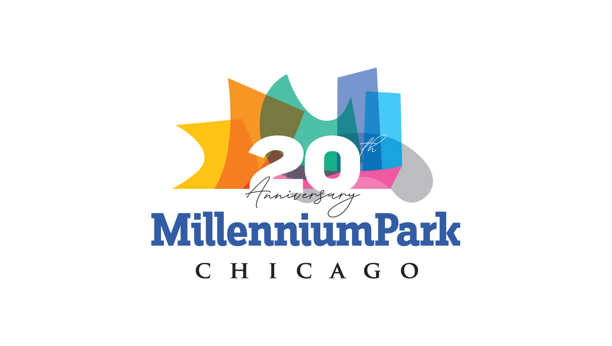
Millennium Park is recognizable for a number of unique architectural features and this logo uses semi-transparent colors to layer these iconic shapes into a single graphic. A number 20 sits above this colorful design with the name of the park sitting below to create balance and base for the rest of the design to sit above.
More Details →Sesame Street 50th Anniversary Logo
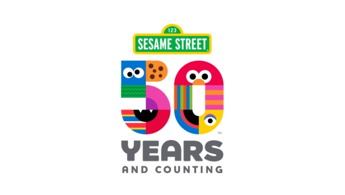
There are so many classic visuals within the Sesame Street story and this logo found a way to weave many of them - from Cookie Monster to Big Bird - into a single design. The result is a colorful number fifty that, set below the traditional street sign logo, is both representative of the story as well as a playful vibe that is perfectly on brand.
More Details →Six Flags 50th Anniversary Logo
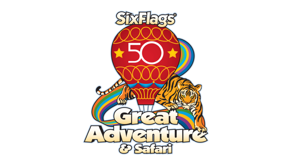
Throwing back to a classic design from the 1970s, this logo takes that original design full of rainbows, balloons, bubble letters, and hues that saw their heyday fifty years ago and adds just enough of a number in the center to make it easy for their audience to recognize the reason for and adaptation of their logo.
More Details →Lego 90th Anniversary Logo
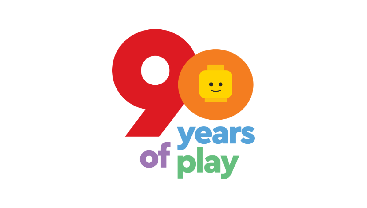
As a toy company, Lego started with mark with a playful, large number 90 in the primary red and yellow colors used in their traditional logo. Below that number are the words "years of play" in blue, violet, and green to continue the playful theme. Finally, the head of the company's famous mini figure toys is included in the middle of the zero to tie this design back to the Lego brand.
More Details →Google 25th Anniversary Logo
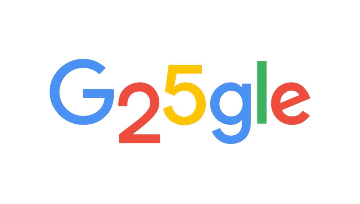
Google is famous for adapting their logos through the popular Google Doodle program, so it wasn't hard for this talented team to come up with a simple, well-executed design for their 25th anniversary. In this case, they used the rounded areas on the numbers 2 and 5 to make the two letter o's they frequently adapt as part of these logos. The result is a perfect, on-brand celebration of the brand's 25th anniversary.
More Details →Super Mario Bros. 35th Anniversary Logo
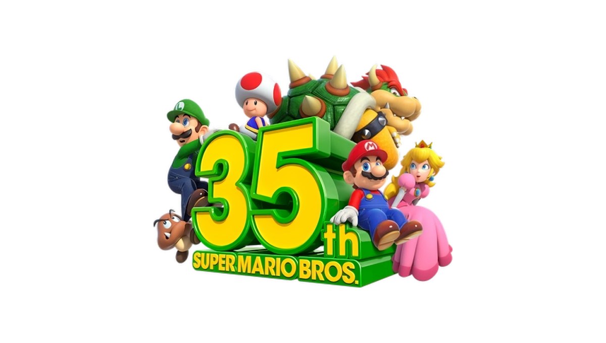
Some anniversary logos are simple, clean shapes that can be used in a variety of situations. This may not be one of them. A three dimensional block shape of the anniversary sits in the center facing away and to the left. Surround the number are similarly three dimensional graphics of many of the series' most popular characters.
More Details →NASCAR 75th Anniversary Logo
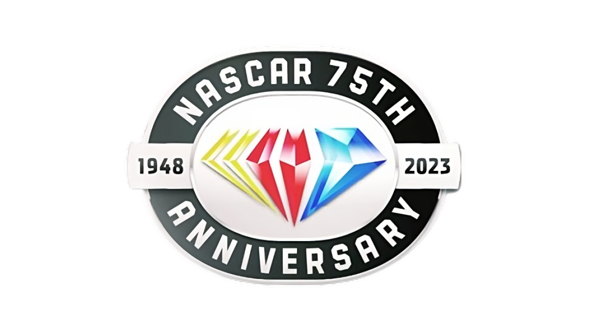
While other anniversaries use the diamond as the traditional shape, the 75th is absolutely one of them and NASCAR leaned into this with their design. A black oval representing the track their cars race around holds the name of the organization and recognition of the anniversary while a yellow, red, and blue diamond in the brand's traditional colors sits inside. A small ribbon then extends to either side of the diamond holding the years of operation.
More Details →USA-Mali Diplomatic Relations 60th Anniversary Logo
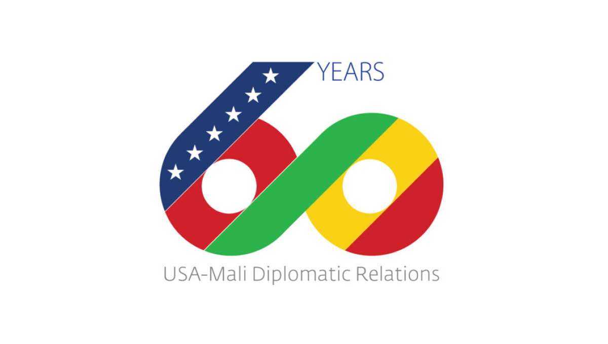
Starting with a large number 60, this logo uses diagonal stripes in the colors of both contries with a thick, green stripe creating a bridge between the two numbers and color palettes. On the upper left diagonal a line of stars is placed to represent the USA, to the right the word years sits, and below this number is a simple description of the occasion in a light, thin typeface.
More Details →Komori America Corp 100th Anniversary Logo
This mark is full of meaning. First, the ten horizontal bars that make up the design represent the 10 decades they've been in business. Next, the color palette points to the industry they work in - printing - and all the possibilities those various colors can represent. Finally, a few upward-turning points symbolize progress and advancement going forward.
More Details →IDSA Foundation 20th Anniversary Logo
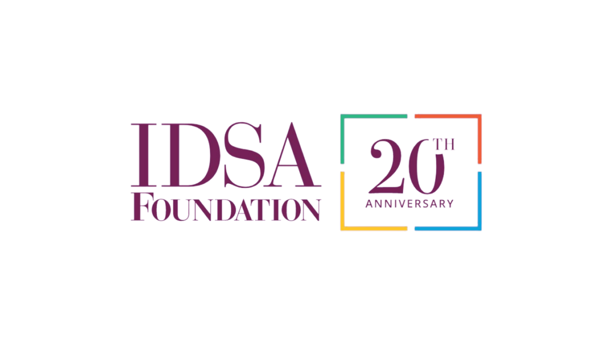
This clean annivesary logo starts with the organization's original logo and adds a balanced, square shape with 4 complimentary colors to form a clean frame. Inside that frame they return to the brand color with a large number 20 in the same color and typeface as the original logo. This preserves the recognizable original logo while adding a clear reference to the anniversary they're celebrating.
More Details →C&W Champions 10th Anniversary Logo
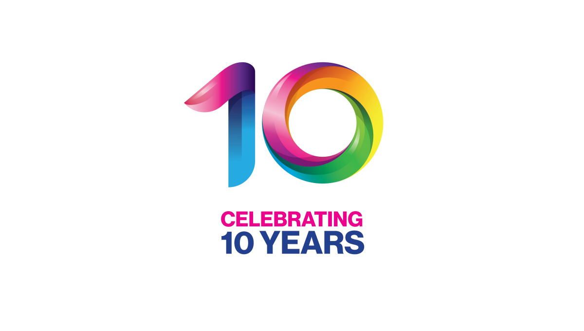
This logo takes a unique angle in that the only visual reference to the original brand is the color and shape of the mark. These rainbow, twisting three-dimensional characters mimic the style used in the organizations main logo and makes it easy for those aware of the original brand to easily connect it back to the mark it's related to.
More Details →