50th Anniversary Logos
Blue Jays 50th Anniversary Logo
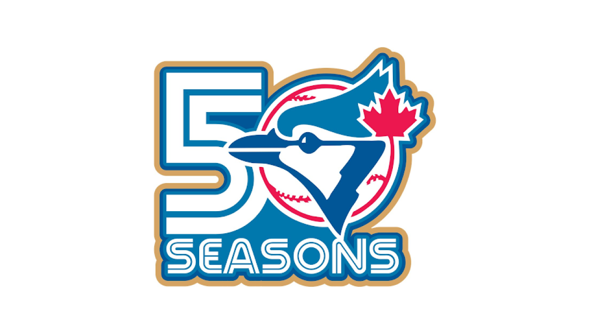
This anniversary logo has a bold and energetic design with a clean, sports-inspired style. The milestone number is the main focus, while a familiar team graphic is blended into the layout to create a unified and recognizable look. A limited color palette with a subtle accent color helps the design stand out without feeling overly busy. Overall, the logo presents the anniversary in a simple, memorable way that reflects tradition, pride, and a long history.
More Details →HellermanTyton 50th Anniversary Logo
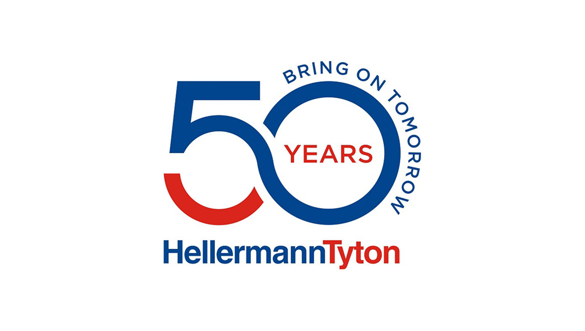
This anniversary logo uses a clean, modern style with bold shapes and clear text. The number “50” is large and flowing, forming a smooth, connected shape that feels forward-looking. Blue and red colors give it a strong, confident tone. The words “Bring on Tomorrow” suggest progress and optimism, while “Years” marks the milestone. Overall, the design feels professional, stable, and focused on long-term growth and experience.
More Details →Ski Utah 50th Anniversary Logo
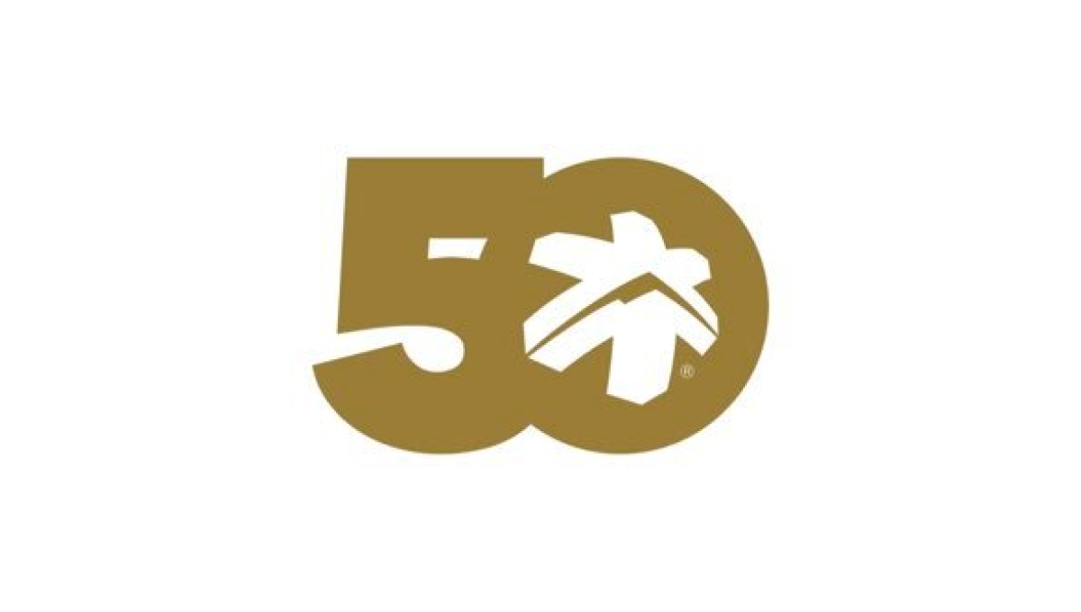
This anniversary logo highlights the number 50 in a bold, smooth shape that feels strong and unified. The design uses simple curves and solid forms that fit together naturally. A small graphic element inside the zero adds a hint of character and meaning without being too specific. The gold color gives it a warm, classic look that suggests celebration and longevity. Overall, the logo feels clean, confident, and respectful of an important milestone.
More Details →Prefontaine Classic 50th Anniversary Logo

This anniversary logo features a bold, clean number paired with a word to mark the occasion. The design feels strong and steady, using clear shapes and solid colors. There’s a sense of pride and tradition in how the elements are arranged, while still keeping things modern. It gives off a respectful and professional feel, showing appreciation for the past while looking ahead. The overall look is neat, balanced, and easy to recognize.
More Details →Jaws 50th Anniversary Logo

This 50th anniversary logo has a bold and dramatic style. The number “50” is big and solid, with the word “JAWS” placed tightly above the number in its well-known red lettering. The colors are on the dark side, giving it a strong and serious feel. The design feels classic and a bit intense, matching the tone of what it’s celebrating, while still keeping things clean and focused.
More Details →ICEE 50th Anniversary Logo

This 50th anniversary logo has a fun and playful feel. The number “50” is large and bold,in a gold color that stands out. The word “ICEE” is placed to the left of the 50, using its familiar logo style. There’s also a small banner underneath that says “Icee-versary,” adding to the celebratory look. The overall design feels cheerful and energetic, reflecting a lighthearted brand marking a big anneversary in a lively way.
More Details →SMI Snowmakers 50th Anniversary Logo

This anniversary logo has a clean and simple look, with soft colors and a modern feel. The number “50” is the main focus, standing out in bold, simple lettering. A short message underneath states the anniversary. Overall, it gives off a calm, respectful tone—something that feels official but still warm and thoughtful, made to honor a meaningful milestone.
More Details →Vanguard 50th Anniversary Logo

This anniversary logo is made up of a large number "50" with the signature V in the center of the 0, for Vanguard. The logo is made in a clean, bold red color, making it stand out from the white background. The font is simple and bold, giving it a strong look. In conclusion, the logo is a simple, creative way to celebrate this company's anniversary.
More Details →Dungeons and Dragons 50th Anniversary Logo

The Dungeons & Dragons 50th Anniversary logo showcases a dynamic fusion of fantasy and modern design. The number 50 is designed in a brilliant gold font, with a head of a dragon in the center of the 0. The accompanying "Dungeons & Dragons" text is presented in their signature font, balancing tradition with a forward-looking approach. This emblem effectively honors the game's storied past while signaling its continued evolution.
More Details →Lake Tahoe Community College 50th Anniversary Logo

This is a fairly simple but surprisingly unique anniversary logo lockup. Yes, it starts with the classic number fifty on the left and uses the word "years" in a short ribbon which are all common elements. But the flag extending from the right side of the zero to hold the college's traditional logo is something i haven't seen before. It's a nice little design that gives the school a nice little package to work with.
More Details →Big Cypress National Preserve 50th Anniversary Logo

The National Park Service has done a number of anniversary logos over the years and I love how they let the colors and styles of the area influence each one instead of a more copy and paste approach. This is another examples of that with unique fonts, bright colors, and imagery that have a different vibe than other logos but come together to create yet another tidy design that can be used in many situations.
More Details →Acura Grand Prix of Long Beach 50th Anniversary Logo

You could take away almost all of the context of this logo and still know that it's for an auto race. The thick, parallel lines of the number fifty along with the checkered flag embedded neatly inside mimic the classic track maps and diagrams that are so familiar in both the actual sport and virtually in games. Places beside the word mark you can see how well the designers matched this addition to the original logo.
More Details →Tampa Bay Rowdies 50th Anniversary Logo

The Tampa Bay Rowdies have always had a classic word mark within their crest, but the designers of this anniversary logo scored an absolute peach of a goal with this design. A large number 50 sits below that word mark with a ribbon weaving in an our of the numbers containing the years of their operation. Best of all, however, are the other design elements they created in tandem with the logo that give their brand a lot of great pieces to work with.
More Details →Poynter 50th Anniversary Logo

Simple doesn't have to mean boring as this anniversary logo from Poynter proves. Yes, it's a simple number fifty with the usual word mark sitting above. But by adding just a little bit of depth to create the appearance of a three-dimensional, fading and twisting surface to that number? They created a really simple, but clean, design that matches the tone of the company overall without overcomplicating the design.
More Details →Washington Capitals 50th Anniversary Logo

We love a good retro logo and this is a perfect example of that. Old school styles, shapes, and colors are combined into a clean design that puts a large number 50 in red, a hockey stick in blue, classic starts below and the team's traditional logo at the top. The result is a really nice logo in a square shape that's easy to use across online and social channels.
More Details →The North Face 50th Anniversary Logo

Anniversary logos often have an offset second digit to add a little bit creativity to an otherwise normal number, but I love how The North Face did this with a little bit more purpose. The number zero uses a horizontal line to mimic the set cresting the horizon, an image common in the visuals that accompany the adventures their customers embark on. It's a clean, simple mark and beautiful design.
More Details →Bousfields 50th Anniversary Logo

The original logo for this brand features a matching circle in the upper left area as you see in the bottom right. By keeping the bottom right circle as a zero and adapting the top left into a number 5, the difference was both easy to spot but neatly subtle. They get to keep building brand recognition by using something close to their usual logo but also highlight their milestone.
More Details →Rubik's 50th Anniversary Logo

When your brand is one built around a toy (even a challenging one), it's not surprising to see so much color and a playful vibe in their original logo. So when Rubik's celebrated an anniversary they took that same colorful angle, turned their normally 3D shape into a 2D figure to better stand in place of the number zero, and added a number 5. That's all they need for a simple, effective mark.
More Details →Bahamas Development Bank 50th Anniversary Logo

It can be tricky to design an anniversary logo when your original logo has so much color, but the designers for this bank did a great job of both choosing a gold that would compliment that palette but also using similar depth, shading, and styles of that original mark to make the combination of the two match really nicely. Set alongside their traditional word mark, this design adds a lot of visual weight to the original but does so with purpose and balance.
More Details →Wintergreen Resort 50th Anniversary Logo

While the resort does have other lockups of this mark they're using, the simplicity of this design is worth showcasing alone because it's a great reminder that anniversary logos don't have to be complicated. That doesn't mean this logo isn't beautifully designed - the block number 50 with offset numbers is neatly balanced with the resort's original logo placed inside - but it does mean that they didn't overthink it. The result is both effective and really sharp looking.
More Details →Dee Foundation 50th Anniversary Logo

The Dee Foundation often uses a logo that only includes the text shown on the right side of this design. So being, they could pair that with an anniversary mark without having to fight with the shape or color or weight of the original logo. A large number 50 filled with a slight gradient and two faces making the negative space in the number zero made for a really classy logo to use during their anniversary year.
More Details →Hard Rock Hotel 50th Anniversary Logo

Hard Rock is a powerful, well-known brand. So at the center of this logo they placed that name in the distinct, edgy font their brand is known for. Behind and around that mark is a large number fifty broken up into multiple lines to give it plenty of presence but a little less weight. Finally, a simple EST 1971 sits above the zero for a little balance plus added reinforcement for the anniversary meaning within the design.
More Details →Accor Hotels 50th Anniversary Logo

Accor Hotels normally uses a bird silhouette the form the left diagonal and cross of the letter A. The designers of their anniversary mark cleverly took that same shape and placed at the top of a number five to form the year the company is celebrating. Combined with a classy serifed font tucking just below their name, this logo is a really sharp design and one that was combined with other colors and elements in their marketing.
More Details →Red Roof 50th Anniversary Logo

While their red, angled roof line is a simple shape, it's also easily recognizable thanks to five decades of brand building. So to celebrate those years in business, Red Roof simply placed a large number fifty below that distinct angle using a similar weight and the same red they'd used for so long. The result is both simple but extremely effective in a tidy package.
More Details →The Consumers Association of Singapore 50th Anniversary Logo

In this case, we don't have to guess what their design concept was. To quote from the case study (see "source" link for this logo) about this logo, "The logo integrates the anniversary tagline to highlight the theme of the anniversary — Past, Present and Future. The arrow is designed with a sense of motion to represent the passage of time. The logo concept incorporates the arrow into the shape of the number 50 to create a sense of motion — moving forward. While the arrow head denotes the future, the circular motion of the arrow reflects how the past can provide a strong foundation for CASE to strive towards greater excellence in the future."
More Details →Ogden Nature Center 50th Anniversary Logo

This is a really creative, simple solution to an anniversary logo that alters the original logo very little while making a clear, unique design for their celebration. In this case, they already had a round shape for their mark, they simple added a ring of gold around that circle and wording the mark the celebration. This keeps the proportions and sizing of the logo almost identical to the original so swapping to and from this logo is easy during and after the anniversary year.
More Details →D Magazine 50th Anniversary Logo
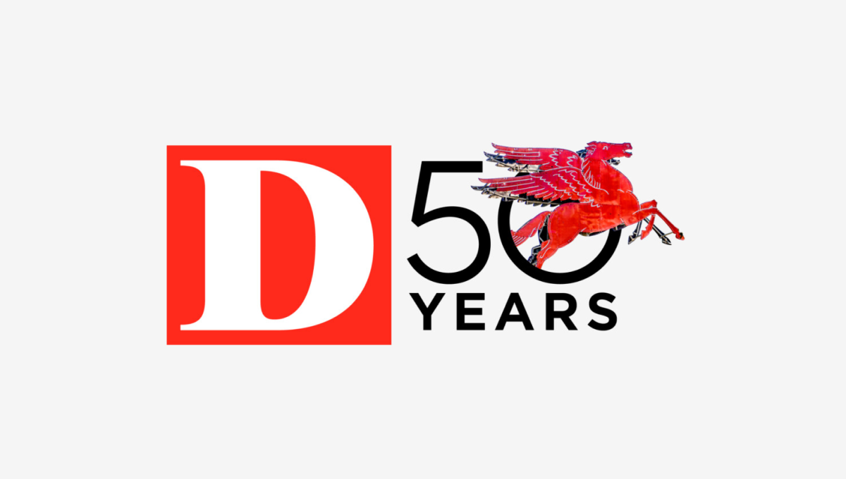
Rather than describe this logo ourselves, we'll just quote the team on this one. "Our in-house designers and art directors wrestled for months about what D’s 50th anniversary logo should be. What would feel like ‘D’? What would be bold and design-forward but not conflict with our existing (already iconic) logo? What have other brands done? Do we even have to do one at all? After dozens of versions and rounds of meetings, we ultimately returned to the original concept presented by our digital product director Ricky Ferrer. When we all first saw it, it felt like ‘us’. It also felt like Dallas: always in motion, full of iconic people and places."
More Details →National Arts Fesitval 50th Anniversary Logo
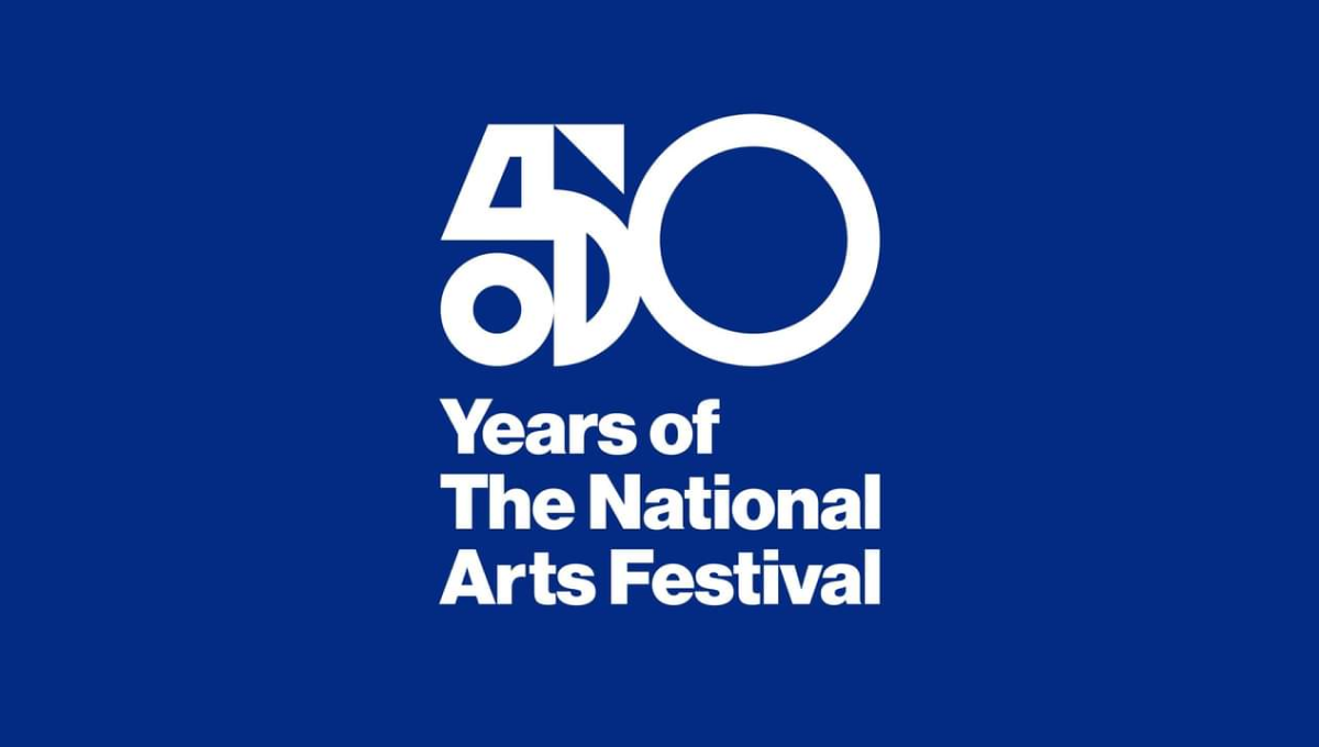
This logo was used primarily on this blue background and combines two nice designe elements to make the whole. The first is a combination of shapes to create a unique, creative number 5 that resembles a bit of modern art. The second is the classic helvetica-style font that is so common in art contexts. Together, this logo is clean, unique, and meaningful.
More Details →Massanutten 50th Anniversary Logo
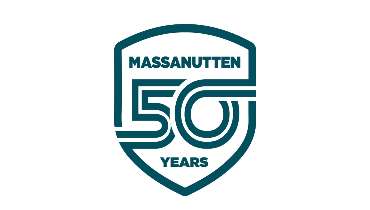
Massanutten went retro for this clean, badge-style logo by starting with a crest shape. Inside that crest is a double-line number fifty with the bottom part of the five connecting with the left edge and the top part of the zero extending to connect with the right. The name of the resort sits above the number with the word years below to complete this clean, effective logo design.
More Details →Sesame Street 50th Anniversary Logo
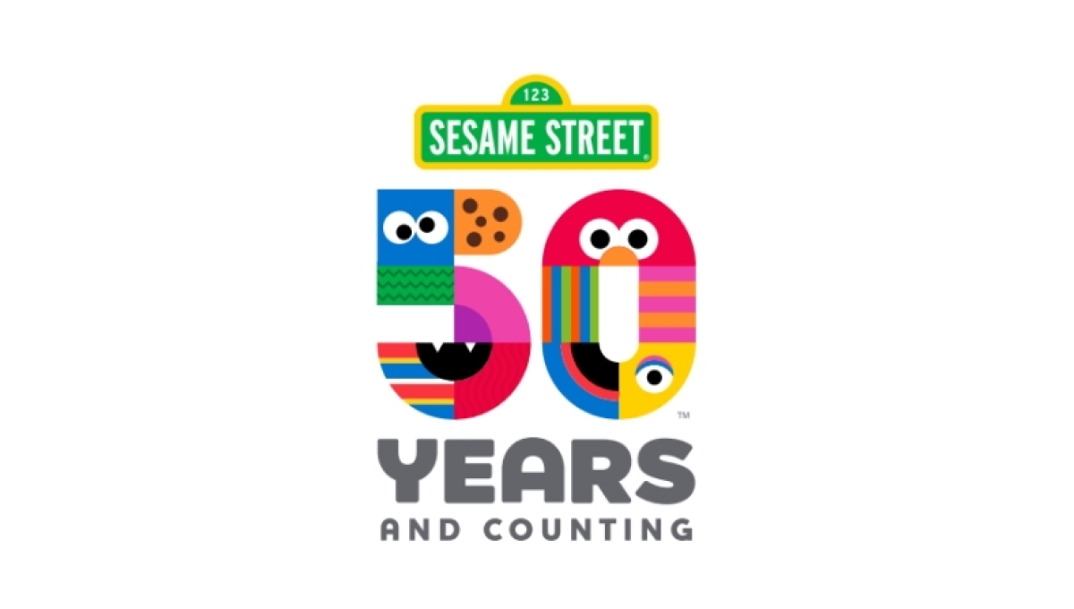
There are so many classic visuals within the Sesame Street story and this logo found a way to weave many of them - from Cookie Monster to Big Bird - into a single design. The result is a colorful number fifty that, set below the traditional street sign logo, is both representative of the story as well as a playful vibe that is perfectly on brand.
More Details →Utah Jazz 50th Anniversary Logo
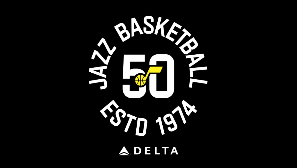
The team has embraced a number of colors over the years, but the black background of this logo and yellow mark in the center were a nice tie to one of their more popular and recent combinations. With a large number 50 in the center and the note mark laid above, this created a clean, but recognizable brand they could use in a variety of situations. In this case, wrapping the name of the team and the year it was established (along with their stadium sponsor) for a nice lockup for use online and in print.
More Details →Wolf Bay 50th Anniversary Logo
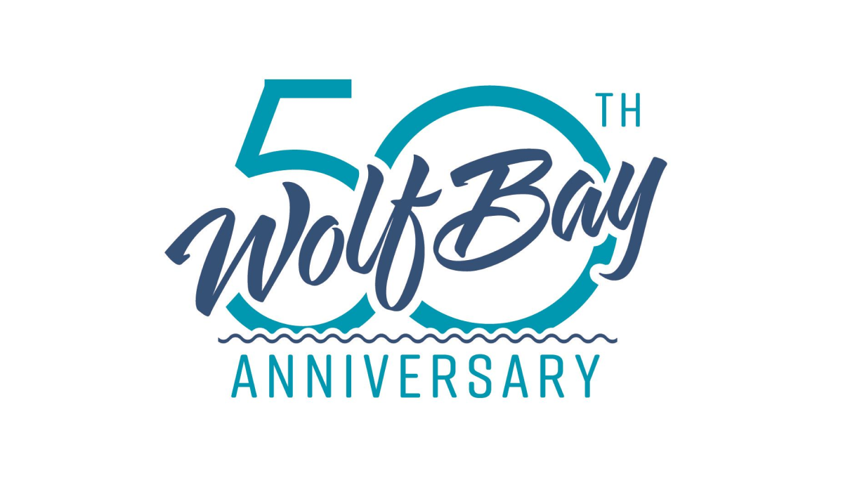
This logo may be simple, but it's also really clean and effective without having too many parts. A large number fifty sits behind with the traditional word mark of this restaurant cutting across at an angle with a little bit of padding around the edge to avoid bleeding. The word anniversary at the bottom clarifies the reason for the design and adds a bit of balance.
More Details →Bull & Bush Brewery 50th Anniversary Logo
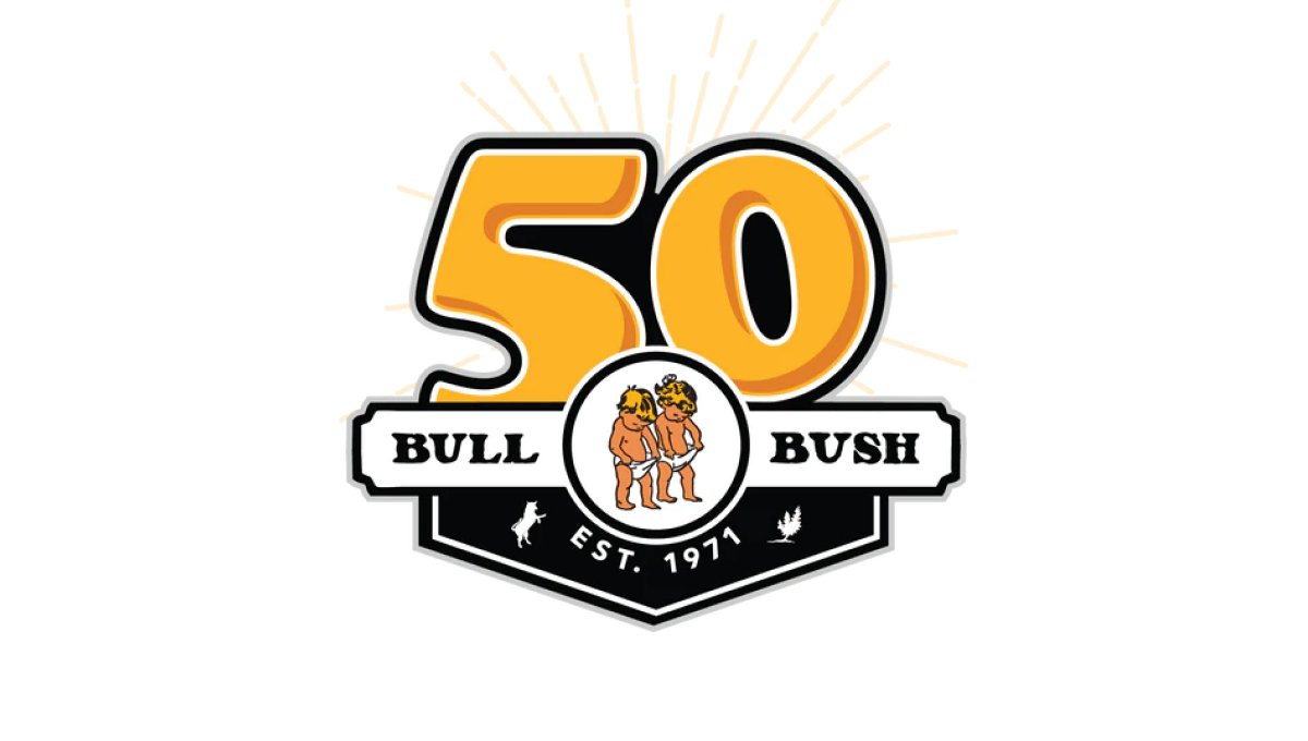
With the brewery's traditional logo held in an small oval, this logo builds behind that with a large, playful number 50 peeking up from behind to match the style and vibe of the traditional brand. To the side of the logo is a ribbon-style rectangle holding the name of the berwery with a label showing when the business was established filling the area below the logo.
More Details →Pittsburgh Penguins 50th Anniversary Logo
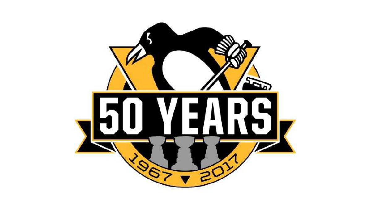
Using the styles famous for their original logo, this logo takes a large circle and wraps a "50 YEARS" ribbon just below center and around either side of the circle. The traditional penguin-with-a-hockey-stick mark slides up from behind with the years of the organization's existence at the bottom. Not to be overlooked are gray silhouettes for each of the team's Stanley Cup titles.
More Details →Six Flags 50th Anniversary Logo
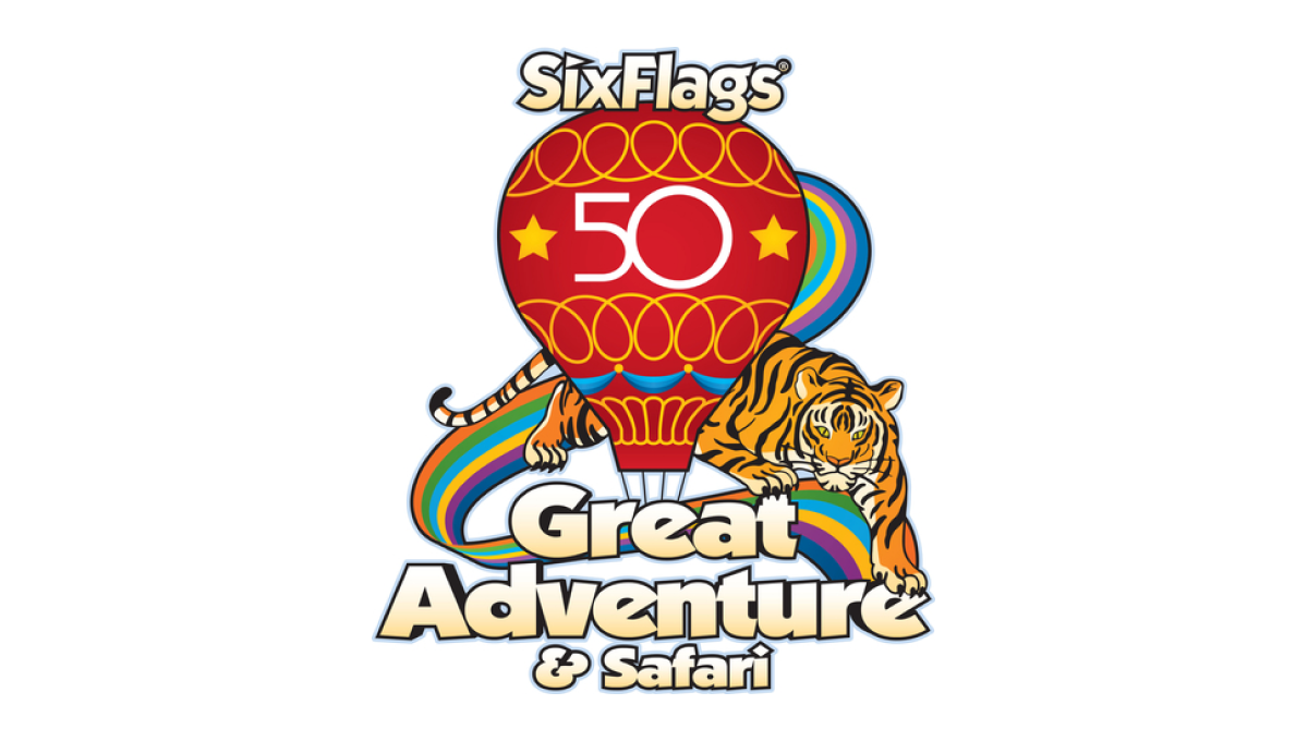
Throwing back to a classic design from the 1970s, this logo takes that original design full of rainbows, balloons, bubble letters, and hues that saw their heyday fifty years ago and adds just enough of a number in the center to make it easy for their audience to recognize the reason for and adaptation of their logo.
More Details →Nike 50th Anniversary Logo
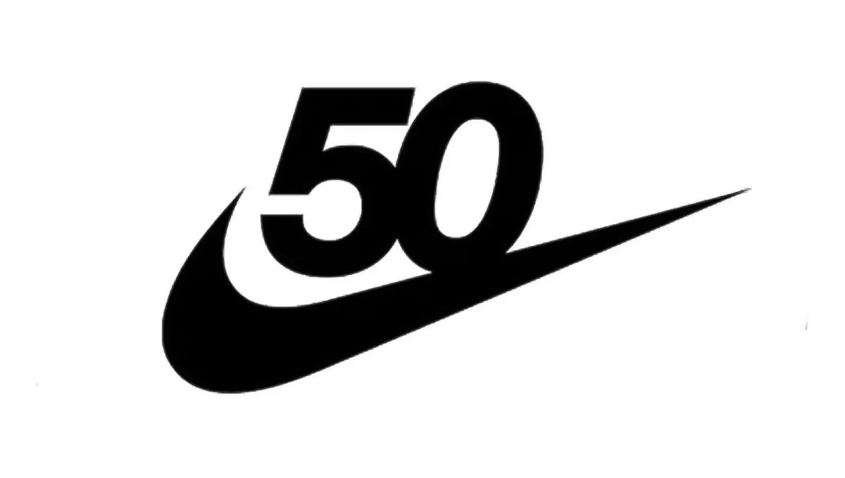
Nike has one of the most powerful brands in the world. Even more, it's incredibly recognizable on a few levels. Take the number 50 in this design, for example. Even if it were just that text, there's a good chance millions of people would still recognize it. With the swoosh below this logo is as powerful as it is simple.
More Details →Barbie 50th Anniversary Logo
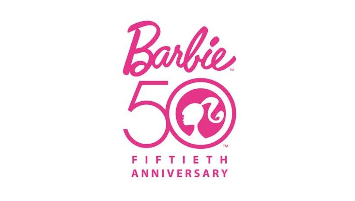
There's only one color to use when celebrating Barbie's anniversary and they started with that as an instantly recognizable foundation for this mark. With the traditional logo above, Barbie's famous ponytail inside the zero of a large number 50, and the usual additional text to commeration the occasion below, this logo combined recognizable elements with a clean design.
More Details →Golden Corral 50th Anniversary Logo
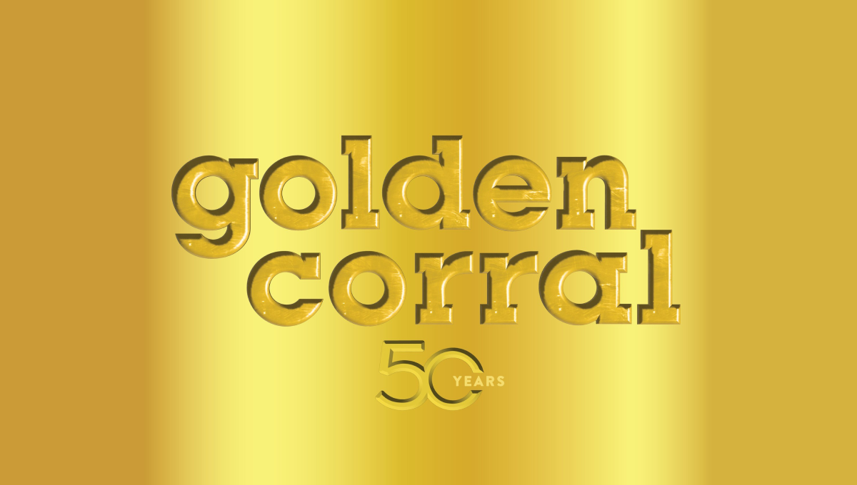
When your logo is already gold, why not build on that for your 50th anniversary? Golden Corral kept it simple and inset their mark and a number 50 into a reflective gold background to create a sort of etched or stamped feeling to their design. The result can be hard to see in some lockups, but was a nice, on-brand way to celebrate the occasion.
More Details →Save the Bay 50th Anniversary Logo
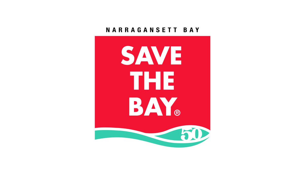
To create their anniversary logo, Narragansett Bay took their traditionally horizontal motto and stacked the words into a square with a solid background. With their traditional mark at the bottom and the name of the city at the top to create a clean, square mark that works well during their anniversary and beyond.
More Details →Wendy's 50th Anniversary Logo
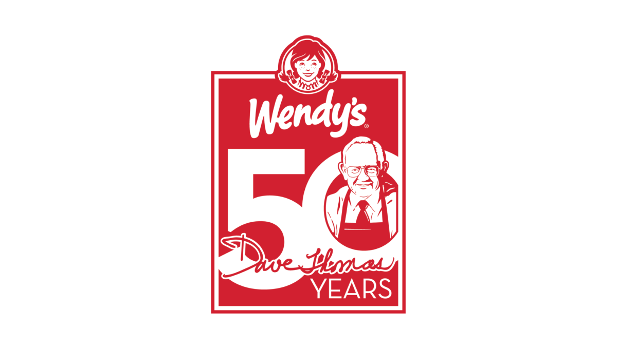
Wendy's original square logo shape was the inspiration for this 50th anniversary mark. All in their traditional brand red, a large number 50 sits just below the brand's current logo to fill out the shape. Inside the O is an illustration of the chain's original founder, Dave Thomas, to neatly tie the beginnings of this company's story to their present.
More Details →Roy Rogers 50th Anniversary Logo
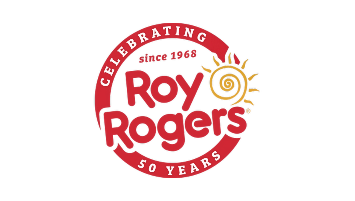
This restaurant chain started with a classic round seal-type shape with a thick border in their classic brand red color. That thick rim held text outlining the reason for their celebration. Then inside that circle and slightly overlapping the edges was placed their original logo with the same slight angle. The result combined a shape that supported the anniversary message with the logo that supports easy brand recognition.
More Details →KFC Japan 50th Anniversary Logo
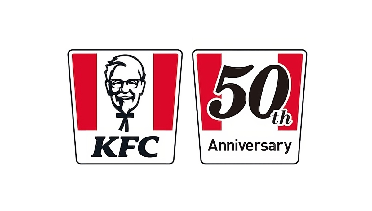
When KFC celebrated 50 years of operations in Japan, they had a powerful, easily-recognized shape at their disposal: the almost-square bucket with red stripes. Because it was so recognizable, they were able to simply overlay the year of their anniversary on top of that shape in a font similar to the KFC name and quickly have a logo that was simple, on-brand, and easy to tie back to the original mark.
More Details →Governors State University 50th Anniversary Logo
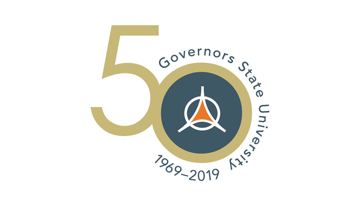
With an offset number 50 as the canvas for this logo, the designers filled in the zero with a dark blue and placed the university's traditional logo in the center to make it easy to tie this back to the original brand. Around the outside of the zero sit the name of the university and the years of operation, with a vertical flip between the two to keep most of the letters right side up and improve readability.
More Details →City of Thunder Bay 50th Anniversary Logo
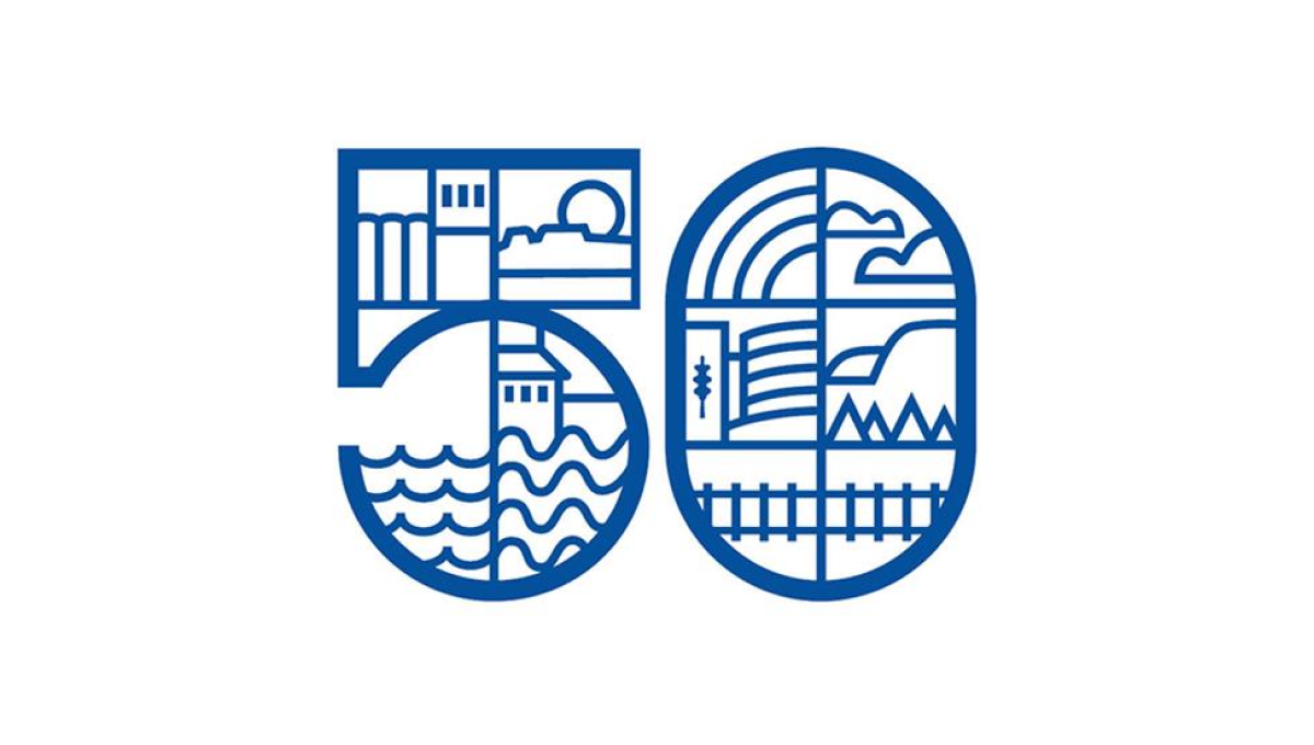
By dividing this number into a series of sections, this logo gave the designer lots of areas to work with as they highlighted many of the most popular, prominent landmarks in the city including the grain elevators, city hall, and the waterfront. By using a slightly thicker line for the number and thinner line for the line art in and around the number, it's easy to recognize the anniversary without the accompanying art distracting from that message.
More Details →Wright State University 50th Anniversary Logo
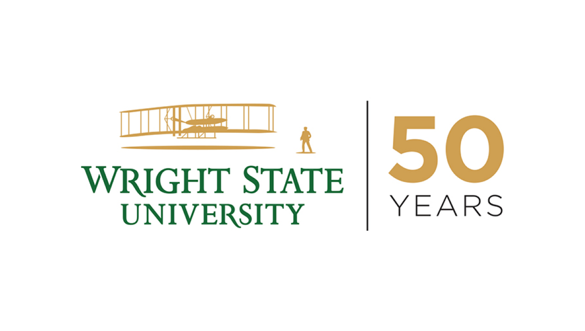
Using a style that is becoming more and more common for anniversary logos, Wright State simplye takes their traditional logo and places a vertical line between that mark and a simple anniversary mark that focuses on the number rather than a unique design. In this cast, a large number 50 in their brand gold with the word "years" below in their brand green.
More Details →Big Sky Resort 50th Anniversary Logo
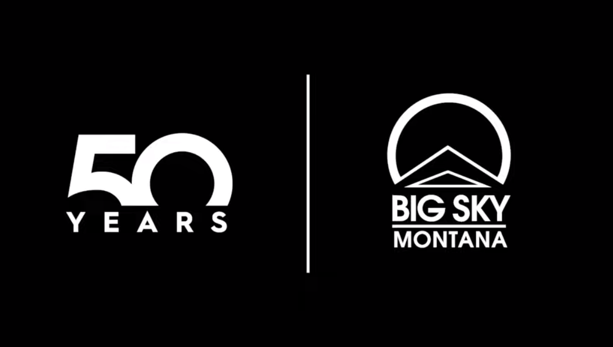
This well known mountain resort used a popular method of separating their traditional logo from a number mark with a vertical line. With a large block number 50 rising from behind a wide, all caps word "YEARS" they created a unique mark that can simply be paired with their original logo during the celebratory season without much work or effort to switch back and forth.
More Details →The Landings Association 50th Anniversary Logo
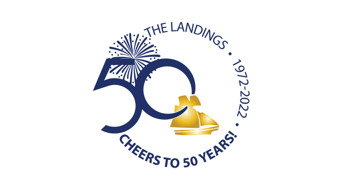
Keeping it simple, this logo places the name of the organization, the years of operation, and a celebratory message in a curving circle of words to create the rough shape. On the left side, the remaining gap in the words is filled with a large number fifty and an illustration of fireworks behind. In the center, a ship representing the orgnaization's main brand sits just in front of and below the number.
More Details →Abiding Word Lutheran Church 50th Anniversary Logo
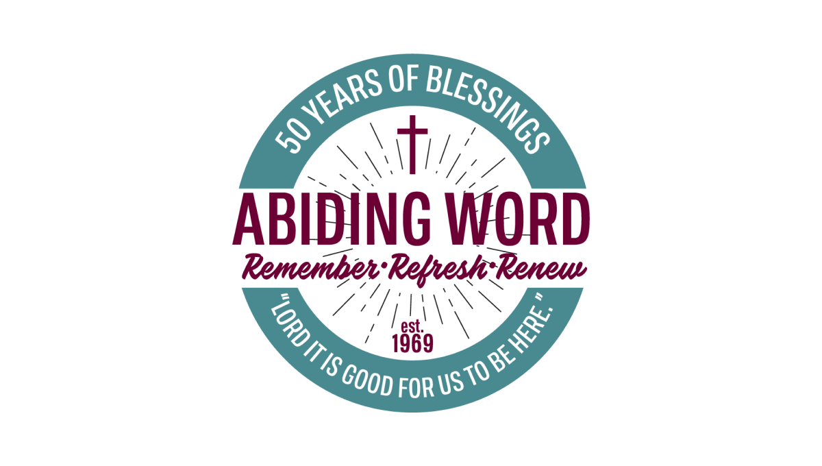
Starting with a thick-bordered circle with white in the center and teal on the rim, this logo places the church's tagline and anniversary year in curved letters on this rim. Inside the center sits the name of the church and another tagline for the congregration. Above and below are lines eminating outward with a cross above and "est 1969" block of text below to add additional color and balance.
More Details →National Park Service Volunteer 50th Anniversary Logo
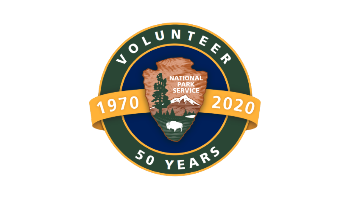
Building on the National Park Service's original logo in the center, this mark adds a circle behind to form a seal and hold wording that specifies this logo is for their volunteer program and the year they're celebrating. Behind the original log and in front of the circle sits an orange ribbon holding the years this program has been in place.
More Details →Glen Canyon National Recreation Area 50th Anniversary Logo
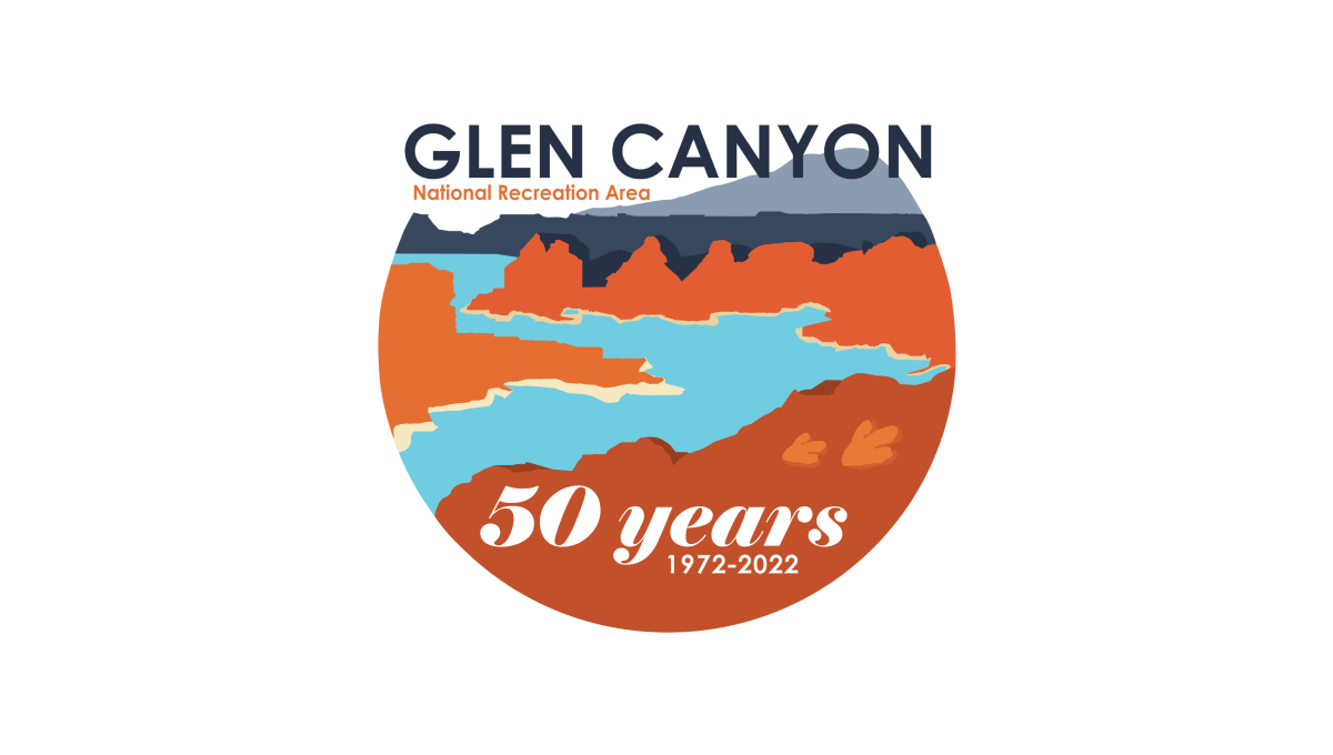
This logo starts with a circle holding the classic blue water and red rocks of the reservoir and landscape that creates it. Instead of completing the circle, however, the mark ends at the horizon line and the name of the area fills this space. At the bottom in a solid block of red color is "50 years" and a smaller line of text containing the years of operation.
More Details →Maryland Hospital Association 50th Anniversary Logo
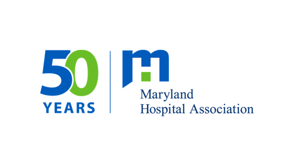
If you want a simple, effective anniversary logo then take note of what the MHA and many other brands are doing. This organization took their original logo, drew a vertical line to the left side, and on the other side of the line placed a simple number mark in their brand colors. The result is effective, balanced, and doesn't require the level of design and planning as a logo that starts from scratch.
More Details →MLB All Star Game 50th Anniversary Logo
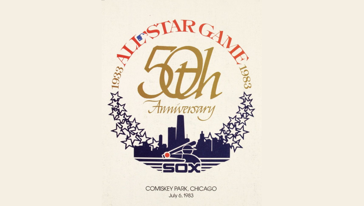
This mark was featured on a poster and sets a few elements into a clean, round shape with a "50th" in gold in the center. On the bottom sits a blue silhouette of the Chicago skyline with blue shares curving up and to the side of the skyline to begin forming the circling. On the top is red lettering signifying the occasion with the start and current years in gold connecting the two and completing the circle.
More Details →United Reformed Church 50th Anniversary Logo
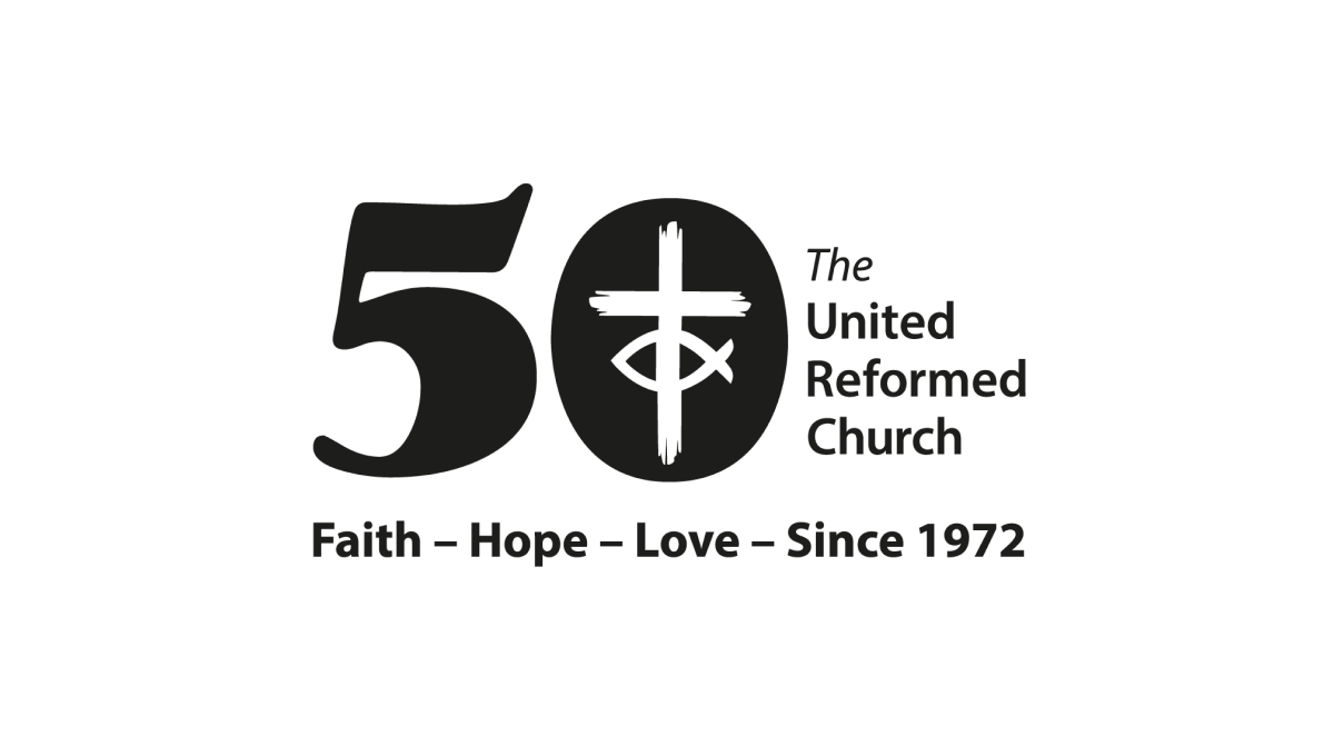
By placing a large, block number 50 to the side of the traditional logo, the church was able to simply invert the color of their mark and place it inside the zero to create a simple but effective mark that kept the familiarity of the original logo while celebrating their milestone with a unique separate brand.
More Details →Memorial City Medical Center 50th Anniversary Logo
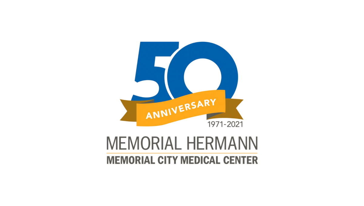
This hospital logo puts their name in dark, block letters at the bottom and simply adds a clean garphic above that to highlight the occasion for this adaptation of their brand. A large, block number 50 in blue is covered on the bottom third by an orange ribbon that contains the word "anniversary" and sits just narrower than the words below for a nice, vertically tapered shape that would work great on a website, swag, or social media avatar.
More Details →California Coast University 50th Anniversary Logo
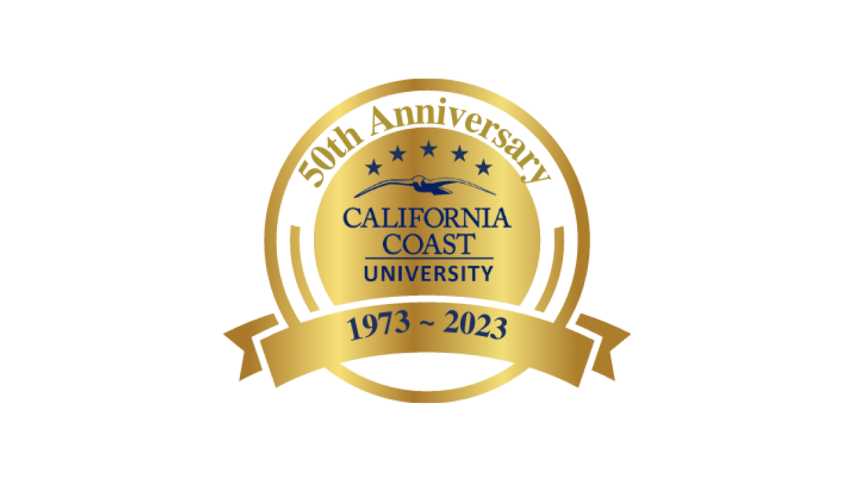
With a very class "seal" style shape as the base, this logo from California Coast University simply adds some dark lettering inside that seal shape to crate a mark that does it's job and doesn't require to much complexity. Like many of this circular, seal-shaped logos, they've also added a ribbon at bottom to display their dates of operation.
More Details →Atari 50th Anniversary Logo
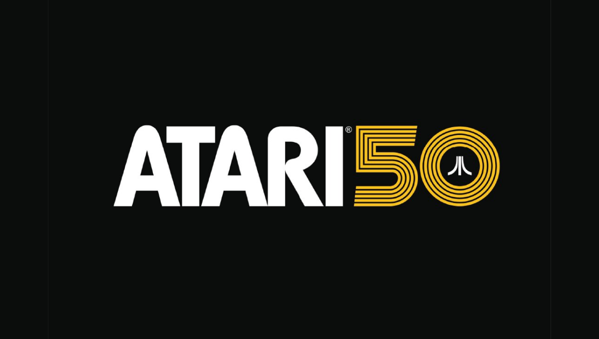
As one of the truly classic brands of early gaming and technology, Atari combined their classic word mark with the three diverging lines in this lockup that's designed for a dark, black background. A line-art version of the number 50 holds the mark in the 0 with a clean gold color providing both contrast with the white but easy readability on the black.
More Details →Sundown Ski Area 50th Anniversary Logo
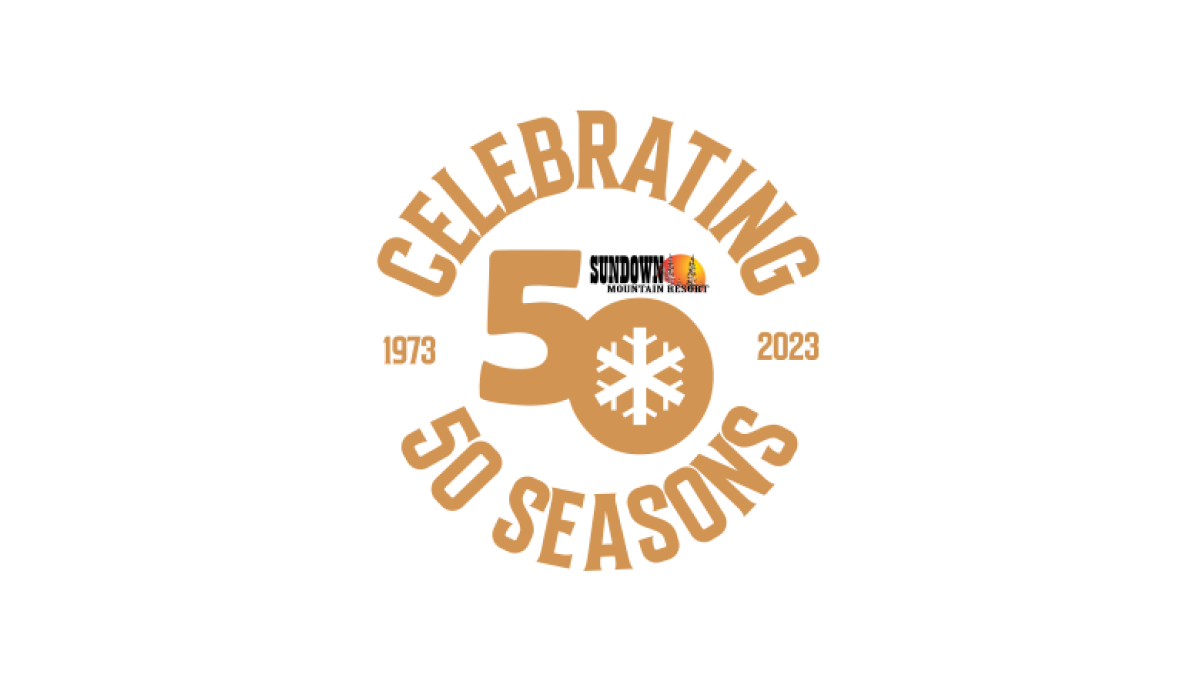
Sundown gave their designer a lot of creative freedom to create a mark that was unique to their anniversary. The result were the words "celebrating 50 seasons" forming a circle around a large number 50 and the years sitting to either side to break up the circle. The 0 in the large fifty contained a snowflake icon to tie it back to the skiing message and made room for the resort's original logo above.
More Details →St Francis Elementary School 50th Anniversary Logo
This logo starts with a double-line number fifty in the school's classic gold color. By overlapping the 5 and 0 in the number, they created a woven, infinity effect. And by shrinking the number 0 slightly, they were able to have room for the word "anniversary" and "th" for the 50. Finally, the zero creates a circle where they were able to neatly place their traditional green, round logo.
More Details →Snowbird 50th Anniversary Logo
Snowbird's classic wings mark is one of the most well-known logos in the ski industry. To celebrate their 50th anniversary, the used a block number 50 in the brand's iconic red color with the wings inset in the number 0. The mark was clean, bold, and easy to recognize for anyone familiar with the snowbird brand.
More Details →Red Fern Farm Services 50th Anniversary Logo
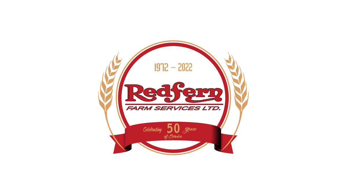
WIth a classic round shape to start, Red Fern added a ribbon with language pointing to the reason for the celebration. Inside the circle, the company's original logo was placed with their years of operation set in a lighter color just above. Similar to laurel leaves that flank the marks of film festival icons, the logo then adds curving stalks of wheat to add a final touch.
More Details →Park City Mountain Resort 50th Anniversary Logo
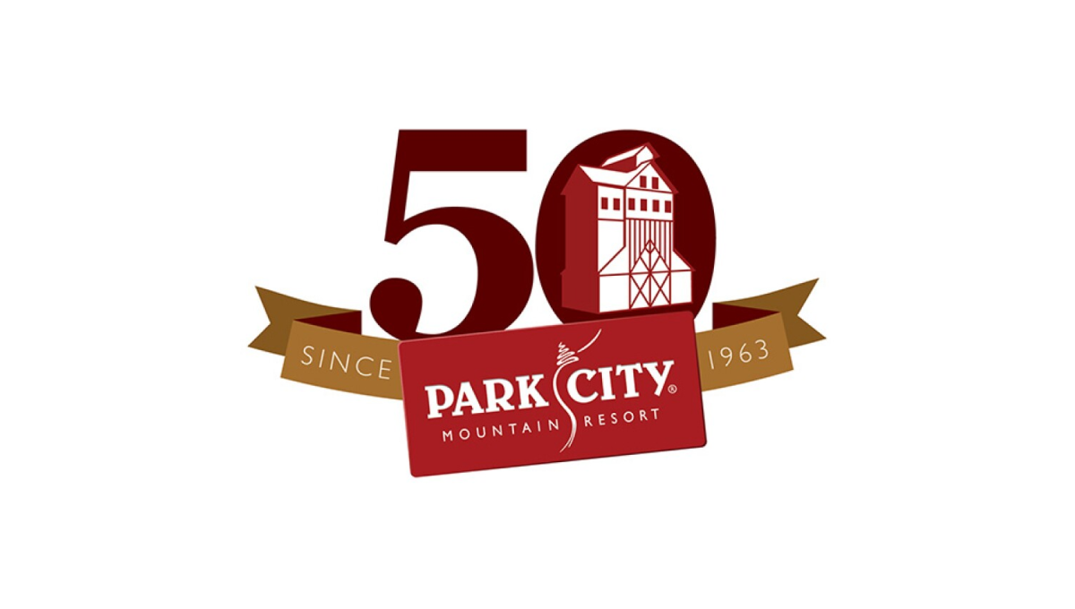
With a logo that was already set in a rectangle, Park City Mountain Resort simply turned that mark into a ribbon to contain the rest of the elements. Gold sections of the ribbon hold the words "since 1963" and the number 0 contains some clean line art depicting the mountain's well-known mining history and buildings still found at the resort.
More Details →Mt Hood Meadows 50th Anniversary Logo
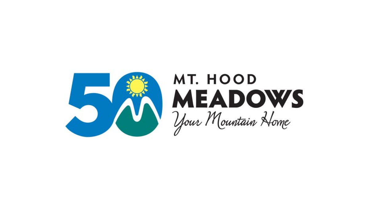
The resort's green, blue, and yellow mark normally sits in a crest-style shape to the left of the word mark. To transition to the anniversary design, the resort simply placed that mark inside the 0 of the number 50 similarly to the left of the word mark. This made their logo both unique to the celebration but also easy to recognize by their audience.
More Details →Jackson Hole 50th Anniversary Logo
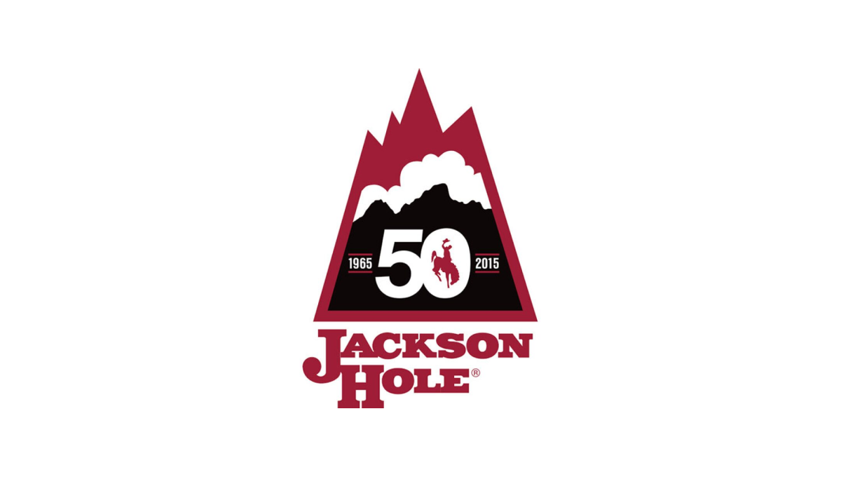
Jackson Hole Mountain Resort combined a shape found in one of their original logos with the layered red, white, and black colors found in their current logo to create a lockup that nearly merges the past with the present. They then the number 50 in the center of the large, black portion at the bottom of this mark to wrap up this strong, meaningful mark.
More Details →Disability Wales 50th Anniversary Logo
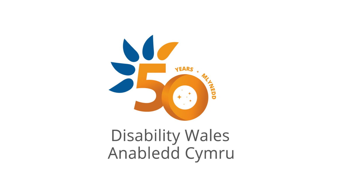
Diability Wales original logo is almost identical to this minus the number 50 in the center. Using orange for the number helps it stand out from the original curved, blue feather design and gives the logo a nice solid anchor in the center to keep things balanced. This similarity in size and shape also makes this logo easy to swap with the original logo in marketing and other designs.
More Details →Canton Youth Hockey 50th Anniversary Logo
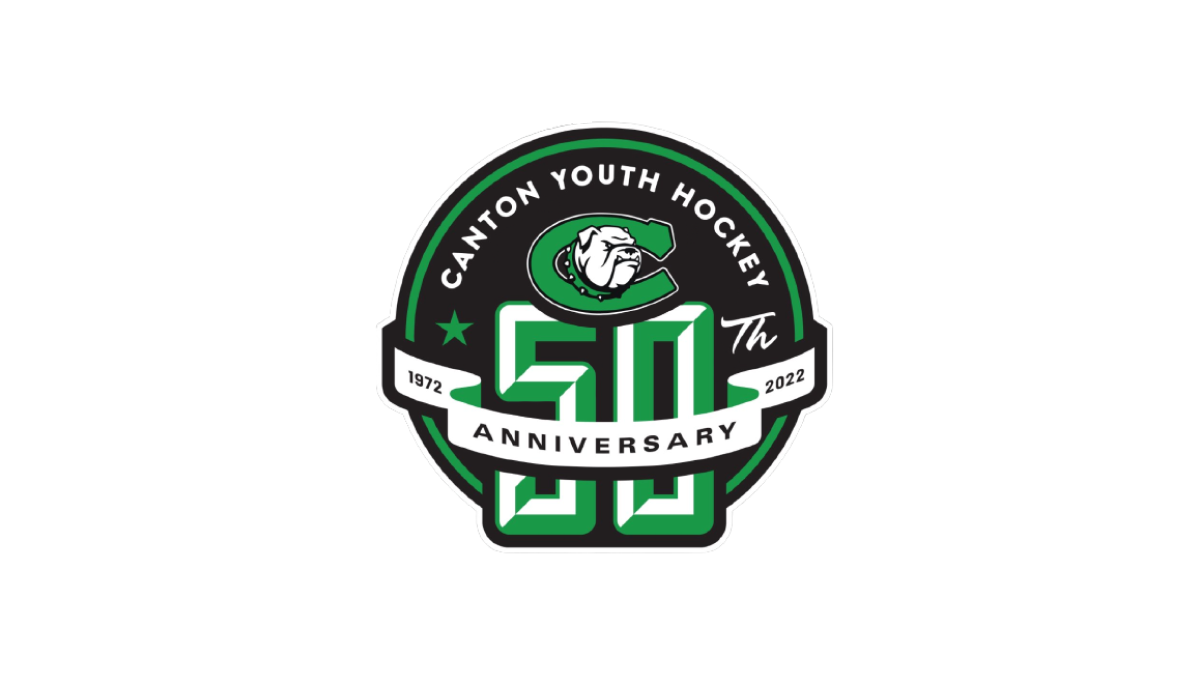
With the classic badge-style design that is so popular with sports anniversary logos, this logo places a large number 50 on a round, black background that also contains the name and "th" fo complete the reference to the year. Above that, a clean ribbon wraps the number 50 to hold the word "anniversary" and years of their operation.
More Details →Canadian Tire Motorsports Park 50th Anniversary Logo
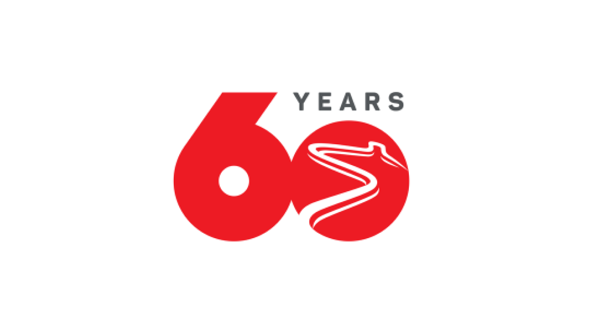
Simplicity is the theme of this number-focused anniversary logo. With the brand's bold, red color at the heart and the number 60 representing the bulk of the design's footprint, by shrinking the number zero to make room for the word "years" and adding a racetrack shape into that same zero, they have a classy, clean logo that checked all the boxes they needed.
More Details →Amstrong Air & Space Museum 50th Anniversary Logo

This badge-style logo features a prominent number wrapped in imagery and colors that align with the airforce, space, etc. theme that the museum - named after Neil Armstrong - is known for. A wrapped ribber contains the years of operation with an off-white background so set it apart from any white backgrounds it's used on.
More Details →