Pink Anniversary Logos
Barbie 50th Anniversary Logo
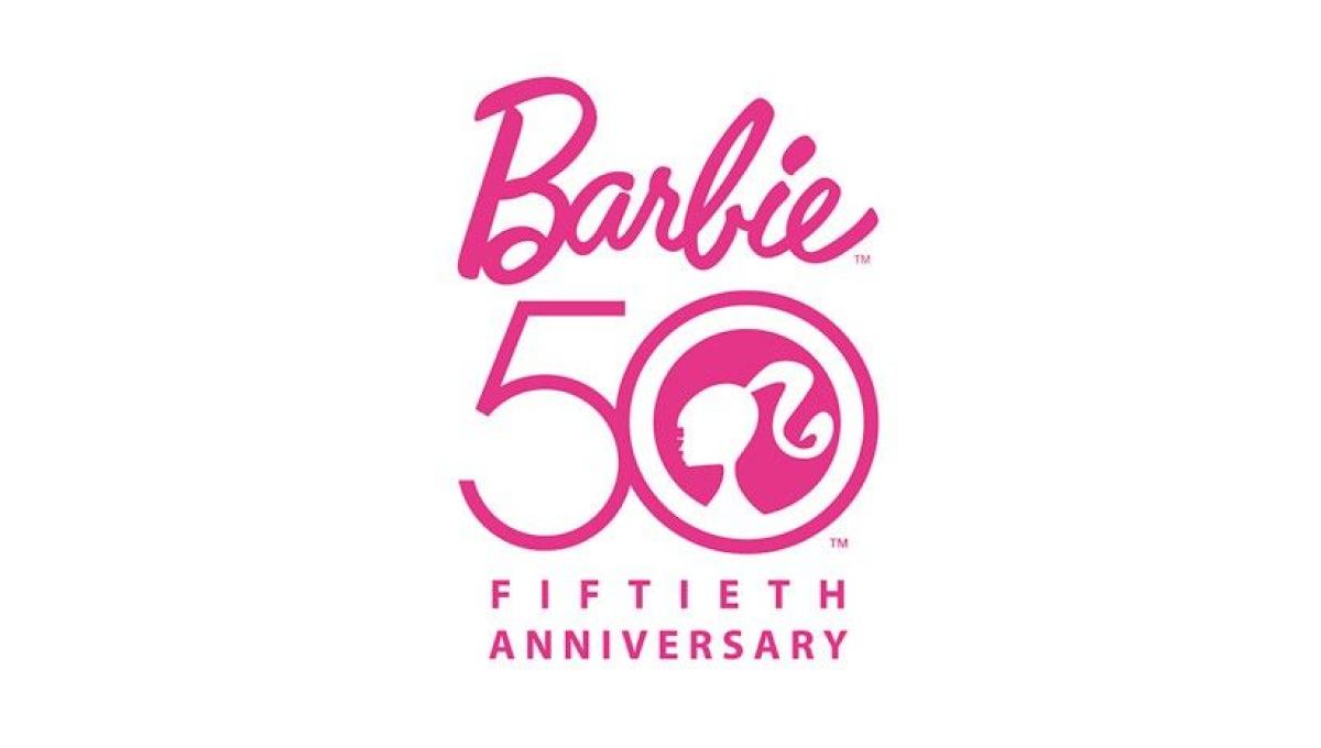
There's only one color to use when celebrating Barbie's anniversary and they started with that as an instantly recognizable foundation for this mark. With the traditional logo above, Barbie's famous ponytail inside the zero of a large number 50, and the usual additional text to commeration the occasion below, this logo combined recognizable elements with a clean design.
More Details →Attractions Ontario 40th Anniversary Logo
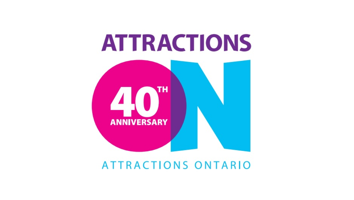
If you've visited a rest area in Ontario you've probably seen their simple logo that features an overlapping O and N. Given the large empty space that already existed in the first letter of their name, they simply placed text to signify their anniversary inside of that O and called it good. The original brand remains but the celebration is clearly visible.
More Details →Nicklaus Children's Hospital 70th Anniversary Logo
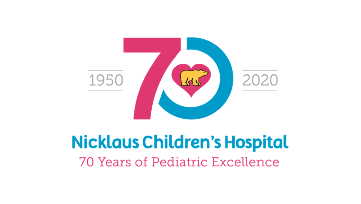
This hospital has a very recognizable logo with a golden bear (Jack Nicklaus' famous nickname and mark) inside a pink heart. By using that mark as the focal point and building a blue and pink number 70 around it, this created a tie back to the traditional brand and gave them space to add wording below and to the sides of the logo, clarifying the name for those not as familiar with the original.
More Details →