Restaurant Anniversary Logos
Wolf Bay 50th Anniversary Logo
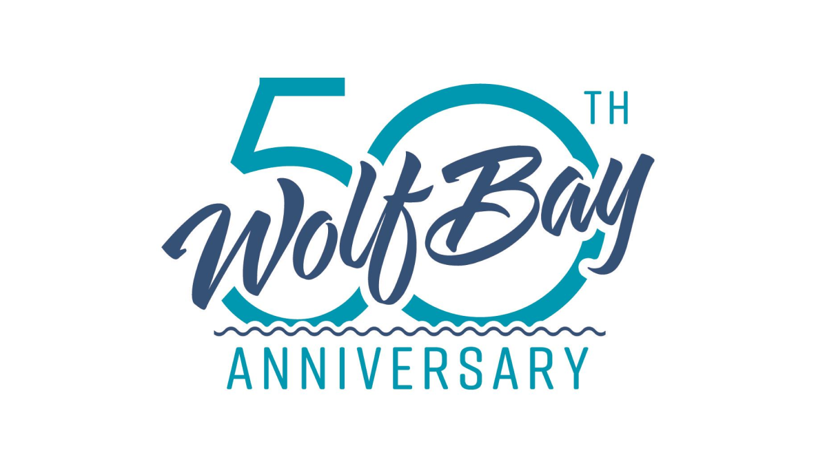
This logo may be simple, but it's also really clean and effective without having too many parts. A large number fifty sits behind with the traditional word mark of this restaurant cutting across at an angle with a little bit of padding around the edge to avoid bleeding. The word anniversary at the bottom clarifies the reason for the design and adds a bit of balance.
More Details →Carl's Jr. 80th Anniversary Logo
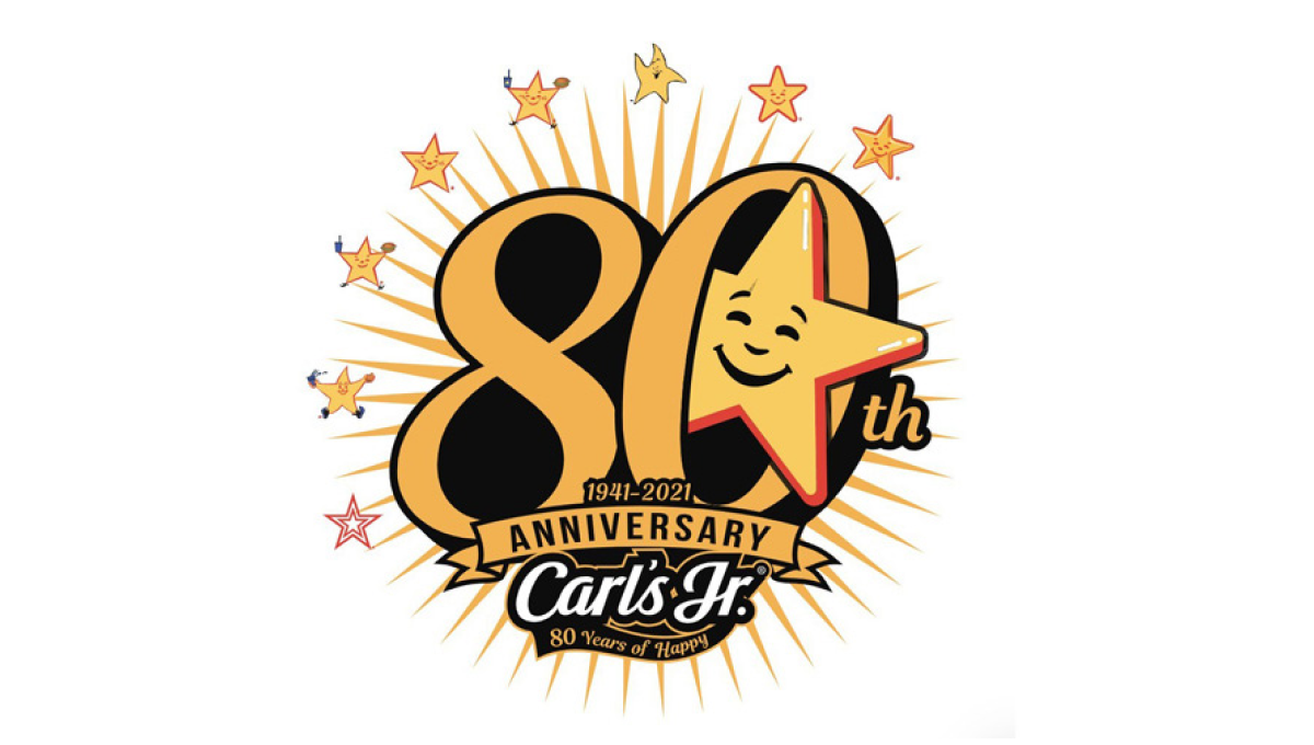
Using the chain's classic colors and fonts, this logo starts with a large number 80 in the center. Around the outside sit 8 of the famous stars the brand is known for with a larger version of that well-known shape peeking out from the zero. At the bottom sits their traditional logo to create a fun, creative logo that's also neatly on brand and easy to tie back to the original.
More Details →Golden Corral 50th Anniversary Logo
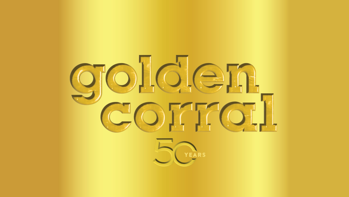
When your logo is already gold, why not build on that for your 50th anniversary? Golden Corral kept it simple and inset their mark and a number 50 into a reflective gold background to create a sort of etched or stamped feeling to their design. The result can be hard to see in some lockups, but was a nice, on-brand way to celebrate the occasion.
More Details →Wendy's 50th Anniversary Logo
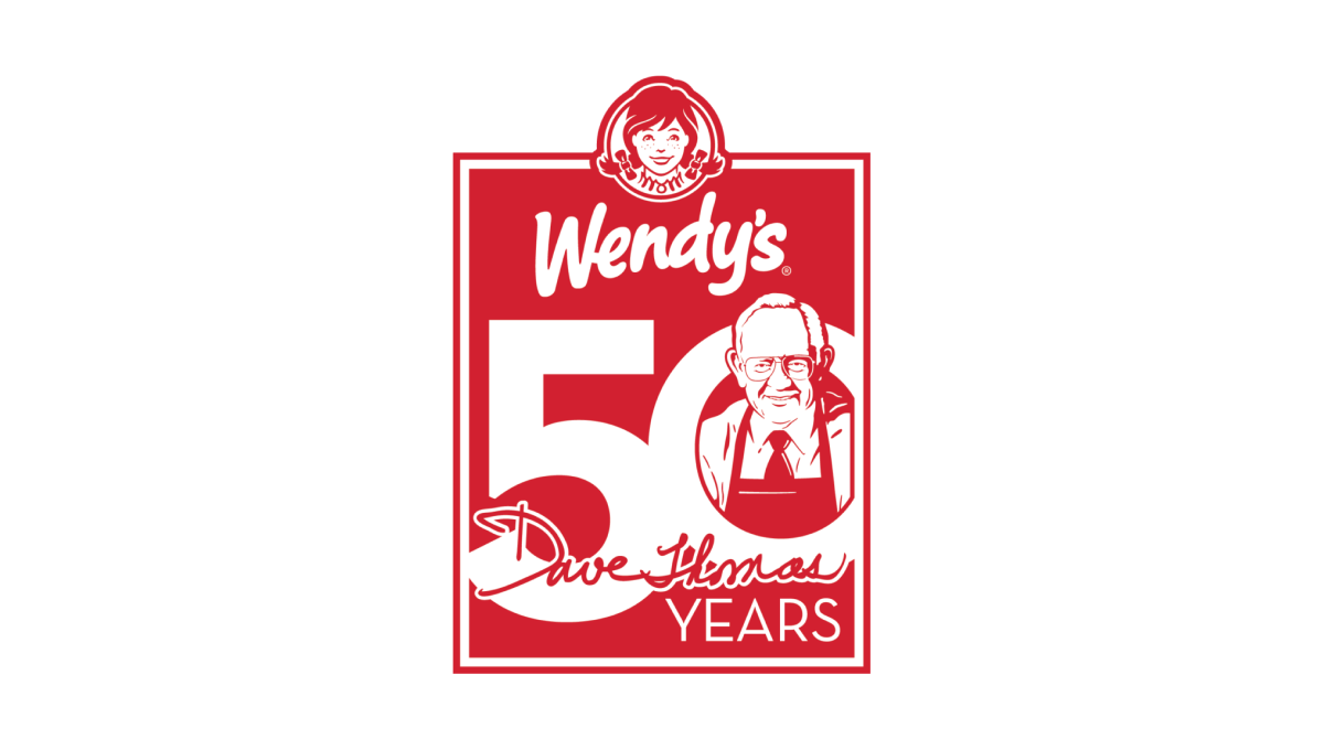
Wendy's original square logo shape was the inspiration for this 50th anniversary mark. All in their traditional brand red, a large number 50 sits just below the brand's current logo to fill out the shape. Inside the O is an illustration of the chain's original founder, Dave Thomas, to neatly tie the beginnings of this company's story to their present.
More Details →Roy Rogers 50th Anniversary Logo
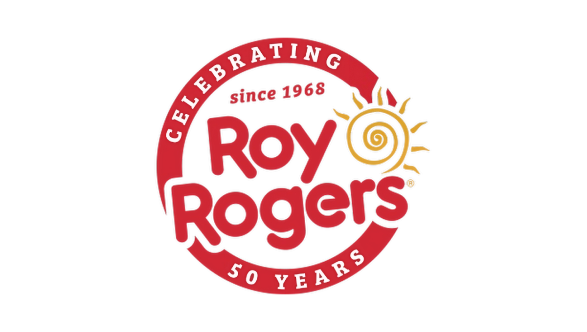
This restaurant chain started with a classic round seal-type shape with a thick border in their classic brand red color. That thick rim held text outlining the reason for their celebration. Then inside that circle and slightly overlapping the edges was placed their original logo with the same slight angle. The result combined a shape that supported the anniversary message with the logo that supports easy brand recognition.
More Details →KFC Japan 50th Anniversary Logo
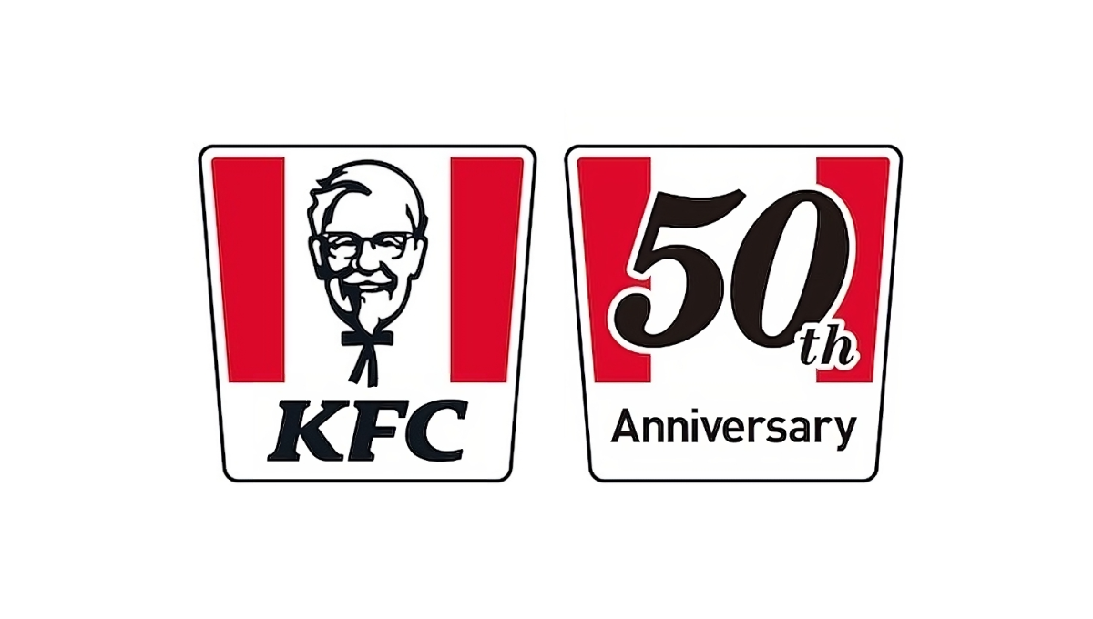
When KFC celebrated 50 years of operations in Japan, they had a powerful, easily-recognized shape at their disposal: the almost-square bucket with red stripes. Because it was so recognizable, they were able to simply overlay the year of their anniversary on top of that shape in a font similar to the KFC name and quickly have a logo that was simple, on-brand, and easy to tie back to the original mark.
More Details →