Church Anniversary Logos
St Gabriel Catholic Church 250th Anniversary Logo

This clean logo features a three dimensional silhouette of this church's bell tower placed above a large number 250 below. Using only the traditional blue color of the church and their name at the bottom, this logo is as simple as it is effective and creates an elegant design that would look great in many different applications.
More Details →St Joseph School 90th Anniversary Logo
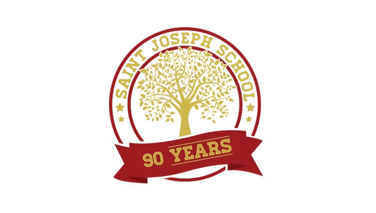
Using a classic circular shape with two rings creating space for words to wrap around the edge, this logo places the name of the school in that space to make it easy to recognize who is celebrating this anniversaty. Inside sits the school tree mark in the brand's traditional gold color. At the bottom is a simple red ribbon holding a recognition of how many years the school has been in operation.
More Details →St Bernard Catholic Church 175th Anniversary Logo
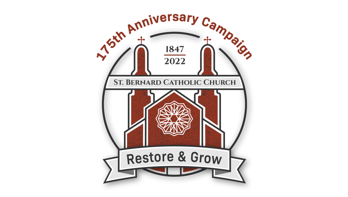
Featuring an illustration of the church's famous architecture in red, this art is wrapped in a circle to hold the bulk of the design. Above the circle sits the name of the church, at the bottom of the circle sits the church's tagline, and between the spires of the building sit the years of operation. Finally, just in front of those spires sits the name of the church.
More Details →Cedar Hills Community Church 60th Anniversary Logo
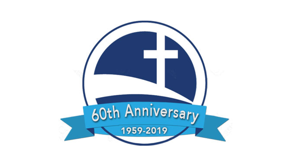
Some logos spend a lot of time creating space for text and names, but this logo keeps it super simple by simply placing the mark for the church - a cross on a sloping curve - inside of a circle. Then in front of that circle placing a blue ribbon that holds the reason for the celebratio and the years of operation.
More Details →Gateway Church 15th Anniversary Logo
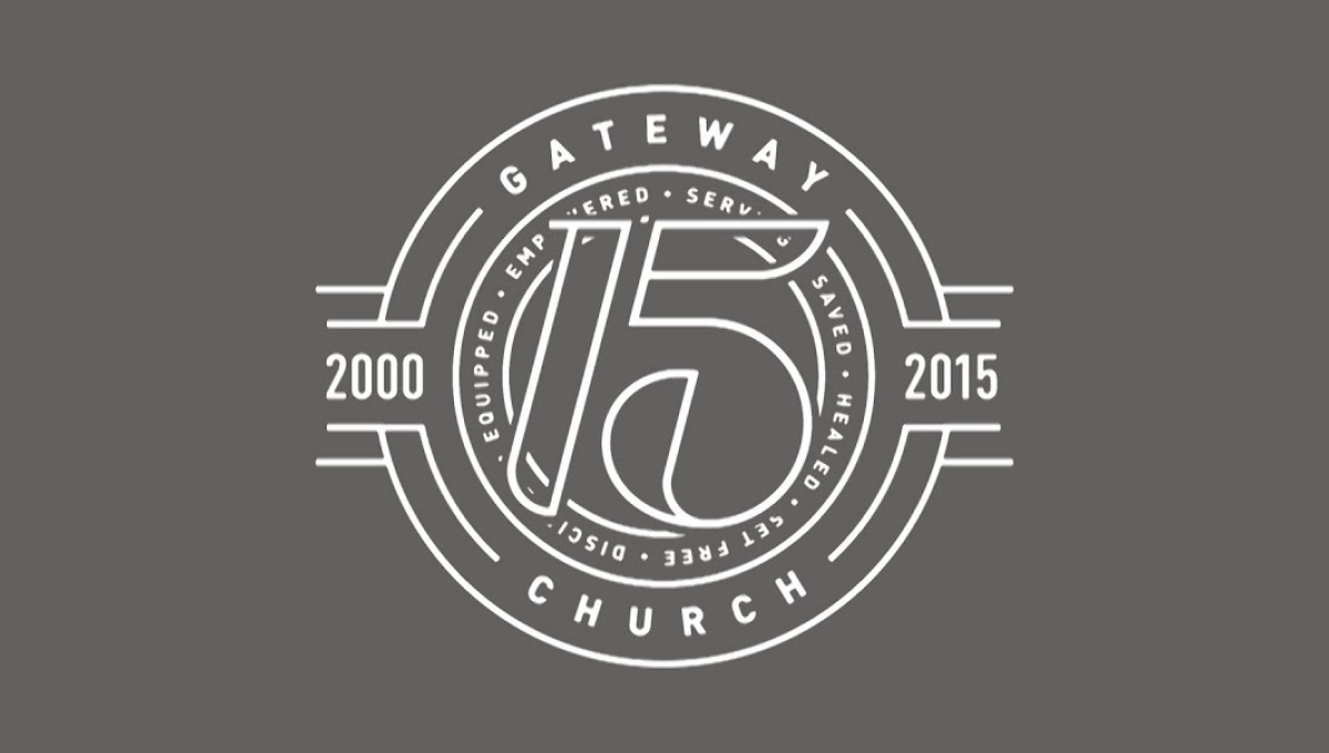
The clean, line-art logo starts with a series of white circles to create two rings where they place the name of the church and a list of the church's values. In front of that sits a large, stylized number 15. On either side are placed the years of operations with more lines connecting the horizontal years to the circular shape of the rest of the logo.
More Details →First Bible Baptist Church 25th Anniversary Logo
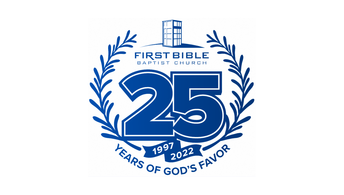
With laurel leaves curing upward to form the shape and the church's traditional logo at the top, this logo then places a large number 25 in the center to add balance. The number also features a solid shadow and outline for depth plus a ribbon below holding their years of operation. Below that, the church's tagline sits to round out this logo.
More Details →First Baptist Church of Kenmore 100th Anniversary Logo
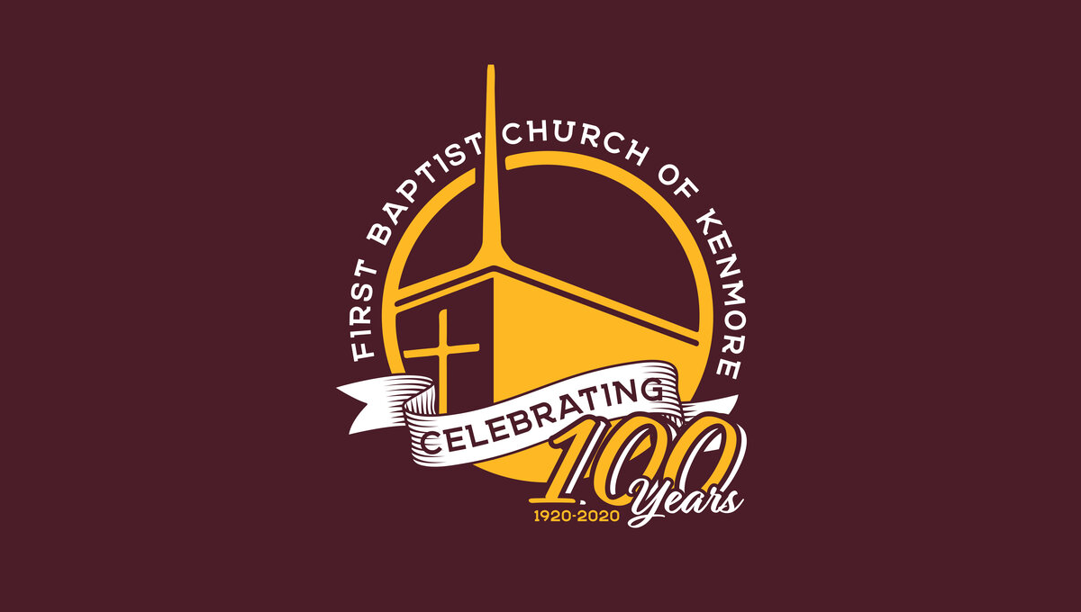
This three-dimensional logo is designed for a dark red background and uses a few classic elements to create a clean logo. First, a gold circle with a thin rim creates the shape with the name of the church arcing around the outside of the circle. Inside sits an illustration of their church with a bit of perspective to add depth. Finally a white ribbon holds the word "celebrating" with the anniversary and years sitting just in front of and below that ribbon.
More Details →Abiding Word Lutheran Church 50th Anniversary Logo
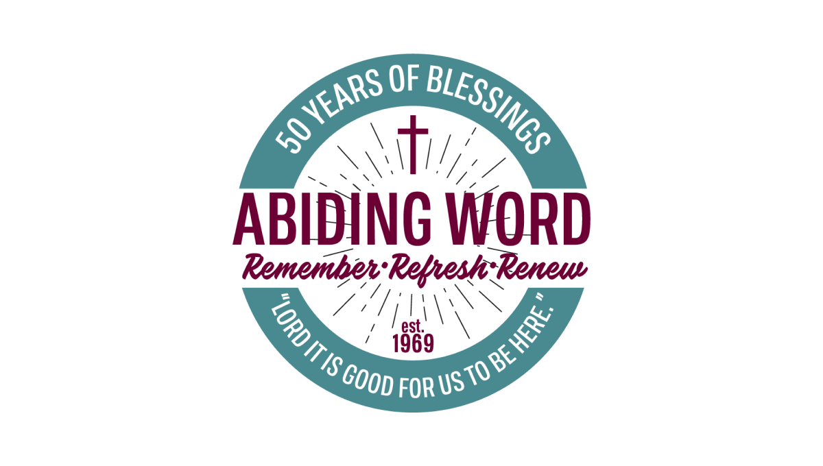
Starting with a thick-bordered circle with white in the center and teal on the rim, this logo places the church's tagline and anniversary year in curved letters on this rim. Inside the center sits the name of the church and another tagline for the congregration. Above and below are lines eminating outward with a cross above and "est 1969" block of text below to add additional color and balance.
More Details →United Reformed Church 50th Anniversary Logo
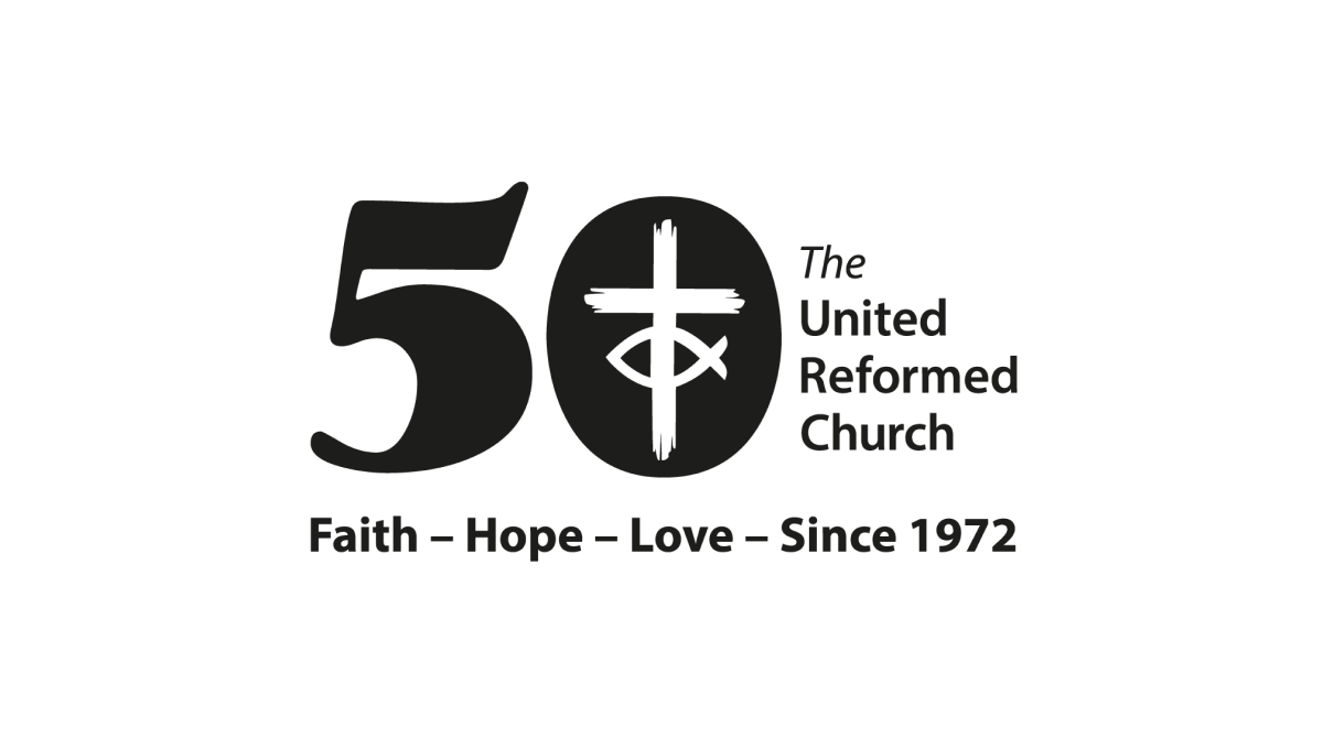
By placing a large, block number 50 to the side of the traditional logo, the church was able to simply invert the color of their mark and place it inside the zero to create a simple but effective mark that kept the familiarity of the original logo while celebrating their milestone with a unique separate brand.
More Details →