Game Anniversary Logos
Mattel 80th Anniversary Logo
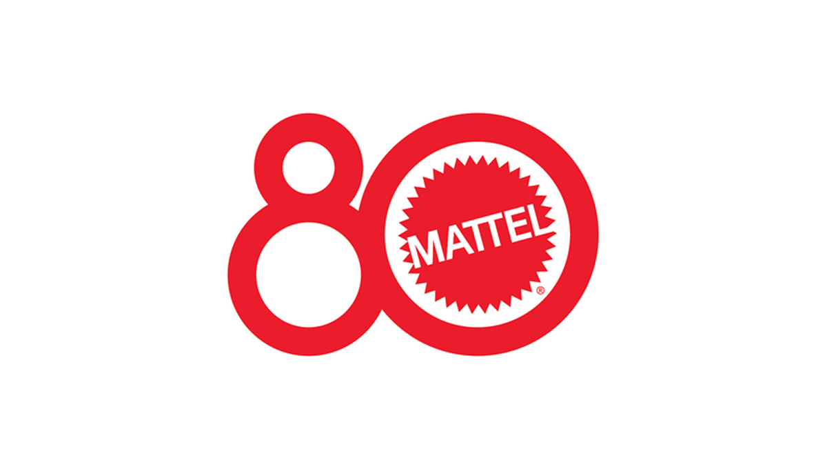
The anniversary logo shows a big, red number 80 where the zero is a bold circle around a familiar brand mark. The brand name sits in the center of that circle in plain, strong letters. The style feels bright and simple, with smooth lines and a clean look that catches your eye. It uses one color and a clear shape to hint at a long history and a big milestone moment.
More Details →Dungeons and Dragons 50th Anniversary Logo

The Dungeons & Dragons 50th Anniversary logo showcases a dynamic fusion of fantasy and modern design. The number 50 is designed in a brilliant gold font, with a head of a dragon in the center of the 0. The accompanying "Dungeons & Dragons" text is presented in their signature font, balancing tradition with a forward-looking approach. This emblem effectively honors the game's storied past while signaling its continued evolution.
More Details →Rubik's 50th Anniversary Logo

When your brand is one built around a toy (even a challenging one), it's not surprising to see so much color and a playful vibe in their original logo. So when Rubik's celebrated an anniversary they took that same colorful angle, turned their normally 3D shape into a 2D figure to better stand in place of the number zero, and added a number 5. That's all they need for a simple, effective mark.
More Details →Scratch 15th Anniversary Logo
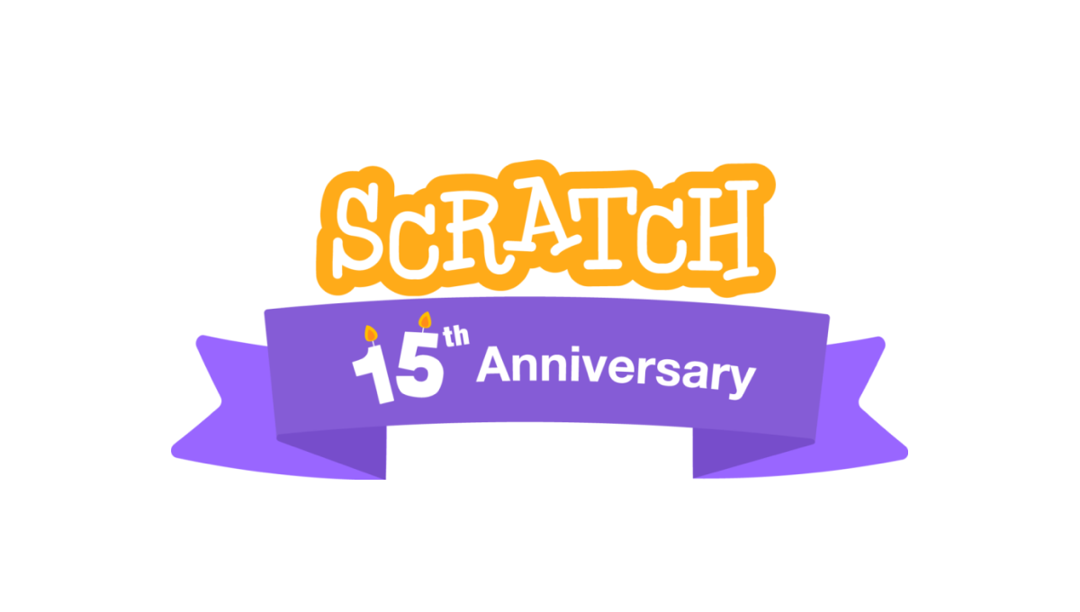
A coding platform that's designed primarily for kids, Scratch celebrated theira nniversary by adding a playful color combination to their altreay playful logo as a base. This color was used in a classic ribbon that wrapped around the logo and held a simple banner indicating the reason for celebration. A simple, but effective design.
More Details →Pokemon 25th Anniversary Logo
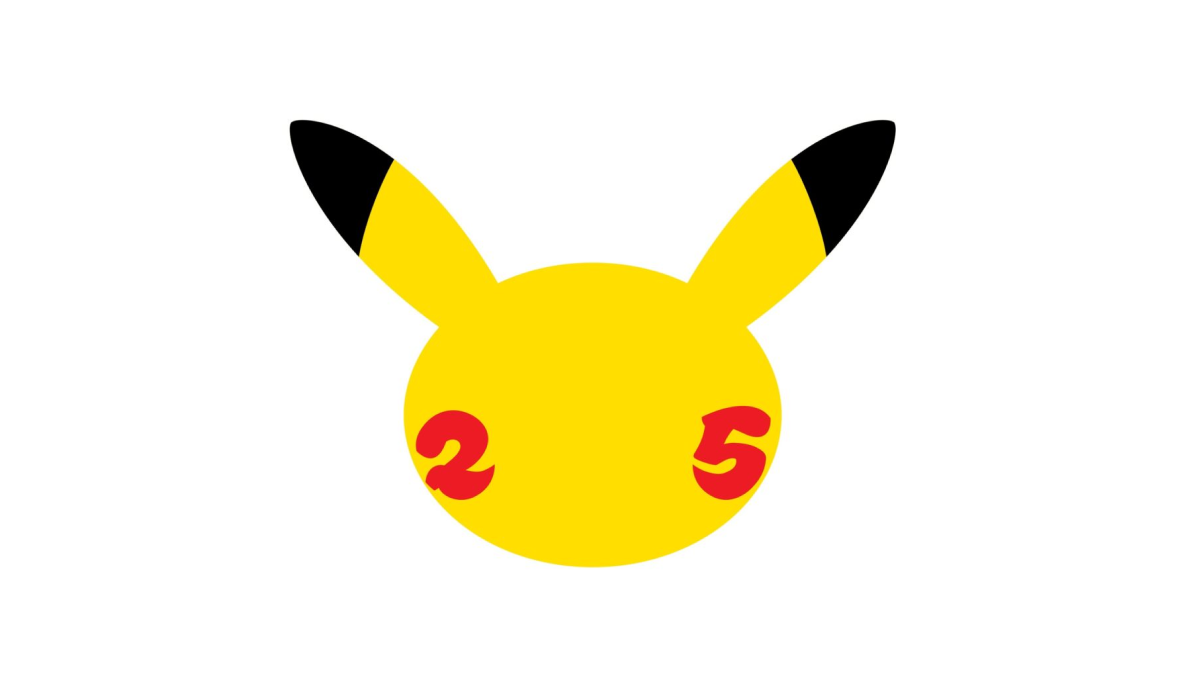
When you're a brand that's as popular as Pokemon, it doesn't take much more than replacing the eys of one of your most famous characters with simple, round representations of the numbers for the anniversary they're celebrating. Folks like me who don't know much about Pokemon may not recognize it, but people like my daughter who love the brand will know instantly what it represents.
More Details →Matchbox 70th Anniversary Logo
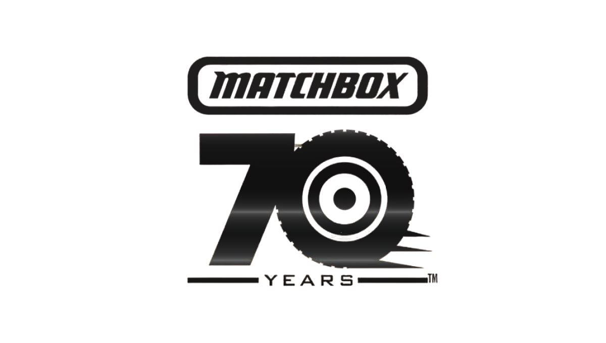
This simple logo from Matchbox starts with the classic logo at the top and a block number 70 below that. With a theme around cars, the clever design concept of using the number zero as a wheel and a few streaks coming off the right side to convey motion created a strong mark that was easy to tie back to the original shape. The square-ish shape also made it easy to use on social media.
More Details →Barbie 50th Anniversary Logo
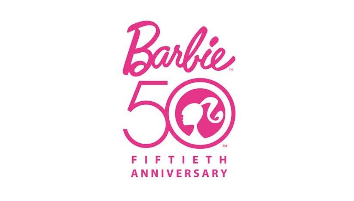
There's only one color to use when celebrating Barbie's anniversary and they started with that as an instantly recognizable foundation for this mark. With the traditional logo above, Barbie's famous ponytail inside the zero of a large number 50, and the usual additional text to commeration the occasion below, this logo combined recognizable elements with a clean design.
More Details →Lego Games 25th Anniversary Logo
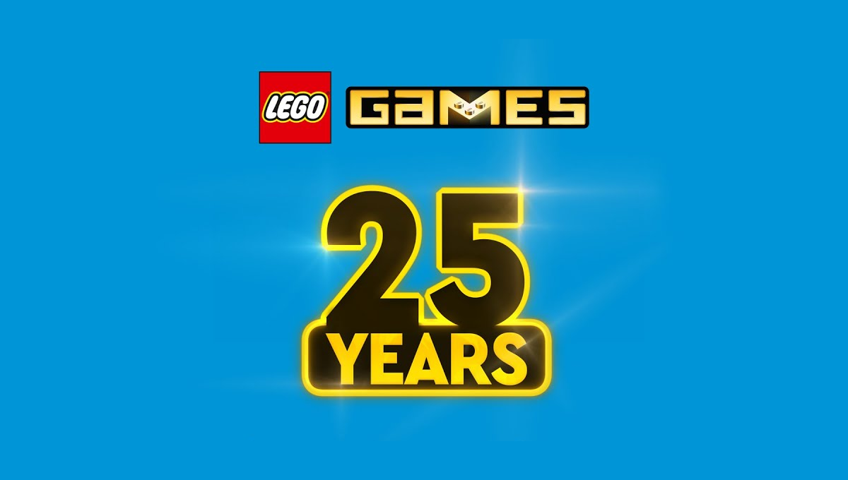
In another example of keeping the original logo and adding a number mark beside it, this design took a slightly different approach that the usual. Instead of placing these side-by-side, they stacked them. The number mark uses similar yellow and black colors of the original mark and a little bit of sparkle to help it stand out and keep the fun vibe of the original.
More Details →Lego 90th Anniversary Logo
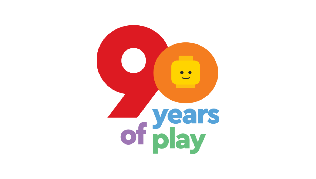
As a toy company, Lego started with mark with a playful, large number 90 in the primary red and yellow colors used in their traditional logo. Below that number are the words "years of play" in blue, violet, and green to continue the playful theme. Finally, the head of the company's famous mini figure toys is included in the middle of the zero to tie this design back to the Lego brand.
More Details →Monopoly 80th Anniversary Logo
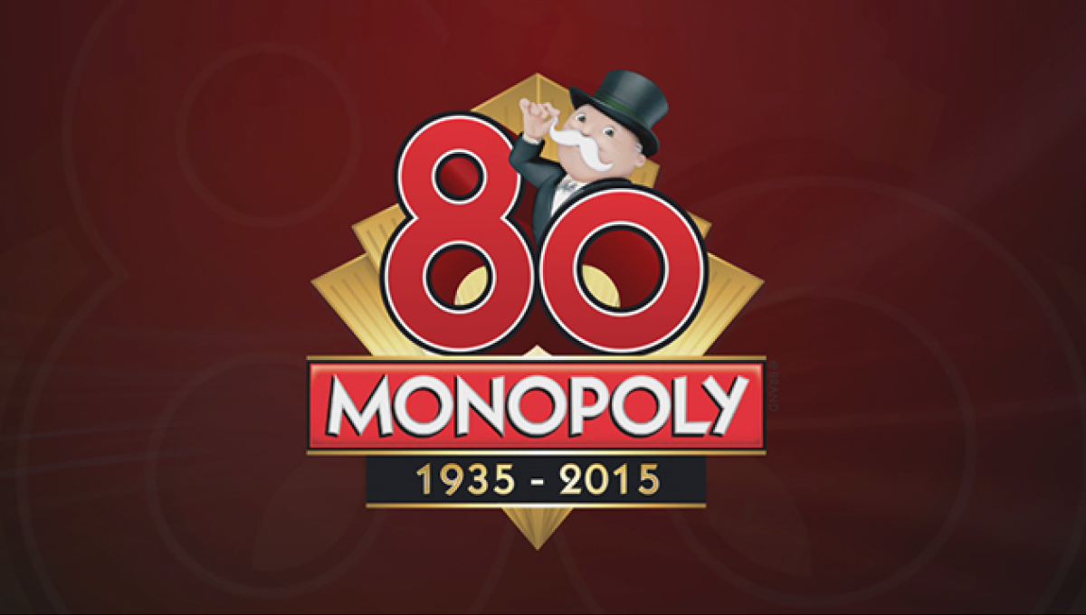
Monopoly applied classic board game design to this anniversary logo that features the traditional, rectangular logo for the game at the bottom of a diamond with a large, three-dimensional number 80 sitting above. Below the years of the game's existence are included with simple, gold lines to keep a sharp look that balances the rest of the design.
More Details →Super Mario Bros. 35th Anniversary Logo
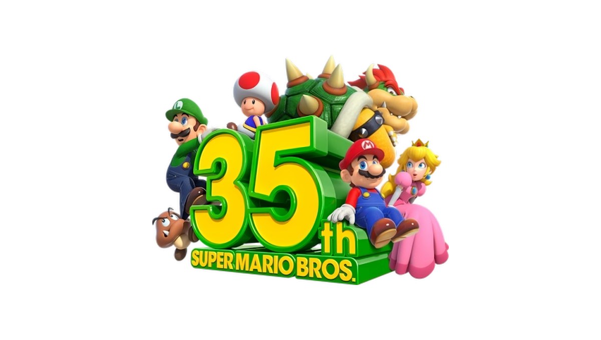
Some anniversary logos are simple, clean shapes that can be used in a variety of situations. This may not be one of them. A three dimensional block shape of the anniversary sits in the center facing away and to the left. Surround the number are similarly three dimensional graphics of many of the series' most popular characters.
More Details →Sega 60th Anniversary Logo
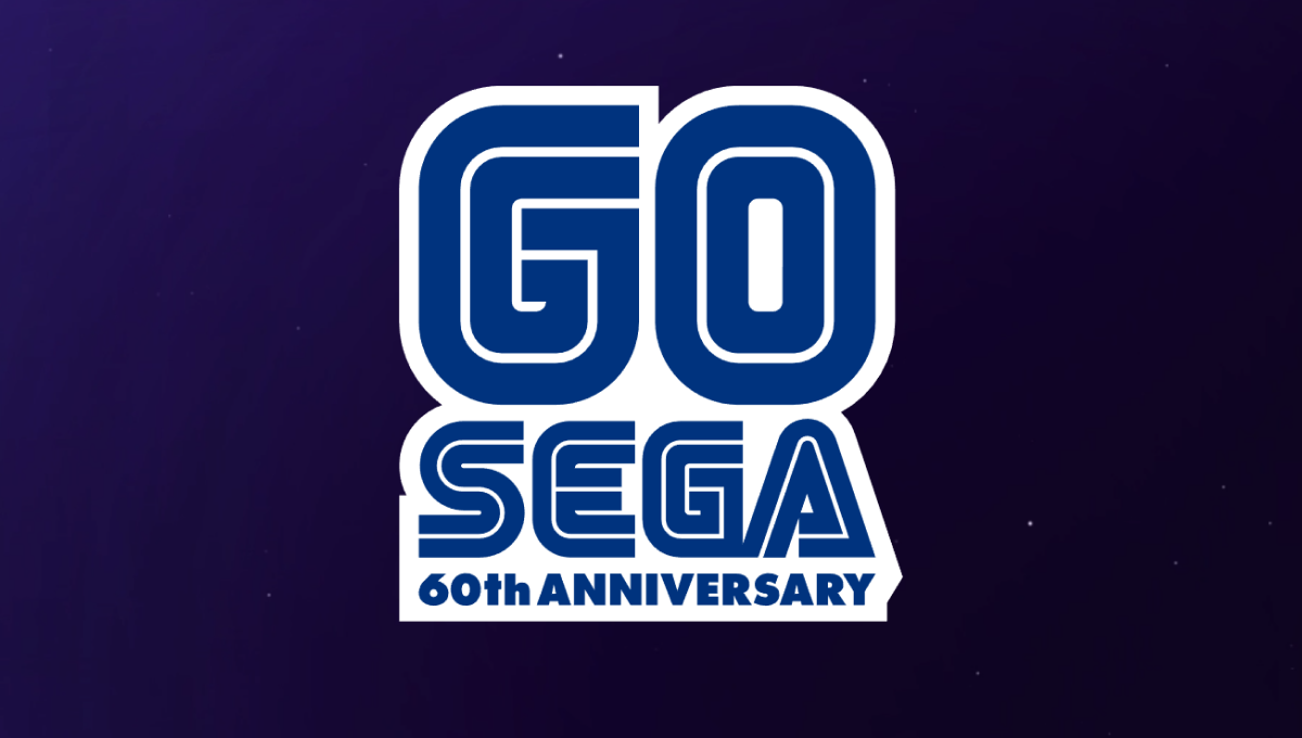
One of the most well-known aspects of the Sega brand are the block letters with a thin, inner-line creating a unique typeface that becomes even more easily recognized in their classic blue. In this case, they simple placed a large number 60 above their traditional word mark and the phrase "60th anniversary" below in the same typeface and color to create a nice mark that would work well in a variety of situations.
More Details →Sonic the Hedgehog 30th Anniversary Logo
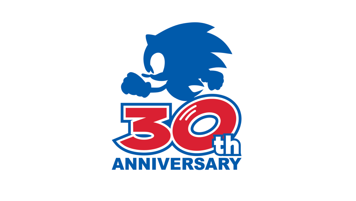
Sonic the Hedgehog's 30th anniversary logo starts with a large number 30 in red. With a white outline on that number followed by a blue outline, they gave the number added weight and a color that could blend neatly into a blue silhouette of their famous character above. At the bottom, the word "anniversary" in that same blue clarifies the meaning of the number and balances the red with blue above and below.
More Details →Atari 50th Anniversary Logo
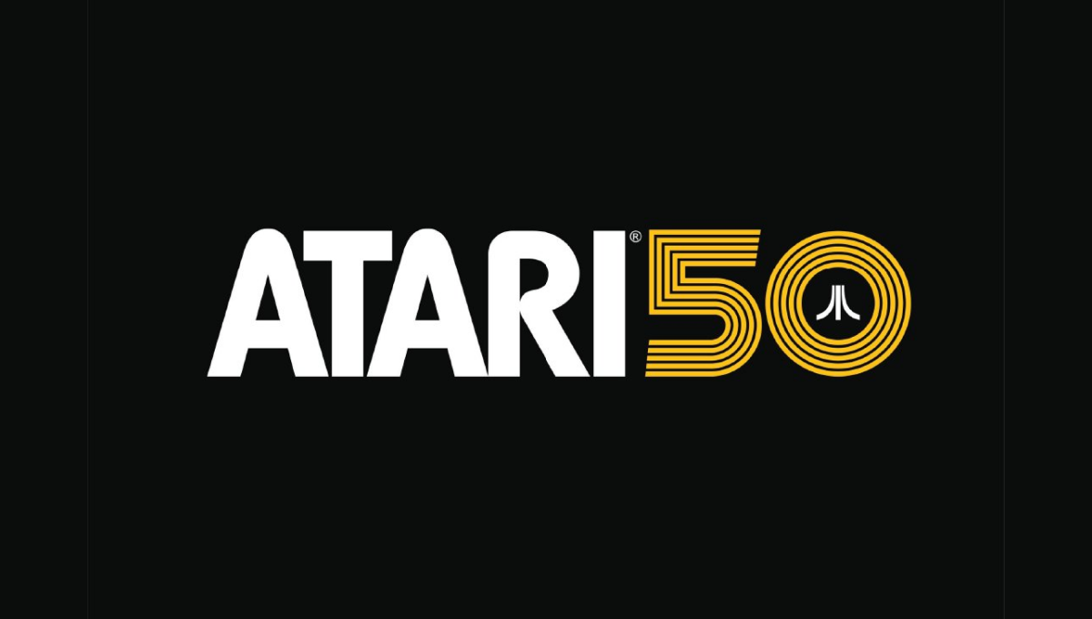
As one of the truly classic brands of early gaming and technology, Atari combined their classic word mark with the three diverging lines in this lockup that's designed for a dark, black background. A line-art version of the number 50 holds the mark in the 0 with a clean gold color providing both contrast with the white but easy readability on the black.
More Details →Lego Star Wars 20th Anniversary Logo

Lego Star Wars created an anniversary logo that featured mini figure versions of popular characters with a round, badge-style design. A reflective silver color and a bit of addition for light sabers to extend above the circle and a box to hold the dates below create a great design that unique and features both a recognizable number and characters.
More Details →Minecraft 10th Anniversary Logo
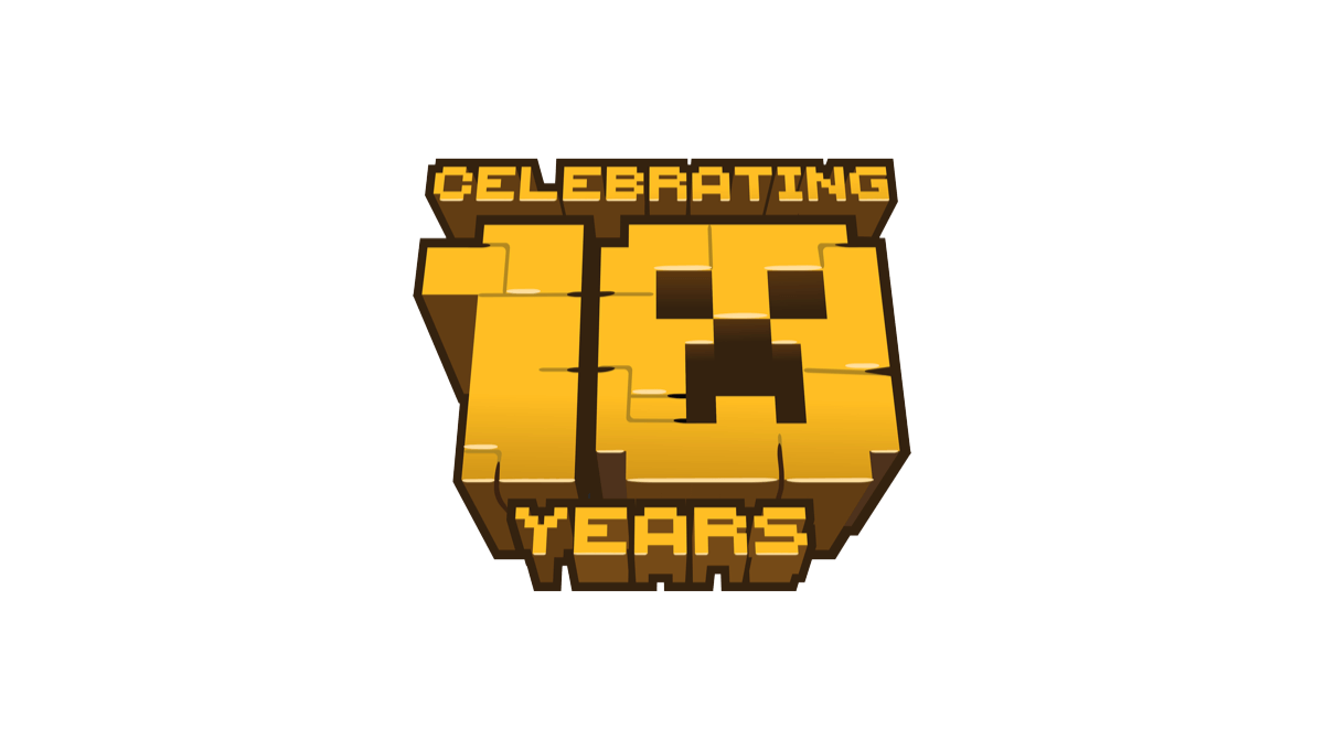
When Minecraft celebrate 10 years of bringing happiness to millions (my children included), they stuck with their block-world design style and created a logo with that featured the face of a popular character. A bold, gold shape with the name above and years below made for a really cool, on-brand concept.
More Details →