Orange Anniversary Logos
Hampton Roads Moving and Storage 35th Anniversary Logo
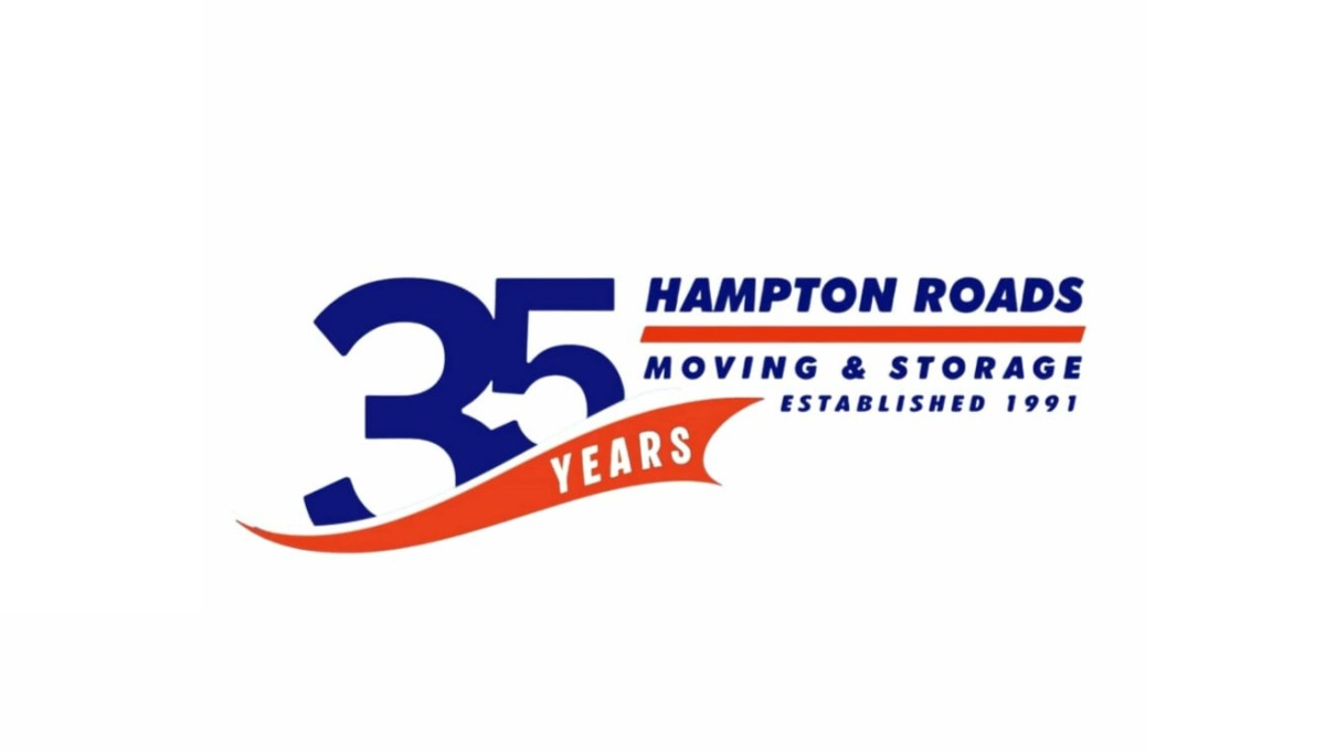
This anniversary logo uses a bold and simple layout with a large “35” as the main focus. The design combines dark blue and bright orange colors to create a strong but friendly look. Curved shapes and flowing lines give it a sense of movement and energy, while the text is clean and easy to read. Smaller details, like the establishment year and anniversary wording, help suggest experience and long-term service without making the design feel too busy or overly formal.
More Details →Scott & Company 30th Anniversary Logo
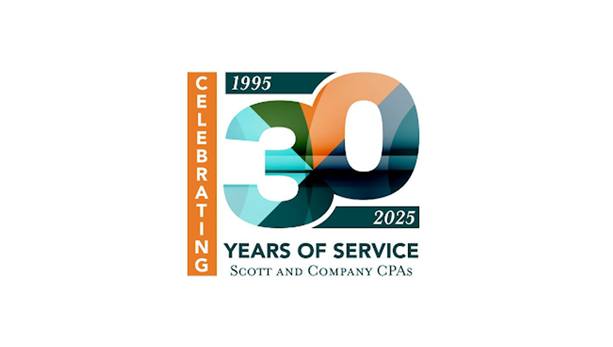
This anniversary logo features a bold “30” design with layered geometric shapes and soft gradient colors that create a modern and professional appearance. The mix of teal, orange, and dark blue tones gives the logo a balanced and polished feel. Simple date details and clean typography help highlight the milestone while keeping the design easy to read. Overall, the logo has a corporate yet celebratory style that feels contemporary, recognizable, and suitable for long-term brand recognition.
More Details →Big Cypress National Preserve 50th Anniversary Logo

The National Park Service has done a number of anniversary logos over the years and I love how they let the colors and styles of the area influence each one instead of a more copy and paste approach. This is another examples of that with unique fonts, bright colors, and imagery that have a different vibe than other logos but come together to create yet another tidy design that can be used in many situations.
More Details →Memorial Stadium 100th Anniversary Logo

Older stadiums and buildings often have an exterior that becomes part of the venue's brand. This stadium is no exception and the designers did a fantastic job of combining the architecural elements that make this stadium famous with the traditional crest-style designs that are famous in sports marketing. The result does a great job of conveying the anniversary, ties perfectly back to the stadium itself, and also sends strong singals to reinforce the industry they're in.
More Details →iSchool at Illinois 130th Anniversary Logo

This logo is a great example of the fact that not all designs have to be a...well...logo. If you want to celebrate your anniversary but don't have a logo of your own to build on, you can do what this organization did and just create a simple graphic with words to describe your group. In this case, a large number 130 with arcing lines above and the name of their school below. Simple and effective, even if it may not exactly be a logo.
More Details →Warren Miller 75th Anniversary Logo

When you make ski movies and are also celebrating an anniversary, why not merge the concept of cover art with the classic anniversary logo angle with art that includes a skier image behind but a large number 75 in front that bleeds into the edges. The original word mark sits inside the square to add a little balance a reminder about which company this design is tied to.
More Details →Encyclopaedia Britannica 250th Anniversary Logo

One of the most well-known brands in the world, Encyclopaedia Britannica's 250th anniversary logo features their classic thistle mark spread across three vertical book-spine rectangular shapes. In each of those shapes is a digit of their anniversary. Their name at the top and the word anniversary at the bottom lock up and balance this simple, clean design.
More Details →Scratch 15th Anniversary Logo
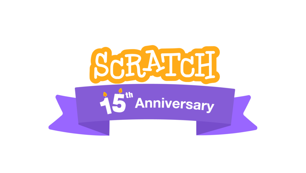
A coding platform that's designed primarily for kids, Scratch celebrated theira nniversary by adding a playful color combination to their altreay playful logo as a base. This color was used in a classic ribbon that wrapped around the logo and held a simple banner indicating the reason for celebration. A simple, but effective design.
More Details →New Gregory Gym 25th Anniversary Logo
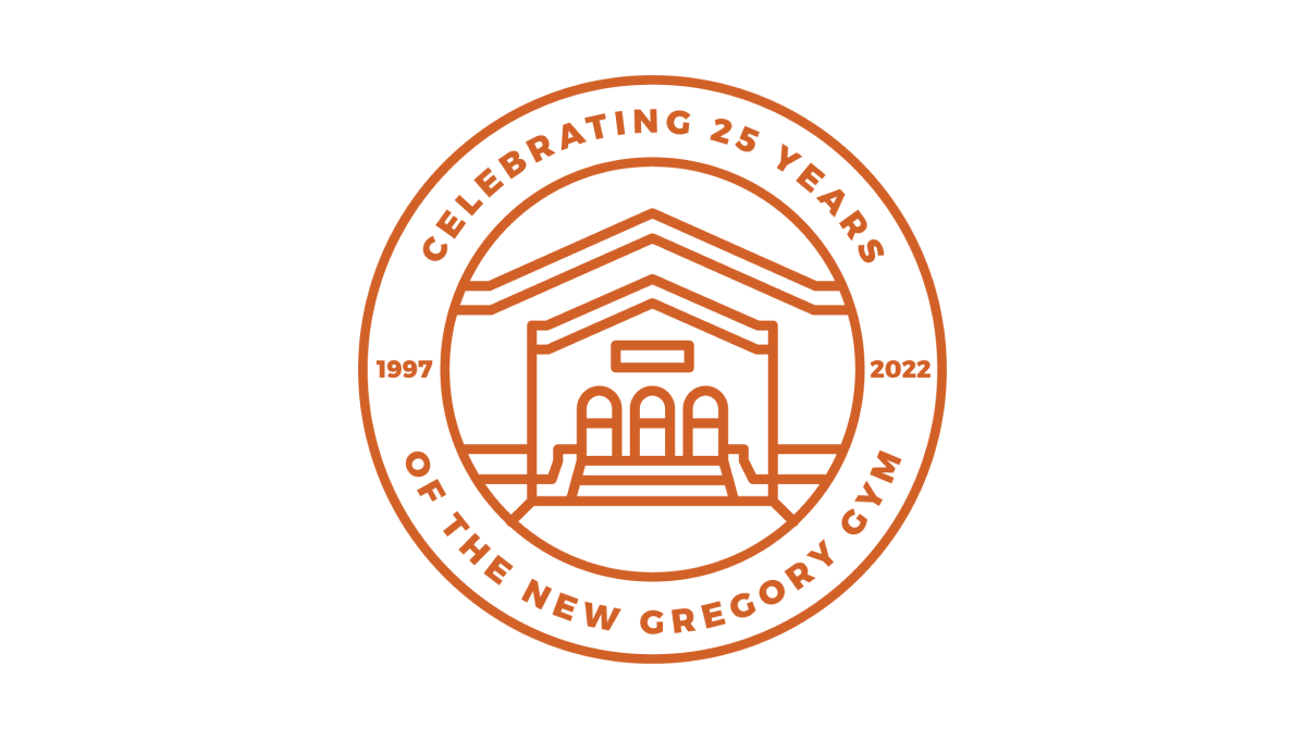
This beautifully simple line-art style logo combines a seal-style shape with two rings to hold the name of the organization and the anniversary details. In the center is a clean illustration of the front side of the building. Together, the design is not only a beautiful blend of a recognizable element of the brand with a unique design that elegently marks the anniversary.
More Details →Bull & Bush Brewery 50th Anniversary Logo
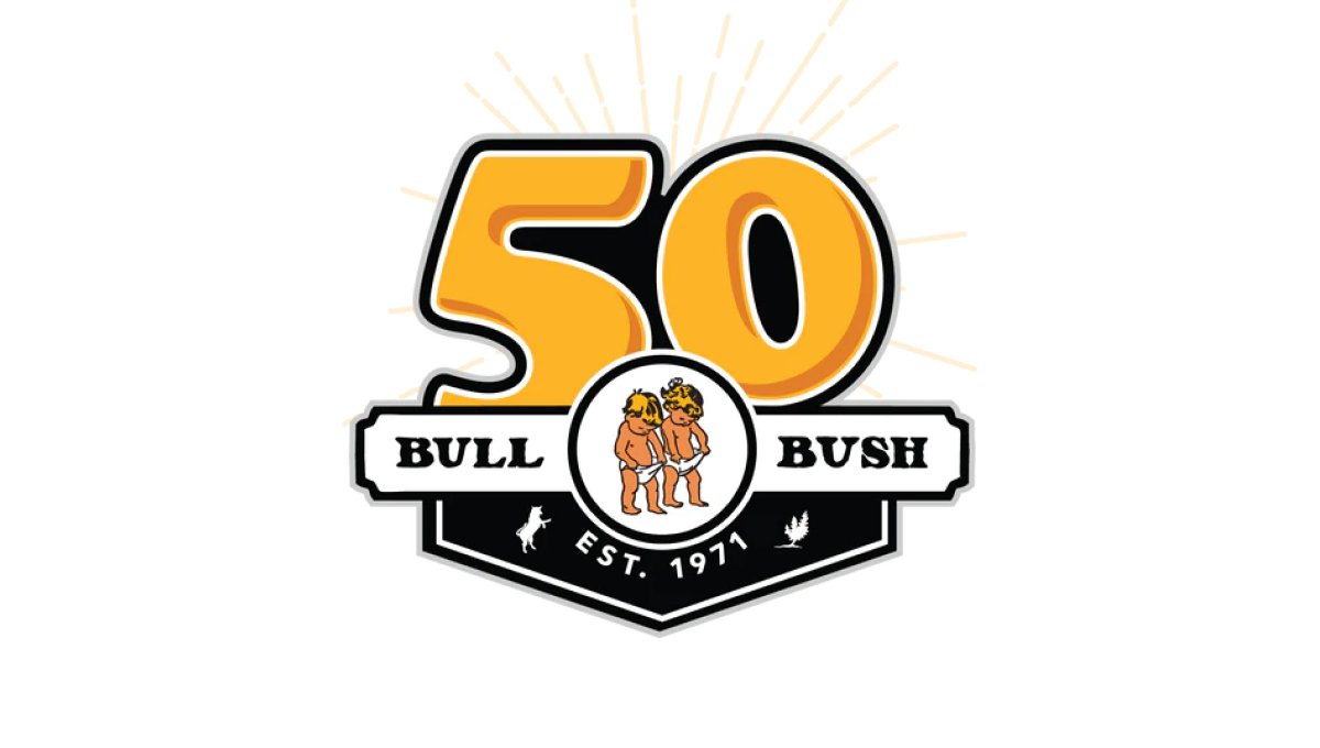
With the brewery's traditional logo held in an small oval, this logo builds behind that with a large, playful number 50 peeking up from behind to match the style and vibe of the traditional brand. To the side of the logo is a ribbon-style rectangle holding the name of the berwery with a label showing when the business was established filling the area below the logo.
More Details →Dust Bowl Brewing 10th Anniversary Logo
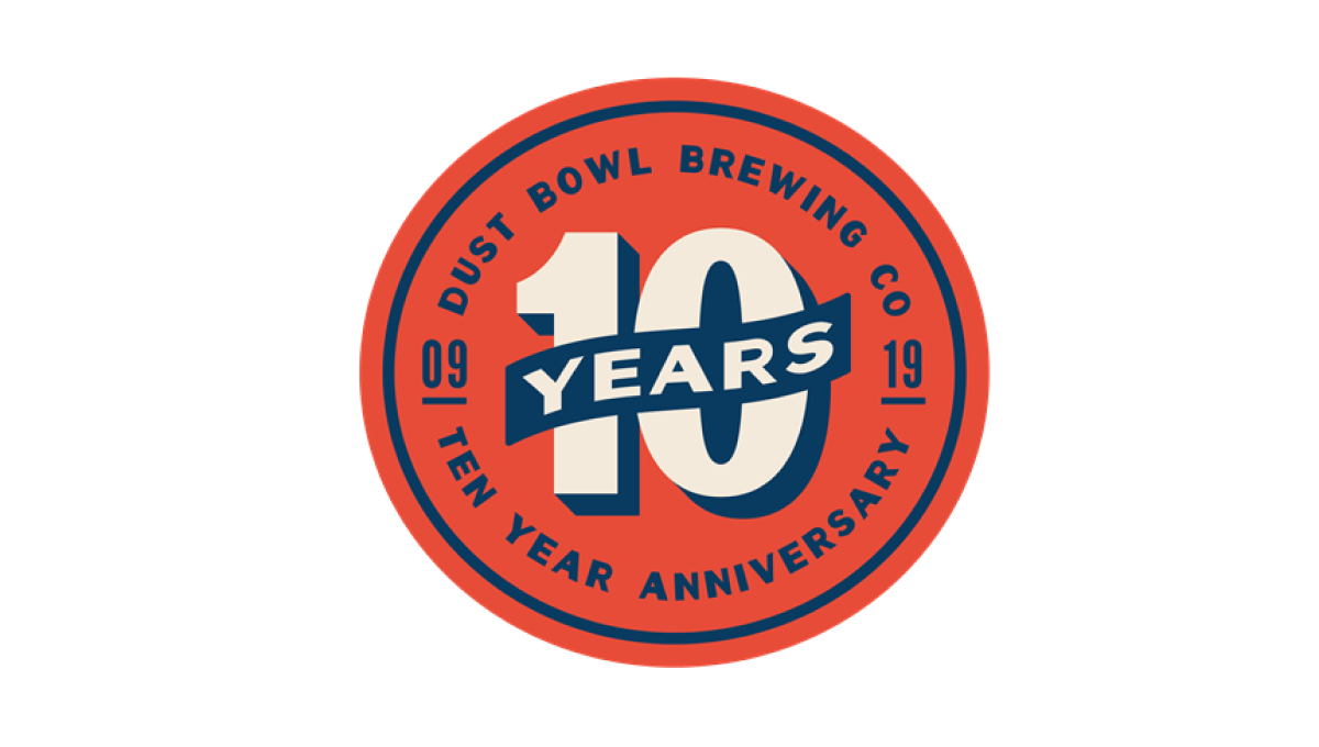
This retro-style logo uses the classic blue and orange colors famous in old-school newspaper and magazine ads. In the center of the circle is a large number 10 with a banner across holding the word "years". Around the outside of the circle is the name of the brewery and some wording to clarify the reason for celebration.
More Details →Stone Brewing 20th Anniversary Logo
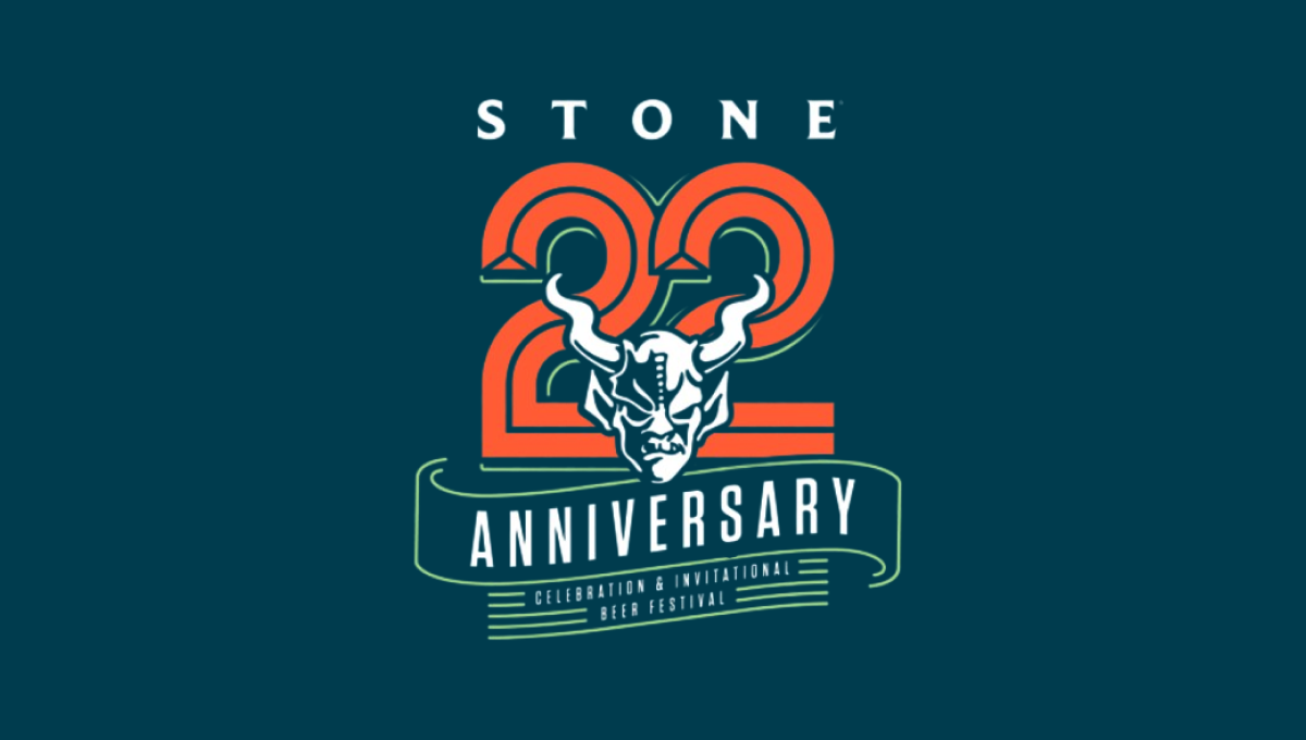
This logo starts with the brewery's traditional mark in the center and then builds layers behind to create a really sharp design. The first layer is a large, line-style number 2 with ribbon-style bit of line art below that signifying the meaning of the number. Above is the name of the brewery to create balance. The result is a beautiful design that tied nicely back to the original logo.
More Details →IDEA Health & Fitness Association 40th Anniversary Logo
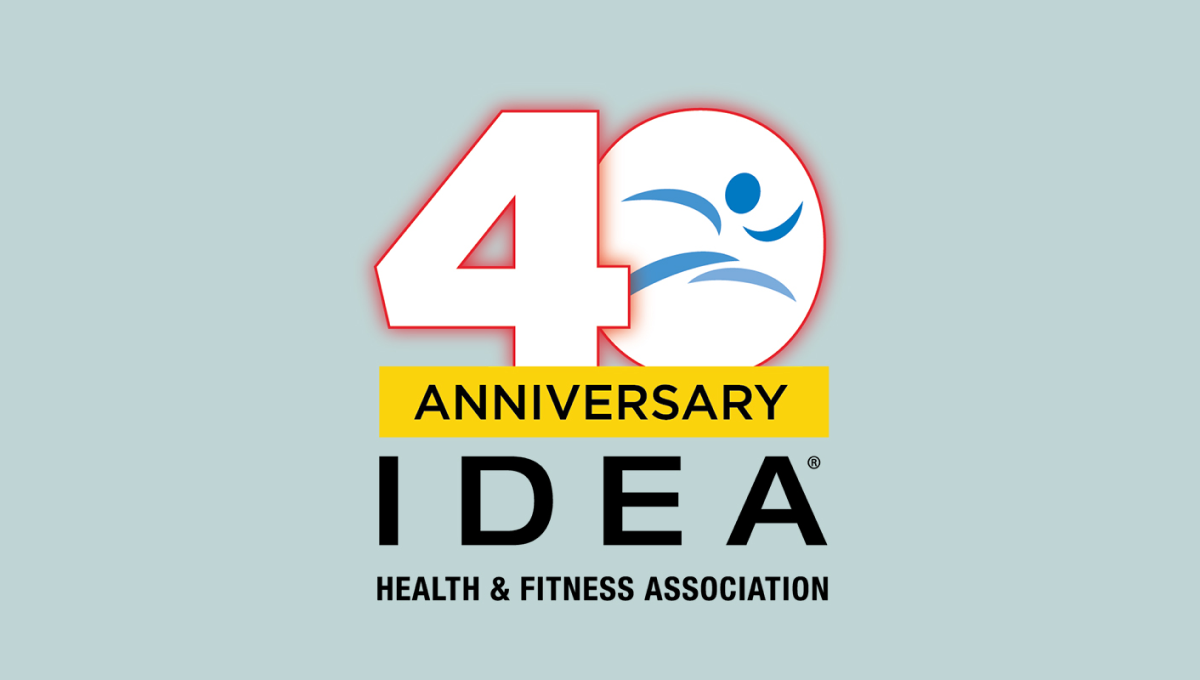
A large, block number 40 anchors this anniversary logo design. Both are outlined in red but the zero holds the blue mark that's traditionally used for this fitness organization's brand. Below is a yellow rectangle with a black word "anniversary" with the name of the organization sitting below to create balanced shaped that fits well in a square or circle avatar.
More Details →Brown's Gym 30th Anniversary Logo
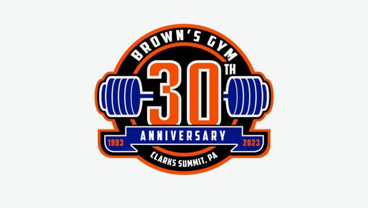
Using a classic sports logo style of a round circle with a ribbon across the lwer section, this logo places a large number 30 in the center with a clever barbell placed behind to tie back to the original brand and industry. Along the top sits the gym's name with the city and state in which the gym is located spelled out across the bottom to complete the logo.
More Details →Regional Food Bank 40th Anniversary Logo
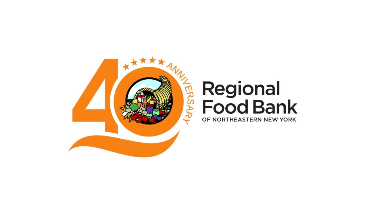
By placing this organizations logo in the zero of the number 40, this mark easily ties the anniversary design to the original logo for easy reconition and swapping during the anniversary year. A few extra elements are also added to this design including a line below the number 40 and a series of stars and the word anniversary curved around the right side of the zero.
More Details →Gate City Bank 100th Anniversary Logo
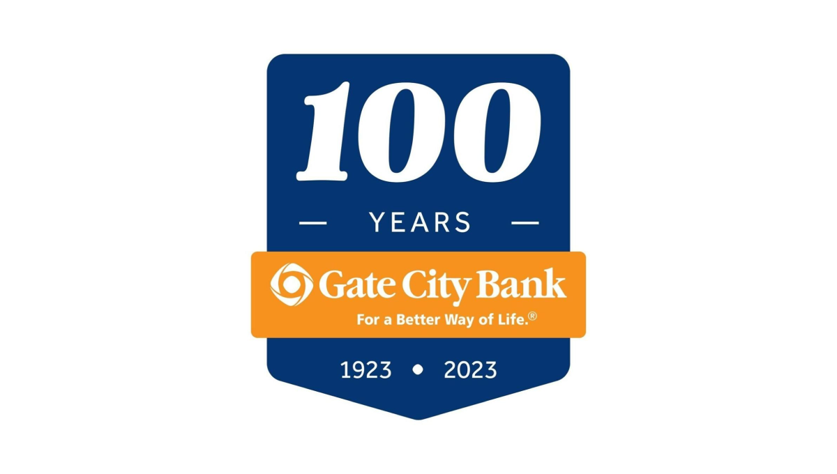
Using a clean banner shape, this badge-style logo uses a dark blue background to create contrast with the number of their annviersary and the years of operation. Between the two wraps an orange ribbon that holds the name of the and the company's tagline to make a clean, easy-to-recognize tie back to their original brand.
More Details →New York Mets 60th Anniversary Logo

Similar to other baseball teams who celebrate anniversary logos, this mark begins with a baseball field for the shape. In this case, the outline is in the team's famous orange and blue colors with a large blue sixty set in the center. At top of the field sits the team's original logo, at the bottom is the year the team was founded, with a ribbon holding the word "annivesary" set just below the number 60.
More Details →City of Virginia Beach 60th Anniversary Logo
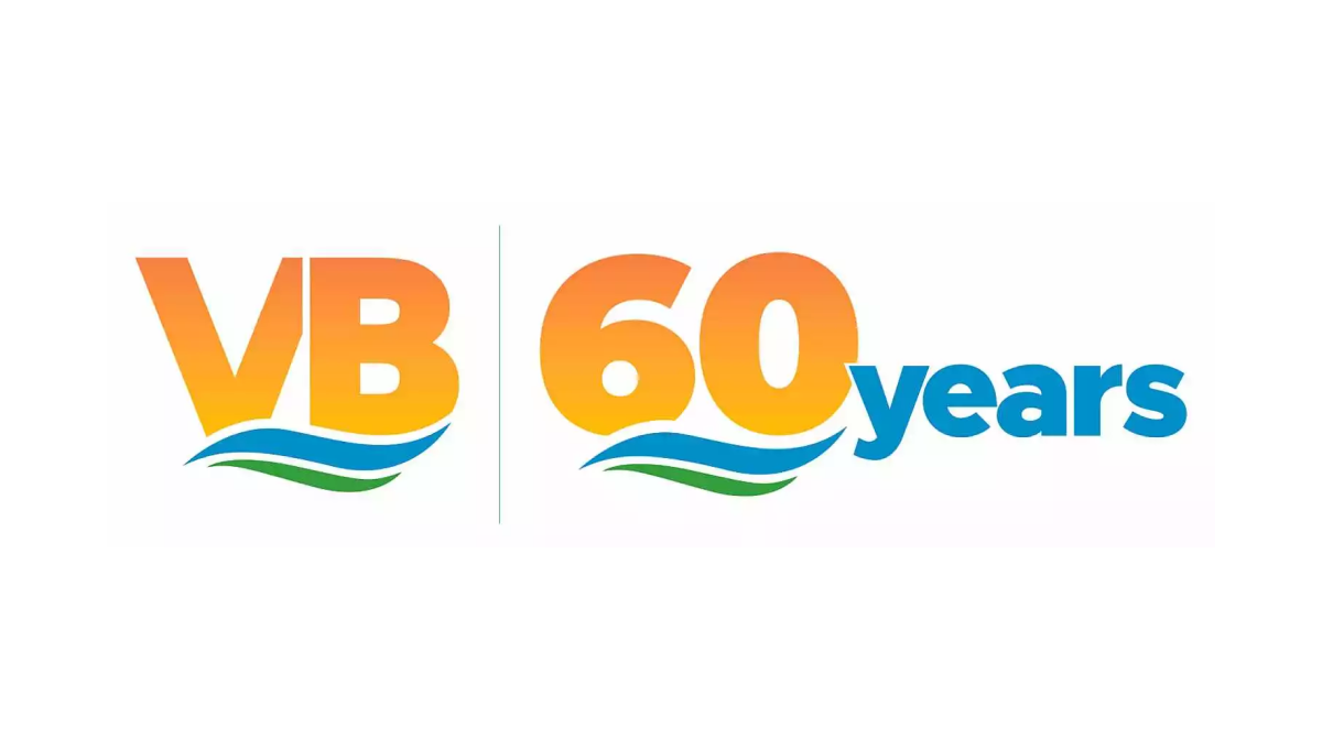
Borrowing from the city's well-known VB mark, this anniversary logo uses the same orange gradient of the VB in the original mark for the number sixty in the anniversary version. Below the same blue waves of the original mark sit with a large word "years" just to the right of this mark in the same blue as the wave. This logo also features the original mark just to the left of this new mark for an easy-to-recognize lockup.
More Details →University of Missouri - St. Louis 60th Anniversary Logo
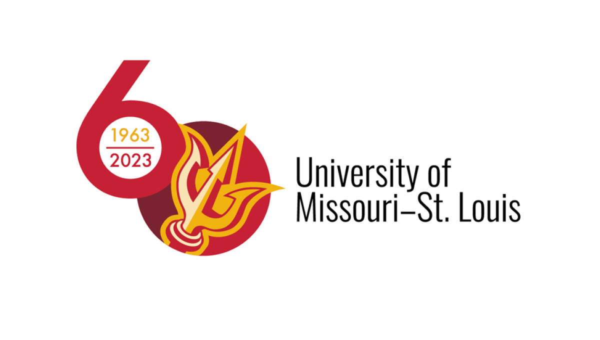
This logo sets the stage with a large number sixty with the six shifted up from the zero. Inside the six sits the years of operation for the organization, inside a filled-in zero sits the school's trident mark. This strong mark sits to the left of the name of the organization in black text, stacked on two lines and lined up vertically with the zero.
More Details →National Park Service Volunteer 50th Anniversary Logo
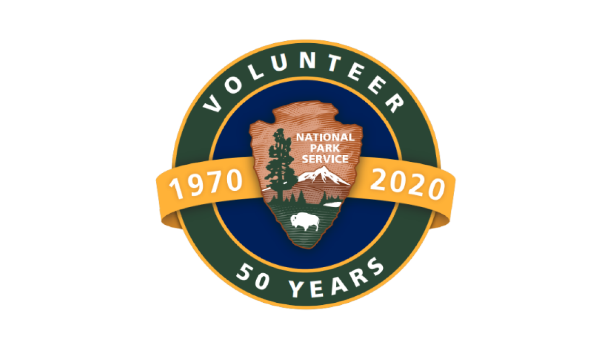
Building on the National Park Service's original logo in the center, this mark adds a circle behind to form a seal and hold wording that specifies this logo is for their volunteer program and the year they're celebrating. Behind the original log and in front of the circle sits an orange ribbon holding the years this program has been in place.
More Details →Yosemite Grant 150th Anniversary Logo
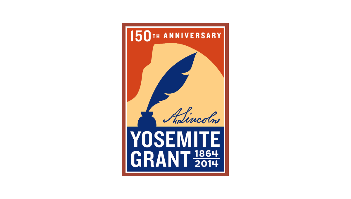
Along with Yosemite National Park's anniversary is the anniversary of the grant that made it possible. This vertical rectangle logo holds the name of the moment in blue at the bottom and features a silhouette of a feather pen extending up from that block. Behind the pen is a rusty orange color that holds the year of celebration just below the top edge of the rectangle.
More Details →Glen Canyon National Recreation Area 50th Anniversary Logo
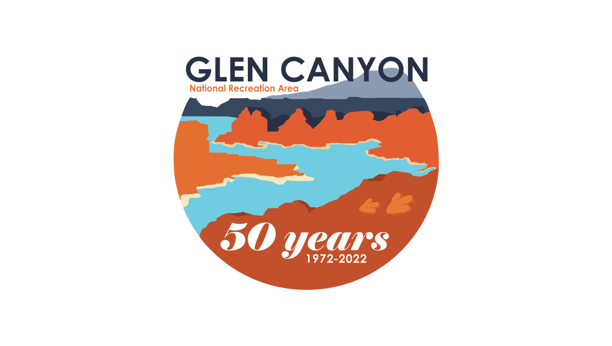
This logo starts with a circle holding the classic blue water and red rocks of the reservoir and landscape that creates it. Instead of completing the circle, however, the mark ends at the horizon line and the name of the area fills this space. At the bottom in a solid block of red color is "50 years" and a smaller line of text containing the years of operation.
More Details →Grand Canyon National Park 100th Anniversary Logo
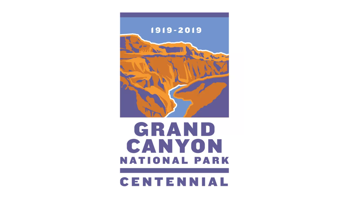
This logo sits within a vertical rectangle shape. The top two thirds holds an illustration of the famous canyon in a classic WPA poster style. In the blue sky area at the top sits the years of operation. Below sits the name of the park and the word "Centennial" to clarify the reason for this special design.
More Details →Yellowstone National Park 100th Anniversary Logo
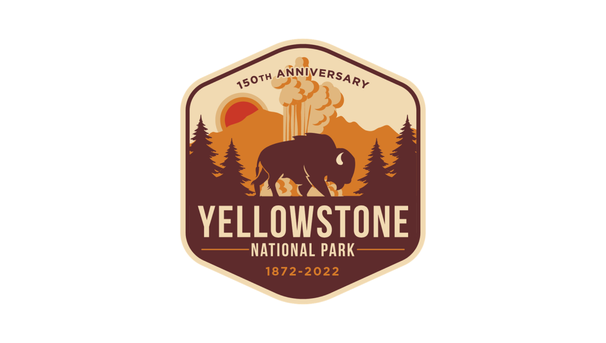
Yellowstone's 150th anniversary logo starts with a hexagonal shape in an orange and brown color that's reminiscent of many colors throughout the park. Inside, layers of monochrome silhouette's depict the park's famous geysers and wildlife. In the bottom half, the name of the park sits just above the years of operation with a callout of the anniversary arching across the upper part of the design.
More Details →United Way of the Midlands 100th Anniversary Logo
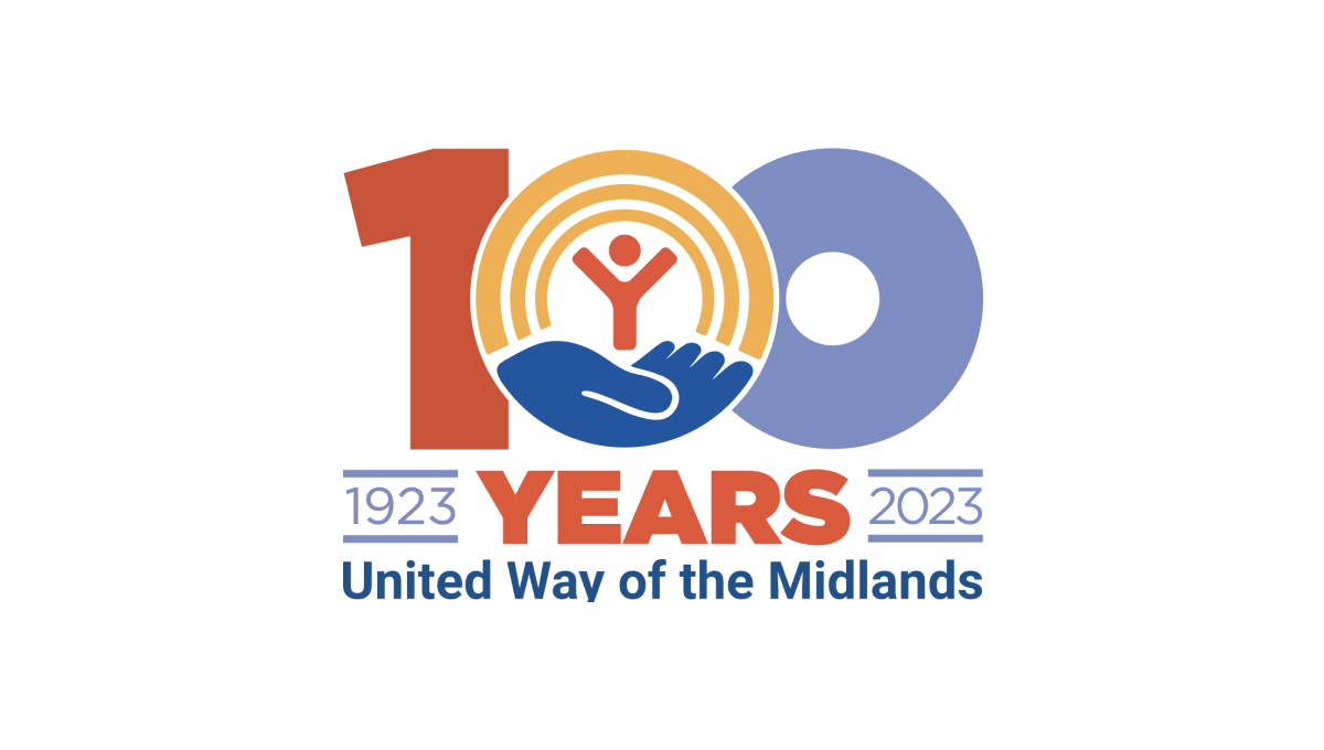
Like other United Way anniversary logos, this logo uses the classic red, gold, and blue colors of the original brand with a large, block number 100 in the center to anchor the logo. The United Way logo sits neatly in the center zero with the word "years" bloe and tha date range on either side to add balance. Finally, the name of the chapter is displayed at the bottom for a clean, on-brand logo.
More Details →1st Choice Mortgage 30th Anniversary Logo
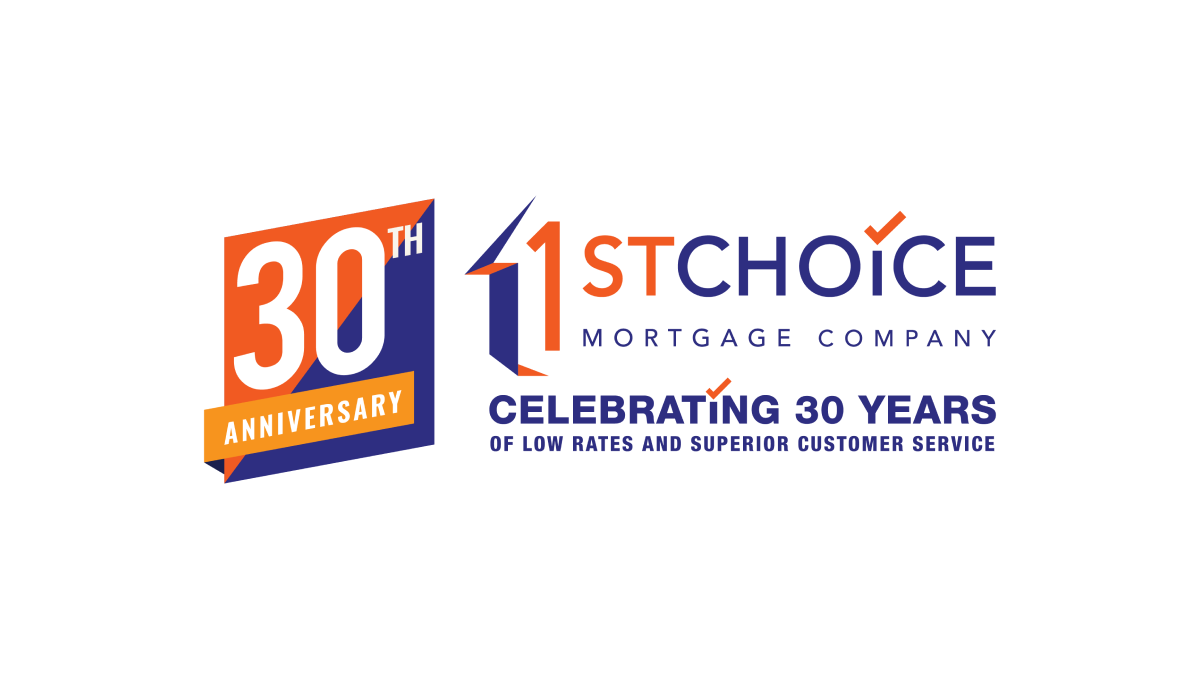
This adaptation of their original logo adds a two-color badge to the left side of their traditional logo that leans into the two primary colors of the brand as well as a third color to add contrast. With a word-heavy original logo, more text below that, and a new shape introduced with the badge, there's a lot going on with this logo but it all ties together nicely.
More Details →Memorial City Medical Center 50th Anniversary Logo
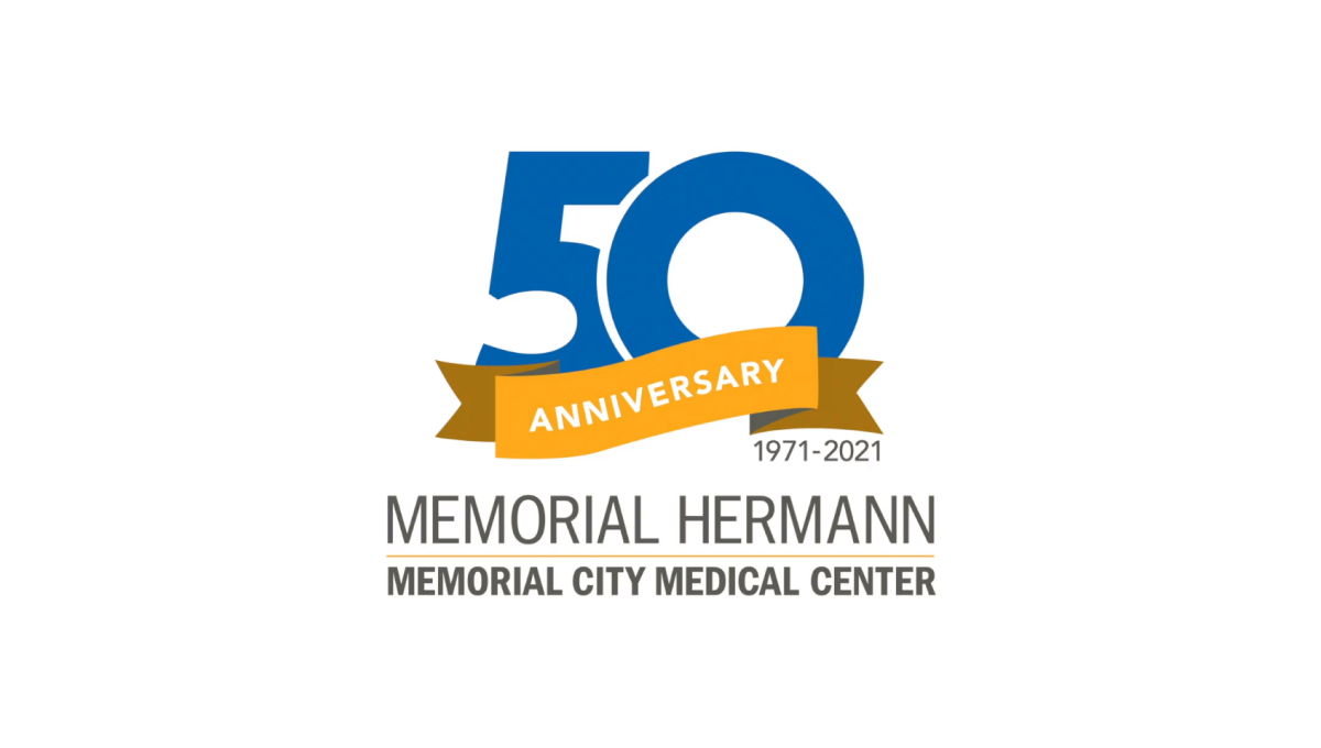
This hospital logo puts their name in dark, block letters at the bottom and simply adds a clean garphic above that to highlight the occasion for this adaptation of their brand. A large, block number 50 in blue is covered on the bottom third by an orange ribbon that contains the word "anniversary" and sits just narrower than the words below for a nice, vertically tapered shape that would work great on a website, swag, or social media avatar.
More Details →Las Vegas Aviators 40th Anniversary Logo
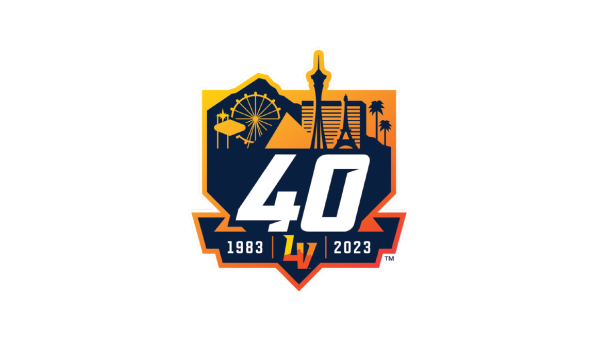
This logo combines three clean layers that establish a nice visual heirarchy for each element. First, an orange gradient creates a badge-style backdrop. Next, a skyline of prominant Las Vegas landmarks in a darker color creates a nice reference back to their home town with a punchout for the team's mark at the bottom. Finally, a large number 40 and the years of existence in white stand out in clear contrast from the rest to draw attention to the key message.
More Details →Disability Wales 50th Anniversary Logo
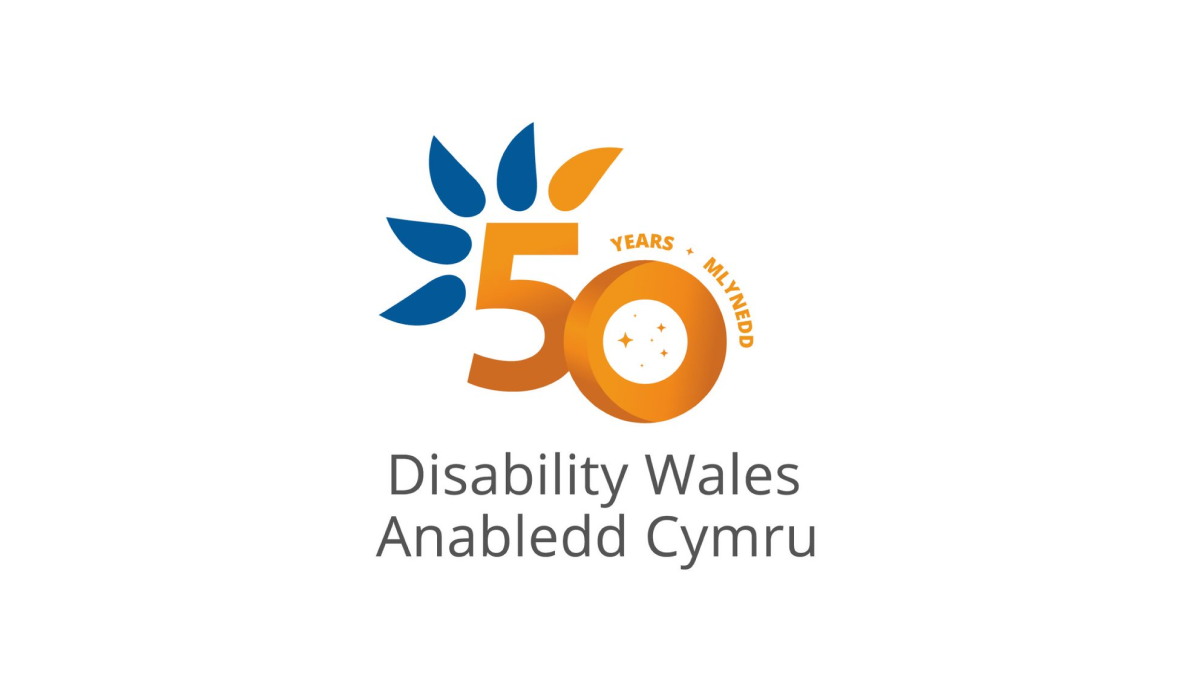
Diability Wales original logo is almost identical to this minus the number 50 in the center. Using orange for the number helps it stand out from the original curved, blue feather design and gives the logo a nice solid anchor in the center to keep things balanced. This similarity in size and shape also makes this logo easy to swap with the original logo in marketing and other designs.
More Details →