Red Anniversary Logos
Chicago Cubs 150th Anniversary Logo
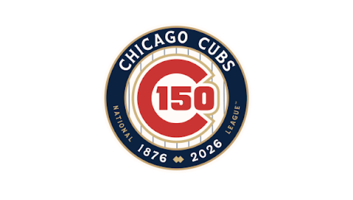
This anniversary logo features a classic, emblem-style design with a clean and timeless appearance. A circular badge serves as the centerpiece, combining the milestone number with familiar brand elements in a balanced layout. A limited color palette and subtle metallic accents give the design a polished, commemorative feel without being overly decorative. Supporting text below reinforces the anniversary message, creating a strong, professional logo that highlights tradition, longevity, and a sense of lasting achievement.
More Details →Fusion Bangor 20th Anniversary Logo
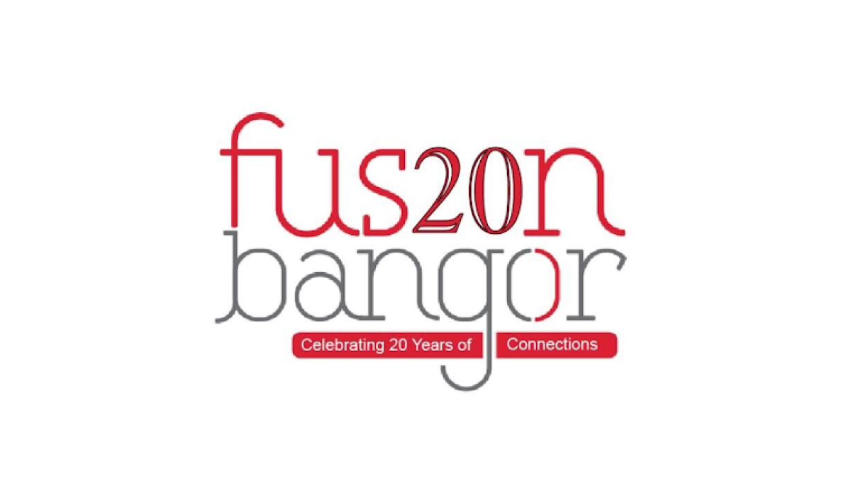
This anniversary logo has a modern and minimal style with a light, open layout. Thin lettering and a simple color palette create a clean, contemporary look, while the anniversary number is blended into the main name to make the milestone stand out without overpowering the design. Small colored bars below contain a short celebratory message, adding balance and visual interest. Overall, the logo feels fresh, approachable, and designed to highlight a lasting connection.
More Details →Heavenly Mountain Resort 70th Anniversary Logo
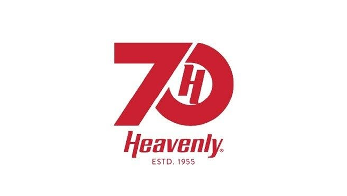
The anniversary logo has a clean and balanced look that feels modern but also familiar. Simple shapes and smooth lines come together in a calm, thoughtful way. The design suggests a sense of time passing and shared history without showing too much detail. The colors feel steady and respectful, giving the logo a warm but professional tone. Overall, it quietly marks an important milestone while staying clear, flexible, and easy to recognize.
More Details →Mattel 80th Anniversary Logo
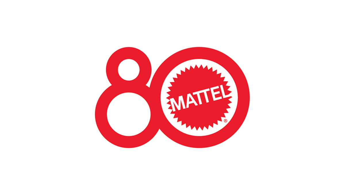
The anniversary logo shows a big, red number 80 where the zero is a bold circle around a familiar brand mark. The brand name sits in the center of that circle in plain, strong letters. The style feels bright and simple, with smooth lines and a clean look that catches your eye. It uses one color and a clear shape to hint at a long history and a big milestone moment.
More Details →X Games 30th Anniversary Logo

The anniversary logo has a clean and modern look, using soft colors and simple shapes. It shows the number 30 in a bold style, with the words “years” and the event name placed nearby. There’s a sense of movement or connection in the way the elements come together. The design feels both respectful of the past and hopeful for the future. Overall, it’s a bold and balanced way to mark an important milestone.
More Details →Trimac 80th Anniversary Logo

Trimac’s 80th anniversary logo combines retro and modern styling to reflect the company’s 80-year legacy and how far it has come. The overall design was inspired by a road (it’s a trucking company after all) to symbolize continuous movement and the “road” ahead, with the three lines representing the company’s founders: J.R. “Bud” McCaig, Roger McCaig and Maurice McCaig. Central to the design is a bold “80,” shaped like an infinity to reflect limitless potential, unity and the collective strength of its people, customers and communities. The logo uses Trimac’s primary brand colours, maroon and red, and is anchored by the company’s original logo for use across various applications, like truck fleet branding, merchandise, print media and digital platforms.
More Details →Reser's 75th Anniversary Logo

The logo celebrates a 75-year milestone with bold colors as the main focus. It uses clean, classic lettering and a smooth layout that feels both modern and respectful of the past. A banner curves across the bottom, mentioning the anniversary, adding a sense of movement. The color choices are warm and timeless, giving it a sense of tradition and pride. Overall, the design feels strong and simple, marking a long and steady journey.
More Details →Jaws 50th Anniversary Logo

This 50th anniversary logo has a bold and dramatic style. The number “50” is big and solid, with the word “JAWS” placed tightly above the number in its well-known red lettering. The colors are on the dark side, giving it a strong and serious feel. The design feels classic and a bit intense, matching the tone of what it’s celebrating, while still keeping things clean and focused.
More Details →ICEE 50th Anniversary Logo

This 50th anniversary logo has a fun and playful feel. The number “50” is large and bold,in a gold color that stands out. The word “ICEE” is placed to the left of the 50, using its familiar logo style. There’s also a small banner underneath that says “Icee-versary,” adding to the celebratory look. The overall design feels cheerful and energetic, reflecting a lighthearted brand marking a big anneversary in a lively way.
More Details →Vanguard 50th Anniversary Logo

This anniversary logo is made up of a large number "50" with the signature V in the center of the 0, for Vanguard. The logo is made in a clean, bold red color, making it stand out from the white background. The font is simple and bold, giving it a strong look. In conclusion, the logo is a simple, creative way to celebrate this company's anniversary.
More Details →FC Barcelona 125th Anniversary Logo

The anniversary logo features a clean and modern design that blends tradition with a sense of celebration. It includes bold, simple shapes and a familiar crest, subtly updated to mark a special milestone. The colors are rich and meaningful, reflecting the identity of the group it represents. Numbers and symbols are placed thoughtfully, suggesting the passage of time and a proud history. Overall, the design feels respectful and strong, with a touch of elegance.
More Details →Rudolph the Red-Nosed Reindeer 60th Anniversary Logo

The anniversary logo for Rudolph the Red-Nosed Reindeer features a minimalist design that emphasizes simplicity and abstraction. The logo utilizes bold lines and circular shapes to represent Rudolph's iconic features, such as his nose and antlers. The use of negative space and geometric forms gives the logo a modern and clean look, while still maintaining a festive and recognizable connection to the beloved holiday character. This design approach reflects a contemporary take on traditional holiday imagery.
More Details →Geissler's Supermarket 100th Anniversary Logo

This logo design brings a clean, traditional approach to this supermarket chain's usual logo. Placing their red word mark in the center and wrapping it with a simple shape that adds some unique corners instead of a standard rectange, their then add a shiny, gold circle behind with the words commemorating the occasion and filling out this seal-style concept.
More Details →Washington Capitals 50th Anniversary Logo

We love a good retro logo and this is a perfect example of that. Old school styles, shapes, and colors are combined into a clean design that puts a large number 50 in red, a hockey stick in blue, classic starts below and the team's traditional logo at the top. The result is a really nice logo in a square shape that's easy to use across online and social channels.
More Details →Boudin Bakery 175th Anniversary Logo

I love this logo because it's a reminder that a logo should work for your needs, not just fit the criteria of what everyone else has done. In this case, their logo combines local landmarks and colors into a banner-style graphic that ties the year, the history, and the original mark into a design that would be easy to place on banners outside the bakery and labels, print materials, and labels inside.
More Details →The North Face 50th Anniversary Logo

Anniversary logos often have an offset second digit to add a little bit creativity to an otherwise normal number, but I love how The North Face did this with a little bit more purpose. The number zero uses a horizontal line to mimic the set cresting the horizon, an image common in the visuals that accompany the adventures their customers embark on. It's a clean, simple mark and beautiful design.
More Details →Tempo Curacao 15th Anniversary Logo

This logo goes ultra simple with a large, block number fifteen in the brand's light gray color. Inside the circle of the number five they've placed their round, original logo in their usual red. Just to add another tiny bit of clarity they've placed the word "years" below the number inline with the red of the logo. It relies heavily on their market being able to recognize their mark, but it does a great job of building on that brand awareness in a simple, clean package.
More Details →Bousfields 50th Anniversary Logo

The original logo for this brand features a matching circle in the upper left area as you see in the bottom right. By keeping the bottom right circle as a zero and adapting the top left into a number 5, the difference was both easy to spot but neatly subtle. They get to keep building brand recognition by using something close to their usual logo but also highlight their milestone.
More Details →Red Roof 50th Anniversary Logo

While their red, angled roof line is a simple shape, it's also easily recognizable thanks to five decades of brand building. So to celebrate those years in business, Red Roof simply placed a large number fifty below that distinct angle using a similar weight and the same red they'd used for so long. The result is both simple but extremely effective in a tidy package.
More Details →America 250 250th Anniversary Logo

You could take an anniversary logo for an idea as large as the United States in many directions, but the America 250 folks kept it simple and clean. A capitalized word in black sits above a number 250 made ot of a single, continuous red, white, and blue ribben with just a bit of rounding extension above and below the top and bottom of the normal number sizing. The result is really clean, balanced, and effective.
More Details →National Parks Service + America 250 250th Anniversary Logo

With the 250th anniversary of the United States coming up, the America 250 organization is not only doing their own anniversary logos for the country as a whole but also the groups that make up key parts of the American brand. The National Parks Service is one of those and this clean logo featuring a large 250 behind the Statue of Liberty and the word America is a clean, retro image seen on many NPS marketing assets.
More Details →Dum Dums 100th Anniversary Logo

When you make a candy that is loved by children, you need a logo to extends the fun, playful vibe of their original mark and that's exactly what Dum Dums did here. This logo features a large number 100 in the same font as their logo and using the child-relevant word birthday instead of the adult-minded anniversary. The candle replacing the number 1 is a perfect way to both break up the color red and reinforce the birthday language of the sub text.
More Details →Encyclopaedia Britannica 250th Anniversary Logo

One of the most well-known brands in the world, Encyclopaedia Britannica's 250th anniversary logo features their classic thistle mark spread across three vertical book-spine rectangular shapes. In each of those shapes is a digit of their anniversary. Their name at the top and the word anniversary at the bottom lock up and balance this simple, clean design.
More Details →Battes of Saratoga 250th Anniversary Logo

Starting with a large number 250 in the center in the classic, handwritten style of the era it represents, this logo builds around it using a seal-style round shape that features the name and a small cannon icon. Wrapping around the bottom is a red ribbon with the tagline of this famous moment in United States history.
More Details →Millennium Challenge Corporation 20th Anniversary Logo

While this logo may seem simple and harder to recognize than other, well-known logos, the star shape containing an adaptaion of the American flag is the organizations original logo that is used across their marketing campaigns. With just a simple number 20 peeking out from the left side of that mark, they created a new mark that celebrates the occasion without overcomplicating the design.
More Details →D Magazine 50th Anniversary Logo
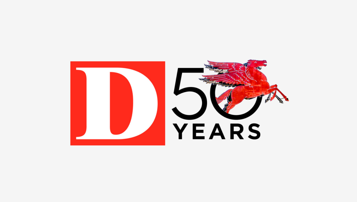
Rather than describe this logo ourselves, we'll just quote the team on this one. "Our in-house designers and art directors wrestled for months about what D’s 50th anniversary logo should be. What would feel like ‘D’? What would be bold and design-forward but not conflict with our existing (already iconic) logo? What have other brands done? Do we even have to do one at all? After dozens of versions and rounds of meetings, we ultimately returned to the original concept presented by our digital product director Ricky Ferrer. When we all first saw it, it felt like ‘us’. It also felt like Dallas: always in motion, full of iconic people and places."
More Details →Hendrick Motorsports 40th Anniversary Logo
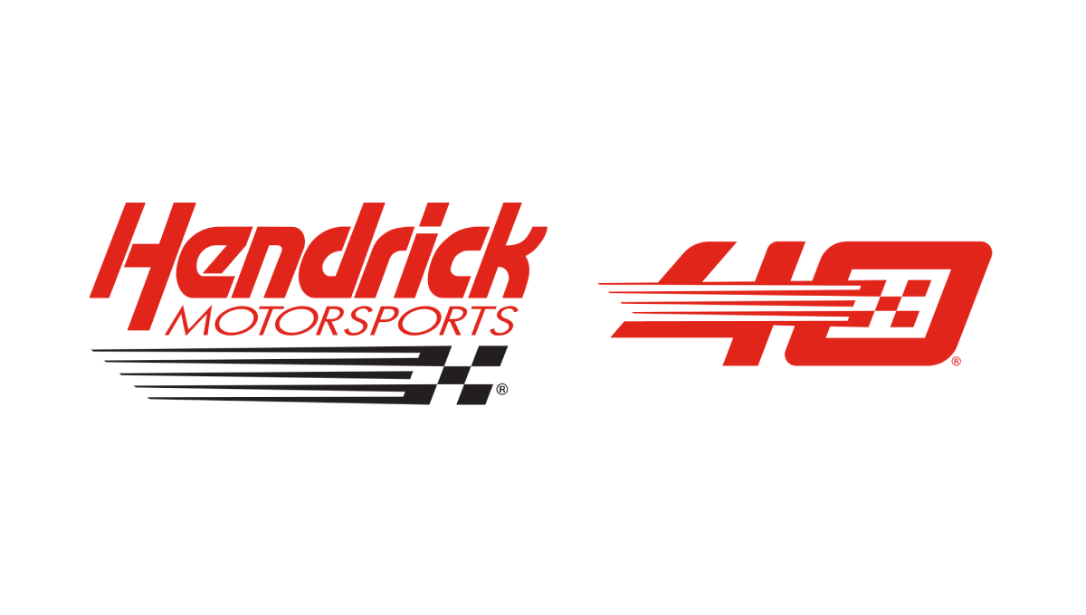
This logo takes the popular side-by-side approach that keeps the original logo as is and adds a unique number mark to the side. In this case, their design team designed a number 40 that features the same slant, color, and checkered flag motif of their original to create a number that neatly matches their original logo but also has enough elements to be recognized on its own by core fans.
More Details →New York Giants 100th Anniversary Logo
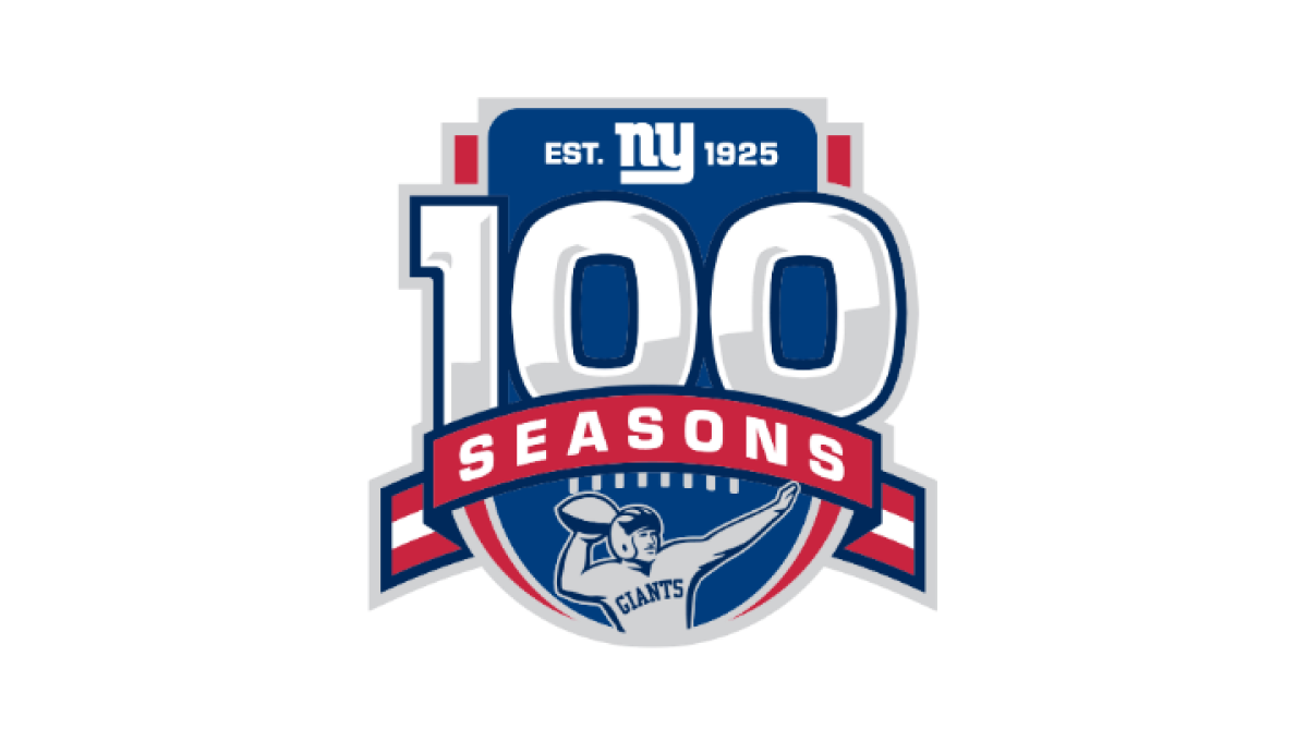
Anchored visually with a large number 100 inside a classic sports-style crest, this logo uses more classic sports vibes to created a logo that has depth and a cohesive design. At the top of the 100 sits the team's original logo, below sits a ribbon holding the word seasons, and a football icon at the bottom completes this logo.
More Details →Park City Resort 60th Anniversary Logo
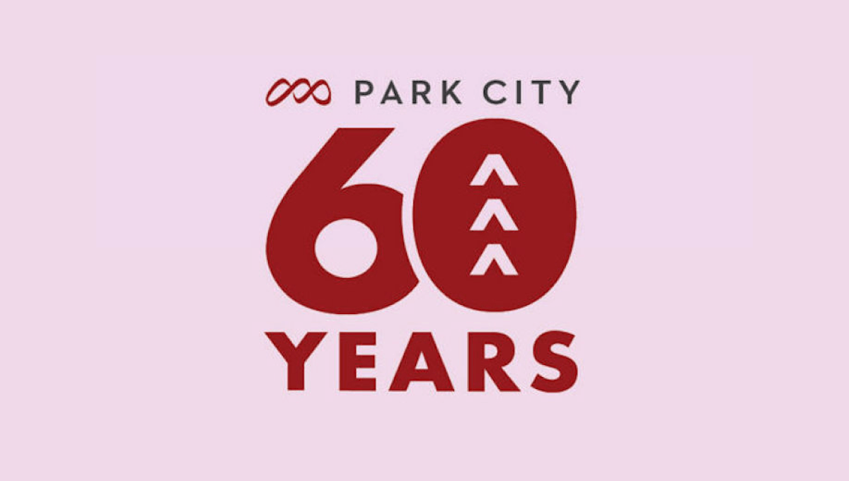
Park City Resort's 60th anniversary celebration needed a simple logo and this design combined the resort's original logo at the top, a large number 60 with shapes to tie the number back to the mountains the resort is famous for, and the word years at the bottom all on the brand's original brick red color.
More Details →Boyne Mountain 70th Anniversary Logo
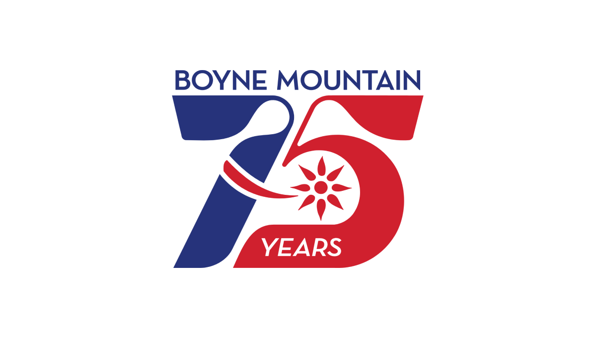
Retro was the name of the game as Boyne Mountain pulled visuals and colors from the early days of their history to create a number mark that was both easy to read but also neatly tied back to the original brand from all those years ago. Above that number mark is the name of the resort to complete the design. This logo as looked fantastic in all white on dark backgrounds and the shape lended itself well to use as social media avatars.
More Details →American Gymnastics Academy 30th Anniversary Logo
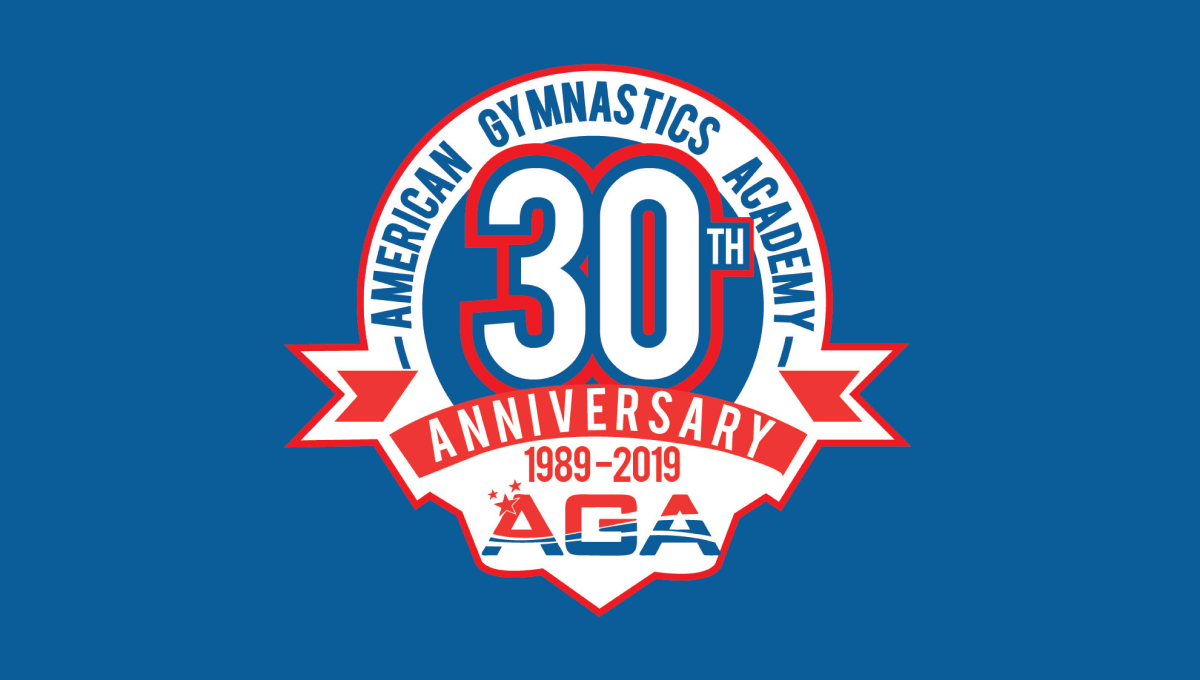
This classic logo combines a few common elements into a really tidy package. First, the logo uses a circle for the base with a large number 30 set in the upper middle of that circle. Next, a ribbon comming across the lower part of the circle holds the reason for the celebration. Finally, the organization's traditional logo sits below the ribbon with their name arching around the edge.
More Details →Cleveland Browns 75th Anniversary Logo
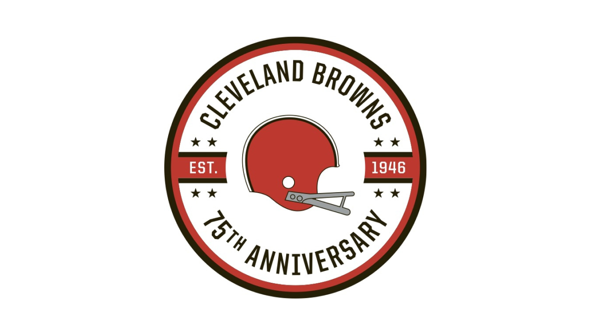
While the Cleveland Brown's "brown" is closer to an orange, they build on this traditional brand color with a circle in this palette as well as a helmet in the center. Around the outside sit the name of the club and words denoting the reason for the celebration with two bars coming in from either side containing the years of the team's existence.
More Details →Marek 75th Anniversary Logo
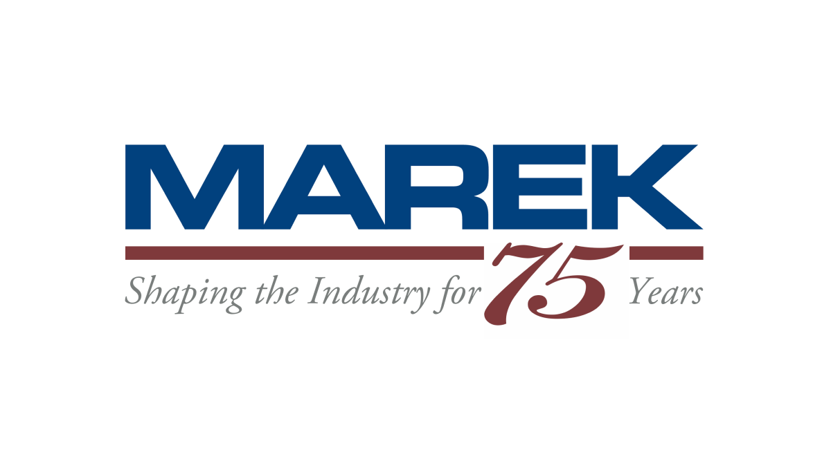
This mark always had a red line below a blue word, so this logo design simply worked with the existing horizontal elements in their traditional logo with the horizontal parts of the number 75. The result is a neatly integrated number that celebrates the occasion with a design that will be easily recognizable to their audience.
More Details →Apple France 40th Anniversary Logo
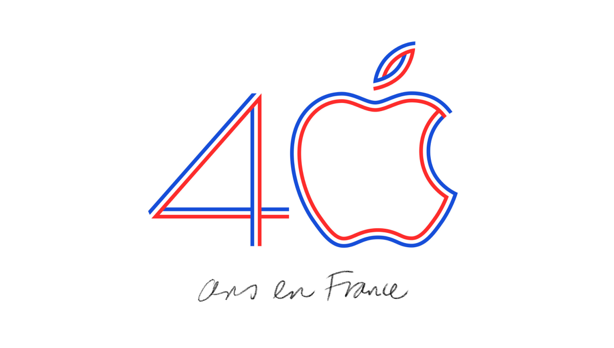
Using the classic Apple logo for the zero in the number 40, this logo uses the three colors of the French flag to create a line-art style logo that neatly combines both the traditional mark for this computer company and the colors that represent the branch of the company they were hoping to celebrate with this special design.
More Details →National Football League 100th Anniversary Logo
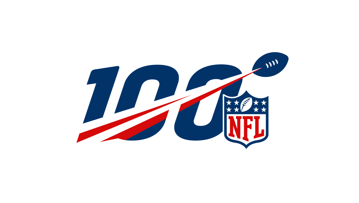
A logo that was seen time and time again by millions during the league's 100th anniversary, this mark features a large, block number 100 with a football streaking from the lower right to the upper left with a red line flowing behind. Finally, the league's traditional logo sits just to the bottom right to add balance and make the mark easy to recognize.
More Details →Coca Cola 125th Anniversary Logo
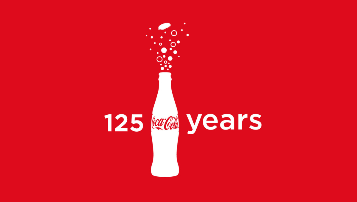
Imagine having a brand so powerful that you only need the shape of your packaging for people to instantly recognize its source. In this case, they also included the logo on the bottle, but it's almost unnecessary. With bubbles coming out the top and text to the left and right, these elements were combined in various lockups but this one - which also showed up on some packaging - was among the more popular.
More Details →Formula One 70th Anniversary Logo
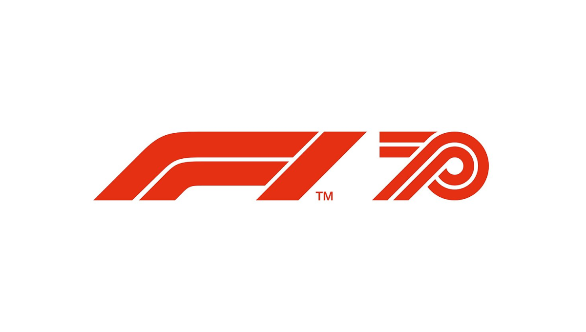
Formula One has an incredible logo that is as recognizable as it is simple. The core of this mark is the red, slanted, outline-style font that is used. So when celebrating their 70th anniversary, they simply created a number 70 using the same style of text and placed it side-by-side. The result is clean and recognizable.
More Details →Jurassic Park 30th Anniversary Logo
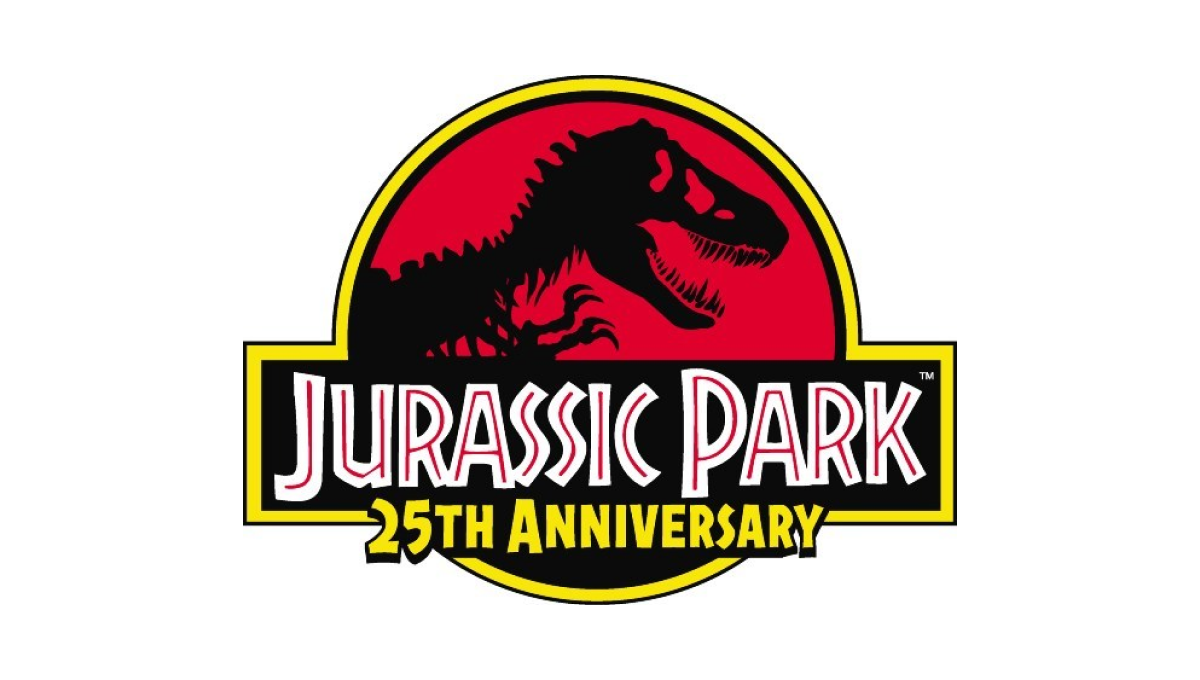
This famous first installment of what is now a multi-part video series already had an iconic logo that was not only the logo for the movie, but the fictional park inside the movie. So instead of starting from scratch, they added the words "25th anniversary" below the words in the traditional logo and called it good.
More Details →Legoland Florida 10th Anniversary Logo
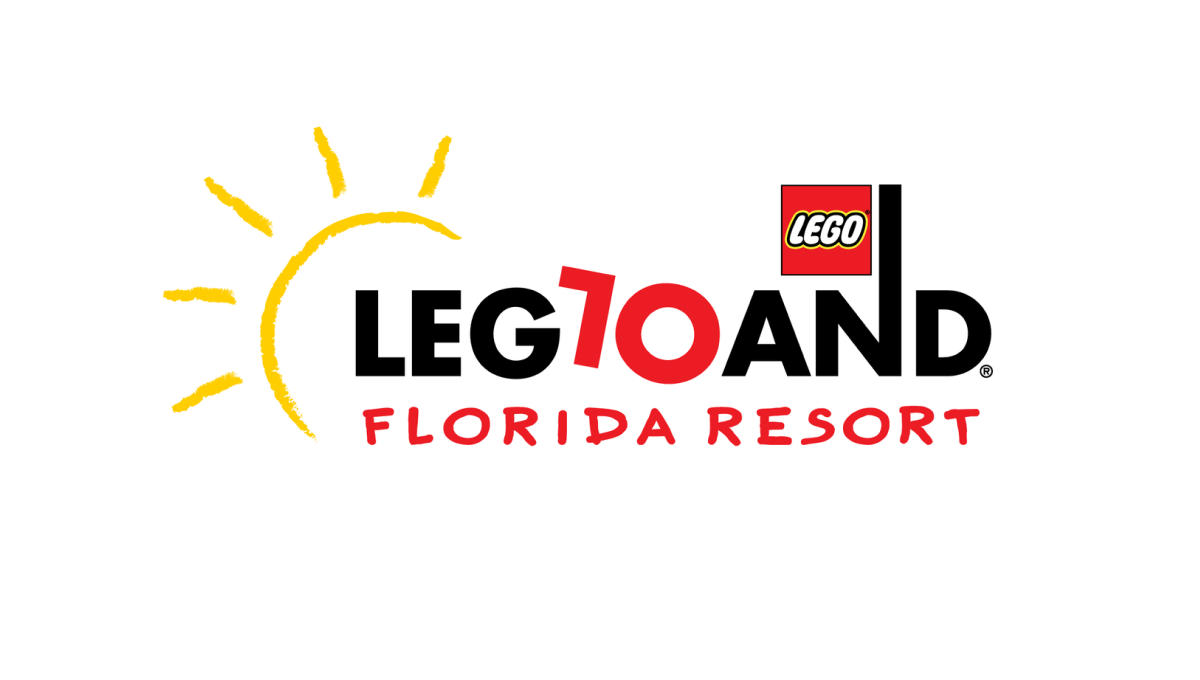
Legoland is a fun, playful place, so the logo of their 10th anniversary started with the same tone. The L and O of the word mark are converted to a 1 and 0 to both keep much of the original, recognizable mark but also make it easy to spot the reason for the change. By making the number slightly askew, it kept the playful tone while producing a design that was easy to swap for the existing mark.
More Details →Netflix 25th Anniversary Logo
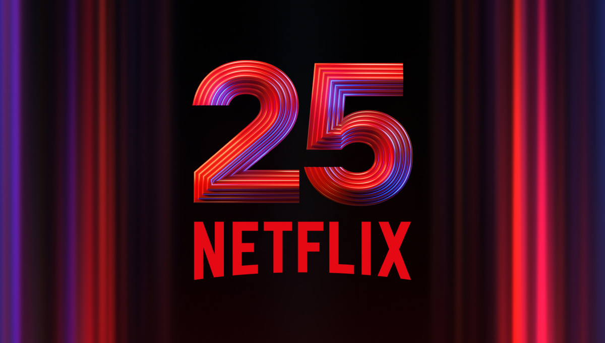
Netflix is famous for many things, but one of their most famous is the opening animation that precedes each video in their library. So when celebrating their 25th anniversary, they used a similar style - almost a still image from that sequence - as the backdrop to easily tie this design back visually to that part of their brand. In the center is placed a multi-faceted number 25 with their traditional logo below.
More Details →Truly Nolen 85th Anniversary Logo
Famous for the black ears that are seen throughout their branding and products, Truly Nolen used the same concept as the starting point for their anniversary logo. A large block number 85 below the ears specified the year, a ribbon held the years of operation, and a thin, black tail made this mark easily recognizable.
More Details →Lux International 120th Anniversary Logo
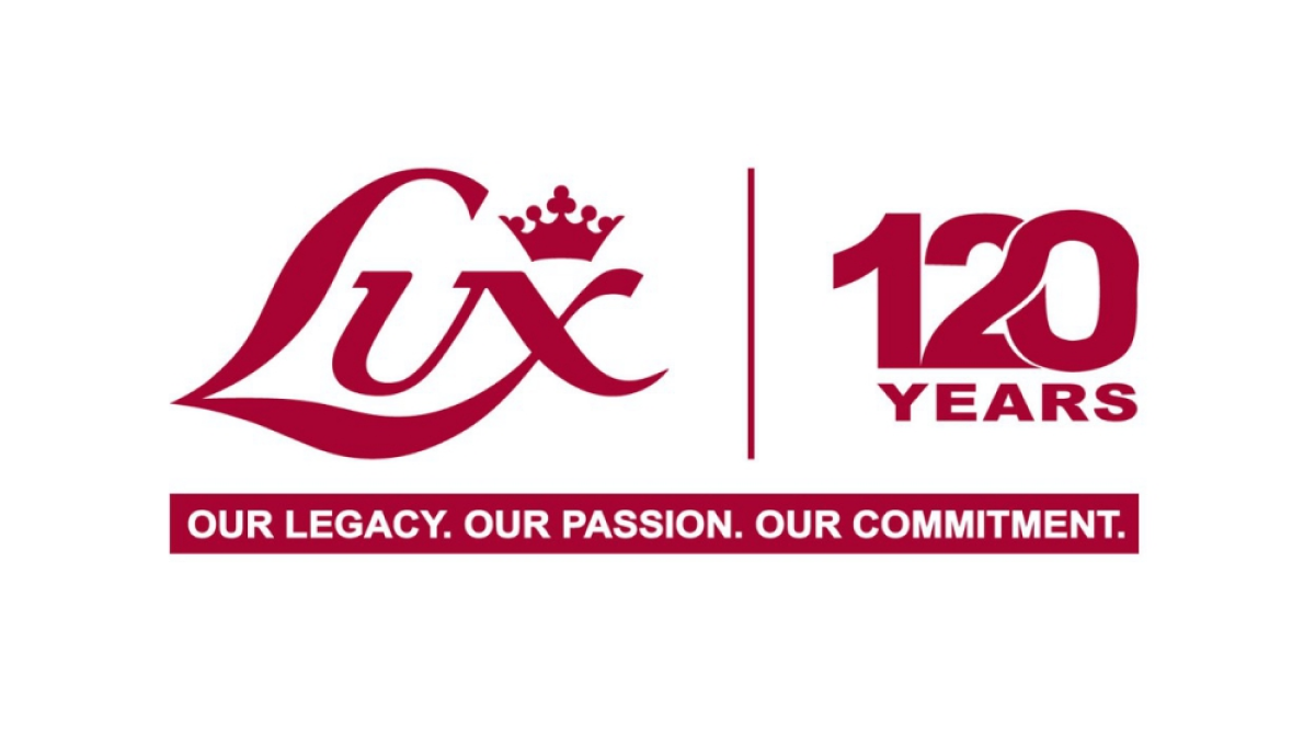
In a style that is becoming more and more common, this logo simply takes the traditional Lux logo in red, draws a vertical line to the right, and on the other side of that line places a stylized number 120 with an overlapping and intertwined 2 and 0. These logos are simple, convey the meaning clearly and simply, but also look sharp and balanced.
More Details →Epec 65th Anniversary Logo
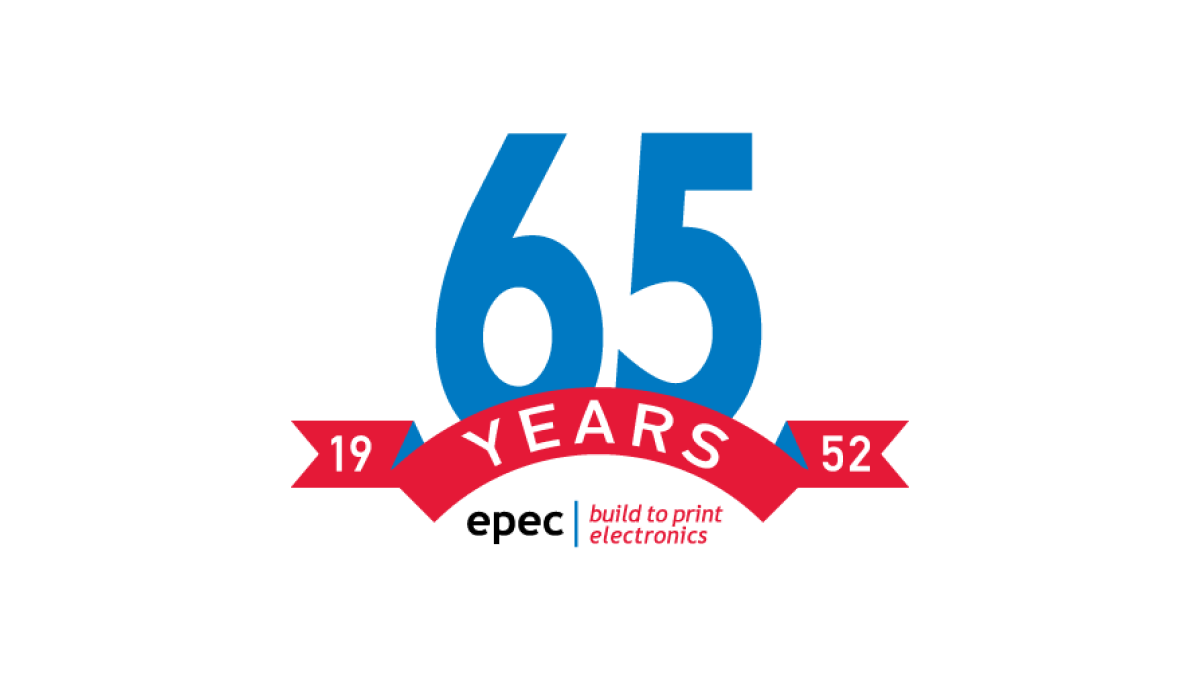
This simple logo uses the brand's primary blue and red colors - a large number 65 in blue rising up from behind a curved ribbon in red - to both spend the message and create a little bit of negative space at the bottom of this mark. In that mark they placed their usual logo for a simple mark that's both big and easy to use but also ties back to the original brand.
More Details →Windsor Historical Society 100th Anniversary Logo
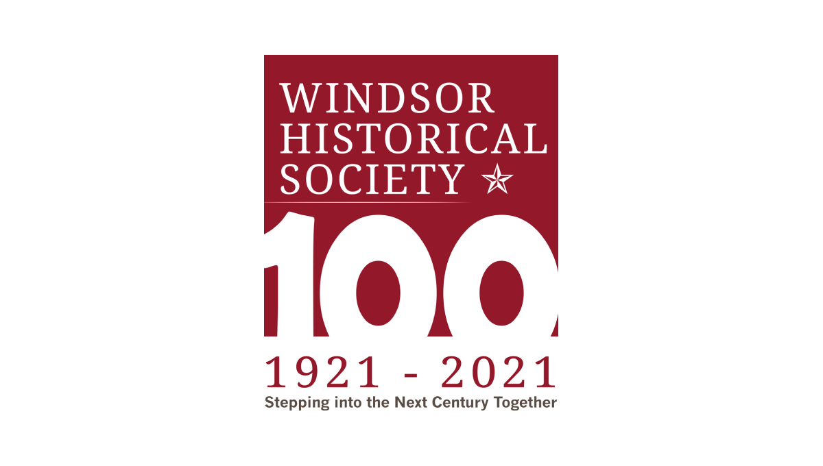
Starting with a square in the non-profit's traditional maroon color, this logo adds a large, block number 100 overlapping the bottom to create a strong, visual anchor for the design. At the top is the organization's name and mark, below the square are their years of operation, and at the bottom is the group's motto to create a tidy, on-brand design with a strong tie back to their usual brand.
More Details →Save the Bay 50th Anniversary Logo
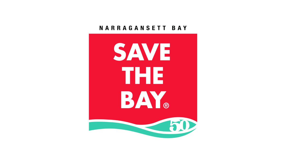
To create their anniversary logo, Narragansett Bay took their traditionally horizontal motto and stacked the words into a square with a solid background. With their traditional mark at the bottom and the name of the city at the top to create a clean, square mark that works well during their anniversary and beyond.
More Details →Wendy's 50th Anniversary Logo
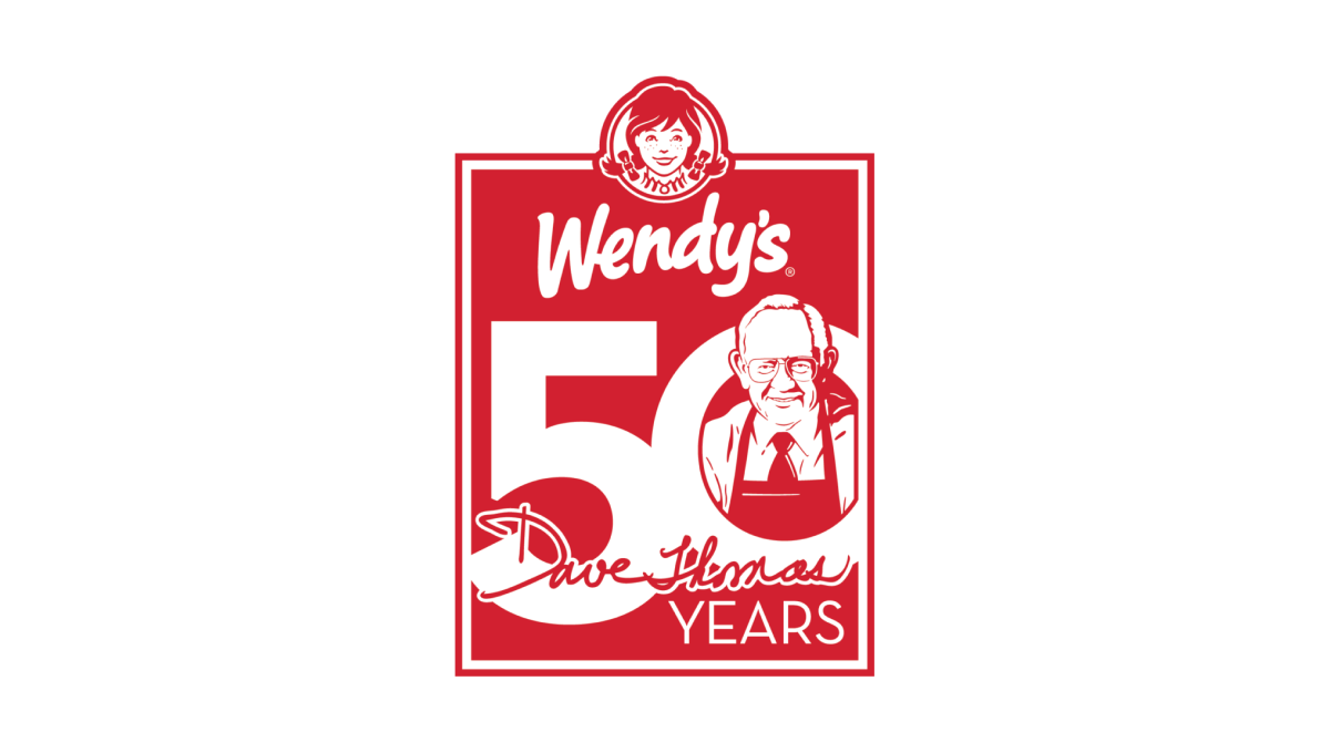
Wendy's original square logo shape was the inspiration for this 50th anniversary mark. All in their traditional brand red, a large number 50 sits just below the brand's current logo to fill out the shape. Inside the O is an illustration of the chain's original founder, Dave Thomas, to neatly tie the beginnings of this company's story to their present.
More Details →Roy Rogers 50th Anniversary Logo
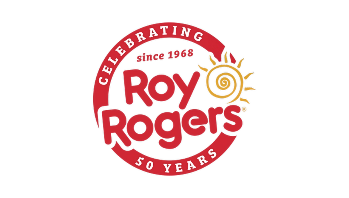
This restaurant chain started with a classic round seal-type shape with a thick border in their classic brand red color. That thick rim held text outlining the reason for their celebration. Then inside that circle and slightly overlapping the edges was placed their original logo with the same slight angle. The result combined a shape that supported the anniversary message with the logo that supports easy brand recognition.
More Details →KFC Japan 50th Anniversary Logo
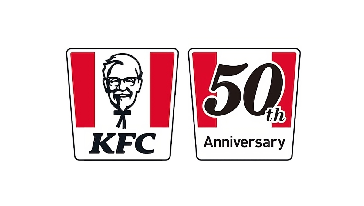
When KFC celebrated 50 years of operations in Japan, they had a powerful, easily-recognized shape at their disposal: the almost-square bucket with red stripes. Because it was so recognizable, they were able to simply overlay the year of their anniversary on top of that shape in a font similar to the KFC name and quickly have a logo that was simple, on-brand, and easy to tie back to the original mark.
More Details →Monopoly 80th Anniversary Logo
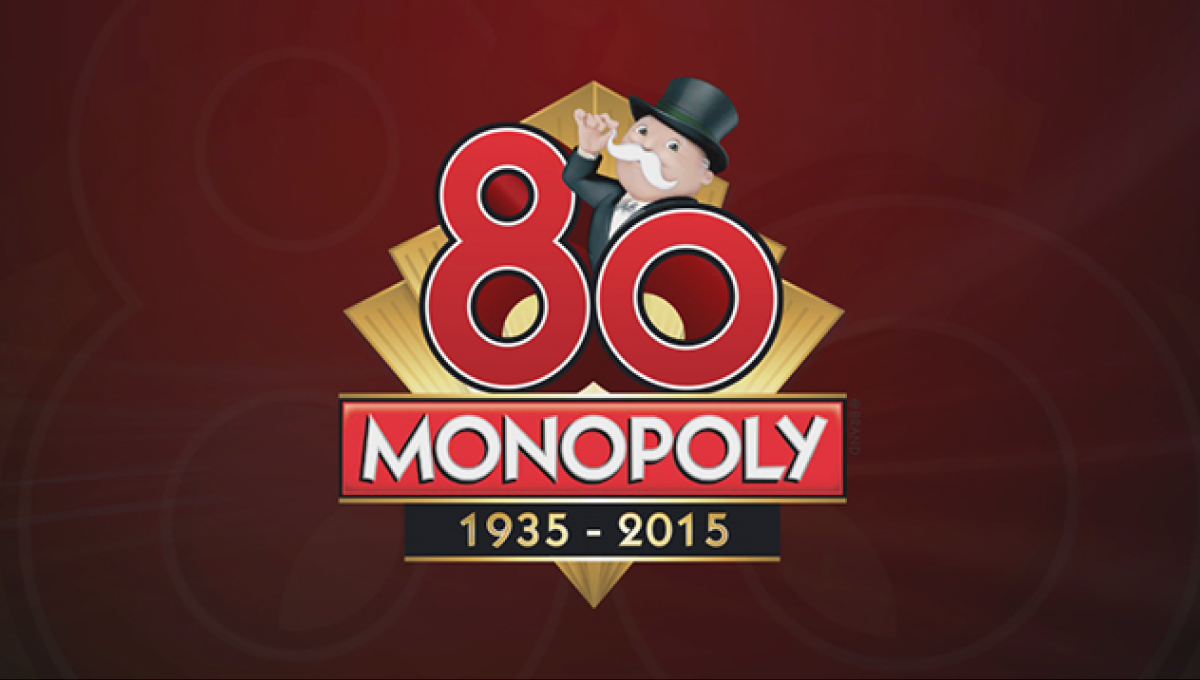
Monopoly applied classic board game design to this anniversary logo that features the traditional, rectangular logo for the game at the bottom of a diamond with a large, three-dimensional number 80 sitting above. Below the years of the game's existence are included with simple, gold lines to keep a sharp look that balances the rest of the design.
More Details →University of Chicago 125th Anniversary Logo
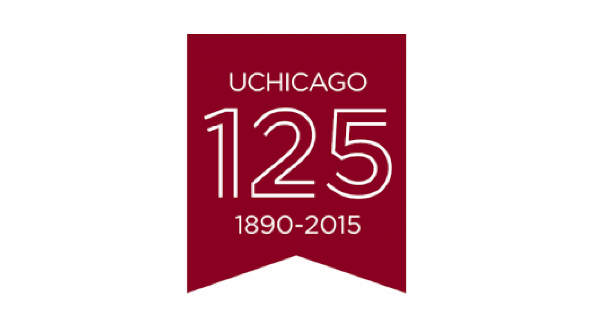
Keeping it simple, this logo uses a vertical ribbon-style banner in the school's main brand color to create a space for this celebratory mark. With a line-art depiction of the number 125 in the center, the name of the school above the number, and the years of operation below, this mark checks all the boxes in a clean, simple package.
More Details →Warner Bros. 90th Anniversary Logo
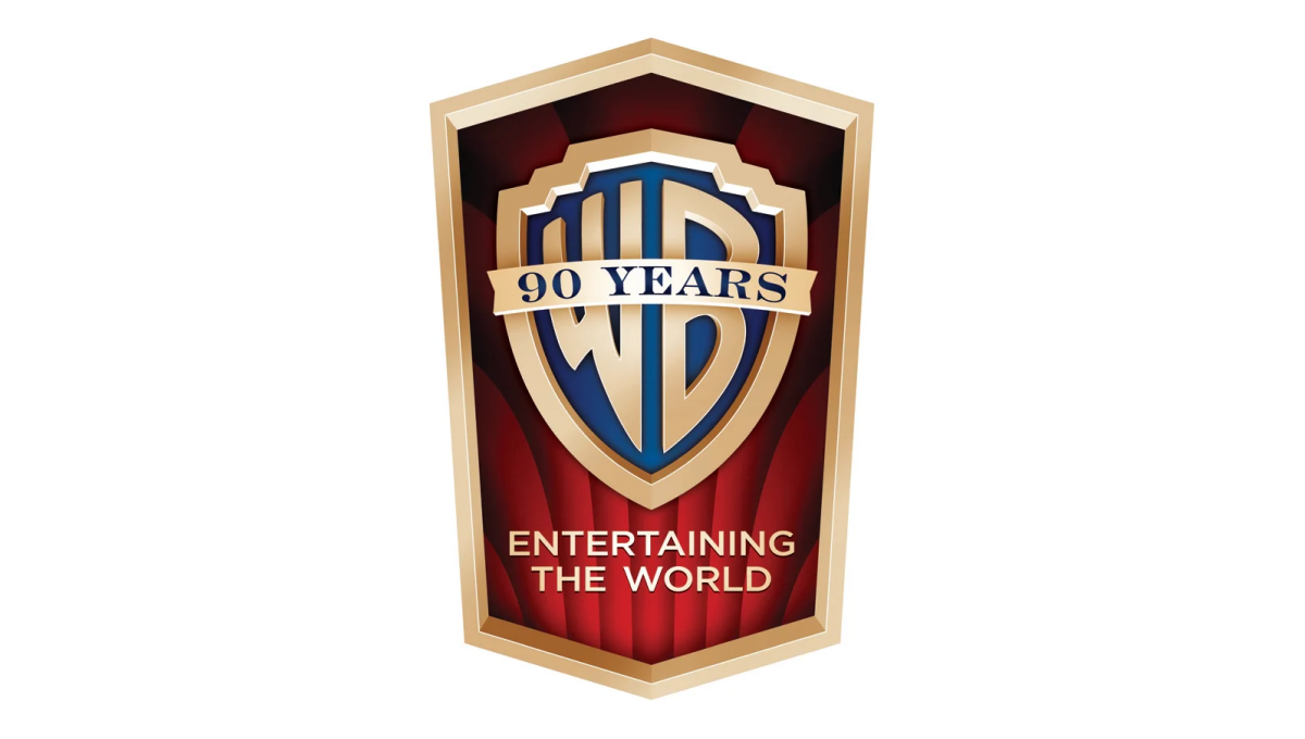
This detailed mark carries the classic feel of the brand's opening sequence that intro their films. The traditional logo sits inside a vertical crest with the brand's famous red curtains falloing behind to fill in the space behind the mark. In the space left at the bottom of the badge sits their company tagline to provide balance.
More Details →St Joseph School 90th Anniversary Logo
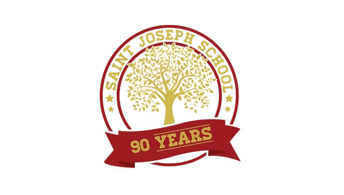
Using a classic circular shape with two rings creating space for words to wrap around the edge, this logo places the name of the school in that space to make it easy to recognize who is celebrating this anniversaty. Inside sits the school tree mark in the brand's traditional gold color. At the bottom is a simple red ribbon holding a recognition of how many years the school has been in operation.
More Details →Bridgestone 90th Anniversary Logo
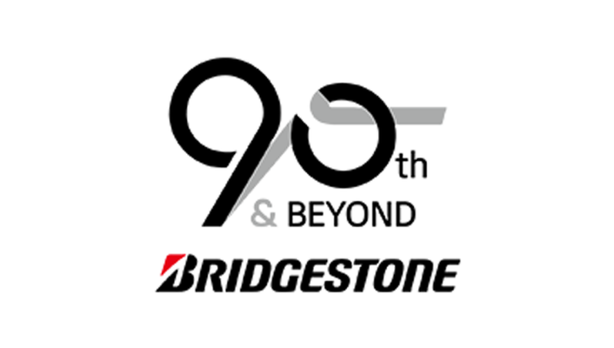
Starting with the original logo along the bottom, this logo uses a clever number mark made to look like tire burn-out marks representing the main product the company sells. Rather than just leave the mark as is, they also added the words "and beyond" to reprsent that this is a milestone on their journey rather than the end.
More Details →Washington Commanders 90th Anniversary Logo
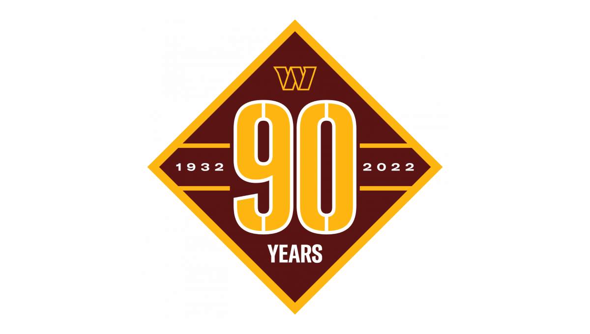
Starting with a diamond shape in the brand's red color, they place a large number 90 that nearly touches each straight side of the diamond and divides the shape into four remaining triangles. In the left and right triangles sit the years of operation. In the top triangle is placed the team's W mark while the bottom triangle holds the word "years".
More Details →Los Angeles Dodgers 60th Anniversary Logo
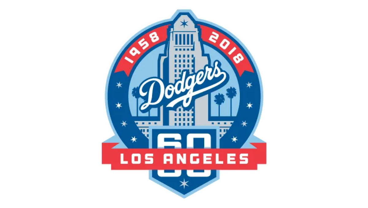
With the famous Los Angeles City Hall as the backdrop, this mark uses a blue circle for the main shape and places an illustration of that building in the center. Above that the years of operation wrap around the top edge of the circle. At the bottom a home-plate shape holds the number 60 with a ribbon holding the name of the city.
More Details →University of Missouri - St. Louis 60th Anniversary Logo
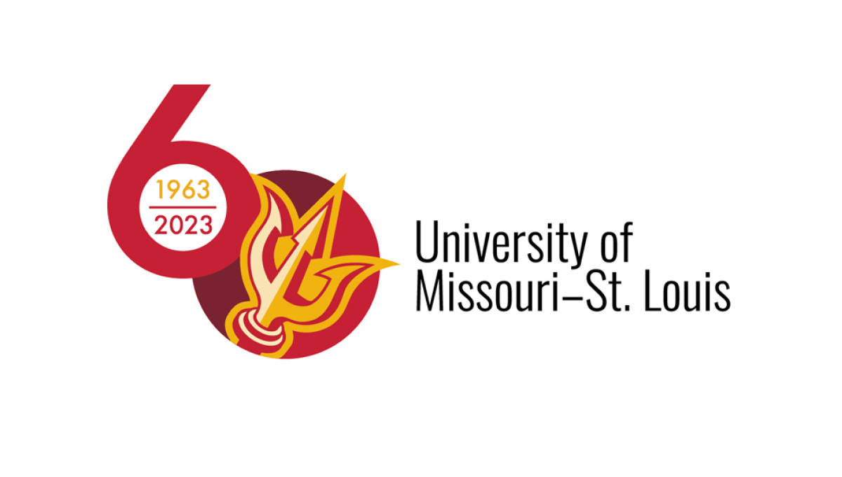
This logo sets the stage with a large number sixty with the six shifted up from the zero. Inside the six sits the years of operation for the organization, inside a filled-in zero sits the school's trident mark. This strong mark sits to the left of the name of the organization in black text, stacked on two lines and lined up vertically with the zero.
More Details →Buffalo Bills 60th Anniversary Logo
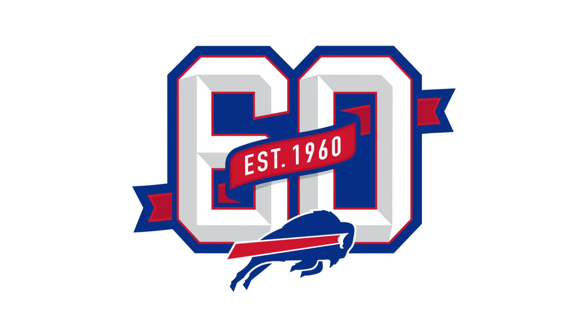
This logo builds on the classic shape, style, and format of the numbers you may see on a football jersey. Weaving in and out of both the number six and zero is a ribbon that identifies what year this footbal team was established. Below that sits the Bills' original mark to make it clear which team this logo is tied to which also reflects the colors used in the ribbon and numbers.
More Details →Samoa Independence 60th Anniversary Logo
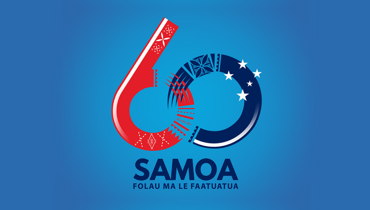
Designed for a light blue background, this logo starts with a large nuumber 60 with the ring of the six and the left side of the zero elegantly overlapping using patterns and shapes tied to the Samoan culture. At the bottom sits the name of the country with a series of starts just above and to the right of the zero to create balance and add extra meaning.
More Details →St Bernard Catholic Church 175th Anniversary Logo
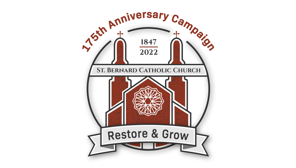
Featuring an illustration of the church's famous architecture in red, this art is wrapped in a circle to hold the bulk of the design. Above the circle sits the name of the church, at the bottom of the circle sits the church's tagline, and between the spires of the building sit the years of operation. Finally, just in front of those spires sits the name of the church.
More Details →First Baptist Church of Kenmore 100th Anniversary Logo
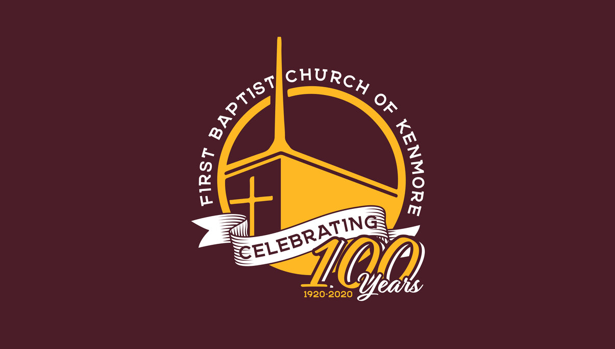
This three-dimensional logo is designed for a dark red background and uses a few classic elements to create a clean logo. First, a gold circle with a thin rim creates the shape with the name of the church arcing around the outside of the circle. Inside sits an illustration of their church with a bit of perspective to add depth. Finally a white ribbon holds the word "celebrating" with the anniversary and years sitting just in front of and below that ribbon.
More Details →Harpers Ferry National Historical Park 75th Anniversary Logo

Starting with a circle shape, this logo fills the bulk of the center area with a clean illustration of Harpers Ferry in green, blue, and yellow. In the yellow sky, lettering specifying the anniversary fills the space and adds balance. Around the rim of the circle is the name of the park with a small rectangle at the bottom holding the years of operation.
More Details →Yosemite National Park 125th Anniversary Logo
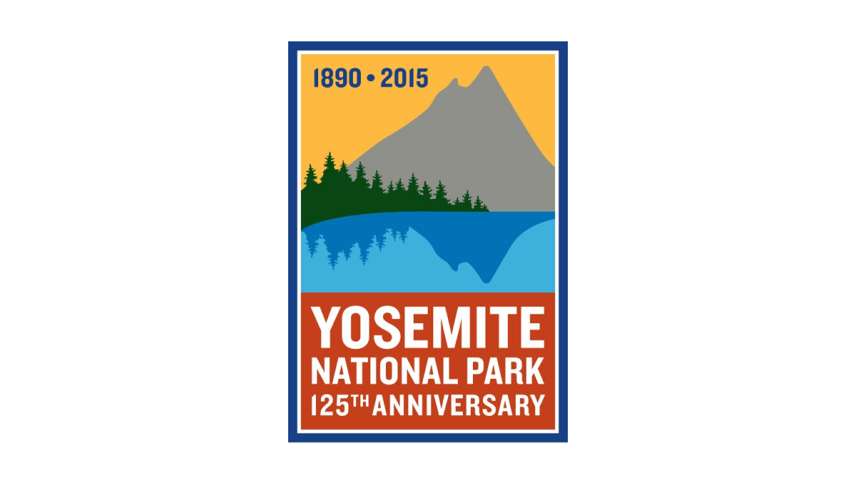
While other logos that include illustrations contain detailed depictions of well-known features, this vertical rectangle logo goes simple with a silhouette of a mountain and trees reflecting in a lake. Behind the mountain sits a yellow sky that contains the years of operation with a block of red at the bottom to hold the name of reason for celebration. A blue border surrounds the rectange to hold the elements together and neatly frame the design.
More Details →MLB All Star Game 50th Anniversary Logo
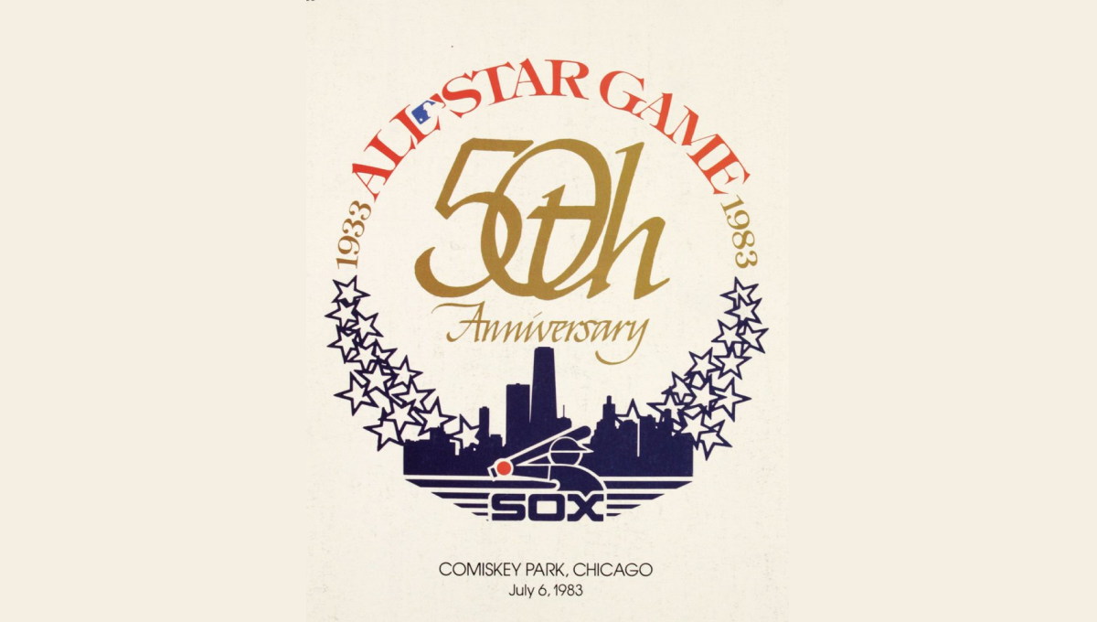
This mark was featured on a poster and sets a few elements into a clean, round shape with a "50th" in gold in the center. On the bottom sits a blue silhouette of the Chicago skyline with blue shares curving up and to the side of the skyline to begin forming the circling. On the top is red lettering signifying the occasion with the start and current years in gold connecting the two and completing the circle.
More Details →Sonic the Hedgehog 30th Anniversary Logo
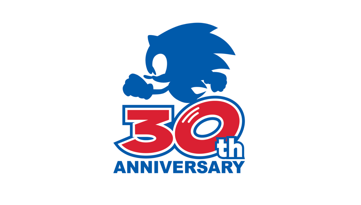
Sonic the Hedgehog's 30th anniversary logo starts with a large number 30 in red. With a white outline on that number followed by a blue outline, they gave the number added weight and a color that could blend neatly into a blue silhouette of their famous character above. At the bottom, the word "anniversary" in that same blue clarifies the meaning of the number and balances the red with blue above and below.
More Details →Anderson Hospital 45th Anniversary Logo
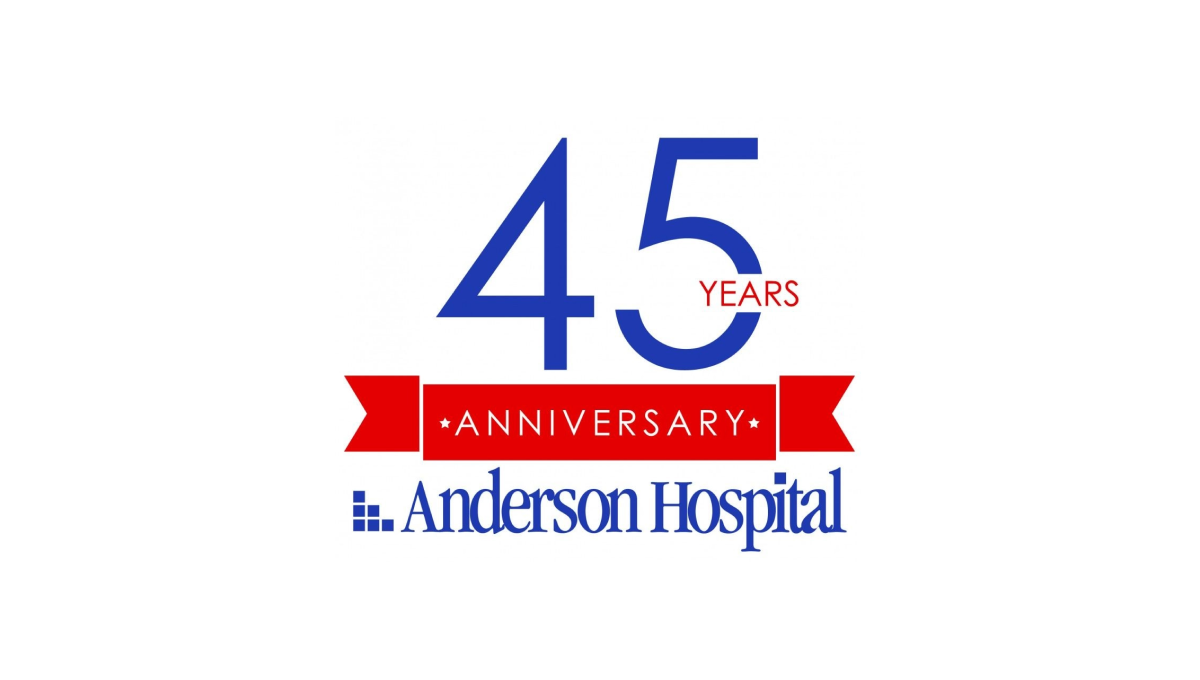
Keeping it simple, Anderson Hospital started with their traditional logo in the classic dark blue color as a base and built vertically from there. First came a red banner holding the word "anniversary" with the number 45 in brand blue above that. To keep balance, the word "years" is inset within the number 5 to avoid it sticking too far out to the side of the number which provides the focal point and primary visual weight for the logo.
More Details →Temple University Hospital 125th Anniversary Logo
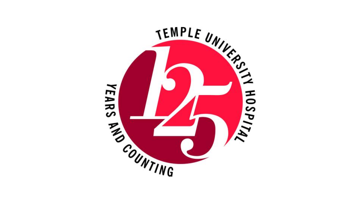
Two digits in a number creates their own design styles and three digits does the same. At 125 years, Temple University's Hospital stacked the three digits on an angle to create a clean layout for the number and focal point of this logo. Placing a circle behind the the university's classic colors and words wrapping around indicating the name and forward-looking vision for the organization, this logo is clean, simple, and effective.
More Details →Stowe 85th Anniversary Logo
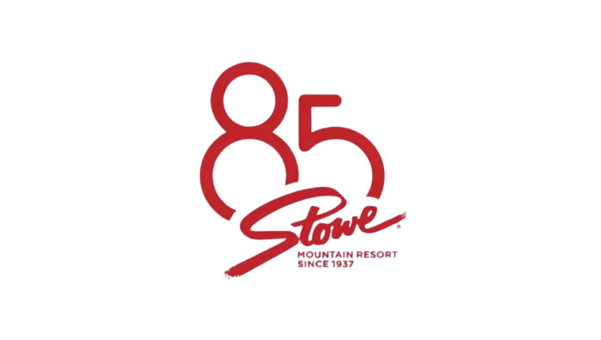
Stowe is a classic logo that hasn't changed since the early days of the resort and town. So rather than mess with something so clean and recognizable, they simply added a stylized number 85 peeking up and from behind the original mark. The result fit neatly on social media icons and marketing materials alike and kept things nice and simple.
More Details →SportsLogos.net 25th Anniversary Logo
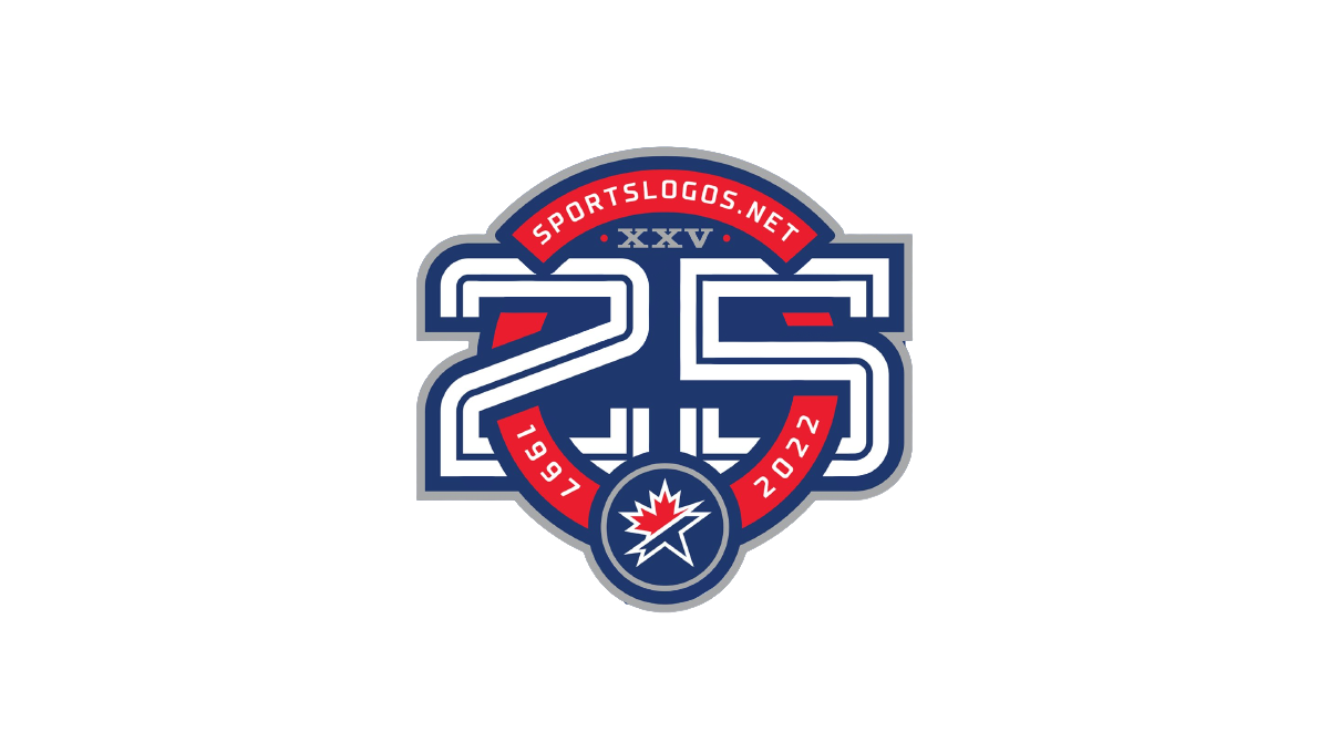
As a site that celebrates sports logos, this mark sets a high bar for anniversary logo designs. Starting with a circle in the brand's traditional red, it then cleverly weaves the number 25 in front of and behind the background to create a sharp three dimensional look. The site name and years are then set into the remaining red of the background with the original mark set in the bottom of the ring to make a clean connection to the original brand.
More Details →Snowbird 50th Anniversary Logo
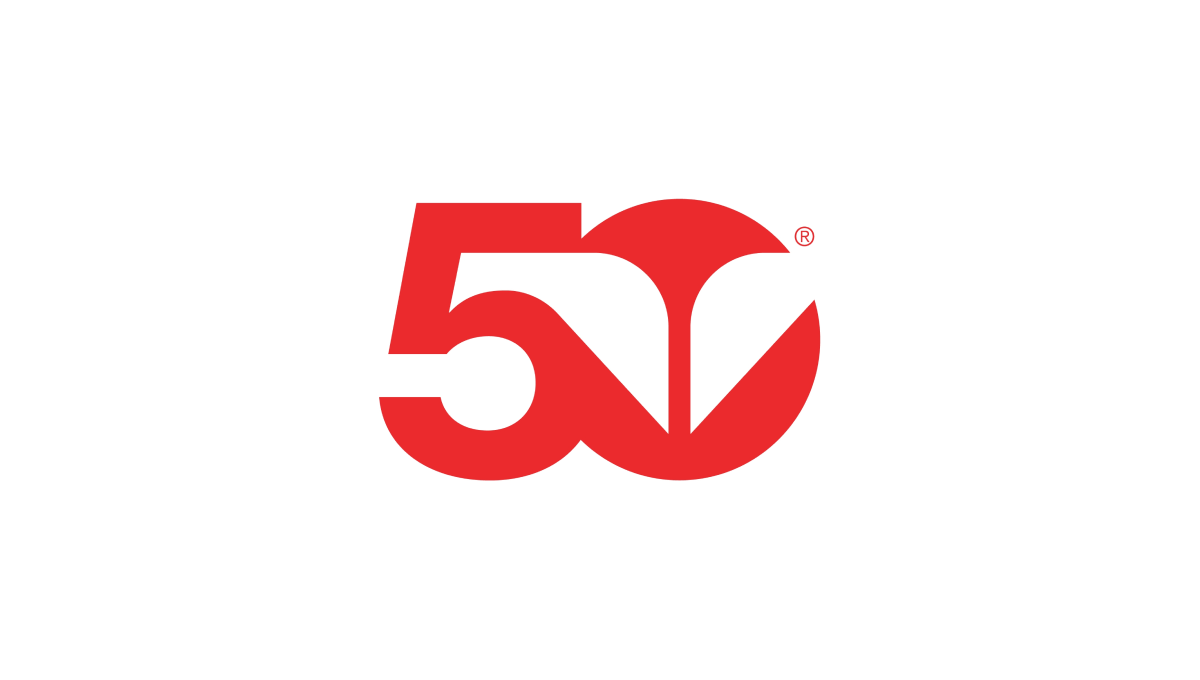
Snowbird's classic wings mark is one of the most well-known logos in the ski industry. To celebrate their 50th anniversary, the used a block number 50 in the brand's iconic red color with the wings inset in the number 0. The mark was clean, bold, and easy to recognize for anyone familiar with the snowbird brand.
More Details →Red Fern Farm Services 50th Anniversary Logo
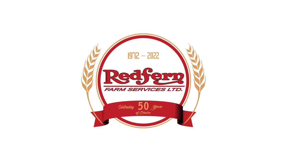
WIth a classic round shape to start, Red Fern added a ribbon with language pointing to the reason for the celebration. Inside the circle, the company's original logo was placed with their years of operation set in a lighter color just above. Similar to laurel leaves that flank the marks of film festival icons, the logo then adds curving stalks of wheat to add a final touch.
More Details →Park City Mountain Resort 50th Anniversary Logo
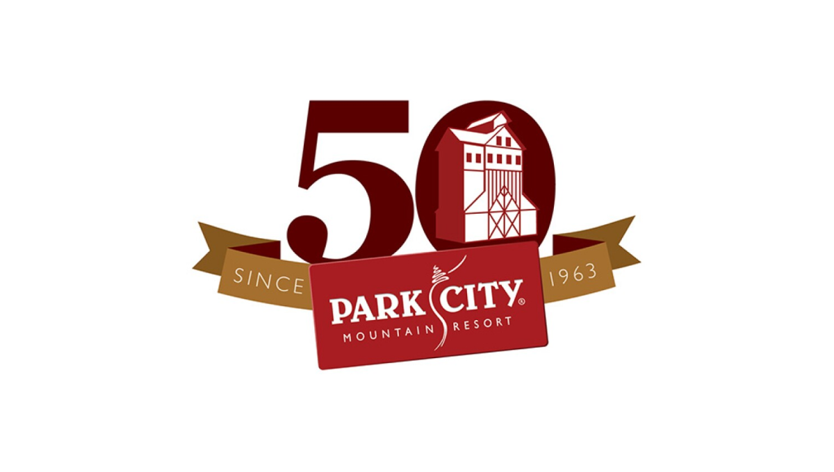
With a logo that was already set in a rectangle, Park City Mountain Resort simply turned that mark into a ribbon to contain the rest of the elements. Gold sections of the ribbon hold the words "since 1963" and the number 0 contains some clean line art depicting the mountain's well-known mining history and buildings still found at the resort.
More Details →Kelly Canyon 60th Anniversary Logo
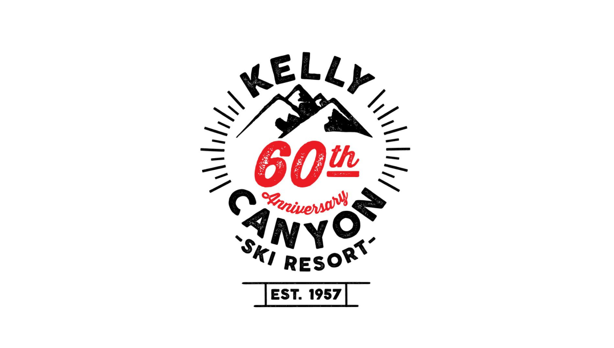
Kelly Canyon gave their designed lots of creative freedom and focused on a mark that was fun and recognizable rather than one that has strong, visual ties back to their original brand. The clean line-art design that they came up with works great in many situations - web, print, etc. - and creates a separate brand for their annversary.
More Details →Jackson Hole 50th Anniversary Logo
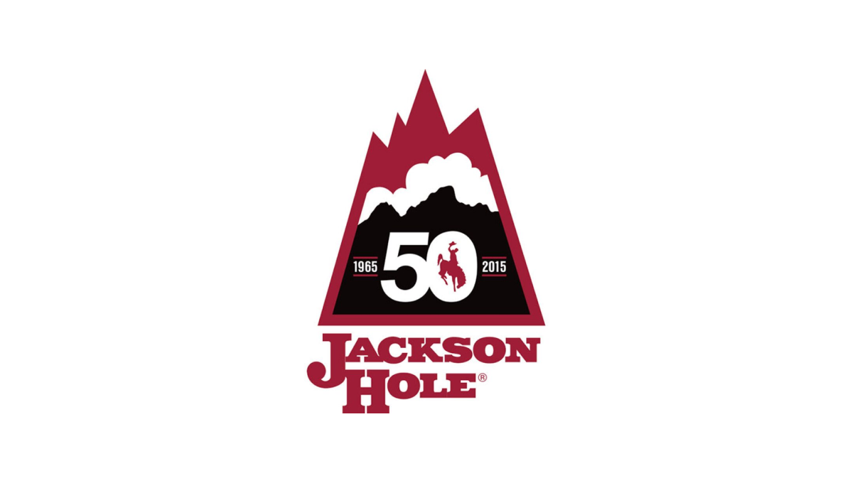
Jackson Hole Mountain Resort combined a shape found in one of their original logos with the layered red, white, and black colors found in their current logo to create a lockup that nearly merges the past with the present. They then the number 50 in the center of the large, black portion at the bottom of this mark to wrap up this strong, meaningful mark.
More Details →Foxbury Film Festival 25th Anniversary Logo

This logo starts with a circle and adds rings to give the designers space for both a silver border to hold the entire design together as well as space to add circular words to specify both the event's name as well as their years of operation. In the center, a stylized reference to the annerversay year and slowly brigtening colors draw attention both the number and center of the logo.
More Details →Canadian Tire Motorsports Park 50th Anniversary Logo
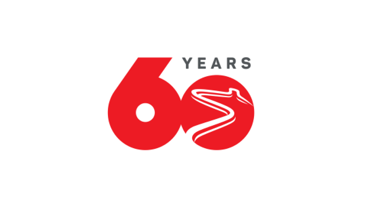
Simplicity is the theme of this number-focused anniversary logo. With the brand's bold, red color at the heart and the number 60 representing the bulk of the design's footprint, by shrinking the number zero to make room for the word "years" and adding a racetrack shape into that same zero, they have a classy, clean logo that checked all the boxes they needed.
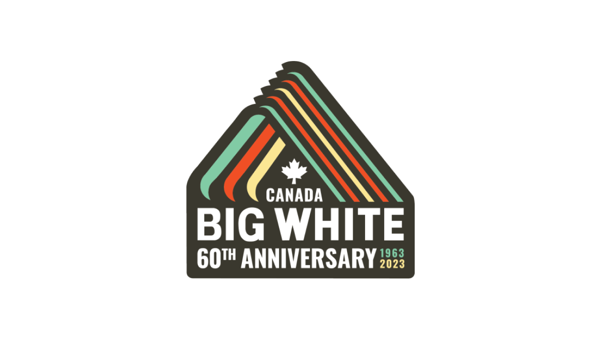
More Details →Big White 60th Anniversary Logo
With a throwback to one of Big White Mountain Resort's original logos, this adaptation brings in a modern, sticker-style badge and extra line of text to hold the anniversary label, with a three-color design that's also a little bit retro. A simple combination of past and present, this is a great use of original logos with modern design needs.
More Details →Amstrong Air & Space Museum 50th Anniversary Logo

This badge-style logo features a prominent number wrapped in imagery and colors that align with the airforce, space, etc. theme that the museum - named after Neil Armstrong - is known for. A wrapped ribber contains the years of operation with an off-white background so set it apart from any white backgrounds it's used on.
More Details →