120th Anniversary Logos
Harley-Davidson 120th Anniversary Logo
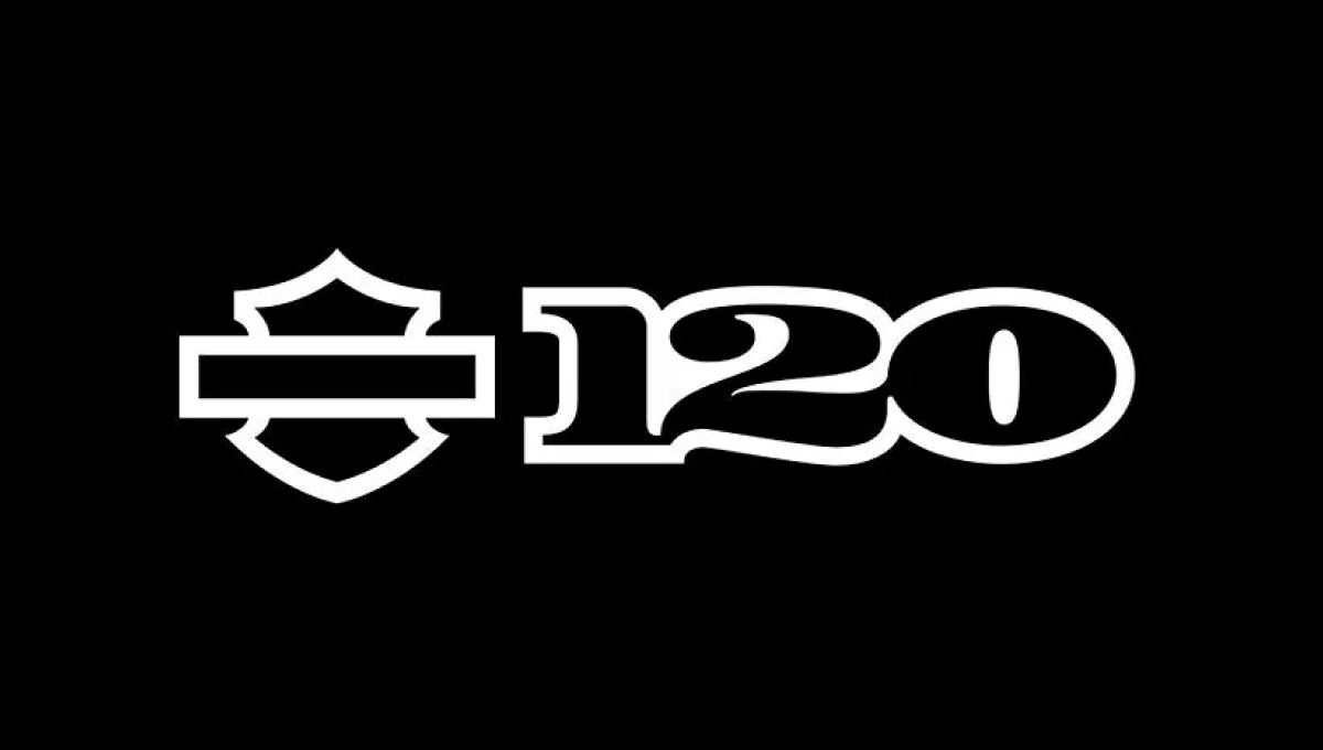
When you have a brand as famous as Harley-Davidson, using just the shape or your mark is more than enough for the general public to recognize it. Adding a clean number 120 to the right of this mark in their classic font all on a black background created a clean, simple design that was easy to recognize and neatly on-brand.
More Details →Lux International 120th Anniversary Logo
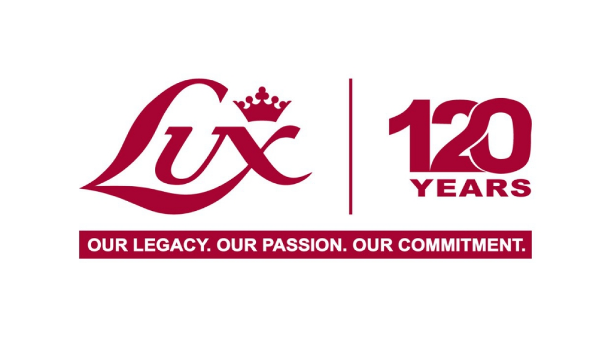
In a style that is becoming more and more common, this logo simply takes the traditional Lux logo in red, draws a vertical line to the right, and on the other side of that line places a stylized number 120 with an overlapping and intertwined 2 and 0. These logos are simple, convey the meaning clearly and simply, but also look sharp and balanced.
More Details →Traditional Bank 120th Anniversary Logo
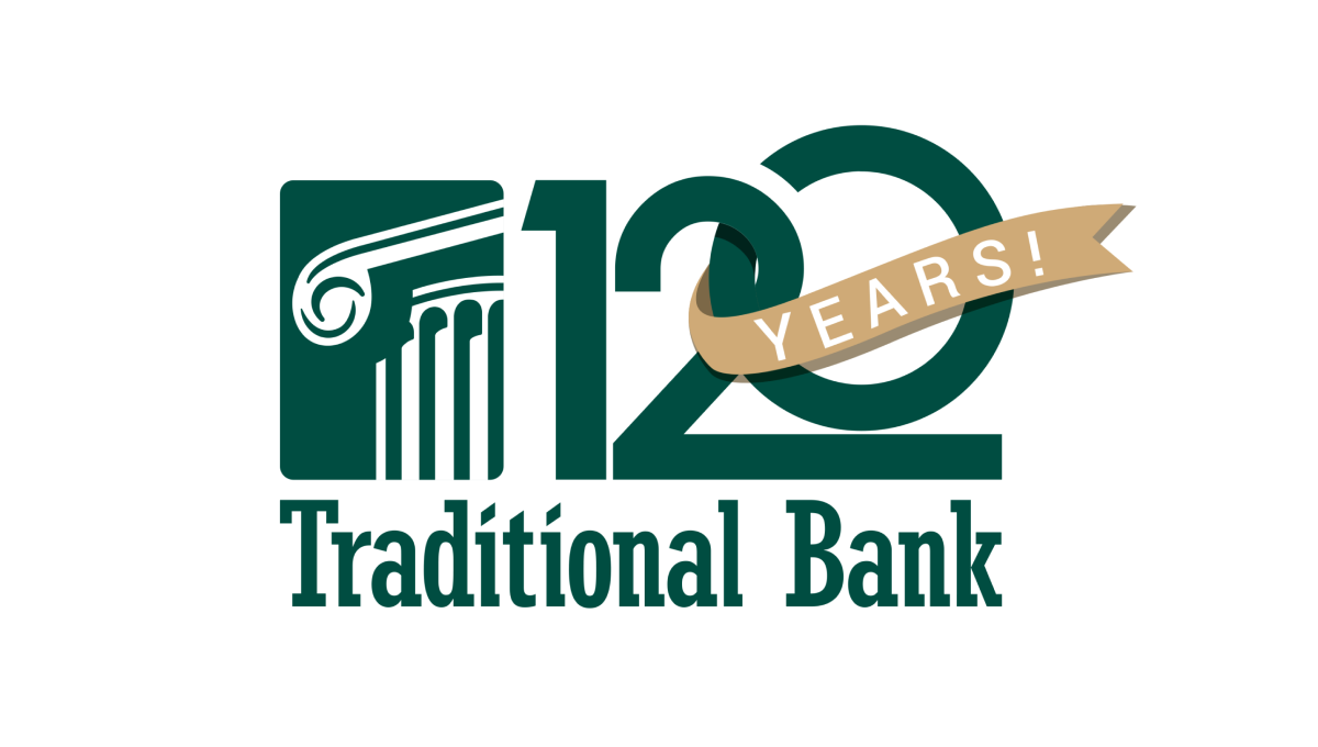
Normally the silhouetted columns in this logo sit in line with the name, but for this logo design they placed that mark above the words and enlarged it slightly which created room for a large number 120. This number features overlapping characters and a vertically offset 0 as well as a gold ribbon holding the word years that wraps around part of the number.
More Details →