Seal Anniversary Logos
Chicago Cubs 150th Anniversary Logo
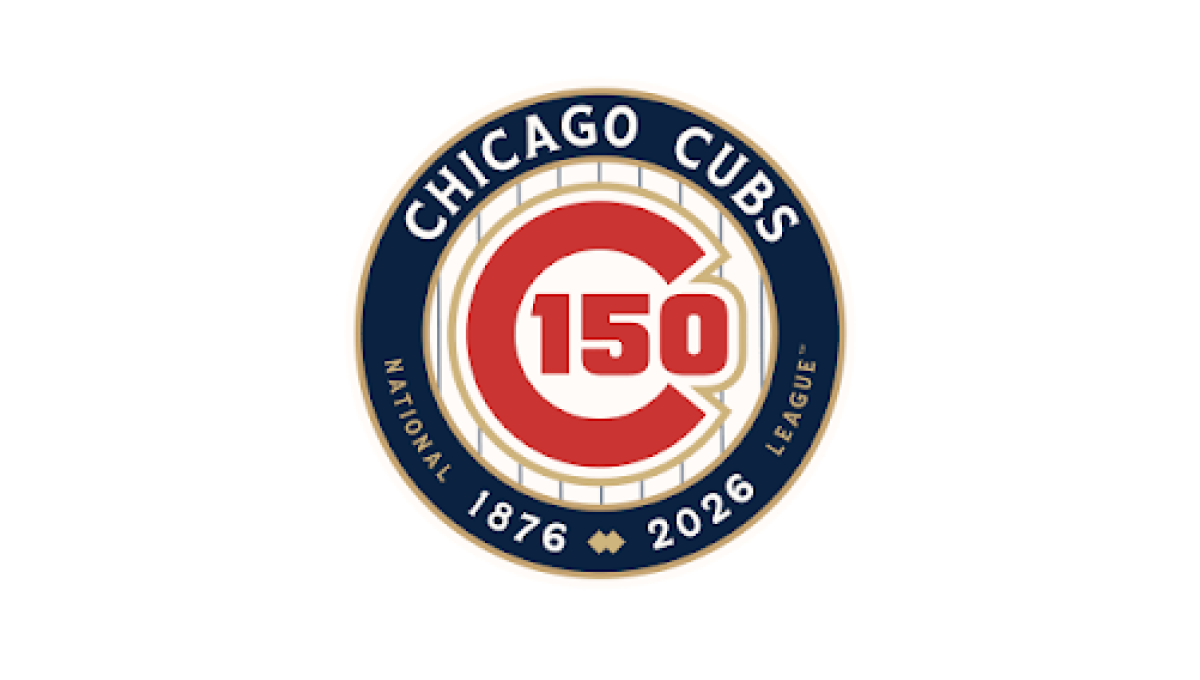
This anniversary logo features a classic, emblem-style design with a clean and timeless appearance. A circular badge serves as the centerpiece, combining the milestone number with familiar brand elements in a balanced layout. A limited color palette and subtle metallic accents give the design a polished, commemorative feel without being overly decorative. Supporting text below reinforces the anniversary message, creating a strong, professional logo that highlights tradition, longevity, and a sense of lasting achievement.
More Details →Kirby 20th Anniversary Logo
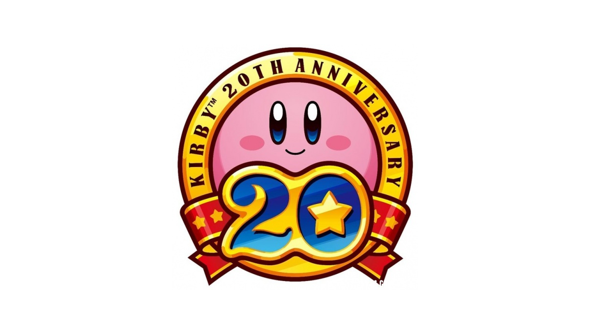
This anniversary logo shows a round, pink character with a soft smile at the center of a bright badge. The design uses warm gold and red colors, giving it a celebratory feel. A large number “20” sits in front, with a small star adding a playful touch. Ribbon shapes and bold outlines make it feel special and proud, like a milestone being honored in a fun, friendly way.
More Details →Utah Shakespeare Festival 65th Anniversary Logo
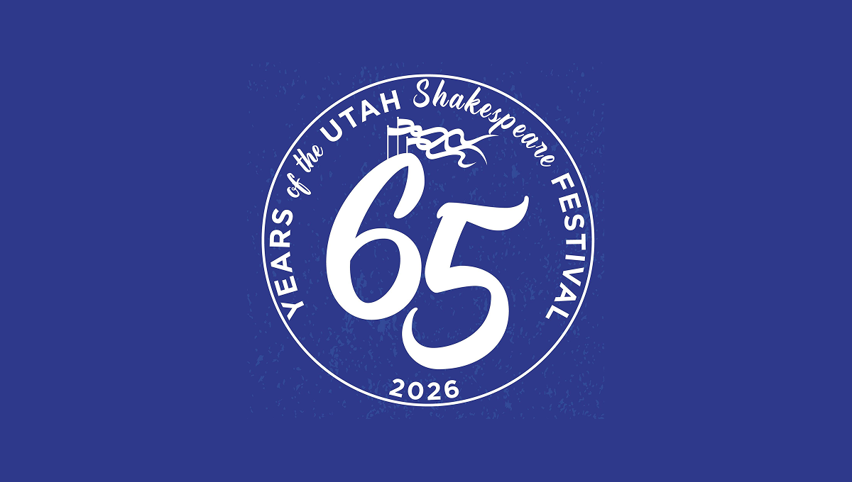
This anniversary logo has a bold, round design with a strong, classic feel. A large “65” sits in the center, standing out clearly and suggesting an important milestone. The words around the edge form a circular frame, giving the logo balance and unity. A small flag detail adds a subtle historical touch. The single color palette feels calm and timeless, while the slightly textured background gives it warmth and character. Overall, it feels celebratory, traditional, and respectful of history.
More Details →US Open 125th Anniversary Logo

This 2025 U.S. Open logo has a clean, traditional look with a touch of elegance. The text is clear and spaced out, with “125th U.S. Open” and “Oakmont” standing out. At the center is a simple image of a squirrel, adding a classic feel. It feels formal and steady, fitting for a long-standing and respected event.
More Details →FC Barcelona 125th Anniversary Logo

The anniversary logo features a clean and modern design that blends tradition with a sense of celebration. It includes bold, simple shapes and a familiar crest, subtly updated to mark a special milestone. The colors are rich and meaningful, reflecting the identity of the group it represents. Numbers and symbols are placed thoughtfully, suggesting the passage of time and a proud history. Overall, the design feels respectful and strong, with a touch of elegance.
More Details →Eastern Michigan University 175th Anniversary Logo

There are a few elements that show up regularly in both anniversary logos as a whole and designs for universities, and while this holds to a fairly traditional design, it does so in a nice clean pckage. Around the outside of the circle is the name of the university, in the center is the big number for the years of operation. A few laurel leaves curving around the sides to fill in the gaps and two rings to hold it all together and you've got a simple but effective design.
More Details →Clarendon Hills 100th Anniversary Logo

This design adds a little more detail that wer're used to seeing in anniversary logos. A gold circle holds artwork that is close to the actual appearance of a famous landmark instead of using the more common silhouette or line-art depiction seen in other logos. Below sits the name of the village stacked to align to the width of the design. The result looks really sharp and likely works just fine on most situations aside from places where limits on colors may come into play like screen printing or embroidery.
More Details →Uni Watch 25th Anniversary Logo

With a sports/university theme, I love that this logo kept that vibe int he design as well. In this case, a large number 25 sits in the center in the classic sports lettering. Below sits imagery associated with their original brand. Around the edge is a thick green circle to hold the description of the brand the reason for the celebration.
More Details →Geissler's Supermarket 100th Anniversary Logo

This logo design brings a clean, traditional approach to this supermarket chain's usual logo. Placing their red word mark in the center and wrapping it with a simple shape that adds some unique corners instead of a standard rectange, their then add a shiny, gold circle behind with the words commemorating the occasion and filling out this seal-style concept.
More Details →Trollhaugen Recreation Area 75th Anniversary Logo

When your ski area has a name like Trollhaugen, you've gotta keep things a little bit playful in all of your marketing and they've extended that fun, causal vibe to this anniversary logo. With the common circle shape, they place an illustration of their mascot at the center, their name and anniversary above and below following the curve of the circle, and a blue ribbon holding their years of operation to tie it all together.
More Details →Boilermakers Local 154 130th Anniversary Logo

This is a classic logo design that borrows some sports-style shapes, colors, and depth to create a really nice mark. Building around a large number 130 with a welder's mask below and their union's name and number above, some arcing laurel leaves and a ribbon to hold the word anniversary are layered to create a nice, cohesive design that's as easy to understand as it is bold.
More Details →Battes of Saratoga 250th Anniversary Logo

Starting with a large number 250 in the center in the classic, handwritten style of the era it represents, this logo builds around it using a seal-style round shape that features the name and a small cannon icon. Wrapping around the bottom is a red ribbon with the tagline of this famous moment in United States history.
More Details →Wenbley Stadium 100th Anniversary Logo
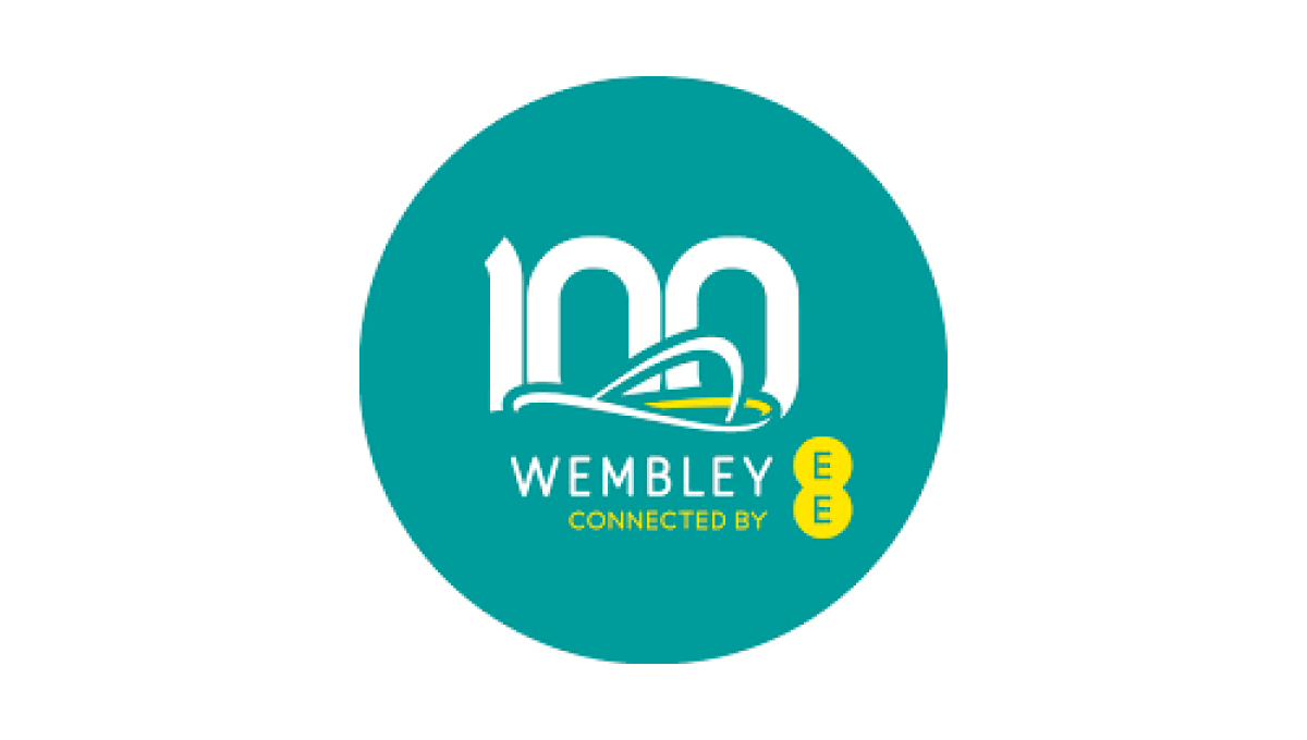
When your architecture is as famous as Wembley's, all you need is a silhouette of your iconic roofline to create the foundation of a logo that is both easy-to-recognize and an elegant set of lines to build on. A number 100 peeks up from behind the stadium and the curren sponsor and name below creates a sharp-looking logo for their century anniversary.
More Details →American Bakers Association 125th Anniversary Logo
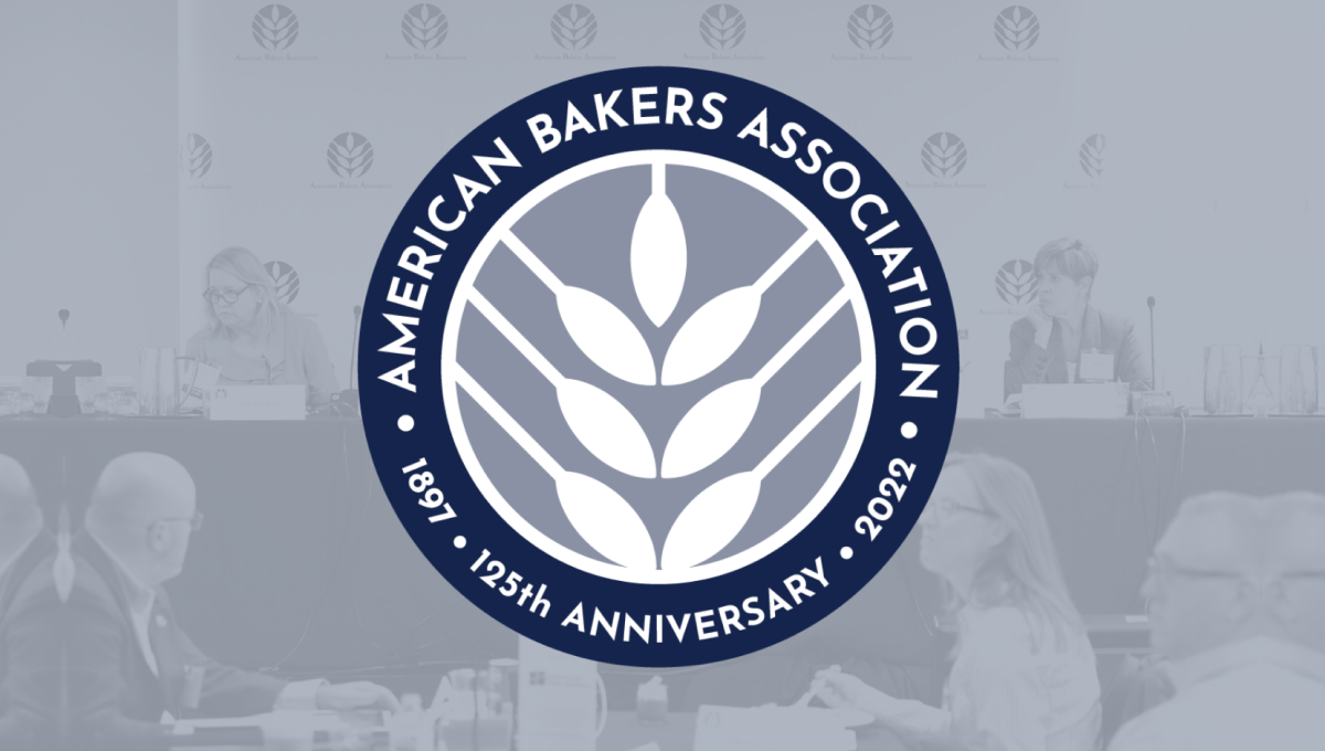
Using the round shape so often found in anniversary logos, this mark adds a clean, on-brand white silhouette of wheat in the center as the visual anchor for the design. Around the perimeter of the circle in a thick blue band wits the name of the organization, the years of operation, and the classic anniversary callout to complete the circle and add clarity to the reason for this separate mark.
More Details →American Gymnastics Academy 30th Anniversary Logo
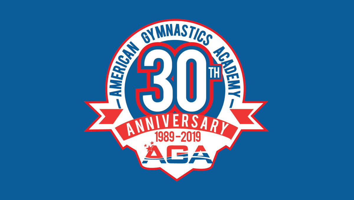
This classic logo combines a few common elements into a really tidy package. First, the logo uses a circle for the base with a large number 30 set in the upper middle of that circle. Next, a ribbon comming across the lower part of the circle holds the reason for the celebration. Finally, the organization's traditional logo sits below the ribbon with their name arching around the edge.
More Details →Meadow Mill 25th Anniversary Logo
While many logos are meant to stand alone and represent the company as a whole, this design was simply meant to be paired with the traditional logo, website, or other assets. Around the left side of the circle is a list of the reasons people love this fitness center while the center holds the number 25 and the other side of the circle is ringed with the word anniversary.
More Details →Cleveland Browns 75th Anniversary Logo
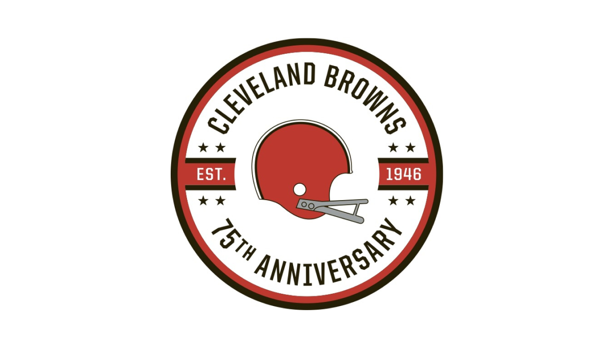
While the Cleveland Brown's "brown" is closer to an orange, they build on this traditional brand color with a circle in this palette as well as a helmet in the center. Around the outside sit the name of the club and words denoting the reason for the celebration with two bars coming in from either side containing the years of the team's existence.
More Details →Pittsburgh Penguins 50th Anniversary Logo
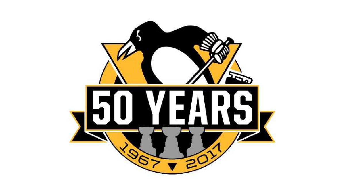
Using the styles famous for their original logo, this logo takes a large circle and wraps a "50 YEARS" ribbon just below center and around either side of the circle. The traditional penguin-with-a-hockey-stick mark slides up from behind with the years of the organization's existence at the bottom. Not to be overlooked are gray silhouettes for each of the team's Stanley Cup titles.
More Details →United States Aircraft Insurance Group 90th Anniversary Logo
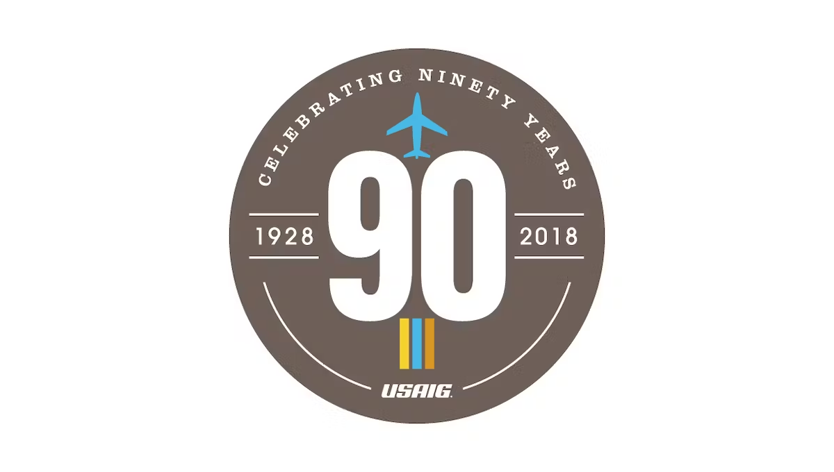
This logo starts with a clean, tan-ish brown circle and a large number 90 in the center. Along the top is the celebration reason written out in words, along the bottom is the name of the organization. Above and below the 90 sit simple illustrations associated with the industry they work in. The result is clean and looks really nice.
More Details →Sugar Land Texas 60th Anniversary Logo
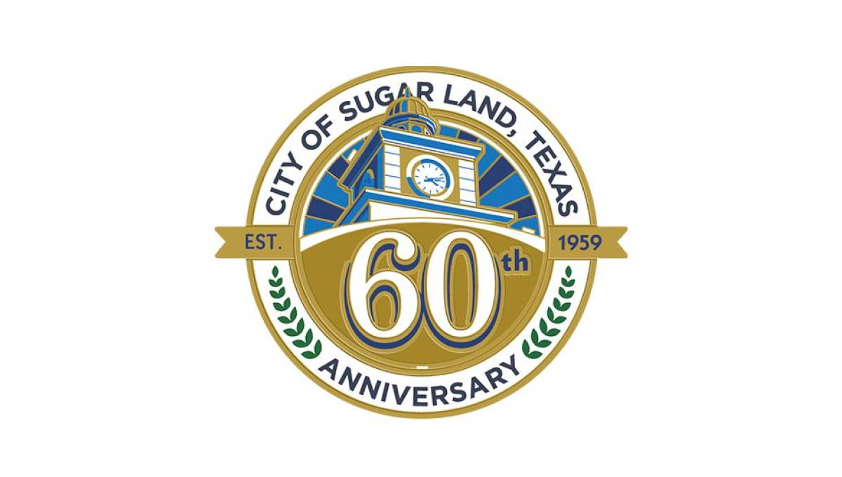
With a seal-style shape to start, this logo places the name of the town, the word anniversary, and laurel leaves in an arc between the outer edge and inner ring. Inside the smaller circle sits an illustration of city hall with a large number 60 sitting just below than on a gold background. A smaller ribben between the number and the illustration holds the years the city was founded and the current year of celebration.
More Details →First Bible Baptist Church 25th Anniversary Logo
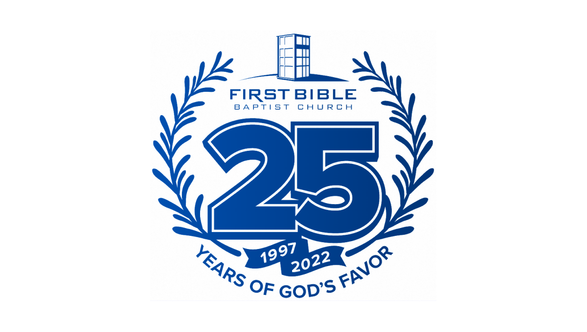
With laurel leaves curing upward to form the shape and the church's traditional logo at the top, this logo then places a large number 25 in the center to add balance. The number also features a solid shadow and outline for depth plus a ribbon below holding their years of operation. Below that, the church's tagline sits to round out this logo.
More Details →First Baptist Church of Kenmore 100th Anniversary Logo
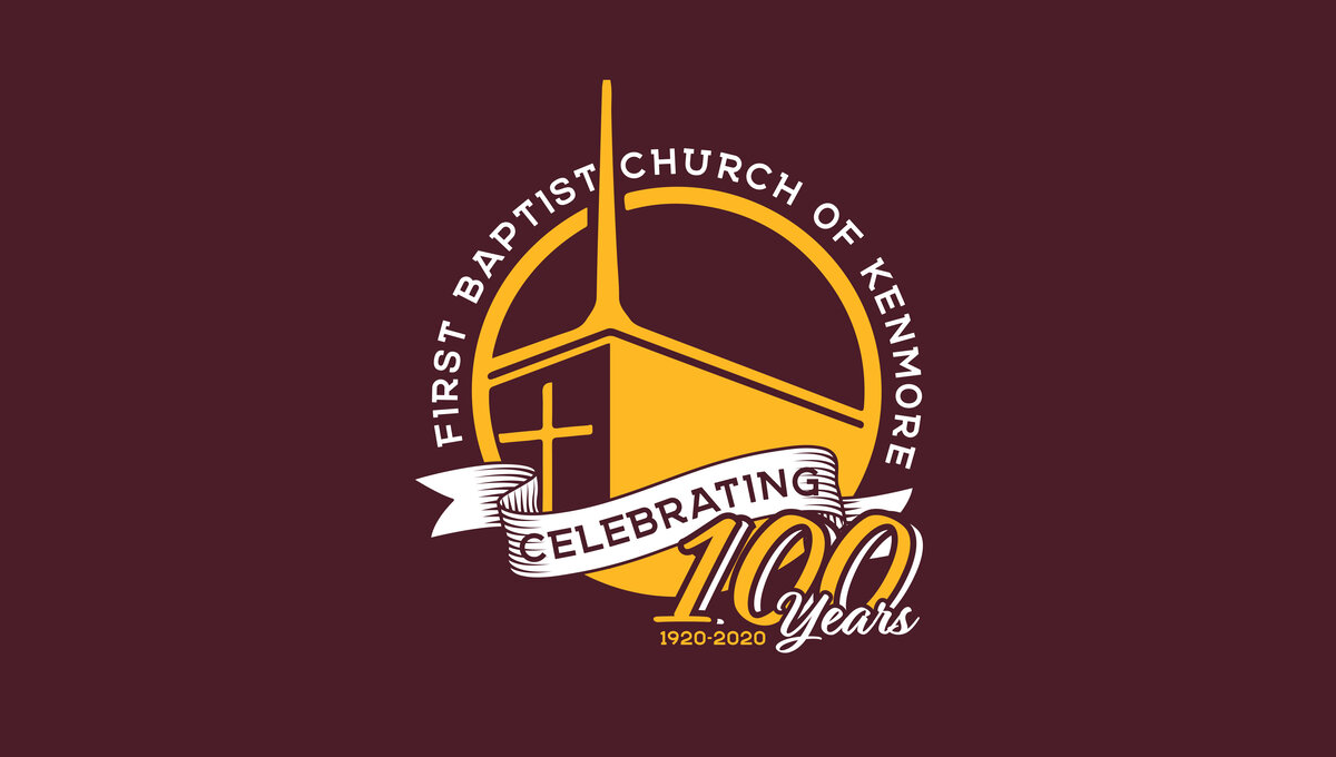
This three-dimensional logo is designed for a dark red background and uses a few classic elements to create a clean logo. First, a gold circle with a thin rim creates the shape with the name of the church arcing around the outside of the circle. Inside sits an illustration of their church with a bit of perspective to add depth. Finally a white ribbon holds the word "celebrating" with the anniversary and years sitting just in front of and below that ribbon.
More Details →Abiding Word Lutheran Church 50th Anniversary Logo
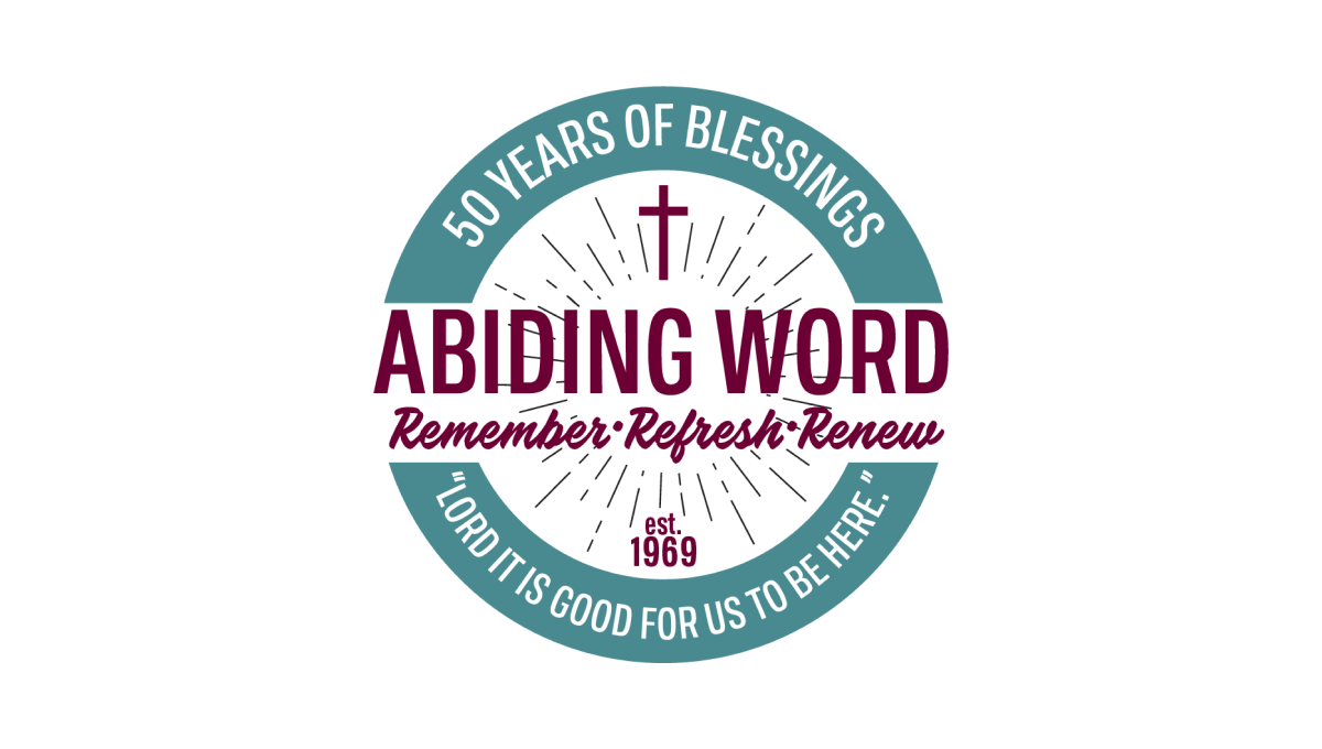
Starting with a thick-bordered circle with white in the center and teal on the rim, this logo places the church's tagline and anniversary year in curved letters on this rim. Inside the center sits the name of the church and another tagline for the congregration. Above and below are lines eminating outward with a cross above and "est 1969" block of text below to add additional color and balance.
More Details →National Park Service Volunteer 50th Anniversary Logo
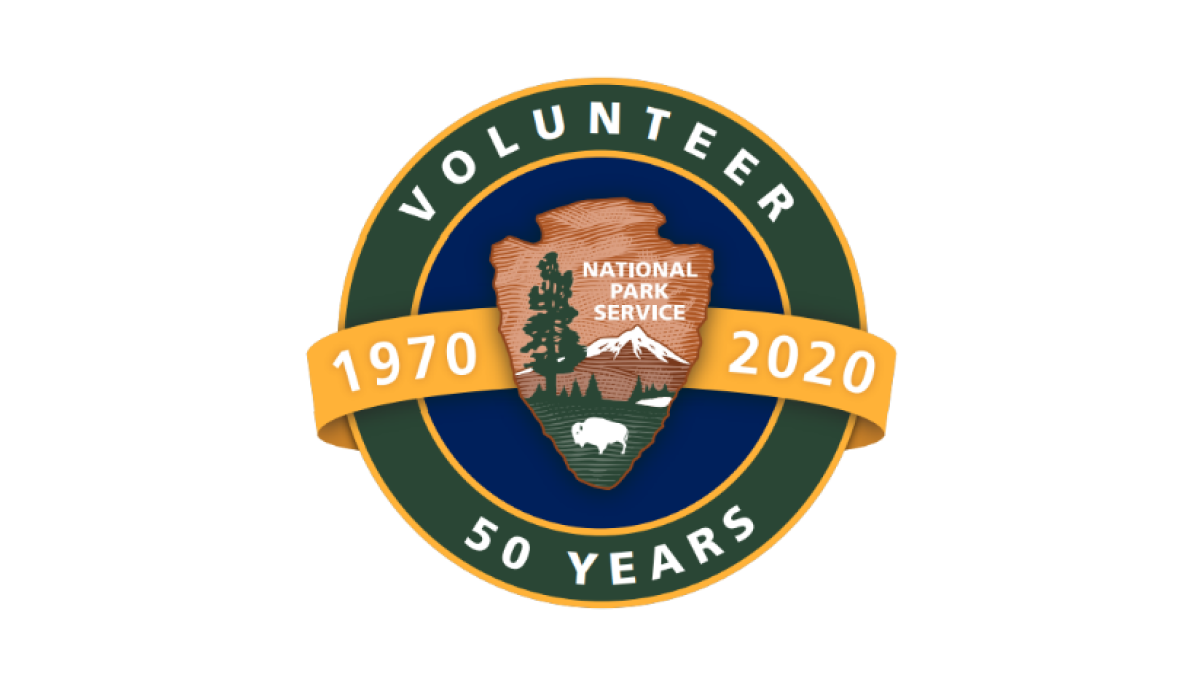
Building on the National Park Service's original logo in the center, this mark adds a circle behind to form a seal and hold wording that specifies this logo is for their volunteer program and the year they're celebrating. Behind the original log and in front of the circle sits an orange ribbon holding the years this program has been in place.
More Details →Acadia National Park 100th Anniversary Logo
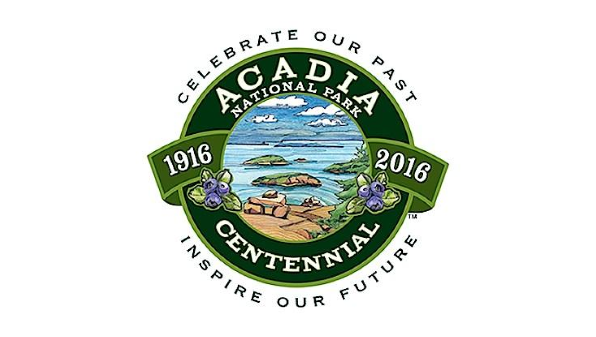
This seal-style logo uses a number of details to create a clean, balanced whole. First, a green circle with wide rim holds the name of the park and the word "centennial". Next, the inner circle is filled with an illustration depicting to beautiful shores and plants found in the park. A ribbon then holds the years of operation with arcing words above and below the seal holding the motto.
More Details →Harpers Ferry National Historical Park 75th Anniversary Logo

Starting with a circle shape, this logo fills the bulk of the center area with a clean illustration of Harpers Ferry in green, blue, and yellow. In the yellow sky, lettering specifying the anniversary fills the space and adds balance. Around the rim of the circle is the name of the park with a small rectangle at the bottom holding the years of operation.
More Details →Rocky Mountain National Park 100th Anniversary Logo
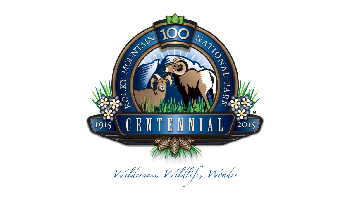
This detailed anniversary logo uses a seal-style design to hold many unique elements related to the park. In the rim sits the name with a keystone shape holding the number 100 at the top. Across the front sits a ribbon holding the word "centennial" and the years of operation. Inside the seal are illustrations of wildlife with flowers and plants below and to the sides of the seal.
More Details →MLB All Star Game 50th Anniversary Logo
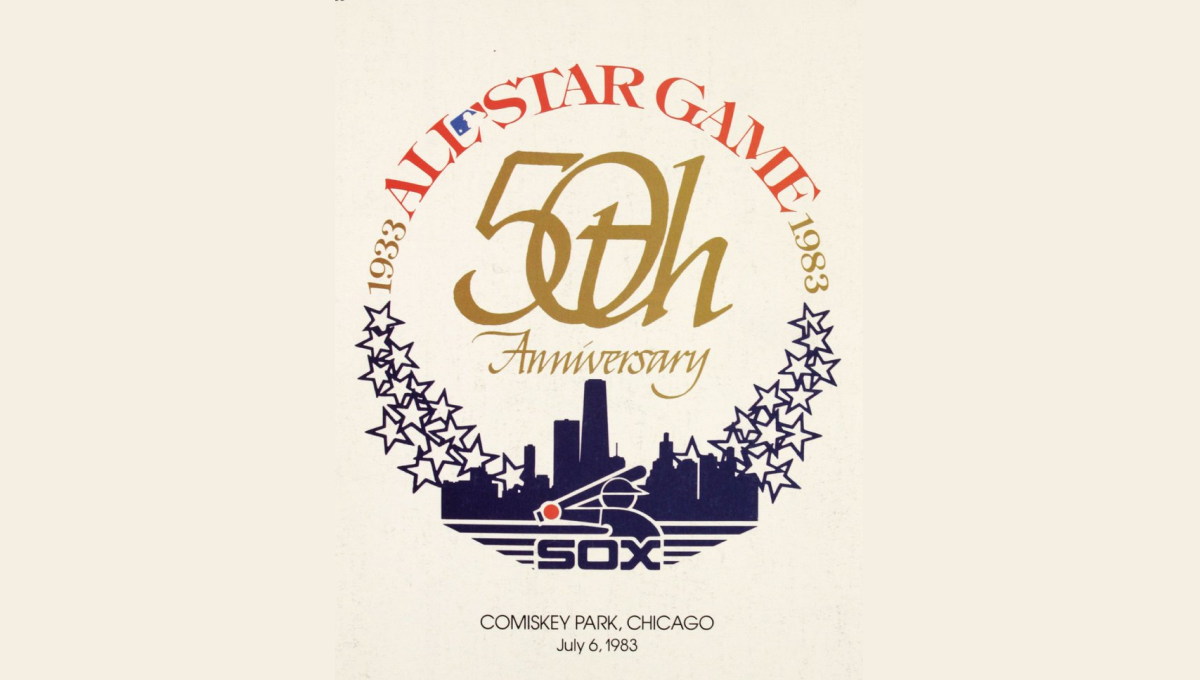
This mark was featured on a poster and sets a few elements into a clean, round shape with a "50th" in gold in the center. On the bottom sits a blue silhouette of the Chicago skyline with blue shares curving up and to the side of the skyline to begin forming the circling. On the top is red lettering signifying the occasion with the start and current years in gold connecting the two and completing the circle.
More Details →Bay Shore Inn 100th Anniversary Logo
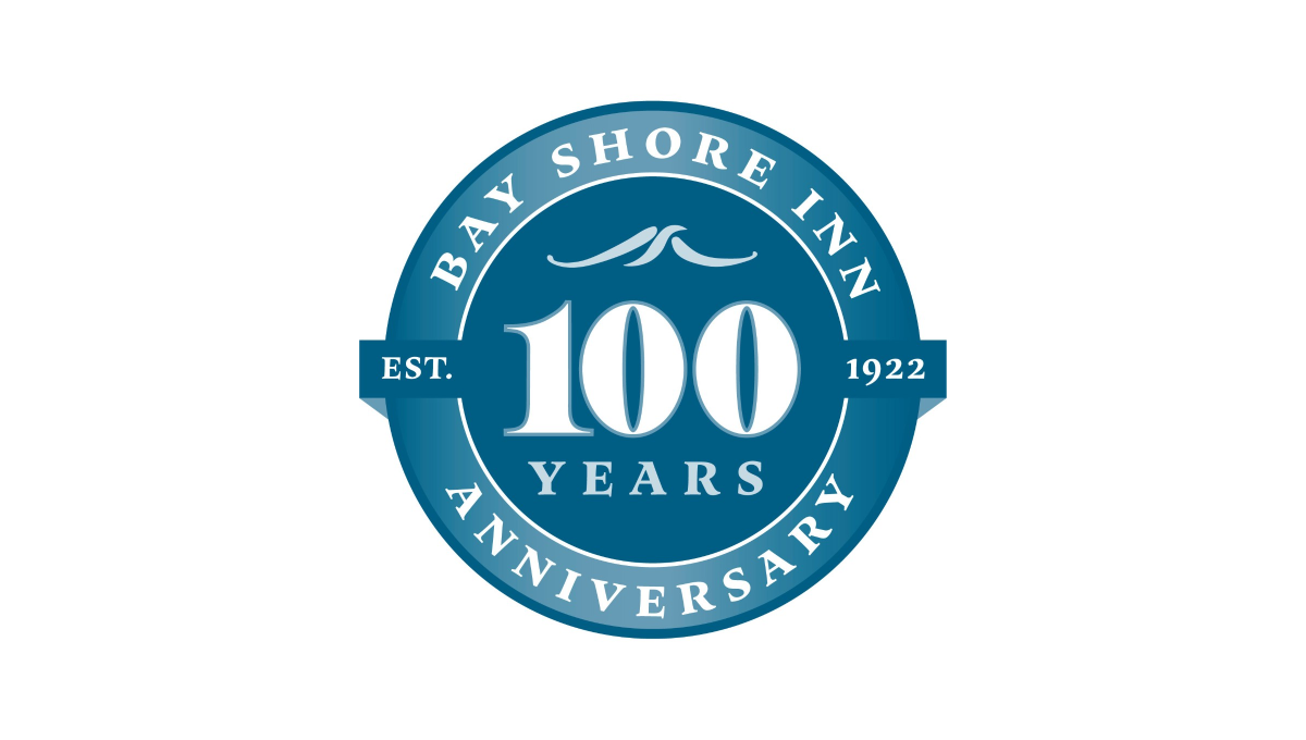
Building on the classic vibe of a lake or water themed brand, this logo uses a round seal-style shape as the foundation. Two tones of the brand's classic blue color make an inner circle and thick, outer rim. In the center is a large number 100 with the word "years" and a small wave icon set above and below to fill the circle. In the rim is the name of the inn and the word "anniversary" with a simple ribbon holding the year the inn opened.
More Details →Columbia International University 100th Anniversary Logo
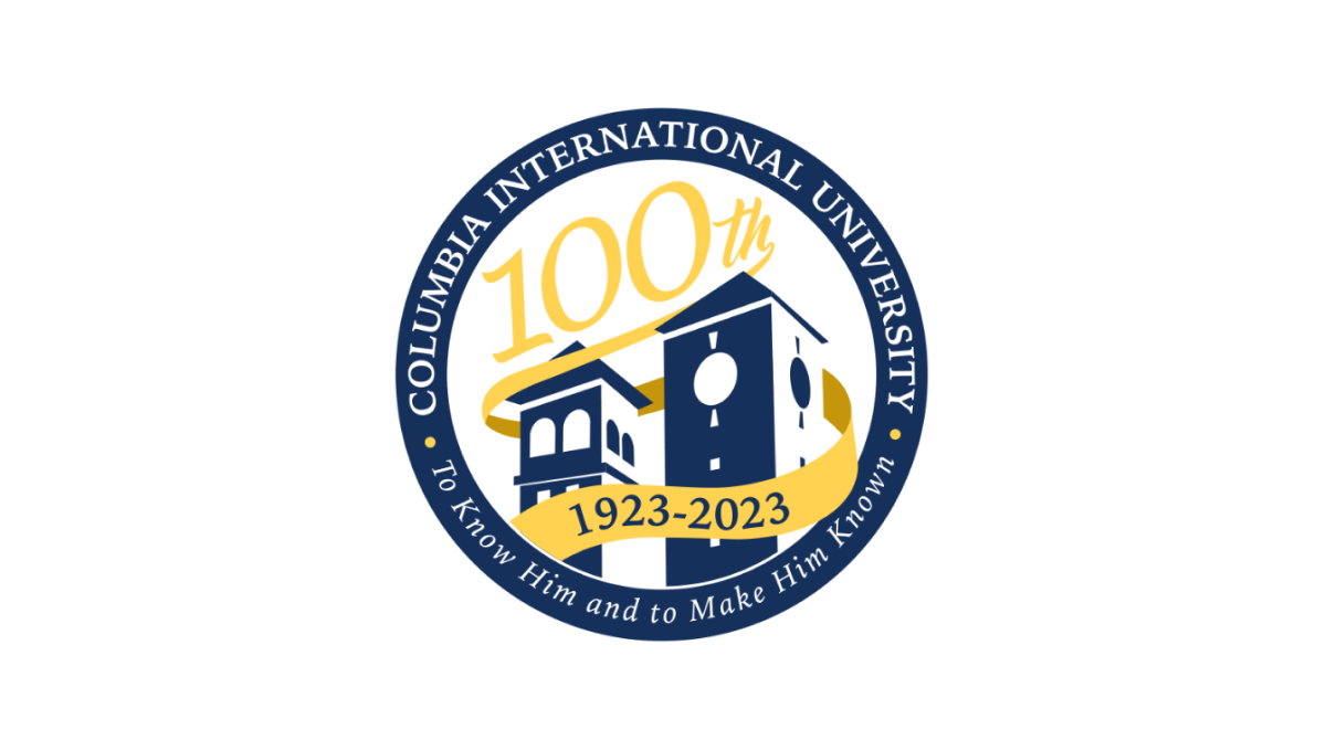
This logo uses a circle with a thick, navy blue border as the foundation. Inside that rim sit the name and mission statement of the school. Inside, a three dimensional silhouette of the school's famous buildings fills in the lower half of the space with a large number 100 in yellow following the angle of the buildings to neatly use the rest of the area inside the circle. A ribbon wrapping around the buildings then completes the design and contains the years of operation.
More Details →St. Rose Dominican 75th Anniversary Logo
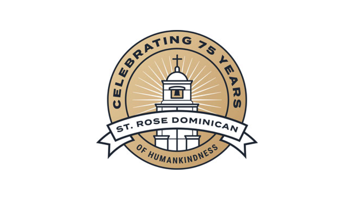
With a gold circle as the background, a stylized line-art representation of their classic buildings sits inside and words describing "celebrating 75 years" wrap around the rim. In a clean, slightly curved ribbon sit the words "St. Rose Dominican" to put the name of the organization front and center in this sharp, badge-style anniversary logo.
More Details →California Coast University 50th Anniversary Logo
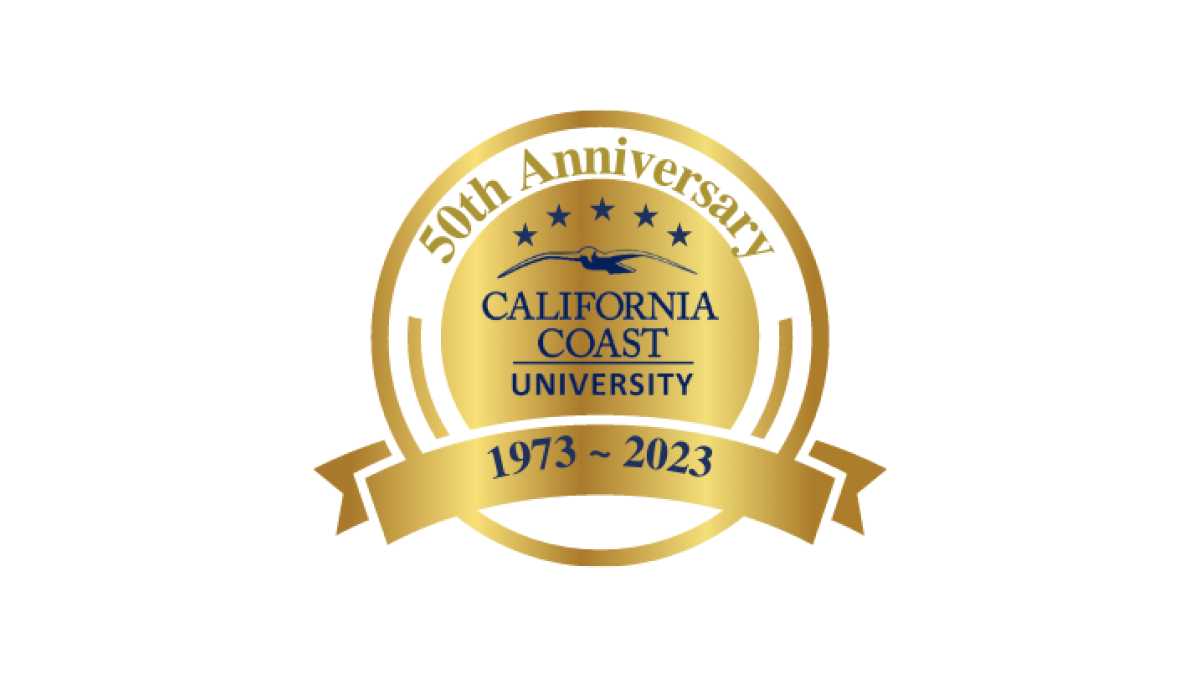
With a very class "seal" style shape as the base, this logo from California Coast University simply adds some dark lettering inside that seal shape to crate a mark that does it's job and doesn't require to much complexity. Like many of this circular, seal-shaped logos, they've also added a ribbon at bottom to display their dates of operation.
More Details →