70th Anniversary Logos
Guiness World Records 70th Anniversary Logo

This anniversary logo is a nice take on the traditional guinnes world records logo. They just placed a '7' of the same style in front of their logo-- and BAM! Anniversary logo! It works really well, with the traditional logo being a 0 and having all the classic elements as the normal logo. The classic blue color works well to mark an imporant milestone.
More Details →Heavenly Mountain Resort 70th Anniversary Logo
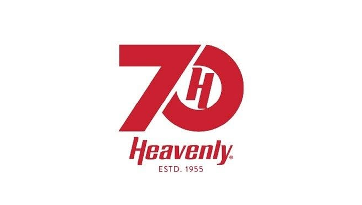
The anniversary logo has a clean and balanced look that feels modern but also familiar. Simple shapes and smooth lines come together in a calm, thoughtful way. The design suggests a sense of time passing and shared history without showing too much detail. The colors feel steady and respectful, giving the logo a warm but professional tone. Overall, it quietly marks an important milestone while staying clear, flexible, and easy to recognize.
More Details →Disneyland 70th Anniversary Logo

With a brand like Disneyland, you know they're going to deliver a great anniversary logo and this version did not disappoint. The classic word mark starts it off with a two-tone purple number seventy crowned with the traditional castle silhouette in pink to make a clean, tidy package that will likely make it easy to use given the similar dimensions to the original logo.
More Details →Boyne Mountain 70th Anniversary Logo
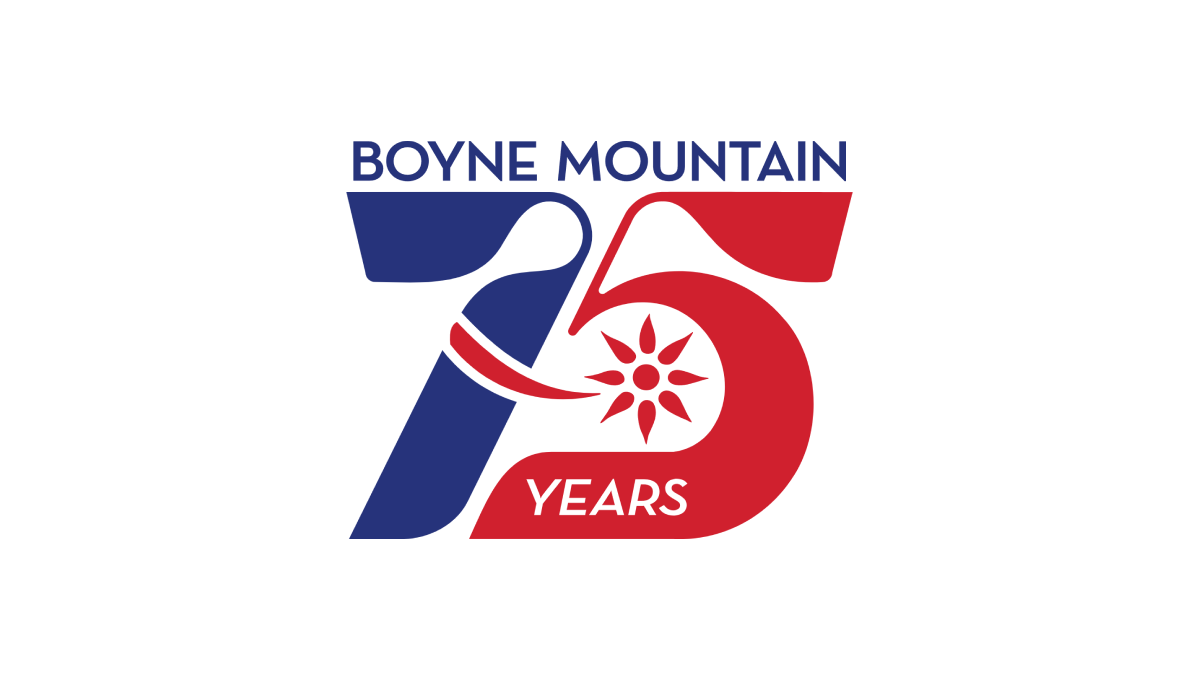
Retro was the name of the game as Boyne Mountain pulled visuals and colors from the early days of their history to create a number mark that was both easy to read but also neatly tied back to the original brand from all those years ago. Above that number mark is the name of the resort to complete the design. This logo as looked fantastic in all white on dark backgrounds and the shape lended itself well to use as social media avatars.
More Details →Matchbox 70th Anniversary Logo
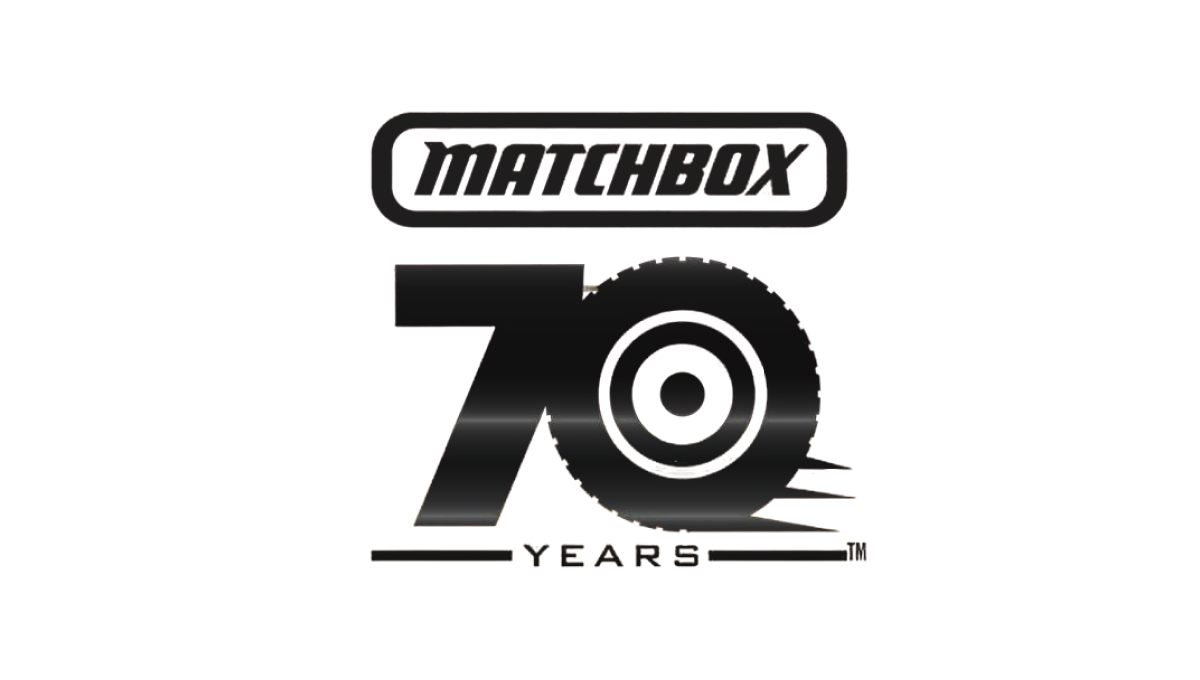
This simple logo from Matchbox starts with the classic logo at the top and a block number 70 below that. With a theme around cars, the clever design concept of using the number zero as a wheel and a few streaks coming off the right side to convey motion created a strong mark that was easy to tie back to the original shape. The square-ish shape also made it easy to use on social media.
More Details →United Nations 70th Anniversary Logo
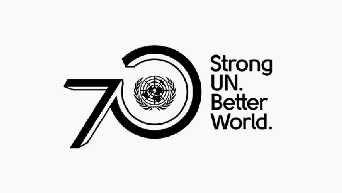
The United Nations logo is one of the most recognizable in the world, so placing this near the visual center of their design was a great move. By placing the number zero around that mark and the number zero ahead of it using a similar style to the logo, they create a strong lockup that's clean and on brand. A tagline to the right rounds out this design and adds a little bit of visual balance.
More Details →De La Salle School 70th Anniversary Logo
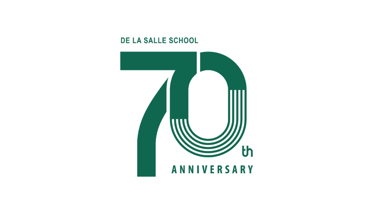
This clean design goes big on a large number 70 to mark the occasion of the celebration and places the name of the school along the top of the number seven and the word annivesray below the number zero. The mark may not be as easy to swap with their traditional logo, but with a clean style and wider shape it's a great fit for banners, swag, and events that often accompany the way universities celebrate the occasion.
More Details →Formula One 70th Anniversary Logo
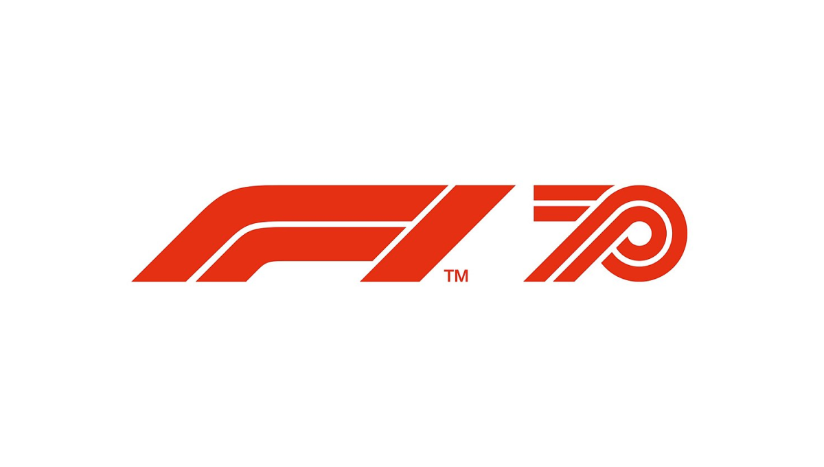
Formula One has an incredible logo that is as recognizable as it is simple. The core of this mark is the red, slanted, outline-style font that is used. So when celebrating their 70th anniversary, they simply created a number 70 using the same style of text and placed it side-by-side. The result is clean and recognizable.
More Details →Metairie Bank 70th Anniversary Logo
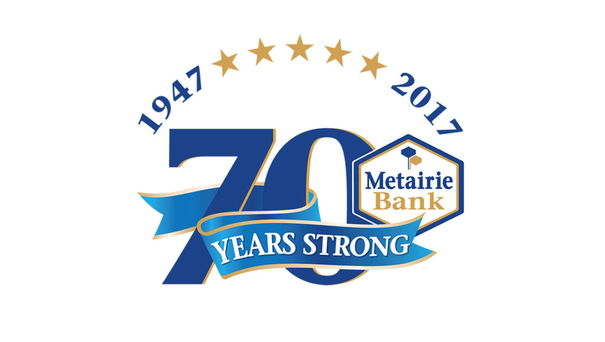
This design makes the number 70 in their brand blue the main visual feature, but also places many elements that sit layered above that logo. Curving above the number at the top sit a series of stars separating their years of operation, across the lower part of the number is a ribbon, with the original brand logo sitting in shape covering a portion of the remaining number.
More Details →Nicklaus Children's Hospital 70th Anniversary Logo
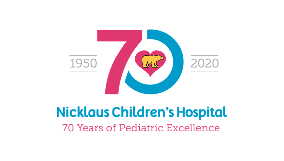
This hospital has a very recognizable logo with a golden bear (Jack Nicklaus' famous nickname and mark) inside a pink heart. By using that mark as the focal point and building a blue and pink number 70 around it, this created a tie back to the traditional brand and gave them space to add wording below and to the sides of the logo, clarifying the name for those not as familiar with the original.
More Details →