Purple Anniversary Logos
Utah Division of Arts & Museums 125th Anniversary Logo

This simple logo sets the original word mark on the right and adds a stylized number 125 to the left. Similar to other anniversary logos, they stagger the digits of the number to add a little bit more design and depth tha having the number alone. Filling the gap left by this stagger are two ribbon shapes that tie the logo back to the meaning and mission of the organization.
More Details →Delta Airlines 100th Anniversary Logo

Delta Airlines kept it simple and classy with this anniversary logo. A large number 100 in their classic purple sits in the center with a silver Delta logo coming out and out of the last zero in the number. Above that sits the full logo with the word years below. It's a simple package but an effective one that gives logo a clean mark that is already being used in a variety of contexts.
More Details →Disneyland 70th Anniversary Logo

With a brand like Disneyland, you know they're going to deliver a great anniversary logo and this version did not disappoint. The classic word mark starts it off with a two-tone purple number seventy crowned with the traditional castle silhouette in pink to make a clean, tidy package that will likely make it easy to use given the similar dimensions to the original logo.
More Details →HSMAI Foundation 100th Anniversary Logo

The original logo for this foundation already had quite a few elements, so I appreciate that design kept it simple by adding a large number 100 below the base of the original, using their tagline as a divider between the main mark and the anniversary addition. The design uses the same colors and fonts to create a nice pair to the traditional mark. There's a lot going on, but it works nicely together.
More Details →Quad Cities Housing Council 25th Anniversary Logo

This is a really clean, effective example of a common anniversary logo design style where the traditional logo is placed side by side (in this case with a small divider line) with a number mark. This number mark uses a cut out silhouette of a house to tie it back to the original logo and meaning. Along the bottom sits wording to mark the occasion.
More Details →Illinois Valley Community College 100th Anniversary Logo
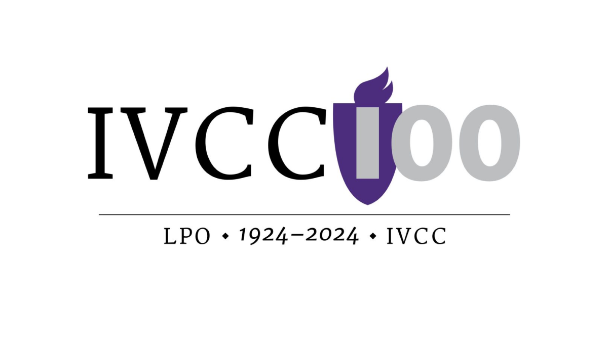
Universities have a unique feel, voice, and set of imagery that is used neatly and effectively in this logo for Illinois Valley Community College. A flame in the school's classic purple color sits behind the first part of the number one hundred, a serfed typecase from the original logo spells out their abbreviation of the school, and a little extra context sits below for a simple but balanced design.
More Details →Scratch 15th Anniversary Logo
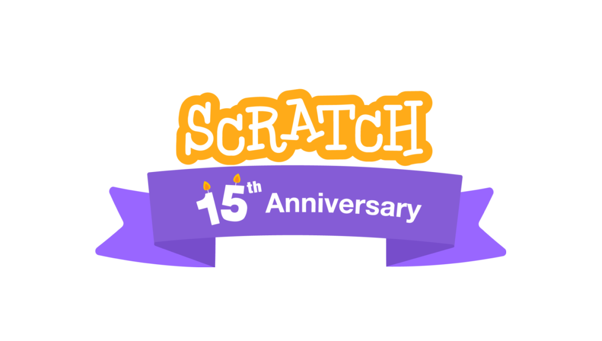
A coding platform that's designed primarily for kids, Scratch celebrated theira nniversary by adding a playful color combination to their altreay playful logo as a base. This color was used in a classic ribbon that wrapped around the logo and held a simple banner indicating the reason for celebration. A simple, but effective design.
More Details →Mountain West Conference 25th Anniversary Logo
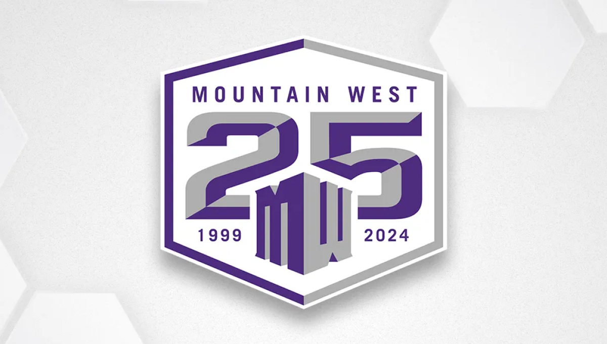
Once an underdog conference, the Mountain West is now home to many top contenders across major college sports. They've leaned into the hex shape for their brand recently, so they started with that shape, added a large, block 25 to the center, placed their original mark below and centered on the number 25, and placed words and years int he remaining spaces to create a solid design featuring their usual brand purple.
More Details →Attractions Ontario 40th Anniversary Logo
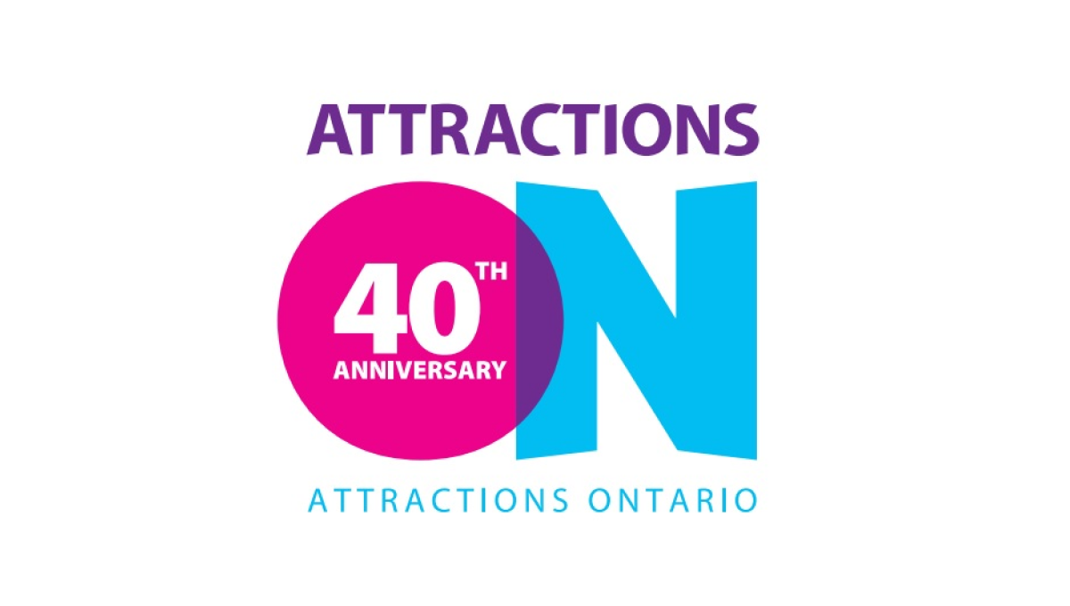
If you've visited a rest area in Ontario you've probably seen their simple logo that features an overlapping O and N. Given the large empty space that already existed in the first letter of their name, they simply placed text to signify their anniversary inside of that O and called it good. The original brand remains but the celebration is clearly visible.
More Details →Carlow University 90th Anniversary Logo
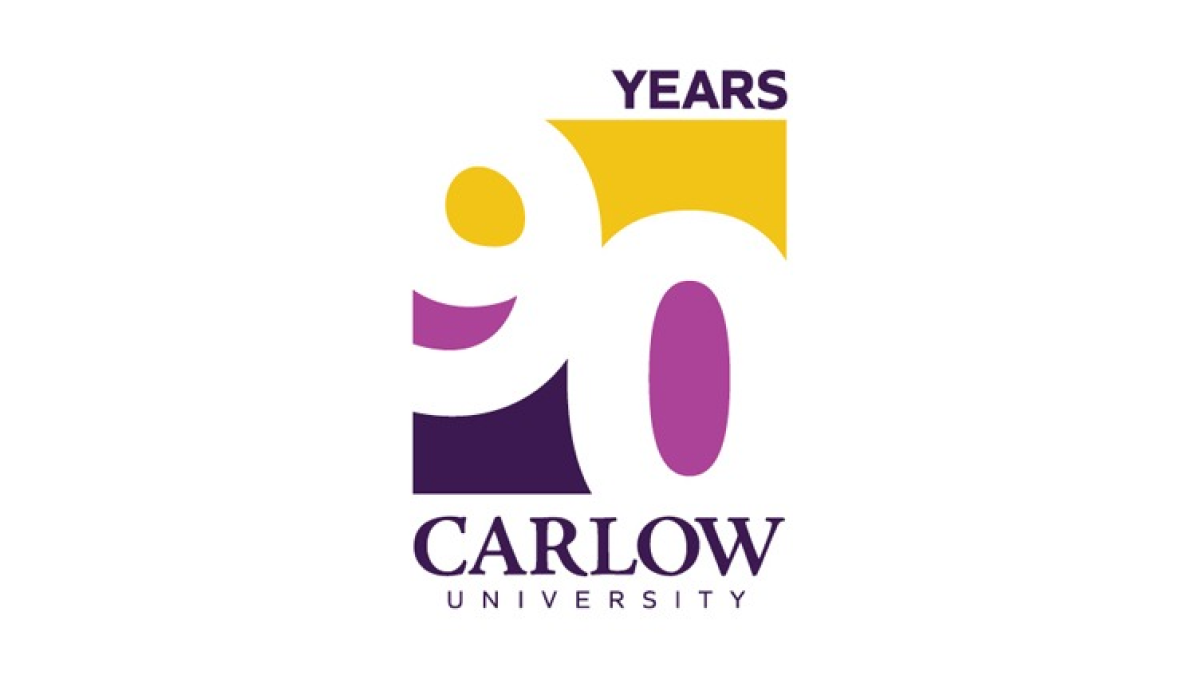
This logo clever uses negative space to blend the year they're celebrating with their brand colors. They start with a vertical rectangle that holds a staggered number 90 that goes edge to edge. The white number leaves spaces for three colors in the top, middle, and bottom of the rectangle with the word "years" at the top and the name of the university at the bottom.
More Details →DC Hospital Association 40th Anniversary Logo
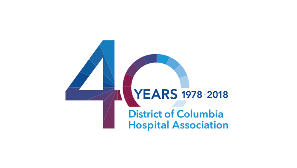
With the organization's name is light blue normal text and the word "years" with a date range above late, this logo takes a large number 40 and places it to the side and behind of that block of text. This makes the 40 easy to read by keeps the logo compact and balanced. Multiple colors used in this brand's identify break up the number 40 and add a slight gradient going left to right.
More Details →Silver Cross Hospital 125th Anniversary Logo
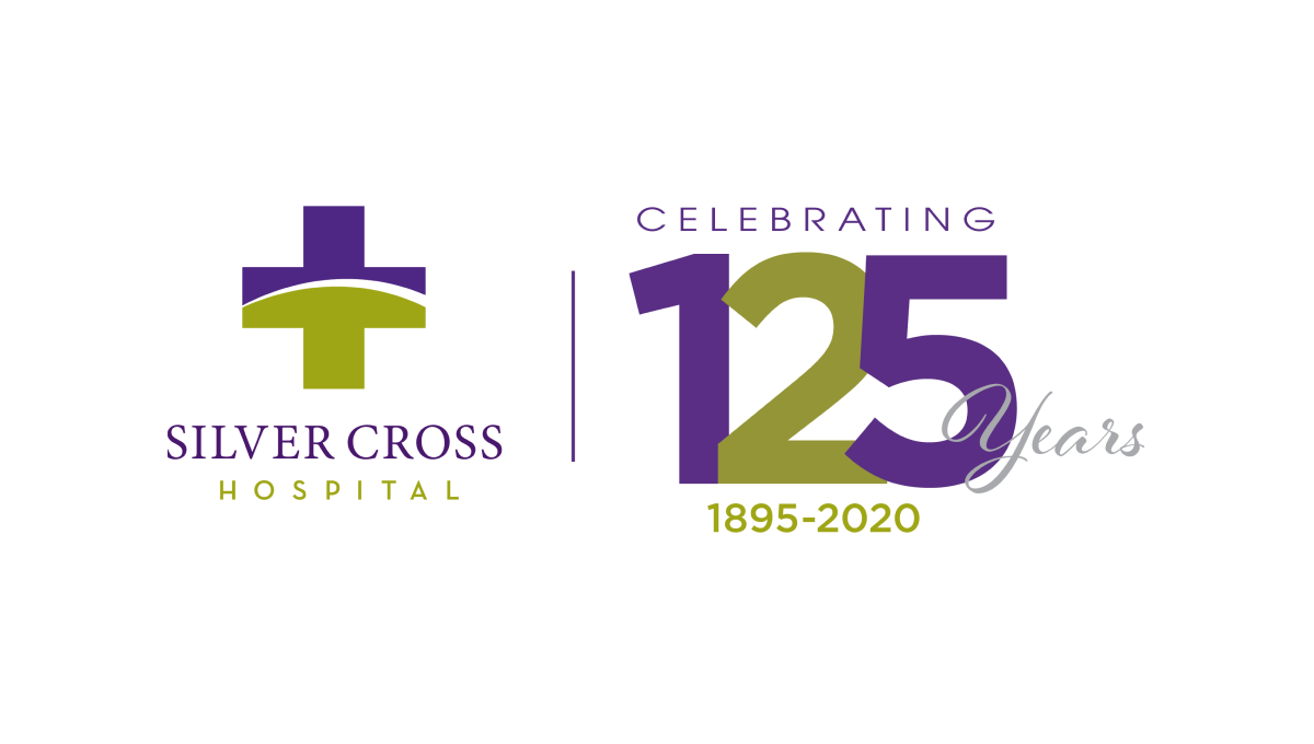
Similar to how some branded events ask partners to place their logo next to the event's logo with a line between for an co-branded marketing, this logo does something similar with a line between the traditional logo and a stylized number with a few words for balance and clarity around. With the number in the brand's original purple and gold/green, it's a simple way to create a clean, effective anniversary logo variation.
More Details →Market Mentors 20th Anniversary Logo
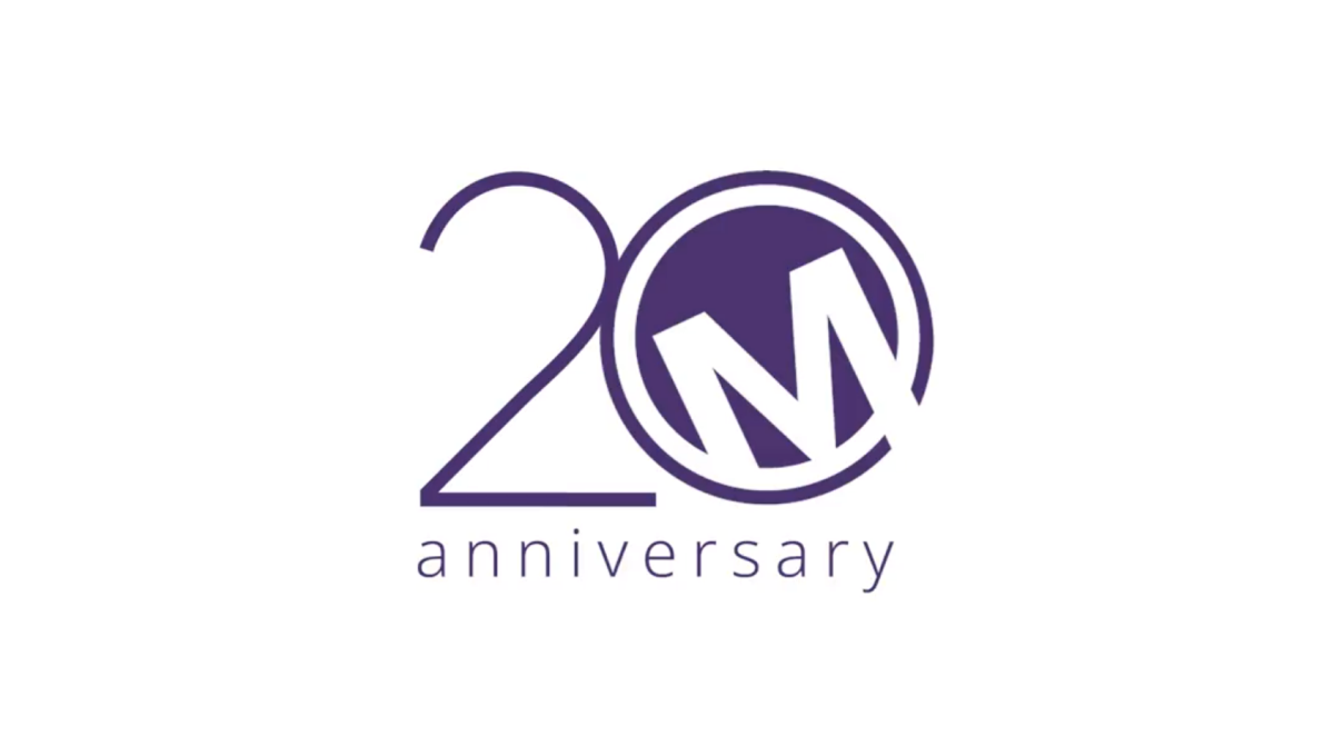
Sometimes a brand has to force their mark into the 0 of their anniversary number, but not Market Mentors. Their traditional mark - a tilted M contained in a purple circle - was a perfect match for this design style and that's exactly what they did. With a thin number 2 to the side and the word anniversary below, this logo is clean, simple, effective, and ties nearly back to their original brand.
More Details →Los Angeles Lakers 75th Anniversary Logo
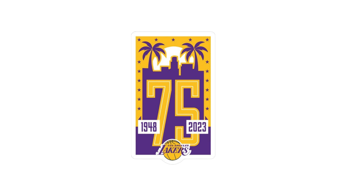
Built on a unique vertical rectangle layout and the team's brand purple and yellow colors, this logo builds on a skyline of a Los Angeles flanked by palm trees to create the backdrop for a large number 75. The team's traditional logo is inset below and on top of the 75 to make it easy to tie back to the organization with a simple white rectangle on either side of the number to denote the dates.
More Details →