Teal Anniversary Logos
Scott & Company 30th Anniversary Logo
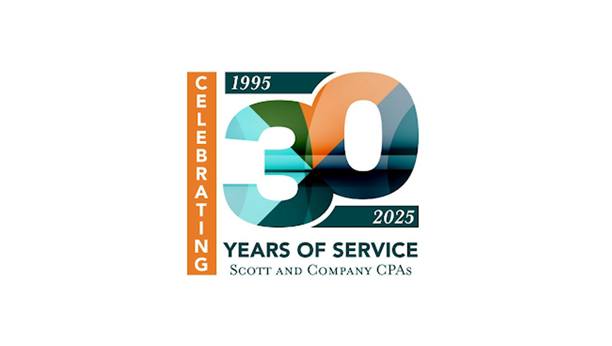
This anniversary logo features a bold “30” design with layered geometric shapes and soft gradient colors that create a modern and professional appearance. The mix of teal, orange, and dark blue tones gives the logo a balanced and polished feel. Simple date details and clean typography help highlight the milestone while keeping the design easy to read. Overall, the logo has a corporate yet celebratory style that feels contemporary, recognizable, and suitable for long-term brand recognition.
More Details →Mountain Creek 60th Anniversary Logo
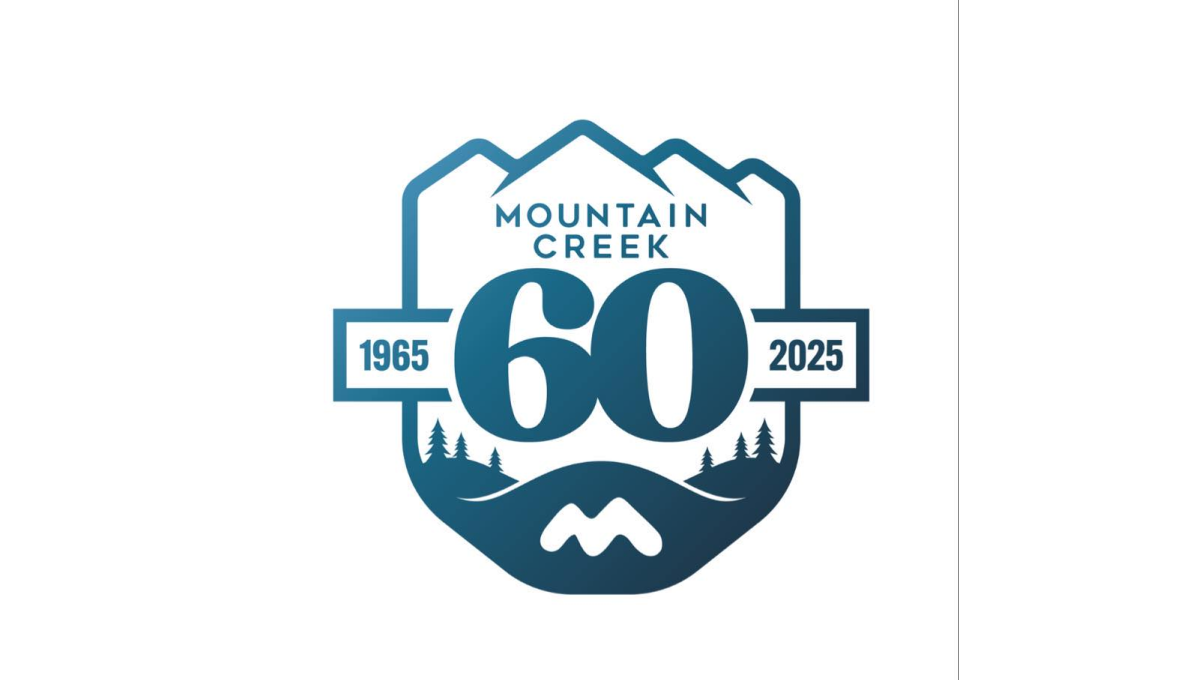
This anniversary logo has a calm, outdoors style with a badge-like shape. Mountains sit at the top, suggesting nature and strength. The large number “60” stands in the center, making the milestone clear. Small trees and flowing lines add a peaceful, grounded feeling. Soft blue tones give it a steady, trustworthy look. Overall, the design feels reflective and proud, marking many years of growth and connection to place.
More Details →MT Rose 60th Anniversary Logo

This anniversary logo has a smooth, elegant look with a large number “90” that draws attention right away. The company name appears below in a clean, simple font, giving it a classic and steady feel. The colors are soft but still noticeable, and there’s a curved banner that adds a nice touch of movement. Overall, the design feels calm, proud, and timeless.
More Details →Lake Tahoe Community College 50th Anniversary Logo

This is a fairly simple but surprisingly unique anniversary logo lockup. Yes, it starts with the classic number fifty on the left and uses the word "years" in a short ribbon which are all common elements. But the flag extending from the right side of the zero to hold the college's traditional logo is something i haven't seen before. It's a nice little design that gives the school a nice little package to work with.
More Details →New Port Richey 100th Anniversary Logo

As much as we love simple logos, I love complex logos that aren't simply adding elements for fun but using intricate imagery that beautifully represents the things being celebrated. In this case, the anniversary logo is a beautifully drawn scene of the town's most famous architecture and locations. The colors are perhaps my favorite part, with the creamy, sand color used both in the imagery and the default background.
More Details →Rimouski Oceanic 30th Anniversary Logo

While it's not clear that this logo is for a hockey team at first glanace, we have no problem with them leaning into their community and past given the awareness of this logo is likely fairly concentrated geographically. The circles represent the St. Lawrence river and the porthole of a boat, while an illustration of the well-known Pointe-au-Pere lighthouse shines on the team's past and future.
More Details →Turning Stone Resort Casino 25th Anniversary Logo

This is a unique anniversary logo in that it takes a distinct departure from the usual brand's color and style. Instead of the traditional blue, there's gold. And instead of a square filled with scripted letters, there's a diamond with block letters. The result, however, works surprisingly well and carries some of the classic anniverary logo design elements like the years of operation, a ribbon to hold extra wording, and the original word mark at the bottom.
More Details →Dee Foundation 50th Anniversary Logo

The Dee Foundation often uses a logo that only includes the text shown on the right side of this design. So being, they could pair that with an anniversary mark without having to fight with the shape or color or weight of the original logo. A large number 50 filled with a slight gradient and two faces making the negative space in the number zero made for a really classy logo to use during their anniversary year.
More Details →Jacksonville Jaguars 30th Anniversary Logo
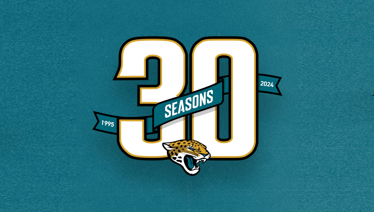
Using classic sports number styling with a textured background in the team's famous green color, this mark sports a large number 30 with a ribbon weaving in-and-out of the number showing the years the organization has been around and the word seasons. At the bottom center is the team's well-known mark to make a clean design that ties neatly back to the original brand.
More Details →Wenbley Stadium 100th Anniversary Logo
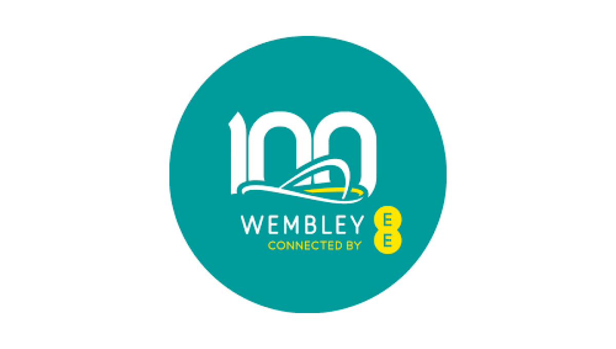
When your architecture is as famous as Wembley's, all you need is a silhouette of your iconic roofline to create the foundation of a logo that is both easy-to-recognize and an elegant set of lines to build on. A number 100 peeks up from behind the stadium and the curren sponsor and name below creates a sharp-looking logo for their century anniversary.
More Details →Massanutten 50th Anniversary Logo
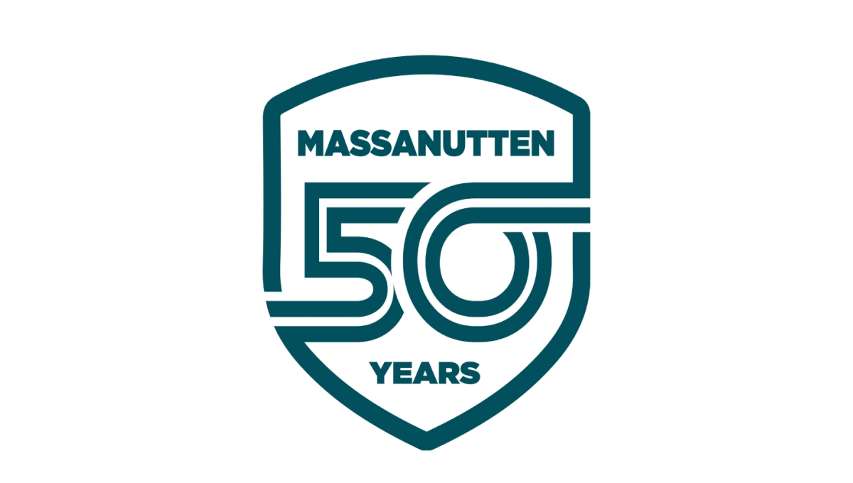
Massanutten went retro for this clean, badge-style logo by starting with a crest shape. Inside that crest is a double-line number fifty with the bottom part of the five connecting with the left edge and the top part of the zero extending to connect with the right. The name of the resort sits above the number with the word years below to complete this clean, effective logo design.
More Details →IDEA Health & Fitness Association 40th Anniversary Logo
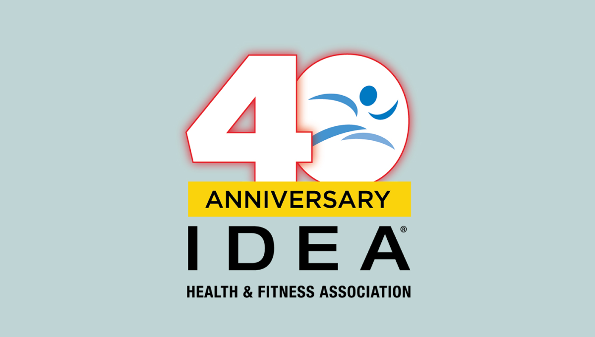
A large, block number 40 anchors this anniversary logo design. Both are outlined in red but the zero holds the blue mark that's traditionally used for this fitness organization's brand. Below is a yellow rectangle with a black word "anniversary" with the name of the organization sitting below to create balanced shaped that fits well in a square or circle avatar.
More Details →Dr. Fred G. Blum 30th Anniversary Logo
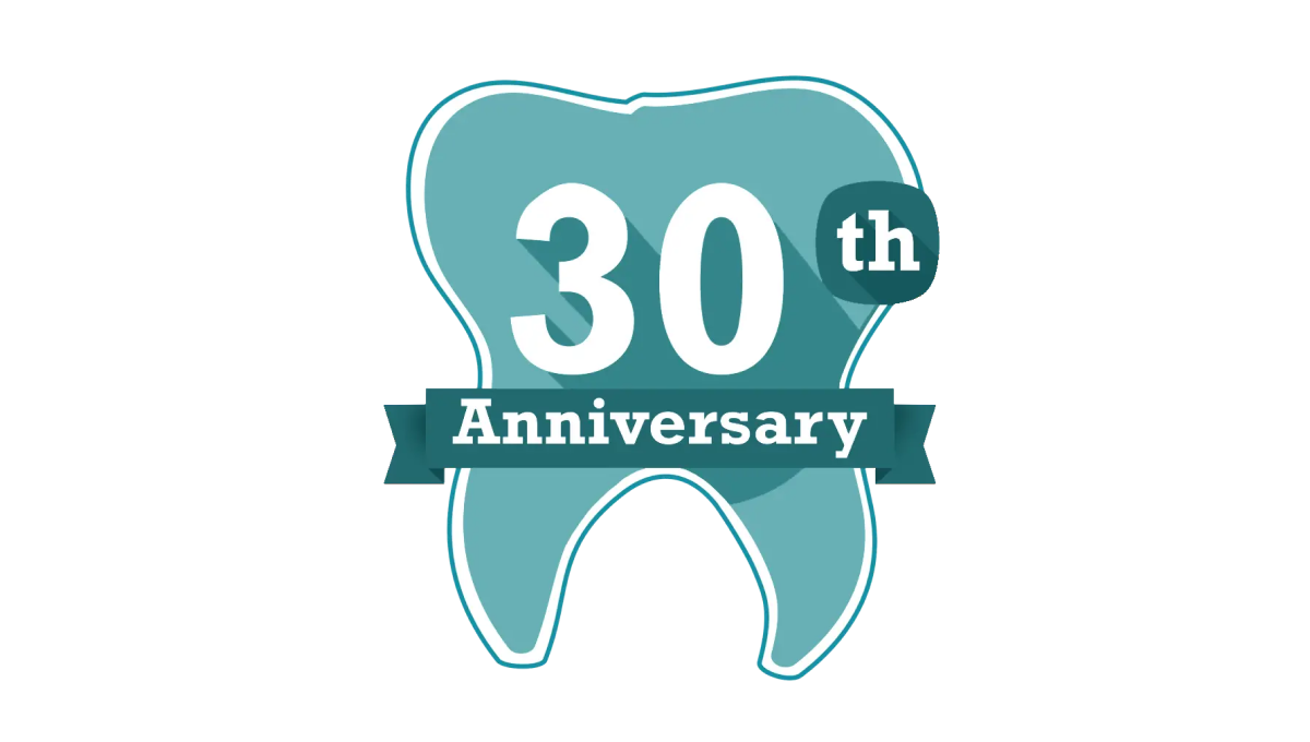
Another mark that celebrates the anniversary in a fun, on-brand way but doesn't try too hard to start fresh with an adaptation of the original logo, this tooth shape creates a simple backdrop for the anniversary in question. With the dental practices traditional teal color in place and used nearby the original logo and practice name, it was a fun way to celebrate without having to change the usual mark.
More Details →Fort Dodge 150th Anniversary Logo
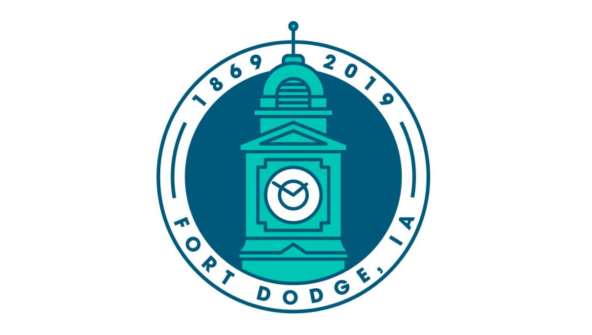
This clean, circular mark places the city's well-known clock tower in the center to establish a visual anchor. The clock tower comes up from behind the bottom part of the circle and overlaps the upper part of the circle. Around the rim of the circle sit the name of the city at the bottom and the years of existence, cleverly using the peak of the tower to separate the two years.
More Details →Abiding Word Lutheran Church 50th Anniversary Logo
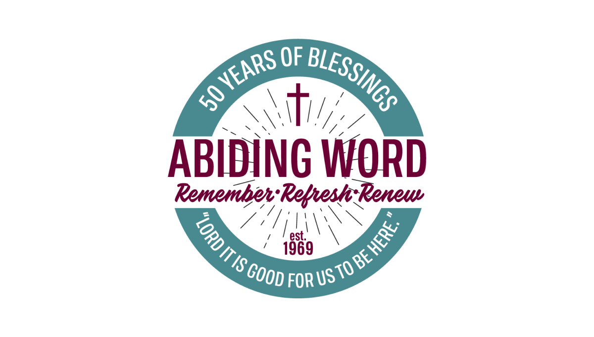
Starting with a thick-bordered circle with white in the center and teal on the rim, this logo places the church's tagline and anniversary year in curved letters on this rim. Inside the center sits the name of the church and another tagline for the congregration. Above and below are lines eminating outward with a cross above and "est 1969" block of text below to add additional color and balance.
More Details →Ski Area Management Magazine 60th Anniversary Logo
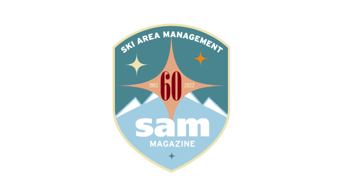
It's not often you see a magazine celebrate their 60th anniversary, but this is exactly what SAM did and celebrated with a clean, crest-style badge in two shades of teal as the base. At the top, their written logo follows the curve of the top of the crest with their traditional lowercase "sam" word mark placed at the bottom. In the center, a red number 60 with a star shape behind to fill in the space and provide balance.
More Details →Adams Memorial Hospital 100th Anniversary Logo
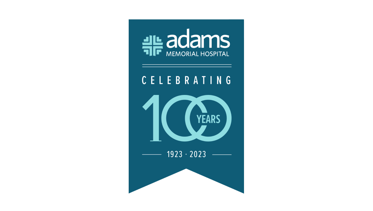
This unique layout for an annversary logo starts with a hanging banner shape in a shade slightly darker than the company's traditional teal color. Then, working downward, they add the primary brand logo followed by a styled "100 years" graphic. The 100 is in the brand color and features overlapping zeros with the word "years" inset within that overlap. Finally, extra text is placed above and below the number to add flow and balance.
More Details →Caboolture Hospital 25th Anniversary Logo
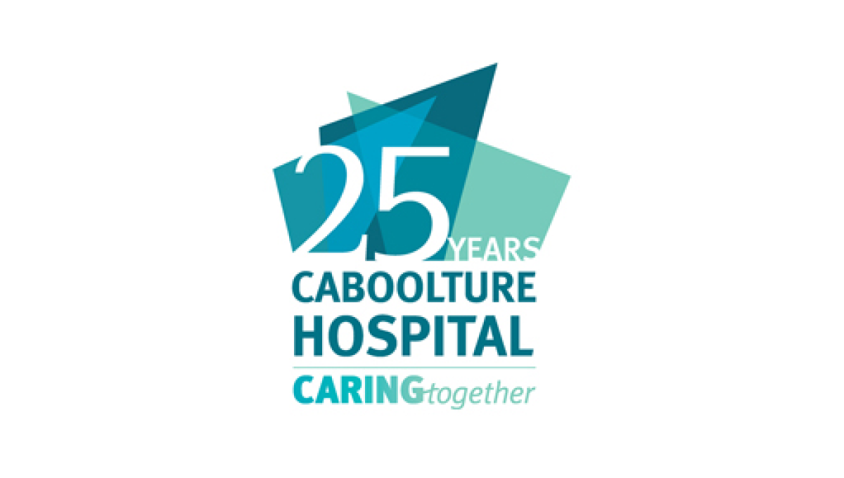
This logo does a great job of using the original word mark as the base for an anniversary extension. By placing some brand-related shapes above they gave themselves space for placing their anniversary number. Not only the number, in fact, but the word years as well to create a nice, balanced logo that ties strongly back to the original brand.
More Details →Hidden Valley 40th Anniversary Logo
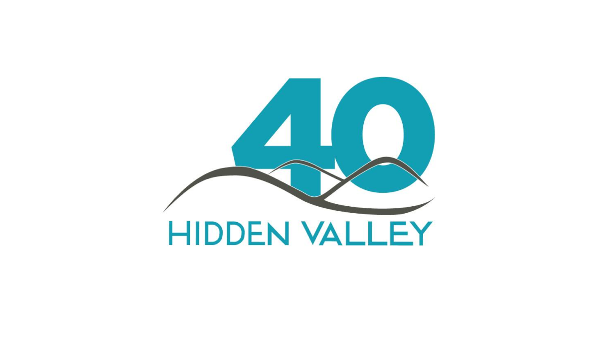
Hidden Valley's 40th anniversary logo keeps a very simple concept with a large number 40 in their brand blue / teal color peeking up from behind their original logo. While simple, the weight, size, and placement of the number give this logo extra weight and a clear reference to the milestone that is missing in some logos that add more diminutive references to their anniversary.
More Details →