10th Anniversary Logos
Disney Shanghai 10th Anniversary Logo
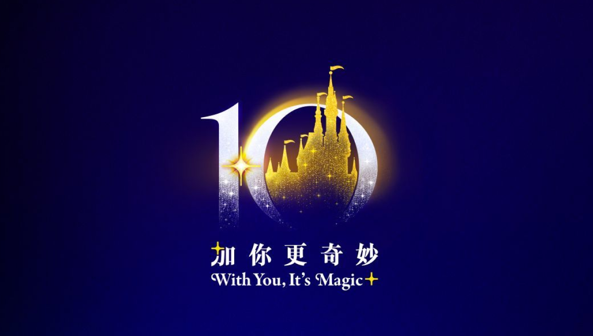
This anniversary logo uses a rich blue and gold color palette to create a polished and celebratory feel. The large “10” is designed with soft glowing effects, while a castle-like silhouette in the center adds a sense of imagination and wonder. Small sparkling details help give the design a magical atmosphere without making it overly complex. The mix of elegant typography and simple visual elements makes the logo feel memorable, festive, and connected to a long-standing brand celebration.
More Details →Disc Golf Pro Tour 10th Anniversary Logo

This anniversary logo has a bold and sporty feel, with a strong number “10” that stands out clearly. The design uses sharp lines and a modern font, giving it an energetic and active vibe. The colors are bright and eye-catching, helping the logo feel fresh and exciting. Overall, the logo feels confident and lively, celebrating the anniversary in a clean and upbeat way.
More Details →Vox 10th Anniversary Logo

Vox is a classic example of a company that cares deeply about brand consistency. And when you care about consistency, it can sometimes be either challenging or uneccessary to create an anniversary logo that adds in a bunch of new elements. So, Vox didn't. They took one of the existing brand fonts, made it nice and bold for a number 10, and placed their logo inside hugging the right line of the number 10. Clean, on-brand, effective.
More Details →Duolingo 10th Anniversary Logo

A logo is a tool and the design of that tool depends on where and how you need to use it. This logo is a perfect example of that given that the vast majority of people who see this logo will be the millions of users of this popular app. So their logo took on the form of a square, fun shape featuring their popular mascot so it could be used as an element within the app like badges and awards. It's such a smart move.
More Details →Trillion Creative 10th Anniversary Logo

Trillion Creative's logo is just as simple, clean, and well-designed as you'd expect from an agency. They already had the letters I and O within their work mark, so they simply swapped those out for a number 1 and 0 with the word years inside the latter. The result looks really sharp, is extremely easy to swap with their traditional logo during and after the anniversary, but is also easy to notice and understand the meaning of.
More Details →Dust Bowl Brewing 10th Anniversary Logo
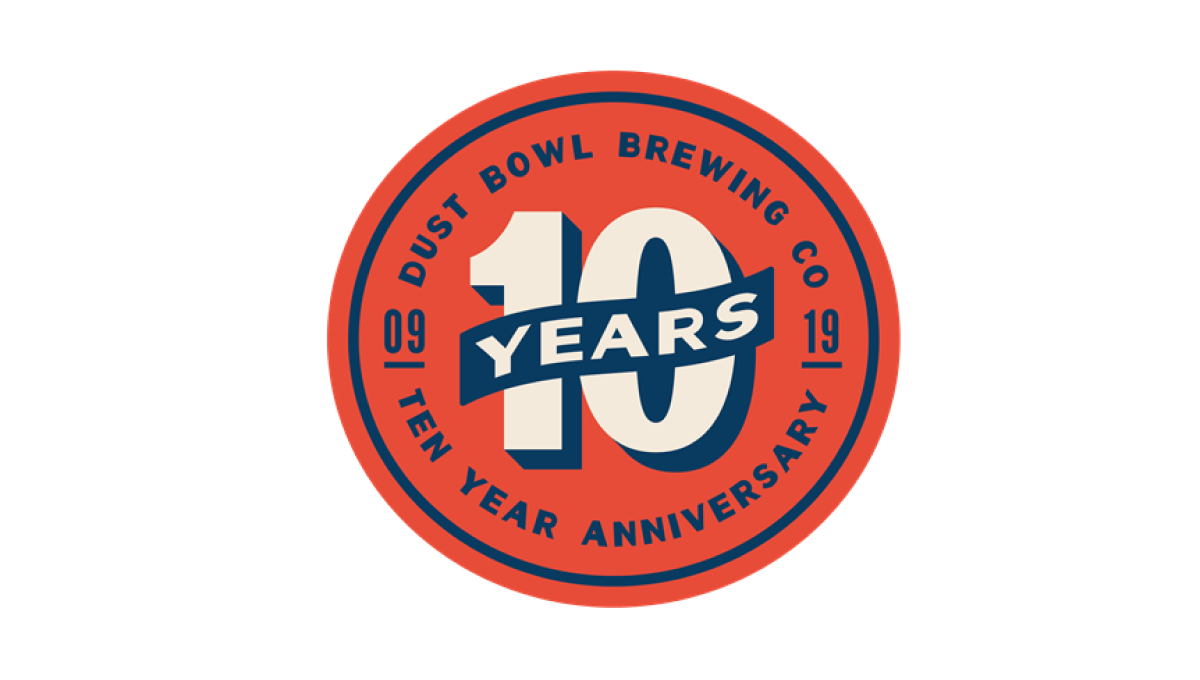
This retro-style logo uses the classic blue and orange colors famous in old-school newspaper and magazine ads. In the center of the circle is a large number 10 with a banner across holding the word "years". Around the outside of the circle is the name of the brewery and some wording to clarify the reason for celebration.
More Details →Legoland Florida 10th Anniversary Logo
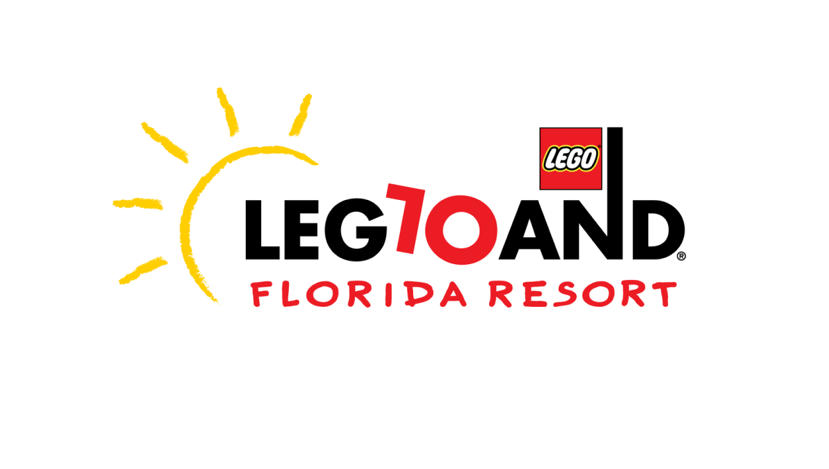
Legoland is a fun, playful place, so the logo of their 10th anniversary started with the same tone. The L and O of the word mark are converted to a 1 and 0 to both keep much of the original, recognizable mark but also make it easy to spot the reason for the change. By making the number slightly askew, it kept the playful tone while producing a design that was easy to swap for the existing mark.
More Details →South Coast Pediatric Dentistry 10th Anniversary Logo
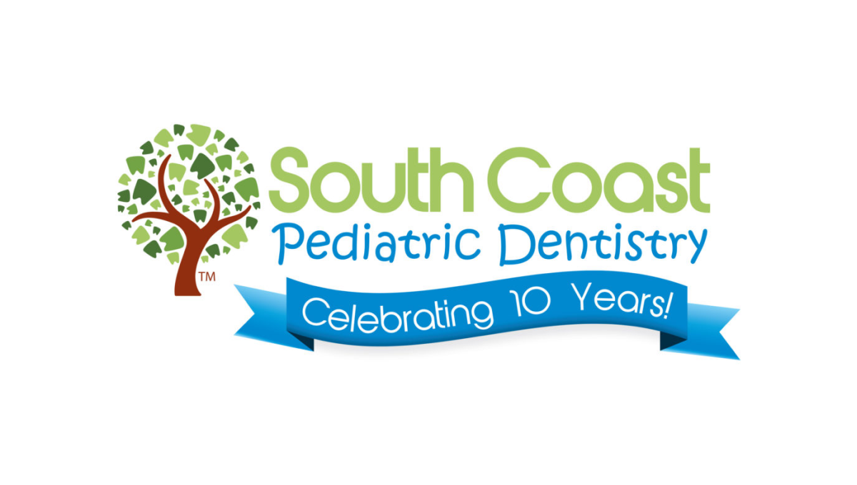
Instead of reinventing the wheel for their anniversary logo, this dentistry office simply added a clean blue banner below the words in their traditional mark. The banner is designed in a way to match the colorful, playful tone of the original mark and doesn't extend too far below the traditional logo's dimensions to make it easy to swap in and out of marketing collateral during and after the anniversary.
More Details →Sisters of Charity Hospital 10th Anniversary Logo
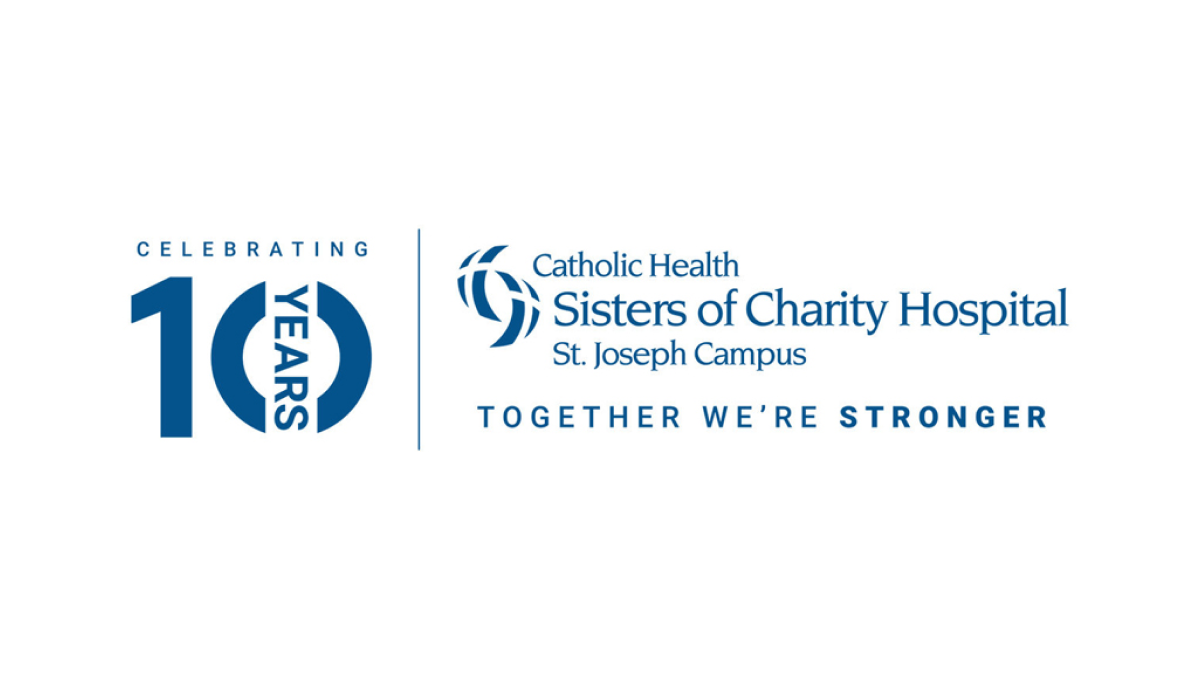
In a style that's become a bit more common, this anniversary logo takes the traditional logo and places a vertical line between it and an anniversary graphic to the left. This anniversary graphic uses a block number 10 in the brand's traditional blue color with a vertical word "year" through the zero and the word "celebrating" above. This gives them a clean lockup for their anniversary without having to redesign the original logo.
More Details →Callie (My Daughter) 10th Anniversary Logo
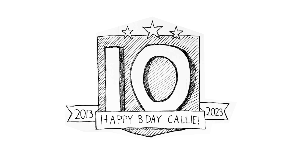
When you're the father of a girl turning 10 and you happen to be just starting a side project of gathering anniversary logos, what do you think comes to mind when working on a birthday poster for the aforementioned 10 year old? You guessed it, all the block numbers and ribbons and years of operation you've been looking at in recent weeks. And, as you might have guessed, that's exactly the direction this poster took.
More Details →NC Early Childhood Foundation 10th Anniversary Logo
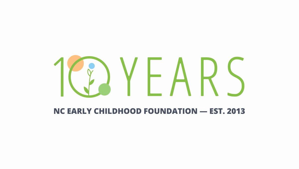
Simple and playful, this logo fits exactly the tone you'd expect from an organization design to help children. With the name of the organization in plain text below, they use this visual line to hold the lighter mark above. With simple shapes and friendly colors denoting growth and optimism, it's a great, on-brand design to support this milestone in their organization's history.
More Details →Minecraft 10th Anniversary Logo
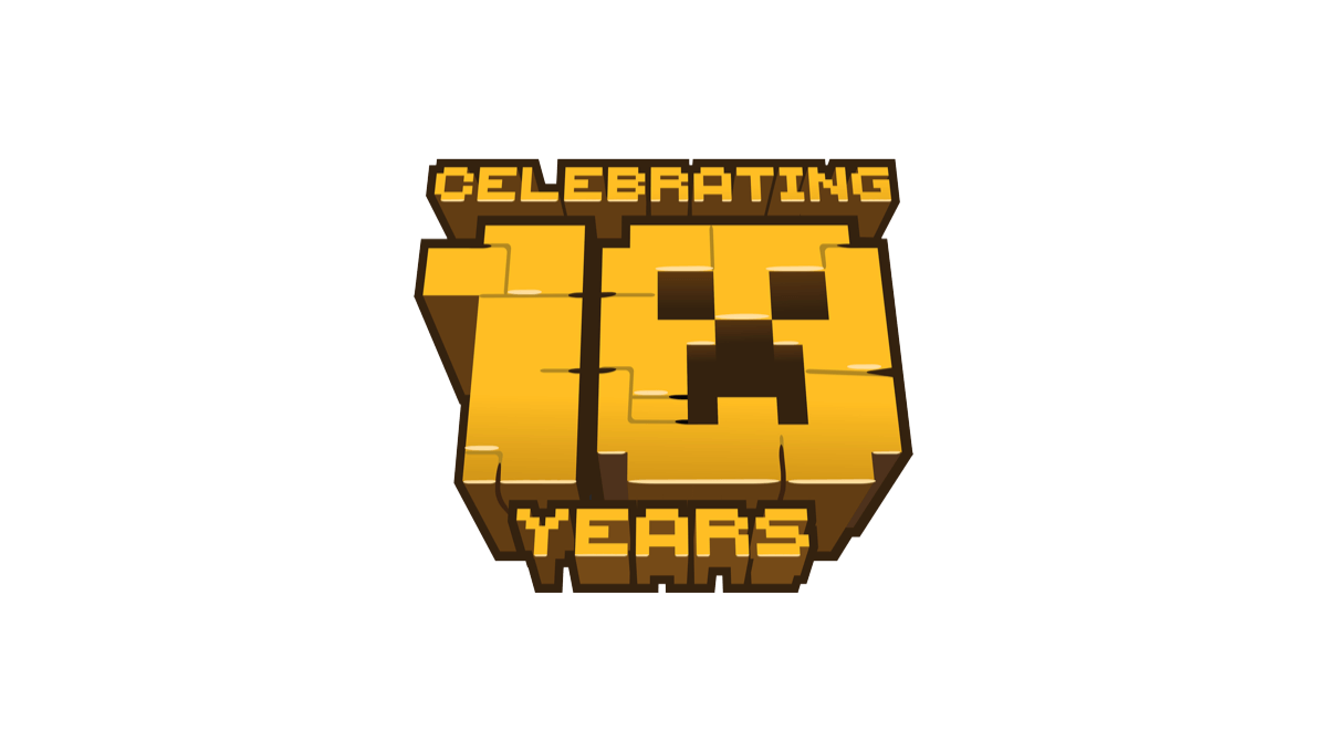
When Minecraft celebrate 10 years of bringing happiness to millions (my children included), they stuck with their block-world design style and created a logo with that featured the face of a popular character. A bold, gold shape with the name above and years below made for a really cool, on-brand concept.
More Details →Lakeshore Chinooks 10th Anniversary Logo
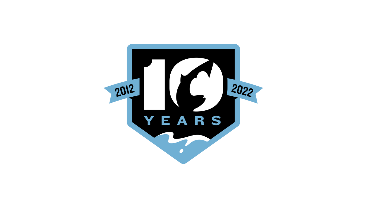
This logo combines a few clever elements within this baseball team's brand. First, it sets the base of the logo with a homeplate hape. Second, a fish jumping in reference to the Chinook Salmon featured in their original logo. Third, a blue lake at the bottom that wraps the homeplate shape as a border and extends to a ribbon holding the years this team has existed to create a clean, meaningful design.
More Details →C&W Champions 10th Anniversary Logo
This logo takes a unique angle in that the only visual reference to the original brand is the color and shape of the mark. These rainbow, twisting three-dimensional characters mimic the style used in the organizations main logo and makes it easy for those aware of the original brand to easily connect it back to the mark it's related to.
More Details →