Square Anniversary Logos
KUER 90.1 65th Anniversary Logo
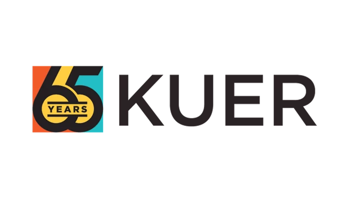
This anniversary logo features a clean, modern design with a mix of bold and light text. It highlights the number "65" to mark a special milestone, standing out in large, simple lettering. The colors are soft but eye-catching, giving the design a fresh and balanced look. The layout feels organized and clear, combining the station's name with the anniversary number in a way that looks both professional and easy to read. It gives a sense of history and progress.
More Details →Golf Digest 75th Anniversary Logo

This 75th anniversary logo has a classic and neat look, with dark and light colors creating a strong contrast. The number “75” is big and placed front and center, with the words “Golf Digest” above it in a clean font. The overall style is simple but firm, with a traditional tone that feels respectful and suited for a lasting milestone.
More Details →Star Wars 40th Anniversary Logo
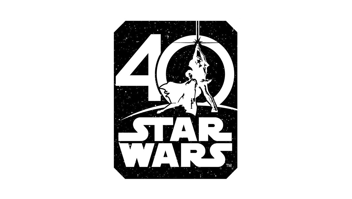
Using the classic image from the cover of the original movie, this logo places this iconic imagery in the center of a zero for the number 40. Below that, the traditional logo is stacked to create a foundation for this logo. Around the logo is a square, black shape to create the dark, space theme of the movie series.
More Details →Windsor Historical Society 100th Anniversary Logo
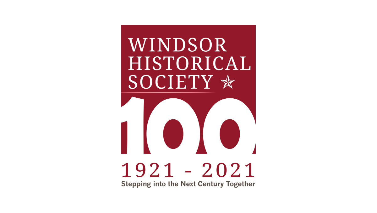
Starting with a square in the non-profit's traditional maroon color, this logo adds a large, block number 100 overlapping the bottom to create a strong, visual anchor for the design. At the top is the organization's name and mark, below the square are their years of operation, and at the bottom is the group's motto to create a tidy, on-brand design with a strong tie back to their usual brand.
More Details →Save the Bay 50th Anniversary Logo
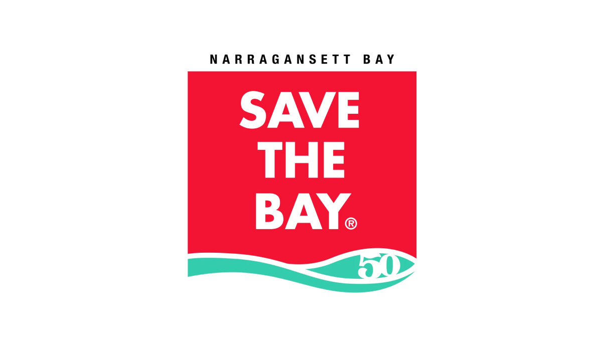
To create their anniversary logo, Narragansett Bay took their traditionally horizontal motto and stacked the words into a square with a solid background. With their traditional mark at the bottom and the name of the city at the top to create a clean, square mark that works well during their anniversary and beyond.
More Details →Wendy's 50th Anniversary Logo
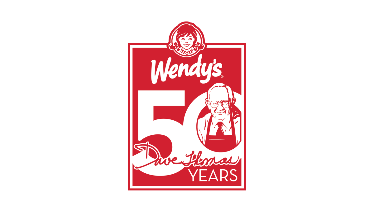
Wendy's original square logo shape was the inspiration for this 50th anniversary mark. All in their traditional brand red, a large number 50 sits just below the brand's current logo to fill out the shape. Inside the O is an illustration of the chain's original founder, Dave Thomas, to neatly tie the beginnings of this company's story to their present.
More Details →