90th Anniversary Logos
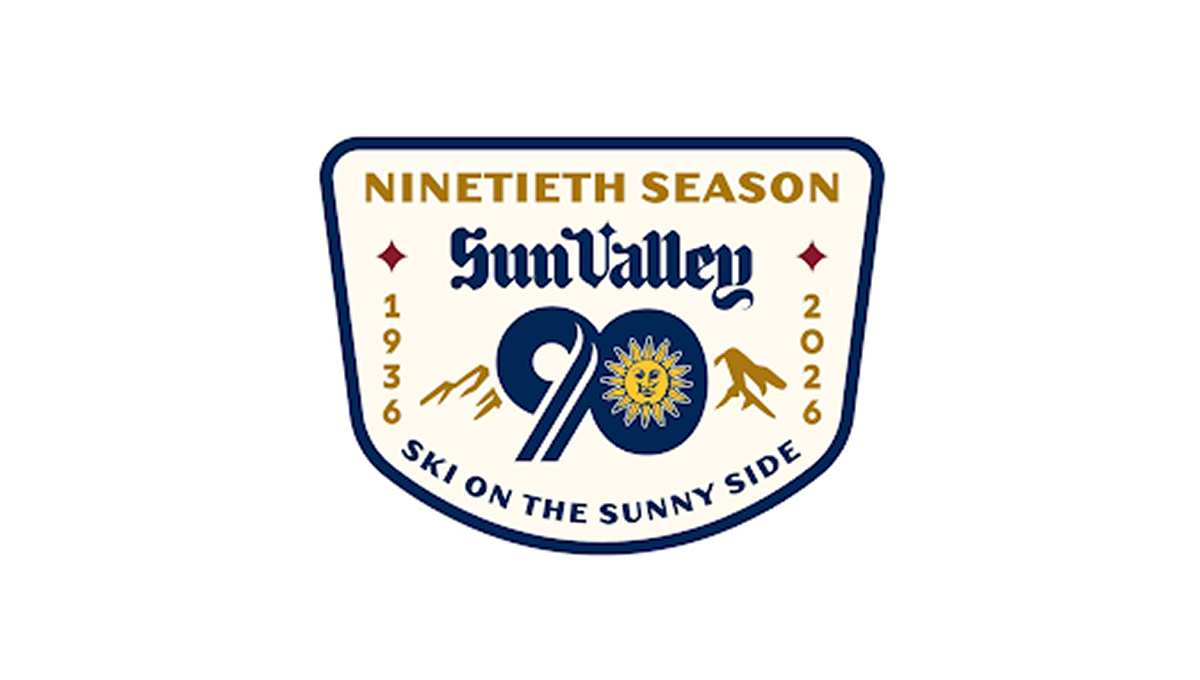
Sun Valley 90th Anniversary Logo
This anniversary logo has a classic, welcoming look that feels tied to tradition and place. The badge shape gives it a sturdy, established feel. A large number marks the milestone season, while mountain shapes and a bright sun suggest outdoor fun and warmth. The lettering feels timeless and confident. The colors are rich but friendly, and the overall design feels proud, cheerful, and quietly celebratory without being too bold.
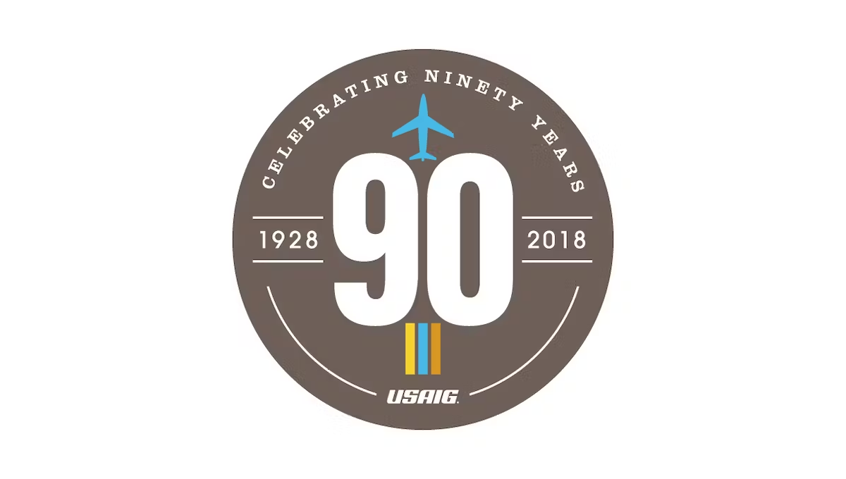
More Details →United States Aircraft Insurance Group 90th Anniversary Logo
This logo starts with a clean, tan-ish brown circle and a large number 90 in the center. Along the top is the celebration reason written out in words, along the bottom is the name of the organization. Above and below the 90 sit simple illustrations associated with the industry they work in. The result is clean and looks really nice.
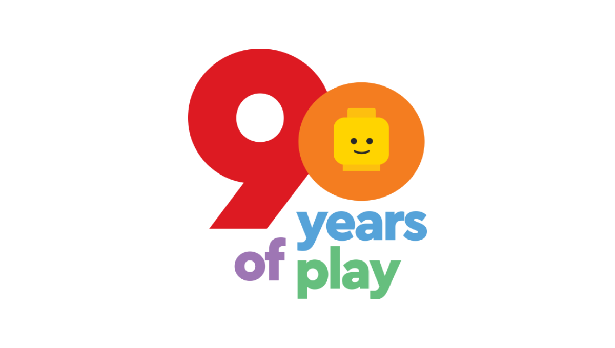
More Details →Lego 90th Anniversary Logo
As a toy company, Lego started with mark with a playful, large number 90 in the primary red and yellow colors used in their traditional logo. Below that number are the words "years of play" in blue, violet, and green to continue the playful theme. Finally, the head of the company's famous mini figure toys is included in the middle of the zero to tie this design back to the Lego brand.
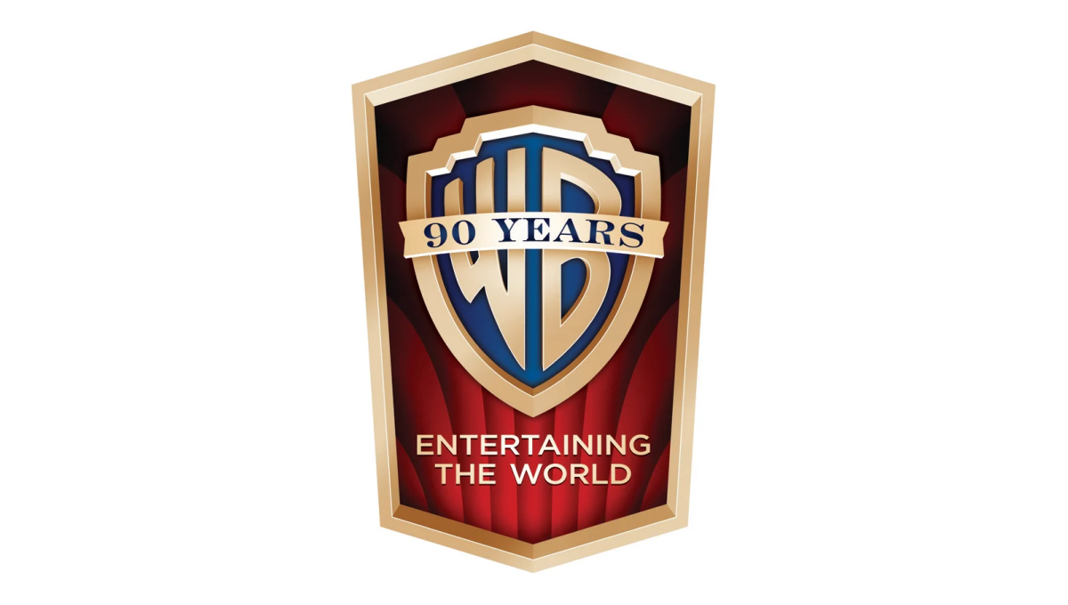
More Details →Warner Bros. 90th Anniversary Logo
This detailed mark carries the classic feel of the brand's opening sequence that intro their films. The traditional logo sits inside a vertical crest with the brand's famous red curtains falloing behind to fill in the space behind the mark. In the space left at the bottom of the badge sits their company tagline to provide balance.
More Details →St Joseph School 90th Anniversary Logo
Using a classic circular shape with two rings creating space for words to wrap around the edge, this logo places the name of the school in that space to make it easy to recognize who is celebrating this anniversaty. Inside sits the school tree mark in the brand's traditional gold color. At the bottom is a simple red ribbon holding a recognition of how many years the school has been in operation.
More Details →Cambridge Community Center 90th Anniversary Logo
This line-art style logo starts with the year of the annversary in large, outline-style characters that slightly overlap to create a nice, compact shape. Inside the zero are the years of operation. Below the number sits a written recognition of the anniversary with the center's motto and goal written below to balance out the design.
More Details →Detroit Lions 90th Anniversary Logo
With a vertical rectangle as the backdrop that is divide into the brand's two primary colors, this mark then places a large, block number 90 in front those bars to create a unique, simple shape. Around the edge is the classic colored borders and white gap famous for sports logos. Finally, the original lion mark is placed overlapping the bottom of the 90 with the word seasons below that.
More Details →Bridgestone 90th Anniversary Logo
Starting with the original logo along the bottom, this logo uses a clever number mark made to look like tire burn-out marks representing the main product the company sells. Rather than just leave the mark as is, they also added the words "and beyond" to reprsent that this is a milestone on their journey rather than the end.
More Details →Washington Commanders 90th Anniversary Logo
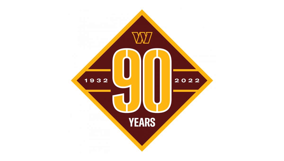
Starting with a diamond shape in the brand's red color, they place a large number 90 that nearly touches each straight side of the diamond and divides the shape into four remaining triangles. In the left and right triangles sit the years of operation. In the top triangle is placed the team's W mark while the bottom triangle holds the word "years".
More Details →Paramount Pictures 90th Anniversary Logo
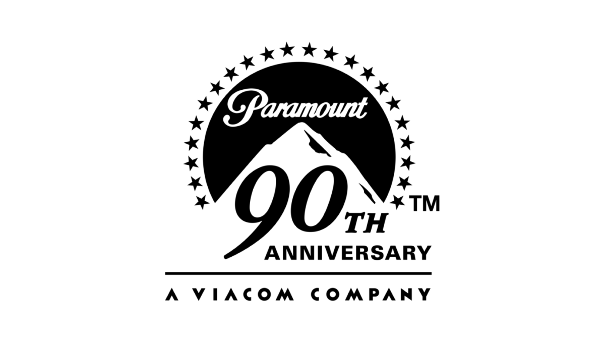
The original logo left a gap where the mountain sits and this anniversary variation kept it simple and simply moved that mark up slightly to create space for a large number 90 and the word anniversary offset below and to the right of the logo. This makes the new logo extremely easy to tie back to the original mark, especially with the traditional, all-black lockup.
More Details →Carlow University 90th Anniversary Logo
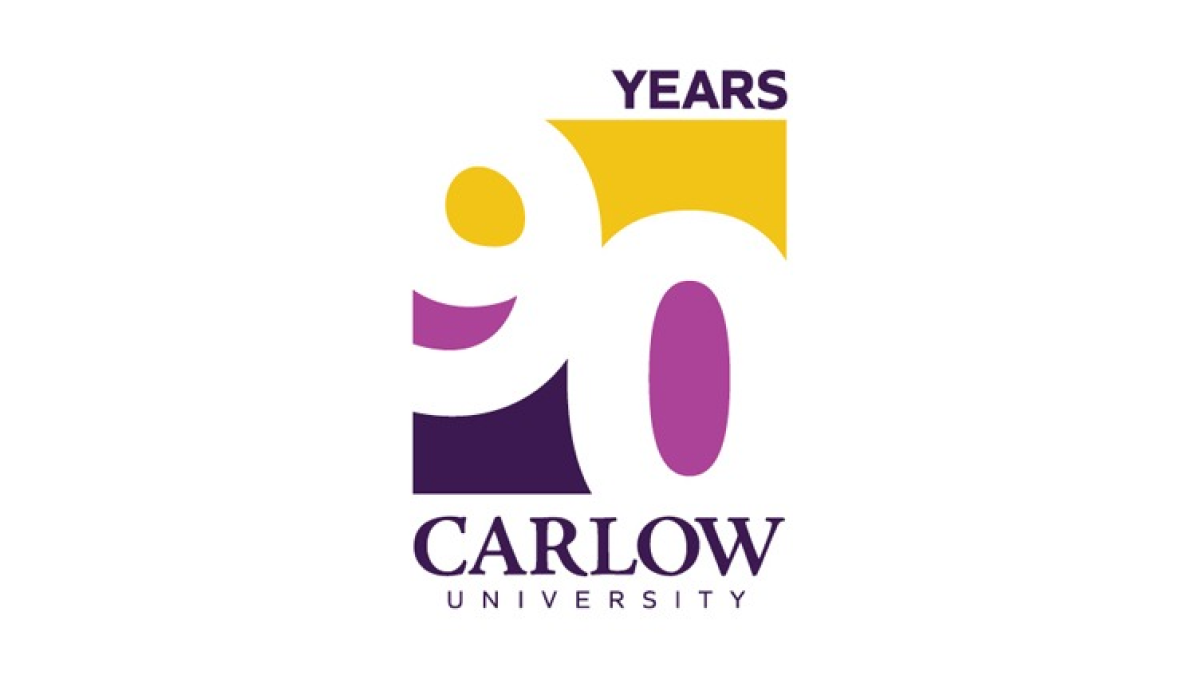
This logo clever uses negative space to blend the year they're celebrating with their brand colors. They start with a vertical rectangle that holds a staggered number 90 that goes edge to edge. The white number leaves spaces for three colors in the top, middle, and bottom of the rectangle with the word "years" at the top and the name of the university at the bottom.
More Details →