20th Anniversary Logos
Kirby 20th Anniversary Logo
This anniversary logo shows a round, pink character with a soft smile at the center of a bright badge. The design uses warm gold and red colors, giving it a celebratory feel. A large number “20” sits in front, with a small star adding a playful touch. Ribbon shapes and bold outlines make it feel special and proud, like a milestone being honored in a fun, friendly way.
More Details →Sunday Night Football 20th Anniversary Logo
This anniversary logo has a bold, modern feel that highlights a major milestone. Large numbers sit at the center, giving the design a strong and confident look. Bright, glowing colors add energy and excitement, while familiar symbols suggest a well-known sports tradition. The layout feels polished and professional, with clean lines and balanced spacing. Overall, the design feels celebratory, current, and focused on marking an important moment in time.
More Details →Peninsula Hot Springs 20th Anniversary Logo
The anniversary logo has a clean, simple look with a modern feel. It uses soft colors and smooth shapes that give it a calm and celebratory vibe. A large number stands off to the side, marking an important milestone, while the surrounding elements show the company's name. There’s a gentle blend of old and new in the design, with just enough detail to feel meaningful without being too busy. It feels thoughtful, yet light.
More Details →Deer Valley Music Festival 20th Anniversary Logo
This creative logo uses a large number 20 in the center as the main focal point of the design. With a silhouette of the mountains that surround the venue at the bottom and line art of the night time sky above, the result is a really compelling, creative mark and shape. Around three sides of that shape sit the various names and groups affiliated with the program.
More Details →Millennium Challenge Corporation 20th Anniversary Logo
While this logo may seem simple and harder to recognize than other, well-known logos, the star shape containing an adaptaion of the American flag is the organizations original logo that is used across their marketing campaigns. With just a simple number 20 peeking out from the left side of that mark, they created a new mark that celebrates the occasion without overcomplicating the design.
More Details →Millennium Park 20th Anniversary Logo
Millennium Park is recognizable for a number of unique architectural features and this logo uses semi-transparent colors to layer these iconic shapes into a single graphic. A number 20 sits above this colorful design with the name of the park sitting below to create balance and base for the rest of the design to sit above.
More Details →Nigeria Foundation 20th Anniversary Logo
This logo takes a smart approach of combining two separate, but complimentary, designs: the traditional logo at the top and a number mark below that. This number mark features an overlapping number twenty with a three-dimensional ribbon covering up the bottom part of the number in the same brand green as the original logo. The result is clean, simple, and effective.
More Details →Pro Source Fitness 20th Anniversary Logo
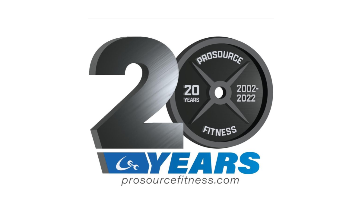
When you run a gym and you're celebrating an anniversary with a new logo, why not use a part of that gym that is both ubiquitous but also shaped like a zero? By using a plate as one digit and adding some metalic sheen to the number 2, this gym create a clever, on-brand mark. Below sits the name of the gym in the brand's primary blue colors.
More Details →Stone Brewing 20th Anniversary Logo
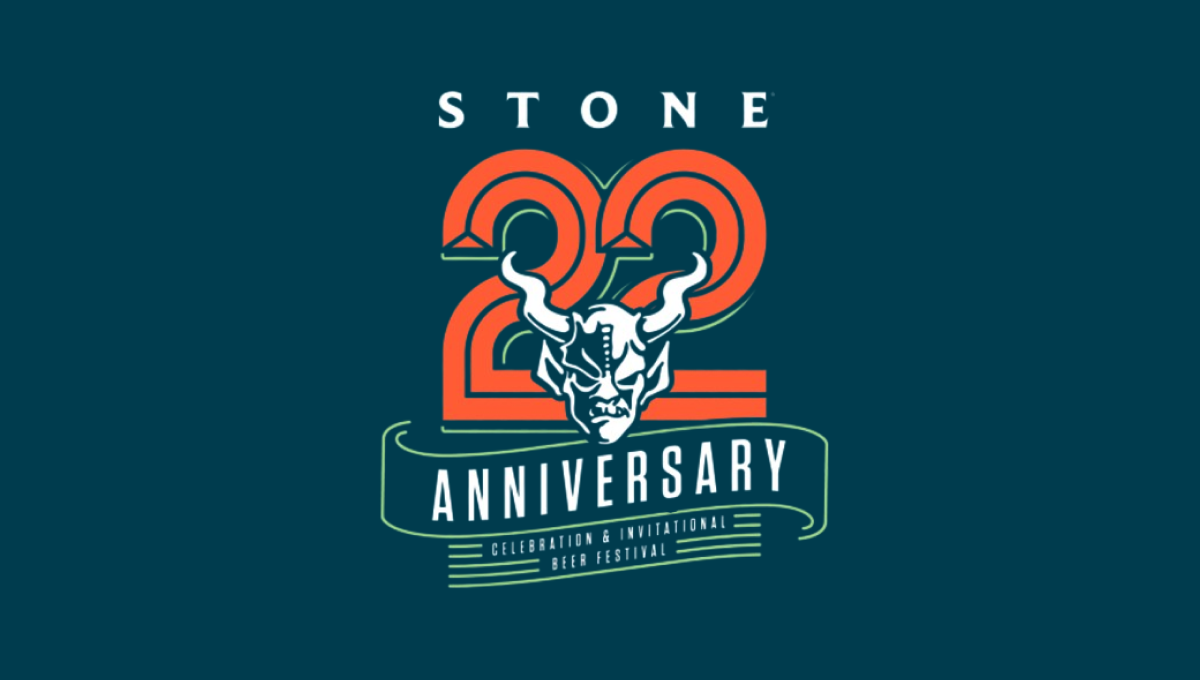
This logo starts with the brewery's traditional mark in the center and then builds layers behind to create a really sharp design. The first layer is a large, line-style number 2 with ribbon-style bit of line art below that signifying the meaning of the number. Above is the name of the brewery to create balance. The result is a beautiful design that tied nicely back to the original logo.
More Details →Blue Moon Brewing Company 20th Anniversary Logo
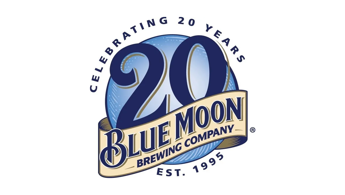
Blue Moon's famous blue circle and ribbon had all the elements the designers needed to adapt for an anniversary logo. By moving the ribbon down to expose more of the blue circle and placing a darker number 20 in the area left behind, this logo is easy to recognize but also being unique. Simple lettering above and below helped clarify the reason for celebration and round out this design.
More Details →Perfect Teeth 20th Anniversary Logo
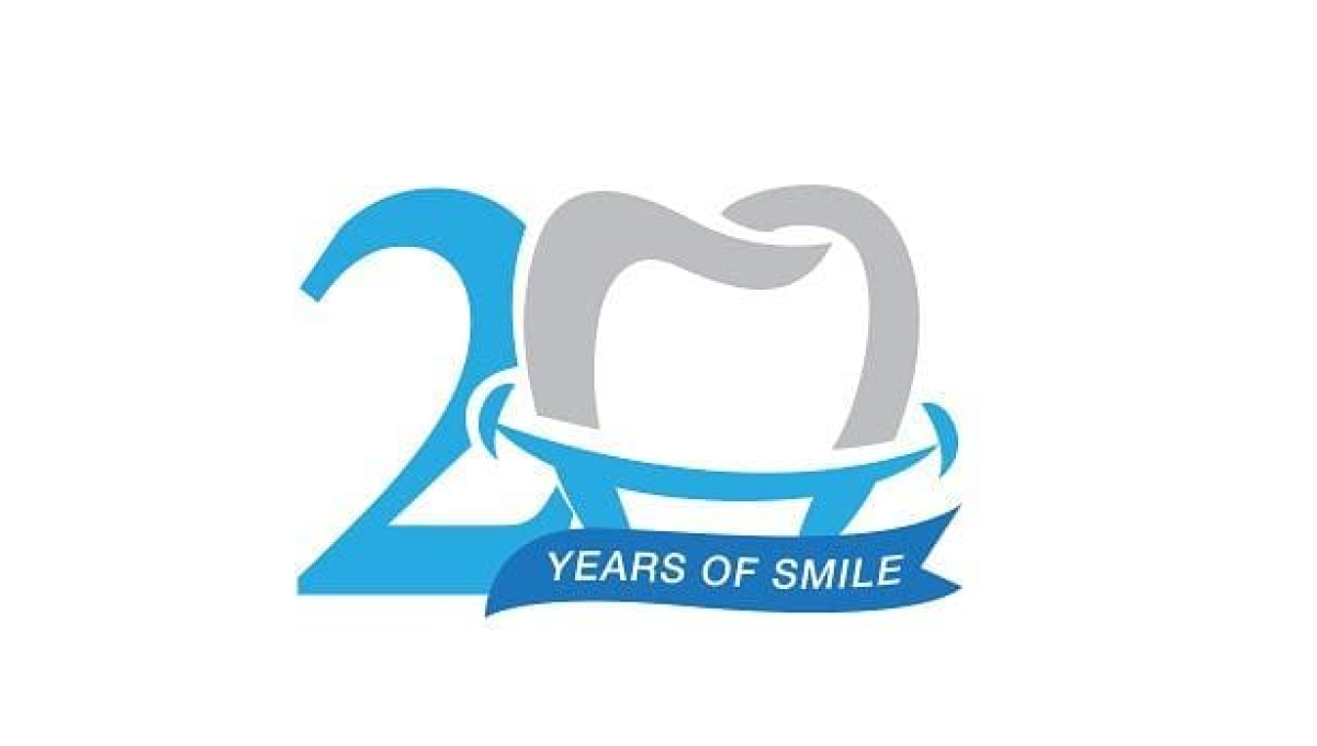
While this mark doesn't contain the name of the company celebrating their arrinversary, the clever use of the tooth shape as the number 0 is the 20th anniversary mark makes it clear what type of business is in question. And used only in places their original log would sit makes it easy to use this on-brand, playful mark without losing the tie to the original brand.
More Details →Market Mentors 20th Anniversary Logo
Sometimes a brand has to force their mark into the 0 of their anniversary number, but not Market Mentors. Their traditional mark - a tilted M contained in a purple circle - was a perfect match for this design style and that's exactly what they did. With a thin number 2 to the side and the word anniversary below, this logo is clean, simple, effective, and ties nearly back to their original brand.
More Details →Wordpress 20th Anniversary Logo
Wordpress learned into their classic brand color and well-known "W" mark for this anniversary logo. Line art style characters forming "20th" created a distinctive shape that could then hold their traditional mark inside the 0. Below that, the word anniversary in sans serif, capital letters go edge to edge for a simple, but effective, design.
More Details →Lego Star Wars 20th Anniversary Logo
Lego Star Wars created an anniversary logo that featured mini figure versions of popular characters with a round, badge-style design. A reflective silver color and a bit of addition for light sabers to extend above the circle and a box to hold the dates below create a great design that unique and features both a recognizable number and characters.
More Details →IDSA Foundation 20th Anniversary Logo
This clean annivesary logo starts with the organization's original logo and adds a balanced, square shape with 4 complimentary colors to form a clean frame. Inside that frame they return to the brand color with a large number 20 in the same color and typeface as the original logo. This preserves the recognizable original logo while adding a clear reference to the anniversary they're celebrating.
More Details →