175th Anniversary Logos
Eastern Michigan University 175th Anniversary Logo

There are a few elements that show up regularly in both anniversary logos as a whole and designs for universities, and while this holds to a fairly traditional design, it does so in a nice clean pckage. Around the outside of the circle is the name of the university, in the center is the big number for the years of operation. A few laurel leaves curving around the sides to fill in the gaps and two rings to hold it all together and you've got a simple but effective design.
More Details →Boudin Bakery 175th Anniversary Logo

I love this logo because it's a reminder that a logo should work for your needs, not just fit the criteria of what everyone else has done. In this case, their logo combines local landmarks and colors into a banner-style graphic that ties the year, the history, and the original mark into a design that would be easy to place on banners outside the bakery and labels, print materials, and labels inside.
More Details →Smithsonian Institute 175th Anniversary Logo
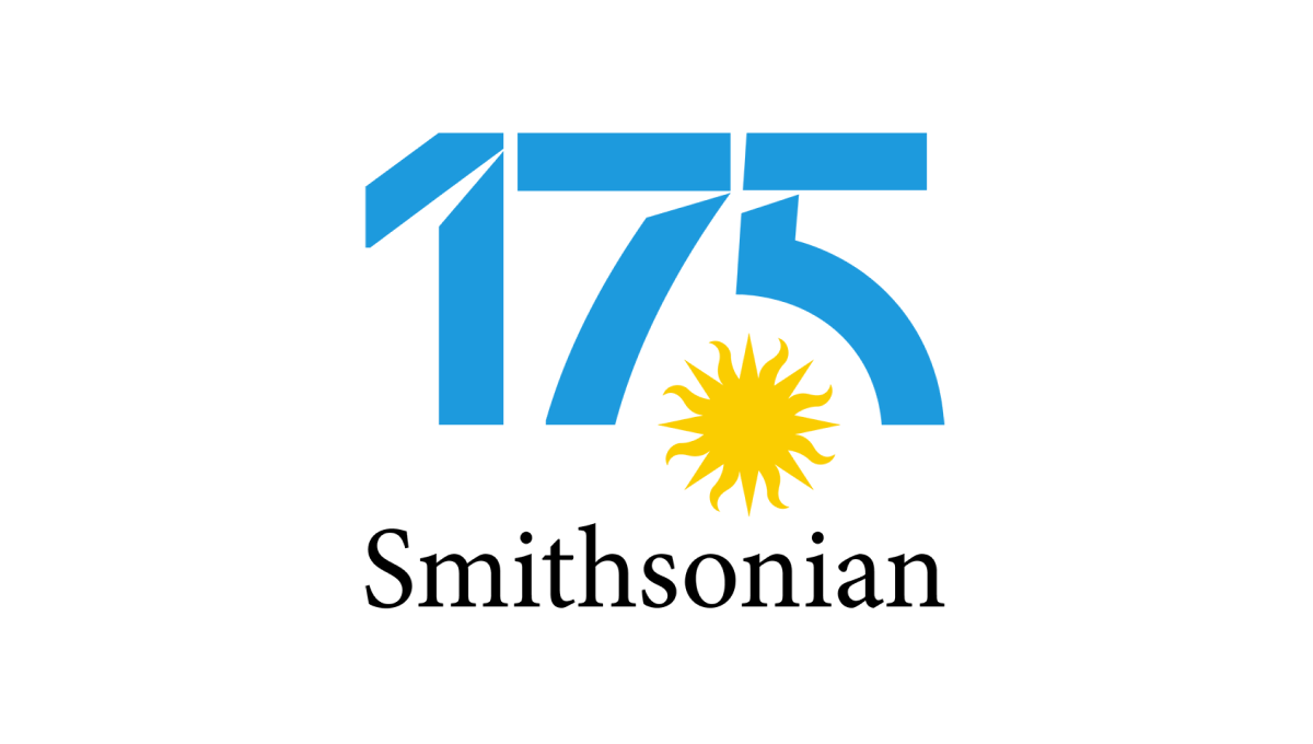
Normally the Smithsonian logo features a yellow sun on a blue circle. Wanting to keep the colors and shape of the original for their anniversary design, their team separated the blue from the yellow, placed the sun on it's own in the gap between the 7 and 5, and then used that backgroudn blue for the color inside the number in this logo. The traditional word mark on the bottom rounded it out and made it easy to recognize.
More Details →City of Huntington Indiana 175th Anniversary Logo
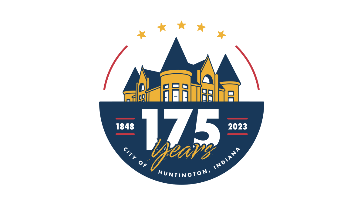
This logo starts with a circle that is divided exactly in half horizontally. On the top is placed a simple line-art drawing of a famous building in the city's downtown, while the bottom features a large number 175, the years of operation, and the name of the city. Curving along the top of the circle are placed 5 stars to round out the design.
More Details →St Bernard Catholic Church 175th Anniversary Logo
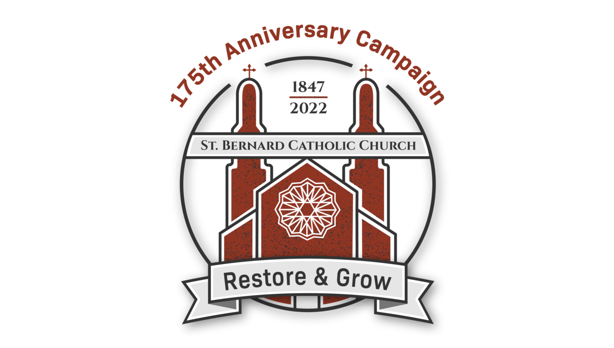
Featuring an illustration of the church's famous architecture in red, this art is wrapped in a circle to hold the bulk of the design. Above the circle sits the name of the church, at the bottom of the circle sits the church's tagline, and between the spires of the building sit the years of operation. Finally, just in front of those spires sits the name of the church.
More Details →