Elegant Anniversary Logos
Cameron & Mittleman LLP 40th Anniversary Logo
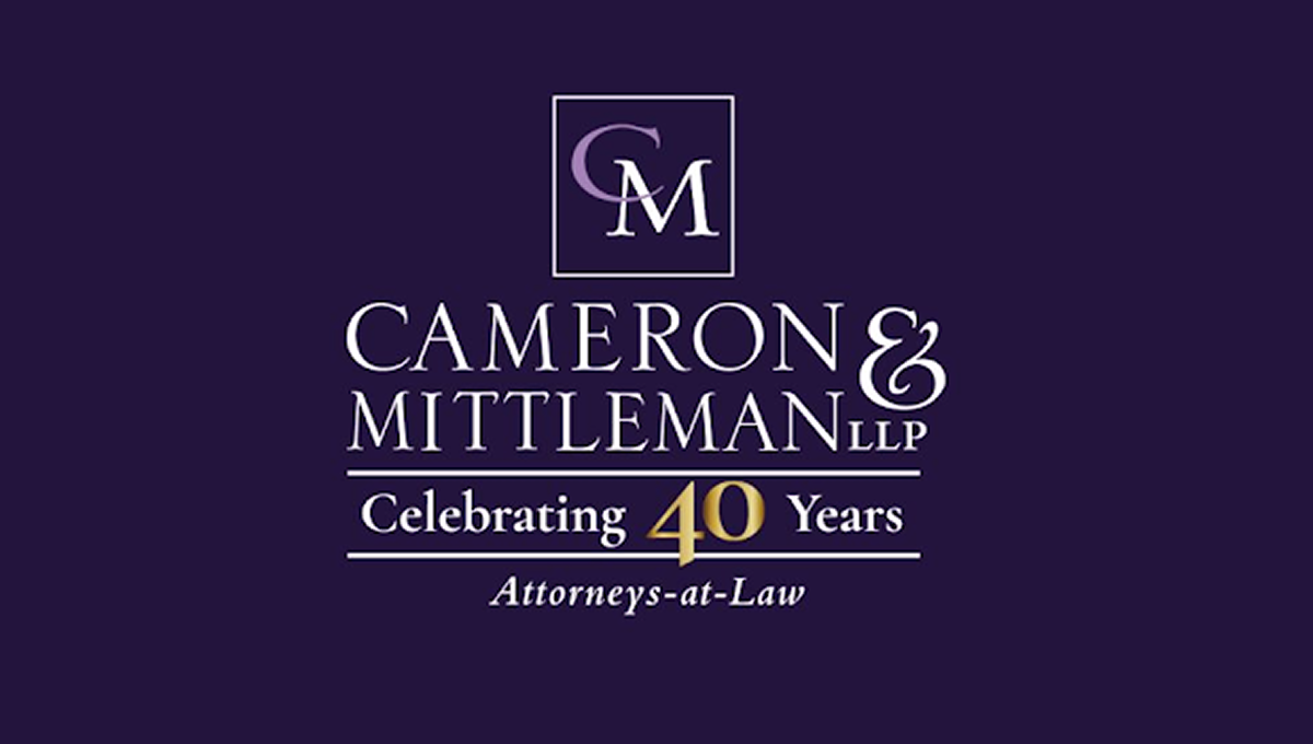
This anniversary logo has a clean, traditional look with a simple layout and a formal style. A dark background is paired with light-colored lettering, while a gold accent helps draw attention to the anniversary milestone. The company name is displayed in large, easy-to-read text, with a small monogram placed above it inside a thin border. A short celebratory message and a descriptive line below complete the design, giving it a professional and established appearance.
More Details →Delta Airlines 100th Anniversary Logo

Delta Airlines kept it simple and classy with this anniversary logo. A large number 100 in their classic purple sits in the center with a silver Delta logo coming out and out of the last zero in the number. Above that sits the full logo with the word years below. It's a simple package but an effective one that gives logo a clean mark that is already being used in a variety of contexts.
More Details →Hotel Leto Hydra 60th Anniversary Logo

If you're a classy hotel that's celebrating your anniversary, kimple it simple, elegant, and minimalistic is a common and effective move. A large number 60 in thin, slightly offset lines sites above the traditional word mark. Below the logo sits the years of operation which is always a nice addition in case this logo shows up outside of the year of the anniversary to clarify when the milestone took place.
More Details →Accor Hotels 50th Anniversary Logo

Accor Hotels normally uses a bird silhouette the form the left diagonal and cross of the letter A. The designers of their anniversary mark cleverly took that same shape and placed at the top of a number five to form the year the company is celebrating. Combined with a classy serifed font tucking just below their name, this logo is a really sharp design and one that was combined with other colors and elements in their marketing.
More Details →Zions Bank 150th Anniversary Logo
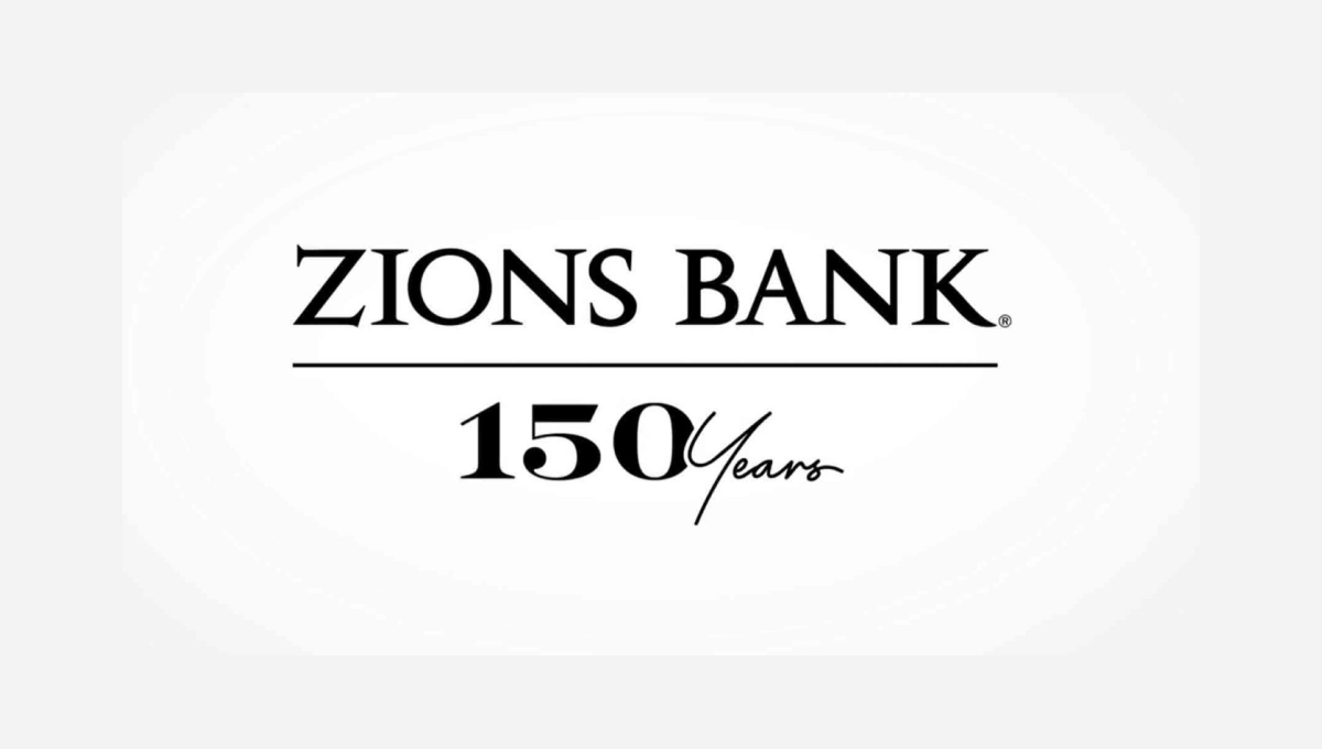
The traditional brand for this bank features the dark, serifed typeface you see at the top, so this logo build on that professional look. instead of placing a vertical line with the anniversary mark to the left or right, this logo places a horizontal line below the existing logo and then adds a simple number mark a similar font and color as the original logo. Given how wide their existing mark is, this was a great move to provide a little bit of balance and avoid further stretching the logo horizontally.
More Details →Caboolture Hospital 25th Anniversary Logo
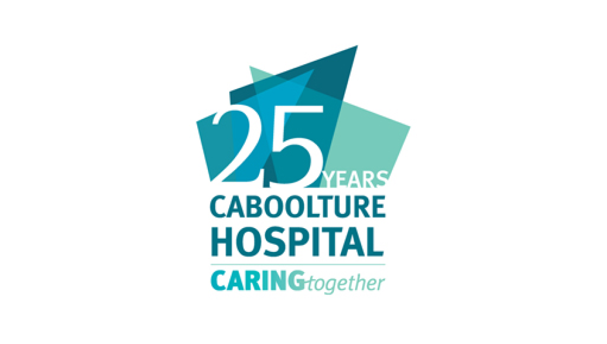
This logo does a great job of using the original word mark as the base for an anniversary extension. By placing some brand-related shapes above they gave themselves space for placing their anniversary number. Not only the number, in fact, but the word years as well to create a nice, balanced logo that ties strongly back to the original brand.
More Details →Stowe 85th Anniversary Logo
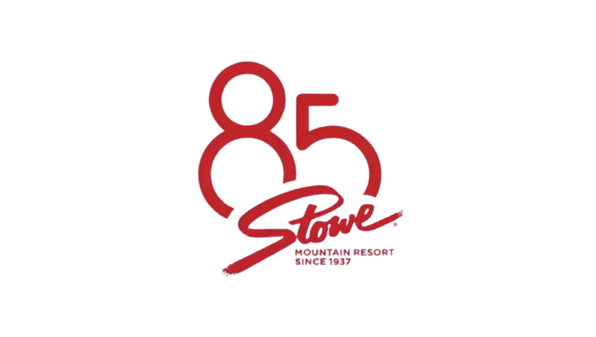
Stowe is a classic logo that hasn't changed since the early days of the resort and town. So rather than mess with something so clean and recognizable, they simply added a stylized number 85 peeking up and from behind the original mark. The result fit neatly on social media icons and marketing materials alike and kept things nice and simple.
More Details →Park City Mountain Resort 50th Anniversary Logo
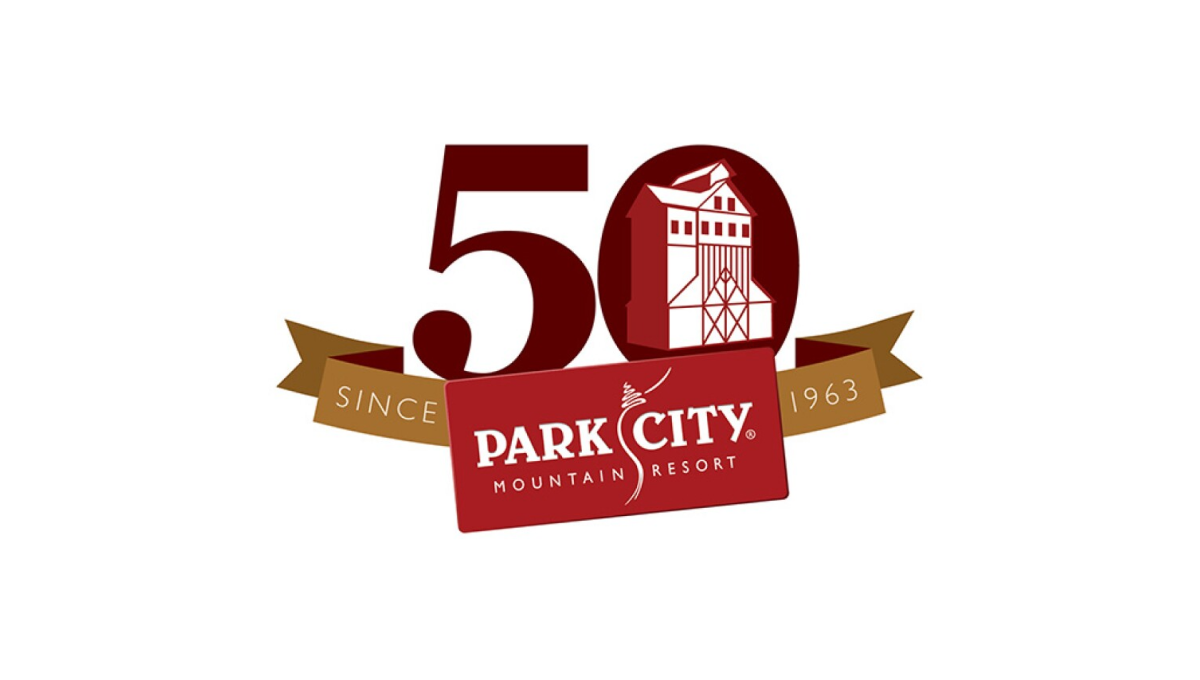
With a logo that was already set in a rectangle, Park City Mountain Resort simply turned that mark into a ribbon to contain the rest of the elements. Gold sections of the ribbon hold the words "since 1963" and the number 0 contains some clean line art depicting the mountain's well-known mining history and buildings still found at the resort.
More Details →IDSA Foundation 20th Anniversary Logo
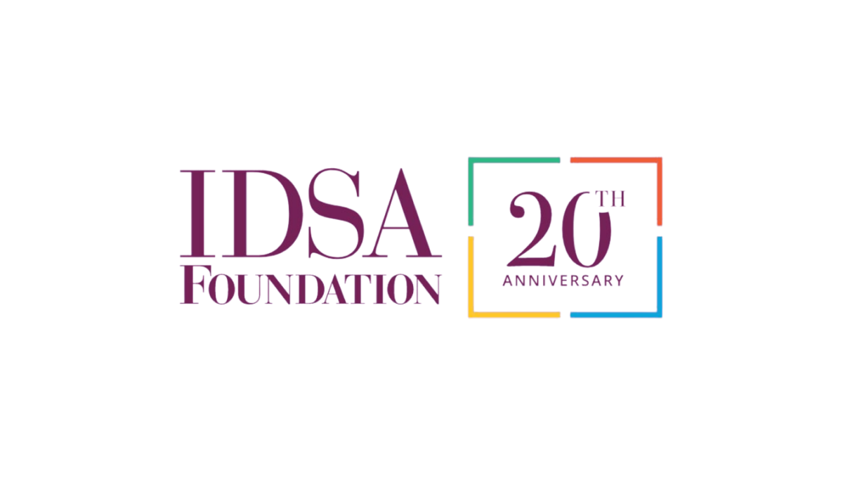
This clean annivesary logo starts with the organization's original logo and adds a balanced, square shape with 4 complimentary colors to form a clean frame. Inside that frame they return to the brand color with a large number 20 in the same color and typeface as the original logo. This preserves the recognizable original logo while adding a clear reference to the anniversary they're celebrating.
More Details →Disability Wales 50th Anniversary Logo
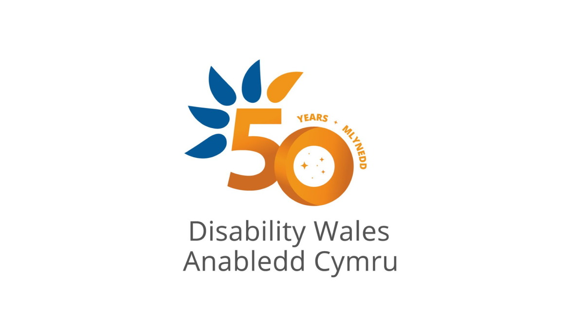
Diability Wales original logo is almost identical to this minus the number 50 in the center. Using orange for the number helps it stand out from the original curved, blue feather design and gives the logo a nice solid anchor in the center to keep things balanced. This similarity in size and shape also makes this logo easy to swap with the original logo in marketing and other designs.
More Details →C&W Champions 10th Anniversary Logo
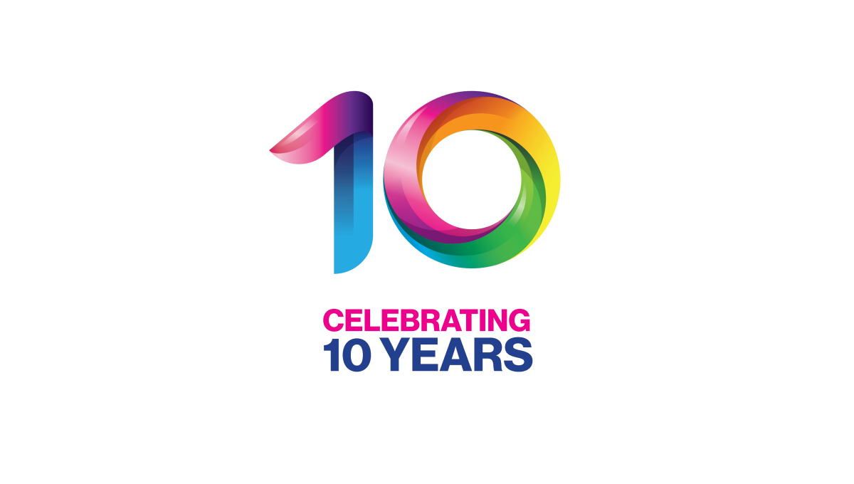
This logo takes a unique angle in that the only visual reference to the original brand is the color and shape of the mark. These rainbow, twisting three-dimensional characters mimic the style used in the organizations main logo and makes it easy for those aware of the original brand to easily connect it back to the mark it's related to.
More Details →