25th Anniversary Logos
Titelist ProV1 25th Anniversary Logo
The 2025 Pro V1 golf ball features a subtle anniversary marking, blending tradition with a nod to its 25-year legacy. The design includes a minimalist 25, with the words 'Pro V1' beneath it. This emblematic detail is positioned near the equator of the ball, maintaining the Pro V1's classic aesthetic. The overall look is clean and refined, honoring its heritage without overt celebration. This design choice reflects a commitment to timeless performance.
More Details →Uni Watch 25th Anniversary Logo
With a sports/university theme, I love that this logo kept that vibe int he design as well. In this case, a large number 25 sits in the center in the classic sports lettering. Below sits imagery associated with their original brand. Around the edge is a thick green circle to hold the description of the brand the reason for the celebration.
More Details →Minnesota Lynx 25th Anniversary Logo
There are so many shapes that appear in so many anniversary logos, that I love it when brands start with a more unique canvas for their design. This logo is a perfect example of that by adapting a diamong-like shape into a more arrow form with a large number 25 in the center, the team's mark at the top, and the word seasons in a ribbon at the bottom to create a unique, meaningful logo.
More Details →Turning Stone Resort Casino 25th Anniversary Logo
This is a unique anniversary logo in that it takes a distinct departure from the usual brand's color and style. Instead of the traditional blue, there's gold. And instead of a square filled with scripted letters, there's a diamond with block letters. The result, however, works surprisingly well and carries some of the classic anniverary logo design elements like the years of operation, a ribbon to hold extra wording, and the original word mark at the bottom.
More Details →Quad Cities Housing Council 25th Anniversary Logo
This is a really clean, effective example of a common anniversary logo design style where the traditional logo is placed side by side (in this case with a small divider line) with a number mark. This number mark uses a cut out silhouette of a house to tie it back to the original logo and meaning. Along the bottom sits wording to mark the occasion.
More Details →Myrtle Beach Pelicans 25th Anniversary Logo
Featuring that classic sports sytling with a clear shape made out of baseball-themed elements, block numbers, and multiple layers, this logo sets a large number 25 in the center with the team's mascot integrated within that number. Around the edge sit a few stars, a pattern depicting the relationship to the sea, and the word seasons at the bottom to create a really strong, balanced logo.
More Details →Pokemon 25th Anniversary Logo
When you're a brand that's as popular as Pokemon, it doesn't take much more than replacing the eys of one of your most famous characters with simple, round representations of the numbers for the anniversary they're celebrating. Folks like me who don't know much about Pokemon may not recognize it, but people like my daughter who love the brand will know instantly what it represents.
More Details →Ripfast Bodybuilding 25th Anniversary Logo
If your brand is bodybuilding, placing the photo of a ripped individual in the center is a pertty simple, on-brand way to start a logo. With a number layered above, a round circle with laurel leaves surrounding, and the traditional logo placed at the top, this logo may have a few more elements that typical anniversary logos but they work together pretty well.
More Details →New Gregory Gym 25th Anniversary Logo
This beautifully simple line-art style logo combines a seal-style shape with two rings to hold the name of the organization and the anniversary details. In the center is a clean illustration of the front side of the building. Together, the design is not only a beautiful blend of a recognizable element of the brand with a unique design that elegently marks the anniversary.
More Details →Stone Brewing 25th Anniversary Logo
Similar to earlier anniversary logos for Stone Mountain Brewing, this logo starts with the brand's traditional mark set in the bottom center and then adds layers of graphics behind. In this case, a large, 3D number 25 held in a circle with the name of the brewery and illustrations to create texture within this monochromatic design.
More Details →Meadow Mill 25th Anniversary Logo
While many logos are meant to stand alone and represent the company as a whole, this design was simply meant to be paired with the traditional logo, website, or other assets. Around the left side of the circle is a list of the reasons people love this fitness center while the center holds the number 25 and the other side of the circle is ringed with the word anniversary.
More Details →Bend Brewing Company 25th Anniversary Logo
Starting with the classic round shape that is famous with anniversary logos but especially among beer-themed designs, this logo spells the brewery's name across the top half of the circle, a fun tagline across the bottom half, and a larger number 25 just above that. Filling the rest of the circle is an illustration of a "cheers" between a glass of beer and a can of beer.
More Details →Barley Brown's Brew Pub 25th Anniversary Logo
Using perhaps the most popular shape for anniversary logos, this brew pub starts with a black circle to create a clean shape to begin. In the center is the name of the company in a yellow that reminiscent of the beer they famously serve with a large, stylized number 25 at the bottom of the circle just extending beyond the edge of the circle.
More Details →Lego Games 25th Anniversary Logo
In another example of keeping the original logo and adding a number mark beside it, this design took a slightly different approach that the usual. Instead of placing these side-by-side, they stacked them. The number mark uses similar yellow and black colors of the original mark and a little bit of sparkle to help it stand out and keep the fun vibe of the original.
More Details →United States Disc Golf Championship 25th Anniversary Logo
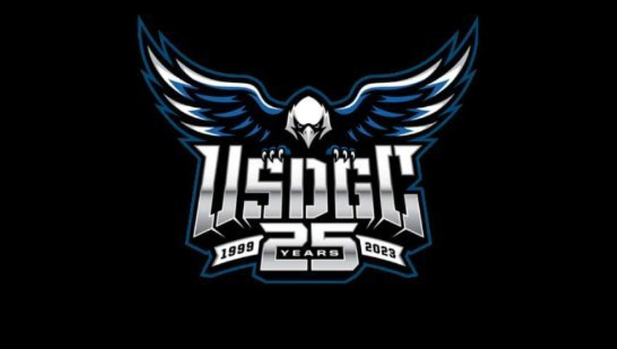
With the sport growing at a record pace, the United States Disc Golf Championship wanted to celebrate their 25th anniversary with a logo worthy of the sport's budding brand. With their traditional logo set in the center, a large bald eagle behind, and the number 25 below, the design adds a metalic sheen for a clean, classy finish.
More Details →Netflix 25th Anniversary Logo
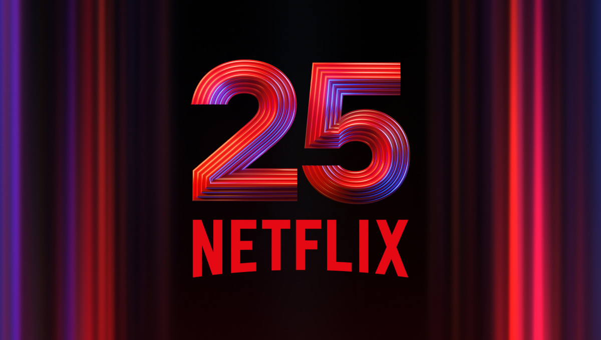
Netflix is famous for many things, but one of their most famous is the opening animation that precedes each video in their library. So when celebrating their 25th anniversary, they used a similar style - almost a still image from that sequence - as the backdrop to easily tie this design back visually to that part of their brand. In the center is placed a multi-faceted number 25 with their traditional logo below.
More Details →Mountain West Conference 25th Anniversary Logo
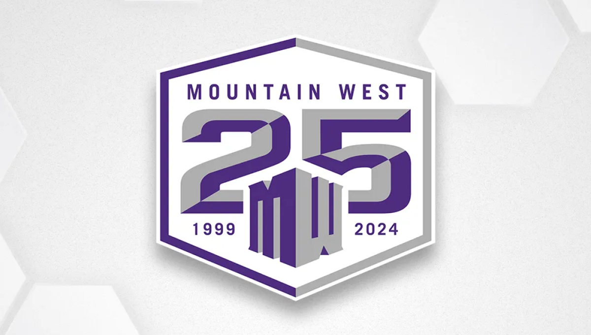
Once an underdog conference, the Mountain West is now home to many top contenders across major college sports. They've leaned into the hex shape for their brand recently, so they started with that shape, added a large, block 25 to the center, placed their original mark below and centered on the number 25, and placed words and years int he remaining spaces to create a solid design featuring their usual brand purple.
More Details →Google 25th Anniversary Logo
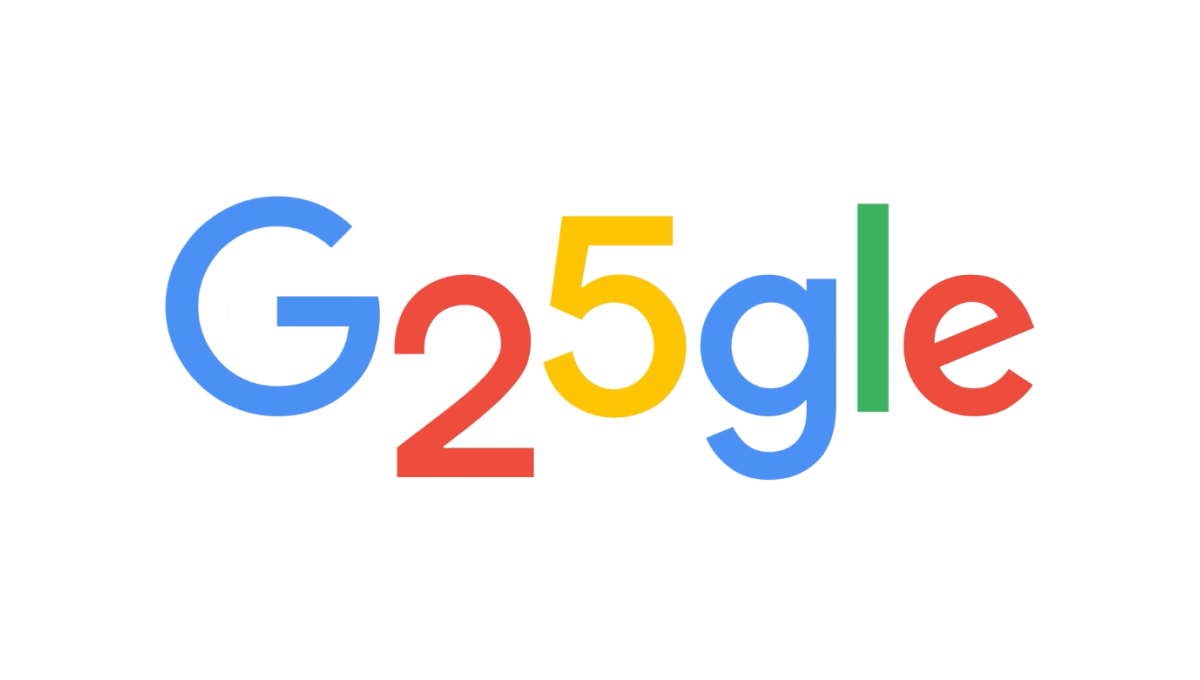
Google is famous for adapting their logos through the popular Google Doodle program, so it wasn't hard for this talented team to come up with a simple, well-executed design for their 25th anniversary. In this case, they used the rounded areas on the numbers 2 and 5 to make the two letter o's they frequently adapt as part of these logos. The result is a perfect, on-brand celebration of the brand's 25th anniversary.
More Details →First Bible Baptist Church 25th Anniversary Logo
With laurel leaves curing upward to form the shape and the church's traditional logo at the top, this logo then places a large number 25 in the center to add balance. The number also features a solid shadow and outline for depth plus a ribbon below holding their years of operation. Below that, the church's tagline sits to round out this logo.
More Details →PACE NSC 25th Anniversary Logo
The Partnership for Academic Competition Excellence (PACE) is a 501(c)(3) non-profit that runs a quizbowl competition called the National Scholastic Championship (NSC). So their logo begins with a green circle in their primary brand color and adds a large number 25 on the left side with the two and five staggered to fit the shape of the circle. On the right, a simple illustration of the clickers they use in their comptition adds relevance with the name of the organization across the top.
More Details →Caboolture Hospital 25th Anniversary Logo
This logo does a great job of using the original word mark as the base for an anniversary extension. By placing some brand-related shapes above they gave themselves space for placing their anniversary number. Not only the number, in fact, but the word years as well to create a nice, balanced logo that ties strongly back to the original brand.
More Details →SportsLogos.net 25th Anniversary Logo
As a site that celebrates sports logos, this mark sets a high bar for anniversary logo designs. Starting with a circle in the brand's traditional red, it then cleverly weaves the number 25 in front of and behind the background to create a sharp three dimensional look. The site name and years are then set into the remaining red of the background with the original mark set in the bottom of the ring to make a clean connection to the original brand.
More Details →Foxbury Film Festival 25th Anniversary Logo
This logo starts with a circle and adds rings to give the designers space for both a silver border to hold the entire design together as well as space to add circular words to specify both the event's name as well as their years of operation. In the center, a stylized reference to the annerversay year and slowly brigtening colors draw attention both the number and center of the logo.
More Details →Elite 11 25th Anniversary Logo
The nationals premier elite quarterback competition, Elite 11 drew inspiration from the strong, bold themes associated with sports logos and the large, blocky numbers that sit behind many major bowl game logos, to create a mark that places their original logo in the center and uses the strong, dark colors of that brand to build a great looking anniversary logo.
More Details →Blacktail Mountain 25th Anniversary Logo
Blacktail Mountain went away from their primary logo with this mark and used a retro, line-art style number with a classic circular bar of text around and deer graphic to tie it all together and back to the core brand. It's a nice, clear, simple design and the retro feel of the number gives it a unique feel that's easy to recognize and remember.
More Details →


