65th Anniversary Logos
Utah Shakespeare Festival 65th Anniversary Logo
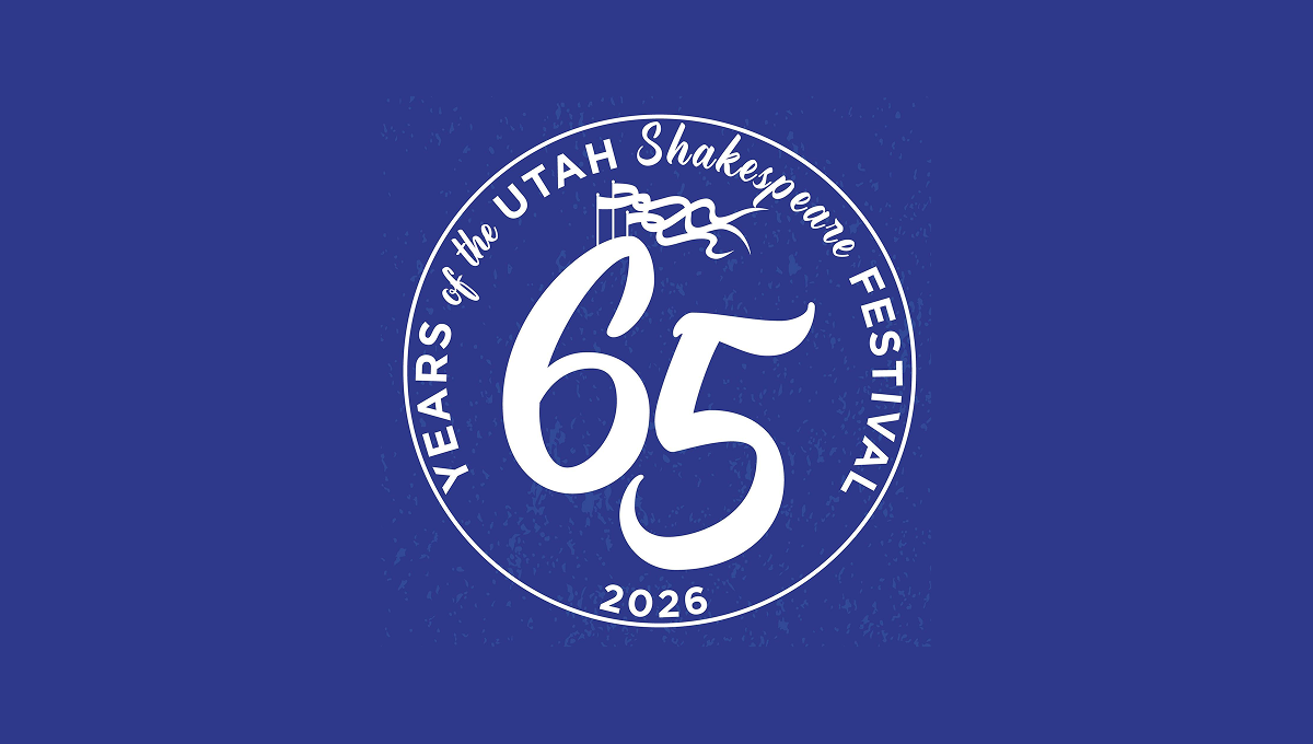
This anniversary logo has a bold, round design with a strong, classic feel. A large “65” sits in the center, standing out clearly and suggesting an important milestone. The words around the edge form a circular frame, giving the logo balance and unity. A small flag detail adds a subtle historical touch. The single color palette feels calm and timeless, while the slightly textured background gives it warmth and character. Overall, it feels celebratory, traditional, and respectful of history.
More Details →Brundage 65th Anniversary Logo
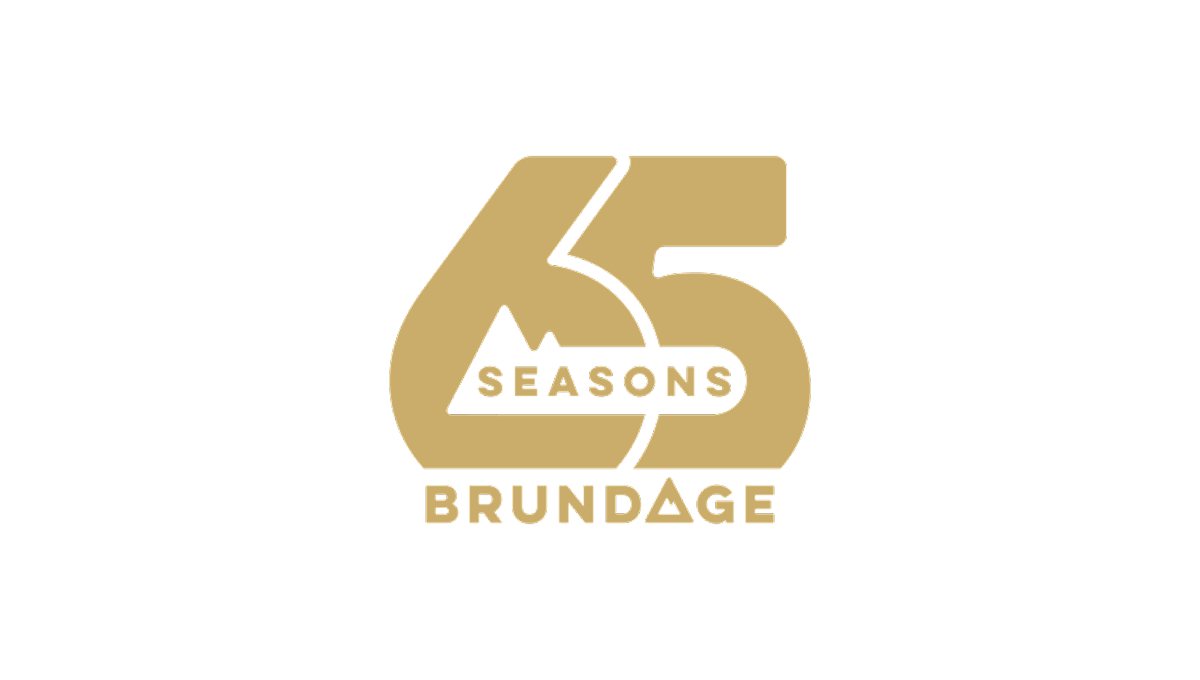
This anniversary logo features the number 65 in a bold, rounded style that feels solid and confident. The design is simple but carefully balanced, with the word “Seasons” placed across the center and “Brundage” below. A small mountain shape adds a subtle natural element without drawing too much attention. The gold color gives the logo a warm, celebratory feel, marking an important milestone.
More Details →KUER 90.1 65th Anniversary Logo
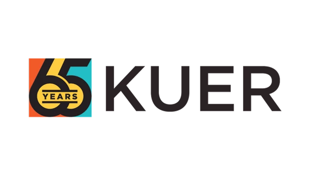
This anniversary logo features a clean, modern design with a mix of bold and light text. It highlights the number "65" to mark a special milestone, standing out in large, simple lettering. The colors are soft but eye-catching, giving the design a fresh and balanced look. The layout feels organized and clear, combining the station's name with the anniversary number in a way that looks both professional and easy to read. It gives a sense of history and progress.
More Details →Tolsa 65th Anniversary Logo
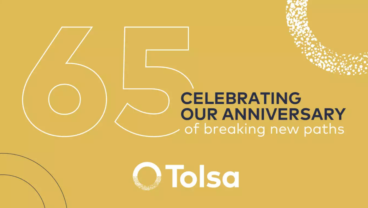
Sometimes what you need isn't a logo as much as a graphic. So while this graphic may no fit the traditional rules of a logo, it does serve its purpose really well. With a background in the brand's gold color, the logo at the bottom, an enlarged mark in the top right, and the number and reason for celebration in the middle, this graphic worked well on thier website as a content block and on social media.
More Details →Epec 65th Anniversary Logo
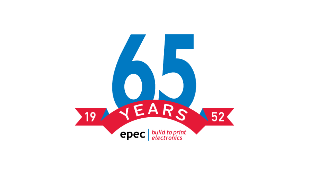
This simple logo uses the brand's primary blue and red colors - a large number 65 in blue rising up from behind a curved ribbon in red - to both spend the message and create a little bit of negative space at the bottom of this mark. In that mark they placed their usual logo for a simple mark that's both big and easy to use but also ties back to the original brand.
More Details →Ruskin 65th Anniversary Logo
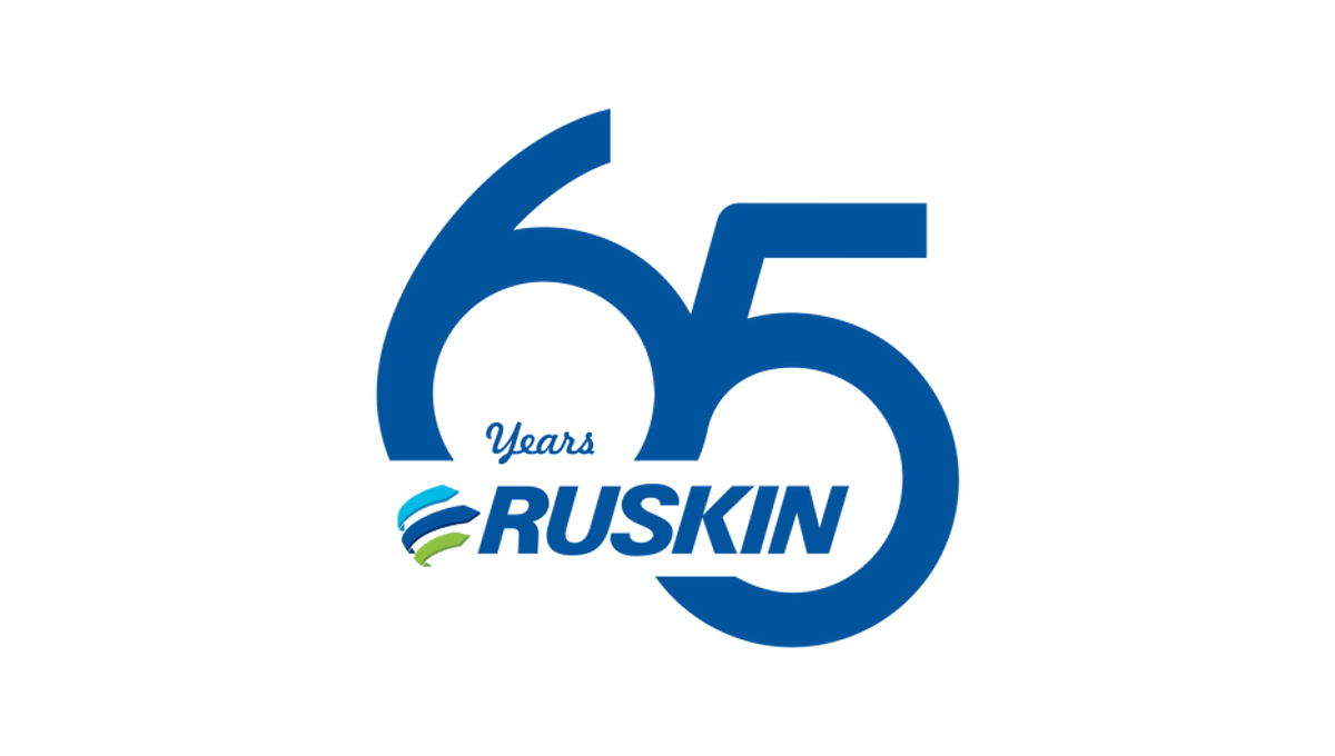
Ruskin's 65th anniversary logo starts with a large number to mark the reason for celebration with a slight offset and overlap. This number, in the brand's traditional blue color, creates the backdrop for the brand's primary logo to be placed across the bottom of the six and into the gap of the five. This creates a clean mark that's easily recognizable as relating to the normal brand.
More Details →Greek Peak 65th Anniversary Logo
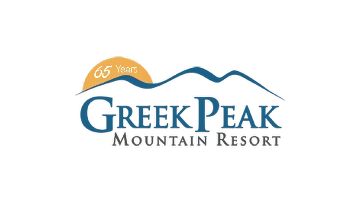
Greek Peak kept their annversary logo simple and clean when they recently reached their 65th anniversary. A simple orange circle peeking up from behind the ridgeline of mountains that make up the original mark hold the number 65 and marks the only chance to this brand. This simplicity made this logo extremely easy to swap with their existing logo during its year of use.
More Details →