80th Anniversary Logos
Mattel 80th Anniversary Logo
The anniversary logo shows a big, red number 80 where the zero is a bold circle around a familiar brand mark. The brand name sits in the center of that circle in plain, strong letters. The style feels bright and simple, with smooth lines and a clean look that catches your eye. It uses one color and a clear shape to hint at a long history and a big milestone moment.
More Details →Smokey Bear 80th Anniversary Logo

This anniversary logo has a warm and friendly feel, with a playful yet respectful tone. It features a familiar face at the center, reminding viewers of a long-standing message. The number 80 is clearly shown, along with simple text to mark the milestone. The colors and style give it a classic, outdoorsy look, fitting for the subject. Overall, the design feels both nostalgic and celebratory, honoring many years of a well-known figure and what they stand for.
More Details →Trimac 80th Anniversary Logo

Trimac’s 80th anniversary logo combines retro and modern styling to reflect the company’s 80-year legacy and how far it has come. The overall design was inspired by a road (it’s a trucking company after all) to symbolize continuous movement and the “road” ahead, with the three lines representing the company’s founders: J.R. “Bud” McCaig, Roger McCaig and Maurice McCaig. Central to the design is a bold “80,” shaped like an infinity to reflect limitless potential, unity and the collective strength of its people, customers and communities. The logo uses Trimac’s primary brand colours, maroon and red, and is anchored by the company’s original logo for use across various applications, like truck fleet branding, merchandise, print media and digital platforms.
More Details →Carl's Jr. 80th Anniversary Logo
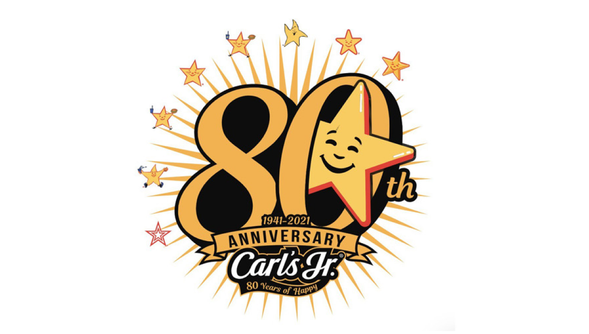
Using the chain's classic colors and fonts, this logo starts with a large number 80 in the center. Around the outside sit 8 of the famous stars the brand is known for with a larger version of that well-known shape peeking out from the zero. At the bottom sits their traditional logo to create a fun, creative logo that's also neatly on brand and easy to tie back to the original.
More Details →SESLOC Federal Credit Union 80th Anniversary Logo
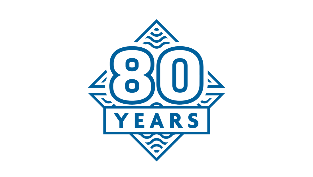
This mark was rarely used on its own, but because they stuck to the same blue color, shape, and style as the company's original logo, this design was a nice campanion to traditionally branded materials. The difference in this mark was a large number 80, unique line art behind, and a large word "YEARS" below the number. The design looked great and was used really well by this credit union during their anniversary.
More Details →Hankook 80th Anniversary Logo
This logo starts with a large number 80 made using three concentric circles for each loop of the number but then places all three into another circle that hides some of the edges. The loose ends of the circles are then connected to make a classy mark that still makes it easy to see the original number. An anniversary tag line sits just to the right. While not recognizable on it's own, this mark is a great asset for Hankook's marketing materials.
More Details →Battle of Normandy 80th Anniversary Logo
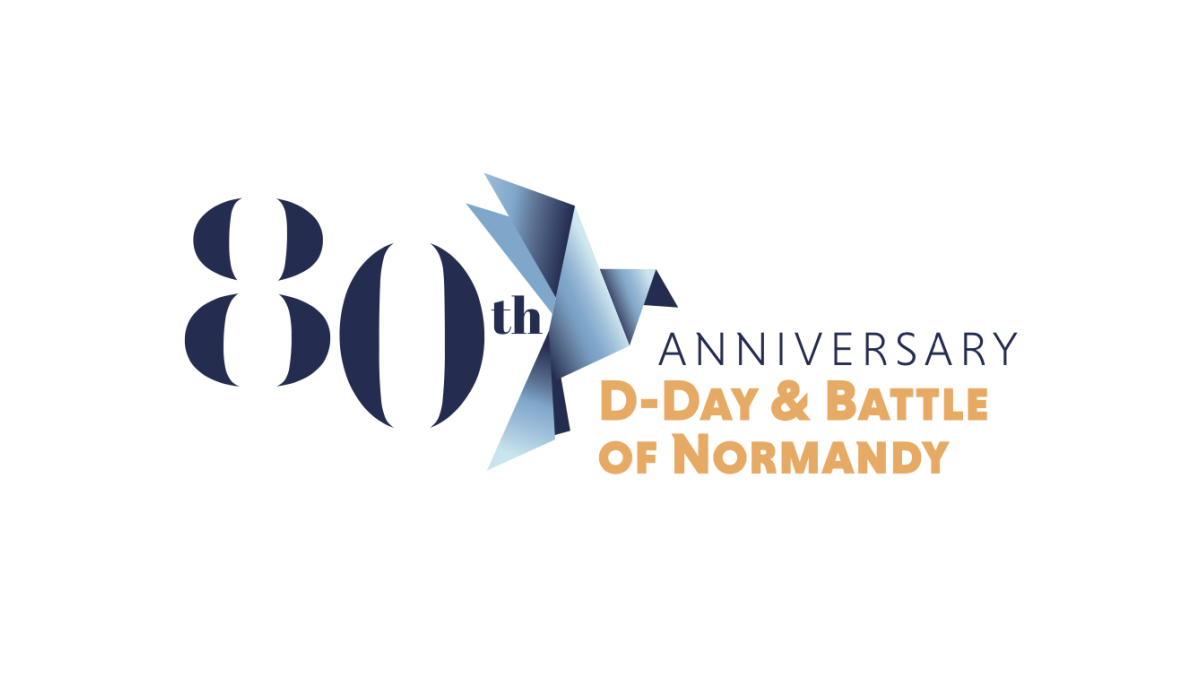
Marketing the anniversary of such an imporant but somber occassionan, this logo uses a clean serif font for a large number 80 that sits on the far left of the logo. Just to the right of that is a dove made of sharp angles and shapes using a few varieties of the same blue. Finally, words sit to the right of that clarifying the why and what of this anniversary.
More Details →Dialight 80th Anniversary Logo
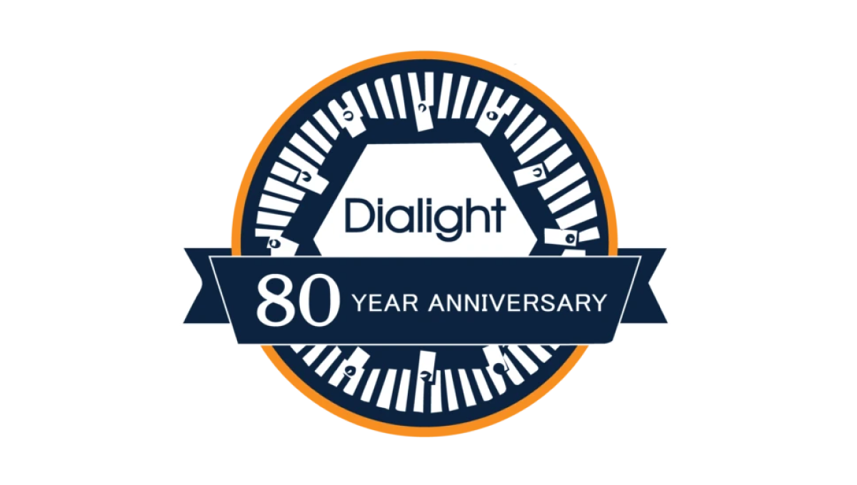
Starting with a classic circle shape, this mark doesn't use as many colors as the brand's traditional mark, but uses both a prominant, center placement of the usual logo with an illustration around the edges of the circle that adds visual cues back to their primary product which, in this case, is LED lighting. A ribbon across the bottom third holds the reason for celebration and creates a little bit of depth for this design.
More Details →The Way International 80th Anniversary Logo
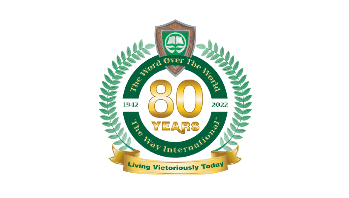
Adding a number of elements you'll see in anniversary logos, this logo uses a thick circle to hold one ring of words, another ring outside of that holding the classic Laurel leaf pattern, and a banner at the bottom where they've played the organization's motto. In the center is placed their year of celebration with the original logo situated at the top.
More Details →Monopoly 80th Anniversary Logo
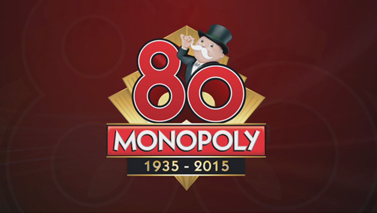
Monopoly applied classic board game design to this anniversary logo that features the traditional, rectangular logo for the game at the bottom of a diamond with a large, three-dimensional number 80 sitting above. Below the years of the game's existence are included with simple, gold lines to keep a sharp look that balances the rest of the design.
More Details →