Simple Anniversary Logos
Prefontaine Classic 50th Anniversary Logo

This anniversary logo features a bold, clean number paired with a word to mark the occasion. The design feels strong and steady, using clear shapes and solid colors. There’s a sense of pride and tradition in how the elements are arranged, while still keeping things modern. It gives off a respectful and professional feel, showing appreciation for the past while looking ahead. The overall look is neat, balanced, and easy to recognize.
More Details →Titelist ProV1 25th Anniversary Logo

The 2025 Pro V1 golf ball features a subtle anniversary marking, blending tradition with a nod to its 25-year legacy. The design includes a minimalist 25, with the words 'Pro V1' beneath it. This emblematic detail is positioned near the equator of the ball, maintaining the Pro V1's classic aesthetic. The overall look is clean and refined, honoring its heritage without overt celebration. This design choice reflects a commitment to timeless performance.
More Details →Utah Division of Arts & Museums 125th Anniversary Logo

This simple logo sets the original word mark on the right and adds a stylized number 125 to the left. Similar to other anniversary logos, they stagger the digits of the number to add a little bit more design and depth tha having the number alone. Filling the gap left by this stagger are two ribbon shapes that tie the logo back to the meaning and mission of the organization.
More Details →The North Face 50th Anniversary Logo

Anniversary logos often have an offset second digit to add a little bit creativity to an otherwise normal number, but I love how The North Face did this with a little bit more purpose. The number zero uses a horizontal line to mimic the set cresting the horizon, an image common in the visuals that accompany the adventures their customers embark on. It's a clean, simple mark and beautiful design.
More Details →Tempo Curacao 15th Anniversary Logo

This logo goes ultra simple with a large, block number fifteen in the brand's light gray color. Inside the circle of the number five they've placed their round, original logo in their usual red. Just to add another tiny bit of clarity they've placed the word "years" below the number inline with the red of the logo. It relies heavily on their market being able to recognize their mark, but it does a great job of building on that brand awareness in a simple, clean package.
More Details →Alliance Technologies 15th Anniversary Logo

I love the minimalism of this anniversary logo design. Their original logo already had a circular shape so, instead of trying to reinvent the whole package, they simply curved an anniversary-themed message around an empty part of this circle. This subtle change is noticable, but not overpowering. The result is a logo that's easy to swap with their existing but doesn't compete with the power of folks repeatedly seeing their original logo.
More Details →iSchool at Illinois 130th Anniversary Logo

This logo is a great example of the fact that not all designs have to be a...well...logo. If you want to celebrate your anniversary but don't have a logo of your own to build on, you can do what this organization did and just create a simple graphic with words to describe your group. In this case, a large number 130 with arcing lines above and the name of their school below. Simple and effective, even if it may not exactly be a logo.
More Details →Dee Foundation 50th Anniversary Logo

The Dee Foundation often uses a logo that only includes the text shown on the right side of this design. So being, they could pair that with an anniversary mark without having to fight with the shape or color or weight of the original logo. A large number 50 filled with a slight gradient and two faces making the negative space in the number zero made for a really classy logo to use during their anniversary year.
More Details →Onstage Ogden 75th Anniversary Logo

Onstage Ogden uses a simple, text-only wordmark for their traditional logo so this gave them the chance to add a mark for their anniversary without competition with their usual mark. In this case they kept the two-tone theme but combined a number seven on the left with a square extending to the right and the number five subtracted from that shape. A nice little design that's easy to swap with their usual mark.
More Details →The Kahala Hotel & Resort 60th Anniversary Logo

A hotel and resort in Hawaii, this logo normally features just the flower in the place where the number 60 sits in this anniversary variation. Not only did they design a number 60 that neatly matches the original logo in font and weight, they also cleverly pinned their original flower mark "behind the ear" of the number sixty. This clean adaptation looks beautiful and has a nice nod to the culture of the area.
More Details →Palisades Tahoe 75th Anniversary Logo

This is an anniversary logo design concept I haven't seen before but I really like. Instead of changing the mark or adding something outside of the logo, this design places a large, block number between the two parts of the original logo. I love the way it keeps the balance of the original logo while adding an easy-to-recognize call to the year they're celebrating.
More Details →Trillion Creative 10th Anniversary Logo

Trillion Creative's logo is just as simple, clean, and well-designed as you'd expect from an agency. They already had the letters I and O within their work mark, so they simply swapped those out for a number 1 and 0 with the word years inside the latter. The result looks really sharp, is extremely easy to swap with their traditional logo during and after the anniversary, but is also easy to notice and understand the meaning of.
More Details →Ogden Nature Center 50th Anniversary Logo

This is a really creative, simple solution to an anniversary logo that alters the original logo very little while making a clear, unique design for their celebration. In this case, they already had a round shape for their mark, they simple added a ring of gold around that circle and wording the mark the celebration. This keeps the proportions and sizing of the logo almost identical to the original so swapping to and from this logo is easy during and after the anniversary year.
More Details →Salem Academy & College 250th Anniversary Logo

In a classic style, this logo takes advantage of the three digits in their anniversary number to connect and overlap each number to create a creative, unique number mark that also creates space along the top right for a shortened name of the university. Around the number 5 sits the years of operation with the full name sitting below to create a simple, balanced logo that would work great in many contexts.
More Details →America 250 250th Anniversary Logo

You could take an anniversary logo for an idea as large as the United States in many directions, but the America 250 folks kept it simple and clean. A capitalized word in black sits above a number 250 made ot of a single, continuous red, white, and blue ribben with just a bit of rounding extension above and below the top and bottom of the normal number sizing. The result is really clean, balanced, and effective.
More Details →Council Of Europe 75th Anniversary Logo

Using the same shape, color, and words of their original logo, this anniversary variation replaces the mark - a stylized letter C surrounded by yellow stars - with a large number 75 surrounded by fewer stars but in the same yellow hue. By using the exact same shape this mark would have been incredibly easy to swap out with their traditional logo both during and after the anniversary celebrations.
More Details →St Gabriel Catholic Church 250th Anniversary Logo

This clean logo features a three dimensional silhouette of this church's bell tower placed above a large number 250 below. Using only the traditional blue color of the church and their name at the bottom, this logo is as simple as it is effective and creates an elegant design that would look great in many different applications.
More Details →Quad Cities Housing Council 25th Anniversary Logo

This is a really clean, effective example of a common anniversary logo design style where the traditional logo is placed side by side (in this case with a small divider line) with a number mark. This number mark uses a cut out silhouette of a house to tie it back to the original logo and meaning. Along the bottom sits wording to mark the occasion.
More Details →Myrtle Beach Pelicans 25th Anniversary Logo

Featuring that classic sports sytling with a clear shape made out of baseball-themed elements, block numbers, and multiple layers, this logo sets a large number 25 in the center with the team's mascot integrated within that number. Around the edge sit a few stars, a pattern depicting the relationship to the sea, and the word seasons at the bottom to create a really strong, balanced logo.
More Details →Hendrick Motorsports 40th Anniversary Logo
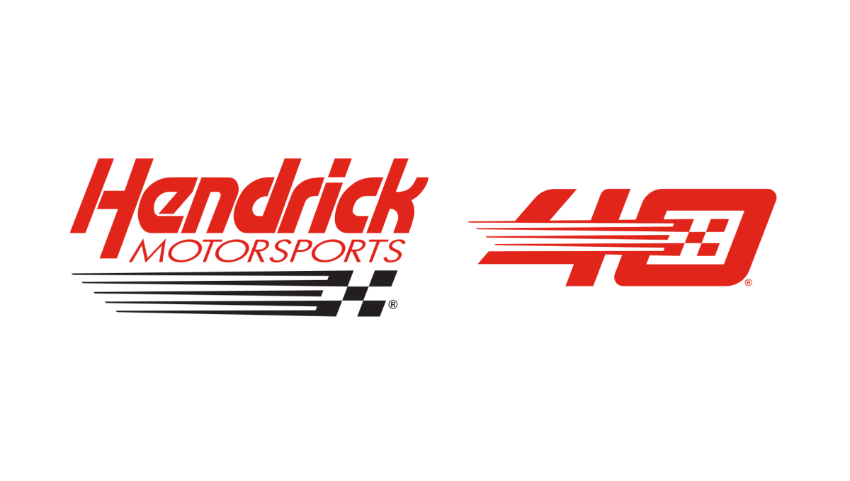
This logo takes the popular side-by-side approach that keeps the original logo as is and adds a unique number mark to the side. In this case, their design team designed a number 40 that features the same slant, color, and checkered flag motif of their original to create a number that neatly matches their original logo but also has enough elements to be recognized on its own by core fans.
More Details →Illinois Valley Community College 100th Anniversary Logo
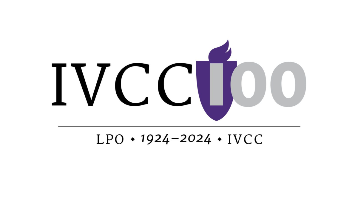
Universities have a unique feel, voice, and set of imagery that is used neatly and effectively in this logo for Illinois Valley Community College. A flame in the school's classic purple color sits behind the first part of the number one hundred, a serfed typecase from the original logo spells out their abbreviation of the school, and a little extra context sits below for a simple but balanced design.
More Details →Mt Buller 100th Anniversary Logo
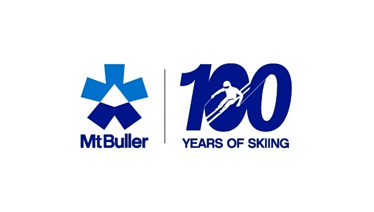
One of the smartest design trends in anniversary logos has been the simple, side-by-side concept that draws a vertical line in the middle, places the original logo on one side, and a simple number mark on the other. Mt Buller did this really wel with a nice "100 years of skiing" mark that makes for a nice, visual balance to the brand both visually and with the meaning they're aiming for.
More Details →Scratch 15th Anniversary Logo
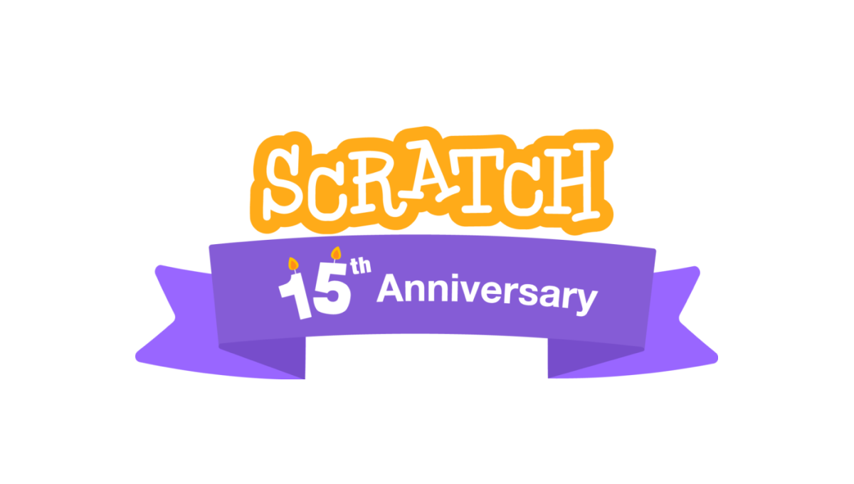
A coding platform that's designed primarily for kids, Scratch celebrated theira nniversary by adding a playful color combination to their altreay playful logo as a base. This color was used in a classic ribbon that wrapped around the logo and held a simple banner indicating the reason for celebration. A simple, but effective design.
More Details →European Distance & E-Learning Network 30th Anniversary Logo

This brand found themselves in a unique position when designing an anniversary logo because their existing logo already resembed the shape of a number. By placing the number 3 above the "ED" with a similar width as those to letters combined and doing the same with the 0 and "EN", the acronym and number mark created a unique, balanced shape that incorportated their existing logo.
More Details →Marek 75th Anniversary Logo
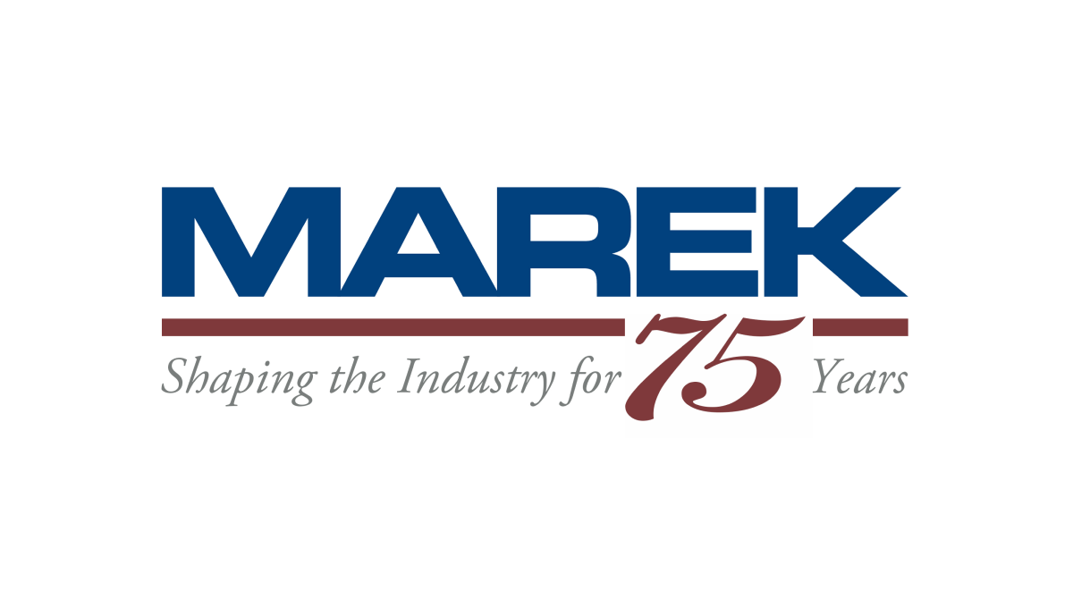
This mark always had a red line below a blue word, so this logo design simply worked with the existing horizontal elements in their traditional logo with the horizontal parts of the number 75. The result is a neatly integrated number that celebrates the occasion with a design that will be easily recognizable to their audience.
More Details →Coca Cola 125th Anniversary Logo
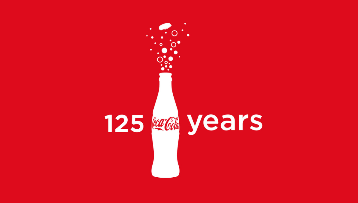
Imagine having a brand so powerful that you only need the shape of your packaging for people to instantly recognize its source. In this case, they also included the logo on the bottle, but it's almost unnecessary. With bubbles coming out the top and text to the left and right, these elements were combined in various lockups but this one - which also showed up on some packaging - was among the more popular.
More Details →Golden Corral 50th Anniversary Logo
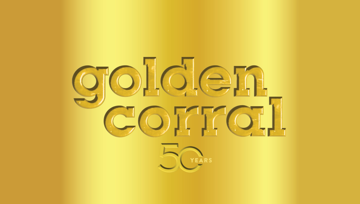
When your logo is already gold, why not build on that for your 50th anniversary? Golden Corral kept it simple and inset their mark and a number 50 into a reflective gold background to create a sort of etched or stamped feeling to their design. The result can be hard to see in some lockups, but was a nice, on-brand way to celebrate the occasion.
More Details →Regional Food Bank 40th Anniversary Logo
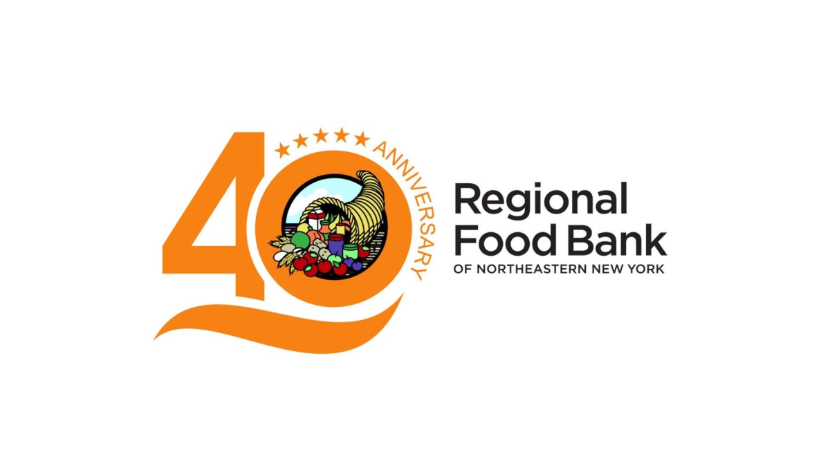
By placing this organizations logo in the zero of the number 40, this mark easily ties the anniversary design to the original logo for easy reconition and swapping during the anniversary year. A few extra elements are also added to this design including a line below the number 40 and a series of stars and the word anniversary curved around the right side of the zero.
More Details →Capital Area Food Bank 40th Anniversary Logo
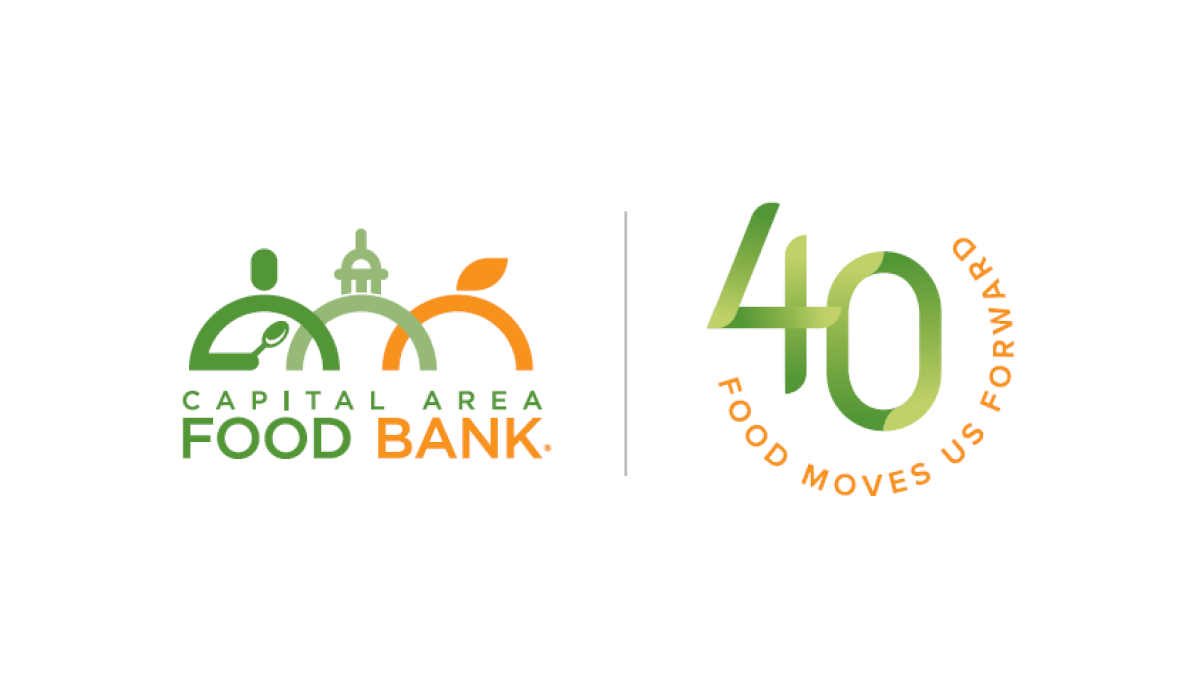
Using what has become a very common and effective design for anniversary logos, this mark starts with the traditional logo on the left, a vertical line for separation, and a separate mark that is solely about the year rather than something tied specifically to the logo. In this case, a green number 40 with an our circle of text with the organizations tagline.
More Details →Formula One 70th Anniversary Logo
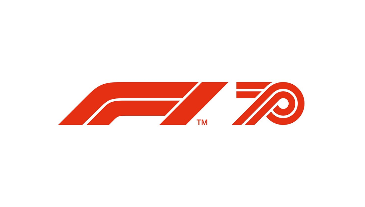
Formula One has an incredible logo that is as recognizable as it is simple. The core of this mark is the red, slanted, outline-style font that is used. So when celebrating their 70th anniversary, they simply created a number 70 using the same style of text and placed it side-by-side. The result is clean and recognizable.
More Details →Legoland Florida 10th Anniversary Logo
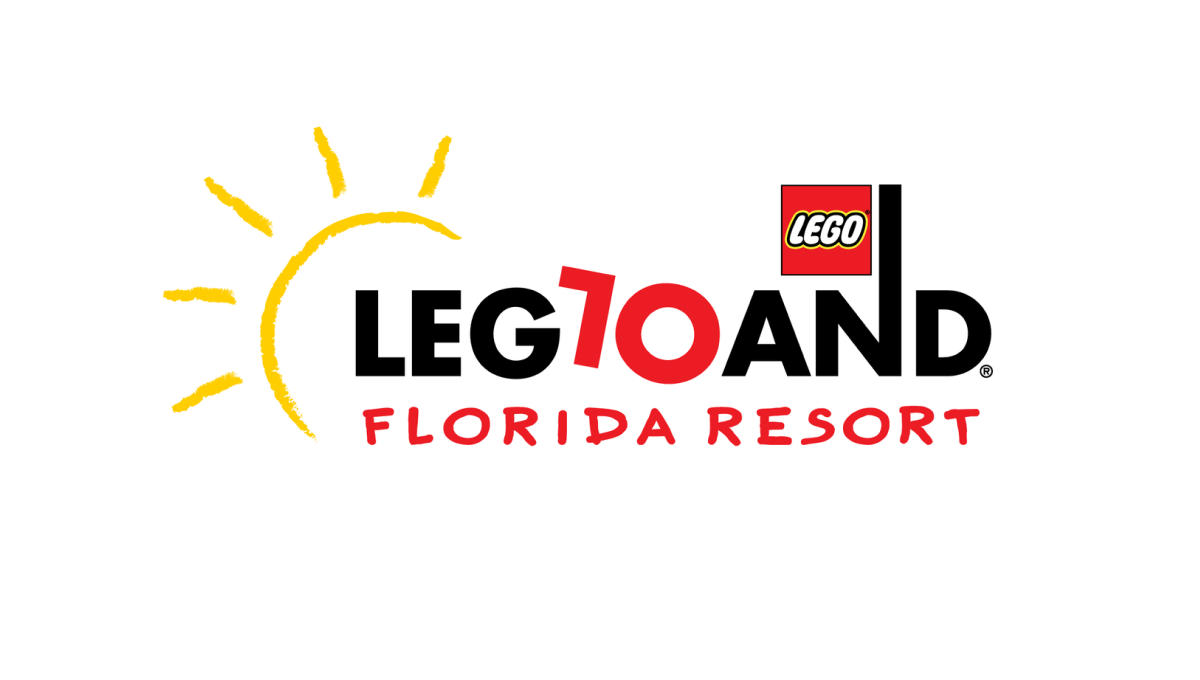
Legoland is a fun, playful place, so the logo of their 10th anniversary started with the same tone. The L and O of the word mark are converted to a 1 and 0 to both keep much of the original, recognizable mark but also make it easy to spot the reason for the change. By making the number slightly askew, it kept the playful tone while producing a design that was easy to swap for the existing mark.
More Details →Smithsonian Institute 175th Anniversary Logo
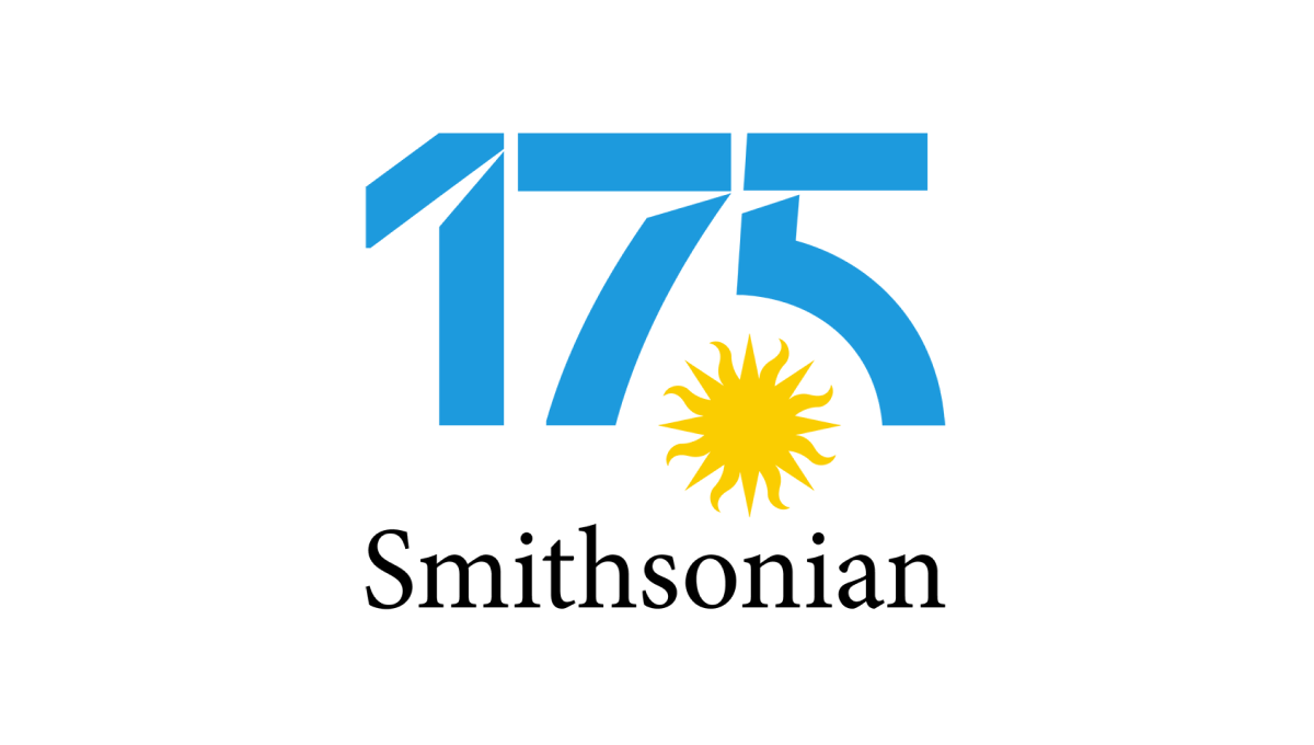
Normally the Smithsonian logo features a yellow sun on a blue circle. Wanting to keep the colors and shape of the original for their anniversary design, their team separated the blue from the yellow, placed the sun on it's own in the gap between the 7 and 5, and then used that backgroudn blue for the color inside the number in this logo. The traditional word mark on the bottom rounded it out and made it easy to recognize.
More Details →Harley-Davidson 120th Anniversary Logo
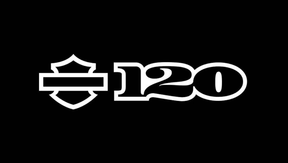
When you have a brand as famous as Harley-Davidson, using just the shape or your mark is more than enough for the general public to recognize it. Adding a clean number 120 to the right of this mark in their classic font all on a black background created a clean, simple design that was easy to recognize and neatly on-brand.
More Details →Lux International 120th Anniversary Logo
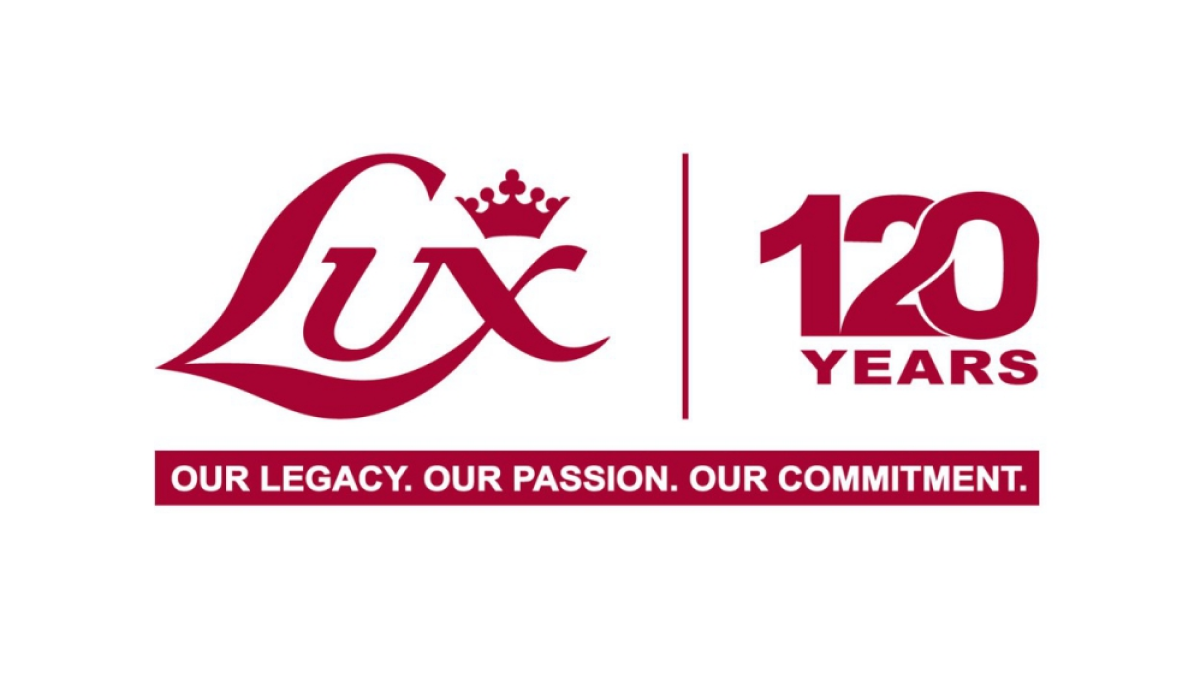
In a style that is becoming more and more common, this logo simply takes the traditional Lux logo in red, draws a vertical line to the right, and on the other side of that line places a stylized number 120 with an overlapping and intertwined 2 and 0. These logos are simple, convey the meaning clearly and simply, but also look sharp and balanced.
More Details →Hydraulics Online 15th Anniversary Logo
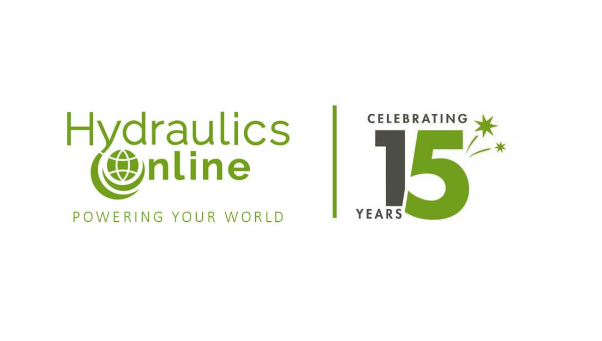
This side-by-side layout using a brand's original logo is becoming more and more common, for good reason. A vertical line seperates this media outlet's traditional logo from a simple design using a number fifteen. Even if this number was using readily available stock imagery of their annersary number, the combination of this mark and their usual design makes it a clean lockup that's easy to tie back to the original brand.
More Details →Battle of Normandy 80th Anniversary Logo
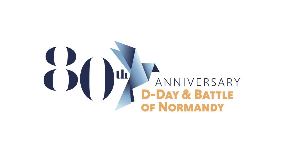
Marketing the anniversary of such an imporant but somber occassionan, this logo uses a clean serif font for a large number 80 that sits on the far left of the logo. Just to the right of that is a dove made of sharp angles and shapes using a few varieties of the same blue. Finally, words sit to the right of that clarifying the why and what of this anniversary.
More Details →Google 25th Anniversary Logo
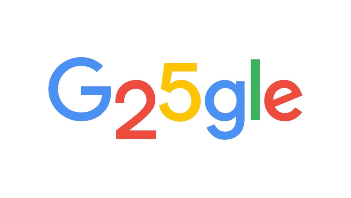
Google is famous for adapting their logos through the popular Google Doodle program, so it wasn't hard for this talented team to come up with a simple, well-executed design for their 25th anniversary. In this case, they used the rounded areas on the numbers 2 and 5 to make the two letter o's they frequently adapt as part of these logos. The result is a perfect, on-brand celebration of the brand's 25th anniversary.
More Details →South Coast Pediatric Dentistry 10th Anniversary Logo
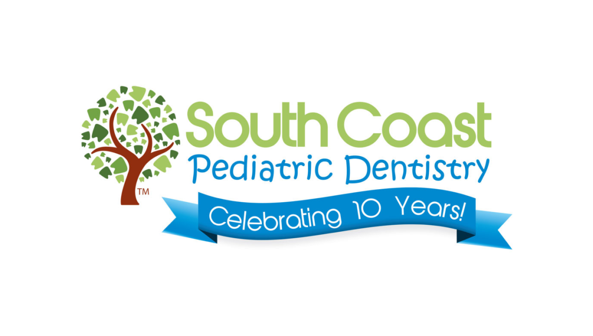
Instead of reinventing the wheel for their anniversary logo, this dentistry office simply added a clean blue banner below the words in their traditional mark. The banner is designed in a way to match the colorful, playful tone of the original mark and doesn't extend too far below the traditional logo's dimensions to make it easy to swap in and out of marketing collateral during and after the anniversary.
More Details →Northern Illinois University 125th Anniversary Logo
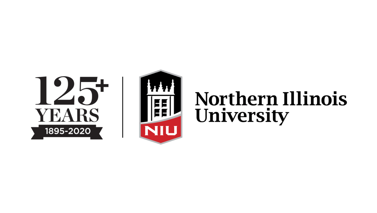
With the popular vertical-line style as the foudnation, this university placed their traditional logo on the right side of the line and a stylized number to higlight the anniversary they're celebrating on the lft. By using the same typefaces alongside the original logo, this mark makes no mistake about which brand is celebrating and creates a clean, well-designed package that can be used easily in marketing collateral.
More Details →Wright State University 50th Anniversary Logo
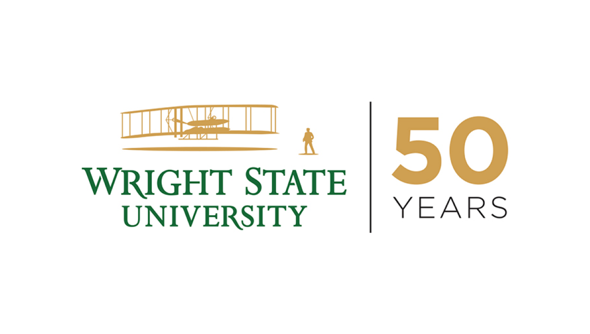
Using a style that is becoming more and more common for anniversary logos, Wright State simplye takes their traditional logo and places a vertical line between that mark and a simple anniversary mark that focuses on the number rather than a unique design. In this cast, a large number 50 in their brand gold with the word "years" below in their brand green.
More Details →Attractions Ontario 40th Anniversary Logo
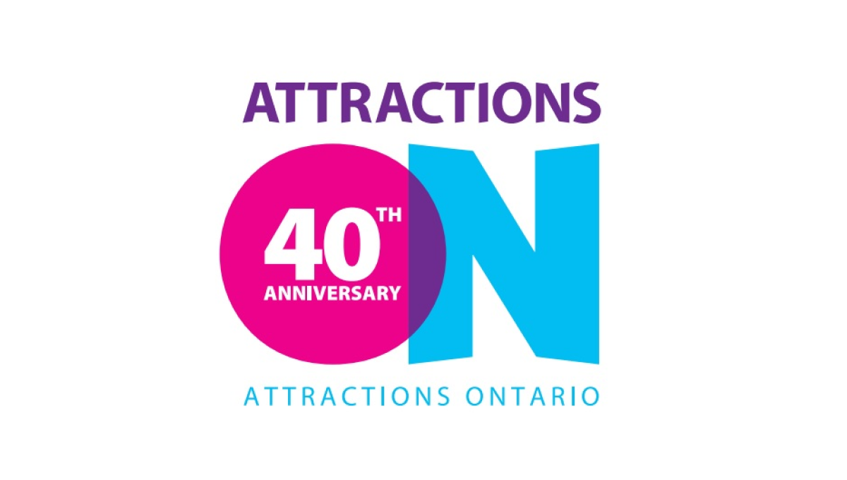
If you've visited a rest area in Ontario you've probably seen their simple logo that features an overlapping O and N. Given the large empty space that already existed in the first letter of their name, they simply placed text to signify their anniversary inside of that O and called it good. The original brand remains but the celebration is clearly visible.
More Details →Big Sky Resort 50th Anniversary Logo
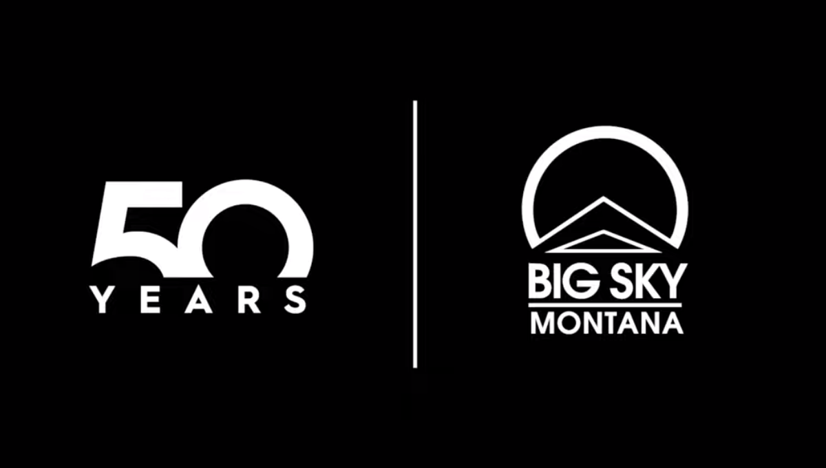
This well known mountain resort used a popular method of separating their traditional logo from a number mark with a vertical line. With a large block number 50 rising from behind a wide, all caps word "YEARS" they created a unique mark that can simply be paired with their original logo during the celebratory season without much work or effort to switch back and forth.
More Details →Paramount Pictures 90th Anniversary Logo
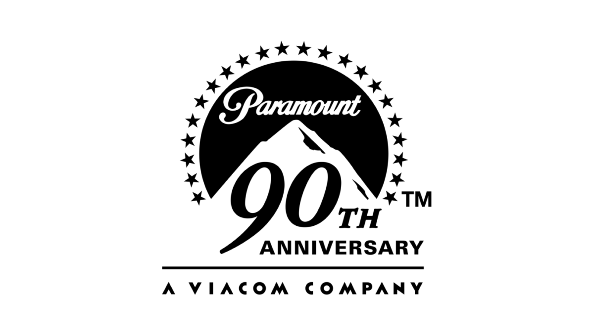
The original logo left a gap where the mountain sits and this anniversary variation kept it simple and simply moved that mark up slightly to create space for a large number 90 and the word anniversary offset below and to the right of the logo. This makes the new logo extremely easy to tie back to the original mark, especially with the traditional, all-black lockup.
More Details →Maryland Hospital Association 50th Anniversary Logo
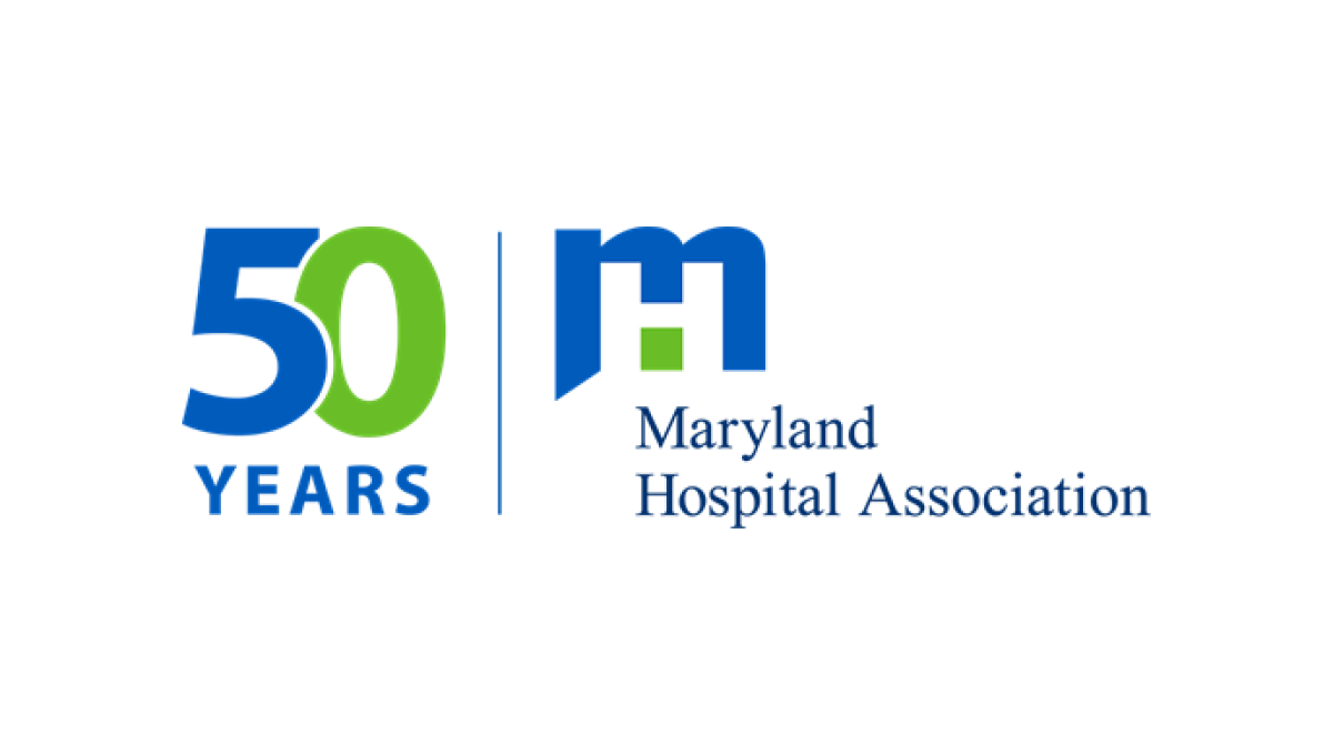
If you want a simple, effective anniversary logo then take note of what the MHA and many other brands are doing. This organization took their original logo, drew a vertical line to the left side, and on the other side of the line placed a simple number mark in their brand colors. The result is effective, balanced, and doesn't require the level of design and planning as a logo that starts from scratch.
More Details →Sonic the Hedgehog 30th Anniversary Logo
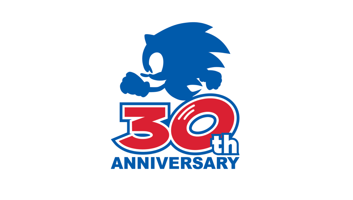
Sonic the Hedgehog's 30th anniversary logo starts with a large number 30 in red. With a white outline on that number followed by a blue outline, they gave the number added weight and a color that could blend neatly into a blue silhouette of their famous character above. At the bottom, the word "anniversary" in that same blue clarifies the meaning of the number and balances the red with blue above and below.
More Details →United Reformed Church 50th Anniversary Logo
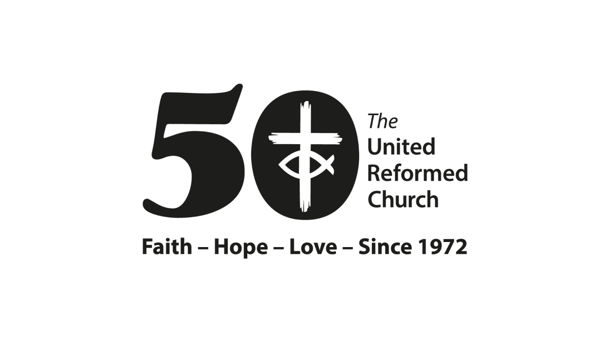
By placing a large, block number 50 to the side of the traditional logo, the church was able to simply invert the color of their mark and place it inside the zero to create a simple but effective mark that kept the familiarity of the original logo while celebrating their milestone with a unique separate brand.
More Details →Sisters of Charity Hospital 10th Anniversary Logo
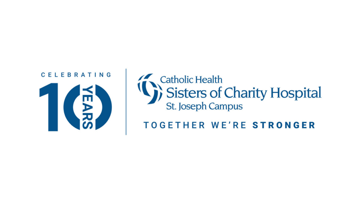
In a style that's become a bit more common, this anniversary logo takes the traditional logo and places a vertical line between it and an anniversary graphic to the left. This anniversary graphic uses a block number 10 in the brand's traditional blue color with a vertical word "year" through the zero and the word "celebrating" above. This gives them a clean lockup for their anniversary without having to redesign the original logo.
More Details →Anderson Hospital 45th Anniversary Logo
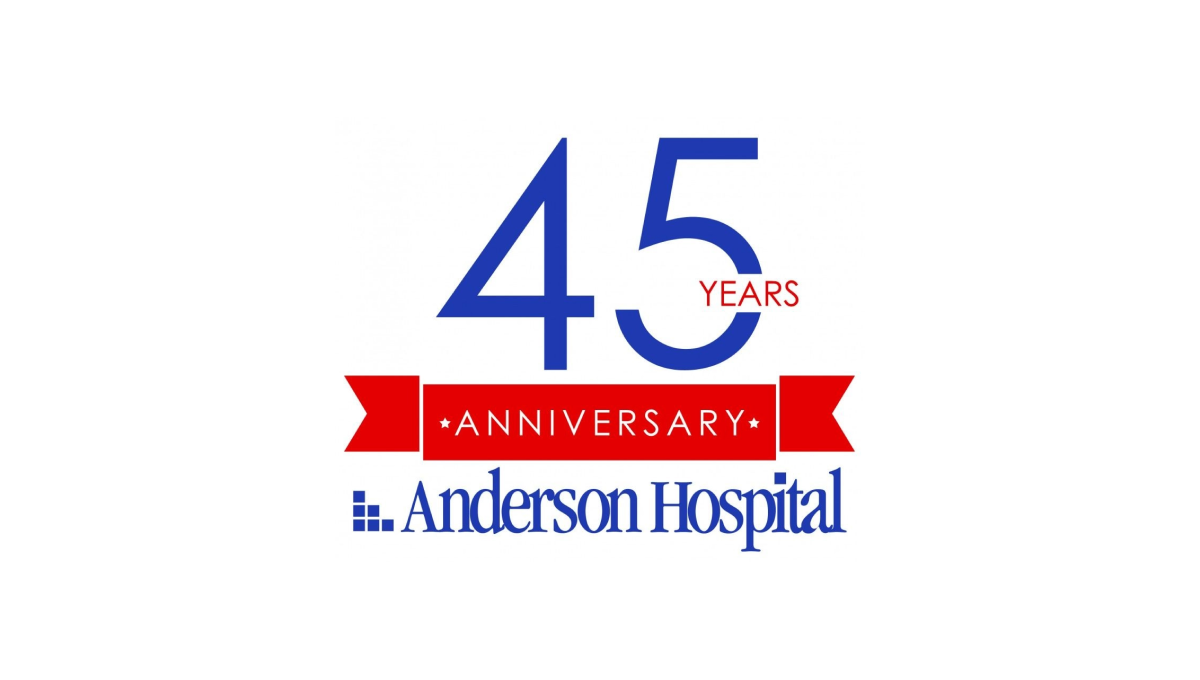
Keeping it simple, Anderson Hospital started with their traditional logo in the classic dark blue color as a base and built vertically from there. First came a red banner holding the word "anniversary" with the number 45 in brand blue above that. To keep balance, the word "years" is inset within the number 5 to avoid it sticking too far out to the side of the number which provides the focal point and primary visual weight for the logo.
More Details →NHS Retirement Fellowship 45th Anniversary Logo
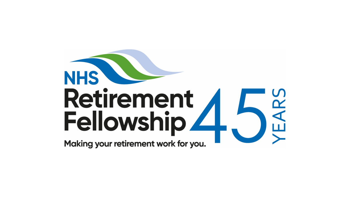
This logo keeps it simple by adding a number 45 to the right of their traditional logo. By putting that number in the brand's traditional blue and a vertical word "years" to the side, they created a simple, effective logo that doesn't stray from the original brand and doesn't add too much complexity around their hope to celebrate this milestone.
More Details →NC Early Childhood Foundation 10th Anniversary Logo
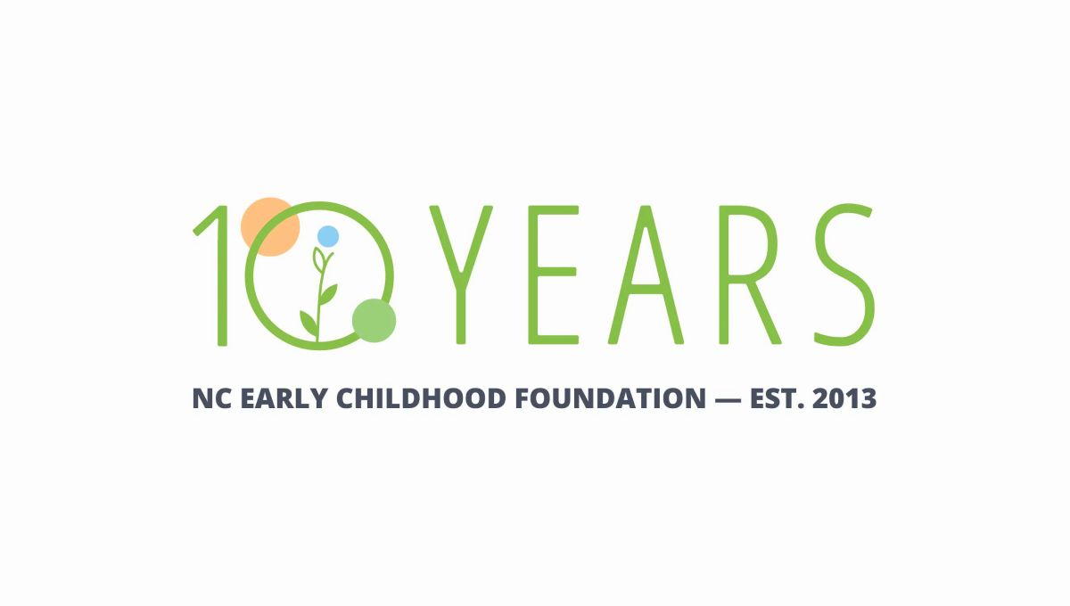
Simple and playful, this logo fits exactly the tone you'd expect from an organization design to help children. With the name of the organization in plain text below, they use this visual line to hold the lighter mark above. With simple shapes and friendly colors denoting growth and optimism, it's a great, on-brand design to support this milestone in their organization's history.
More Details →Market Mentors 20th Anniversary Logo
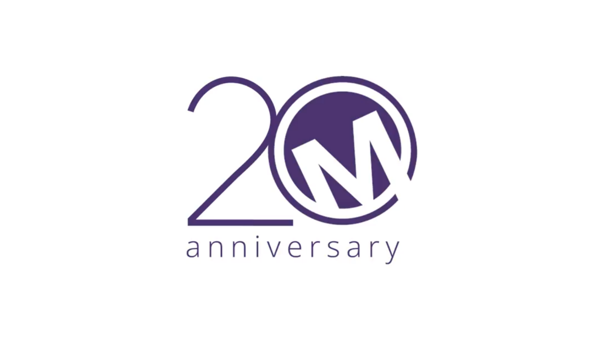
Sometimes a brand has to force their mark into the 0 of their anniversary number, but not Market Mentors. Their traditional mark - a tilted M contained in a purple circle - was a perfect match for this design style and that's exactly what they did. With a thin number 2 to the side and the word anniversary below, this logo is clean, simple, effective, and ties nearly back to their original brand.
More Details →Loveland Ski Area 75th Anniversary Logo
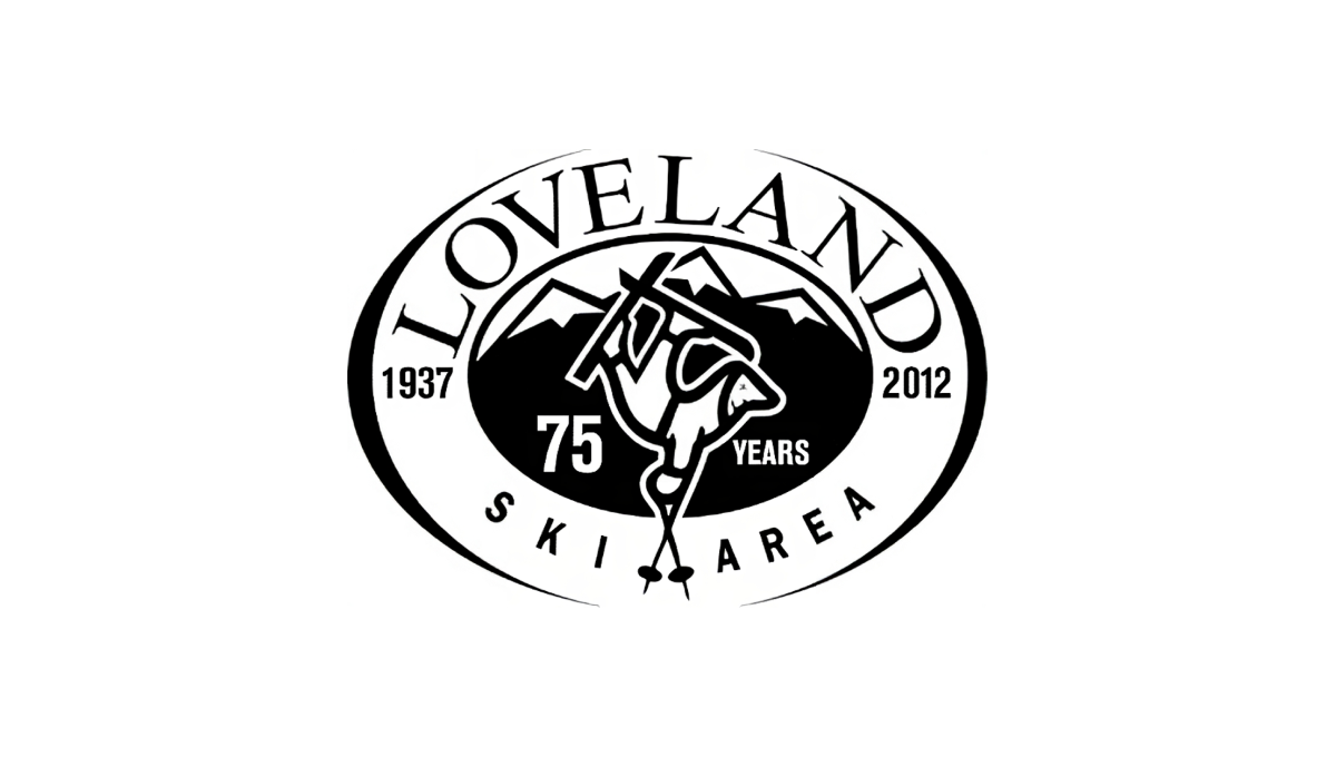
Loveland changed very little with their traditional logo when they celebrated their anniversary. By adding the number 75 and the word "years" to dark space on either side of their center mark, the resort was able to have something unique to use for their anniversary but also something that was seamless to swap in and out with their existing logo.
More Details →Hidden Valley 40th Anniversary Logo
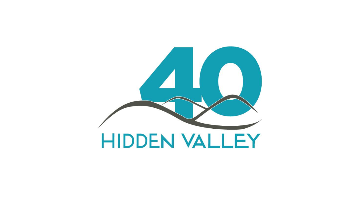
Hidden Valley's 40th anniversary logo keeps a very simple concept with a large number 40 in their brand blue / teal color peeking up from behind their original logo. While simple, the weight, size, and placement of the number give this logo extra weight and a clear reference to the milestone that is missing in some logos that add more diminutive references to their anniversary.
More Details →Greek Peak 65th Anniversary Logo
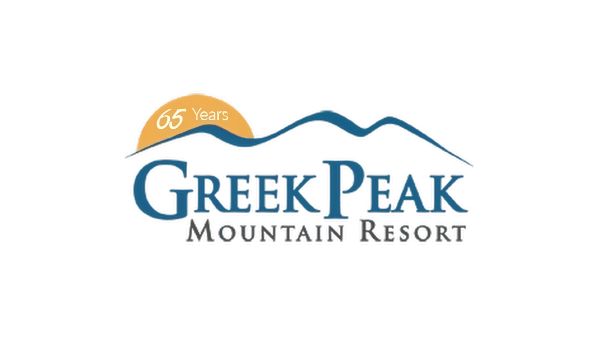
Greek Peak kept their annversary logo simple and clean when they recently reached their 65th anniversary. A simple orange circle peeking up from behind the ridgeline of mountains that make up the original mark hold the number 65 and marks the only chance to this brand. This simplicity made this logo extremely easy to swap with their existing logo during its year of use.
More Details →