Sports Anniversary Logos
Blue Jays 50th Anniversary Logo
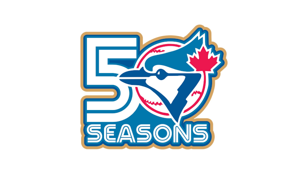
This anniversary logo has a bold and energetic design with a clean, sports-inspired style. The milestone number is the main focus, while a familiar team graphic is blended into the layout to create a unified and recognizable look. A limited color palette with a subtle accent color helps the design stand out without feeling overly busy. Overall, the logo presents the anniversary in a simple, memorable way that reflects tradition, pride, and a long history.
More Details →Chicago Cubs 150th Anniversary Logo
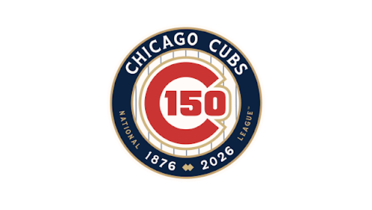
This anniversary logo features a classic, emblem-style design with a clean and timeless appearance. A circular badge serves as the centerpiece, combining the milestone number with familiar brand elements in a balanced layout. A limited color palette and subtle metallic accents give the design a polished, commemorative feel without being overly decorative. Supporting text below reinforces the anniversary message, creating a strong, professional logo that highlights tradition, longevity, and a sense of lasting achievement.
More Details →Hardwood Classic 45th Anniversary Logo
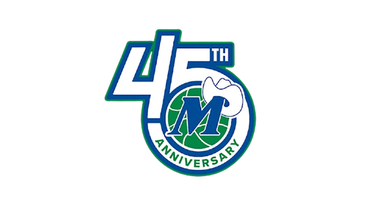
This anniversary logo has a clean, compact design with a bold and modern appearance. The anniversary number is the main focus, while a circular emblem is blended into the layout to give the design a unified look. A simple blue, green, and white color palette creates a fresh and professional feel, and a small graphic element adds a touch of personality. Overall, the logo presents the milestone in a clear, balanced, and recognizable way.
More Details →Sunday Night Football 20th Anniversary Logo
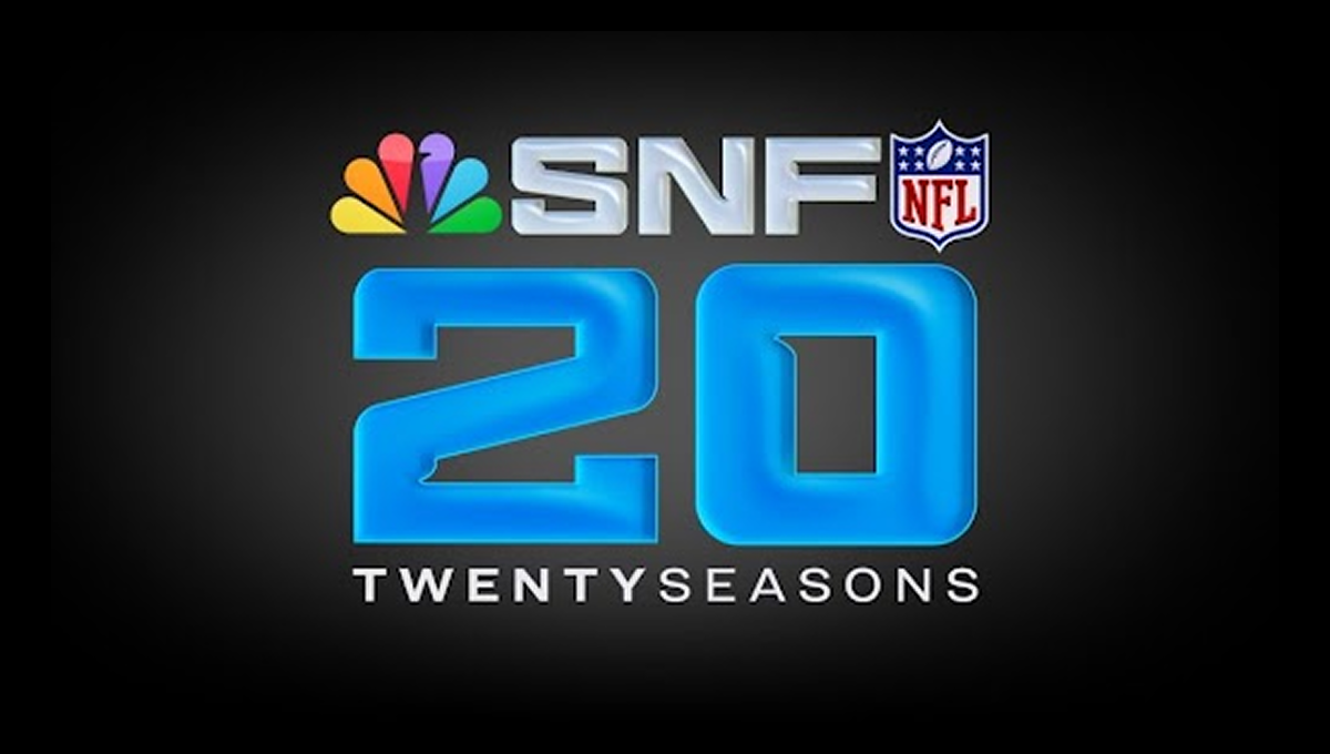
This anniversary logo has a bold, modern feel that highlights a major milestone. Large numbers sit at the center, giving the design a strong and confident look. Bright, glowing colors add energy and excitement, while familiar symbols suggest a well-known sports tradition. The layout feels polished and professional, with clean lines and balanced spacing. Overall, the design feels celebratory, current, and focused on marking an important moment in time.
More Details →Prefontaine Classic 50th Anniversary Logo

This anniversary logo features a bold, clean number paired with a word to mark the occasion. The design feels strong and steady, using clear shapes and solid colors. There’s a sense of pride and tradition in how the elements are arranged, while still keeping things modern. It gives off a respectful and professional feel, showing appreciation for the past while looking ahead. The overall look is neat, balanced, and easy to recognize.
More Details →X Games 30th Anniversary Logo

The anniversary logo has a clean and modern look, using soft colors and simple shapes. It shows the number 30 in a bold style, with the words “years” and the event name placed nearby. There’s a sense of movement or connection in the way the elements come together. The design feels both respectful of the past and hopeful for the future. Overall, it’s a bold and balanced way to mark an important milestone.
More Details →US Open 125th Anniversary Logo

This 2025 U.S. Open logo has a clean, traditional look with a touch of elegance. The text is clear and spaced out, with “125th U.S. Open” and “Oakmont” standing out. At the center is a simple image of a squirrel, adding a classic feel. It feels formal and steady, fitting for a long-standing and respected event.
More Details →Titelist ProV1 25th Anniversary Logo

The 2025 Pro V1 golf ball features a subtle anniversary marking, blending tradition with a nod to its 25-year legacy. The design includes a minimalist 25, with the words 'Pro V1' beneath it. This emblematic detail is positioned near the equator of the ball, maintaining the Pro V1's classic aesthetic. The overall look is clean and refined, honoring its heritage without overt celebration. This design choice reflects a commitment to timeless performance.
More Details →Disc Golf Pro Tour 10th Anniversary Logo

This anniversary logo has a bold and sporty feel, with a strong number “10” that stands out clearly. The design uses sharp lines and a modern font, giving it an energetic and active vibe. The colors are bright and eye-catching, helping the logo feel fresh and exciting. Overall, the logo feels confident and lively, celebrating the anniversary in a clean and upbeat way.
More Details →MT Rose 60th Anniversary Logo

This anniversary logo has a smooth, elegant look with a large number “90” that draws attention right away. The company name appears below in a clean, simple font, giving it a classic and steady feel. The colors are soft but still noticeable, and there’s a curved banner that adds a nice touch of movement. Overall, the design feels calm, proud, and timeless.
More Details →FC Barcelona 125th Anniversary Logo

The anniversary logo features a clean and modern design that blends tradition with a sense of celebration. It includes bold, simple shapes and a familiar crest, subtly updated to mark a special milestone. The colors are rich and meaningful, reflecting the identity of the group it represents. Numbers and symbols are placed thoughtfully, suggesting the passage of time and a proud history. Overall, the design feels respectful and strong, with a touch of elegance.
More Details →Acura Grand Prix of Long Beach 50th Anniversary Logo

You could take away almost all of the context of this logo and still know that it's for an auto race. The thick, parallel lines of the number fifty along with the checkered flag embedded neatly inside mimic the classic track maps and diagrams that are so familiar in both the actual sport and virtually in games. Places beside the word mark you can see how well the designers matched this addition to the original logo.
More Details →Rimouski Oceanic 30th Anniversary Logo

While it's not clear that this logo is for a hockey team at first glanace, we have no problem with them leaning into their community and past given the awareness of this logo is likely fairly concentrated geographically. The circles represent the St. Lawrence river and the porthole of a boat, while an illustration of the well-known Pointe-au-Pere lighthouse shines on the team's past and future.
More Details →Tampa Bay Rowdies 50th Anniversary Logo

The Tampa Bay Rowdies have always had a classic word mark within their crest, but the designers of this anniversary logo scored an absolute peach of a goal with this design. A large number 50 sits below that word mark with a ribbon weaving in an our of the numbers containing the years of their operation. Best of all, however, are the other design elements they created in tandem with the logo that give their brand a lot of great pieces to work with.
More Details →Minnesota Lynx 25th Anniversary Logo

There are so many shapes that appear in so many anniversary logos, that I love it when brands start with a more unique canvas for their design. This logo is a perfect example of that by adapting a diamong-like shape into a more arrow form with a large number 25 in the center, the team's mark at the top, and the word seasons in a ribbon at the bottom to create a unique, meaningful logo.
More Details →Washington Capitals 50th Anniversary Logo

We love a good retro logo and this is a perfect example of that. Old school styles, shapes, and colors are combined into a clean design that puts a large number 50 in red, a hockey stick in blue, classic starts below and the team's traditional logo at the top. The result is a really nice logo in a square shape that's easy to use across online and social channels.
More Details →Golden State Warrios 75th Anniversary Logo

This is a really creative logo that starts with a shape totally unique to the brand - a tall diamond - and places a large number 75 inside of that. Well, mostly inside as the designers let just a bit of the edges peek out the top to keep the shape in the center and large but also add depth. In the middle of the rounded part of the number five sits the original logo which also shows how well they've matched the lines of both the number and diamond to the original logo.
More Details →Memorial Stadium 100th Anniversary Logo

Older stadiums and buildings often have an exterior that becomes part of the venue's brand. This stadium is no exception and the designers did a fantastic job of combining the architecural elements that make this stadium famous with the traditional crest-style designs that are famous in sports marketing. The result does a great job of conveying the anniversary, ties perfectly back to the stadium itself, and also sends strong singals to reinforce the industry they're in.
More Details →Myrtle Beach Pelicans 25th Anniversary Logo

Featuring that classic sports sytling with a clear shape made out of baseball-themed elements, block numbers, and multiple layers, this logo sets a large number 25 in the center with the team's mascot integrated within that number. Around the edge sit a few stars, a pattern depicting the relationship to the sea, and the word seasons at the bottom to create a really strong, balanced logo.
More Details →Jacksonville Jaguars 30th Anniversary Logo
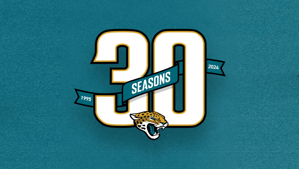
Using classic sports number styling with a textured background in the team's famous green color, this mark sports a large number 30 with a ribbon weaving in-and-out of the number showing the years the organization has been around and the word seasons. At the bottom center is the team's well-known mark to make a clean design that ties neatly back to the original brand.
More Details →Hendrick Motorsports 40th Anniversary Logo
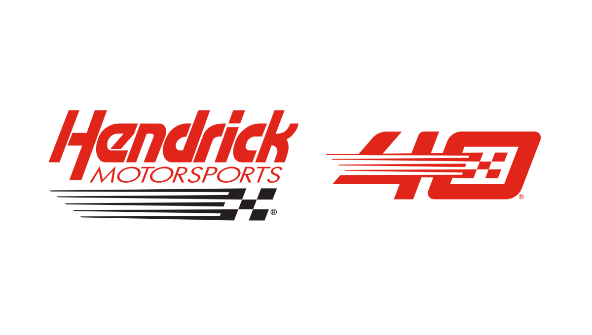
This logo takes the popular side-by-side approach that keeps the original logo as is and adds a unique number mark to the side. In this case, their design team designed a number 40 that features the same slant, color, and checkered flag motif of their original to create a number that neatly matches their original logo but also has enough elements to be recognized on its own by core fans.
More Details →New York Giants 100th Anniversary Logo
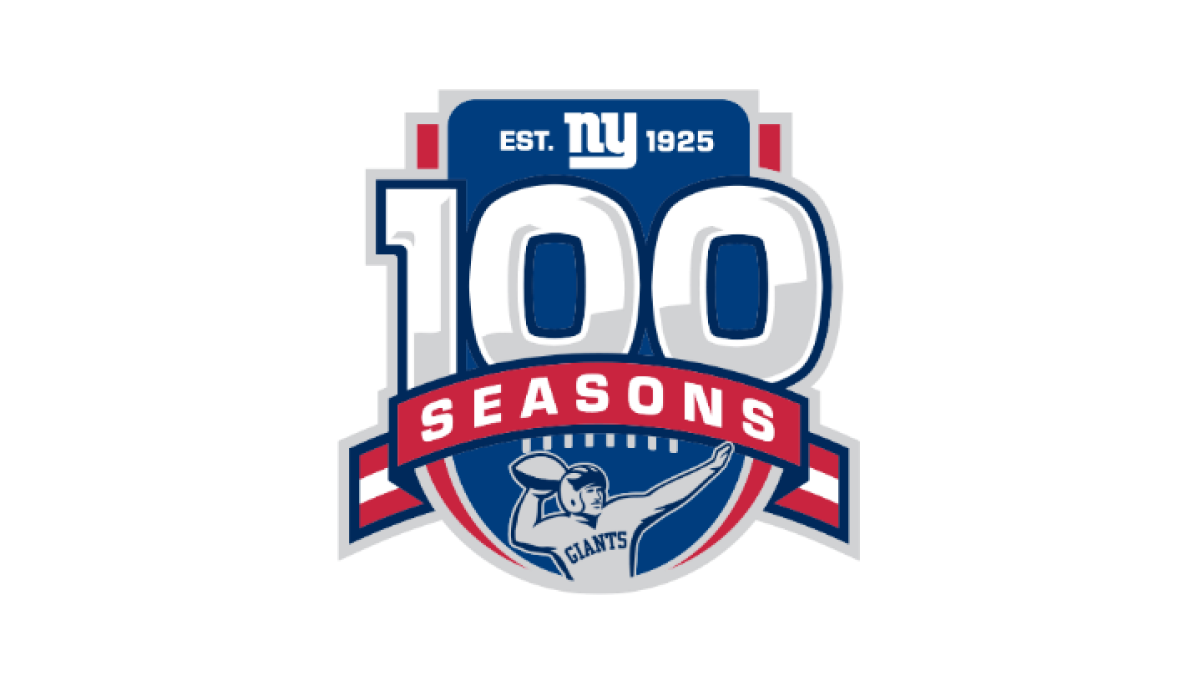
Anchored visually with a large number 100 inside a classic sports-style crest, this logo uses more classic sports vibes to created a logo that has depth and a cohesive design. At the top of the 100 sits the team's original logo, below sits a ribbon holding the word seasons, and a football icon at the bottom completes this logo.
More Details →Wenbley Stadium 100th Anniversary Logo
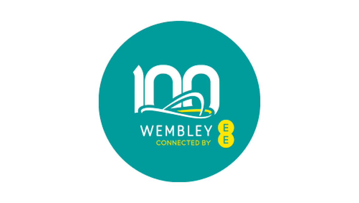
When your architecture is as famous as Wembley's, all you need is a silhouette of your iconic roofline to create the foundation of a logo that is both easy-to-recognize and an elegant set of lines to build on. A number 100 peeks up from behind the stadium and the curren sponsor and name below creates a sharp-looking logo for their century anniversary.
More Details →Edmonton Elks 75th Anniversary Logo
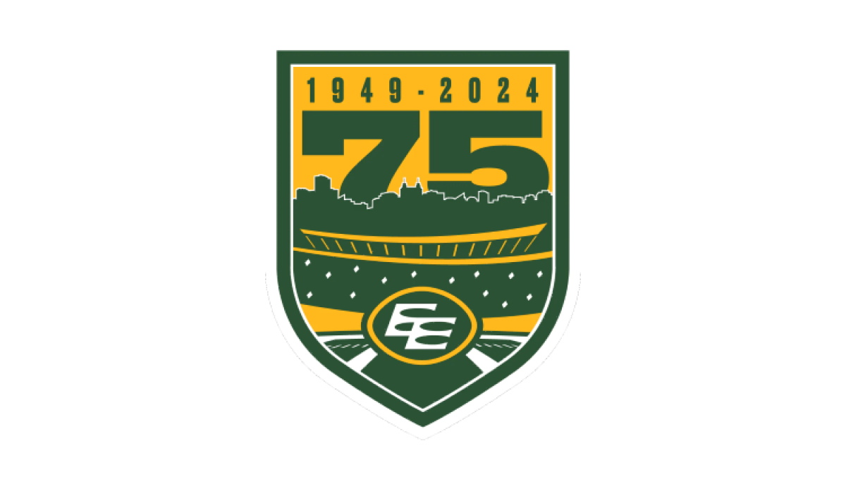
Using the classic sports style of large numbers, bold fonts, and crest-style shapes, this anniversary logo combines imagery that makes it clear the context is football and enough of the original brand to tie it back to the traditional mark. A large number 75 rises up from behind the stadium to complete this well-designed logo.
More Details →Orlando Magic 35th Anniversary Logo
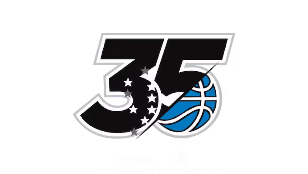
This logo has rarely been used outside of the context of the team's games, name, or traditional logo, so this minimal design that builds on a large number 35 does a great job of weaving the original blue basketball mark into the classic, block style lettering from sports to make a clean logo that looks great on everything form their home court to team swag.
More Details →FIS 100th Anniversary Logo
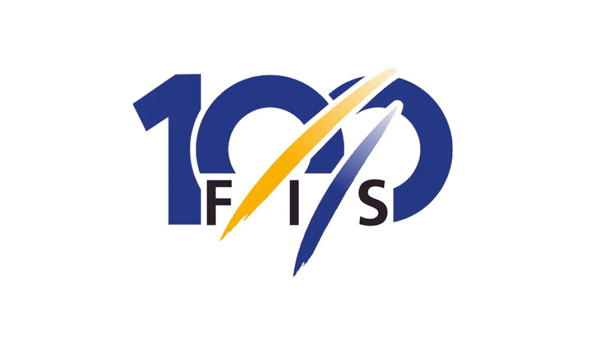
The organization behind professional skiing and ski racing, FIS started with a large number 100 in their classic blue color but added another of their brand colors, yellow, in two streats representing the tracks their members form down the mountain. With their traditional logo woven in at the bottom, this made for a really sharp, clean anniversary logo.
More Details →Utah Jazz 50th Anniversary Logo
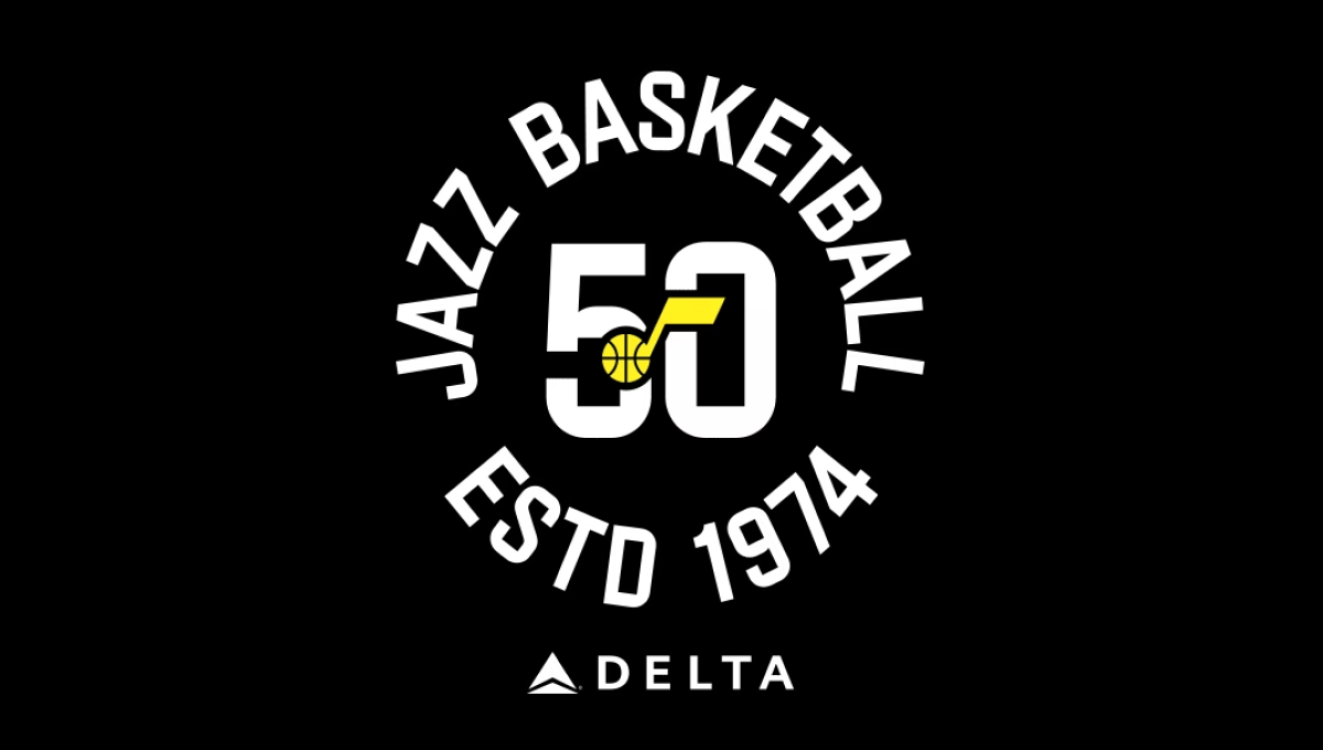
The team has embraced a number of colors over the years, but the black background of this logo and yellow mark in the center were a nice tie to one of their more popular and recent combinations. With a large number 50 in the center and the note mark laid above, this created a clean, but recognizable brand they could use in a variety of situations. In this case, wrapping the name of the team and the year it was established (along with their stadium sponsor) for a nice lockup for use online and in print.
More Details →American Gymnastics Academy 30th Anniversary Logo
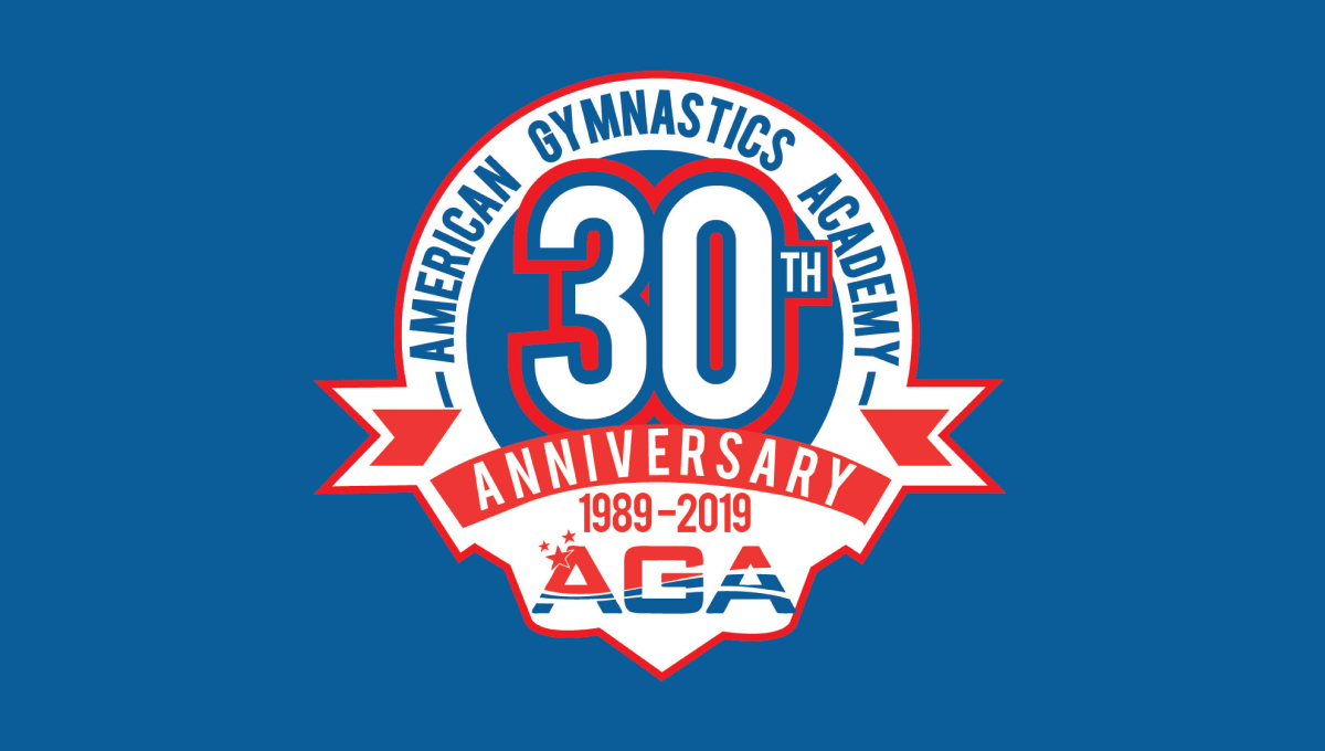
This classic logo combines a few common elements into a really tidy package. First, the logo uses a circle for the base with a large number 30 set in the upper middle of that circle. Next, a ribbon comming across the lower part of the circle holds the reason for the celebration. Finally, the organization's traditional logo sits below the ribbon with their name arching around the edge.
More Details →Cleveland Browns 75th Anniversary Logo
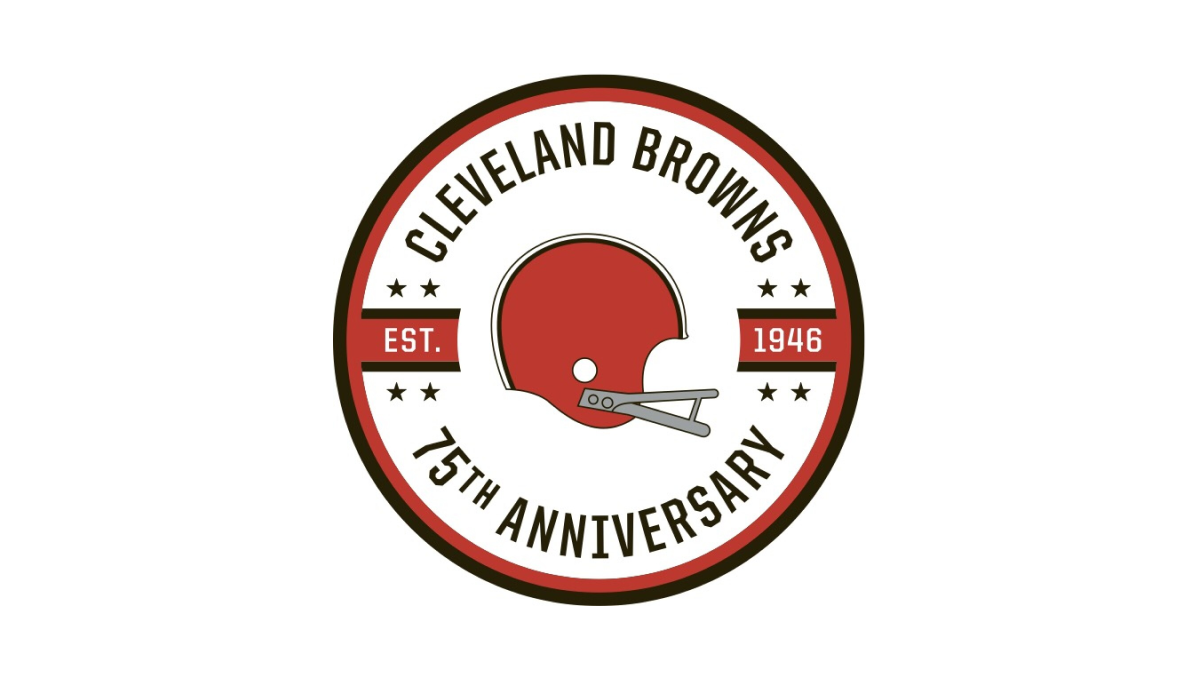
While the Cleveland Brown's "brown" is closer to an orange, they build on this traditional brand color with a circle in this palette as well as a helmet in the center. Around the outside sit the name of the club and words denoting the reason for the celebration with two bars coming in from either side containing the years of the team's existence.
More Details →Pittsburgh Penguins 50th Anniversary Logo
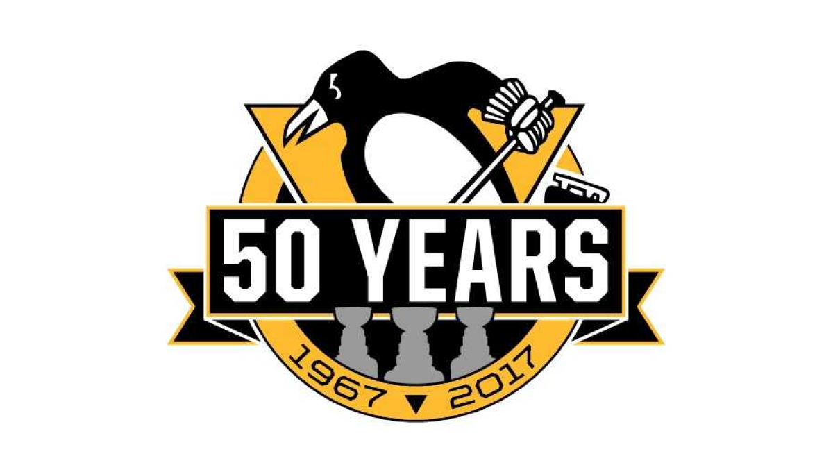
Using the styles famous for their original logo, this logo takes a large circle and wraps a "50 YEARS" ribbon just below center and around either side of the circle. The traditional penguin-with-a-hockey-stick mark slides up from behind with the years of the organization's existence at the bottom. Not to be overlooked are gray silhouettes for each of the team's Stanley Cup titles.
More Details →National Football League 100th Anniversary Logo
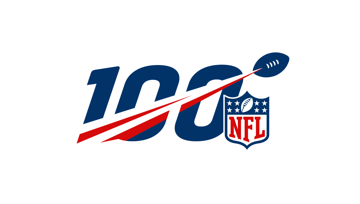
A logo that was seen time and time again by millions during the league's 100th anniversary, this mark features a large, block number 100 with a football streaking from the lower right to the upper left with a red line flowing behind. Finally, the league's traditional logo sits just to the bottom right to add balance and make the mark easy to recognize.
More Details →Adidas 60th Anniversary Logo
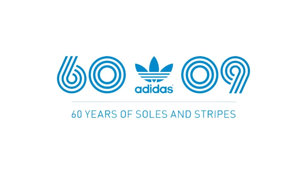
Three strips, classic blue color; that's about all Adidas needed to set the tone for a recognizable mark and they did exactly that. Three lines to form the anniversary they're celebrating and a 09 to mark the year of celebration. With the traditional mark placed in the middle, this logo is as simple as it is effective.
More Details →Nike 50th Anniversary Logo
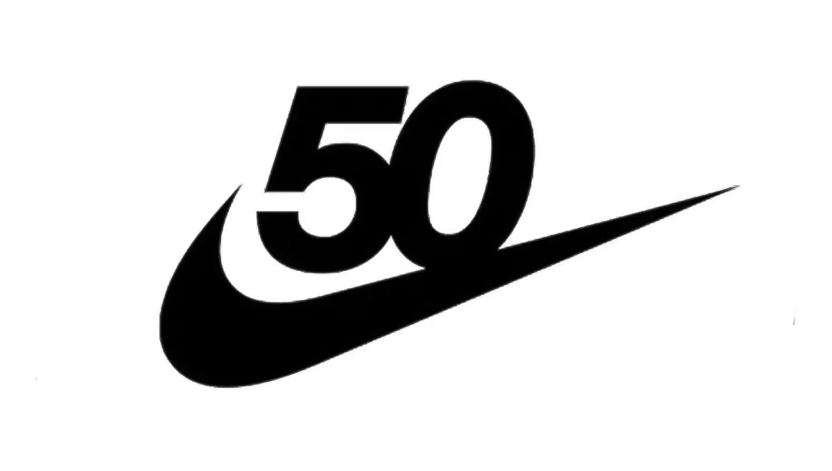
Nike has one of the most powerful brands in the world. Even more, it's incredibly recognizable on a few levels. Take the number 50 in this design, for example. Even if it were just that text, there's a good chance millions of people would still recognize it. With the swoosh below this logo is as powerful as it is simple.
More Details →Formula One 70th Anniversary Logo
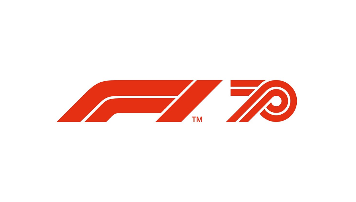
Formula One has an incredible logo that is as recognizable as it is simple. The core of this mark is the red, slanted, outline-style font that is used. So when celebrating their 70th anniversary, they simply created a number 70 using the same style of text and placed it side-by-side. The result is clean and recognizable.
More Details →United States Disc Golf Championship 25th Anniversary Logo
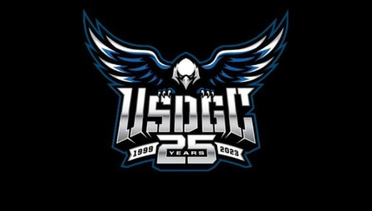
With the sport growing at a record pace, the United States Disc Golf Championship wanted to celebrate their 25th anniversary with a logo worthy of the sport's budding brand. With their traditional logo set in the center, a large bald eagle behind, and the number 25 below, the design adds a metalic sheen for a clean, classy finish.
More Details →Brazon Valley Bombers 15th Anniversary Logo
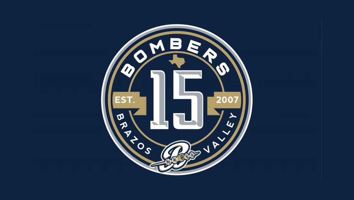
With classic sports design styling, this mark starts with a clean, circular badge that places a large, sports-lettering number 15 in the center. Above and below that number is the name of the team in curved letters to follow the shape of the circle. To either side is a gold ribbon holding the years of operation. Above and below the lnumber sit the silhouette of the state of Texas and the team's traditional logo
More Details →Mountain West Conference 25th Anniversary Logo
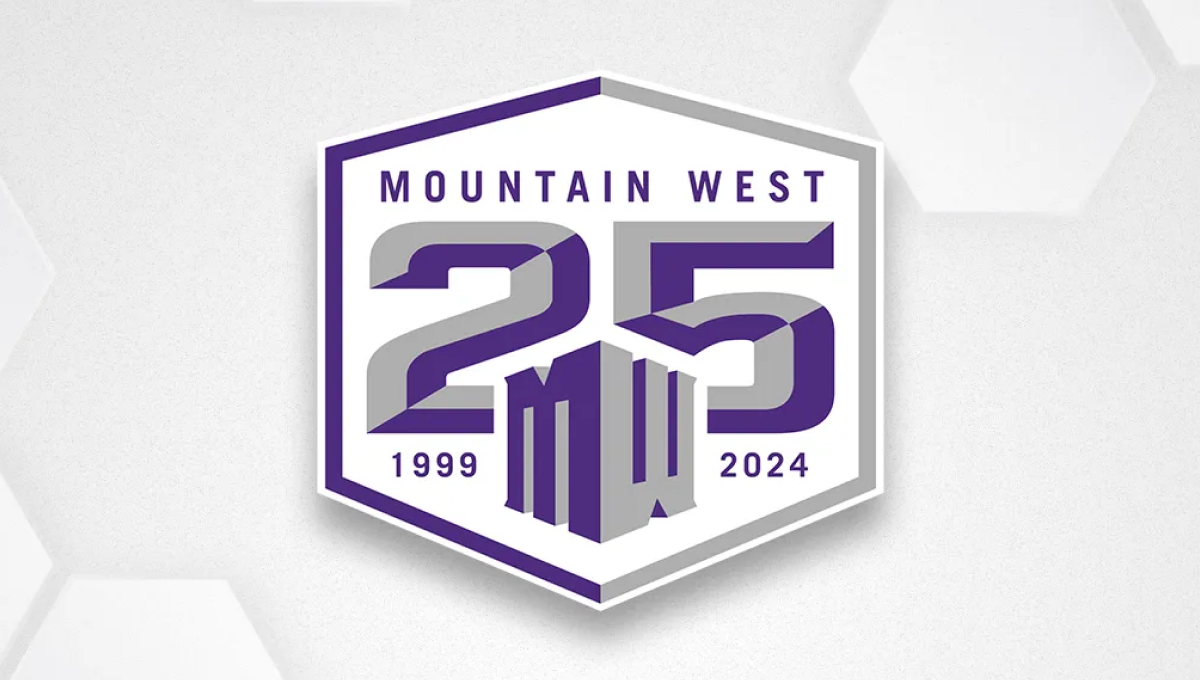
Once an underdog conference, the Mountain West is now home to many top contenders across major college sports. They've leaned into the hex shape for their brand recently, so they started with that shape, added a large, block 25 to the center, placed their original mark below and centered on the number 25, and placed words and years int he remaining spaces to create a solid design featuring their usual brand purple.
More Details →Folsom Field 100th Anniversary Logo
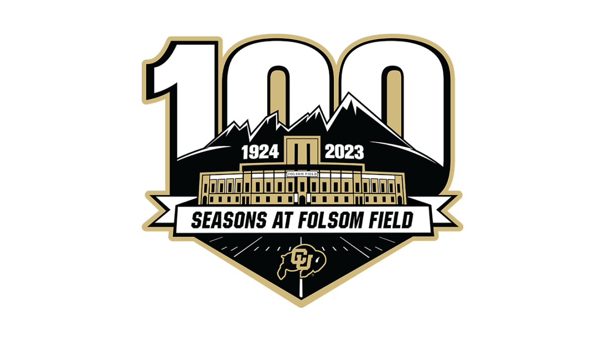
It's a big year for Colorado football for many reasons, but one of them is the anniversary celebration for their famous Folsom Field. This mark combines their mountain skyline, yard lines from the field, and a beautifully line-art illustration of the stadium's exterior to set the stage for this anniversary logo. Behind the mark sits a large, block number 100 rising up from behind the mountains.
More Details →Detroit Lions 90th Anniversary Logo
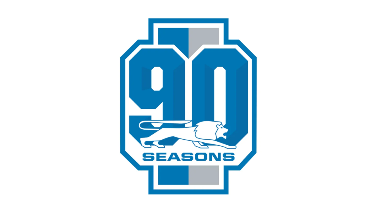
With a vertical rectangle as the backdrop that is divide into the brand's two primary colors, this mark then places a large, block number 90 in front those bars to create a unique, simple shape. Around the edge is the classic colored borders and white gap famous for sports logos. Finally, the original lion mark is placed overlapping the bottom of the 90 with the word seasons below that.
More Details →Washington Commanders 90th Anniversary Logo
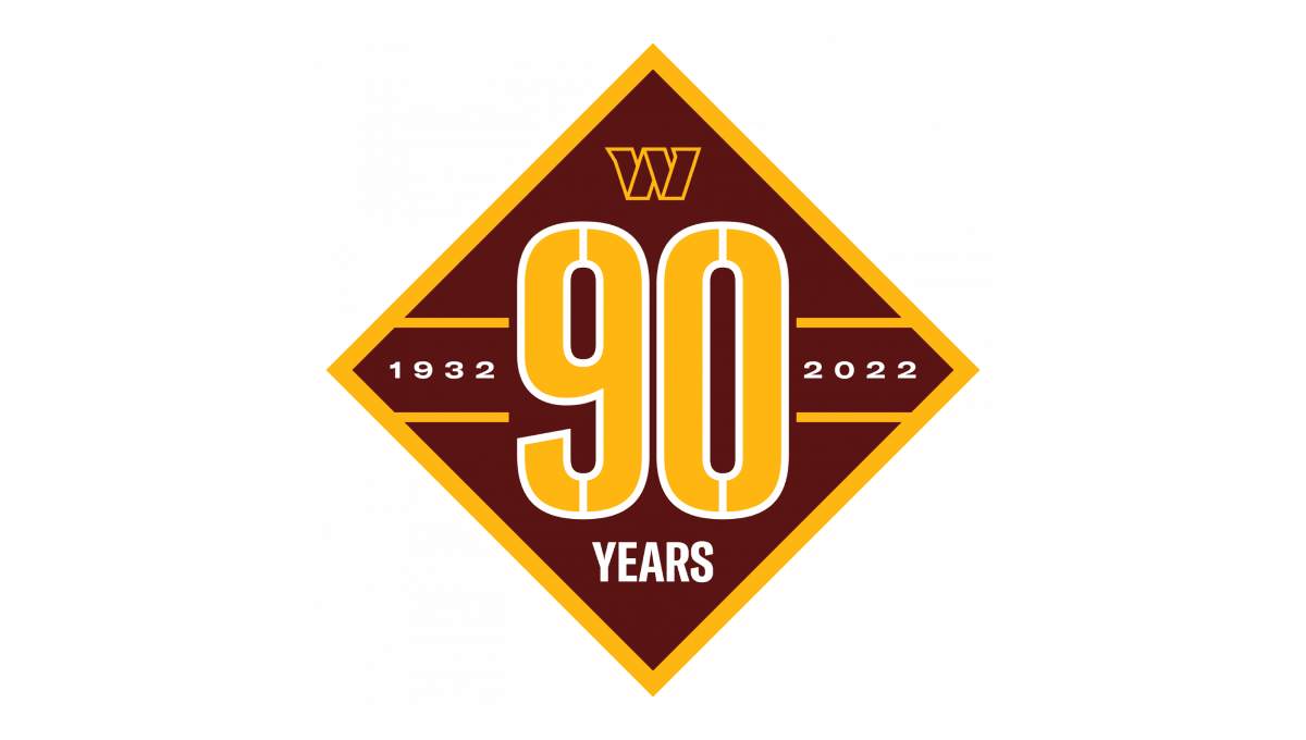
Starting with a diamond shape in the brand's red color, they place a large number 90 that nearly touches each straight side of the diamond and divides the shape into four remaining triangles. In the left and right triangles sit the years of operation. In the top triangle is placed the team's W mark while the bottom triangle holds the word "years".
More Details →Los Angeles Dodgers 60th Anniversary Logo
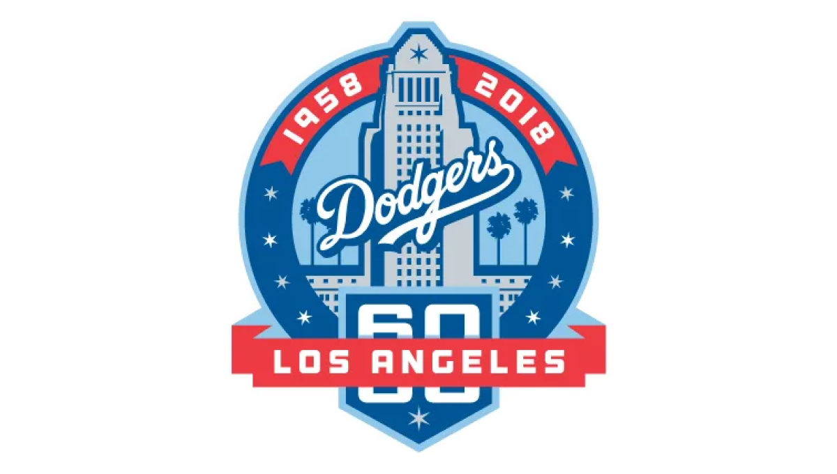
With the famous Los Angeles City Hall as the backdrop, this mark uses a blue circle for the main shape and places an illustration of that building in the center. Above that the years of operation wrap around the top edge of the circle. At the bottom a home-plate shape holds the number 60 with a ribbon holding the name of the city.
More Details →New York Mets 60th Anniversary Logo

Similar to other baseball teams who celebrate anniversary logos, this mark begins with a baseball field for the shape. In this case, the outline is in the team's famous orange and blue colors with a large blue sixty set in the center. At top of the field sits the team's original logo, at the bottom is the year the team was founded, with a ribbon holding the word "annivesary" set just below the number 60.
More Details →Buffalo Bills 60th Anniversary Logo
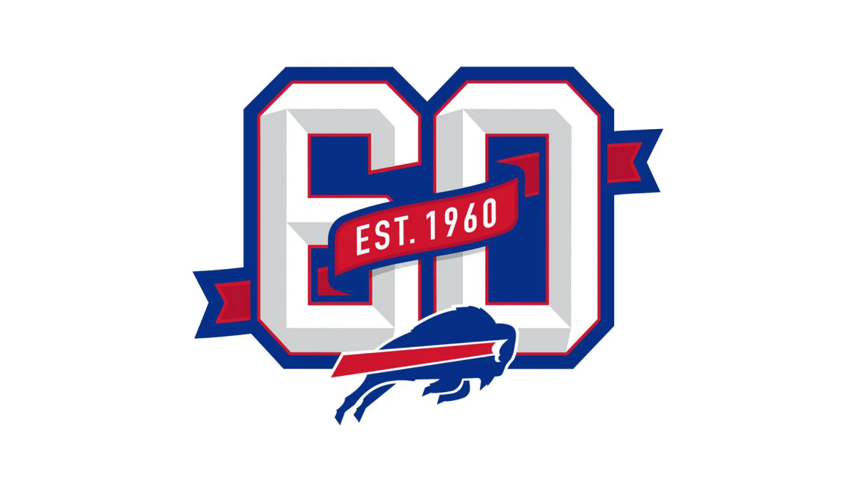
This logo builds on the classic shape, style, and format of the numbers you may see on a football jersey. Weaving in and out of both the number six and zero is a ribbon that identifies what year this footbal team was established. Below that sits the Bills' original mark to make it clear which team this logo is tied to which also reflects the colors used in the ribbon and numbers.
More Details →MLB All Star Game 50th Anniversary Logo
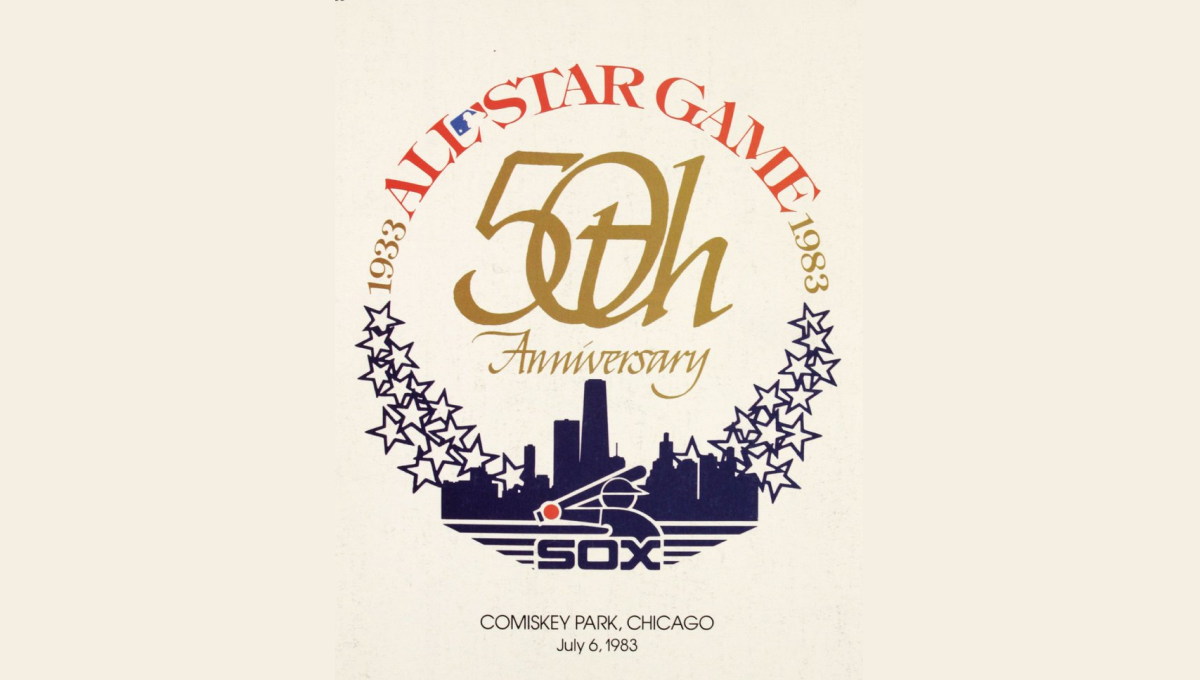
This mark was featured on a poster and sets a few elements into a clean, round shape with a "50th" in gold in the center. On the bottom sits a blue silhouette of the Chicago skyline with blue shares curving up and to the side of the skyline to begin forming the circling. On the top is red lettering signifying the occasion with the start and current years in gold connecting the two and completing the circle.
More Details →Anaheim Ducks 30th Anniversary Logo
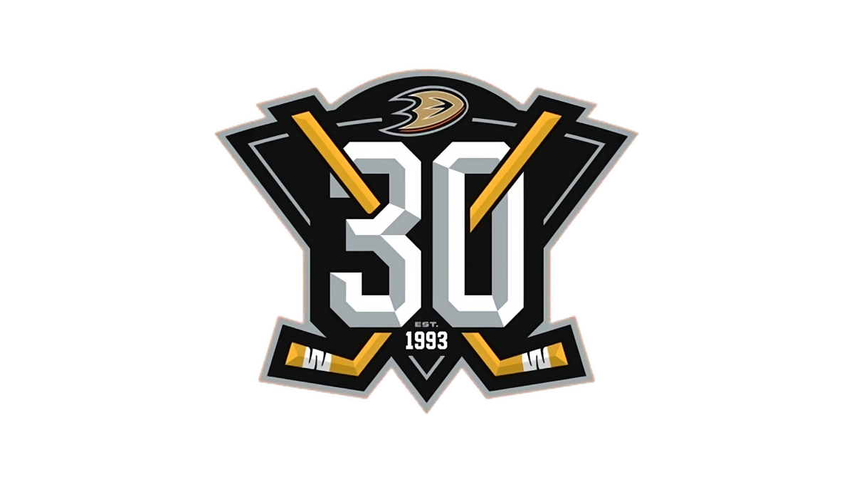
With a stylized triangle (point down) as the base, this logo starts with a three dimensional, block number 30 in the center as the visual foundation. Next, two hockey sticks weave in and out of the number 30, cross in the center, and extend just beyond the triable to make the shape a bit more dynamic. Finally, a small curved area is extended above the top of the triangle to hold the team's original logo.
More Details →Yankee Stadium 100th Anniversary Logo
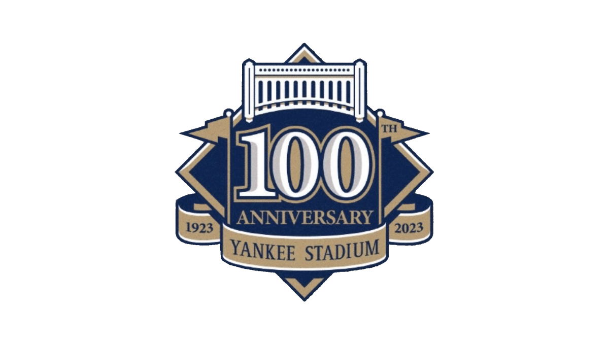
This logo starts with the classic baseball diamond shape as the base and adds a large number 100 in the center to begin. Above that sits an illustrtion representing the landmark's famous architechture. To either side of the 100 sit the famous flags - the right one containing the "th" for the year - which also frame the number nicely. Below, a ribbon holds the years of operation and the name of the stadium to comlete the design.
More Details →Miami Heat 35th Anniversary Logo
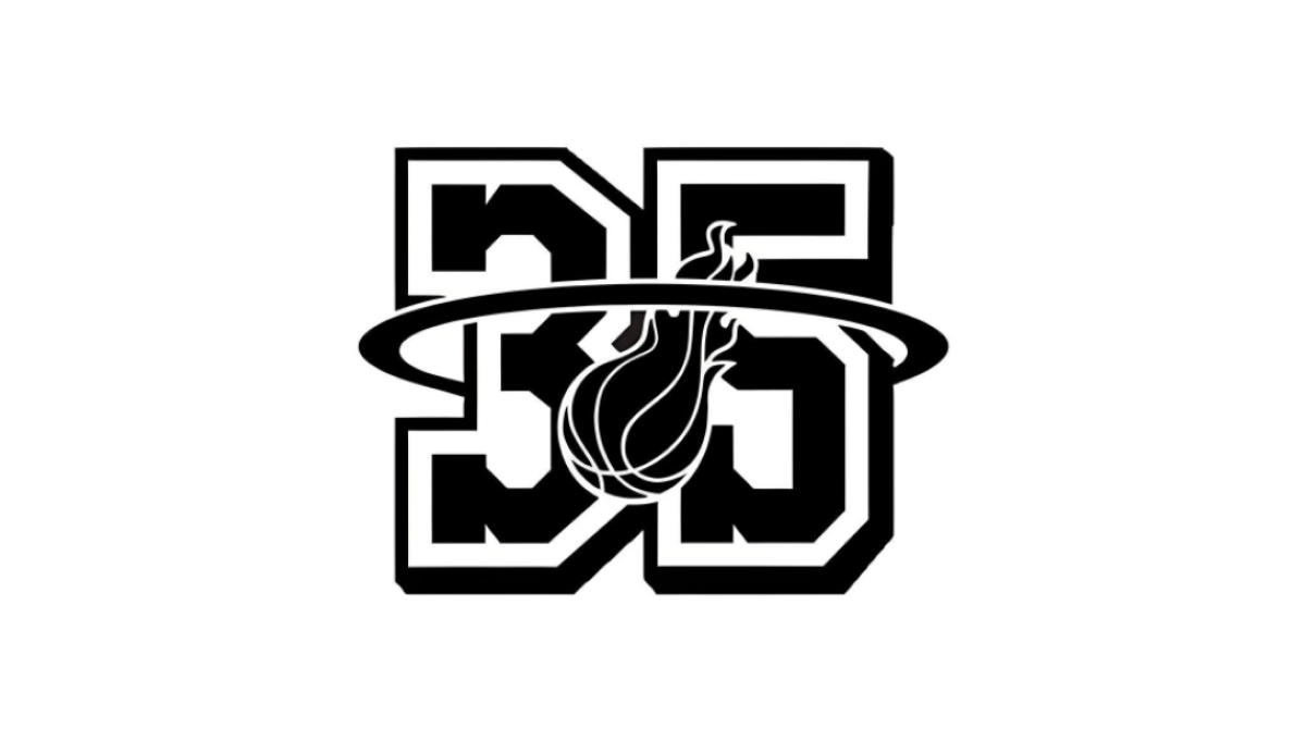
With their 35th anniversary in store, the Miami head started with block, jersey-style number 35 as the shape, this logo extends the traditional logo's famous rim shape to surround the entire number 35 and placing the other element element of the original logo, a flaming basketball, in the center to make a recognizable logo with a clear sports vibe.
More Details →Nottingham Panthers 75th Anniversary Logo

Starting with a round black backdrop, this logo sets a large number 75 with a little bit of offset shadow for depth to create a strong foundation to buid on. The team name then wraps around the 75 and cleverly uses the "th" in the name as the "th" for the number and ties those together visually with color. A ribbon style element sits at the bottom showing the year the team was founded.
More Details →Las Vegas Aviators 40th Anniversary Logo
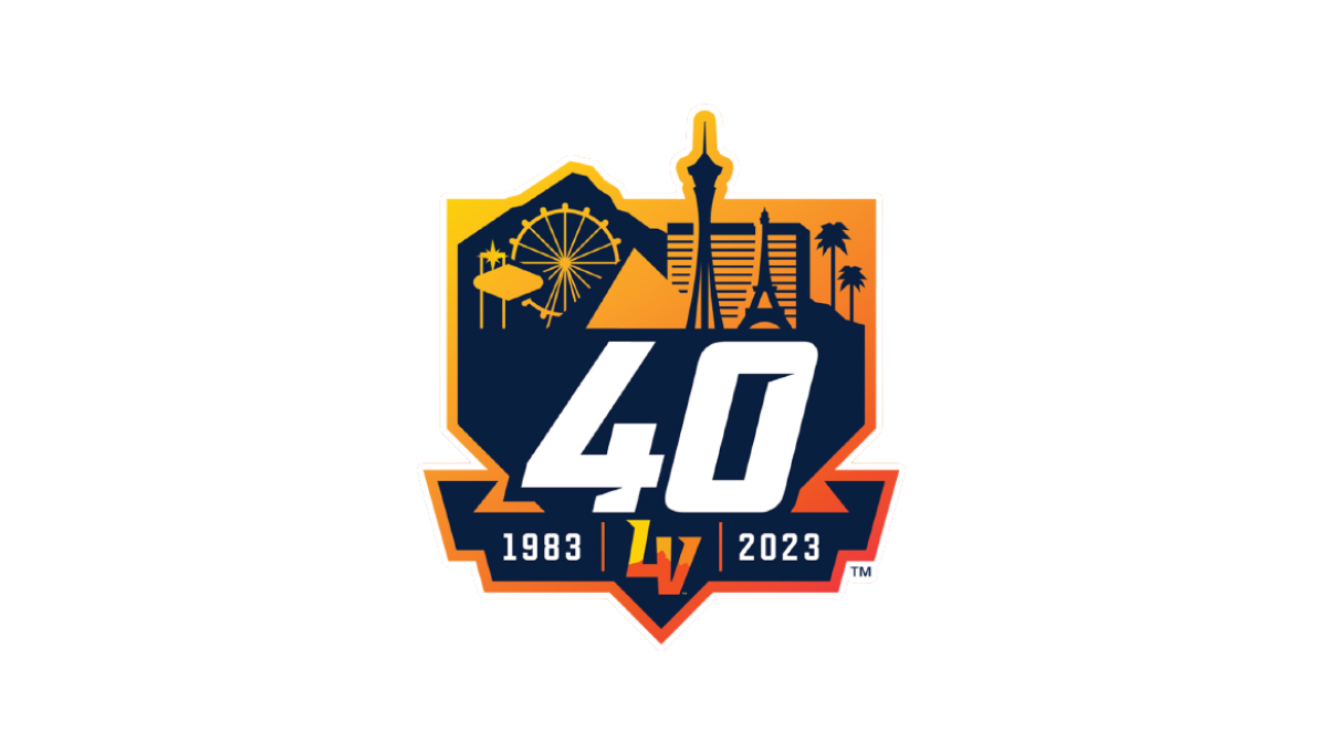
This logo combines three clean layers that establish a nice visual heirarchy for each element. First, an orange gradient creates a badge-style backdrop. Next, a skyline of prominant Las Vegas landmarks in a darker color creates a nice reference back to their home town with a punchout for the team's mark at the bottom. Finally, a large number 40 and the years of existence in white stand out in clear contrast from the rest to draw attention to the key message.
More Details →Los Angeles Lakers 75th Anniversary Logo
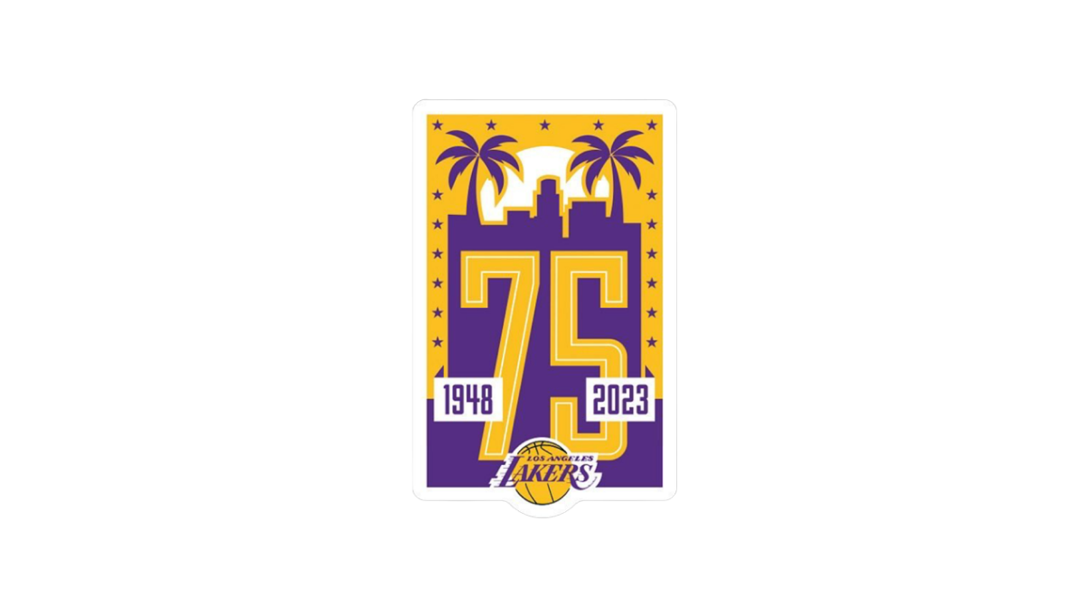
Built on a unique vertical rectangle layout and the team's brand purple and yellow colors, this logo builds on a skyline of a Los Angeles flanked by palm trees to create the backdrop for a large number 75. The team's traditional logo is inset below and on top of the 75 to make it easy to tie back to the organization with a simple white rectangle on either side of the number to denote the dates.
More Details →Lakeshore Chinooks 10th Anniversary Logo
This logo combines a few clever elements within this baseball team's brand. First, it sets the base of the logo with a homeplate hape. Second, a fish jumping in reference to the Chinook Salmon featured in their original logo. Third, a blue lake at the bottom that wraps the homeplate shape as a border and extends to a ribbon holding the years this team has existed to create a clean, meaningful design.
More Details →Elite 11 25th Anniversary Logo
The nationals premier elite quarterback competition, Elite 11 drew inspiration from the strong, bold themes associated with sports logos and the large, blocky numbers that sit behind many major bowl game logos, to create a mark that places their original logo in the center and uses the strong, dark colors of that brand to build a great looking anniversary logo.
More Details →Canton Youth Hockey 50th Anniversary Logo
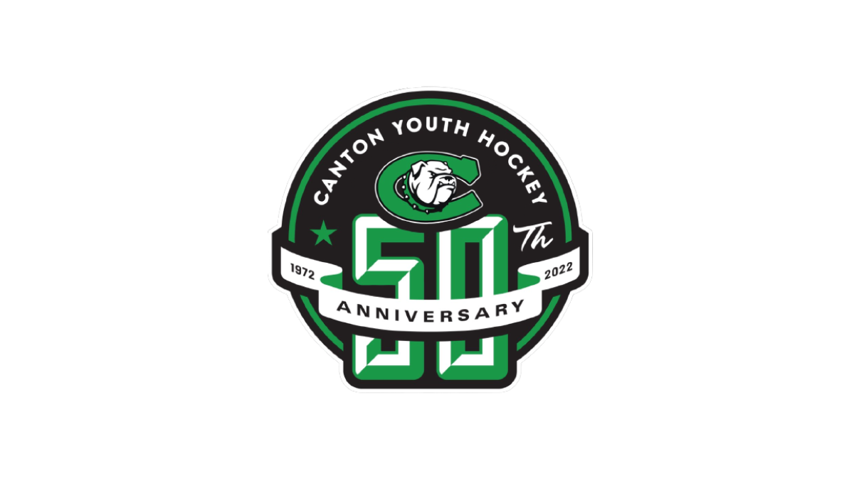
With the classic badge-style design that is so popular with sports anniversary logos, this logo places a large number 50 on a round, black background that also contains the name and "th" fo complete the reference to the year. Above that, a clean ribbon wraps the number 50 to hold the word "anniversary" and years of their operation.
More Details →Canadian Tire Motorsports Park 50th Anniversary Logo
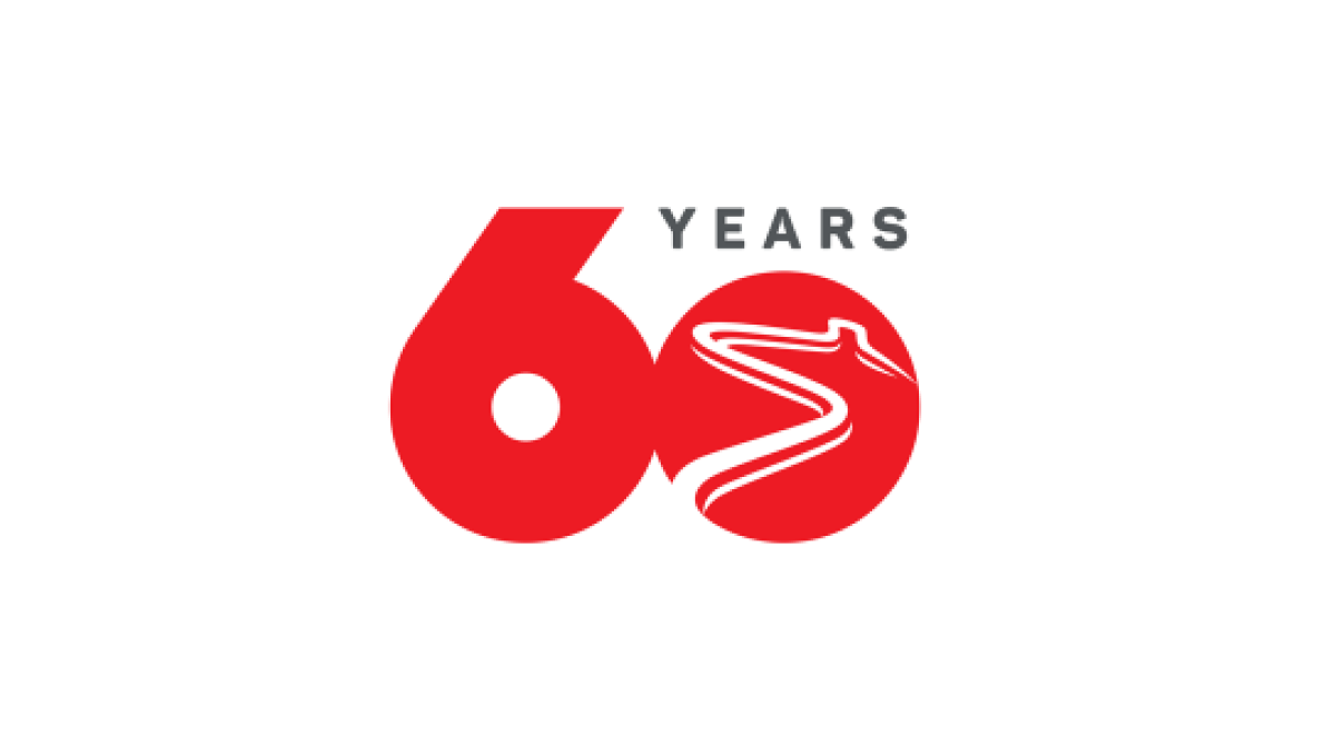
Simplicity is the theme of this number-focused anniversary logo. With the brand's bold, red color at the heart and the number 60 representing the bulk of the design's footprint, by shrinking the number zero to make room for the word "years" and adding a racetrack shape into that same zero, they have a classy, clean logo that checked all the boxes they needed.
More Details →