15th Anniversary Logos
Tempo Curacao 15th Anniversary Logo

This logo goes ultra simple with a large, block number fifteen in the brand's light gray color. Inside the circle of the number five they've placed their round, original logo in their usual red. Just to add another tiny bit of clarity they've placed the word "years" below the number inline with the red of the logo. It relies heavily on their market being able to recognize their mark, but it does a great job of building on that brand awareness in a simple, clean package.
More Details →Alliance Technologies 15th Anniversary Logo

I love the minimalism of this anniversary logo design. Their original logo already had a circular shape so, instead of trying to reinvent the whole package, they simply curved an anniversary-themed message around an empty part of this circle. This subtle change is noticable, but not overpowering. The result is a logo that's easy to swap with their existing but doesn't compete with the power of folks repeatedly seeing their original logo.
More Details →Scratch 15th Anniversary Logo
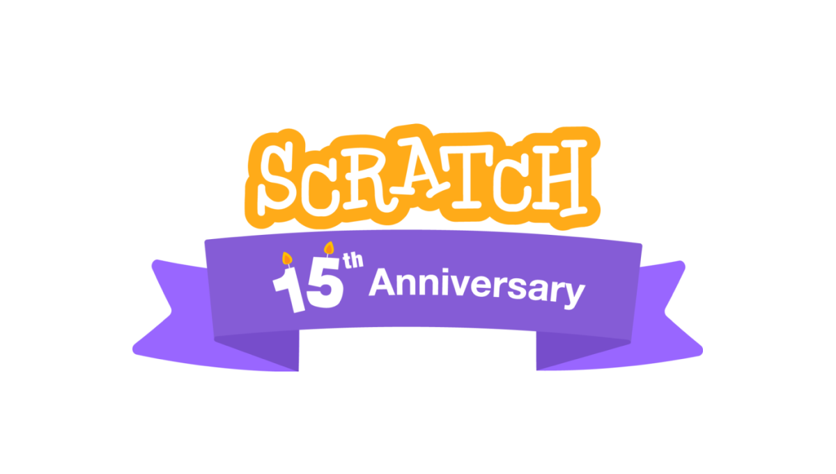
A coding platform that's designed primarily for kids, Scratch celebrated theira nniversary by adding a playful color combination to their altreay playful logo as a base. This color was used in a classic ribbon that wrapped around the logo and held a simple banner indicating the reason for celebration. A simple, but effective design.
More Details →Brazon Valley Bombers 15th Anniversary Logo
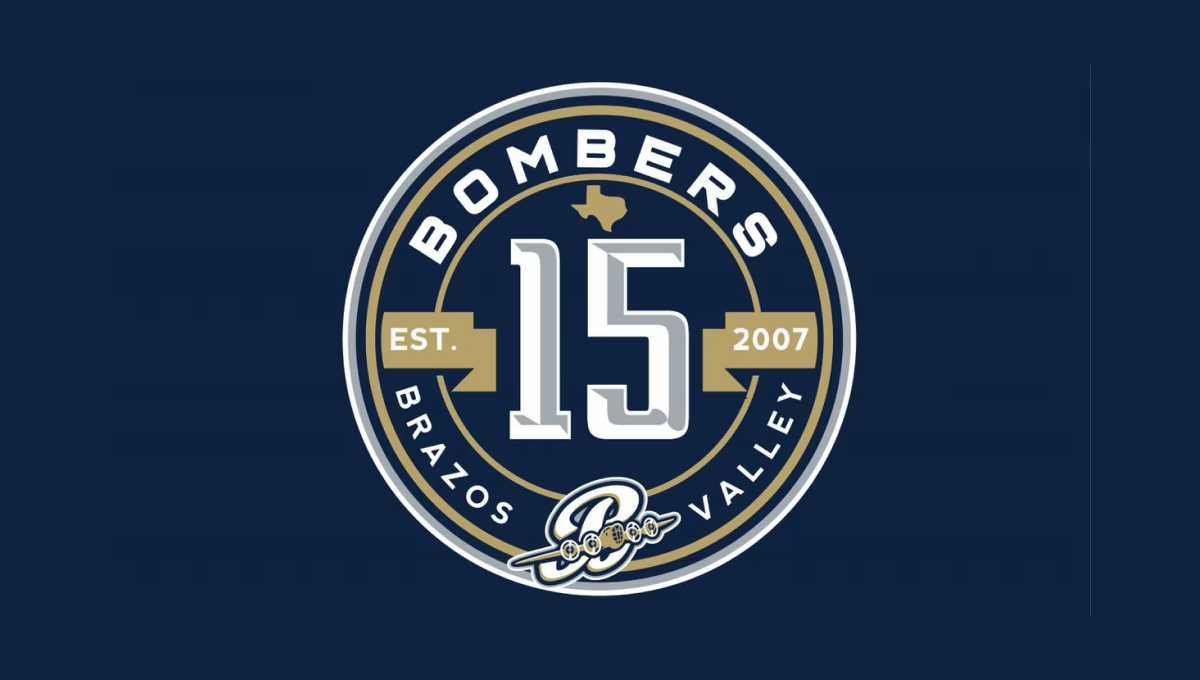
With classic sports design styling, this mark starts with a clean, circular badge that places a large, sports-lettering number 15 in the center. Above and below that number is the name of the team in curved letters to follow the shape of the circle. To either side is a gold ribbon holding the years of operation. Above and below the lnumber sit the silhouette of the state of Texas and the team's traditional logo
More Details →Hydraulics Online 15th Anniversary Logo
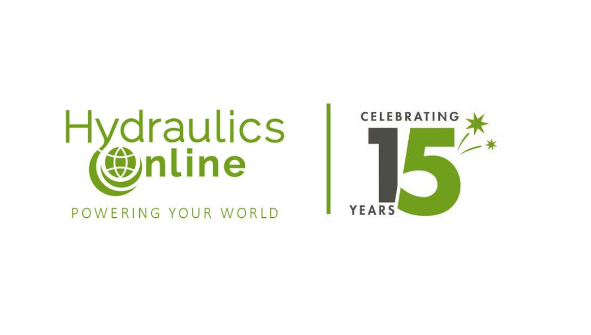
This side-by-side layout using a brand's original logo is becoming more and more common, for good reason. A vertical line seperates this media outlet's traditional logo from a simple design using a number fifteen. Even if this number was using readily available stock imagery of their annersary number, the combination of this mark and their usual design makes it a clean lockup that's easy to tie back to the original brand.
More Details →Gateway Church 15th Anniversary Logo
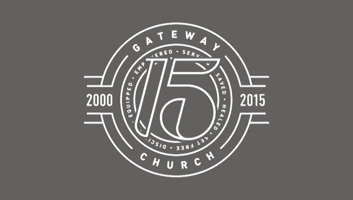
The clean, line-art logo starts with a series of white circles to create two rings where they place the name of the church and a list of the church's values. In front of that sits a large, stylized number 15. On either side are placed the years of operations with more lines connecting the horizontal years to the circular shape of the rest of the logo.
More Details →