Badge Anniversary Logos
BYU Idaho 25th Anniversary Logo
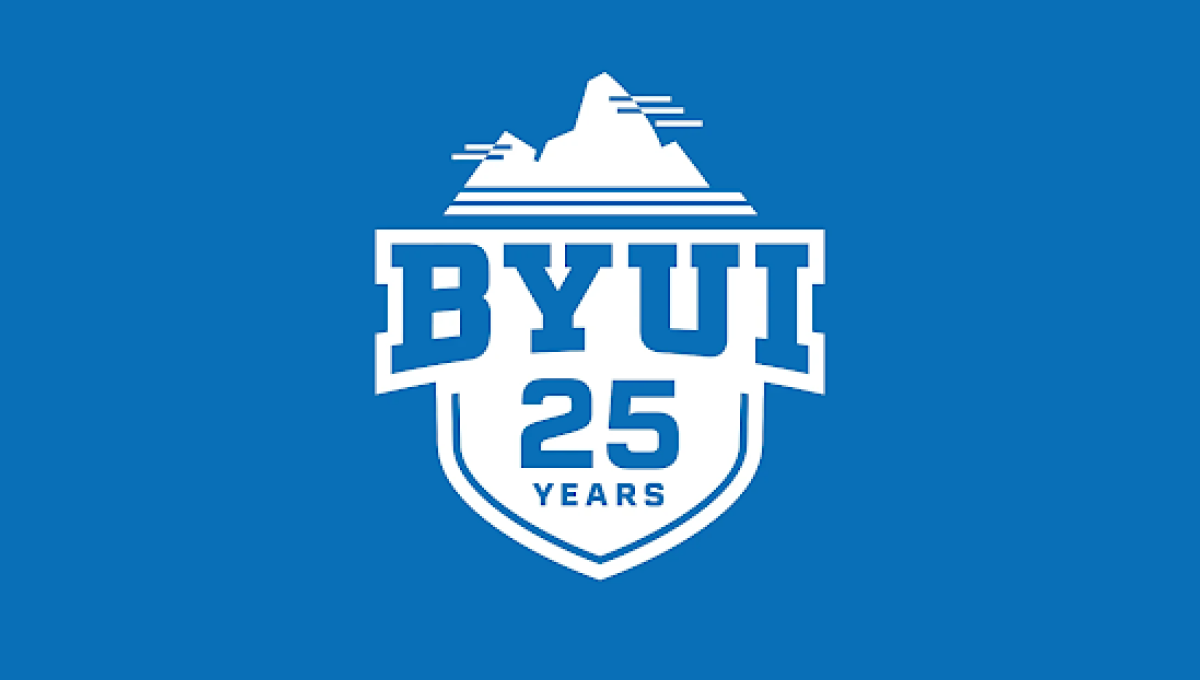
This anniversary logo has a simple, bold design with a clean and athletic appearance. A shield-shaped emblem provides a strong foundation, while large lettering and the anniversary number are arranged in a balanced, easy-to-read layout. A small graphic at the top adds visual interest without making the design feel busy. The limited color palette and crisp lines create a polished, recognizable look that celebrates the milestone in a modern and straightforward way.
More Details →Colorado 150th Anniversary Logo
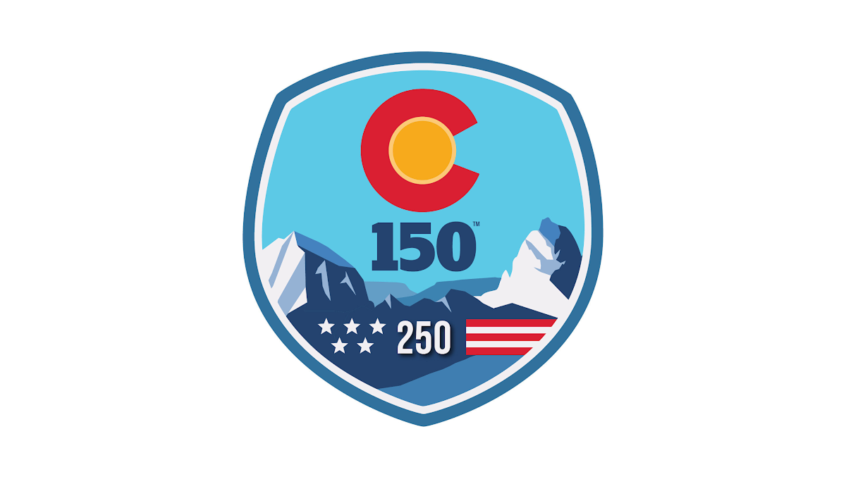
This anniversary logo uses a bold, badge-style design with a strong, recognizable shape. Bright colors and simple graphic elements create a memorable, outdoor-inspired look, while the anniversary number is placed prominently in the center to emphasize the milestone. Stylized landscape features and a few symbolic details add character without making the design feel crowded. Overall, the logo has a clean, confident appearance that celebrates a long history in a visually engaging way.
More Details →Mountain Creek 60th Anniversary Logo
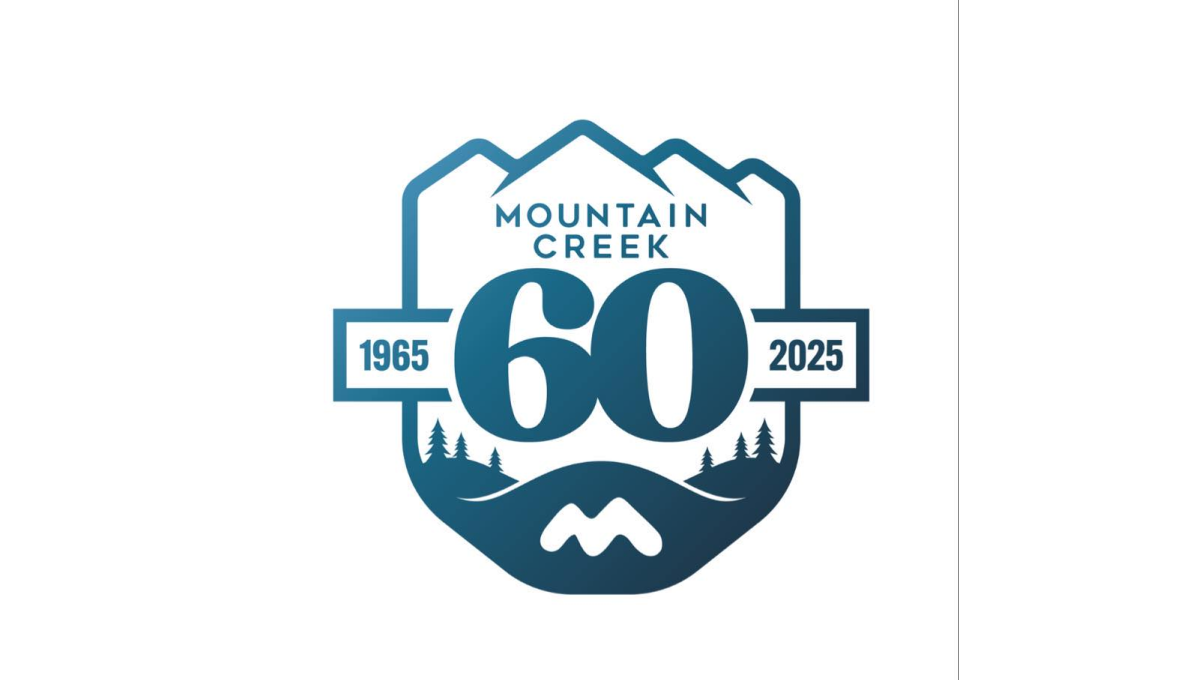
This anniversary logo has a calm, outdoors style with a badge-like shape. Mountains sit at the top, suggesting nature and strength. The large number “60” stands in the center, making the milestone clear. Small trees and flowing lines add a peaceful, grounded feeling. Soft blue tones give it a steady, trustworthy look. Overall, the design feels reflective and proud, marking many years of growth and connection to place.
More Details →Diamond Peak 60th Anniversary Logo
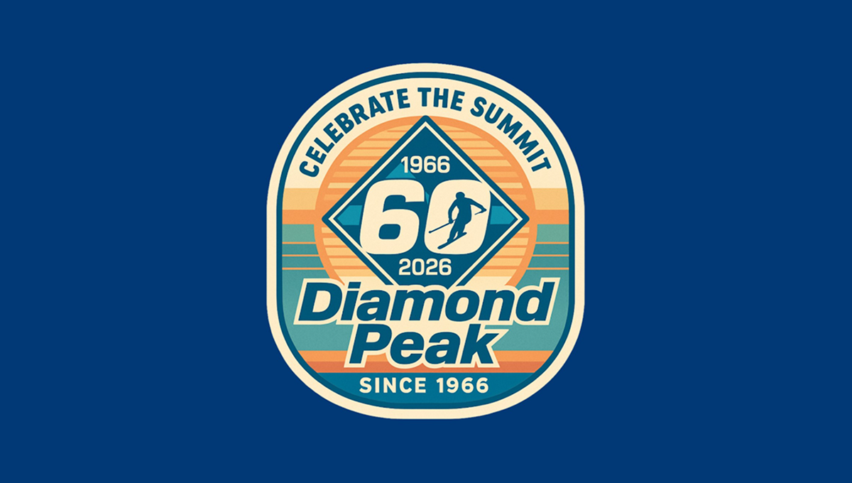
The anniversary logo has a rounded badge shape with layered colors and a vintage feel. In the center is a large 60, framed by a diamond shape, with dates above and below to mark the milestone. A small skier figure adds a sense of motion and outdoor spirit. The background uses soft stripes and warm tones, while the text curves around the design, giving it a balanced, classic look that feels celebratory and familiar.
More Details →Reser's 75th Anniversary Logo

The logo celebrates a 75-year milestone with bold colors as the main focus. It uses clean, classic lettering and a smooth layout that feels both modern and respectful of the past. A banner curves across the bottom, mentioning the anniversary, adding a sense of movement. The color choices are warm and timeless, giving it a sense of tradition and pride. Overall, the design feels strong and simple, marking a long and steady journey.
More Details →New Port Richey 100th Anniversary Logo

As much as we love simple logos, I love complex logos that aren't simply adding elements for fun but using intricate imagery that beautifully represents the things being celebrated. In this case, the anniversary logo is a beautifully drawn scene of the town's most famous architecture and locations. The colors are perhaps my favorite part, with the creamy, sand color used both in the imagery and the default background.
More Details →Love's Travel Stops 60th Anniversary Logo

A place that's supposed to be a friendly place to stop during your travels, this logo for loves starts with a big, friendly number that adds a little bit of shading to suggest a soft, rounded feel. A classic ribbon holds the word years with the years of operation at the bottom. All of this is held in a crest-like shape that keeps that friendly, rounded style around the corners and leaves just enough room for Love's original logo at the top.
More Details →Turning Stone Resort Casino 25th Anniversary Logo

This is a unique anniversary logo in that it takes a distinct departure from the usual brand's color and style. Instead of the traditional blue, there's gold. And instead of a square filled with scripted letters, there's a diamond with block letters. The result, however, works surprisingly well and carries some of the classic anniverary logo design elements like the years of operation, a ribbon to hold extra wording, and the original word mark at the bottom.
More Details →Memorial Stadium 100th Anniversary Logo

Older stadiums and buildings often have an exterior that becomes part of the venue's brand. This stadium is no exception and the designers did a fantastic job of combining the architecural elements that make this stadium famous with the traditional crest-style designs that are famous in sports marketing. The result does a great job of conveying the anniversary, ties perfectly back to the stadium itself, and also sends strong singals to reinforce the industry they're in.
More Details →Edmonton Elks 75th Anniversary Logo
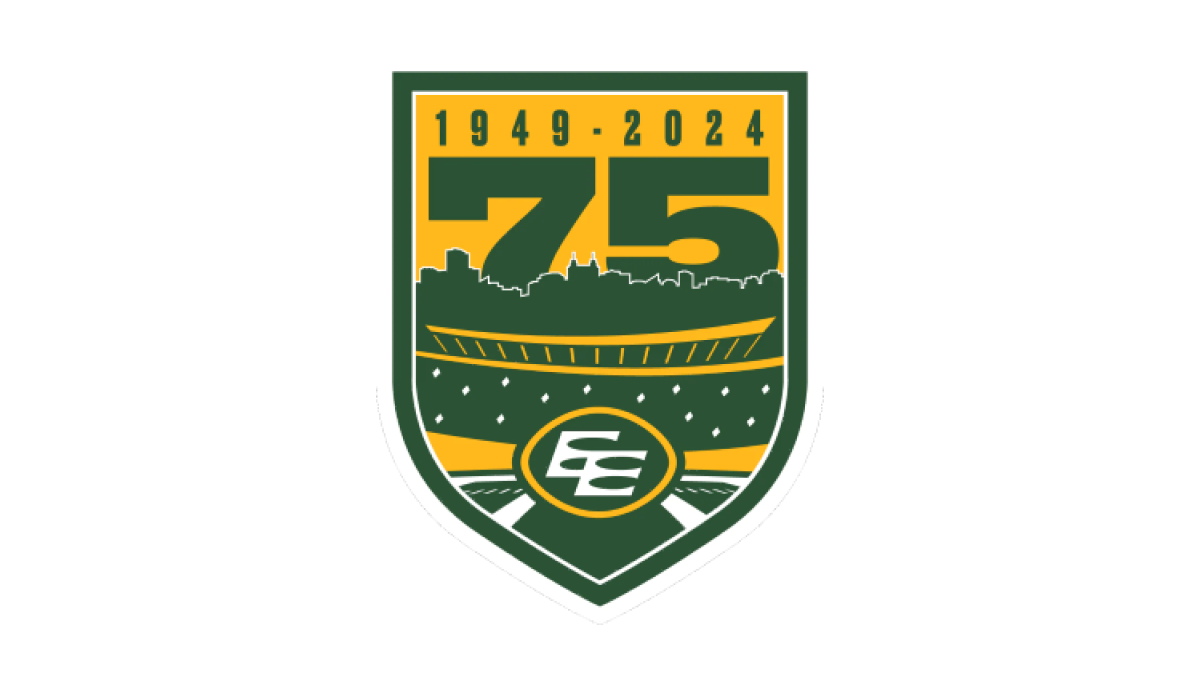
Using the classic sports style of large numbers, bold fonts, and crest-style shapes, this anniversary logo combines imagery that makes it clear the context is football and enough of the original brand to tie it back to the traditional mark. A large number 75 rises up from behind the stadium to complete this well-designed logo.
More Details →Kentucky State Parks 100th Anniversary Logo
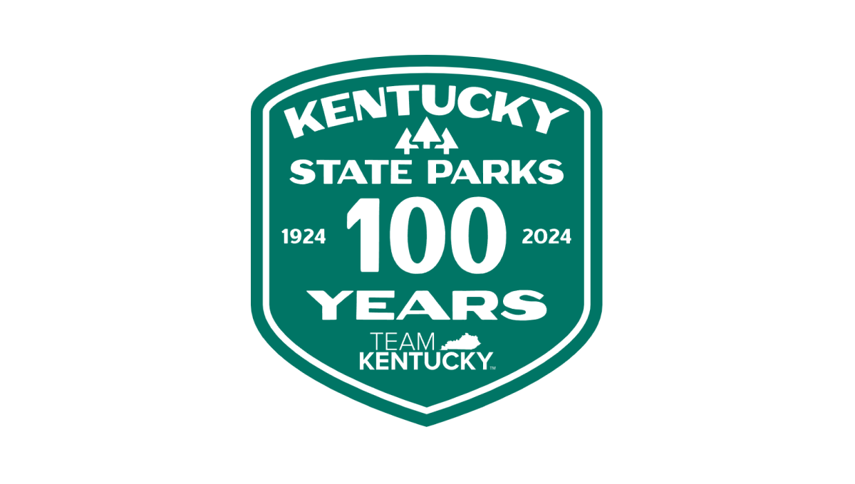
Using the classic parks-style badge, old-school fonts common on vintage posters, and a large number 100 to anchor the design, this badge-style logo combines a lot of elements - the name of the organization, the years, the state, etc. - into a conhesive design that is easy to picture being something that would have existed 100 years ago when Kentucky State Parks was organized.
More Details →Bend Brewing Company 25th Anniversary Logo
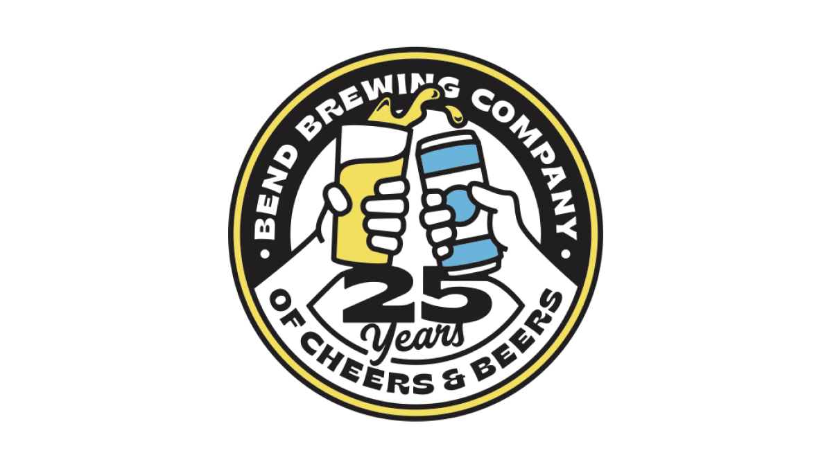
Starting with the classic round shape that is famous with anniversary logos but especially among beer-themed designs, this logo spells the brewery's name across the top half of the circle, a fun tagline across the bottom half, and a larger number 25 just above that. Filling the rest of the circle is an illustration of a "cheers" between a glass of beer and a can of beer.
More Details →Barley Brown's Brew Pub 25th Anniversary Logo
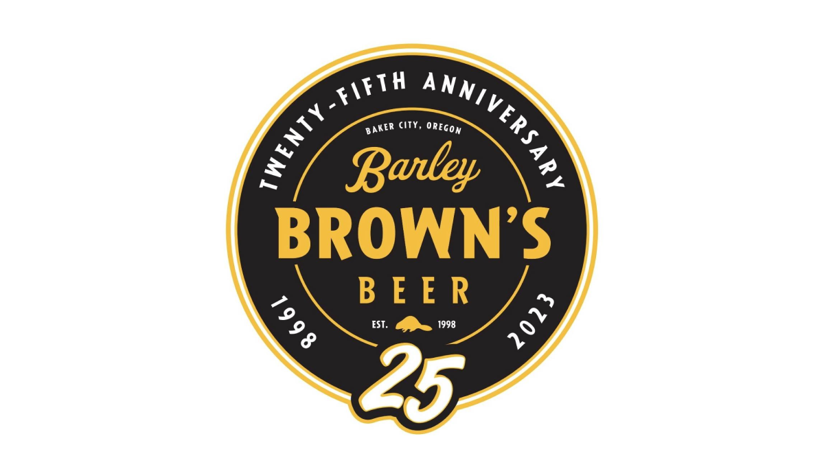
Using perhaps the most popular shape for anniversary logos, this brew pub starts with a black circle to create a clean shape to begin. In the center is the name of the company in a yellow that reminiscent of the beer they famously serve with a large, stylized number 25 at the bottom of the circle just extending beyond the edge of the circle.
More Details →Brown's Gym 30th Anniversary Logo
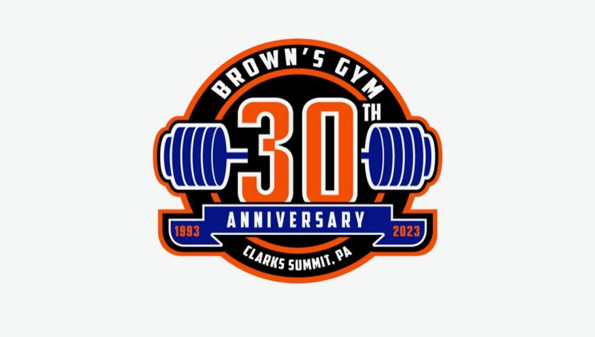
Using a classic sports logo style of a round circle with a ribbon across the lwer section, this logo places a large number 30 in the center with a clever barbell placed behind to tie back to the original brand and industry. Along the top sits the gym's name with the city and state in which the gym is located spelled out across the bottom to complete the logo.
More Details →Lego Games 25th Anniversary Logo
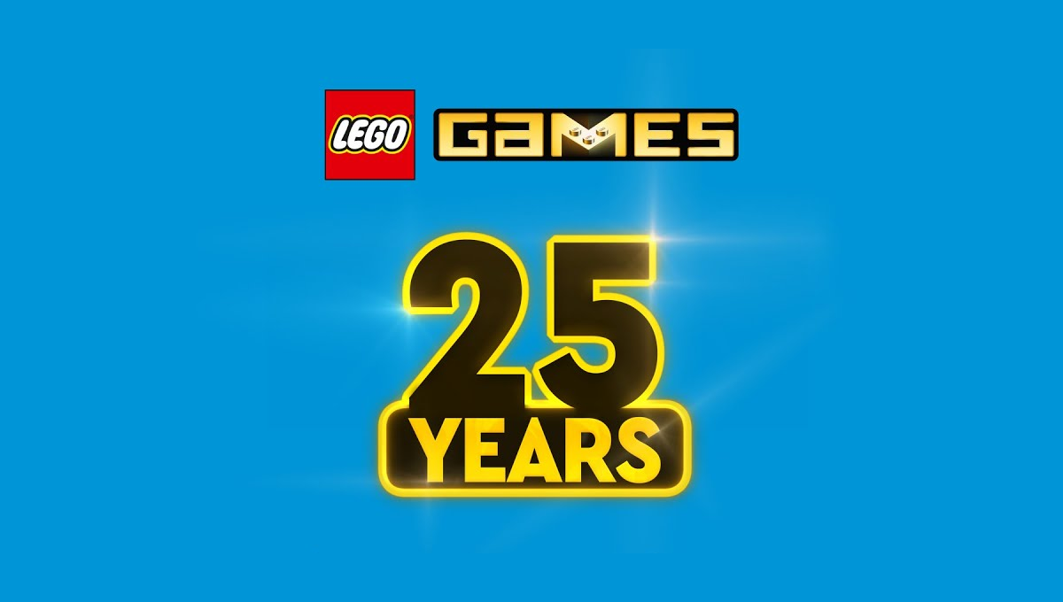
In another example of keeping the original logo and adding a number mark beside it, this design took a slightly different approach that the usual. Instead of placing these side-by-side, they stacked them. The number mark uses similar yellow and black colors of the original mark and a little bit of sparkle to help it stand out and keep the fun vibe of the original.
More Details →Jurassic Park 30th Anniversary Logo
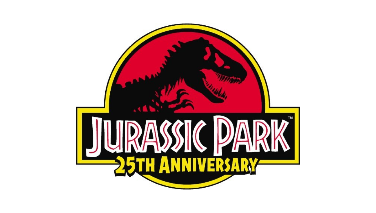
This famous first installment of what is now a multi-part video series already had an iconic logo that was not only the logo for the movie, but the fictional park inside the movie. So instead of starting from scratch, they added the words "25th anniversary" below the words in the traditional logo and called it good.
More Details →City of Burien 30th Anniversary Logo
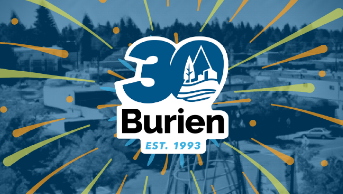
This clean, sticker-style logo starts with a large number 30 with a slight ilatic style in the city's traditional blue color. Inside the zero is place a white, line-art version of the city's main logo. Below that is the name of the city with the year it was established at the bottom. And by locking up this design with white padding, they were able to place it on any color including a fireworks-like design used on their website.
More Details →Brazon Valley Bombers 15th Anniversary Logo
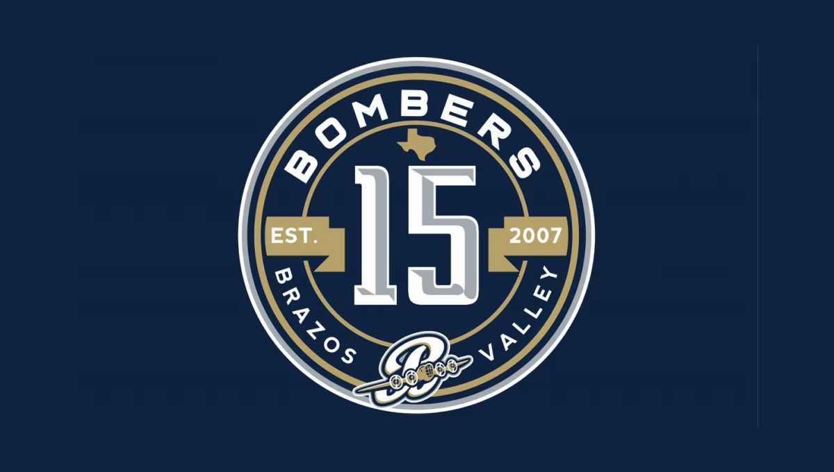
With classic sports design styling, this mark starts with a clean, circular badge that places a large, sports-lettering number 15 in the center. Above and below that number is the name of the team in curved letters to follow the shape of the circle. To either side is a gold ribbon holding the years of operation. Above and below the lnumber sit the silhouette of the state of Texas and the team's traditional logo
More Details →Mountain West Conference 25th Anniversary Logo
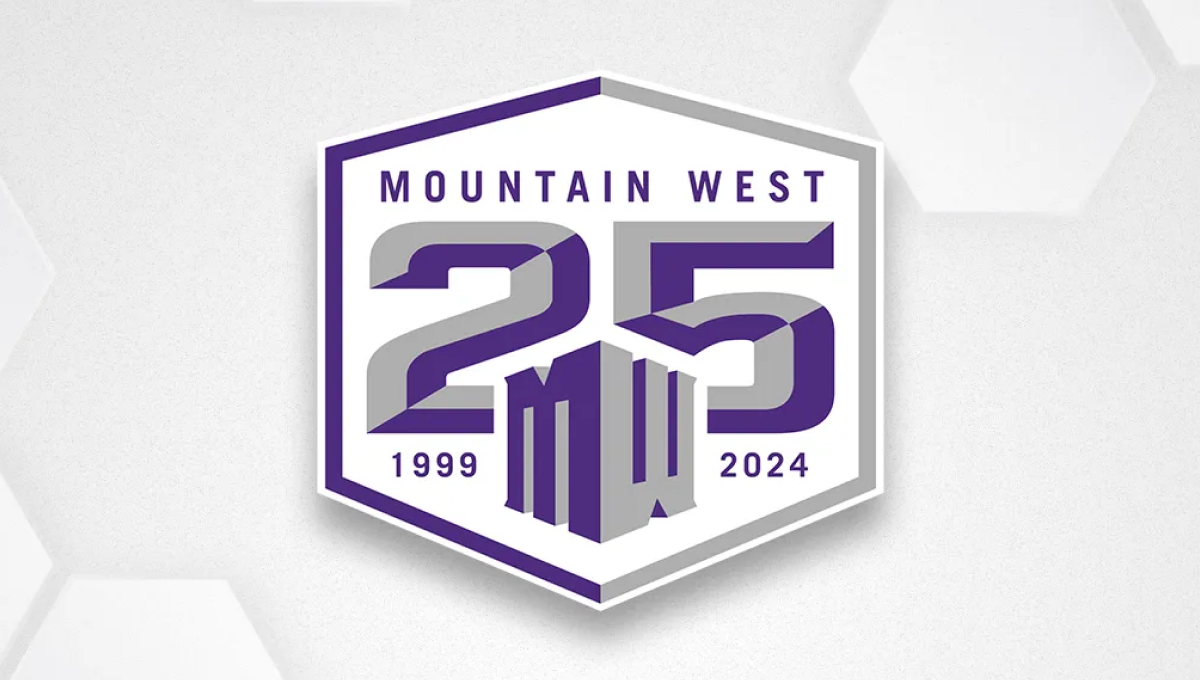
Once an underdog conference, the Mountain West is now home to many top contenders across major college sports. They've leaned into the hex shape for their brand recently, so they started with that shape, added a large, block 25 to the center, placed their original mark below and centered on the number 25, and placed words and years int he remaining spaces to create a solid design featuring their usual brand purple.
More Details →Folsom Field 100th Anniversary Logo
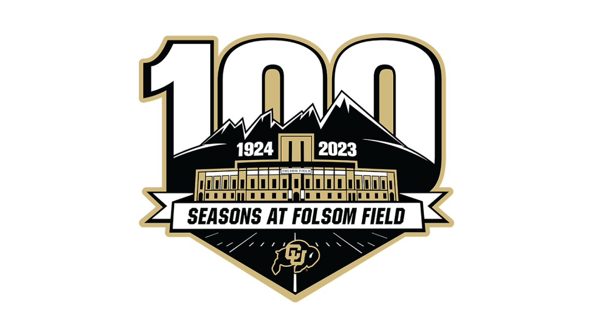
It's a big year for Colorado football for many reasons, but one of them is the anniversary celebration for their famous Folsom Field. This mark combines their mountain skyline, yard lines from the field, and a beautifully line-art illustration of the stadium's exterior to set the stage for this anniversary logo. Behind the mark sits a large, block number 100 rising up from behind the mountains.
More Details →The Way International 80th Anniversary Logo
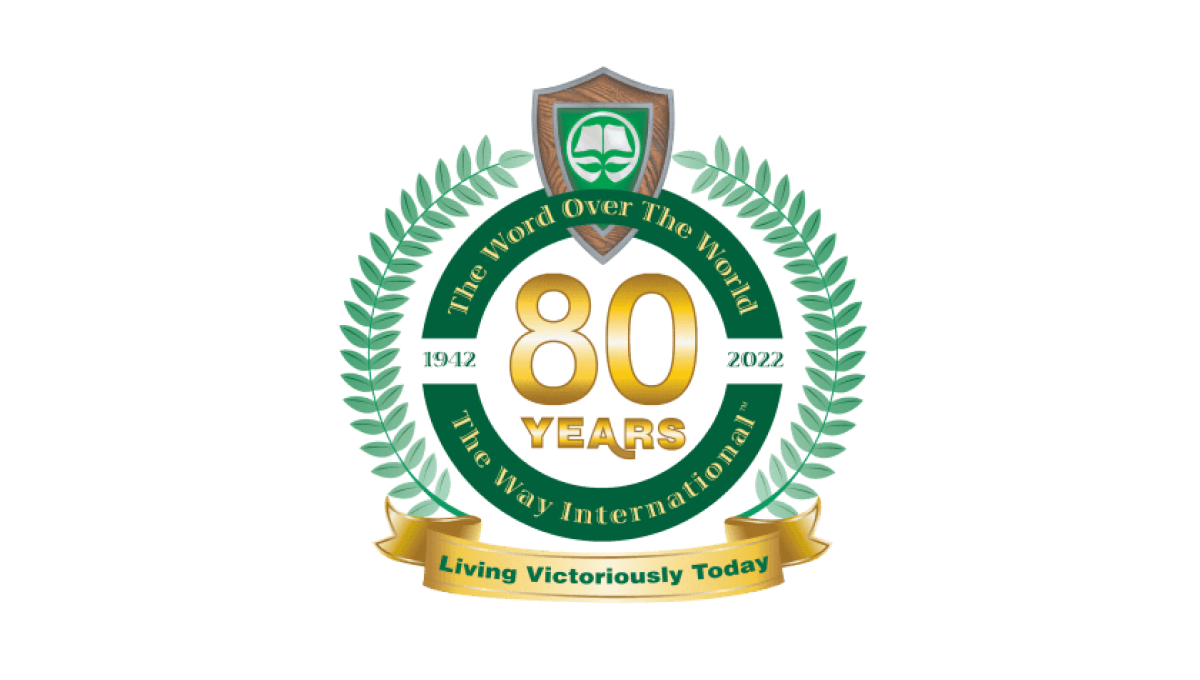
Adding a number of elements you'll see in anniversary logos, this logo uses a thick circle to hold one ring of words, another ring outside of that holding the classic Laurel leaf pattern, and a banner at the bottom where they've played the organization's motto. In the center is placed their year of celebration with the original logo situated at the top.
More Details →KFC Japan 50th Anniversary Logo
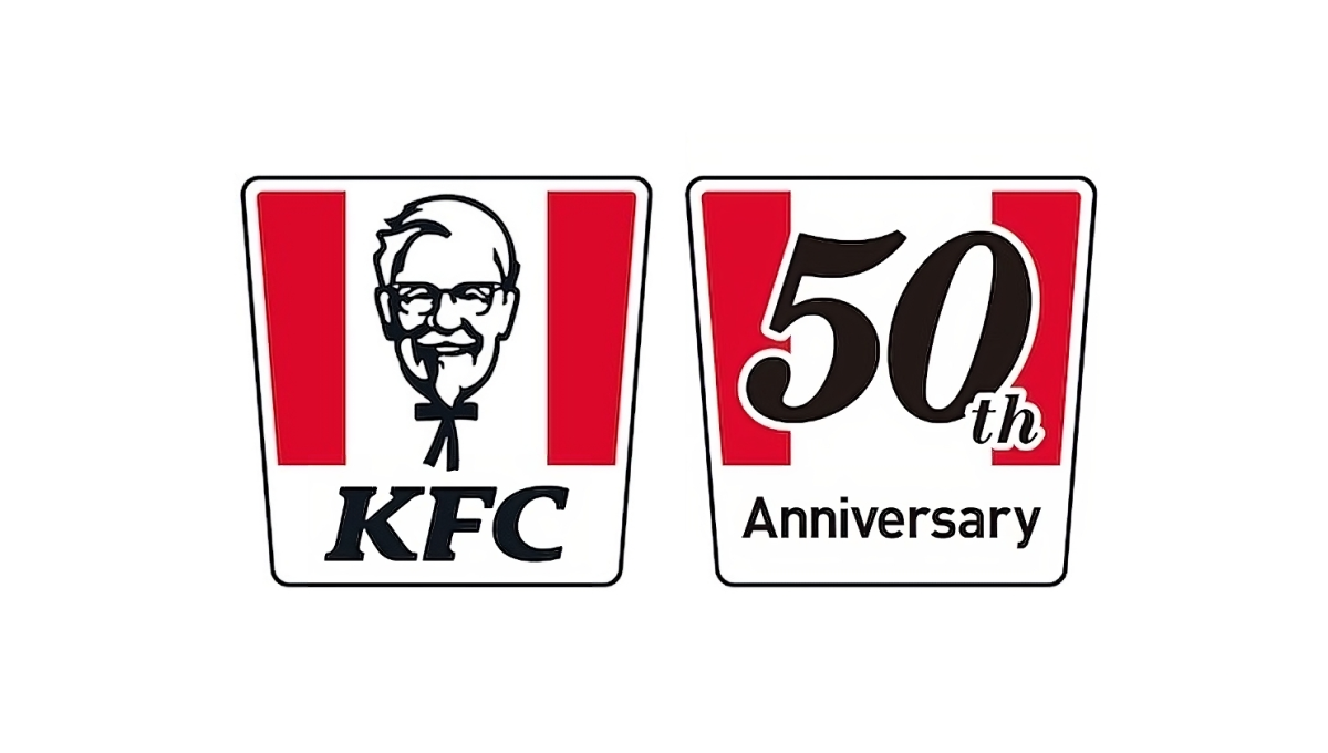
When KFC celebrated 50 years of operations in Japan, they had a powerful, easily-recognized shape at their disposal: the almost-square bucket with red stripes. Because it was so recognizable, they were able to simply overlay the year of their anniversary on top of that shape in a font similar to the KFC name and quickly have a logo that was simple, on-brand, and easy to tie back to the original mark.
More Details →Gate City Bank 100th Anniversary Logo
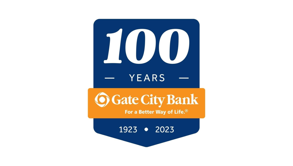
Using a clean banner shape, this badge-style logo uses a dark blue background to create contrast with the number of their annviersary and the years of operation. Between the two wraps an orange ribbon that holds the name of the and the company's tagline to make a clean, easy-to-recognize tie back to their original brand.
More Details →Hobart 125th Anniversary Logo
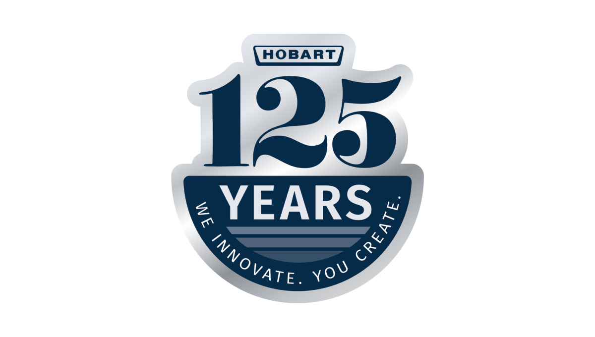
Using a look of the classic stainless steel material that many of their products are created from combined with the brand's traditional blue color, this clean mark places a large 125 and the main logo above a semicircle holding the word "years" and a tagline to celebrate the occasion and reinforce the company's main message, mission, and values.
More Details →NASCAR 75th Anniversary Logo
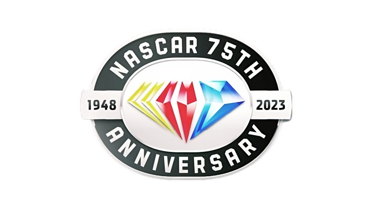
While other anniversaries use the diamond as the traditional shape, the 75th is absolutely one of them and NASCAR leaned into this with their design. A black oval representing the track their cars race around holds the name of the organization and recognition of the anniversary while a yellow, red, and blue diamond in the brand's traditional colors sits inside. A small ribbon then extends to either side of the diamond holding the years of operation.
More Details →Warner Bros. 90th Anniversary Logo
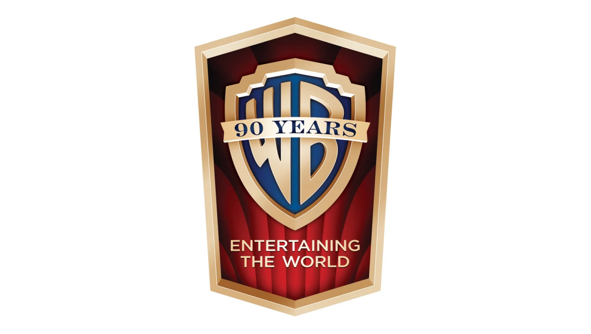
This detailed mark carries the classic feel of the brand's opening sequence that intro their films. The traditional logo sits inside a vertical crest with the brand's famous red curtains falloing behind to fill in the space behind the mark. In the space left at the bottom of the badge sits their company tagline to provide balance.
More Details →Los Angeles Dodgers 60th Anniversary Logo
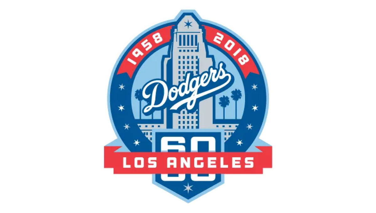
With the famous Los Angeles City Hall as the backdrop, this mark uses a blue circle for the main shape and places an illustration of that building in the center. Above that the years of operation wrap around the top edge of the circle. At the bottom a home-plate shape holds the number 60 with a ribbon holding the name of the city.
More Details →New York Mets 60th Anniversary Logo

Similar to other baseball teams who celebrate anniversary logos, this mark begins with a baseball field for the shape. In this case, the outline is in the team's famous orange and blue colors with a large blue sixty set in the center. At top of the field sits the team's original logo, at the bottom is the year the team was founded, with a ribbon holding the word "annivesary" set just below the number 60.
More Details →Hot Springs National Park 100th Anniversary Logo
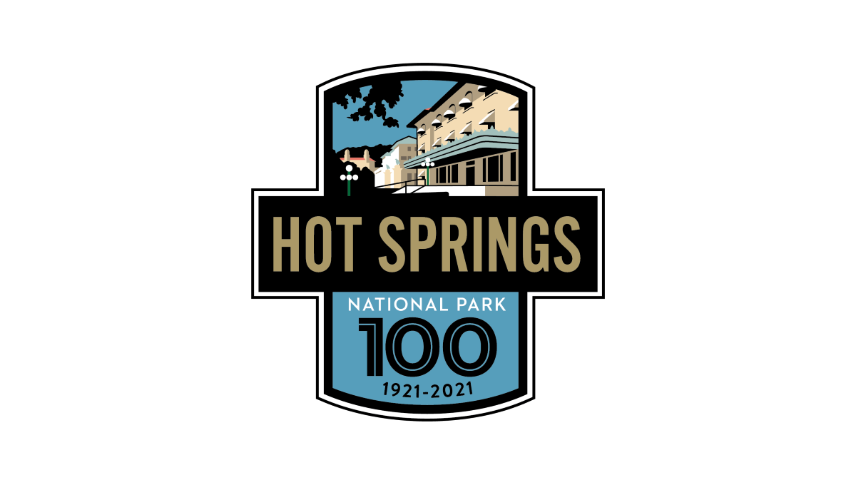
This logo starts with two overlapping rectangles, one placed vertically and the other horizontally. The horizontal rectangle is filled with black and gold letters of the park's name sit inside. In the vertiacl rectangle, the part sticking up from behind the name of the park holds a depiction of the park's famous architecture with the bottom holding a large number 100, the years of operation, and the words national park with blue behind.
More Details →Yellowstone National Park 100th Anniversary Logo
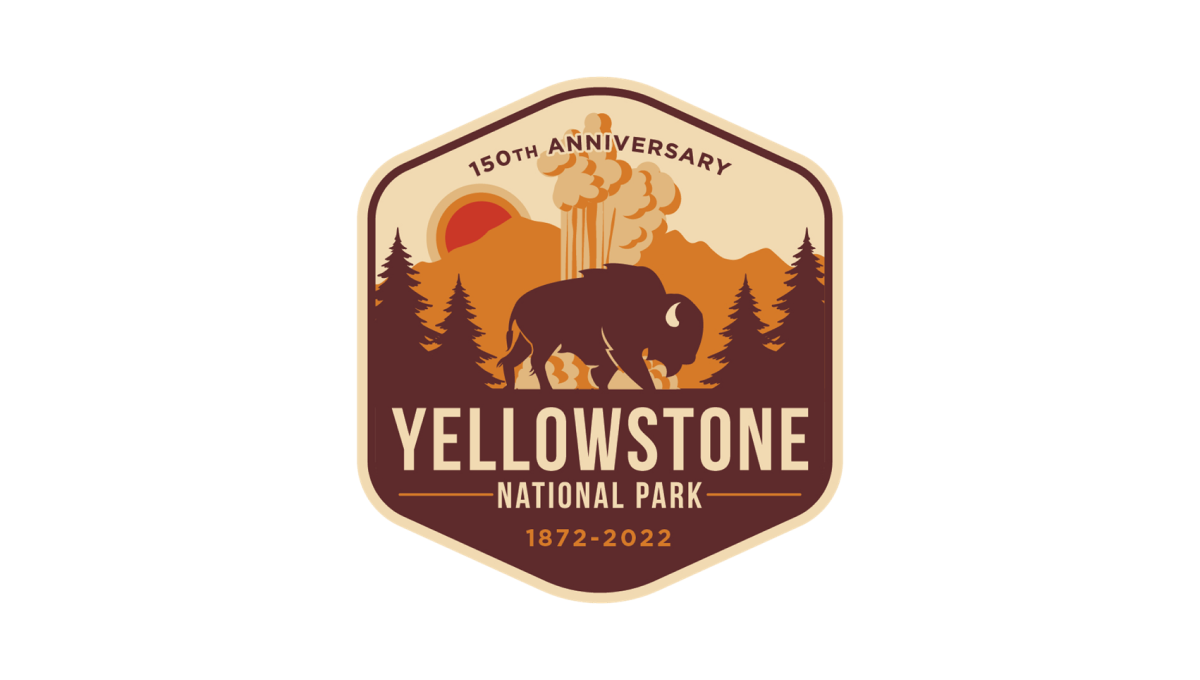
Yellowstone's 150th anniversary logo starts with a hexagonal shape in an orange and brown color that's reminiscent of many colors throughout the park. Inside, layers of monochrome silhouette's depict the park's famous geysers and wildlife. In the bottom half, the name of the park sits just above the years of operation with a callout of the anniversary arching across the upper part of the design.
More Details →Anaheim Ducks 30th Anniversary Logo
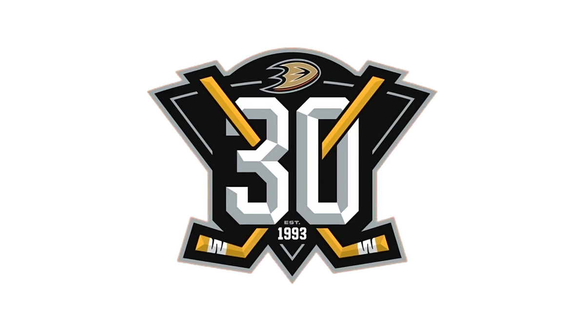
With a stylized triangle (point down) as the base, this logo starts with a three dimensional, block number 30 in the center as the visual foundation. Next, two hockey sticks weave in and out of the number 30, cross in the center, and extend just beyond the triable to make the shape a bit more dynamic. Finally, a small curved area is extended above the top of the triangle to hold the team's original logo.
More Details →Yankee Stadium 100th Anniversary Logo
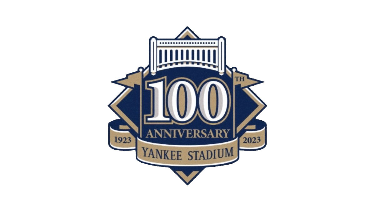
This logo starts with the classic baseball diamond shape as the base and adds a large number 100 in the center to begin. Above that sits an illustrtion representing the landmark's famous architechture. To either side of the 100 sit the famous flags - the right one containing the "th" for the year - which also frame the number nicely. Below, a ribbon holds the years of operation and the name of the stadium to comlete the design.
More Details →Ski Area Management Magazine 60th Anniversary Logo
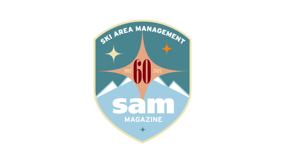
It's not often you see a magazine celebrate their 60th anniversary, but this is exactly what SAM did and celebrated with a clean, crest-style badge in two shades of teal as the base. At the top, their written logo follows the curve of the top of the crest with their traditional lowercase "sam" word mark placed at the bottom. In the center, a red number 60 with a star shape behind to fill in the space and provide balance.
More Details →Miami Heat 35th Anniversary Logo
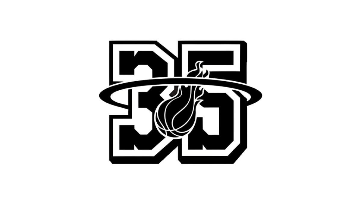
With their 35th anniversary in store, the Miami head started with block, jersey-style number 35 as the shape, this logo extends the traditional logo's famous rim shape to surround the entire number 35 and placing the other element element of the original logo, a flaming basketball, in the center to make a recognizable logo with a clear sports vibe.
More Details →Aggie Ice Cream 100th Anniversary Logo
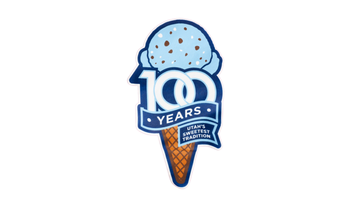
A stable of Utah State University's history, the ice cream shop within this school's campus wanted to celebrate their famous treats with a logo. So they started with an icre cream cone in the classic aggie blue, added a block number 100 in front of that with a ribbon below that wrapped below to contain the words "years" and "Utah's sweetest tradition." The logo was featured in the shop and on logo t-shirts and hats available in the store and online.
More Details →Adams Memorial Hospital 100th Anniversary Logo
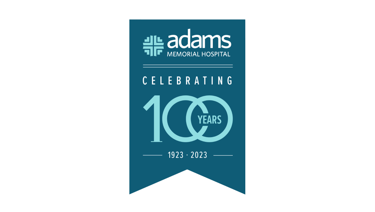
This unique layout for an annversary logo starts with a hanging banner shape in a shade slightly darker than the company's traditional teal color. Then, working downward, they add the primary brand logo followed by a styled "100 years" graphic. The 100 is in the brand color and features overlapping zeros with the word "years" inset within that overlap. Finally, extra text is placed above and below the number to add flow and balance.
More Details →Callie (My Daughter) 10th Anniversary Logo
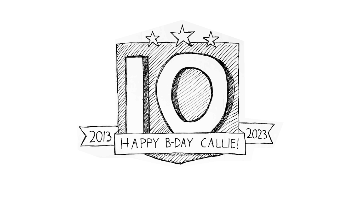
When you're the father of a girl turning 10 and you happen to be just starting a side project of gathering anniversary logos, what do you think comes to mind when working on a birthday poster for the aforementioned 10 year old? You guessed it, all the block numbers and ribbons and years of operation you've been looking at in recent weeks. And, as you might have guessed, that's exactly the direction this poster took.
More Details →Lego Star Wars 20th Anniversary Logo

Lego Star Wars created an anniversary logo that featured mini figure versions of popular characters with a round, badge-style design. A reflective silver color and a bit of addition for light sabers to extend above the circle and a box to hold the dates below create a great design that unique and features both a recognizable number and characters.
More Details →SportsLogos.net 25th Anniversary Logo
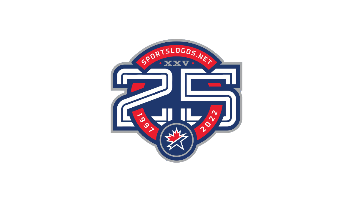
As a site that celebrates sports logos, this mark sets a high bar for anniversary logo designs. Starting with a circle in the brand's traditional red, it then cleverly weaves the number 25 in front of and behind the background to create a sharp three dimensional look. The site name and years are then set into the remaining red of the background with the original mark set in the bottom of the ring to make a clean connection to the original brand.
More Details →Las Vegas Aviators 40th Anniversary Logo
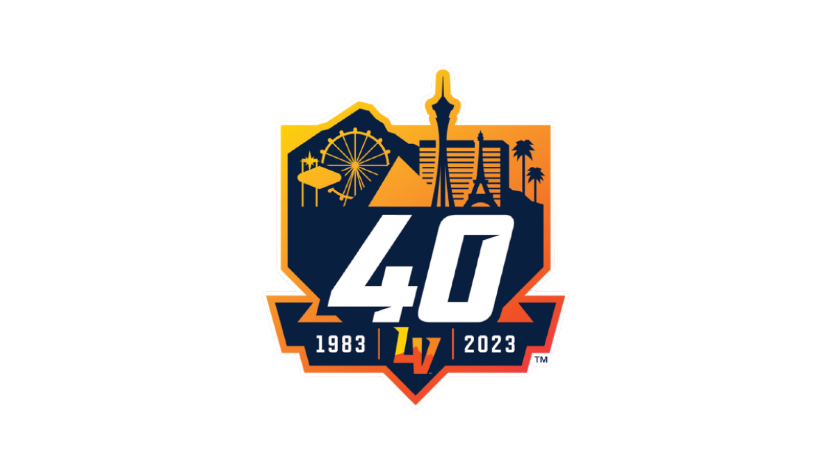
This logo combines three clean layers that establish a nice visual heirarchy for each element. First, an orange gradient creates a badge-style backdrop. Next, a skyline of prominant Las Vegas landmarks in a darker color creates a nice reference back to their home town with a punchout for the team's mark at the bottom. Finally, a large number 40 and the years of existence in white stand out in clear contrast from the rest to draw attention to the key message.
More Details →Lakeshore Chinooks 10th Anniversary Logo
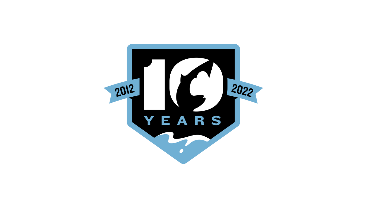
This logo combines a few clever elements within this baseball team's brand. First, it sets the base of the logo with a homeplate hape. Second, a fish jumping in reference to the Chinook Salmon featured in their original logo. Third, a blue lake at the bottom that wraps the homeplate shape as a border and extends to a ribbon holding the years this team has existed to create a clean, meaningful design.
More Details →Jackson Hole 50th Anniversary Logo
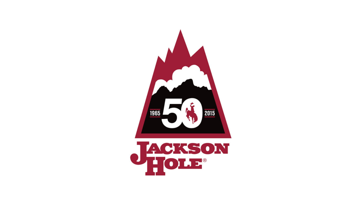
Jackson Hole Mountain Resort combined a shape found in one of their original logos with the layered red, white, and black colors found in their current logo to create a lockup that nearly merges the past with the present. They then the number 50 in the center of the large, black portion at the bottom of this mark to wrap up this strong, meaningful mark.
More Details →Elite 11 25th Anniversary Logo
The nationals premier elite quarterback competition, Elite 11 drew inspiration from the strong, bold themes associated with sports logos and the large, blocky numbers that sit behind many major bowl game logos, to create a mark that places their original logo in the center and uses the strong, dark colors of that brand to build a great looking anniversary logo.
More Details →Canton Youth Hockey 50th Anniversary Logo
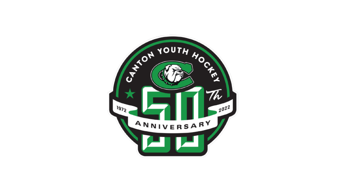
With the classic badge-style design that is so popular with sports anniversary logos, this logo places a large number 50 on a round, black background that also contains the name and "th" fo complete the reference to the year. Above that, a clean ribbon wraps the number 50 to hold the word "anniversary" and years of their operation.
More Details →Amstrong Air & Space Museum 50th Anniversary Logo

This badge-style logo features a prominent number wrapped in imagery and colors that align with the airforce, space, etc. theme that the museum - named after Neil Armstrong - is known for. A wrapped ribber contains the years of operation with an off-white background so set it apart from any white backgrounds it's used on.
More Details →