Circle Anniversary Logos
Big Cypress National Preserve 50th Anniversary Logo

The National Park Service has done a number of anniversary logos over the years and I love how they let the colors and styles of the area influence each one instead of a more copy and paste approach. This is another examples of that with unique fonts, bright colors, and imagery that have a different vibe than other logos but come together to create yet another tidy design that can be used in many situations.
More Details →Patrick & Co 150th Anniversary Logo

This design combines all of the classic annivesrary logo elements into a neat, tidy package. Starting with a circular shape that holds the words marking the anniversary celebration, the original name set in the middle with horizontal lines to break the circle into two semi-circles, and a nod to the Golden Gate Bridge to tie it back to where this company calls home.
More Details →Camp Pasquaney 130th Anniversary Logo

Circles are a shape that feature in many anniversary logo designs and this one does the same to great effect. The name of the camp arcs over the top, the years of operation fill the center, and a simple set of graphics including a campfire at the center bottom fill out the shape and give it a little bit of weight to keep the design from feeling top-heavy, a common issue with round designs like this.
More Details →University of North Texas 125th Anniversary Logo
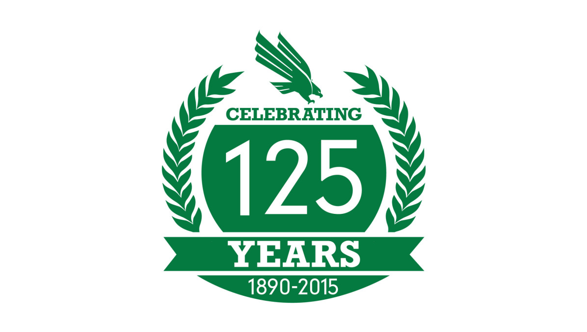
With a classic laurel-leaf style of many crests and anniversary logos, this mark uses these illustrations to create a simple, round shape to work with. Inside that shape is a large number 125 along with the words celebrating, years, and the years of operation. A ribbon holds some of these words while the gab between the laurels at the top is filled with the university's traditional logo.
More Details →City of Huntington Indiana 175th Anniversary Logo
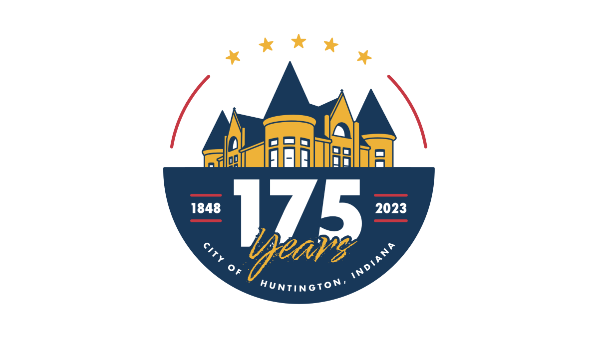
This logo starts with a circle that is divided exactly in half horizontally. On the top is placed a simple line-art drawing of a famous building in the city's downtown, while the bottom features a large number 175, the years of operation, and the name of the city. Curving along the top of the circle are placed 5 stars to round out the design.
More Details →Dialight 80th Anniversary Logo
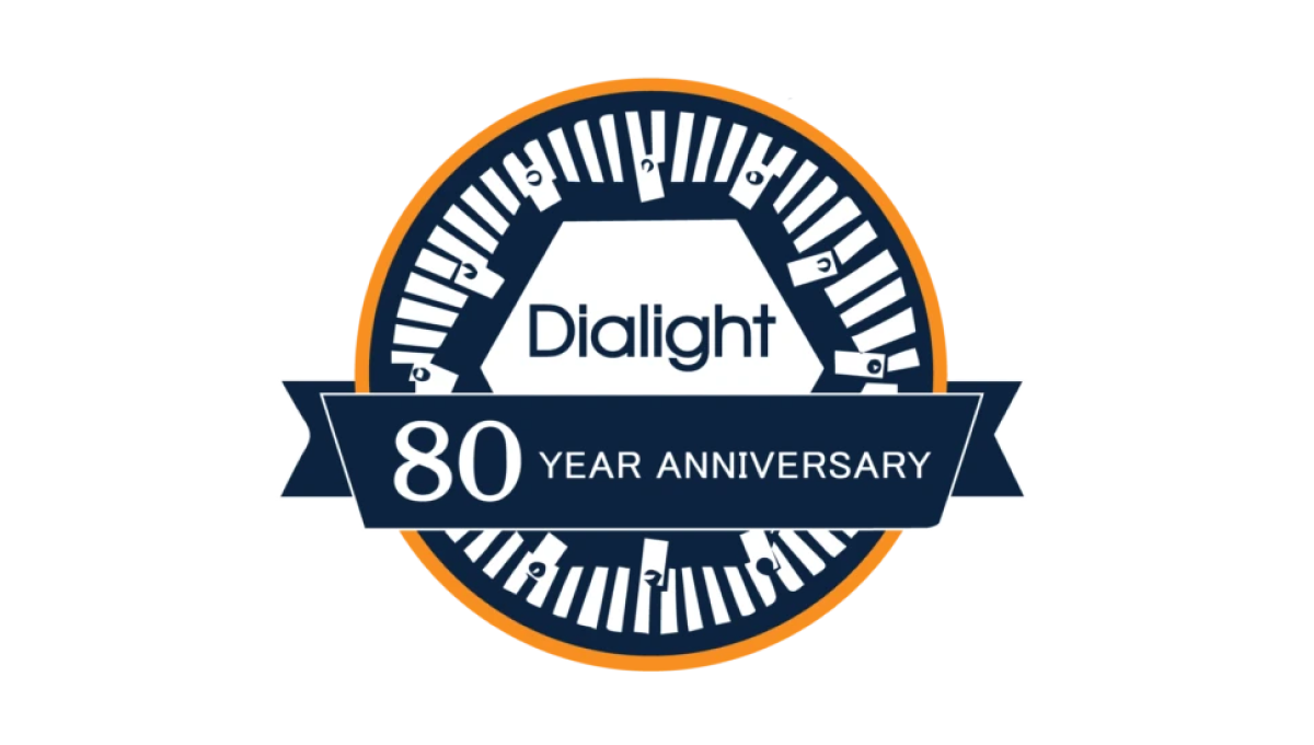
Starting with a classic circle shape, this mark doesn't use as many colors as the brand's traditional mark, but uses both a prominant, center placement of the usual logo with an illustration around the edges of the circle that adds visual cues back to their primary product which, in this case, is LED lighting. A ribbon across the bottom third holds the reason for celebration and creates a little bit of depth for this design.
More Details →Roy Rogers 50th Anniversary Logo
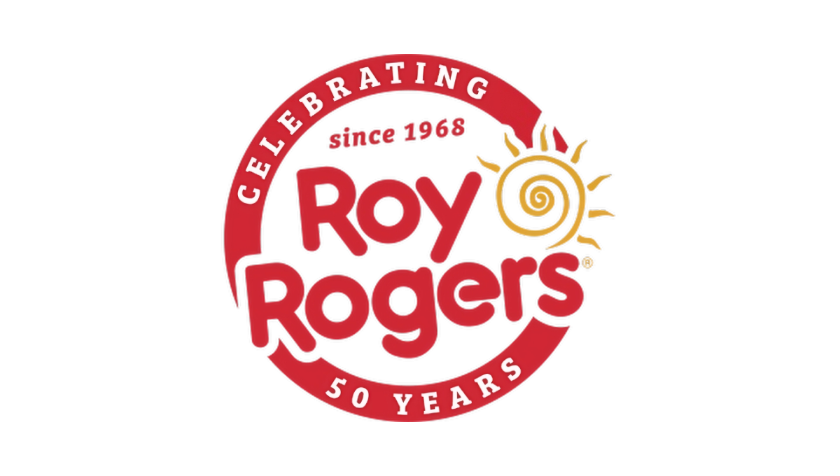
This restaurant chain started with a classic round seal-type shape with a thick border in their classic brand red color. That thick rim held text outlining the reason for their celebration. Then inside that circle and slightly overlapping the edges was placed their original logo with the same slight angle. The result combined a shape that supported the anniversary message with the logo that supports easy brand recognition.
More Details →Fort Dodge 150th Anniversary Logo
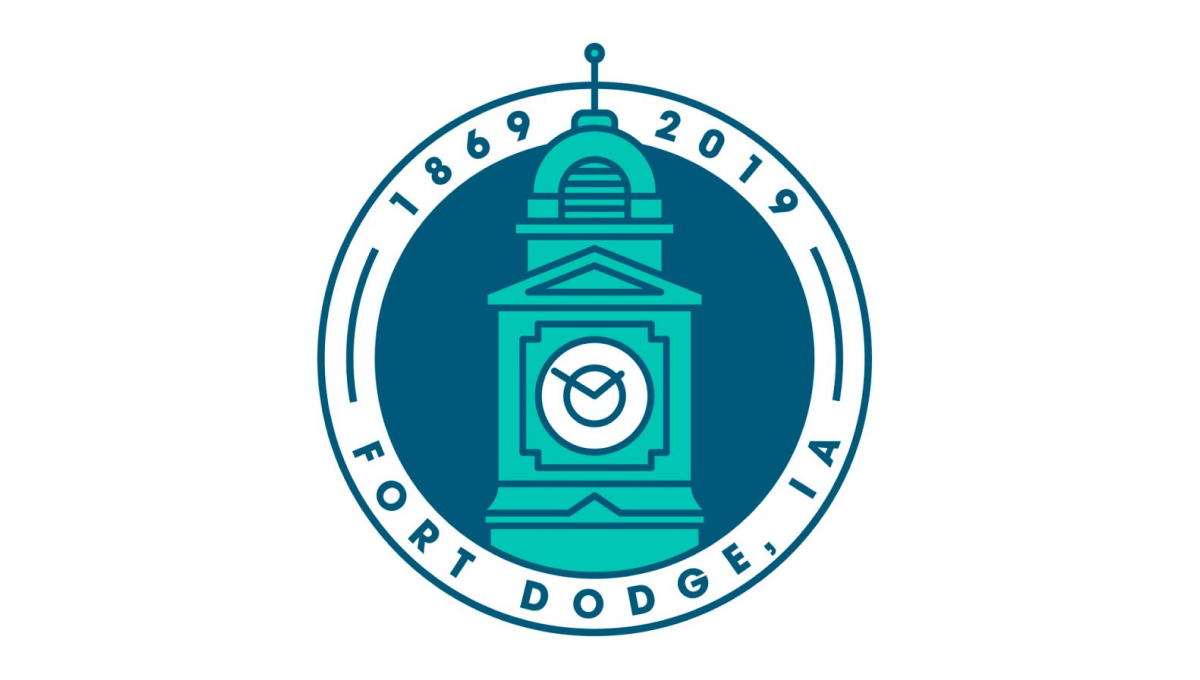
This clean, circular mark places the city's well-known clock tower in the center to establish a visual anchor. The clock tower comes up from behind the bottom part of the circle and overlaps the upper part of the circle. Around the rim of the circle sit the name of the city at the bottom and the years of existence, cleverly using the peak of the tower to separate the two years.
More Details →Brookline Bank 150th Anniversary Logo
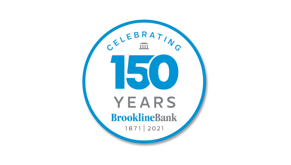
Round anniversary logos are easy to use on various channels including social media and this logo builds on that shape with a large number 150 to anchor the design visually in the banks' traditional brand blue. Above and below the number sit words to support that annivesary with the brank traditional logo at the bottom to help maintain brand recognition while the logo is in us.
More Details →Swain Resort 75th Anniversary Logo
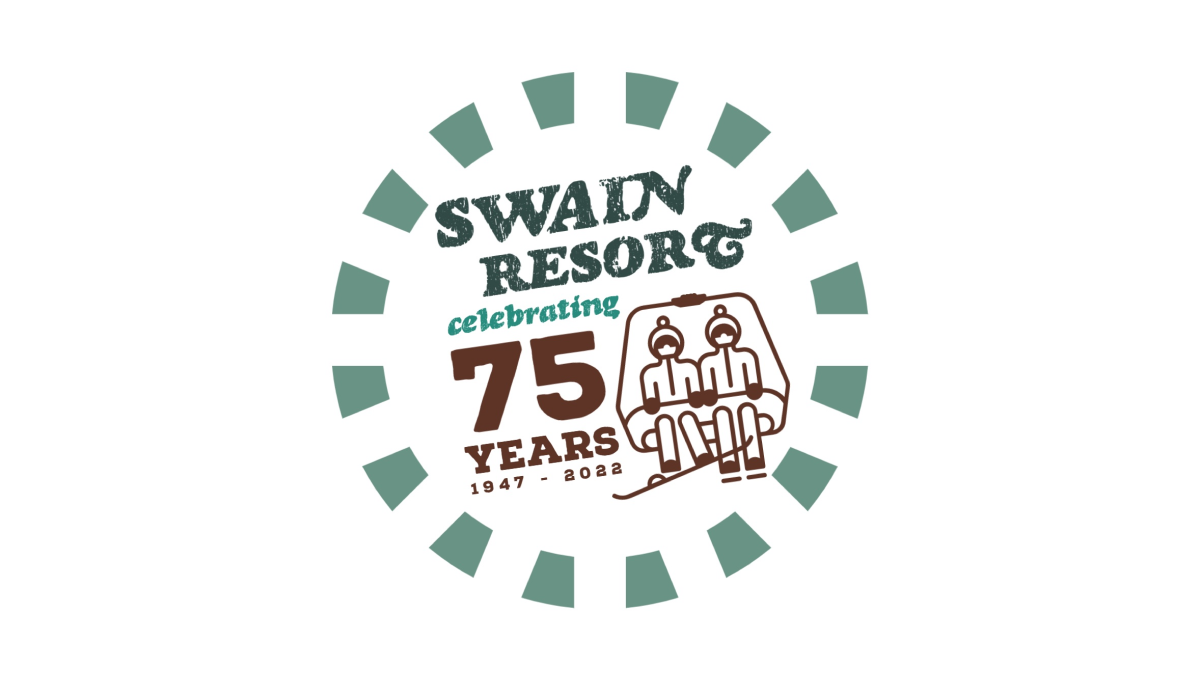
Swain Resort's anniversary logo start's with the brand's traditional green color and creates a shape using a dashed line circle. Inside sits the resort's name with maroon text highlighting the reason for the celebration. Finally, to the right of the years, sits an illustration of a ski chair in the same maroon color to add a playful tie back to the resort's primary activity.
More Details →St Joseph School 90th Anniversary Logo
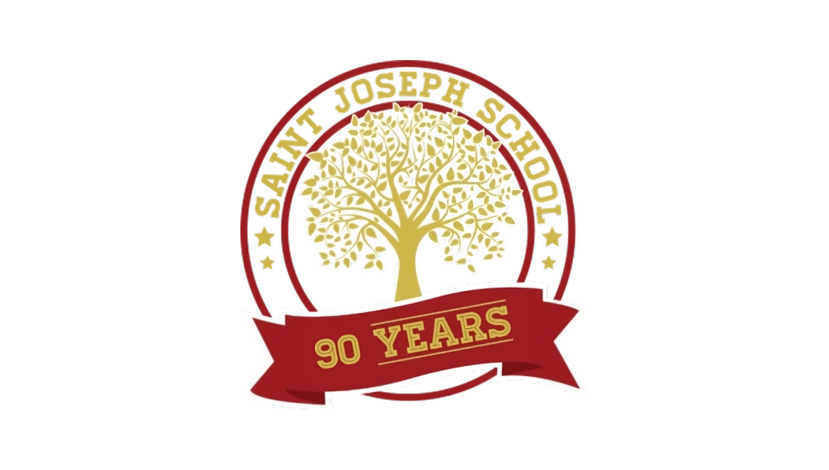
Using a classic circular shape with two rings creating space for words to wrap around the edge, this logo places the name of the school in that space to make it easy to recognize who is celebrating this anniversaty. Inside sits the school tree mark in the brand's traditional gold color. At the bottom is a simple red ribbon holding a recognition of how many years the school has been in operation.
More Details →St Bernard Catholic Church 175th Anniversary Logo
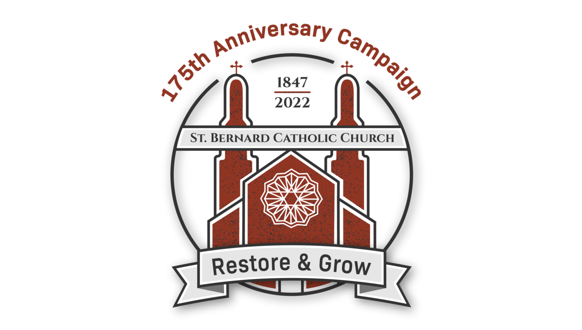
Featuring an illustration of the church's famous architecture in red, this art is wrapped in a circle to hold the bulk of the design. Above the circle sits the name of the church, at the bottom of the circle sits the church's tagline, and between the spires of the building sit the years of operation. Finally, just in front of those spires sits the name of the church.
More Details →Cedar Hills Community Church 60th Anniversary Logo
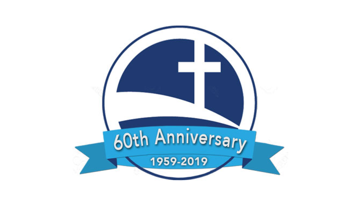
Some logos spend a lot of time creating space for text and names, but this logo keeps it super simple by simply placing the mark for the church - a cross on a sloping curve - inside of a circle. Then in front of that circle placing a blue ribbon that holds the reason for the celebratio and the years of operation.
More Details →The Landings Association 50th Anniversary Logo
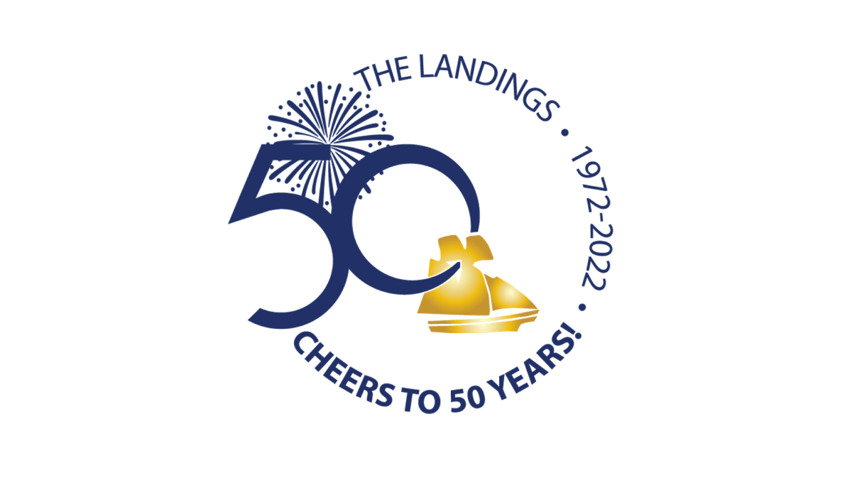
Keeping it simple, this logo places the name of the organization, the years of operation, and a celebratory message in a curving circle of words to create the rough shape. On the left side, the remaining gap in the words is filled with a large number fifty and an illustration of fireworks behind. In the center, a ship representing the orgnaization's main brand sits just in front of and below the number.
More Details →Glen Canyon National Recreation Area 50th Anniversary Logo
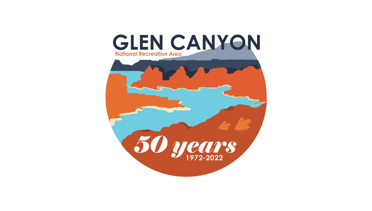
This logo starts with a circle holding the classic blue water and red rocks of the reservoir and landscape that creates it. Instead of completing the circle, however, the mark ends at the horizon line and the name of the area fills this space. At the bottom in a solid block of red color is "50 years" and a smaller line of text containing the years of operation.
More Details →PACE NSC 25th Anniversary Logo
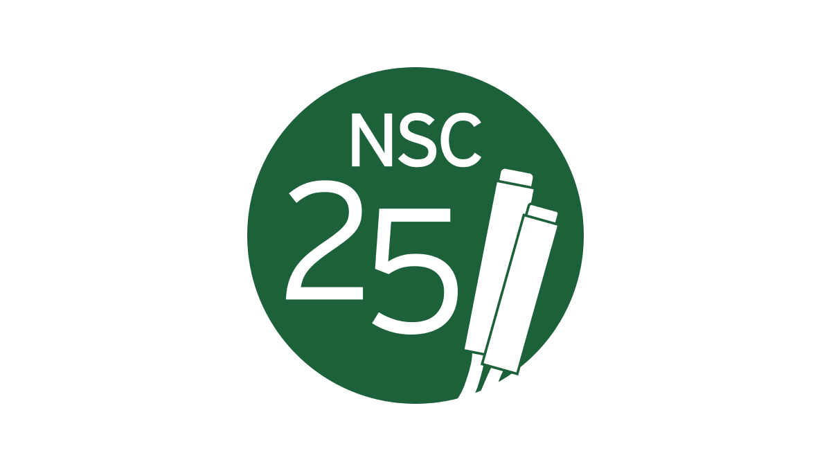
The Partnership for Academic Competition Excellence (PACE) is a 501(c)(3) non-profit that runs a quizbowl competition called the National Scholastic Championship (NSC). So their logo begins with a green circle in their primary brand color and adds a large number 25 on the left side with the two and five staggered to fit the shape of the circle. On the right, a simple illustration of the clickers they use in their comptition adds relevance with the name of the organization across the top.
More Details →Temple University Hospital 125th Anniversary Logo
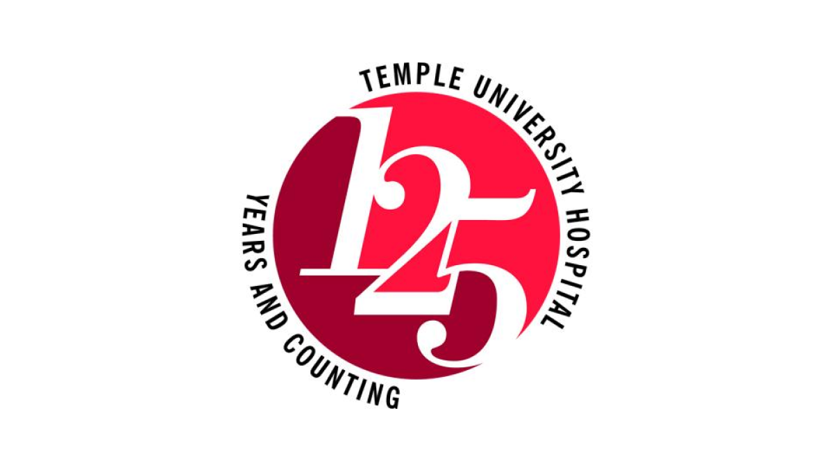
Two digits in a number creates their own design styles and three digits does the same. At 125 years, Temple University's Hospital stacked the three digits on an angle to create a clean layout for the number and focal point of this logo. Placing a circle behind the the university's classic colors and words wrapping around indicating the name and forward-looking vision for the organization, this logo is clean, simple, and effective.
More Details →U of R Dept of Psychiatry 75th Anniversary Logo
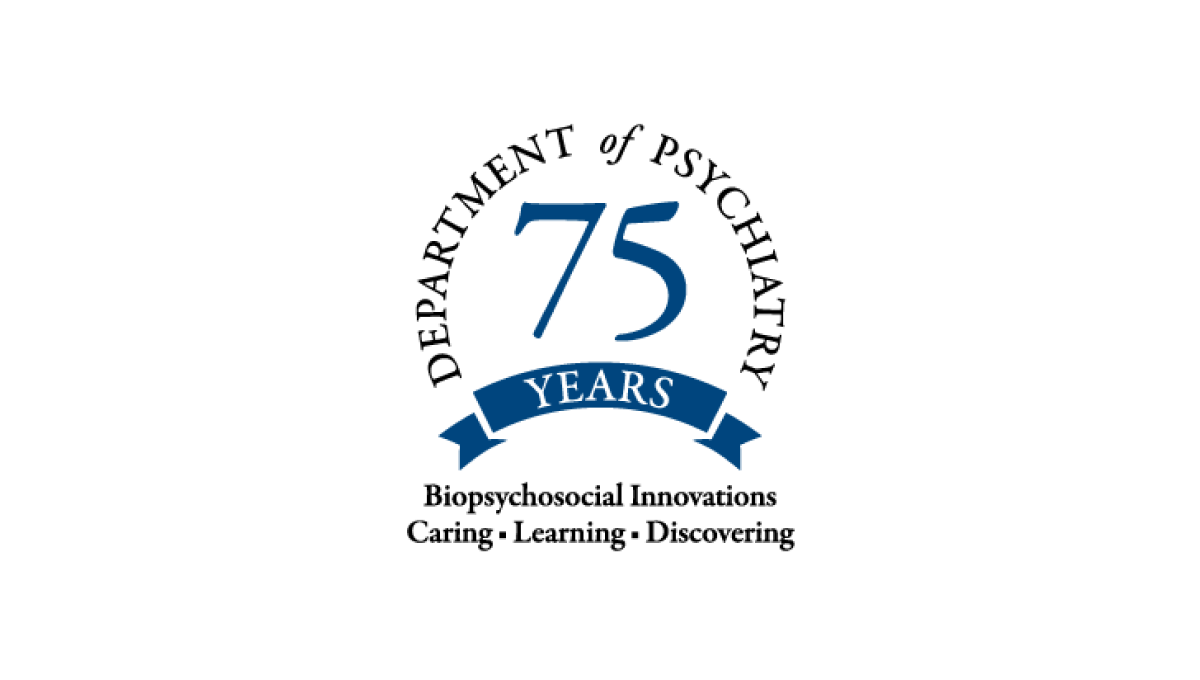
Never inteneded to stand on its own, this mark only appears on university-branded marketing like their anniversary web page, so it focused only on the department of the school. This name wraps in a circle around the number 75 with their brand values covering two lines below to reinforce their identify even as they expand it with this anniversary logo.
More Details →Sundown Ski Area 50th Anniversary Logo
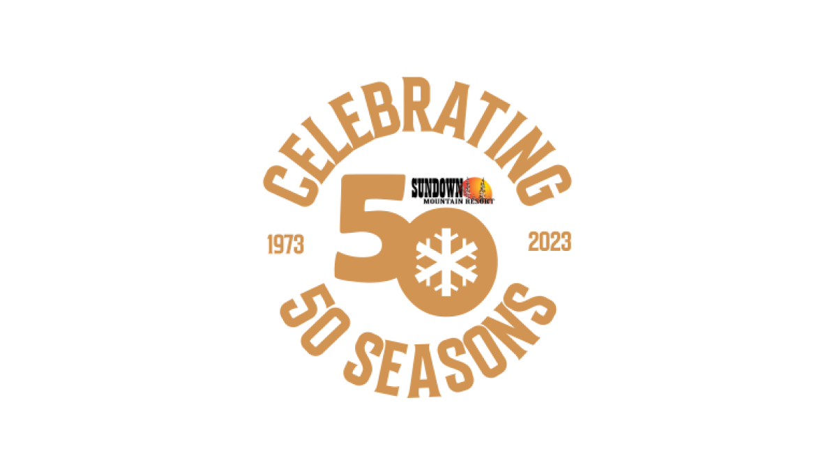
Sundown gave their designer a lot of creative freedom to create a mark that was unique to their anniversary. The result were the words "celebrating 50 seasons" forming a circle around a large number 50 and the years sitting to either side to break up the circle. The 0 in the large fifty contained a snowflake icon to tie it back to the skiing message and made room for the resort's original logo above.
More Details →Steamboat 60th Anniversary Logo
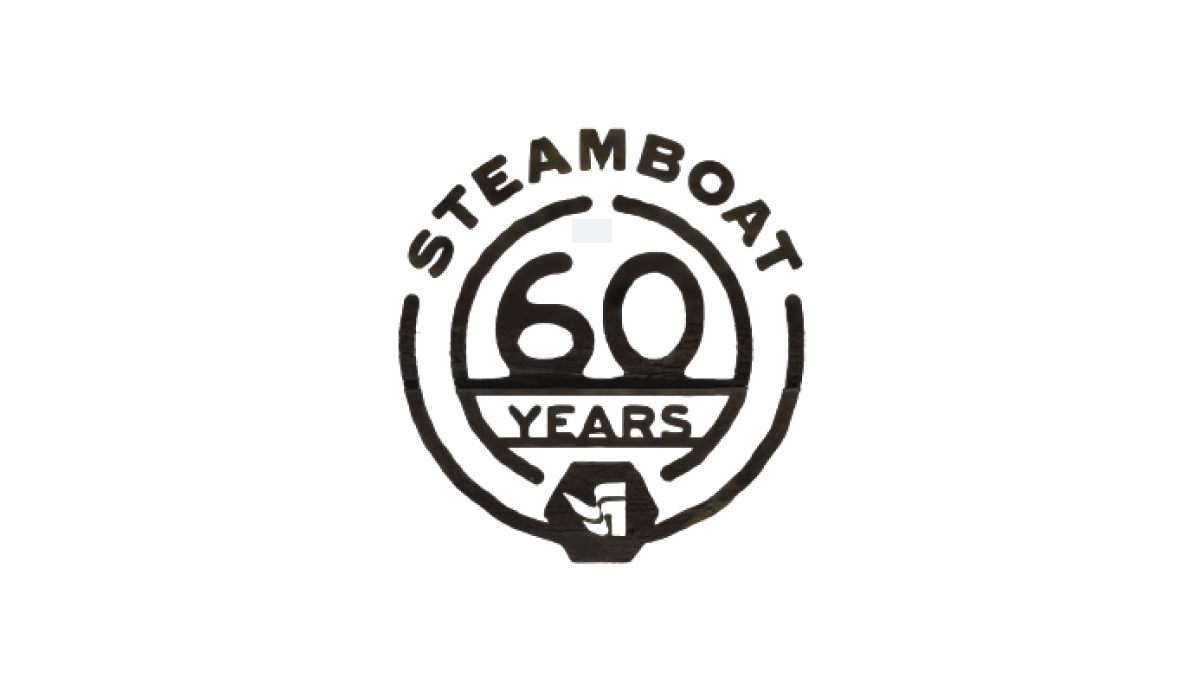
Steamboat used a really sharp bit of line art for their 60th anniversary. With the resort name arched across teh top, the number 60 set in the middle, and the word "years" set just below with a partial center ring to hold it all together, the resort's famous flag mark sits as an achor at the bottom to create mark that was easy to use and adapt to many situations during their anniversary season.
More Details →Red Fern Farm Services 50th Anniversary Logo
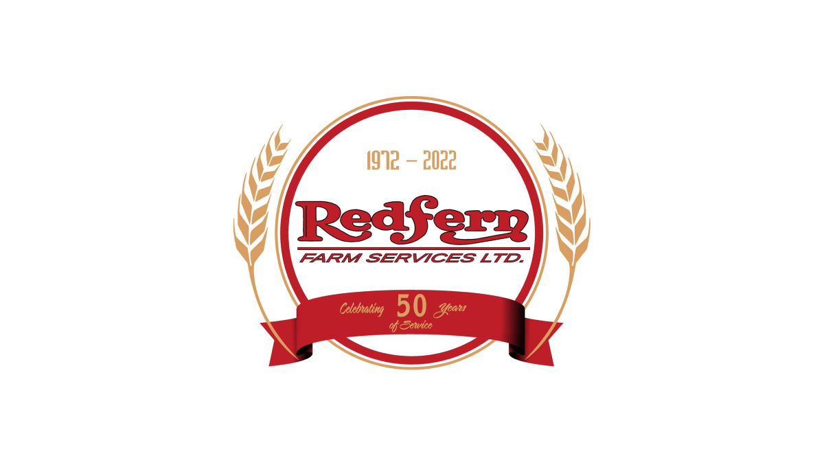
WIth a classic round shape to start, Red Fern added a ribbon with language pointing to the reason for the celebration. Inside the circle, the company's original logo was placed with their years of operation set in a lighter color just above. Similar to laurel leaves that flank the marks of film festival icons, the logo then adds curving stalks of wheat to add a final touch.
More Details →Nottingham Panthers 75th Anniversary Logo

Starting with a round black backdrop, this logo sets a large number 75 with a little bit of offset shadow for depth to create a strong foundation to buid on. The team name then wraps around the 75 and cleverly uses the "th" in the name as the "th" for the number and ties those together visually with color. A ribbon style element sits at the bottom showing the year the team was founded.
More Details →King Pine 60th Anniversary Logo
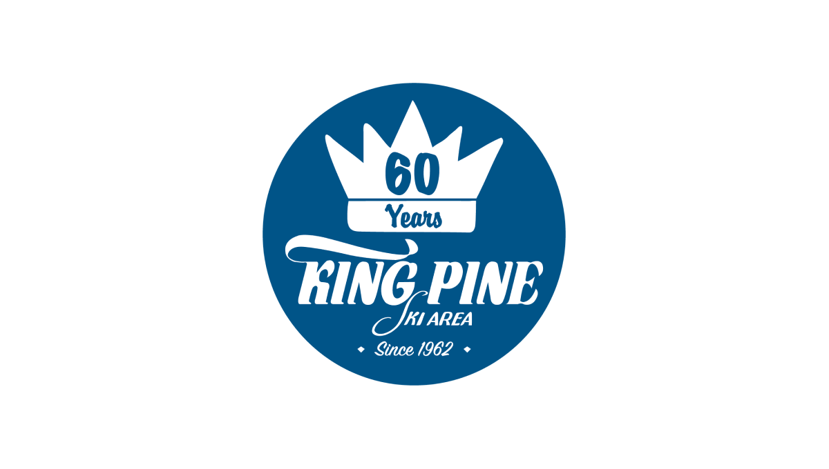
King Pine started with a filled circle in their brand blue color and placed a white version of their logo / word mark in the bottom center to tie back to their original brand and anchor the rest of the design. Above that a crown - referencing back to the "King" portion of the name - with the annversary number in the center balances to the top, with a "since" label at the bottom creates clean balance for the rest.
More Details →Foxbury Film Festival 25th Anniversary Logo

This logo starts with a circle and adds rings to give the designers space for both a silver border to hold the entire design together as well as space to add circular words to specify both the event's name as well as their years of operation. In the center, a stylized reference to the annerversay year and slowly brigtening colors draw attention both the number and center of the logo.
More Details →