White Anniversary Logos
Hardwood Classic 45th Anniversary Logo
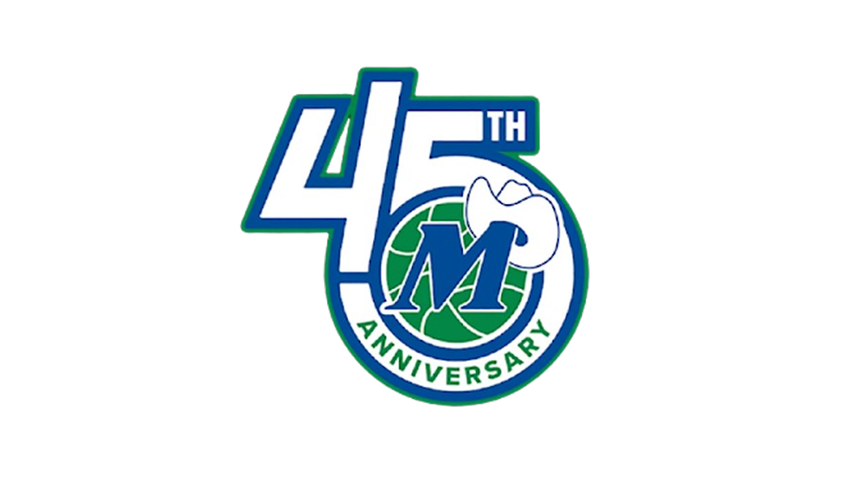
This anniversary logo has a clean, compact design with a bold and modern appearance. The anniversary number is the main focus, while a circular emblem is blended into the layout to give the design a unified look. A simple blue, green, and white color palette creates a fresh and professional feel, and a small graphic element adds a touch of personality. Overall, the logo presents the milestone in a clear, balanced, and recognizable way.
More Details →Cameron & Mittleman LLP 40th Anniversary Logo
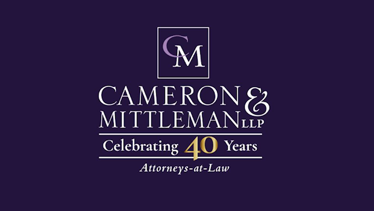
This anniversary logo has a clean, traditional look with a simple layout and a formal style. A dark background is paired with light-colored lettering, while a gold accent helps draw attention to the anniversary milestone. The company name is displayed in large, easy-to-read text, with a small monogram placed above it inside a thin border. A short celebratory message and a descriptive line below complete the design, giving it a professional and established appearance.
More Details →Disney Shanghai 10th Anniversary Logo
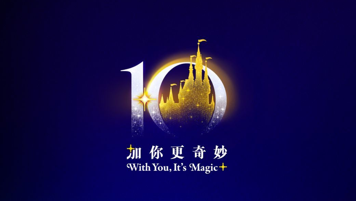
This anniversary logo uses a rich blue and gold color palette to create a polished and celebratory feel. The large “10” is designed with soft glowing effects, while a castle-like silhouette in the center adds a sense of imagination and wonder. Small sparkling details help give the design a magical atmosphere without making it overly complex. The mix of elegant typography and simple visual elements makes the logo feel memorable, festive, and connected to a long-standing brand celebration.
More Details →Disc Golf Pro Tour 10th Anniversary Logo

This anniversary logo has a bold and sporty feel, with a strong number “10” that stands out clearly. The design uses sharp lines and a modern font, giving it an energetic and active vibe. The colors are bright and eye-catching, helping the logo feel fresh and exciting. Overall, the logo feels confident and lively, celebrating the anniversary in a clean and upbeat way.
More Details →Onstage Ogden 75th Anniversary Logo

Onstage Ogden uses a simple, text-only wordmark for their traditional logo so this gave them the chance to add a mark for their anniversary without competition with their usual mark. In this case they kept the two-tone theme but combined a number seven on the left with a square extending to the right and the number five subtracted from that shape. A nice little design that's easy to swap with their usual mark.
More Details →The Kahala Hotel & Resort 60th Anniversary Logo

A hotel and resort in Hawaii, this logo normally features just the flower in the place where the number 60 sits in this anniversary variation. Not only did they design a number 60 that neatly matches the original logo in font and weight, they also cleverly pinned their original flower mark "behind the ear" of the number sixty. This clean adaptation looks beautiful and has a nice nod to the culture of the area.
More Details →The Consumers Association of Singapore 50th Anniversary Logo

In this case, we don't have to guess what their design concept was. To quote from the case study (see "source" link for this logo) about this logo, "The logo integrates the anniversary tagline to highlight the theme of the anniversary — Past, Present and Future. The arrow is designed with a sense of motion to represent the passage of time. The logo concept incorporates the arrow into the shape of the number 50 to create a sense of motion — moving forward. While the arrow head denotes the future, the circular motion of the arrow reflects how the past can provide a strong foundation for CASE to strive towards greater excellence in the future."
More Details →Trillion Creative 10th Anniversary Logo

Trillion Creative's logo is just as simple, clean, and well-designed as you'd expect from an agency. They already had the letters I and O within their work mark, so they simply swapped those out for a number 1 and 0 with the word years inside the latter. The result looks really sharp, is extremely easy to swap with their traditional logo during and after the anniversary, but is also easy to notice and understand the meaning of.
More Details →Deer Valley Music Festival 20th Anniversary Logo

This creative logo uses a large number 20 in the center as the main focal point of the design. With a silhouette of the mountains that surround the venue at the bottom and line art of the night time sky above, the result is a really compelling, creative mark and shape. Around three sides of that shape sit the various names and groups affiliated with the program.
More Details →Star Wars 40th Anniversary Logo
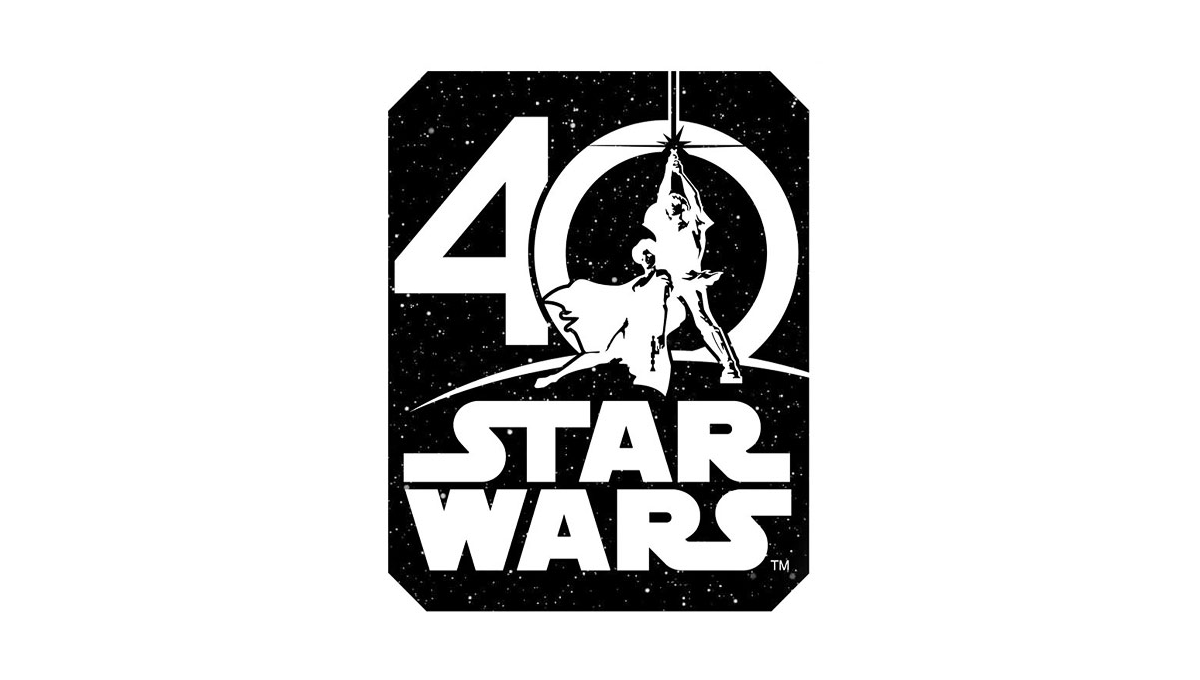
Using the classic image from the cover of the original movie, this logo places this iconic imagery in the center of a zero for the number 40. Below that, the traditional logo is stacked to create a foundation for this logo. Around the logo is a square, black shape to create the dark, space theme of the movie series.
More Details →Harley-Davidson 120th Anniversary Logo
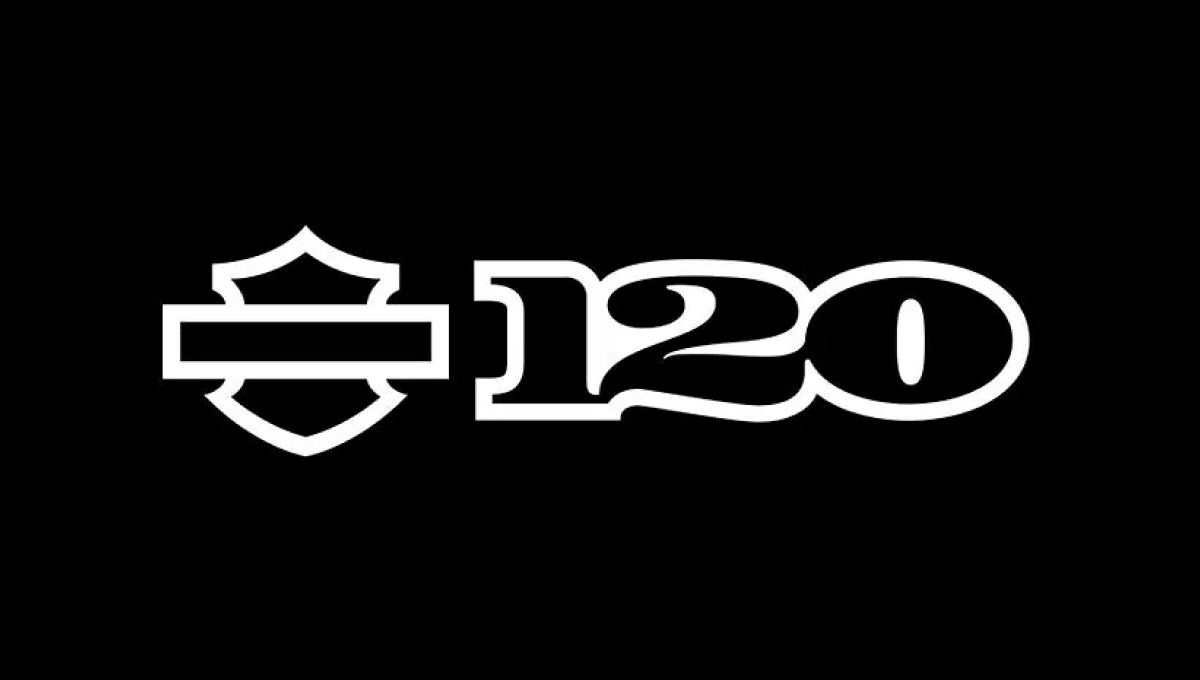
When you have a brand as famous as Harley-Davidson, using just the shape or your mark is more than enough for the general public to recognize it. Adding a clean number 120 to the right of this mark in their classic font all on a black background created a clean, simple design that was easy to recognize and neatly on-brand.
More Details →Goya 85th Anniversary Logo
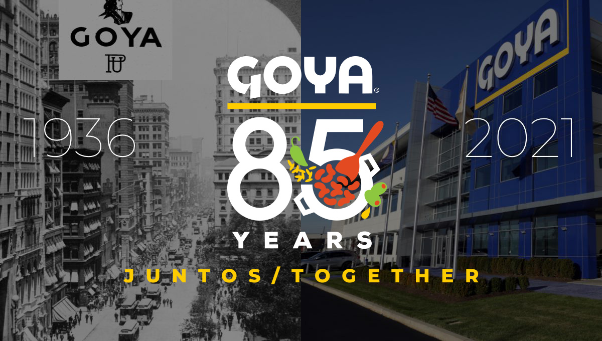
Starting with the company's original logo at the top, this design uses that logo's already existing yellow underline to create separate and shape for the rest of the logo. Below that sits a large number 85 with small illustrations of the fruits famously used in their foods with the word "years" at the bottom to complete the shape. In various lockups like the one pictured, they've also included the years of operation on the sides and a tagline at the bottom.
More Details →Big Sky Resort 50th Anniversary Logo
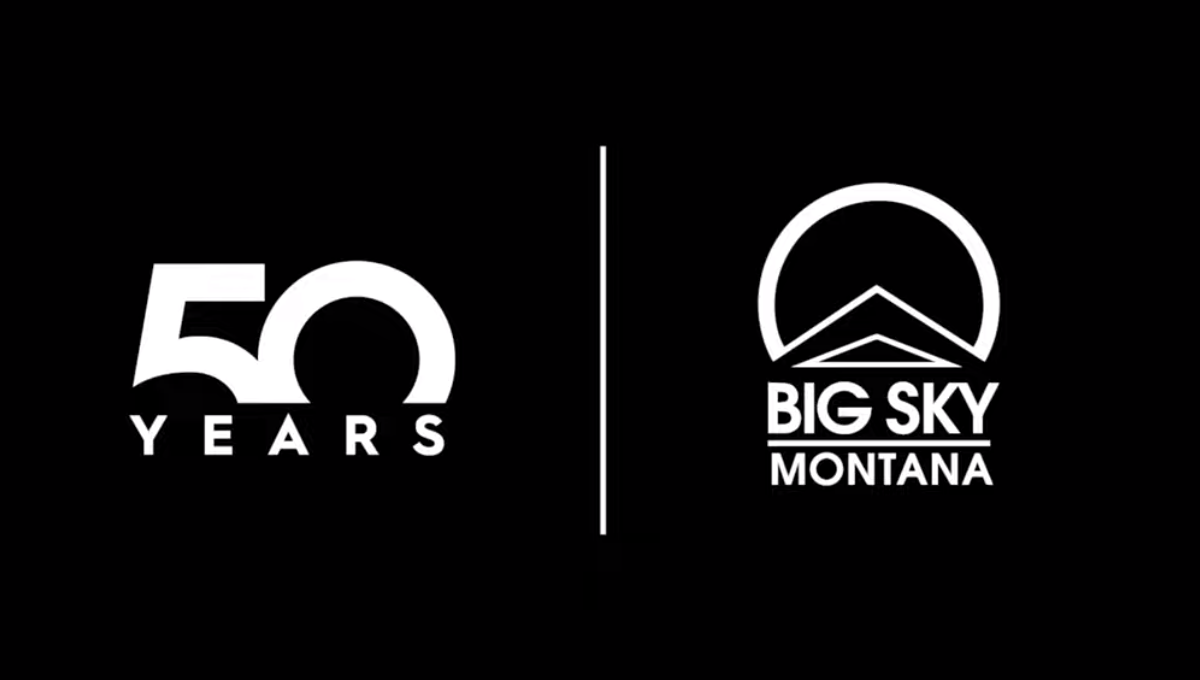
This well known mountain resort used a popular method of separating their traditional logo from a number mark with a vertical line. With a large block number 50 rising from behind a wide, all caps word "YEARS" they created a unique mark that can simply be paired with their original logo during the celebratory season without much work or effort to switch back and forth.
More Details →Sega 60th Anniversary Logo
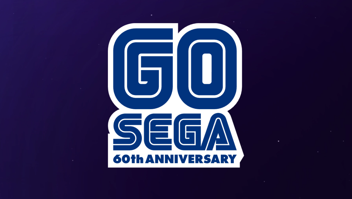
One of the most well-known aspects of the Sega brand are the block letters with a thin, inner-line creating a unique typeface that becomes even more easily recognized in their classic blue. In this case, they simple placed a large number 60 above their traditional word mark and the phrase "60th anniversary" below in the same typeface and color to create a nice mark that would work well in a variety of situations.
More Details →Gateway Church 15th Anniversary Logo
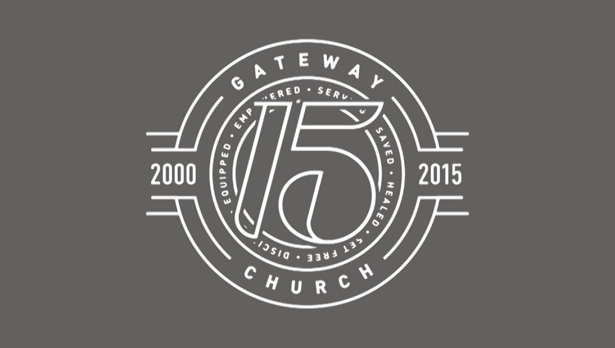
The clean, line-art logo starts with a series of white circles to create two rings where they place the name of the church and a list of the church's values. In front of that sits a large, stylized number 15. On either side are placed the years of operations with more lines connecting the horizontal years to the circular shape of the rest of the logo.
More Details →