Yellow Anniversary Logos
Vox 10th Anniversary Logo

Vox is a classic example of a company that cares deeply about brand consistency. And when you care about consistency, it can sometimes be either challenging or uneccessary to create an anniversary logo that adds in a bunch of new elements. So, Vox didn't. They took one of the existing brand fonts, made it nice and bold for a number 10, and placed their logo inside hugging the right line of the number 10. Clean, on-brand, effective.
More Details →Fair Lawn 100th Anniversary Logo

When you're hitting a big number, I love designs that really put that front and center. In this case, a large number 100 in yellow sits behind a simple graphic of a prominent landmark. To the left flies a banner with the word "anniversary" and below sits the name of the town that's celebrating the occasion. It's a simple, clean, and on-brand design that would work in a lot of situations.
More Details →Trollhaugen Recreation Area 75th Anniversary Logo

When your ski area has a name like Trollhaugen, you've gotta keep things a little bit playful in all of your marketing and they've extended that fun, causal vibe to this anniversary logo. With the common circle shape, they place an illustration of their mascot at the center, their name and anniversary above and below following the curve of the circle, and a blue ribbon holding their years of operation to tie it all together.
More Details →Love's Travel Stops 60th Anniversary Logo

A place that's supposed to be a friendly place to stop during your travels, this logo for loves starts with a big, friendly number that adds a little bit of shading to suggest a soft, rounded feel. A classic ribbon holds the word years with the years of operation at the bottom. All of this is held in a crest-like shape that keeps that friendly, rounded style around the corners and leaves just enough room for Love's original logo at the top.
More Details →Boilermakers Local 154 130th Anniversary Logo

This is a classic logo design that borrows some sports-style shapes, colors, and depth to create a really nice mark. Building around a large number 130 with a welder's mask below and their union's name and number above, some arcing laurel leaves and a ribbon to hold the word anniversary are layered to create a nice, cohesive design that's as easy to understand as it is bold.
More Details →Salem Academy & College 250th Anniversary Logo

In a classic style, this logo takes advantage of the three digits in their anniversary number to connect and overlap each number to create a creative, unique number mark that also creates space along the top right for a shortened name of the university. Around the number 5 sits the years of operation with the full name sitting below to create a simple, balanced logo that would work great in many contexts.
More Details →Encyclopaedia Britannica 250th Anniversary Logo

One of the most well-known brands in the world, Encyclopaedia Britannica's 250th anniversary logo features their classic thistle mark spread across three vertical book-spine rectangular shapes. In each of those shapes is a digit of their anniversary. Their name at the top and the word anniversary at the bottom lock up and balance this simple, clean design.
More Details →Edmonton Elks 75th Anniversary Logo
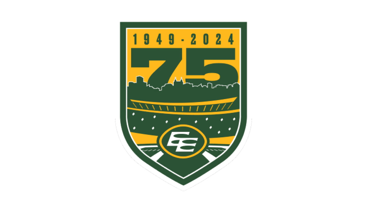
Using the classic sports style of large numbers, bold fonts, and crest-style shapes, this anniversary logo combines imagery that makes it clear the context is football and enough of the original brand to tie it back to the traditional mark. A large number 75 rises up from behind the stadium to complete this well-designed logo.
More Details →FIS 100th Anniversary Logo
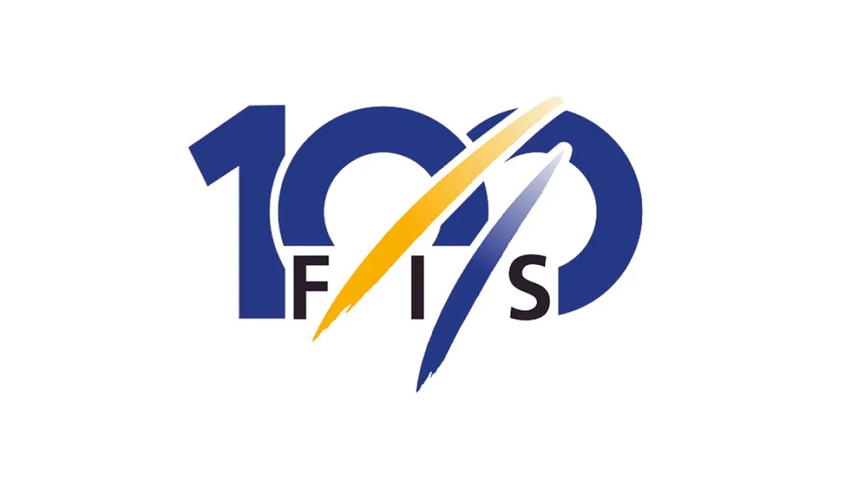
The organization behind professional skiing and ski racing, FIS started with a large number 100 in their classic blue color but added another of their brand colors, yellow, in two streats representing the tracks their members form down the mountain. With their traditional logo woven in at the bottom, this made for a really sharp, clean anniversary logo.
More Details →Pokemon 25th Anniversary Logo
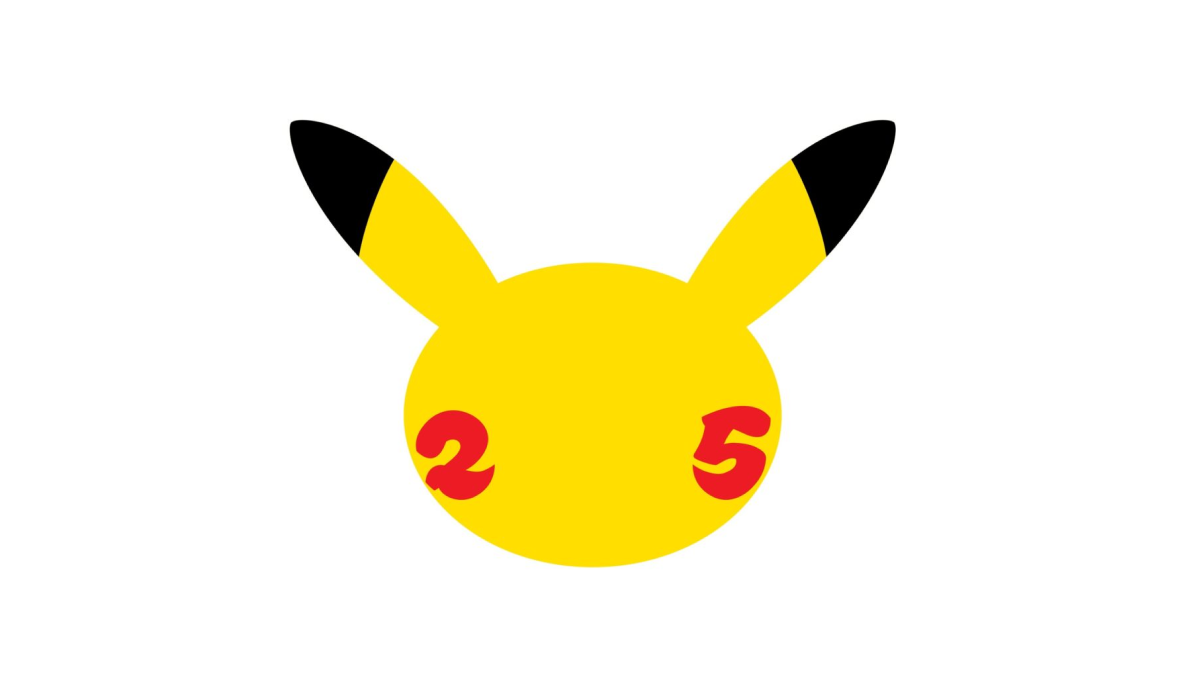
When you're a brand that's as popular as Pokemon, it doesn't take much more than replacing the eys of one of your most famous characters with simple, round representations of the numbers for the anniversary they're celebrating. Folks like me who don't know much about Pokemon may not recognize it, but people like my daughter who love the brand will know instantly what it represents.
More Details →Utah Jazz 50th Anniversary Logo
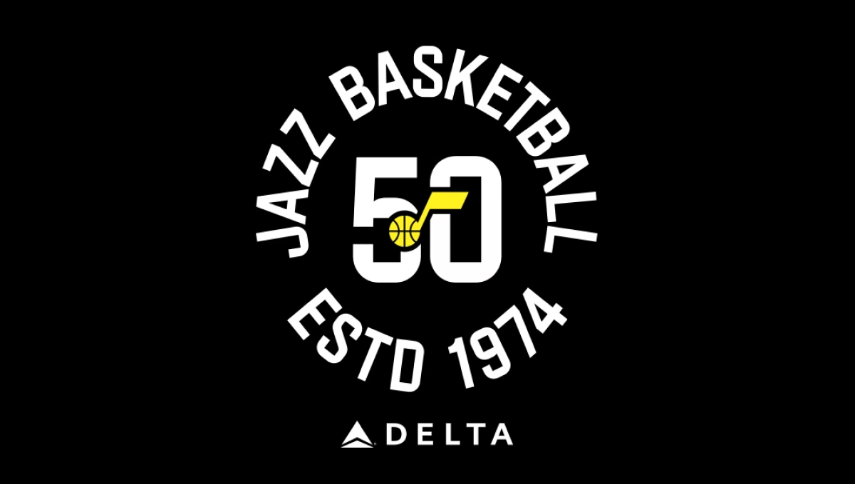
The team has embraced a number of colors over the years, but the black background of this logo and yellow mark in the center were a nice tie to one of their more popular and recent combinations. With a large number 50 in the center and the note mark laid above, this created a clean, but recognizable brand they could use in a variety of situations. In this case, wrapping the name of the team and the year it was established (along with their stadium sponsor) for a nice lockup for use online and in print.
More Details →Snowbasin 75th Anniversary Logo
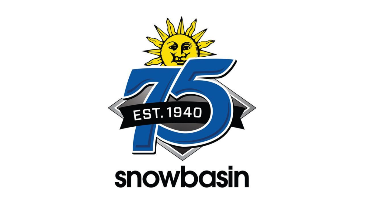
Featuring a large number 75 in the brand's usual blue, this logo adds a few simple elements in and around these digits. First, the brand's traditional mark peeks up from behind the 75. Next, a black ribbon holding the years of operation weave in and out of the main number mark. Finally, the traditional work mark for the resort sits at the bottom to make a fun, but recognizable design.
More Details →Carl's Jr. 80th Anniversary Logo
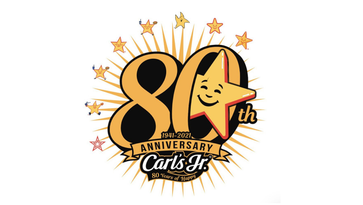
Using the chain's classic colors and fonts, this logo starts with a large number 80 in the center. Around the outside sit 8 of the famous stars the brand is known for with a larger version of that well-known shape peeking out from the zero. At the bottom sits their traditional logo to create a fun, creative logo that's also neatly on brand and easy to tie back to the original.
More Details →IDEA Health & Fitness Association 40th Anniversary Logo
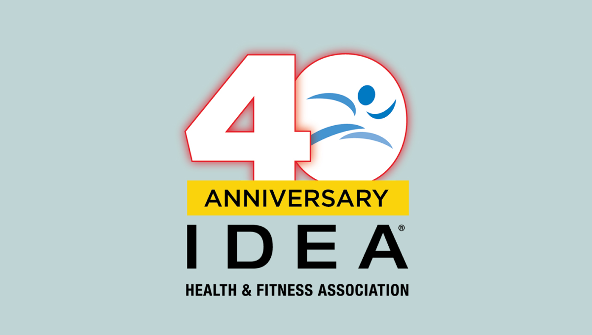
A large, block number 40 anchors this anniversary logo design. Both are outlined in red but the zero holds the blue mark that's traditionally used for this fitness organization's brand. Below is a yellow rectangle with a black word "anniversary" with the name of the organization sitting below to create balanced shaped that fits well in a square or circle avatar.
More Details →Bend Brewing Company 25th Anniversary Logo
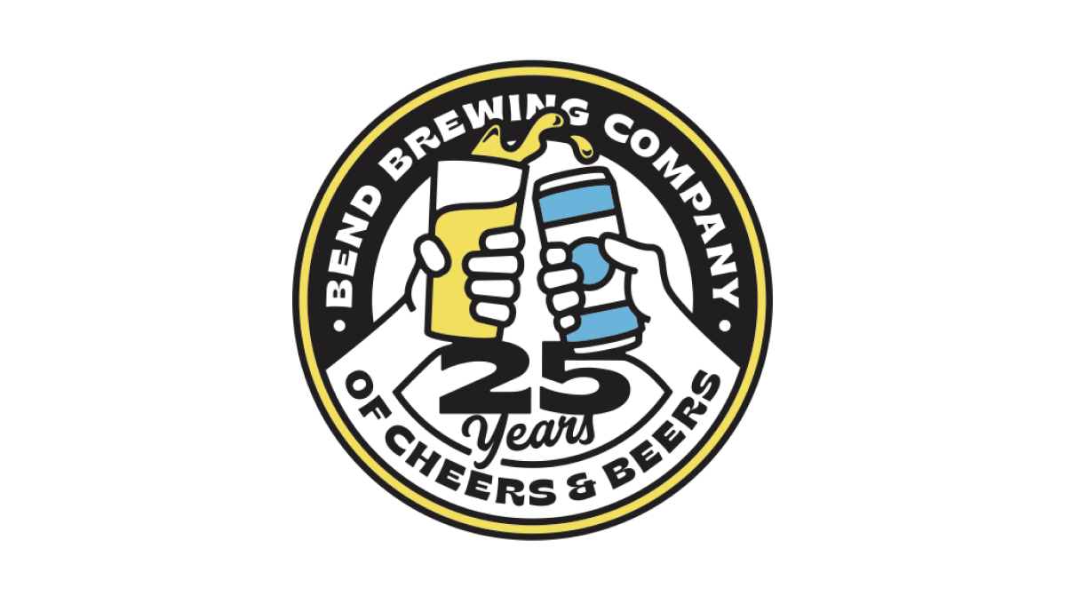
Starting with the classic round shape that is famous with anniversary logos but especially among beer-themed designs, this logo spells the brewery's name across the top half of the circle, a fun tagline across the bottom half, and a larger number 25 just above that. Filling the rest of the circle is an illustration of a "cheers" between a glass of beer and a can of beer.
More Details →Barley Brown's Brew Pub 25th Anniversary Logo
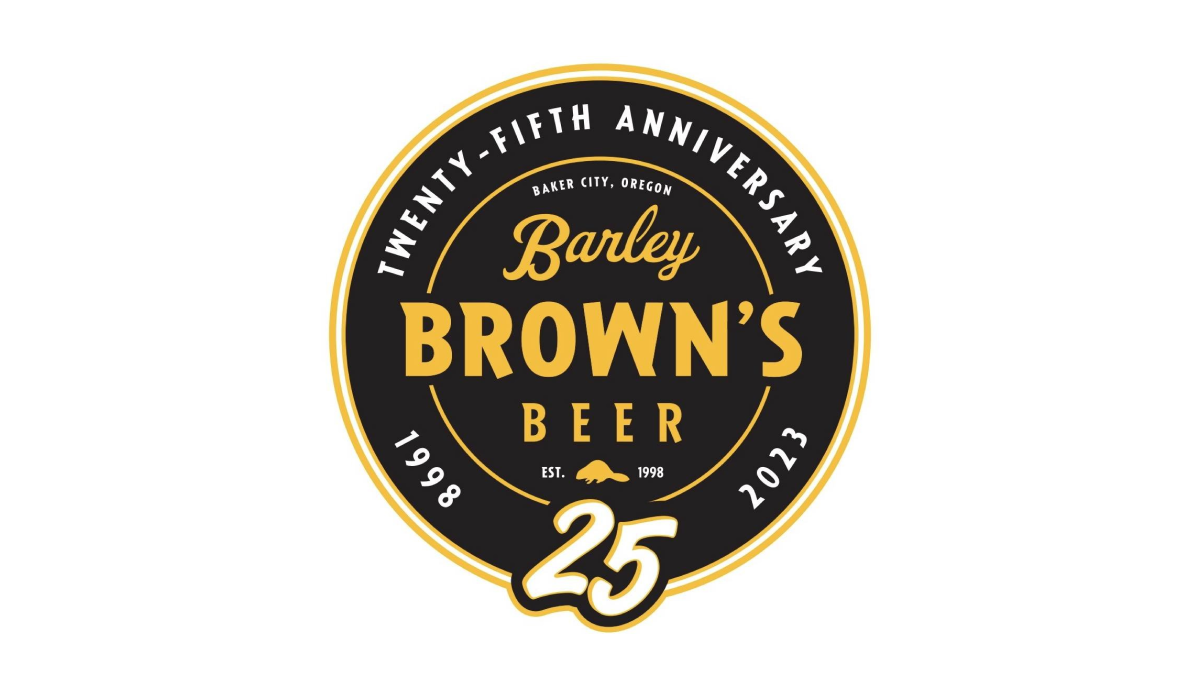
Using perhaps the most popular shape for anniversary logos, this brew pub starts with a black circle to create a clean shape to begin. In the center is the name of the company in a yellow that reminiscent of the beer they famously serve with a large, stylized number 25 at the bottom of the circle just extending beyond the edge of the circle.
More Details →Pittsburgh Penguins 50th Anniversary Logo
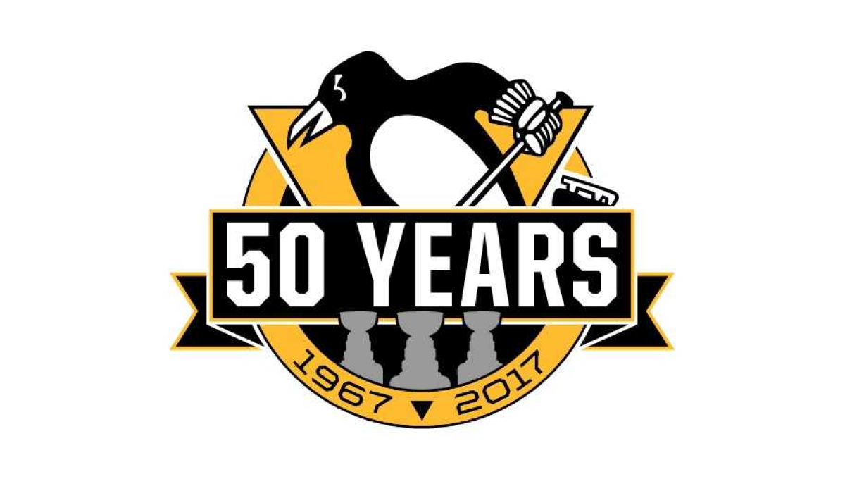
Using the styles famous for their original logo, this logo takes a large circle and wraps a "50 YEARS" ribbon just below center and around either side of the circle. The traditional penguin-with-a-hockey-stick mark slides up from behind with the years of the organization's existence at the bottom. Not to be overlooked are gray silhouettes for each of the team's Stanley Cup titles.
More Details →Jurassic Park 30th Anniversary Logo
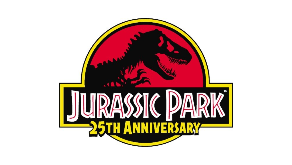
This famous first installment of what is now a multi-part video series already had an iconic logo that was not only the logo for the movie, but the fictional park inside the movie. So instead of starting from scratch, they added the words "25th anniversary" below the words in the traditional logo and called it good.
More Details →Legoland Florida 10th Anniversary Logo
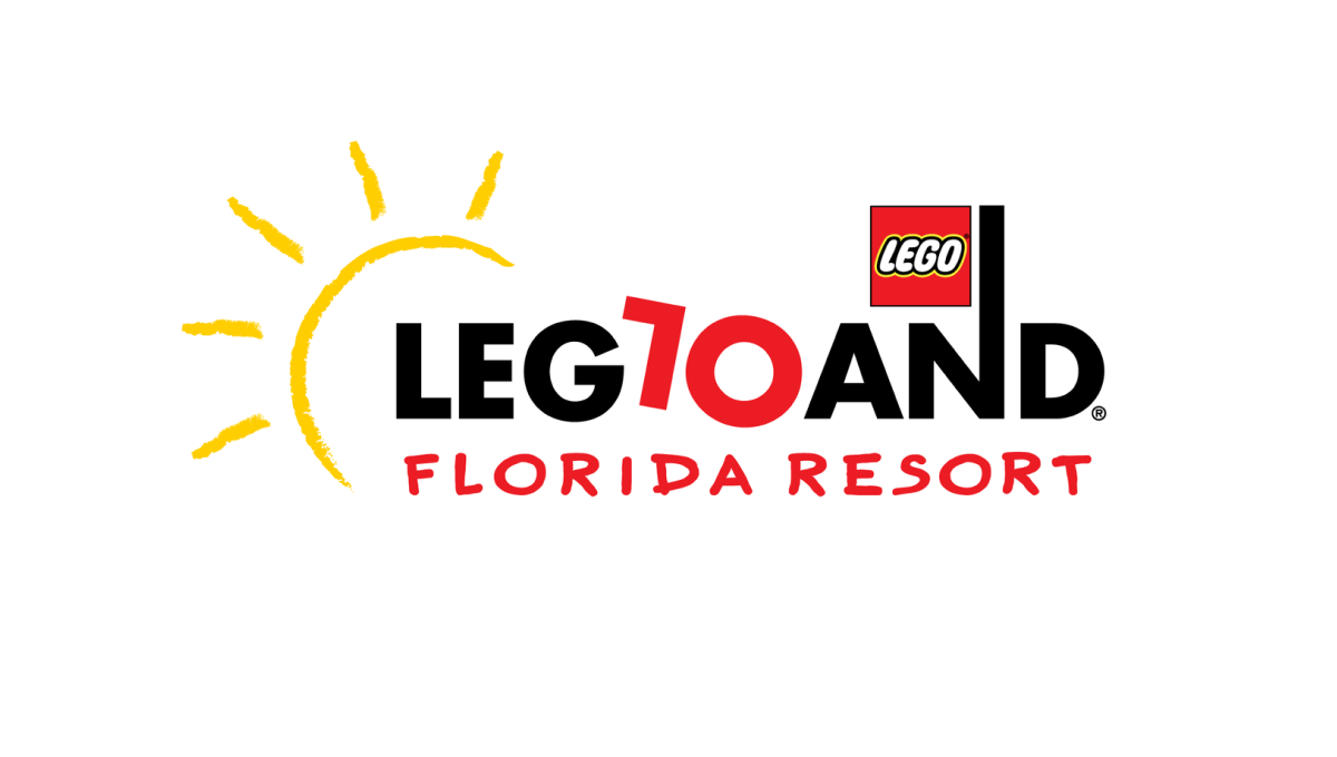
Legoland is a fun, playful place, so the logo of their 10th anniversary started with the same tone. The L and O of the word mark are converted to a 1 and 0 to both keep much of the original, recognizable mark but also make it easy to spot the reason for the change. By making the number slightly askew, it kept the playful tone while producing a design that was easy to swap for the existing mark.
More Details →Truly Nolen 85th Anniversary Logo
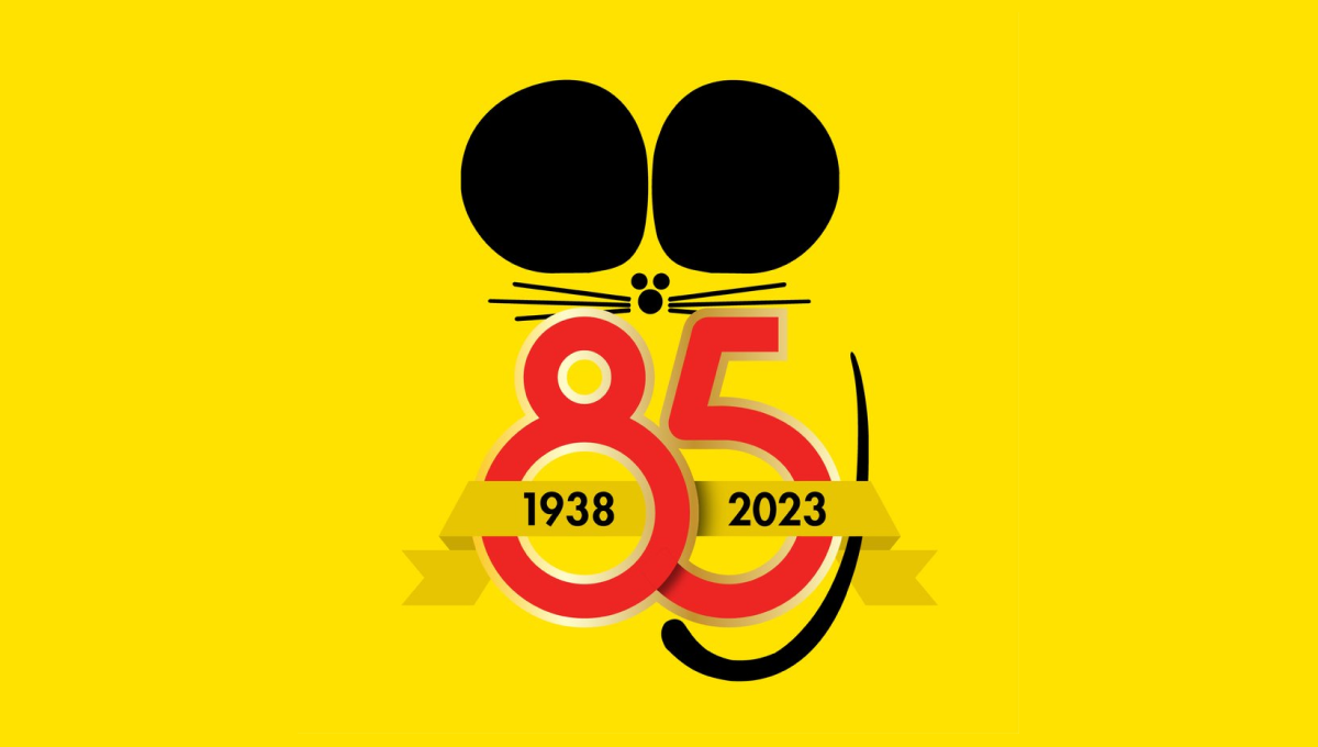
Famous for the black ears that are seen throughout their branding and products, Truly Nolen used the same concept as the starting point for their anniversary logo. A large block number 85 below the ears specified the year, a ribbon held the years of operation, and a thin, black tail made this mark easily recognizable.
More Details →Washington Commanders 90th Anniversary Logo
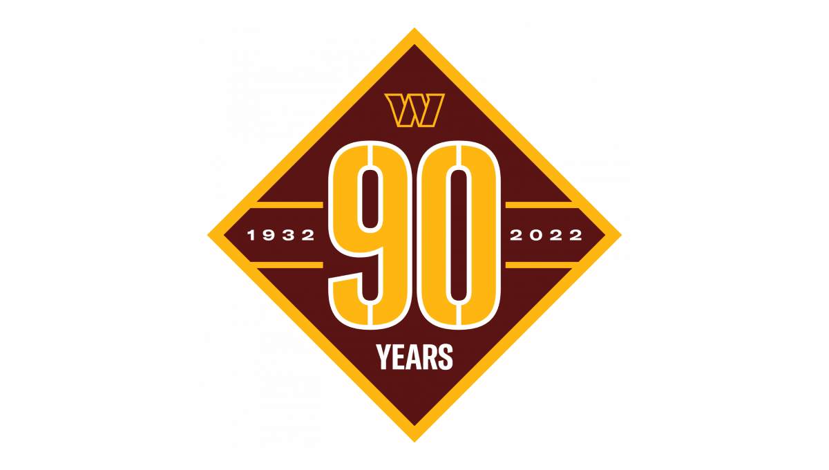
Starting with a diamond shape in the brand's red color, they place a large number 90 that nearly touches each straight side of the diamond and divides the shape into four remaining triangles. In the left and right triangles sit the years of operation. In the top triangle is placed the team's W mark while the bottom triangle holds the word "years".
More Details →Carlow University 90th Anniversary Logo
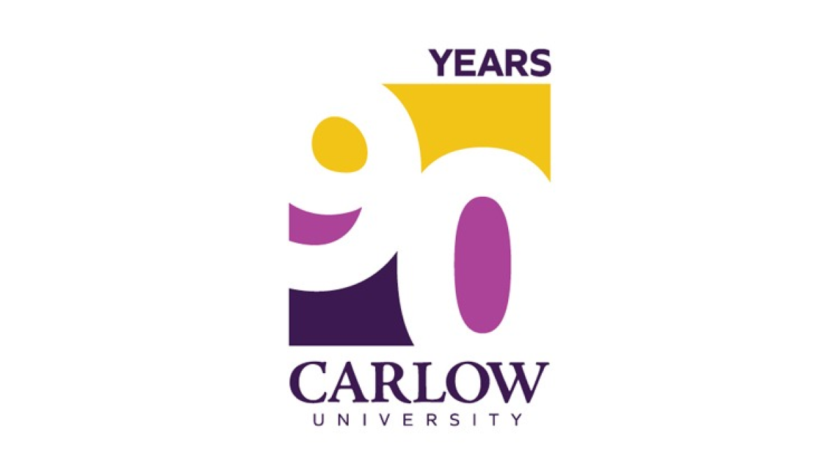
This logo clever uses negative space to blend the year they're celebrating with their brand colors. They start with a vertical rectangle that holds a staggered number 90 that goes edge to edge. The white number leaves spaces for three colors in the top, middle, and bottom of the rectangle with the word "years" at the top and the name of the university at the bottom.
More Details →Yosemite Grant 150th Anniversary Logo
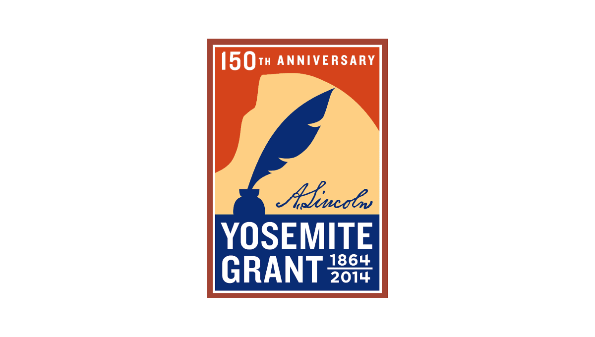
Along with Yosemite National Park's anniversary is the anniversary of the grant that made it possible. This vertical rectangle logo holds the name of the moment in blue at the bottom and features a silhouette of a feather pen extending up from that block. Behind the pen is a rusty orange color that holds the year of celebration just below the top edge of the rectangle.
More Details →Columbia International University 100th Anniversary Logo
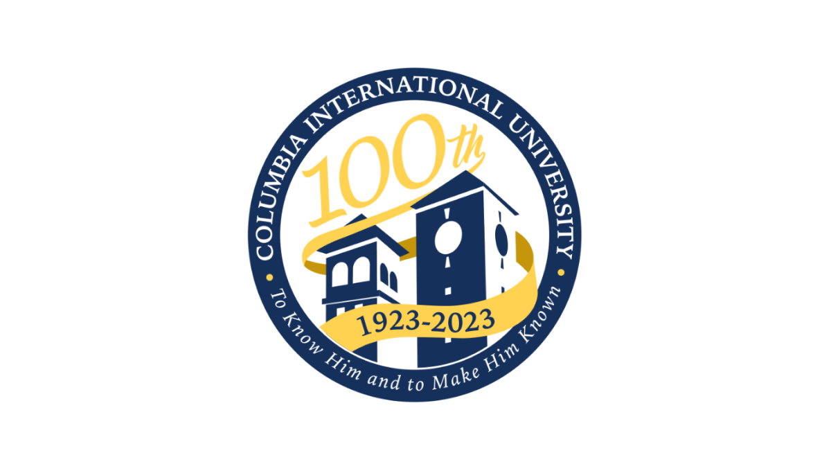
This logo uses a circle with a thick, navy blue border as the foundation. Inside that rim sit the name and mission statement of the school. Inside, a three dimensional silhouette of the school's famous buildings fills in the lower half of the space with a large number 100 in yellow following the angle of the buildings to neatly use the rest of the area inside the circle. A ribbon wrapping around the buildings then completes the design and contains the years of operation.
More Details →Los Angeles Lakers 75th Anniversary Logo
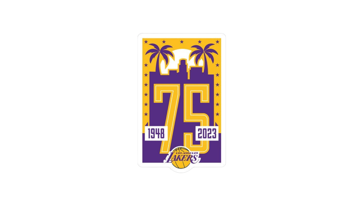
Built on a unique vertical rectangle layout and the team's brand purple and yellow colors, this logo builds on a skyline of a Los Angeles flanked by palm trees to create the backdrop for a large number 75. The team's traditional logo is inset below and on top of the 75 to make it easy to tie back to the organization with a simple white rectangle on either side of the number to denote the dates.
More Details →Big White 60th Anniversary Logo
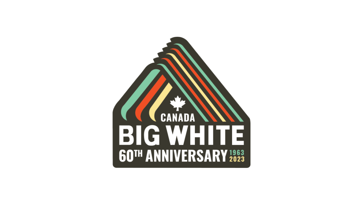
With a throwback to one of Big White Mountain Resort's original logos, this adaptation brings in a modern, sticker-style badge and extra line of text to hold the anniversary label, with a three-color design that's also a little bit retro. A simple combination of past and present, this is a great use of original logos with modern design needs.
More Details →