45th Anniversary Logos
Hardwood Classic 45th Anniversary Logo
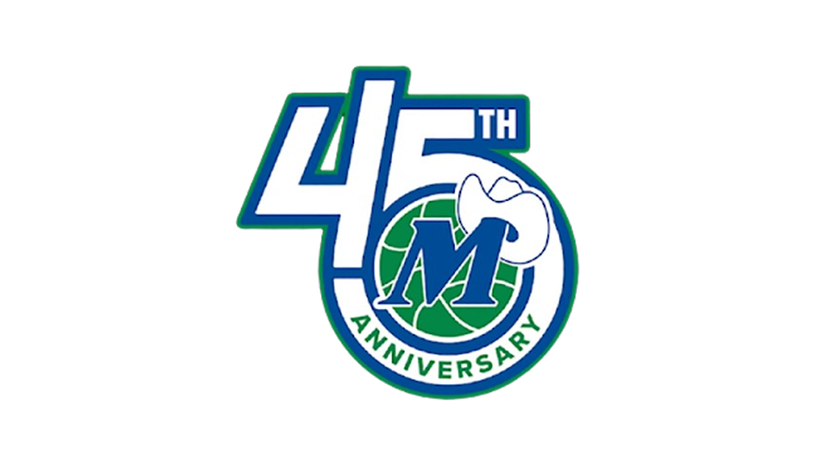
This anniversary logo has a clean, compact design with a bold and modern appearance. The anniversary number is the main focus, while a circular emblem is blended into the layout to give the design a unified look. A simple blue, green, and white color palette creates a fresh and professional feel, and a small graphic element adds a touch of personality. Overall, the logo presents the milestone in a clear, balanced, and recognizable way.
More Details →Anderson Hospital 45th Anniversary Logo
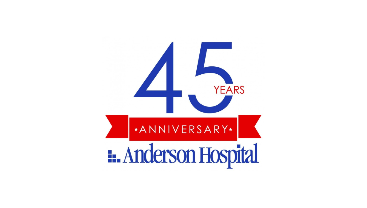
Keeping it simple, Anderson Hospital started with their traditional logo in the classic dark blue color as a base and built vertically from there. First came a red banner holding the word "anniversary" with the number 45 in brand blue above that. To keep balance, the word "years" is inset within the number 5 to avoid it sticking too far out to the side of the number which provides the focal point and primary visual weight for the logo.
More Details →NHS Retirement Fellowship 45th Anniversary Logo
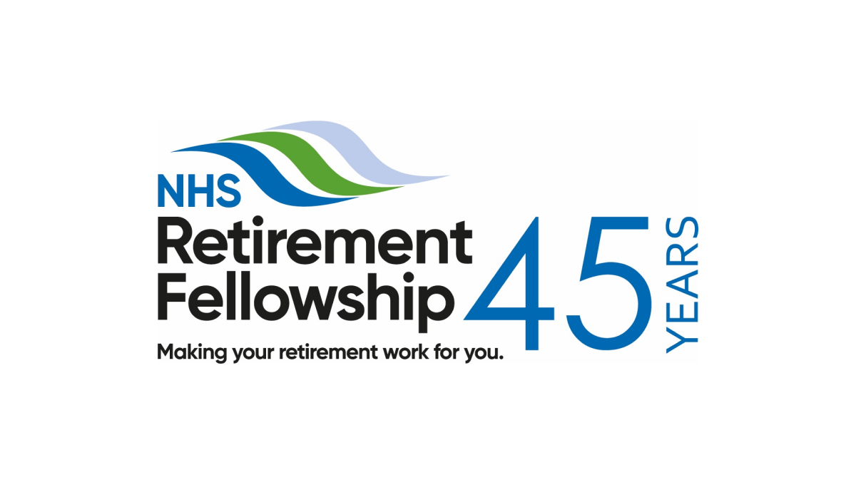
This logo keeps it simple by adding a number 45 to the right of their traditional logo. By putting that number in the brand's traditional blue and a vertical word "years" to the side, they created a simple, effective logo that doesn't stray from the original brand and doesn't add too much complexity around their hope to celebrate this milestone.
More Details →