150th Anniversary Logos
Chicago Cubs 150th Anniversary Logo
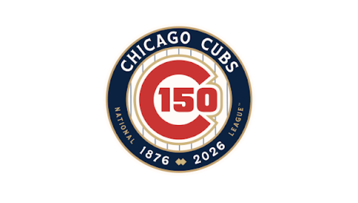
This anniversary logo features a classic, emblem-style design with a clean and timeless appearance. A circular badge serves as the centerpiece, combining the milestone number with familiar brand elements in a balanced layout. A limited color palette and subtle metallic accents give the design a polished, commemorative feel without being overly decorative. Supporting text below reinforces the anniversary message, creating a strong, professional logo that highlights tradition, longevity, and a sense of lasting achievement.
More Details →Colorado 150th Anniversary Logo
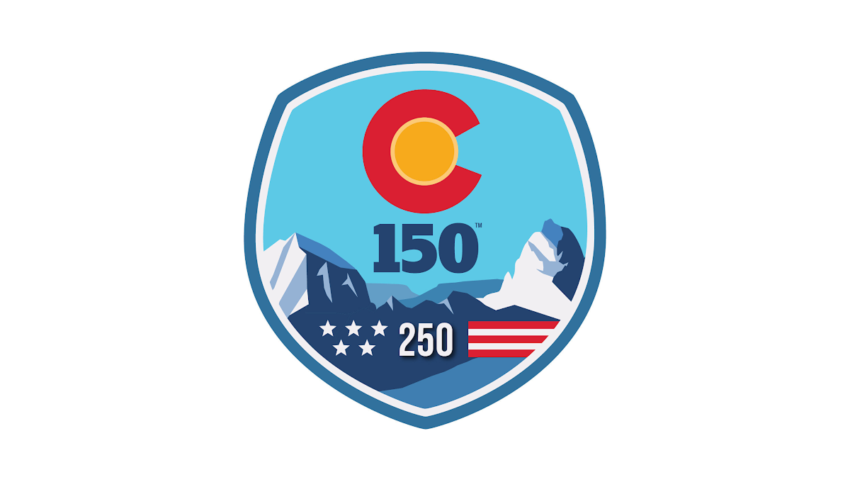
This anniversary logo uses a bold, badge-style design with a strong, recognizable shape. Bright colors and simple graphic elements create a memorable, outdoor-inspired look, while the anniversary number is placed prominently in the center to emphasize the milestone. Stylized landscape features and a few symbolic details add character without making the design feel crowded. Overall, the logo has a clean, confident appearance that celebrates a long history in a visually engaging way.
More Details →Winnepeg 150th Anniversary Logo

The Winnipeg 150th Anniversary logo is a rich tapestry of symbolism reflecting the city's heritage and Indigenous roots. At its core, the design features the outline of a turtle shell, representing Turtle Island, overlaid with the current footprint of Winnipeg. Elements such as the North Star, the Red and Assiniboine rivers forming the profile of Mother Earth, a crocus (part of the city crest), and sage and tobacco crops are intricately woven into the logo. This emblem encapsulates Winnipeg's journey, celebrating its shared stories and future aspirations.
More Details →Patrick & Co 150th Anniversary Logo

This design combines all of the classic annivesrary logo elements into a neat, tidy package. Starting with a circular shape that holds the words marking the anniversary celebration, the original name set in the middle with horizontal lines to break the circle into two semi-circles, and a nod to the Golden Gate Bridge to tie it back to where this company calls home.
More Details →Zions Bank 150th Anniversary Logo
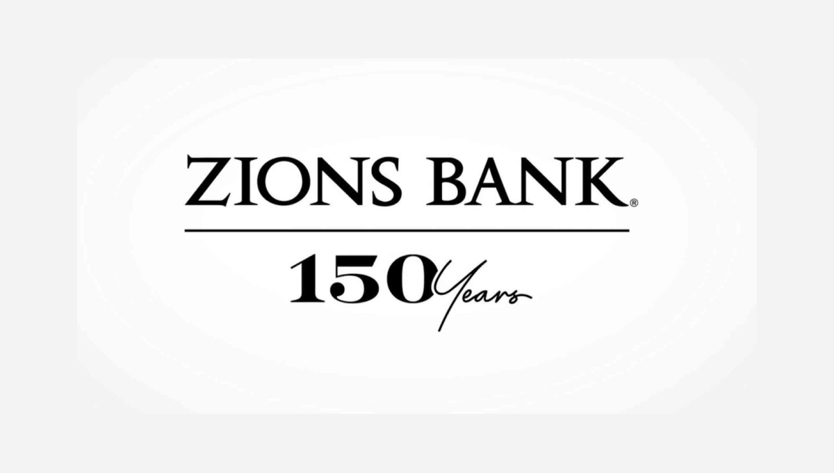
The traditional brand for this bank features the dark, serifed typeface you see at the top, so this logo build on that professional look. instead of placing a vertical line with the anniversary mark to the left or right, this logo places a horizontal line below the existing logo and then adds a simple number mark a similar font and color as the original logo. Given how wide their existing mark is, this was a great move to provide a little bit of balance and avoid further stretching the logo horizontally.
More Details →Fort Dodge 150th Anniversary Logo
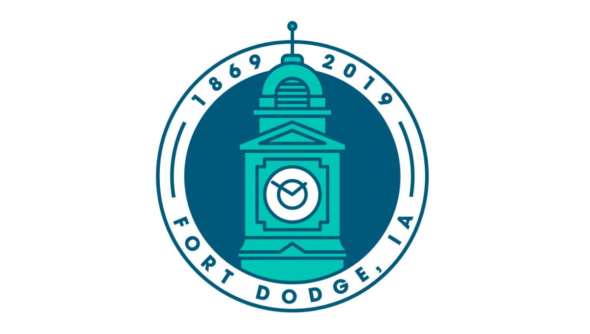
This clean, circular mark places the city's well-known clock tower in the center to establish a visual anchor. The clock tower comes up from behind the bottom part of the circle and overlaps the upper part of the circle. Around the rim of the circle sit the name of the city at the bottom and the years of existence, cleverly using the peak of the tower to separate the two years.
More Details →Brookline Bank 150th Anniversary Logo
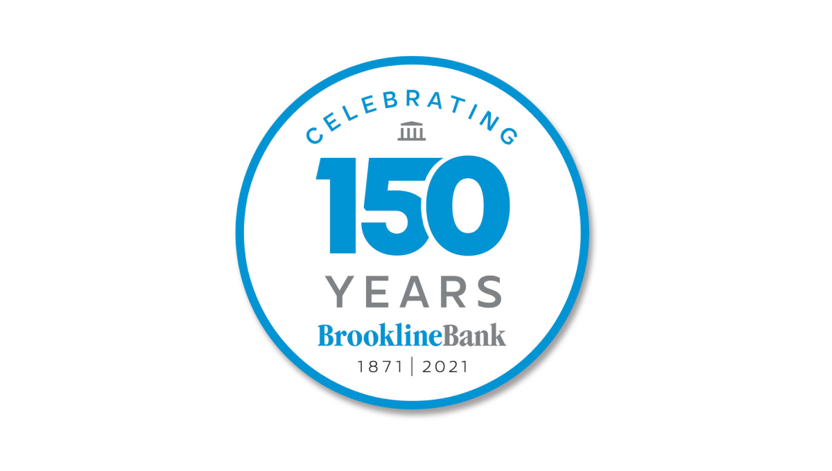
Round anniversary logos are easy to use on various channels including social media and this logo builds on that shape with a large number 150 to anchor the design visually in the banks' traditional brand blue. Above and below the number sit words to support that annivesary with the brank traditional logo at the bottom to help maintain brand recognition while the logo is in us.
More Details →Yosemite Grant 150th Anniversary Logo
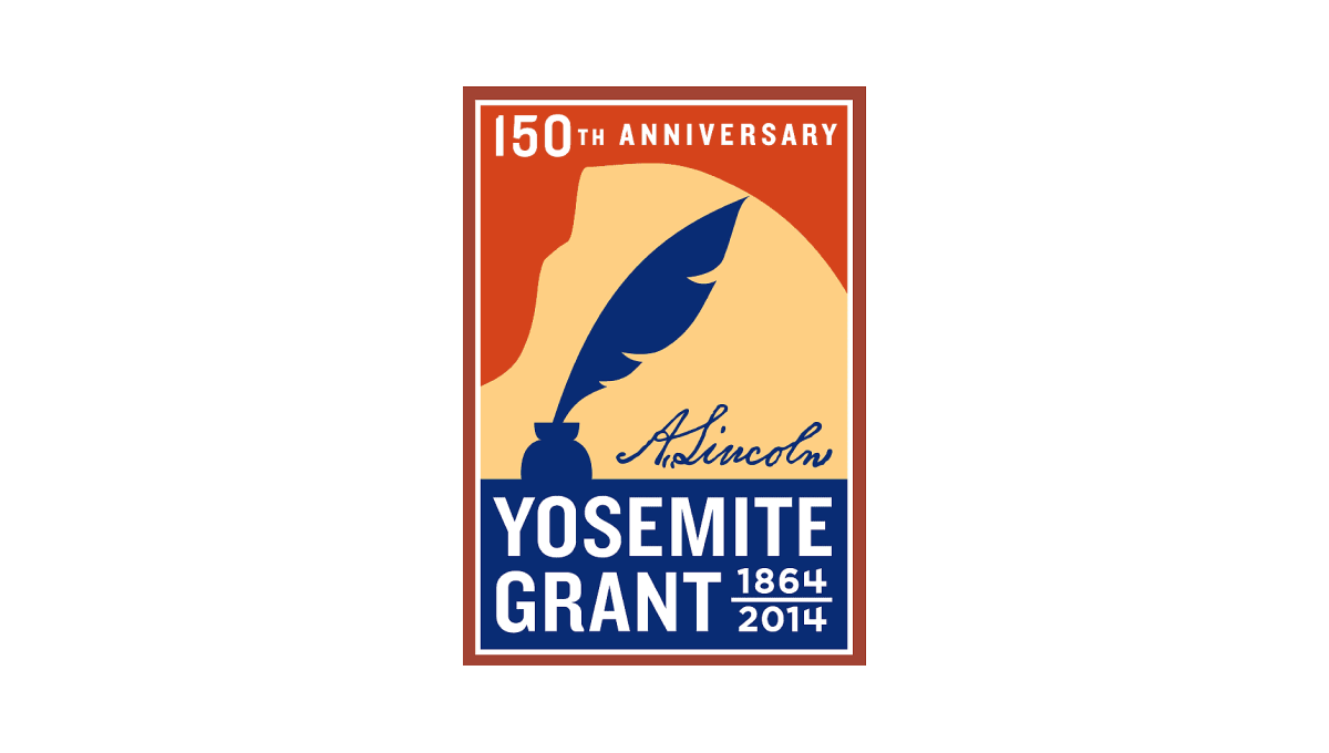
Along with Yosemite National Park's anniversary is the anniversary of the grant that made it possible. This vertical rectangle logo holds the name of the moment in blue at the bottom and features a silhouette of a feather pen extending up from that block. Behind the pen is a rusty orange color that holds the year of celebration just below the top edge of the rectangle.
More Details →