85th Anniversary Logos
Goldenwest Credit Union 85th Anniversary Logo
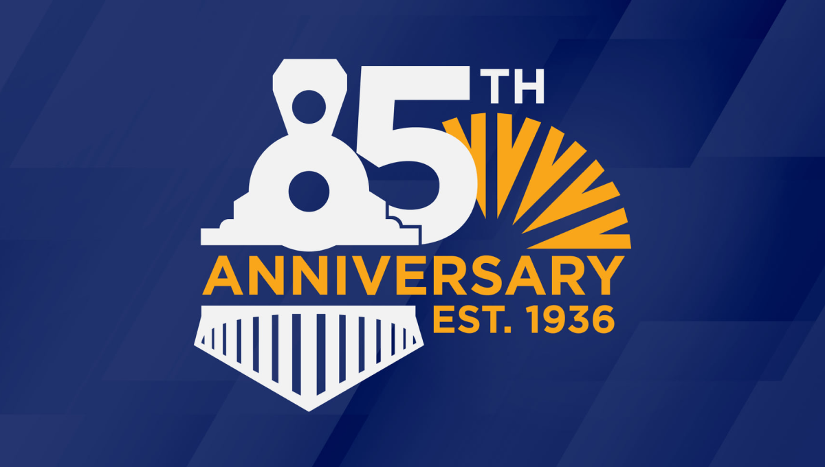
Goldenwest was originally founded as the Ogden Railway and Depot Company Employees Federal Credit Union, so on their 85th anniversary they tipped their hats to their rail-related roots by turning the number 8 into an illustration of a train engine. With their traditional mark peeking out from the side and the word anniversary across the middle, the design was a fun recognition of how far they've come.
More Details →Truly Nolen 85th Anniversary Logo
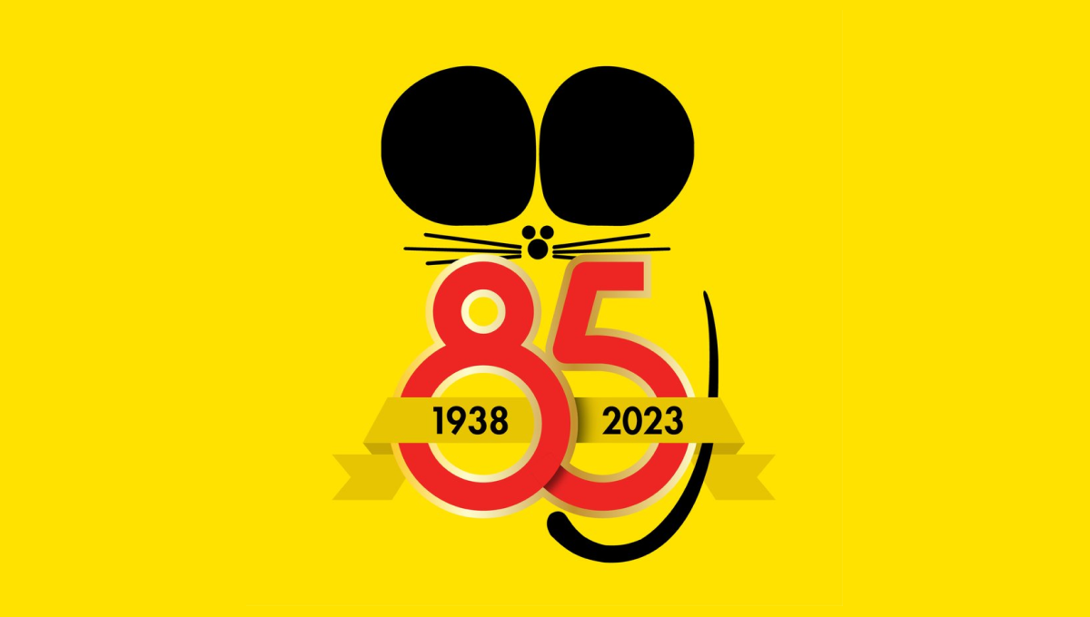
Famous for the black ears that are seen throughout their branding and products, Truly Nolen used the same concept as the starting point for their anniversary logo. A large block number 85 below the ears specified the year, a ribbon held the years of operation, and a thin, black tail made this mark easily recognizable.
More Details →Goya 85th Anniversary Logo
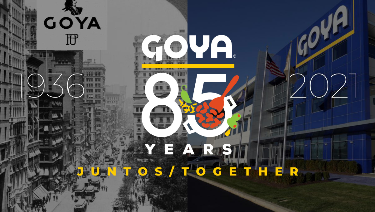
Starting with the company's original logo at the top, this design uses that logo's already existing yellow underline to create separate and shape for the rest of the logo. Below that sits a large number 85 with small illustrations of the fruits famously used in their foods with the word "years" at the bottom to complete the shape. In various lockups like the one pictured, they've also included the years of operation on the sides and a tagline at the bottom.
More Details →Stowe 85th Anniversary Logo
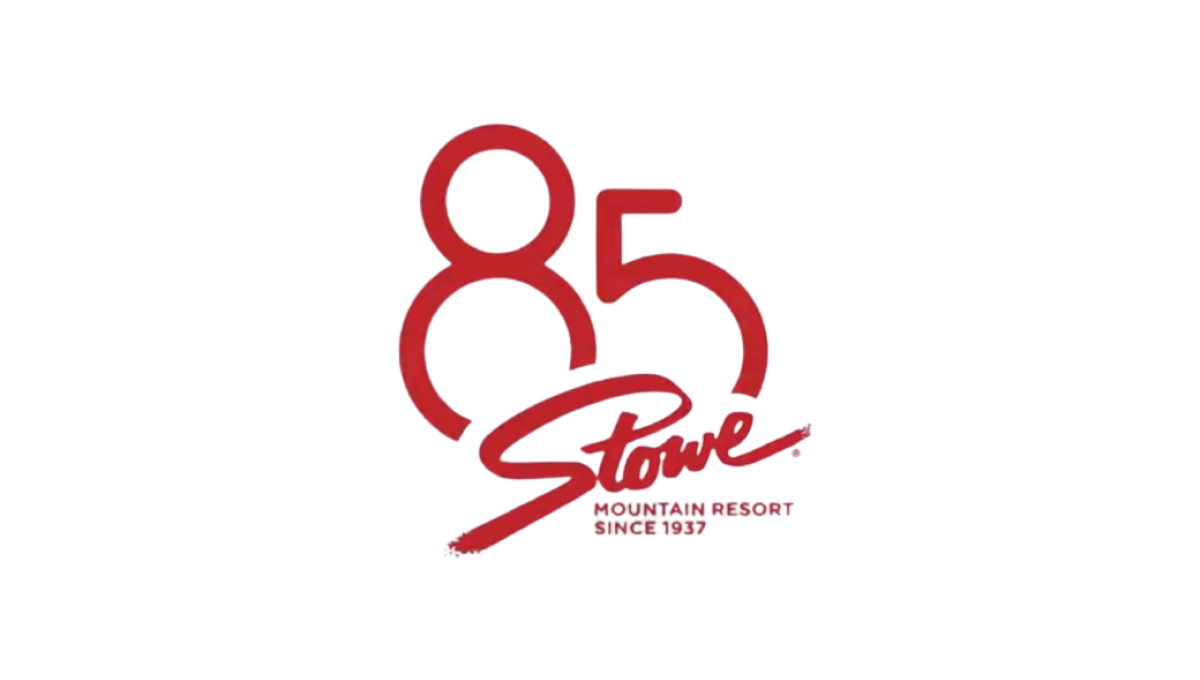
Stowe is a classic logo that hasn't changed since the early days of the resort and town. So rather than mess with something so clean and recognizable, they simply added a stylized number 85 peeking up and from behind the original mark. The result fit neatly on social media icons and marketing materials alike and kept things nice and simple.
More Details →