75th Anniversary Logos
Sugarloaf Mountain 75th Anniversary Logo
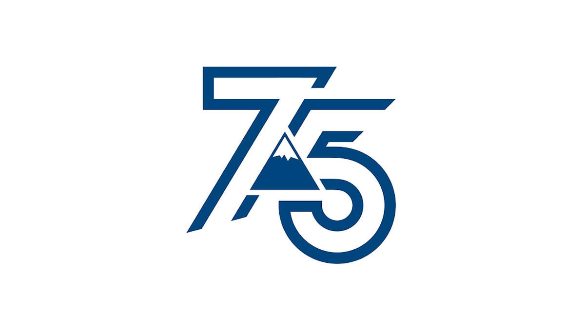
This anniversary logo shows the number 75 in a bold, clean style. The numbers are shaped with smooth, modern lines that feel strong and balanced. A simple mountain shape appears in the center, adding a quiet sense of place, history, or growth. The blue color gives it a calm and trustworthy feeling. Overall, the design feels modern but respectful, marking an important milestone without being too detailed or busy.
More Details →Reser's 75th Anniversary Logo

The logo celebrates a 75-year milestone with bold colors as the main focus. It uses clean, classic lettering and a smooth layout that feels both modern and respectful of the past. A banner curves across the bottom, mentioning the anniversary, adding a sense of movement. The color choices are warm and timeless, giving it a sense of tradition and pride. Overall, the design feels strong and simple, marking a long and steady journey.
More Details →Golf Digest 75th Anniversary Logo

This 75th anniversary logo has a classic and neat look, with dark and light colors creating a strong contrast. The number “75” is big and placed front and center, with the words “Golf Digest” above it in a clean font. The overall style is simple but firm, with a traditional tone that feels respectful and suited for a lasting milestone.
More Details →TASB 75th Anniversary Logo

I really like the way this logo works with the simple design and shape of the original word mark. Since their logo is all black, they added color behind the number 75 and their years of operation. And with a heavy weight to their original mark, they went vertically down from the logo with heavier squares to create a clean, square design that matches that original weight.
More Details →Trollhaugen Recreation Area 75th Anniversary Logo

When your ski area has a name like Trollhaugen, you've gotta keep things a little bit playful in all of your marketing and they've extended that fun, causal vibe to this anniversary logo. With the common circle shape, they place an illustration of their mascot at the center, their name and anniversary above and below following the curve of the circle, and a blue ribbon holding their years of operation to tie it all together.
More Details →Golden State Warrios 75th Anniversary Logo

This is a really creative logo that starts with a shape totally unique to the brand - a tall diamond - and places a large number 75 inside of that. Well, mostly inside as the designers let just a bit of the edges peek out the top to keep the shape in the center and large but also add depth. In the middle of the rounded part of the number five sits the original logo which also shows how well they've matched the lines of both the number and diamond to the original logo.
More Details →Onstage Ogden 75th Anniversary Logo

Onstage Ogden uses a simple, text-only wordmark for their traditional logo so this gave them the chance to add a mark for their anniversary without competition with their usual mark. In this case they kept the two-tone theme but combined a number seven on the left with a square extending to the right and the number five subtracted from that shape. A nice little design that's easy to swap with their usual mark.
More Details →Warren Miller 75th Anniversary Logo

When you make ski movies and are also celebrating an anniversary, why not merge the concept of cover art with the classic anniversary logo angle with art that includes a skier image behind but a large number 75 in front that bleeds into the edges. The original word mark sits inside the square to add a little balance a reminder about which company this design is tied to.
More Details →Palisades Tahoe 75th Anniversary Logo

This is an anniversary logo design concept I haven't seen before but I really like. Instead of changing the mark or adding something outside of the logo, this design places a large, block number between the two parts of the original logo. I love the way it keeps the balance of the original logo while adding an easy-to-recognize call to the year they're celebrating.
More Details →Council Of Europe 75th Anniversary Logo

Using the same shape, color, and words of their original logo, this anniversary variation replaces the mark - a stylized letter C surrounded by yellow stars - with a large number 75 surrounded by fewer stars but in the same yellow hue. By using the exact same shape this mark would have been incredibly easy to swap out with their traditional logo both during and after the anniversary celebrations.
More Details →Edmonton Elks 75th Anniversary Logo
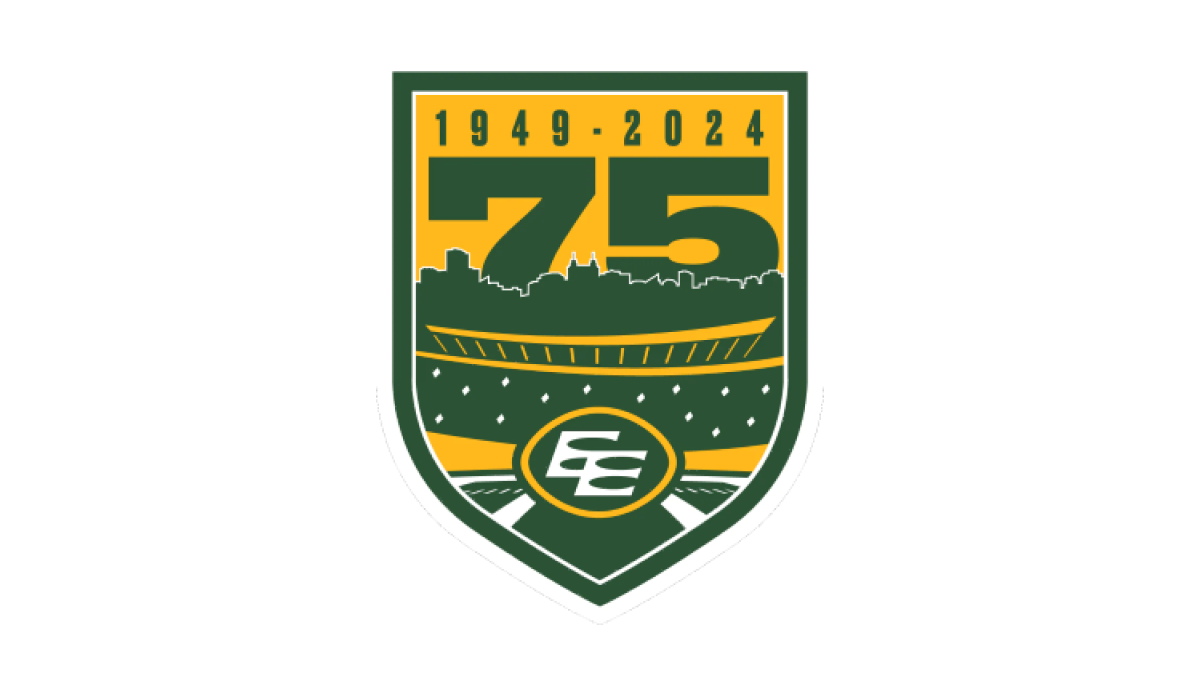
Using the classic sports style of large numbers, bold fonts, and crest-style shapes, this anniversary logo combines imagery that makes it clear the context is football and enough of the original brand to tie it back to the traditional mark. A large number 75 rises up from behind the stadium to complete this well-designed logo.
More Details →Snowbasin 75th Anniversary Logo
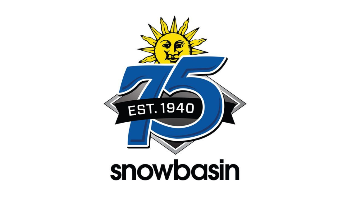
Featuring a large number 75 in the brand's usual blue, this logo adds a few simple elements in and around these digits. First, the brand's traditional mark peeks up from behind the 75. Next, a black ribbon holding the years of operation weave in and out of the main number mark. Finally, the traditional work mark for the resort sits at the bottom to make a fun, but recognizable design.
More Details →Cleveland Browns 75th Anniversary Logo
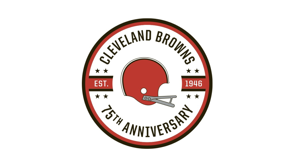
While the Cleveland Brown's "brown" is closer to an orange, they build on this traditional brand color with a circle in this palette as well as a helmet in the center. Around the outside sit the name of the club and words denoting the reason for the celebration with two bars coming in from either side containing the years of the team's existence.
More Details →Marek 75th Anniversary Logo
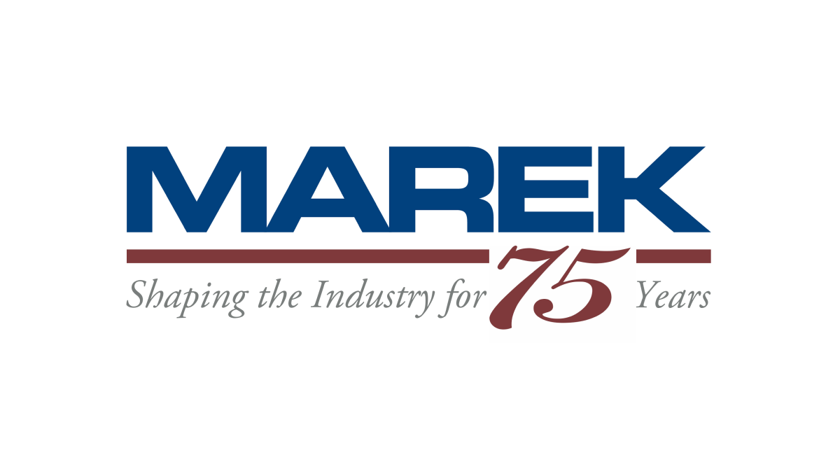
This mark always had a red line below a blue word, so this logo design simply worked with the existing horizontal elements in their traditional logo with the horizontal parts of the number 75. The result is a neatly integrated number that celebrates the occasion with a design that will be easily recognizable to their audience.
More Details →Swain Resort 75th Anniversary Logo
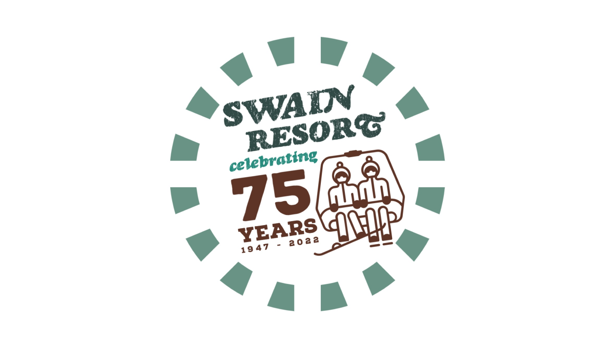
Swain Resort's anniversary logo start's with the brand's traditional green color and creates a shape using a dashed line circle. Inside sits the resort's name with maroon text highlighting the reason for the celebration. Finally, to the right of the years, sits an illustration of a ski chair in the same maroon color to add a playful tie back to the resort's primary activity.
More Details →NASCAR 75th Anniversary Logo
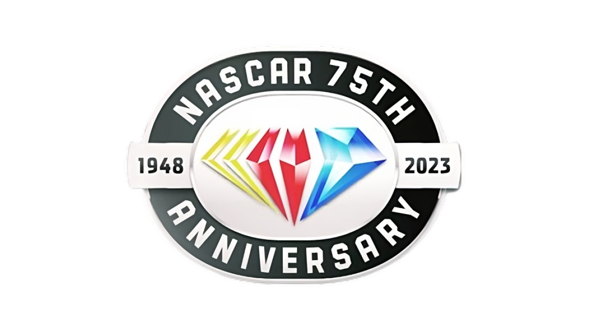
While other anniversaries use the diamond as the traditional shape, the 75th is absolutely one of them and NASCAR leaned into this with their design. A black oval representing the track their cars race around holds the name of the organization and recognition of the anniversary while a yellow, red, and blue diamond in the brand's traditional colors sits inside. A small ribbon then extends to either side of the diamond holding the years of operation.
More Details →Joshua Tree National Park 75th Anniversary Logo
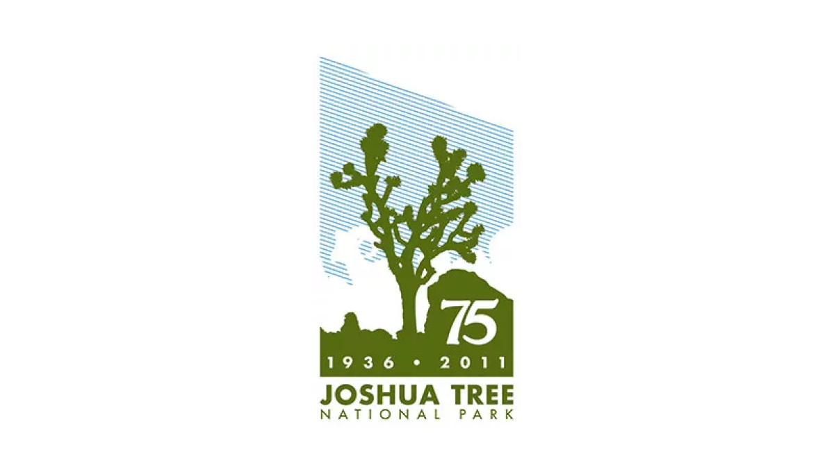
Joshue Tree is a unique national park and this logo carries that feeling with a unique shape and design. First, a vertical rectangle holds a line-hard depiction of blue sky, white clouds, and a green silhouette of the famous trees found in the park. Below that sits the name of the park and inside the green area is placed the milestone and years of celebration. However, by adding a downward angle across the top of the rectangle, the designers gave this logo a sharp, striking look that stands apart from other anniversary designs.
More Details →Harpers Ferry National Historical Park 75th Anniversary Logo

Starting with a circle shape, this logo fills the bulk of the center area with a clean illustration of Harpers Ferry in green, blue, and yellow. In the yellow sky, lettering specifying the anniversary fills the space and adds balance. Around the rim of the circle is the name of the park with a small rectangle at the bottom holding the years of operation.
More Details →St. Rose Dominican 75th Anniversary Logo
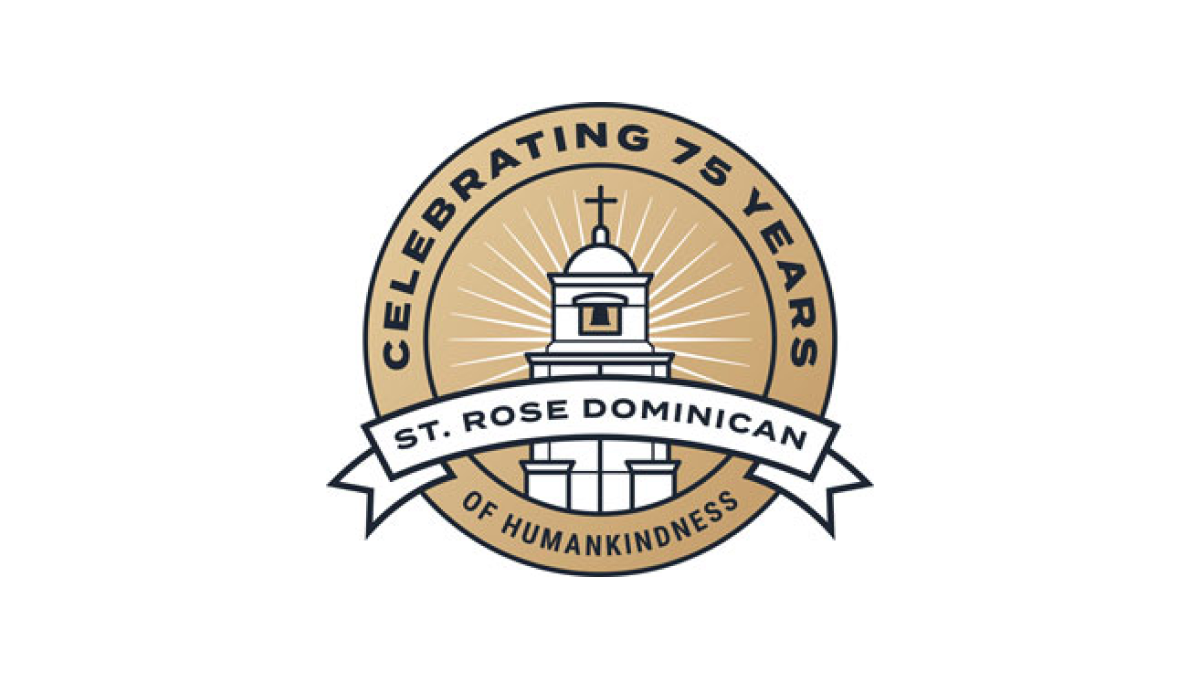
With a gold circle as the background, a stylized line-art representation of their classic buildings sits inside and words describing "celebrating 75 years" wrap around the rim. In a clean, slightly curved ribbon sit the words "St. Rose Dominican" to put the name of the organization front and center in this sharp, badge-style anniversary logo.
More Details →U of R Dept of Psychiatry 75th Anniversary Logo
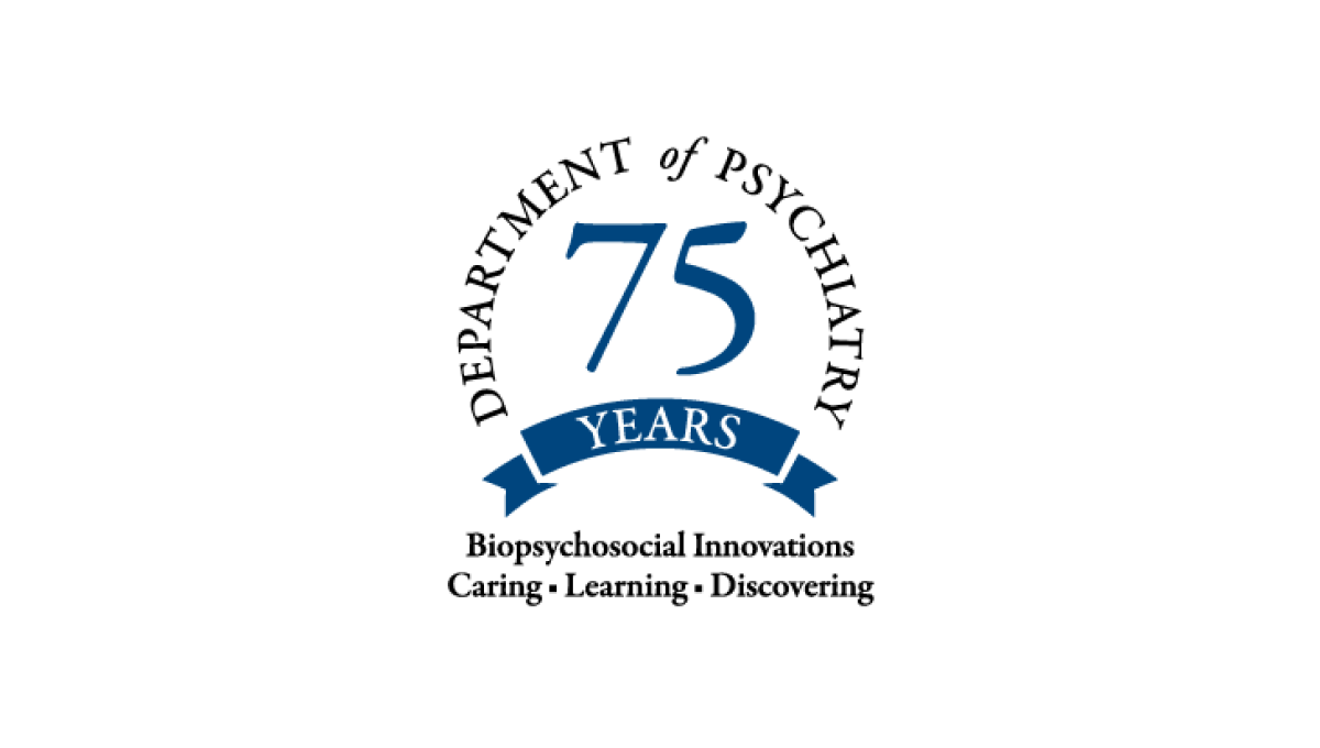
Never inteneded to stand on its own, this mark only appears on university-branded marketing like their anniversary web page, so it focused only on the department of the school. This name wraps in a circle around the number 75 with their brand values covering two lines below to reinforce their identify even as they expand it with this anniversary logo.
More Details →Nottingham Panthers 75th Anniversary Logo

Starting with a round black backdrop, this logo sets a large number 75 with a little bit of offset shadow for depth to create a strong foundation to buid on. The team name then wraps around the 75 and cleverly uses the "th" in the name as the "th" for the number and ties those together visually with color. A ribbon style element sits at the bottom showing the year the team was founded.
More Details →Loveland Ski Area 75th Anniversary Logo
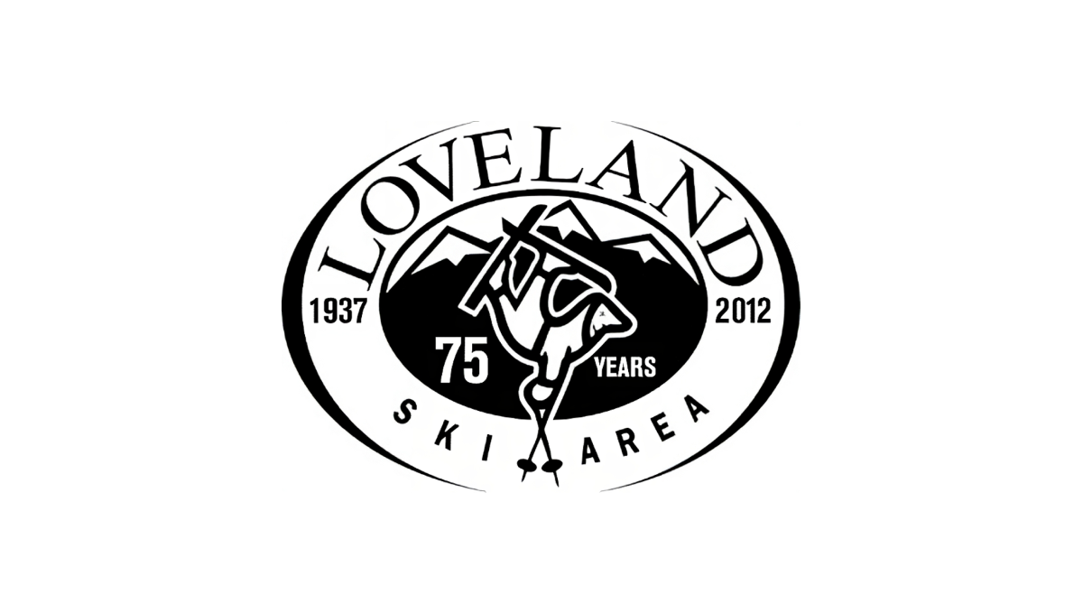
Loveland changed very little with their traditional logo when they celebrated their anniversary. By adding the number 75 and the word "years" to dark space on either side of their center mark, the resort was able to have something unique to use for their anniversary but also something that was seamless to swap in and out with their existing logo.
More Details →Los Angeles Lakers 75th Anniversary Logo
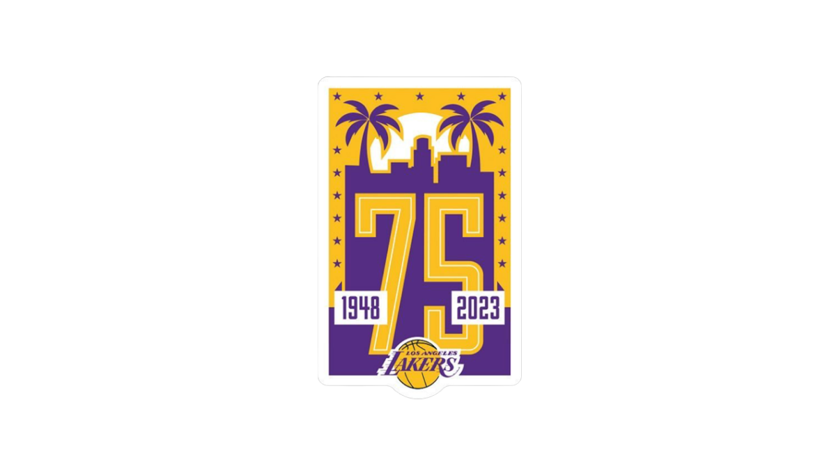
Built on a unique vertical rectangle layout and the team's brand purple and yellow colors, this logo builds on a skyline of a Los Angeles flanked by palm trees to create the backdrop for a large number 75. The team's traditional logo is inset below and on top of the 75 to make it easy to tie back to the organization with a simple white rectangle on either side of the number to denote the dates.
More Details →