Ribbon Anniversary Logos
Hampton Roads Moving and Storage 35th Anniversary Logo
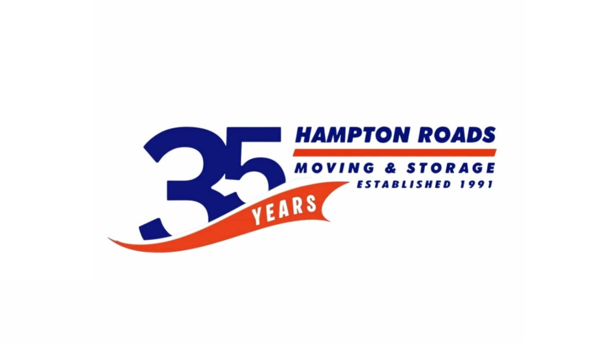
This anniversary logo uses a bold and simple layout with a large “35” as the main focus. The design combines dark blue and bright orange colors to create a strong but friendly look. Curved shapes and flowing lines give it a sense of movement and energy, while the text is clean and easy to read. Smaller details, like the establishment year and anniversary wording, help suggest experience and long-term service without making the design feel too busy or overly formal.
More Details →Lake Tahoe Community College 50th Anniversary Logo

This is a fairly simple but surprisingly unique anniversary logo lockup. Yes, it starts with the classic number fifty on the left and uses the word "years" in a short ribbon which are all common elements. But the flag extending from the right side of the zero to hold the college's traditional logo is something i haven't seen before. It's a nice little design that gives the school a nice little package to work with.
More Details →Valley Oral Surgery 40th Anniversary Logo
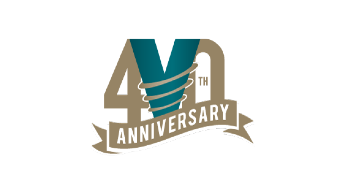
This logo combines the original V the brand has already been using in their original green color with two elements that stand out and compliment the design. First, a number 40 flanks the original mark while maintaining balance. Then, a ribbon holds the word anniversary below and in front to frame the upper part of the design. Good spacing and balance gives this logo a nice feel.
More Details →