Beer Anniversary Logos
Bull & Bush Brewery 50th Anniversary Logo
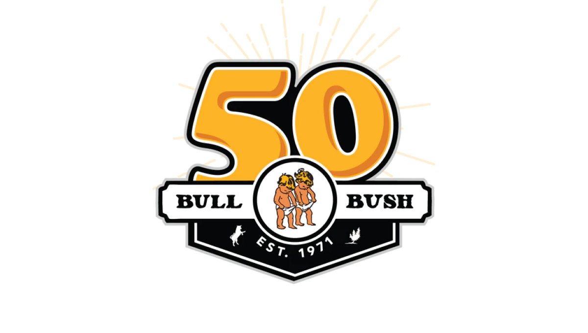
With the brewery's traditional logo held in an small oval, this logo builds behind that with a large, playful number 50 peeking up from behind to match the style and vibe of the traditional brand. To the side of the logo is a ribbon-style rectangle holding the name of the berwery with a label showing when the business was established filling the area below the logo.
More Details →Stone Brewing 25th Anniversary Logo
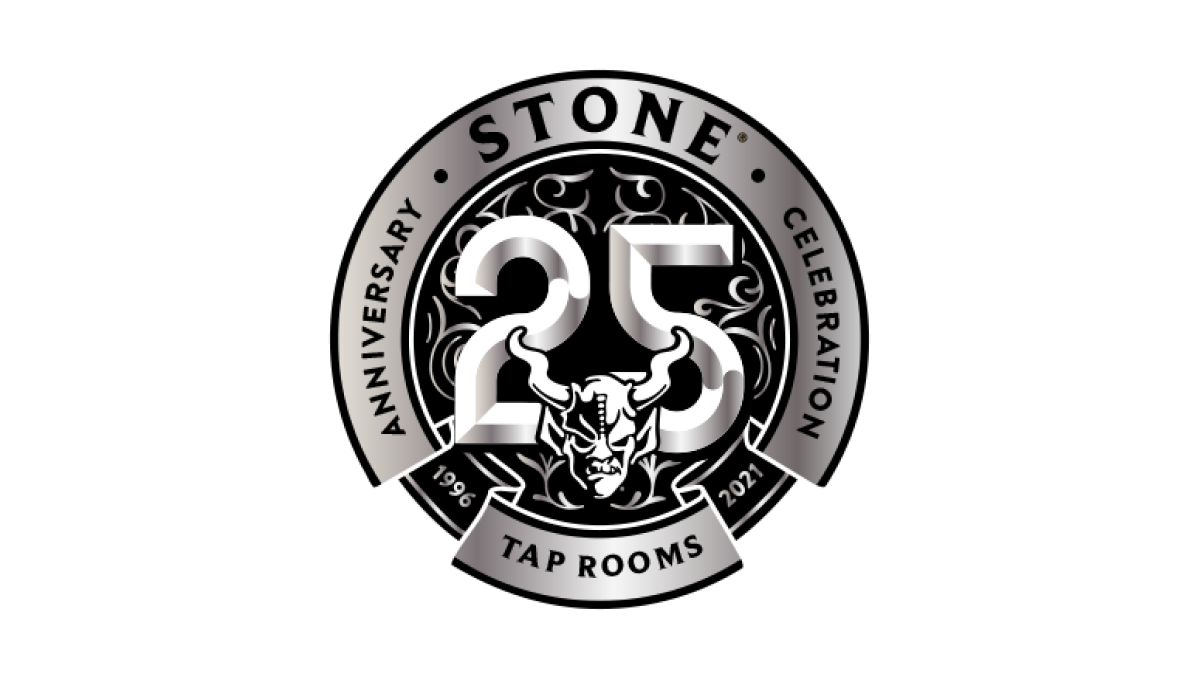
Similar to earlier anniversary logos for Stone Mountain Brewing, this logo starts with the brand's traditional mark set in the bottom center and then adds layers of graphics behind. In this case, a large, 3D number 25 held in a circle with the name of the brewery and illustrations to create texture within this monochromatic design.
More Details →Dust Bowl Brewing 10th Anniversary Logo
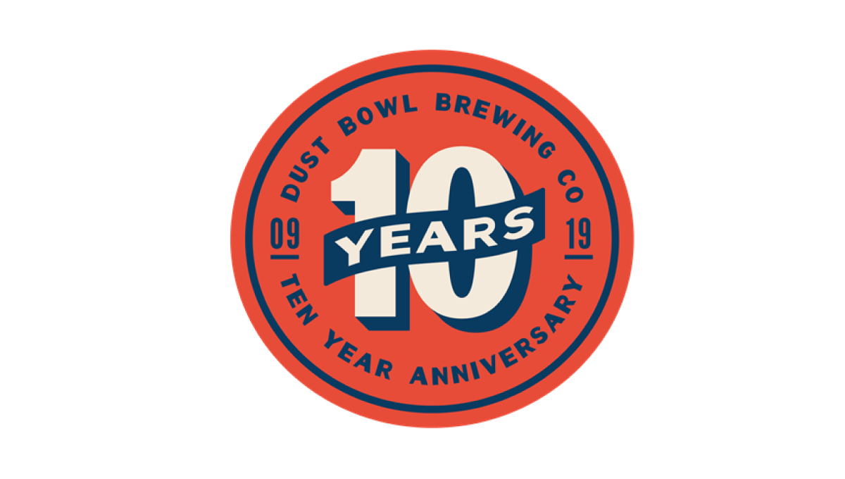
This retro-style logo uses the classic blue and orange colors famous in old-school newspaper and magazine ads. In the center of the circle is a large number 10 with a banner across holding the word "years". Around the outside of the circle is the name of the brewery and some wording to clarify the reason for celebration.
More Details →Stone Brewing 20th Anniversary Logo
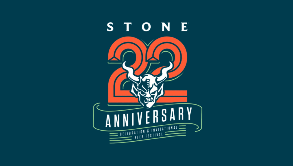
This logo starts with the brewery's traditional mark in the center and then builds layers behind to create a really sharp design. The first layer is a large, line-style number 2 with ribbon-style bit of line art below that signifying the meaning of the number. Above is the name of the brewery to create balance. The result is a beautiful design that tied nicely back to the original logo.
More Details →Boulevard Brewing Company 30th Anniversary Logo
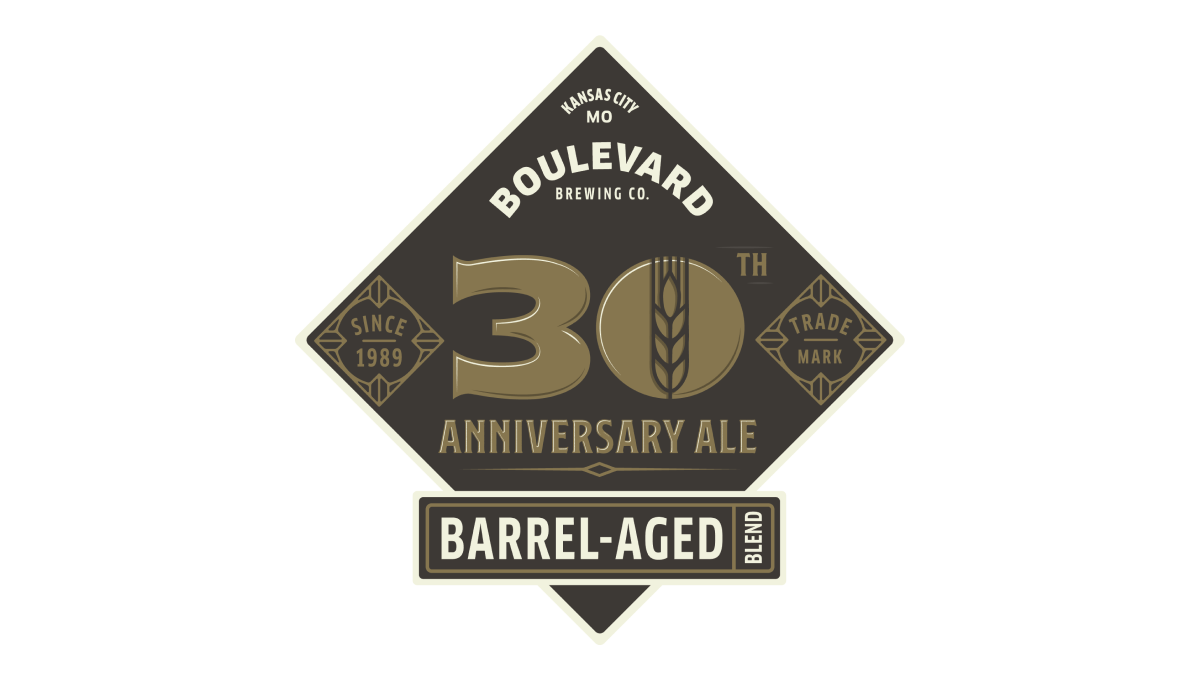
Breaking a bit from the style of other beer-themed anniversary logos, this logo adds a little bit more sophistication to with the style of beer they produce. In the center sits a large number 30 with the words "trade mark" and "barrel aged" in the classic script-designs that are part of the main brand that Boulevard is built around.
More Details →Blue Moon Brewing Company 20th Anniversary Logo
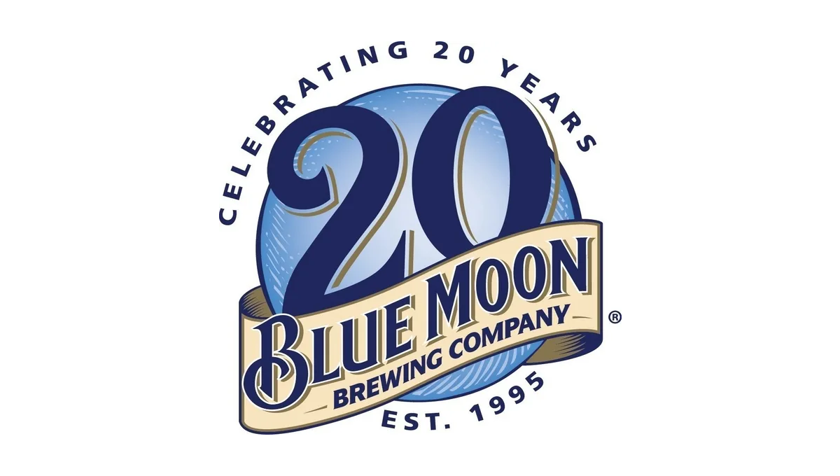
Blue Moon's famous blue circle and ribbon had all the elements the designers needed to adapt for an anniversary logo. By moving the ribbon down to expose more of the blue circle and placing a darker number 20 in the area left behind, this logo is easy to recognize but also being unique. Simple lettering above and below helped clarify the reason for celebration and round out this design.
More Details →Bend Brewing Company 25th Anniversary Logo
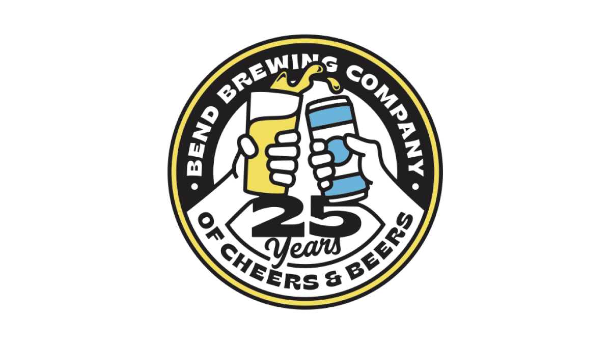
Starting with the classic round shape that is famous with anniversary logos but especially among beer-themed designs, this logo spells the brewery's name across the top half of the circle, a fun tagline across the bottom half, and a larger number 25 just above that. Filling the rest of the circle is an illustration of a "cheers" between a glass of beer and a can of beer.
More Details →Barley Brown's Brew Pub 25th Anniversary Logo
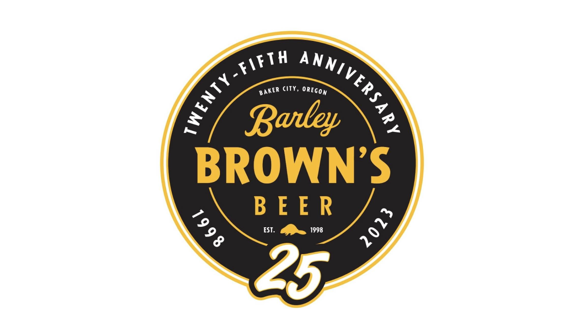
Using perhaps the most popular shape for anniversary logos, this brew pub starts with a black circle to create a clean shape to begin. In the center is the name of the company in a yellow that reminiscent of the beer they famously serve with a large, stylized number 25 at the bottom of the circle just extending beyond the edge of the circle.
More Details →