Gold Anniversary Logos
Kirby 20th Anniversary Logo
This anniversary logo shows a round, pink character with a soft smile at the center of a bright badge. The design uses warm gold and red colors, giving it a celebratory feel. A large number “20” sits in front, with a small star adding a playful touch. Ribbon shapes and bold outlines make it feel special and proud, like a milestone being honored in a fun, friendly way.
More Details →Ski Utah 50th Anniversary Logo
This anniversary logo highlights the number 50 in a bold, smooth shape that feels strong and unified. The design uses simple curves and solid forms that fit together naturally. A small graphic element inside the zero adds a hint of character and meaning without being too specific. The gold color gives it a warm, classic look that suggests celebration and longevity. Overall, the logo feels clean, confident, and respectful of an important milestone.
More Details →Brundage 65th Anniversary Logo
This anniversary logo features the number 65 in a bold, rounded style that feels solid and confident. The design is simple but carefully balanced, with the word “Seasons” placed across the center and “Brundage” below. A small mountain shape adds a subtle natural element without drawing too much attention. The gold color gives the logo a warm, celebratory feel, marking an important milestone.
More Details →Martock 60th Anniversary Logo
The logo features a large, bold 60 as the main focus, using smooth, rounded shapes. Inside the zero is a simple mountain outline that hints at an outdoor setting. Below, the name appears in clean, angled lettering that feels modern but grounded. The single warm color gives the design a calm, unified look. Overall, it feels straightforward and confident, marking an important anniversary without too many extra details or decoration.
More Details →Prefontaine Classic 50th Anniversary Logo
This anniversary logo features a bold, clean number paired with a word to mark the occasion. The design feels strong and steady, using clear shapes and solid colors. There’s a sense of pride and tradition in how the elements are arranged, while still keeping things modern. It gives off a respectful and professional feel, showing appreciation for the past while looking ahead. The overall look is neat, balanced, and easy to recognize.
More Details →ICEE 50th Anniversary Logo
This 50th anniversary logo has a fun and playful feel. The number “50” is large and bold,in a gold color that stands out. The word “ICEE” is placed to the left of the 50, using its familiar logo style. There’s also a small banner underneath that says “Icee-versary,” adding to the celebratory look. The overall design feels cheerful and energetic, reflecting a lighthearted brand marking a big anneversary in a lively way.
More Details →Dungeons and Dragons 50th Anniversary Logo
The Dungeons & Dragons 50th Anniversary logo showcases a dynamic fusion of fantasy and modern design. The number 50 is designed in a brilliant gold font, with a head of a dragon in the center of the 0. The accompanying "Dungeons & Dragons" text is presented in their signature font, balancing tradition with a forward-looking approach. This emblem effectively honors the game's storied past while signaling its continued evolution.
More Details →Clarendon Hills 100th Anniversary Logo
This design adds a little more detail that wer're used to seeing in anniversary logos. A gold circle holds artwork that is close to the actual appearance of a famous landmark instead of using the more common silhouette or line-art depiction seen in other logos. Below sits the name of the village stacked to align to the width of the design. The result looks really sharp and likely works just fine on most situations aside from places where limits on colors may come into play like screen printing or embroidery.
More Details →Geissler's Supermarket 100th Anniversary Logo
This logo design brings a clean, traditional approach to this supermarket chain's usual logo. Placing their red word mark in the center and wrapping it with a simple shape that adds some unique corners instead of a standard rectange, their then add a shiny, gold circle behind with the words commemorating the occasion and filling out this seal-style concept.
More Details →Hotel Leto Hydra 60th Anniversary Logo
If you're a classy hotel that's celebrating your anniversary, kimple it simple, elegant, and minimalistic is a common and effective move. A large number 60 in thin, slightly offset lines sites above the traditional word mark. Below the logo sits the years of operation which is always a nice addition in case this logo shows up outside of the year of the anniversary to clarify when the milestone took place.
More Details →Golden State Warrios 75th Anniversary Logo
This is a really creative logo that starts with a shape totally unique to the brand - a tall diamond - and places a large number 75 inside of that. Well, mostly inside as the designers let just a bit of the edges peek out the top to keep the shape in the center and large but also add depth. In the middle of the rounded part of the number five sits the original logo which also shows how well they've matched the lines of both the number and diamond to the original logo.
More Details →Wintergreen Resort 50th Anniversary Logo
While the resort does have other lockups of this mark they're using, the simplicity of this design is worth showcasing alone because it's a great reminder that anniversary logos don't have to be complicated. That doesn't mean this logo isn't beautifully designed - the block number 50 with offset numbers is neatly balanced with the resort's original logo placed inside - but it does mean that they didn't overthink it. The result is both effective and really sharp looking.
More Details →Hard Rock Hotel 50th Anniversary Logo
Hard Rock is a powerful, well-known brand. So at the center of this logo they placed that name in the distinct, edgy font their brand is known for. Behind and around that mark is a large number fifty broken up into multiple lines to give it plenty of presence but a little less weight. Finally, a simple EST 1971 sits above the zero for a little balance plus added reinforcement for the anniversary meaning within the design.
More Details →Accor Hotels 50th Anniversary Logo
Accor Hotels normally uses a bird silhouette the form the left diagonal and cross of the letter A. The designers of their anniversary mark cleverly took that same shape and placed at the top of a number five to form the year the company is celebrating. Combined with a classy serifed font tucking just below their name, this logo is a really sharp design and one that was combined with other colors and elements in their marketing.
More Details →Ogden Nature Center 50th Anniversary Logo
This is a really creative, simple solution to an anniversary logo that alters the original logo very little while making a clear, unique design for their celebration. In this case, they already had a round shape for their mark, they simple added a ring of gold around that circle and wording the mark the celebration. This keeps the proportions and sizing of the logo almost identical to the original so swapping to and from this logo is easy during and after the anniversary year.
More Details →Columbia Pictures 100th Anniversary Logo
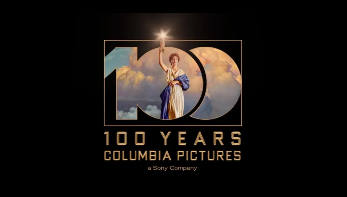
Columbia Pictures' opening sequence has been seen dozens of times by millions of moviegoers. So when they wanted to create a recognizable but simple anniversary logo, they simply overlaid a large, block 100 on this classic imagery. The result is clean, easy to understand, and an instantly, clean connection back to their original brand.
More Details →European Distance & E-Learning Network 30th Anniversary Logo
This brand found themselves in a unique position when designing an anniversary logo because their existing logo already resembed the shape of a number. By placing the number 3 above the "ED" with a similar width as those to letters combined and doing the same with the 0 and "EN", the acronym and number mark created a unique, balanced shape that incorportated their existing logo.
More Details →Ripfast Bodybuilding 25th Anniversary Logo
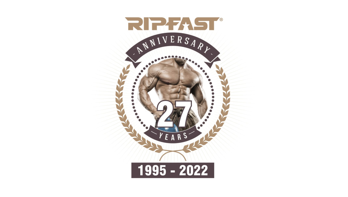
If your brand is bodybuilding, placing the photo of a ripped individual in the center is a pertty simple, on-brand way to start a logo. With a number layered above, a round circle with laurel leaves surrounding, and the traditional logo placed at the top, this logo may have a few more elements that typical anniversary logos but they work together pretty well.
More Details →Golden Corral 50th Anniversary Logo
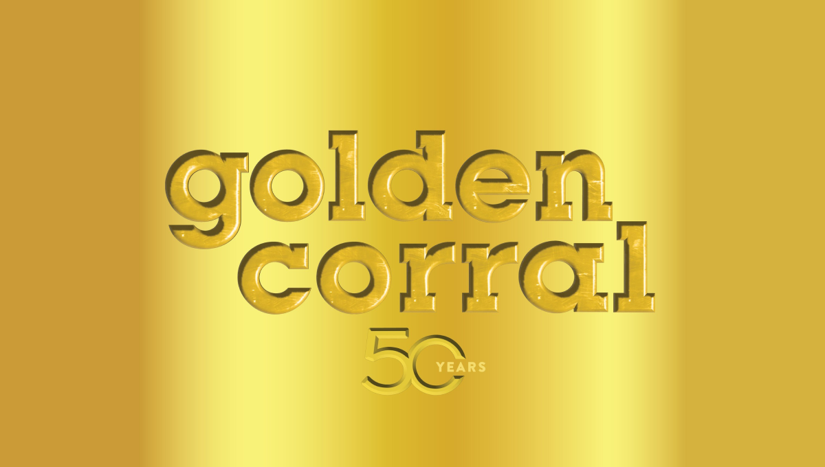
When your logo is already gold, why not build on that for your 50th anniversary? Golden Corral kept it simple and inset their mark and a number 50 into a reflective gold background to create a sort of etched or stamped feeling to their design. The result can be hard to see in some lockups, but was a nice, on-brand way to celebrate the occasion.
More Details →Lego Games 25th Anniversary Logo
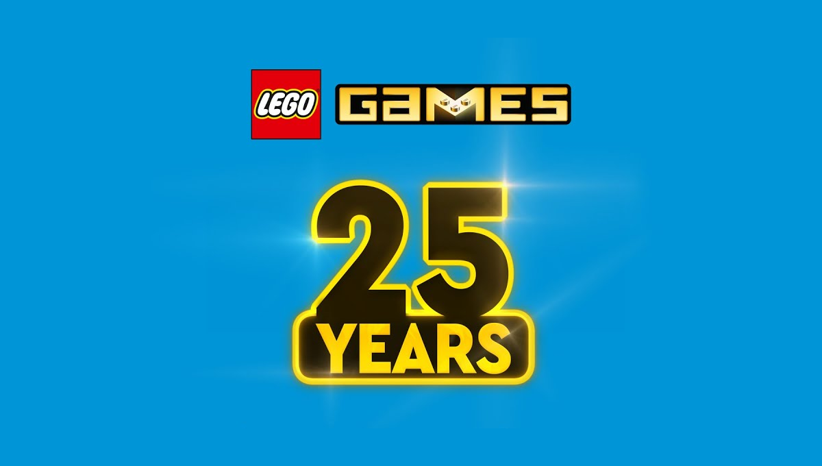
In another example of keeping the original logo and adding a number mark beside it, this design took a slightly different approach that the usual. Instead of placing these side-by-side, they stacked them. The number mark uses similar yellow and black colors of the original mark and a little bit of sparkle to help it stand out and keep the fun vibe of the original.
More Details →Lincoln Memorial 100th Anniversary Logo
As one of the most recognizable monuments in the country, this logo leaned into this famous design for their anniversary logo. By replacing three of the pillars with a large, elongated number 100, the designers created a clean layout but also one that one easy to recognize even without the ribbon and dates along the bottom clarifying what is being celebrated and the years of operation.
More Details →Tolsa 65th Anniversary Logo
Sometimes what you need isn't a logo as much as a graphic. So while this graphic may no fit the traditional rules of a logo, it does serve its purpose really well. With a background in the brand's gold color, the logo at the bottom, an enlarged mark in the top right, and the number and reason for celebration in the middle, this graphic worked well on thier website as a content block and on social media.
More Details →City of Huntington Indiana 175th Anniversary Logo
This logo starts with a circle that is divided exactly in half horizontally. On the top is placed a simple line-art drawing of a famous building in the city's downtown, while the bottom features a large number 175, the years of operation, and the name of the city. Curving along the top of the circle are placed 5 stars to round out the design.
More Details →Brazon Valley Bombers 15th Anniversary Logo
With classic sports design styling, this mark starts with a clean, circular badge that places a large, sports-lettering number 15 in the center. Above and below that number is the name of the team in curved letters to follow the shape of the circle. To either side is a gold ribbon holding the years of operation. Above and below the lnumber sit the silhouette of the state of Texas and the team's traditional logo
More Details →Everton Park State High School 60th Anniversary Logo
Sometimes marketers think there are two options for anniversary logos: go with a stock design or do something custom. But this team saw a nice middle ground by starting with one of the classic, stock 60th anniversary logos found online but finding one that matched their brand so they could insert their traditional mark in the bottom center and their years of operation to make this logo their own. A simple way to get a logo that is both easy to create and customized to their brand.
More Details →Governors State University 50th Anniversary Logo
With an offset number 50 as the canvas for this logo, the designers filled in the zero with a dark blue and placed the university's traditional logo in the center to make it easy to tie this back to the original brand. Around the outside of the zero sit the name of the university and the years of operation, with a vertical flip between the two to keep most of the letters right side up and improve readability.
More Details →Wright State University 50th Anniversary Logo
Using a style that is becoming more and more common for anniversary logos, Wright State simplye takes their traditional logo and places a vertical line between that mark and a simple anniversary mark that focuses on the number rather than a unique design. In this cast, a large number 50 in their brand gold with the word "years" below in their brand green.
More Details →St Joseph School 90th Anniversary Logo
Using a classic circular shape with two rings creating space for words to wrap around the edge, this logo places the name of the school in that space to make it easy to recognize who is celebrating this anniversaty. Inside sits the school tree mark in the brand's traditional gold color. At the bottom is a simple red ribbon holding a recognition of how many years the school has been in operation.
More Details →Sugar Land Texas 60th Anniversary Logo
With a seal-style shape to start, this logo places the name of the town, the word anniversary, and laurel leaves in an arc between the outer edge and inner ring. Inside the smaller circle sits an illustration of city hall with a large number 60 sitting just below than on a gold background. A smaller ribben between the number and the illustration holds the years the city was founded and the current year of celebration.
More Details →First Baptist Church of Kenmore 100th Anniversary Logo
This three-dimensional logo is designed for a dark red background and uses a few classic elements to create a clean logo. First, a gold circle with a thin rim creates the shape with the name of the church arcing around the outside of the circle. Inside sits an illustration of their church with a bit of perspective to add depth. Finally a white ribbon holds the word "celebrating" with the anniversary and years sitting just in front of and below that ribbon.
More Details →Bryce Canyon National Park 100th Anniversary Logo
Bryce Canyon's centennial logo uses gold line art for the vibe in this design. A large number 100 contains a clean line-art depiction of the park's famous hoodoo formations with sunset-style lines emerging from behind and filling only the area with the number. Below, the name of the park and the dates of operation are placed in the same color as the mark above for a clean, balanced design.
More Details →MLB All Star Game 50th Anniversary Logo
This mark was featured on a poster and sets a few elements into a clean, round shape with a "50th" in gold in the center. On the bottom sits a blue silhouette of the Chicago skyline with blue shares curving up and to the side of the skyline to begin forming the circling. On the top is red lettering signifying the occasion with the start and current years in gold connecting the two and completing the circle.
More Details →Anaheim Ducks 30th Anniversary Logo
With a stylized triangle (point down) as the base, this logo starts with a three dimensional, block number 30 in the center as the visual foundation. Next, two hockey sticks weave in and out of the number 30, cross in the center, and extend just beyond the triable to make the shape a bit more dynamic. Finally, a small curved area is extended above the top of the triangle to hold the team's original logo.
More Details →Yankee Stadium 100th Anniversary Logo
This logo starts with the classic baseball diamond shape as the base and adds a large number 100 in the center to begin. Above that sits an illustrtion representing the landmark's famous architechture. To either side of the 100 sit the famous flags - the right one containing the "th" for the year - which also frame the number nicely. Below, a ribbon holds the years of operation and the name of the stadium to comlete the design.
More Details →St. Rose Dominican 75th Anniversary Logo
With a gold circle as the background, a stylized line-art representation of their classic buildings sits inside and words describing "celebrating 75 years" wrap around the rim. In a clean, slightly curved ribbon sit the words "St. Rose Dominican" to put the name of the organization front and center in this sharp, badge-style anniversary logo.
More Details →California Coast University 50th Anniversary Logo
With a very class "seal" style shape as the base, this logo from California Coast University simply adds some dark lettering inside that seal shape to crate a mark that does it's job and doesn't require to much complexity. Like many of this circular, seal-shaped logos, they've also added a ribbon at bottom to display their dates of operation.
More Details →Valley Oral Surgery 40th Anniversary Logo
This logo combines the original V the brand has already been using in their original green color with two elements that stand out and compliment the design. First, a number 40 flanks the original mark while maintaining balance. Then, a ribbon holds the word anniversary below and in front to frame the upper part of the design. Good spacing and balance gives this logo a nice feel.
More Details →Atari 50th Anniversary Logo
As one of the truly classic brands of early gaming and technology, Atari combined their classic word mark with the three diverging lines in this lockup that's designed for a dark, black background. A line-art version of the number 50 holds the mark in the 0 with a clean gold color providing both contrast with the white but easy readability on the black.
More Details →Minecraft 10th Anniversary Logo
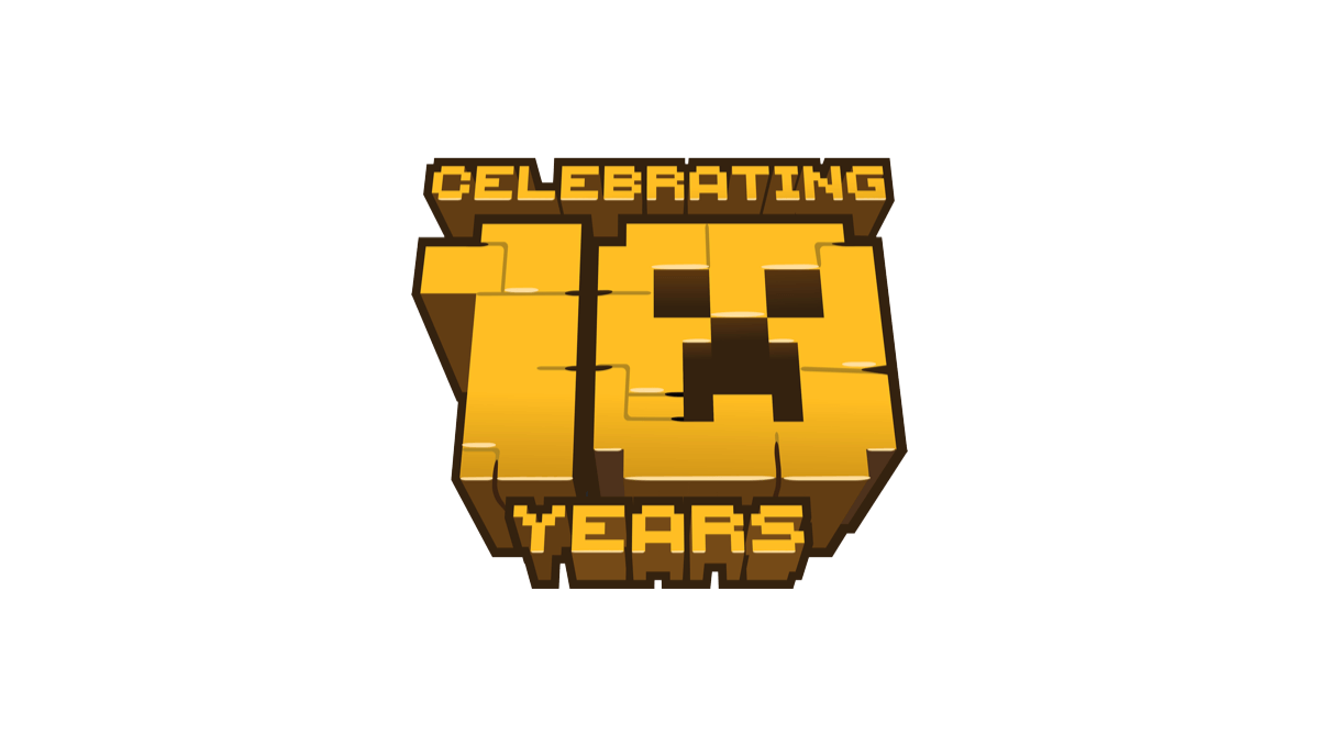
When Minecraft celebrate 10 years of bringing happiness to millions (my children included), they stuck with their block-world design style and created a logo with that featured the face of a popular character. A bold, gold shape with the name above and years below made for a really cool, on-brand concept.
More Details →Sundown Ski Area 50th Anniversary Logo
Sundown gave their designer a lot of creative freedom to create a mark that was unique to their anniversary. The result were the words "celebrating 50 seasons" forming a circle around a large number 50 and the years sitting to either side to break up the circle. The 0 in the large fifty contained a snowflake icon to tie it back to the skiing message and made room for the resort's original logo above.
More Details →St Francis Elementary School 50th Anniversary Logo
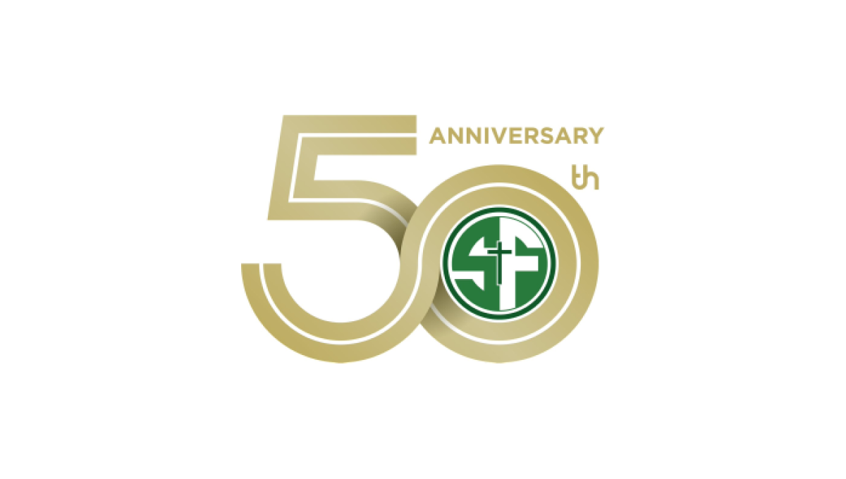
This logo starts with a double-line number fifty in the school's classic gold color. By overlapping the 5 and 0 in the number, they created a woven, infinity effect. And by shrinking the number 0 slightly, they were able to have room for the word "anniversary" and "th" for the 50. Finally, the zero creates a circle where they were able to neatly place their traditional green, round logo.
More Details →