Best Anniversary Logos
Colorado 150th Anniversary Logo
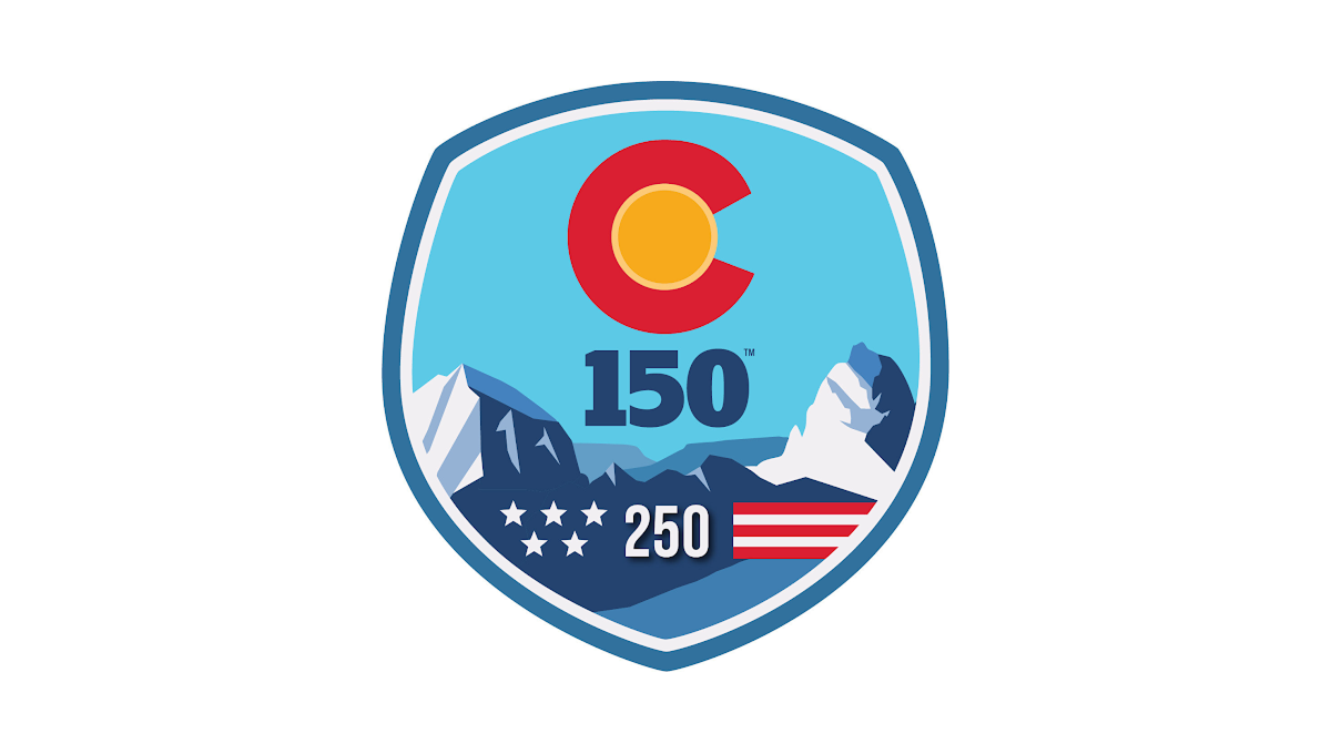
This anniversary logo uses a bold, badge-style design with a strong, recognizable shape. Bright colors and simple graphic elements create a memorable, outdoor-inspired look, while the anniversary number is placed prominently in the center to emphasize the milestone. Stylized landscape features and a few symbolic details add character without making the design feel crowded. Overall, the logo has a clean, confident appearance that celebrates a long history in a visually engaging way.
More Details →Barley Brown's Brew Pub 25th Anniversary Logo
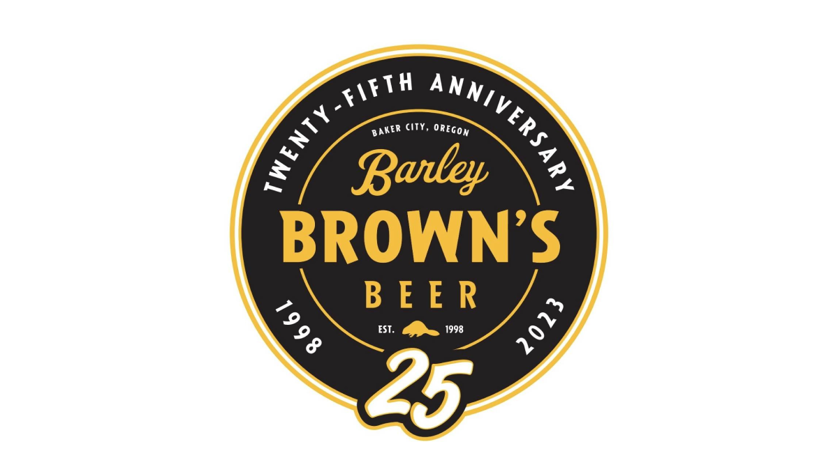
Using perhaps the most popular shape for anniversary logos, this brew pub starts with a black circle to create a clean shape to begin. In the center is the name of the company in a yellow that reminiscent of the beer they famously serve with a large, stylized number 25 at the bottom of the circle just extending beyond the edge of the circle.
More Details →National Football League 100th Anniversary Logo
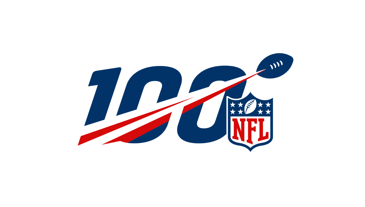
A logo that was seen time and time again by millions during the league's 100th anniversary, this mark features a large, block number 100 with a football streaking from the lower right to the upper left with a red line flowing behind. Finally, the league's traditional logo sits just to the bottom right to add balance and make the mark easy to recognize.
More Details →City of Burien 30th Anniversary Logo
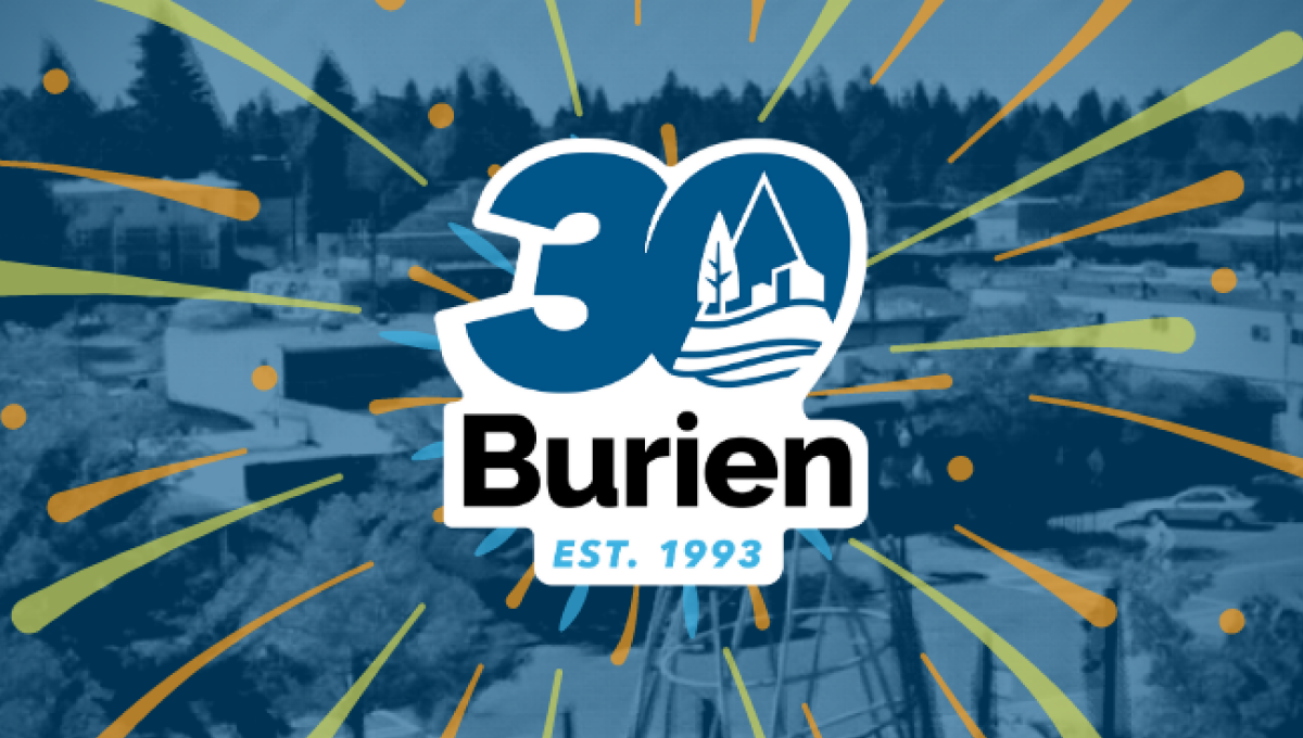
This clean, sticker-style logo starts with a large number 30 with a slight ilatic style in the city's traditional blue color. Inside the zero is place a white, line-art version of the city's main logo. Below that is the name of the city with the year it was established at the bottom. And by locking up this design with white padding, they were able to place it on any color including a fireworks-like design used on their website.
More Details →Brazon Valley Bombers 15th Anniversary Logo
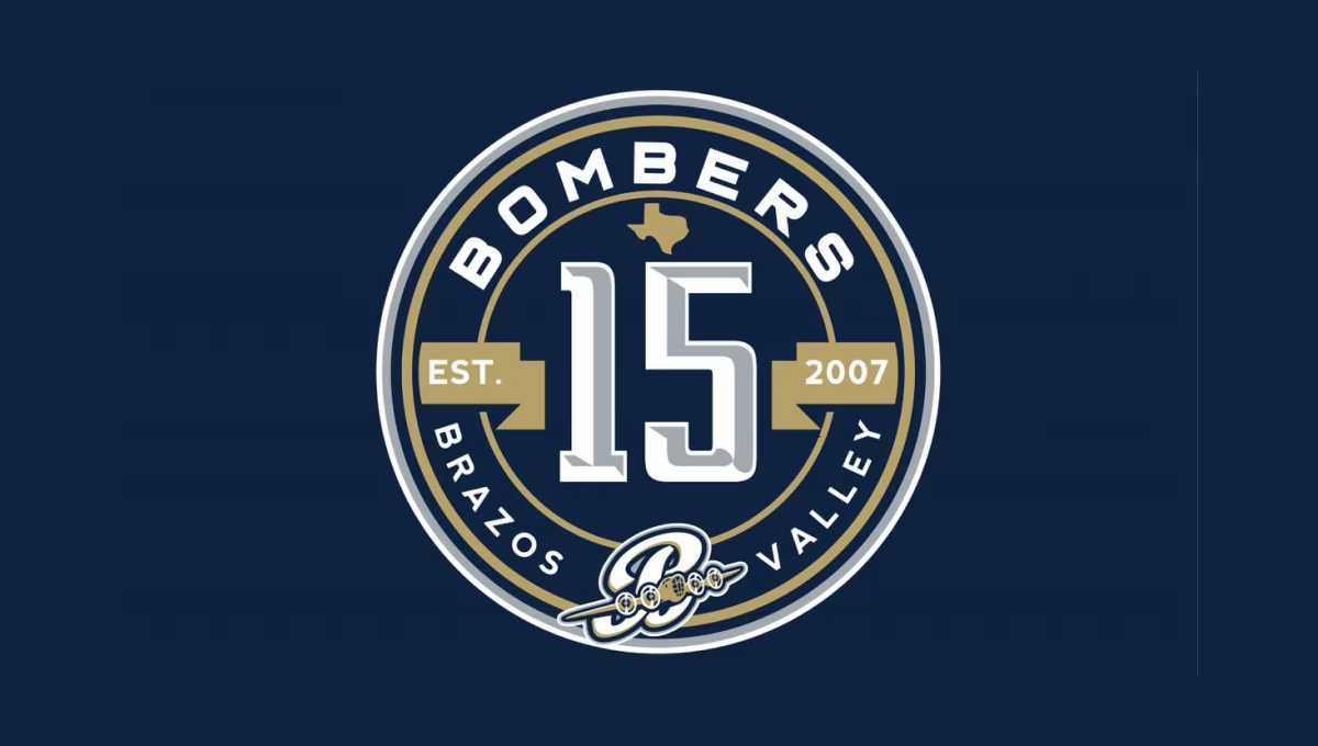
With classic sports design styling, this mark starts with a clean, circular badge that places a large, sports-lettering number 15 in the center. Above and below that number is the name of the team in curved letters to follow the shape of the circle. To either side is a gold ribbon holding the years of operation. Above and below the lnumber sit the silhouette of the state of Texas and the team's traditional logo
More Details →City of Thunder Bay 50th Anniversary Logo
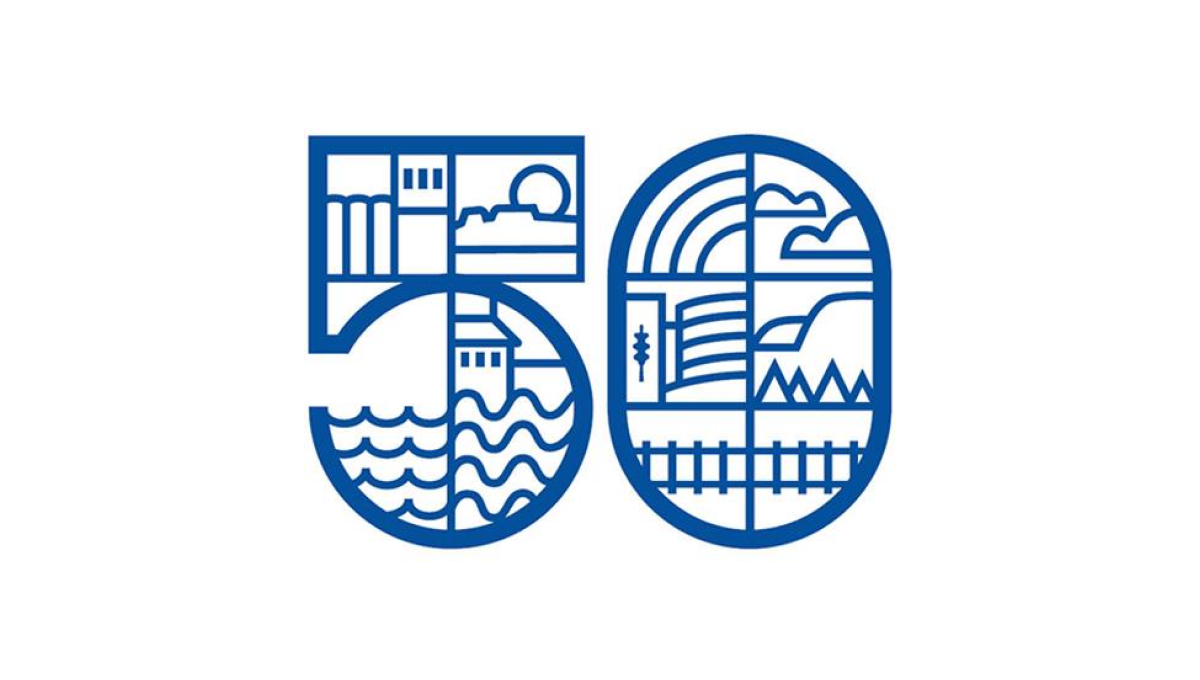
By dividing this number into a series of sections, this logo gave the designer lots of areas to work with as they highlighted many of the most popular, prominent landmarks in the city including the grain elevators, city hall, and the waterfront. By using a slightly thicker line for the number and thinner line for the line art in and around the number, it's easy to recognize the anniversary without the accompanying art distracting from that message.
More Details →Drexel University 125th Anniversary Logo
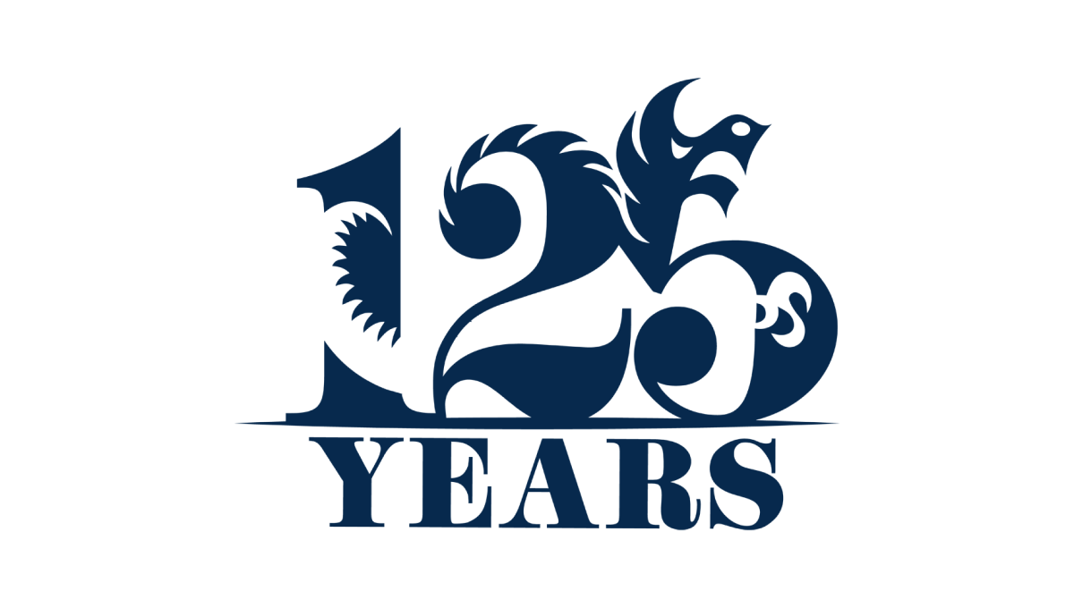
Designed by a student as part of a year-long project, this beautiful anniversary logo combines a large, block number 125 with the school's famous dragon logo to create a design that, remarkably, is easy to identify both elements within despite using a single color. With a block word "years" below, this is a beautiful example of design and art in a thoughtful, meaningful logo.
More Details →DePaul University 125th Anniversary Logo
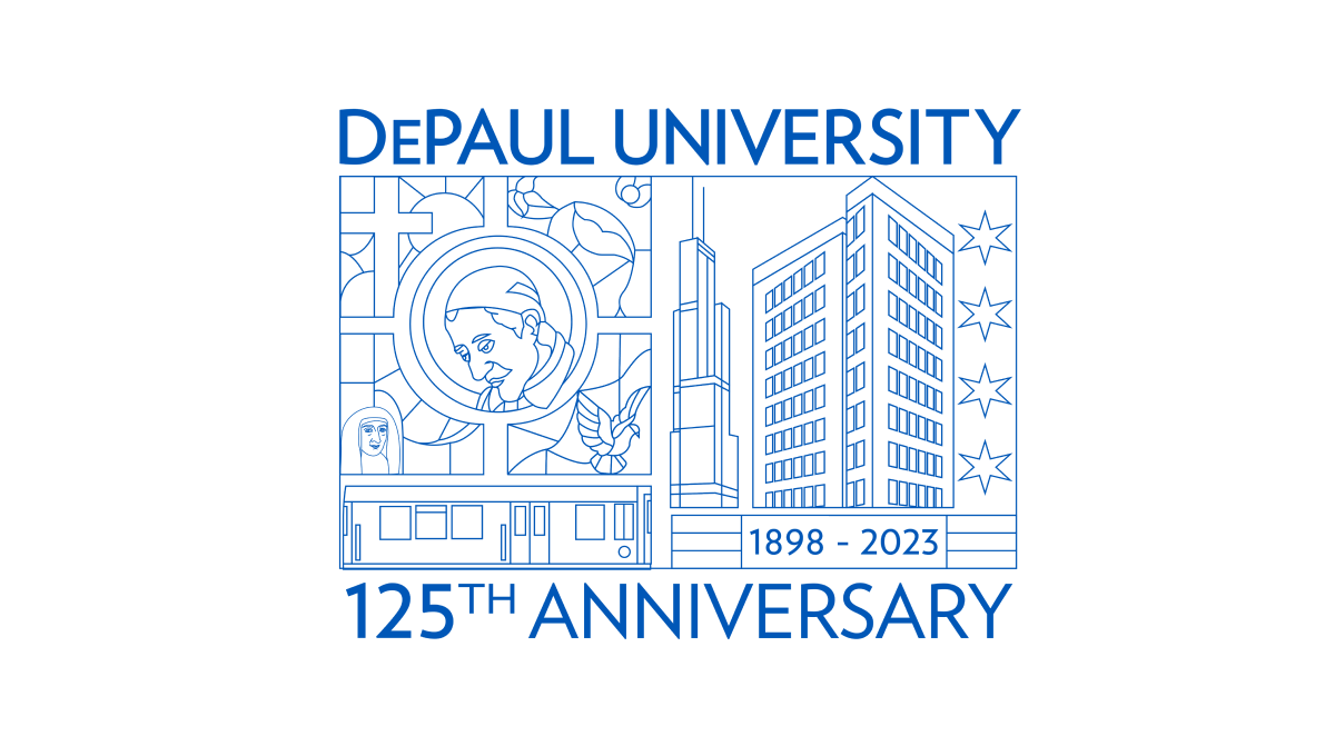
Using beautiful line art of the city in which this university is location and famous figures from their story and history, this annivesary logo is an incredible design that stands out from traditional annivesary logos. With this art at the center, playing the name of the school and the year that is being celebrated above and below in the same brand blue is all that was needed to balance out this design.
More Details →Gateway Church 15th Anniversary Logo
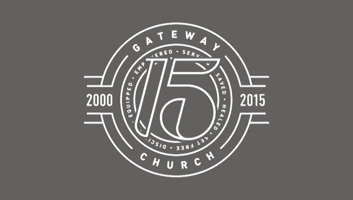
The clean, line-art logo starts with a series of white circles to create two rings where they place the name of the church and a list of the church's values. In front of that sits a large, stylized number 15. On either side are placed the years of operations with more lines connecting the horizontal years to the circular shape of the rest of the logo.
More Details →Acadia National Park 100th Anniversary Logo
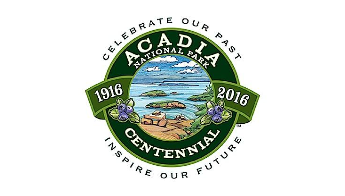
This seal-style logo uses a number of details to create a clean, balanced whole. First, a green circle with wide rim holds the name of the park and the word "centennial". Next, the inner circle is filled with an illustration depicting to beautiful shores and plants found in the park. A ribbon then holds the years of operation with arcing words above and below the seal holding the motto.
More Details →Yellowstone National Park 100th Anniversary Logo
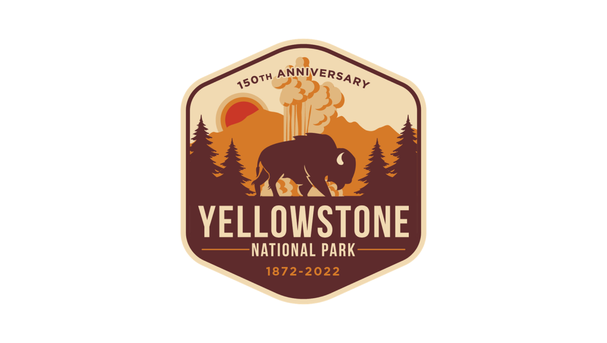
Yellowstone's 150th anniversary logo starts with a hexagonal shape in an orange and brown color that's reminiscent of many colors throughout the park. Inside, layers of monochrome silhouette's depict the park's famous geysers and wildlife. In the bottom half, the name of the park sits just above the years of operation with a callout of the anniversary arching across the upper part of the design.
More Details →Aggie Ice Cream 100th Anniversary Logo
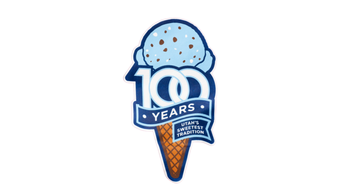
A stable of Utah State University's history, the ice cream shop within this school's campus wanted to celebrate their famous treats with a logo. So they started with an icre cream cone in the classic aggie blue, added a block number 100 in front of that with a ribbon below that wrapped below to contain the words "years" and "Utah's sweetest tradition." The logo was featured in the shop and on logo t-shirts and hats available in the store and online.
More Details →St. Rose Dominican 75th Anniversary Logo
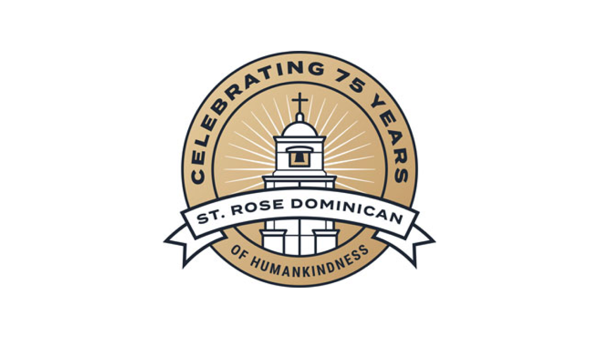
With a gold circle as the background, a stylized line-art representation of their classic buildings sits inside and words describing "celebrating 75 years" wrap around the rim. In a clean, slightly curved ribbon sit the words "St. Rose Dominican" to put the name of the organization front and center in this sharp, badge-style anniversary logo.
More Details →Adams Memorial Hospital 100th Anniversary Logo
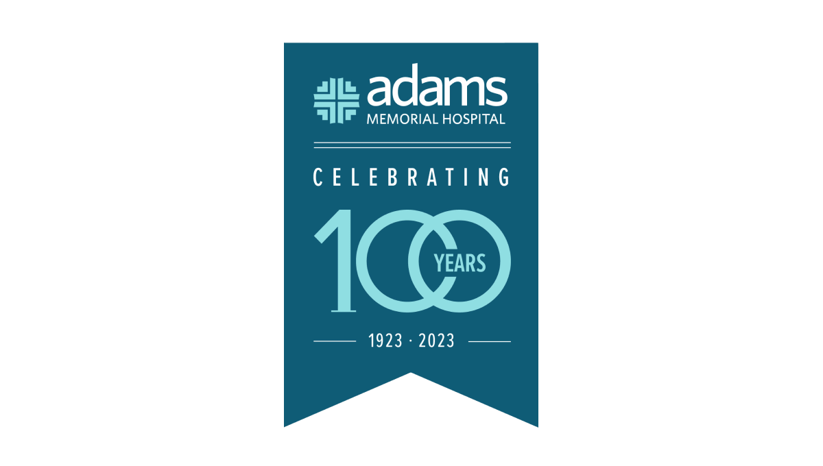
This unique layout for an annversary logo starts with a hanging banner shape in a shade slightly darker than the company's traditional teal color. Then, working downward, they add the primary brand logo followed by a styled "100 years" graphic. The 100 is in the brand color and features overlapping zeros with the word "years" inset within that overlap. Finally, extra text is placed above and below the number to add flow and balance.
More Details →Stowe 85th Anniversary Logo
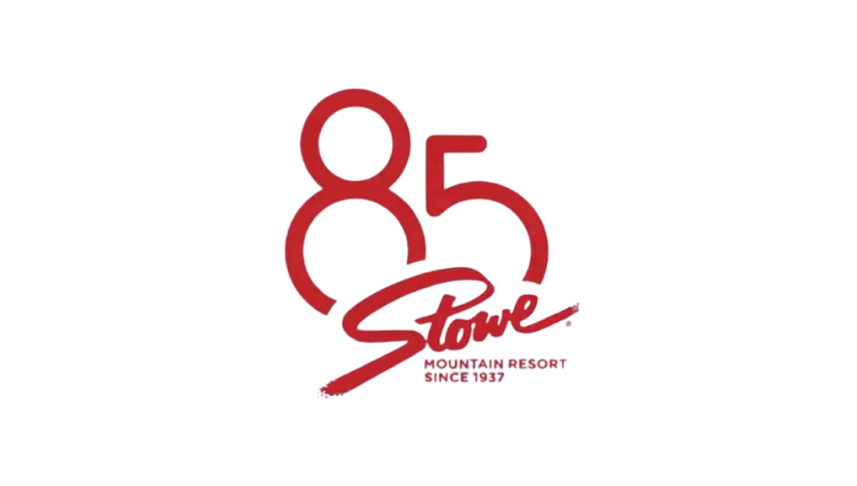
Stowe is a classic logo that hasn't changed since the early days of the resort and town. So rather than mess with something so clean and recognizable, they simply added a stylized number 85 peeking up and from behind the original mark. The result fit neatly on social media icons and marketing materials alike and kept things nice and simple.
More Details →SportsLogos.net 25th Anniversary Logo
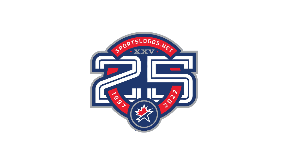
As a site that celebrates sports logos, this mark sets a high bar for anniversary logo designs. Starting with a circle in the brand's traditional red, it then cleverly weaves the number 25 in front of and behind the background to create a sharp three dimensional look. The site name and years are then set into the remaining red of the background with the original mark set in the bottom of the ring to make a clean connection to the original brand.
More Details →