Bank Anniversary Logos
Goldenwest Credit Union 90th Anniversary Logo
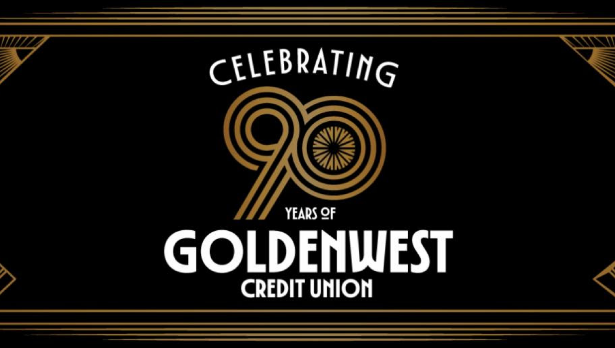
This anniversary logo has a refined, vintage-inspired style with a balanced and decorative layout. Thin geometric lines frame the design, creating a formal and elegant appearance, while the anniversary number is placed prominently in the center as the main focal point. A black, gold, and white color palette gives the logo a timeless and celebratory feel. Overall, the design combines classic decorative elements with clean typography to highlight a long-standing milestone in a polished, memorable way.
More Details →Bahamas Development Bank 50th Anniversary Logo

It can be tricky to design an anniversary logo when your original logo has so much color, but the designers for this bank did a great job of both choosing a gold that would compliment that palette but also using similar depth, shading, and styles of that original mark to make the combination of the two match really nicely. Set alongside their traditional word mark, this design adds a lot of visual weight to the original but does so with purpose and balance.
More Details →Zions Bank 150th Anniversary Logo
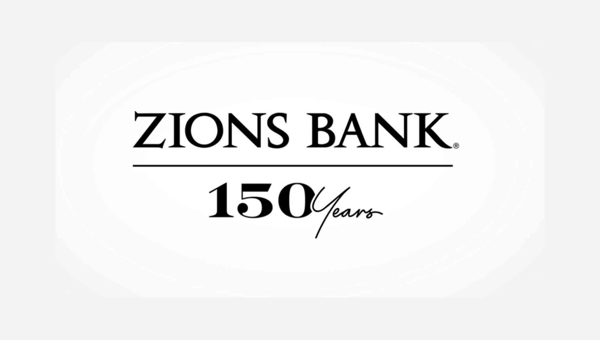
The traditional brand for this bank features the dark, serifed typeface you see at the top, so this logo build on that professional look. instead of placing a vertical line with the anniversary mark to the left or right, this logo places a horizontal line below the existing logo and then adds a simple number mark a similar font and color as the original logo. Given how wide their existing mark is, this was a great move to provide a little bit of balance and avoid further stretching the logo horizontally.
More Details →Goldenwest Credit Union 85th Anniversary Logo
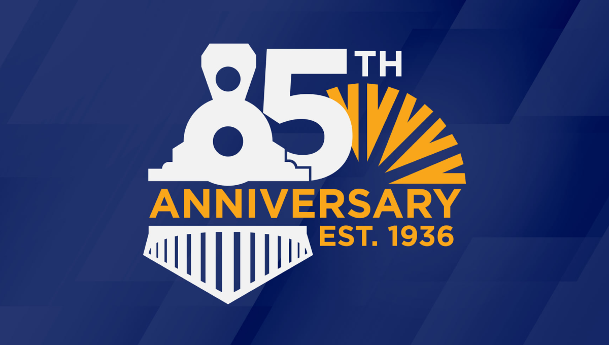
Goldenwest was originally founded as the Ogden Railway and Depot Company Employees Federal Credit Union, so on their 85th anniversary they tipped their hats to their rail-related roots by turning the number 8 into an illustration of a train engine. With their traditional mark peeking out from the side and the word anniversary across the middle, the design was a fun recognition of how far they've come.
More Details →SESLOC Federal Credit Union 80th Anniversary Logo
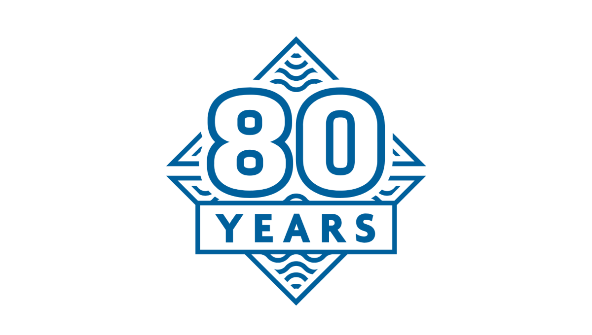
This mark was rarely used on its own, but because they stuck to the same blue color, shape, and style as the company's original logo, this design was a nice campanion to traditionally branded materials. The difference in this mark was a large number 80, unique line art behind, and a large word "YEARS" below the number. The design looked great and was used really well by this credit union during their anniversary.
More Details →Gate City Bank 100th Anniversary Logo
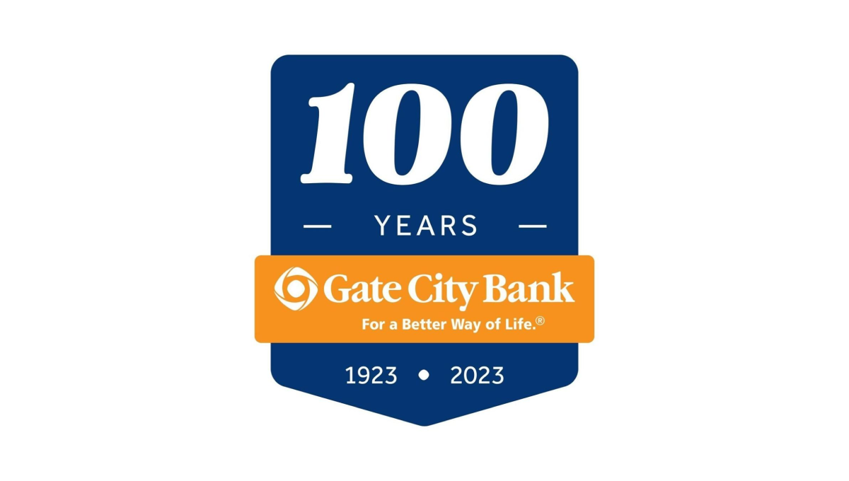
Using a clean banner shape, this badge-style logo uses a dark blue background to create contrast with the number of their annviersary and the years of operation. Between the two wraps an orange ribbon that holds the name of the and the company's tagline to make a clean, easy-to-recognize tie back to their original brand.
More Details →Traditional Bank 120th Anniversary Logo
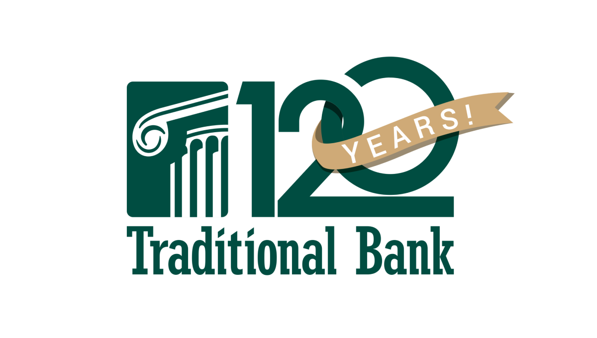
Normally the silhouetted columns in this logo sit in line with the name, but for this logo design they placed that mark above the words and enlarged it slightly which created room for a large number 120. This number features overlapping characters and a vertically offset 0 as well as a gold ribbon holding the word years that wraps around part of the number.
More Details →Metairie Bank 70th Anniversary Logo
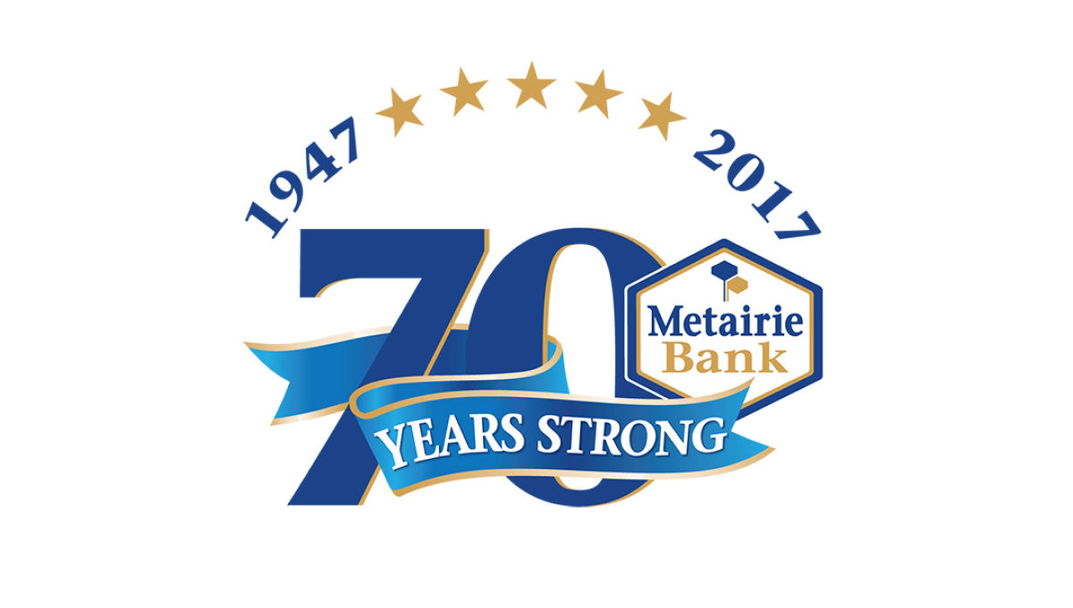
This design makes the number 70 in their brand blue the main visual feature, but also places many elements that sit layered above that logo. Curving above the number at the top sit a series of stars separating their years of operation, across the lower part of the number is a ribbon, with the original brand logo sitting in shape covering a portion of the remaining number.
More Details →Brookline Bank 150th Anniversary Logo
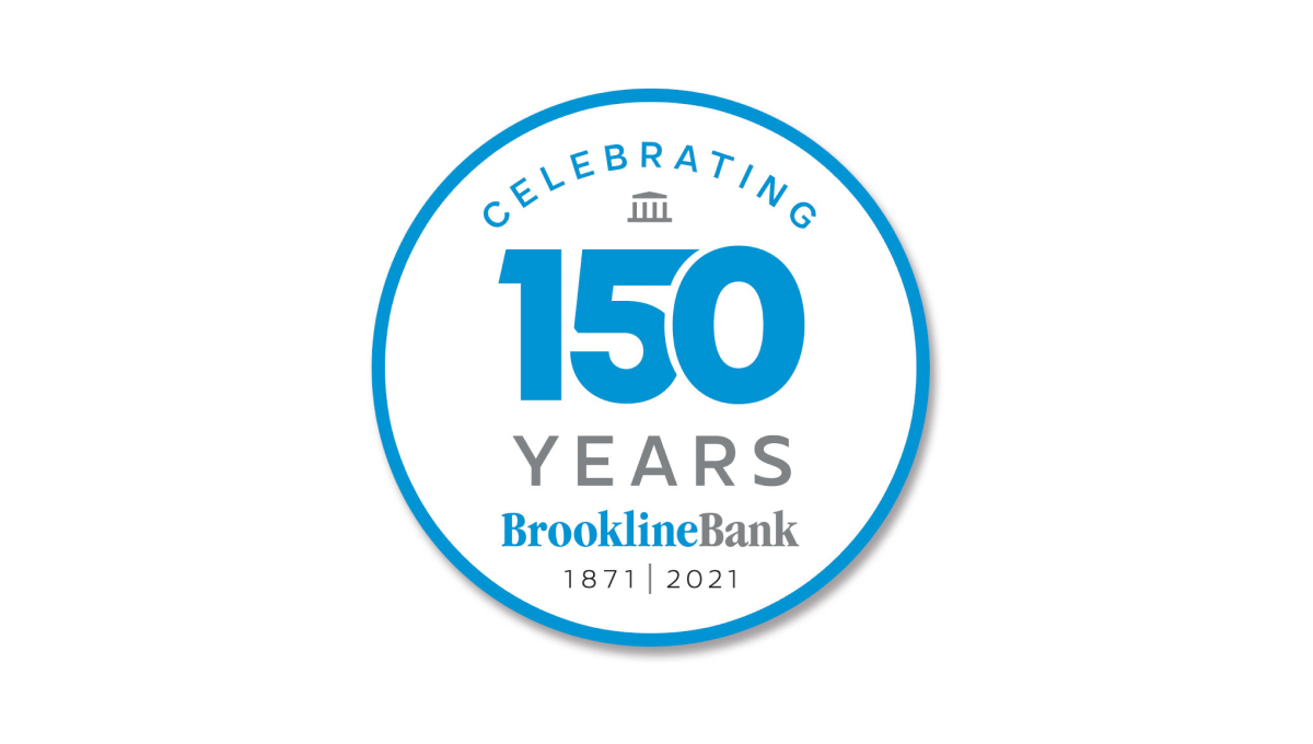
Round anniversary logos are easy to use on various channels including social media and this logo builds on that shape with a large number 150 to anchor the design visually in the banks' traditional brand blue. Above and below the number sit words to support that annivesary with the brank traditional logo at the bottom to help maintain brand recognition while the logo is in us.
More Details →