100th Anniversary Logos
Napa Auto Parts 100th Anniversary Logo
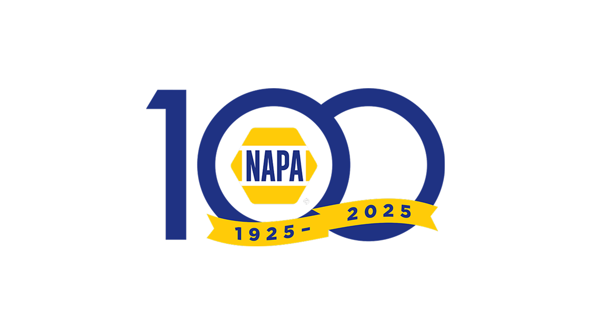
The anniversary logo shows a large, simple 100 with the classic NAPA badge sitting at the center in bright yellow and blue. Below that, a curved band has the years of the celebration in plain numbers. The basic colors and clear shapes give it a clean, straightforward look that marks an important milestone for the brand.
More Details →Hooper City Tomato Days 100th Anniversary Logo
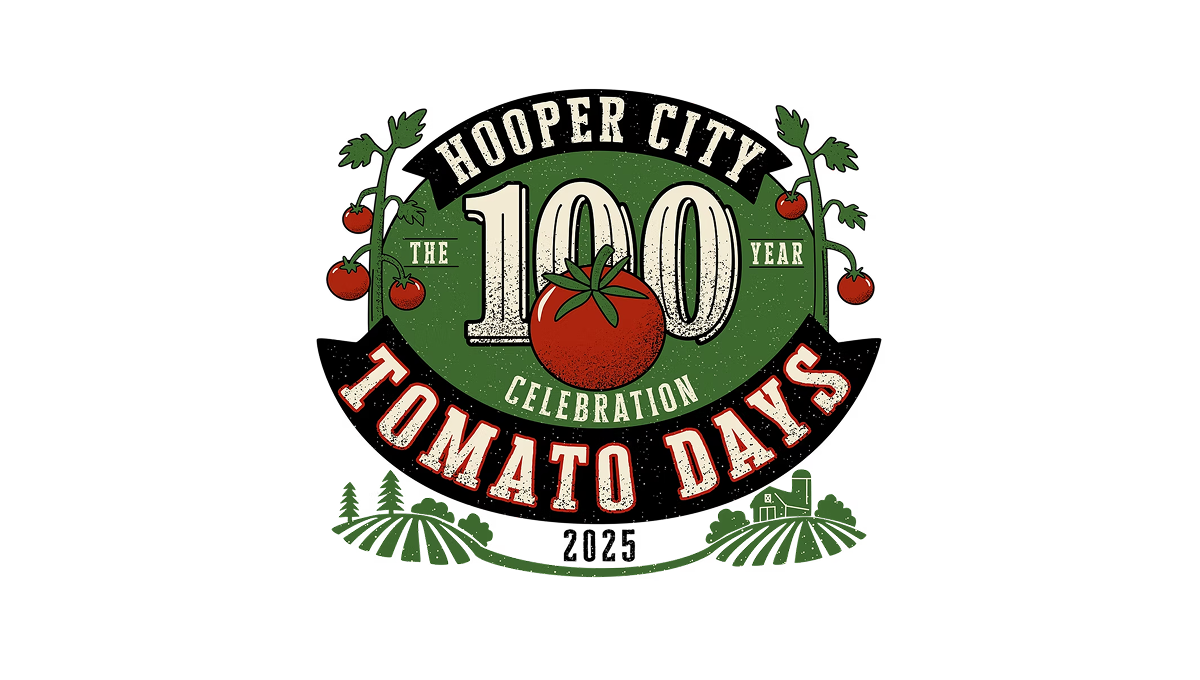
The logo uses a bold number 100 in the center with a tomato shape overlapping it, showing this event’s big milestone year. Around that, there’s simple text for the place and event name in a curved layout. On the sides and below, there are basic plant and field shapes that give it a slightly rustic, homey feel. The colors are earthy reds and greens with an old-fashioned, slightly worn look to the letters and shapes.
More Details →Tomy Toys 100th Anniversary Logo

Some logos seem to be well equiped to pair with a number of add-on to celebrate something like an anniversary logo and this is one of those. A rounded blue rectanged with the name of the company anchors the traditional logo on the left and by placing a stylized number 100 to the right - in this case by turning the zeros into an infinity sign - they've got a balance package that keeps the original logo as both the main element and the focal point of the design.
More Details →New Port Richey 100th Anniversary Logo

As much as we love simple logos, I love complex logos that aren't simply adding elements for fun but using intricate imagery that beautifully represents the things being celebrated. In this case, the anniversary logo is a beautifully drawn scene of the town's most famous architecture and locations. The colors are perhaps my favorite part, with the creamy, sand color used both in the imagery and the default background.
More Details →Clarendon Hills 100th Anniversary Logo

This design adds a little more detail that wer're used to seeing in anniversary logos. A gold circle holds artwork that is close to the actual appearance of a famous landmark instead of using the more common silhouette or line-art depiction seen in other logos. Below sits the name of the village stacked to align to the width of the design. The result looks really sharp and likely works just fine on most situations aside from places where limits on colors may come into play like screen printing or embroidery.
More Details →Fair Lawn 100th Anniversary Logo

When you're hitting a big number, I love designs that really put that front and center. In this case, a large number 100 in yellow sits behind a simple graphic of a prominent landmark. To the left flies a banner with the word "anniversary" and below sits the name of the town that's celebrating the occasion. It's a simple, clean, and on-brand design that would work in a lot of situations.
More Details →Geissler's Supermarket 100th Anniversary Logo

This logo design brings a clean, traditional approach to this supermarket chain's usual logo. Placing their red word mark in the center and wrapping it with a simple shape that adds some unique corners instead of a standard rectange, their then add a shiny, gold circle behind with the words commemorating the occasion and filling out this seal-style concept.
More Details →Delta Airlines 100th Anniversary Logo

Delta Airlines kept it simple and classy with this anniversary logo. A large number 100 in their classic purple sits in the center with a silver Delta logo coming out and out of the last zero in the number. Above that sits the full logo with the word years below. It's a simple package but an effective one that gives logo a clean mark that is already being used in a variety of contexts.
More Details →HSMAI Foundation 100th Anniversary Logo

The original logo for this foundation already had quite a few elements, so I appreciate that design kept it simple by adding a large number 100 below the base of the original, using their tagline as a divider between the main mark and the anniversary addition. The design uses the same colors and fonts to create a nice pair to the traditional mark. There's a lot going on, but it works nicely together.
More Details →Memorial Stadium 100th Anniversary Logo

Older stadiums and buildings often have an exterior that becomes part of the venue's brand. This stadium is no exception and the designers did a fantastic job of combining the architecural elements that make this stadium famous with the traditional crest-style designs that are famous in sports marketing. The result does a great job of conveying the anniversary, ties perfectly back to the stadium itself, and also sends strong singals to reinforce the industry they're in.
More Details →Art Directors Club 100th Anniversary Logo

The concept for this logo is describeed by Bruce Chao. In his words from the source linked below this logo, "ADC100 branding plays on the existing ADC letterform, as well as the rich legacy of archival imagery that foregrounds the people and work at the heart of the organization and awards program. The branding also references the original ADC geometric pattern that echoes the Art Deco design style from the era in which the club was founded."
More Details →Dum Dums 100th Anniversary Logo

When you make a candy that is loved by children, you need a logo to extends the fun, playful vibe of their original mark and that's exactly what Dum Dums did here. This logo features a large number 100 in the same font as their logo and using the child-relevant word birthday instead of the adult-minded anniversary. The candle replacing the number 1 is a perfect way to both break up the color red and reinforce the birthday language of the sub text.
More Details →Columbia Pictures 100th Anniversary Logo
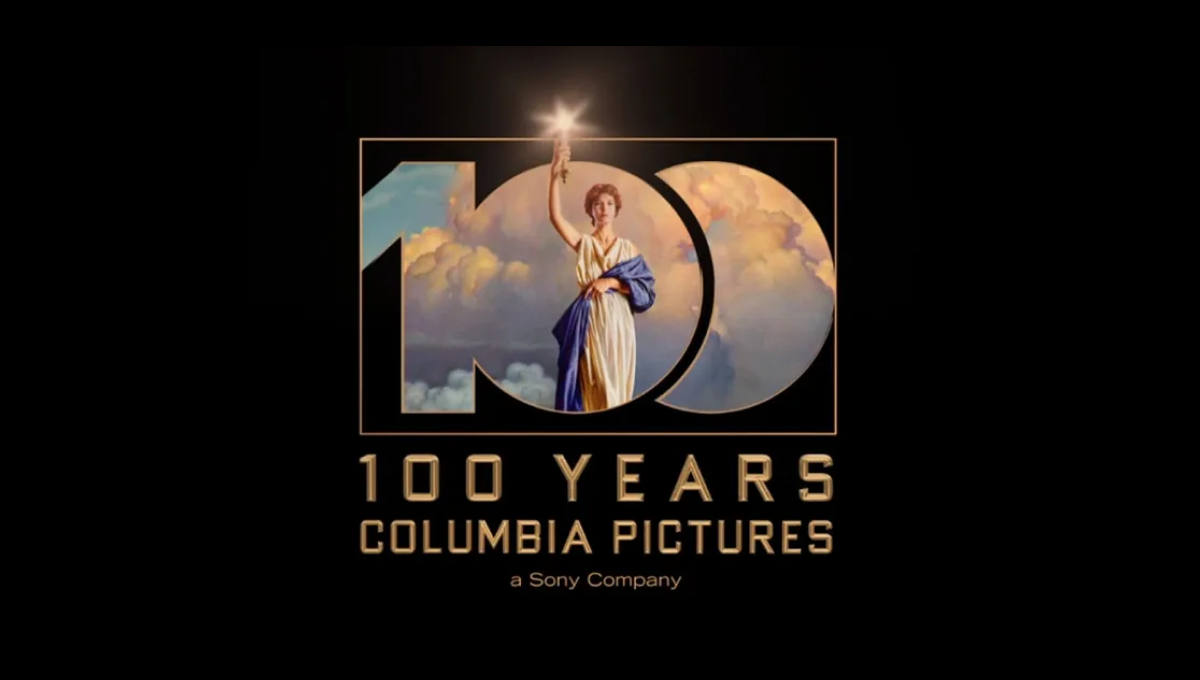
Columbia Pictures' opening sequence has been seen dozens of times by millions of moviegoers. So when they wanted to create a recognizable but simple anniversary logo, they simply overlaid a large, block 100 on this classic imagery. The result is clean, easy to understand, and an instantly, clean connection back to their original brand.
More Details →New York Giants 100th Anniversary Logo
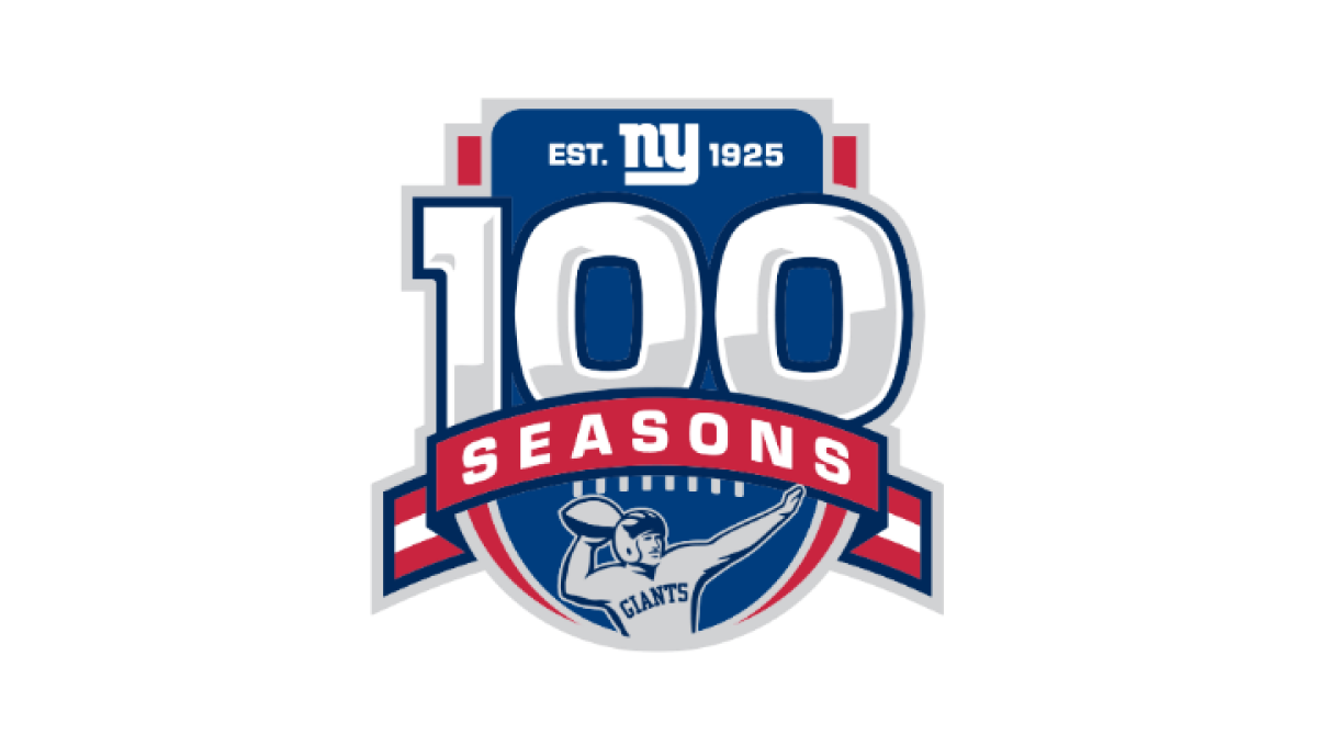
Anchored visually with a large number 100 inside a classic sports-style crest, this logo uses more classic sports vibes to created a logo that has depth and a cohesive design. At the top of the 100 sits the team's original logo, below sits a ribbon holding the word seasons, and a football icon at the bottom completes this logo.
More Details →Wenbley Stadium 100th Anniversary Logo
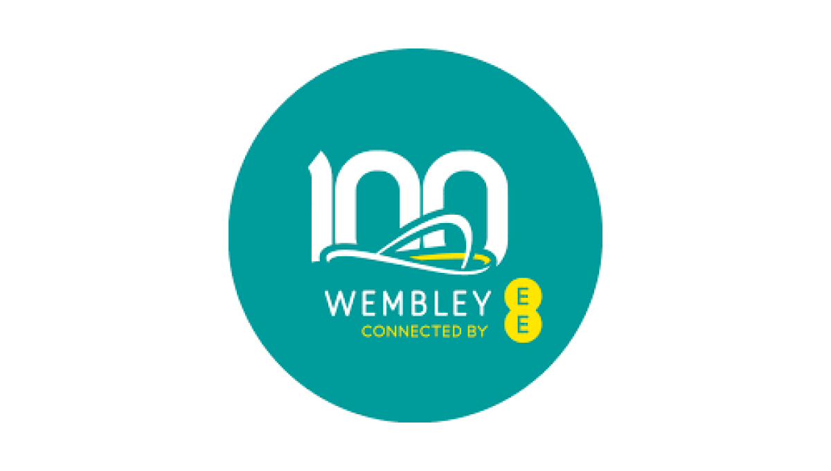
When your architecture is as famous as Wembley's, all you need is a silhouette of your iconic roofline to create the foundation of a logo that is both easy-to-recognize and an elegant set of lines to build on. A number 100 peeks up from behind the stadium and the curren sponsor and name below creates a sharp-looking logo for their century anniversary.
More Details →Illinois Valley Community College 100th Anniversary Logo
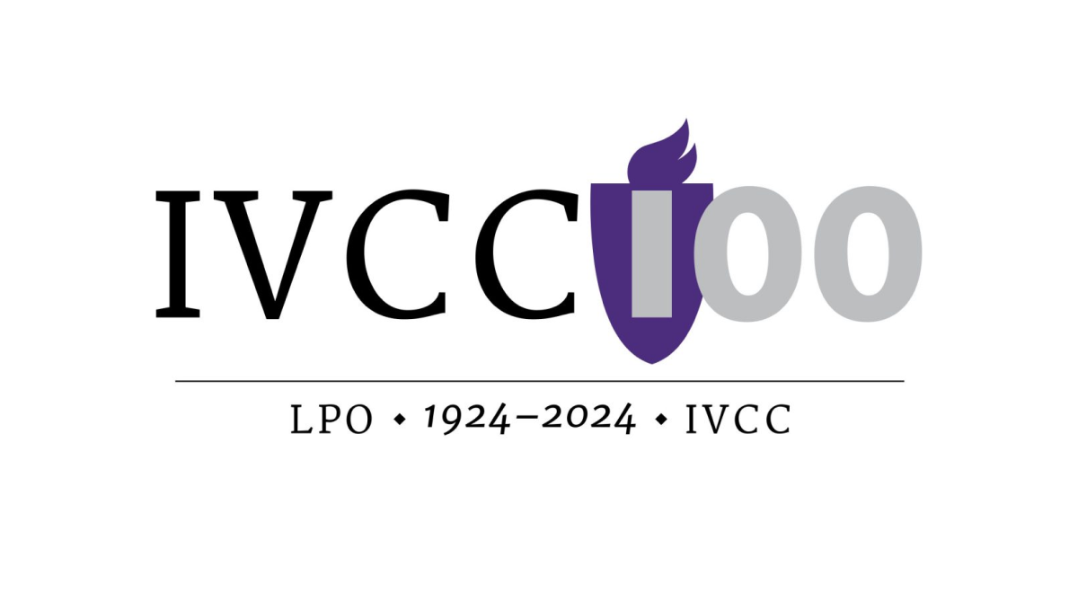
Universities have a unique feel, voice, and set of imagery that is used neatly and effectively in this logo for Illinois Valley Community College. A flame in the school's classic purple color sits behind the first part of the number one hundred, a serfed typecase from the original logo spells out their abbreviation of the school, and a little extra context sits below for a simple but balanced design.
More Details →Kentucky State Parks 100th Anniversary Logo
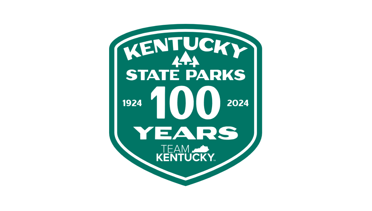
Using the classic parks-style badge, old-school fonts common on vintage posters, and a large number 100 to anchor the design, this badge-style logo combines a lot of elements - the name of the organization, the years, the state, etc. - into a conhesive design that is easy to picture being something that would have existed 100 years ago when Kentucky State Parks was organized.
More Details →Mt Buller 100th Anniversary Logo
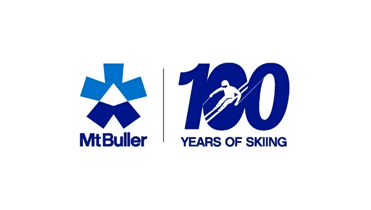
One of the smartest design trends in anniversary logos has been the simple, side-by-side concept that draws a vertical line in the middle, places the original logo on one side, and a simple number mark on the other. Mt Buller did this really wel with a nice "100 years of skiing" mark that makes for a nice, visual balance to the brand both visually and with the meaning they're aiming for.
More Details →FIS 100th Anniversary Logo
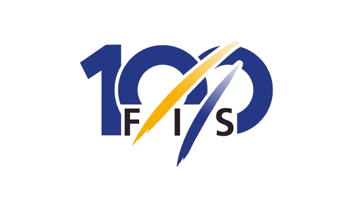
The organization behind professional skiing and ski racing, FIS started with a large number 100 in their classic blue color but added another of their brand colors, yellow, in two streats representing the tracks their members form down the mountain. With their traditional logo woven in at the bottom, this made for a really sharp, clean anniversary logo.
More Details →National Football League 100th Anniversary Logo
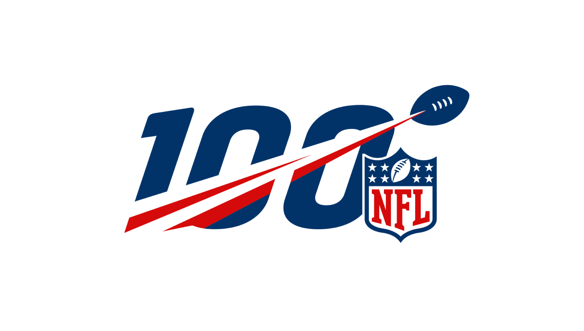
A logo that was seen time and time again by millions during the league's 100th anniversary, this mark features a large, block number 100 with a football streaking from the lower right to the upper left with a red line flowing behind. Finally, the league's traditional logo sits just to the bottom right to add balance and make the mark easy to recognize.
More Details →Lincoln Memorial 100th Anniversary Logo
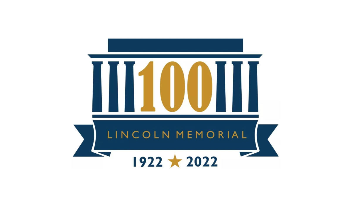
As one of the most recognizable monuments in the country, this logo leaned into this famous design for their anniversary logo. By replacing three of the pillars with a large, elongated number 100, the designers created a clean layout but also one that one easy to recognize even without the ribbon and dates along the bottom clarifying what is being celebrated and the years of operation.
More Details →Folsom Field 100th Anniversary Logo
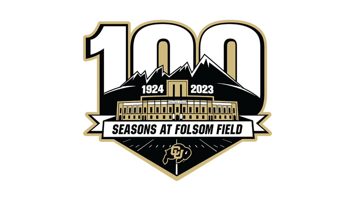
It's a big year for Colorado football for many reasons, but one of them is the anniversary celebration for their famous Folsom Field. This mark combines their mountain skyline, yard lines from the field, and a beautifully line-art illustration of the stadium's exterior to set the stage for this anniversary logo. Behind the mark sits a large, block number 100 rising up from behind the mountains.
More Details →Windsor Historical Society 100th Anniversary Logo
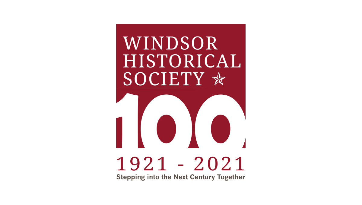
Starting with a square in the non-profit's traditional maroon color, this logo adds a large, block number 100 overlapping the bottom to create a strong, visual anchor for the design. At the top is the organization's name and mark, below the square are their years of operation, and at the bottom is the group's motto to create a tidy, on-brand design with a strong tie back to their usual brand.
More Details →Gate City Bank 100th Anniversary Logo
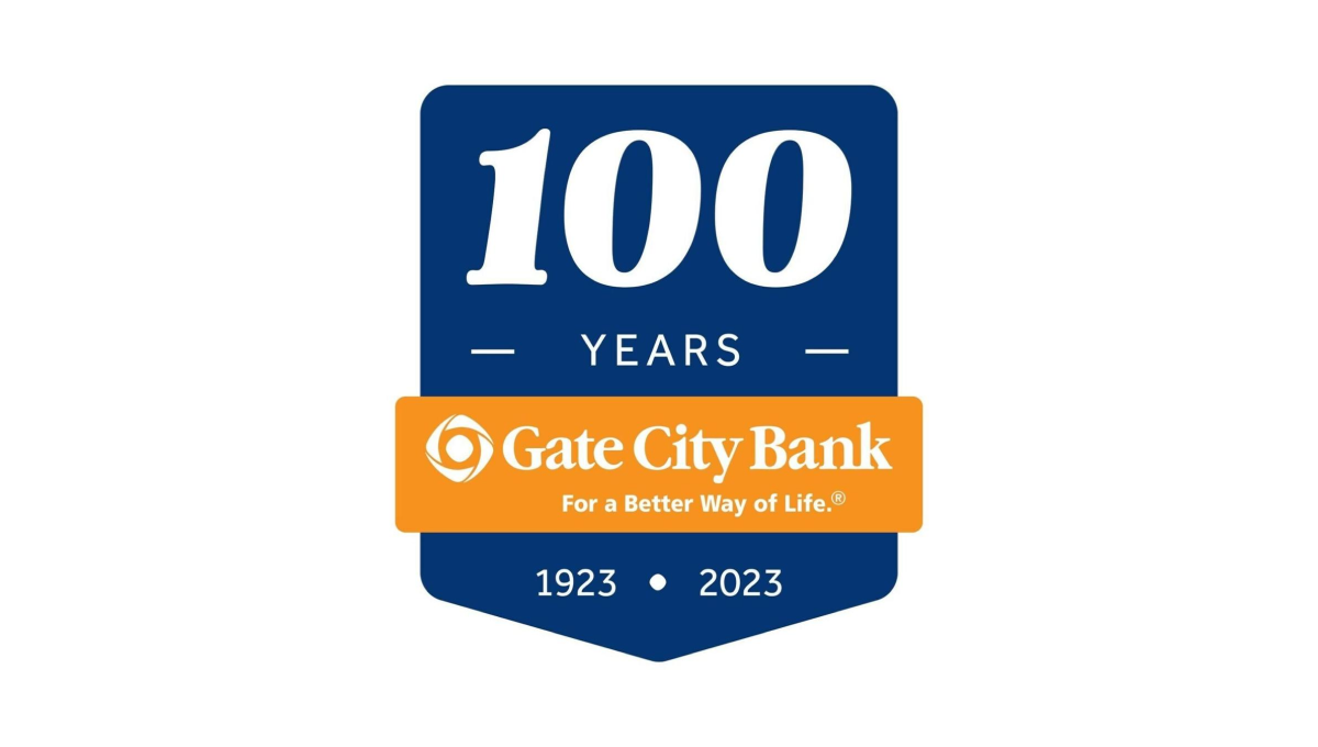
Using a clean banner shape, this badge-style logo uses a dark blue background to create contrast with the number of their annviersary and the years of operation. Between the two wraps an orange ribbon that holds the name of the and the company's tagline to make a clean, easy-to-recognize tie back to their original brand.
More Details →First Baptist Church of Kenmore 100th Anniversary Logo
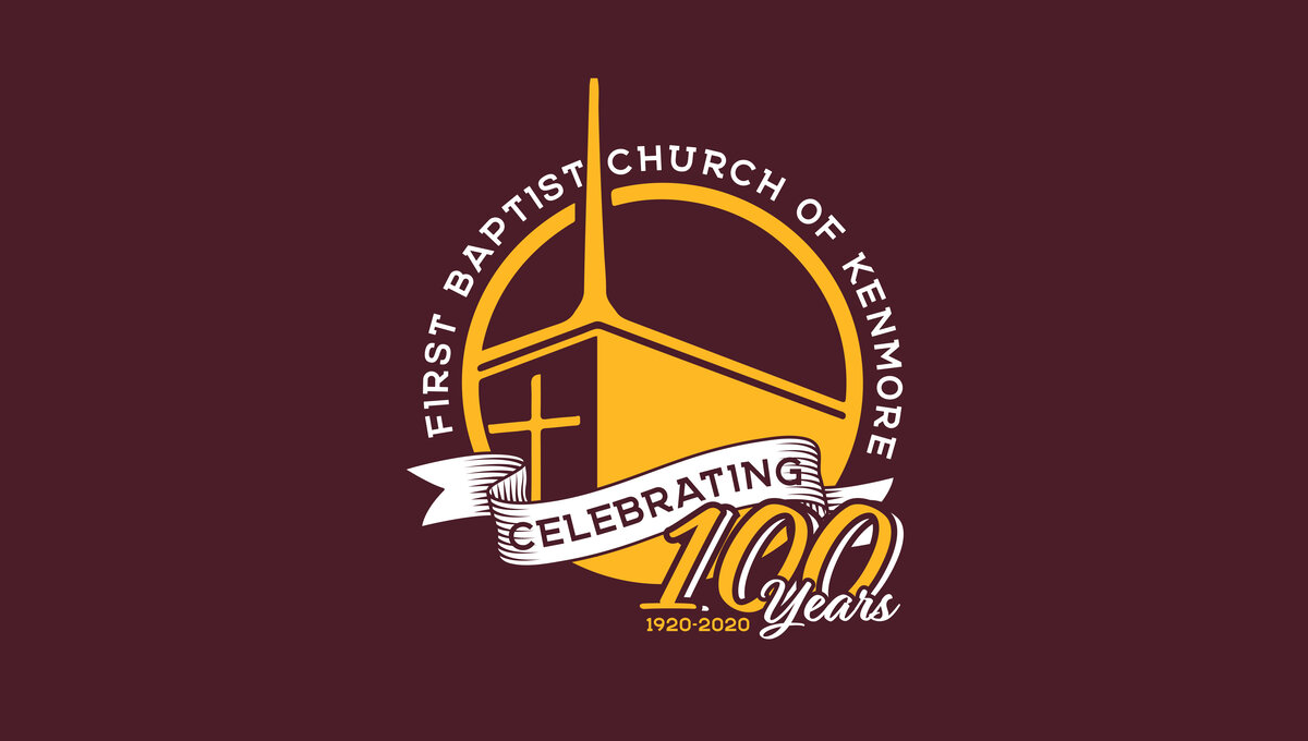
This three-dimensional logo is designed for a dark red background and uses a few classic elements to create a clean logo. First, a gold circle with a thin rim creates the shape with the name of the church arcing around the outside of the circle. Inside sits an illustration of their church with a bit of perspective to add depth. Finally a white ribbon holds the word "celebrating" with the anniversary and years sitting just in front of and below that ribbon.
More Details →Acadia National Park 100th Anniversary Logo
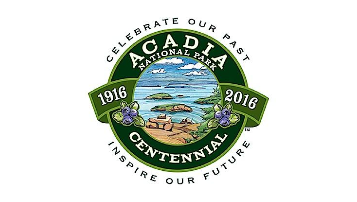
This seal-style logo uses a number of details to create a clean, balanced whole. First, a green circle with wide rim holds the name of the park and the word "centennial". Next, the inner circle is filled with an illustration depicting to beautiful shores and plants found in the park. A ribbon then holds the years of operation with arcing words above and below the seal holding the motto.
More Details →National Park Service 100th Anniversary Logo
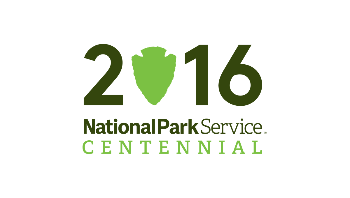
Starting with a large, block number 2016 to signify the year of the annivesary, this logo takes a recognizable shape that holds the National Park Serivice's primary logo - a downward pointing arrowhead - and swaps that for the number zero in a slightly lighter green. Below the number sits a word mark with the name of the organization and the word "Centennial" below in the same green as the arrowhead.
More Details →Grand Canyon National Park 100th Anniversary Logo
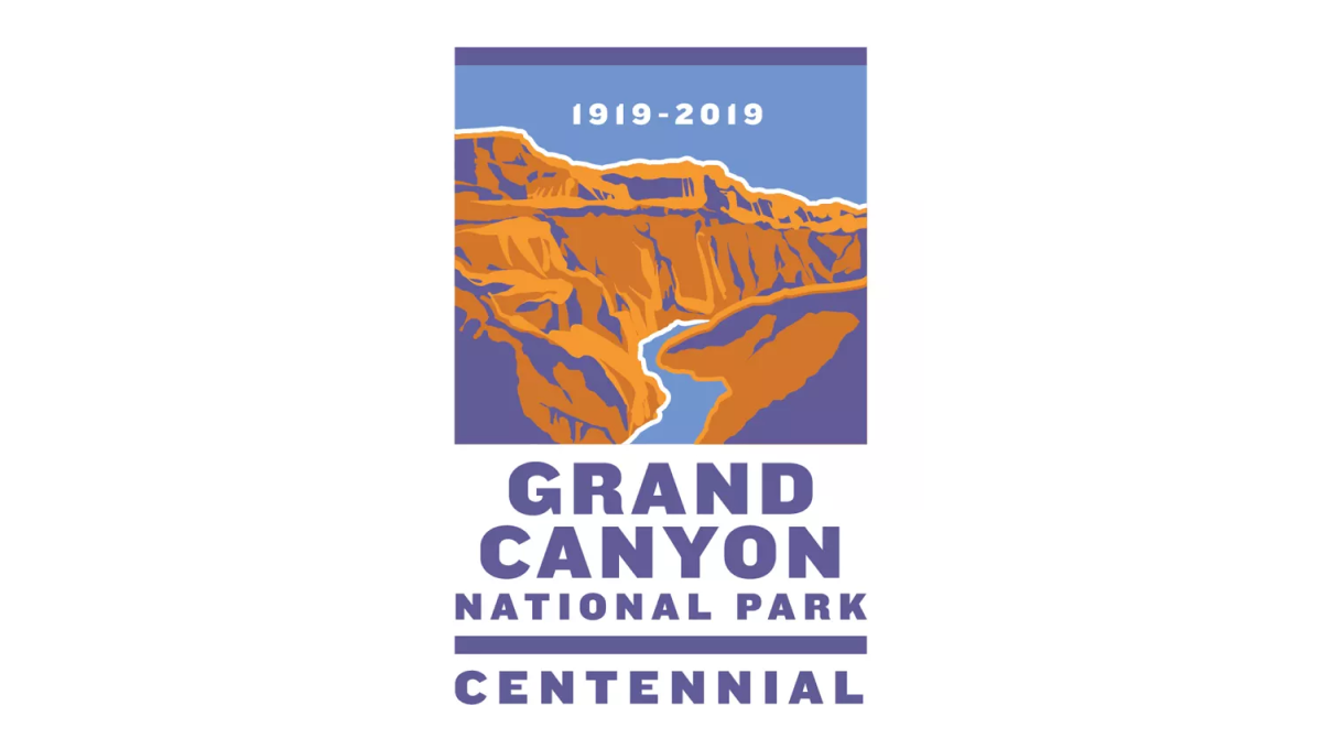
This logo sits within a vertical rectangle shape. The top two thirds holds an illustration of the famous canyon in a classic WPA poster style. In the blue sky area at the top sits the years of operation. Below sits the name of the park and the word "Centennial" to clarify the reason for this special design.
More Details →Rocky Mountain National Park 100th Anniversary Logo
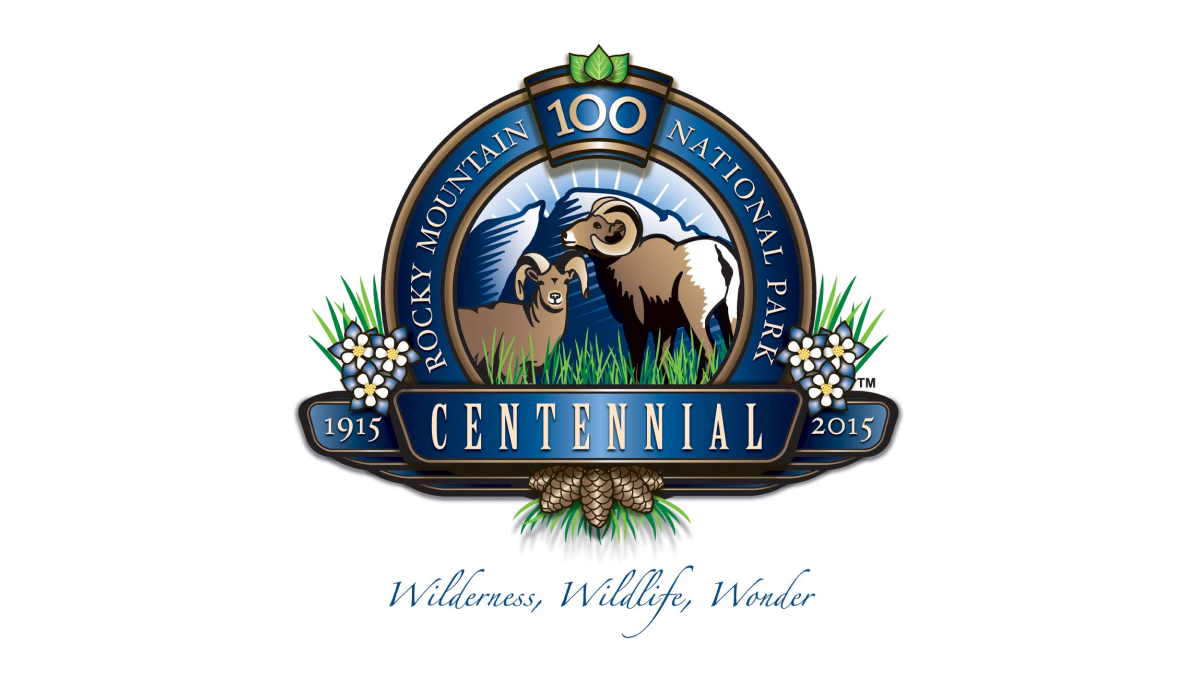
This detailed anniversary logo uses a seal-style design to hold many unique elements related to the park. In the rim sits the name with a keystone shape holding the number 100 at the top. Across the front sits a ribbon holding the word "centennial" and the years of operation. Inside the seal are illustrations of wildlife with flowers and plants below and to the sides of the seal.
More Details →Hot Springs National Park 100th Anniversary Logo
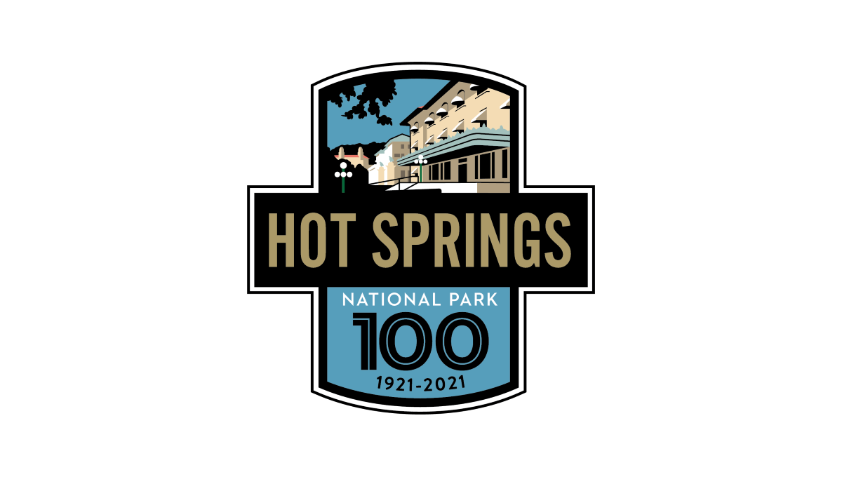
This logo starts with two overlapping rectangles, one placed vertically and the other horizontally. The horizontal rectangle is filled with black and gold letters of the park's name sit inside. In the vertiacl rectangle, the part sticking up from behind the name of the park holds a depiction of the park's famous architecture with the bottom holding a large number 100, the years of operation, and the words national park with blue behind.
More Details →Yellowstone National Park 100th Anniversary Logo
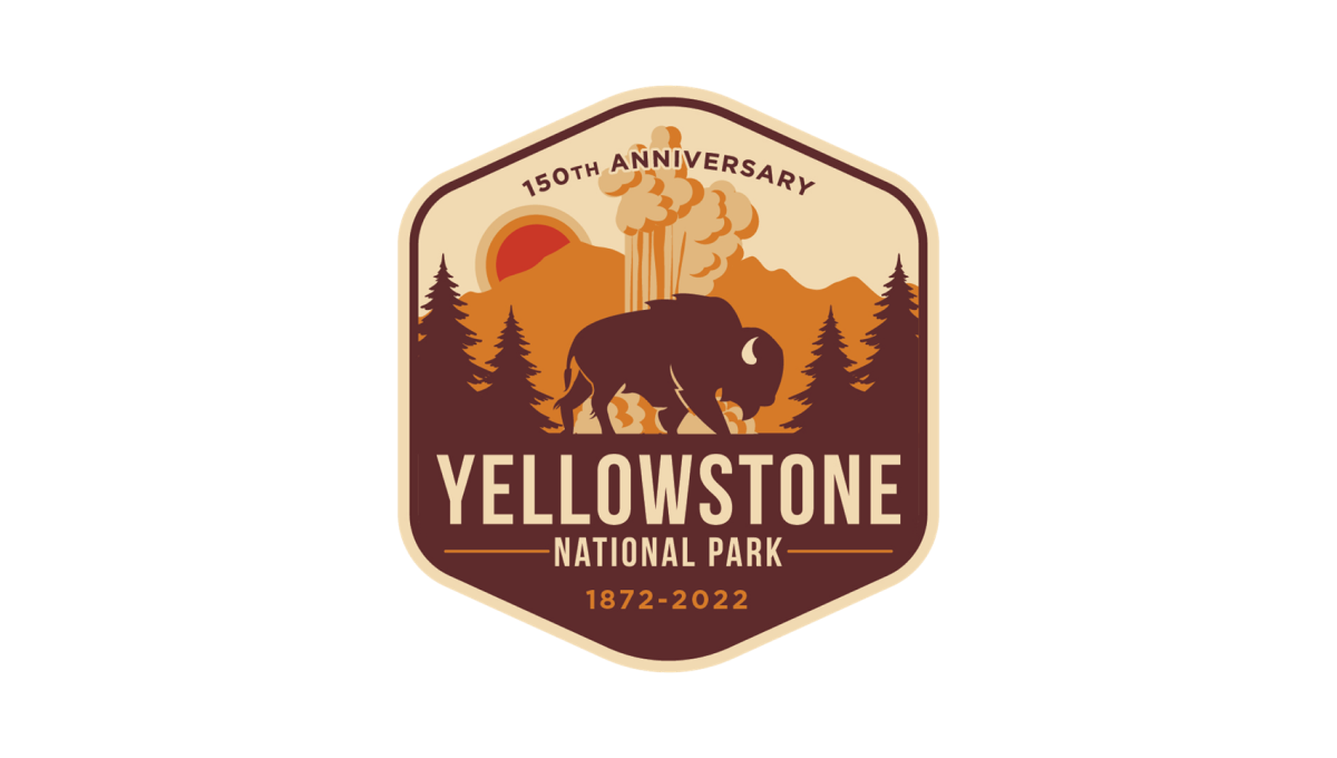
Yellowstone's 150th anniversary logo starts with a hexagonal shape in an orange and brown color that's reminiscent of many colors throughout the park. Inside, layers of monochrome silhouette's depict the park's famous geysers and wildlife. In the bottom half, the name of the park sits just above the years of operation with a callout of the anniversary arching across the upper part of the design.
More Details →Bryce Canyon National Park 100th Anniversary Logo
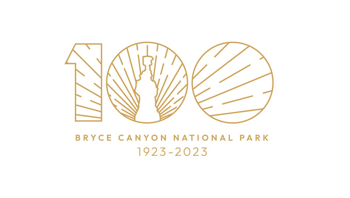
Bryce Canyon's centennial logo uses gold line art for the vibe in this design. A large number 100 contains a clean line-art depiction of the park's famous hoodoo formations with sunset-style lines emerging from behind and filling only the area with the number. Below, the name of the park and the dates of operation are placed in the same color as the mark above for a clean, balanced design.
More Details →Bay Shore Inn 100th Anniversary Logo
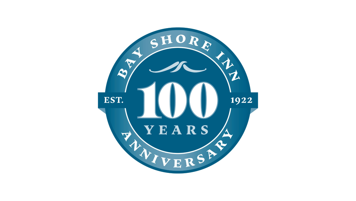
Building on the classic vibe of a lake or water themed brand, this logo uses a round seal-style shape as the foundation. Two tones of the brand's classic blue color make an inner circle and thick, outer rim. In the center is a large number 100 with the word "years" and a small wave icon set above and below to fill the circle. In the rim is the name of the inn and the word "anniversary" with a simple ribbon holding the year the inn opened.
More Details →United Way of the Midlands 100th Anniversary Logo
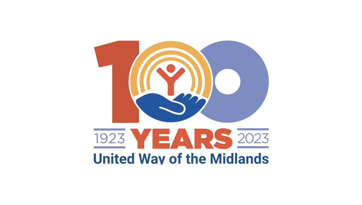
Like other United Way anniversary logos, this logo uses the classic red, gold, and blue colors of the original brand with a large, block number 100 in the center to anchor the logo. The United Way logo sits neatly in the center zero with the word "years" bloe and tha date range on either side to add balance. Finally, the name of the chapter is displayed at the bottom for a clean, on-brand logo.
More Details →Yankee Stadium 100th Anniversary Logo
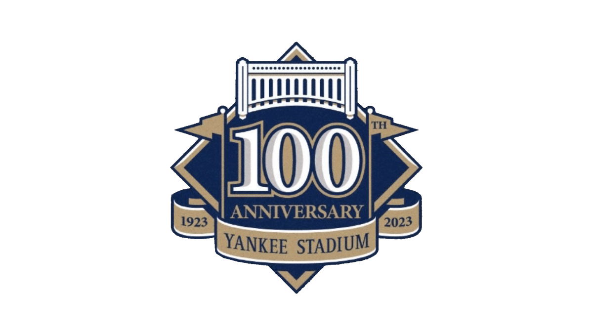
This logo starts with the classic baseball diamond shape as the base and adds a large number 100 in the center to begin. Above that sits an illustrtion representing the landmark's famous architechture. To either side of the 100 sit the famous flags - the right one containing the "th" for the year - which also frame the number nicely. Below, a ribbon holds the years of operation and the name of the stadium to comlete the design.
More Details →Columbia International University 100th Anniversary Logo
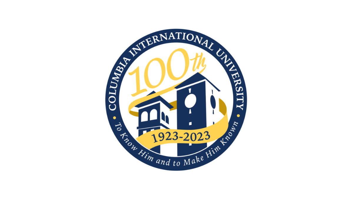
This logo uses a circle with a thick, navy blue border as the foundation. Inside that rim sit the name and mission statement of the school. Inside, a three dimensional silhouette of the school's famous buildings fills in the lower half of the space with a large number 100 in yellow following the angle of the buildings to neatly use the rest of the area inside the circle. A ribbon wrapping around the buildings then completes the design and contains the years of operation.
More Details →Warner Bros. 100th Anniversary Logo
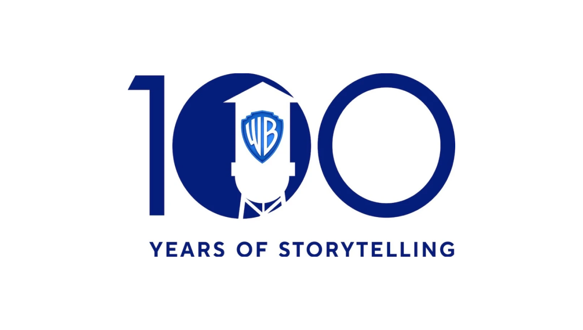
Starting with a large, block number 100, this logo fills in the first zero to create a canvas for their design. Next, the famous Warner Bros. watertower is placed inside that first zero with a slightly different blue color holding their traditional WB badge. Below the number 100 the words "years of storytelling" give the 100 context and reinforce what their brand is all about.
More Details →Aggie Ice Cream 100th Anniversary Logo
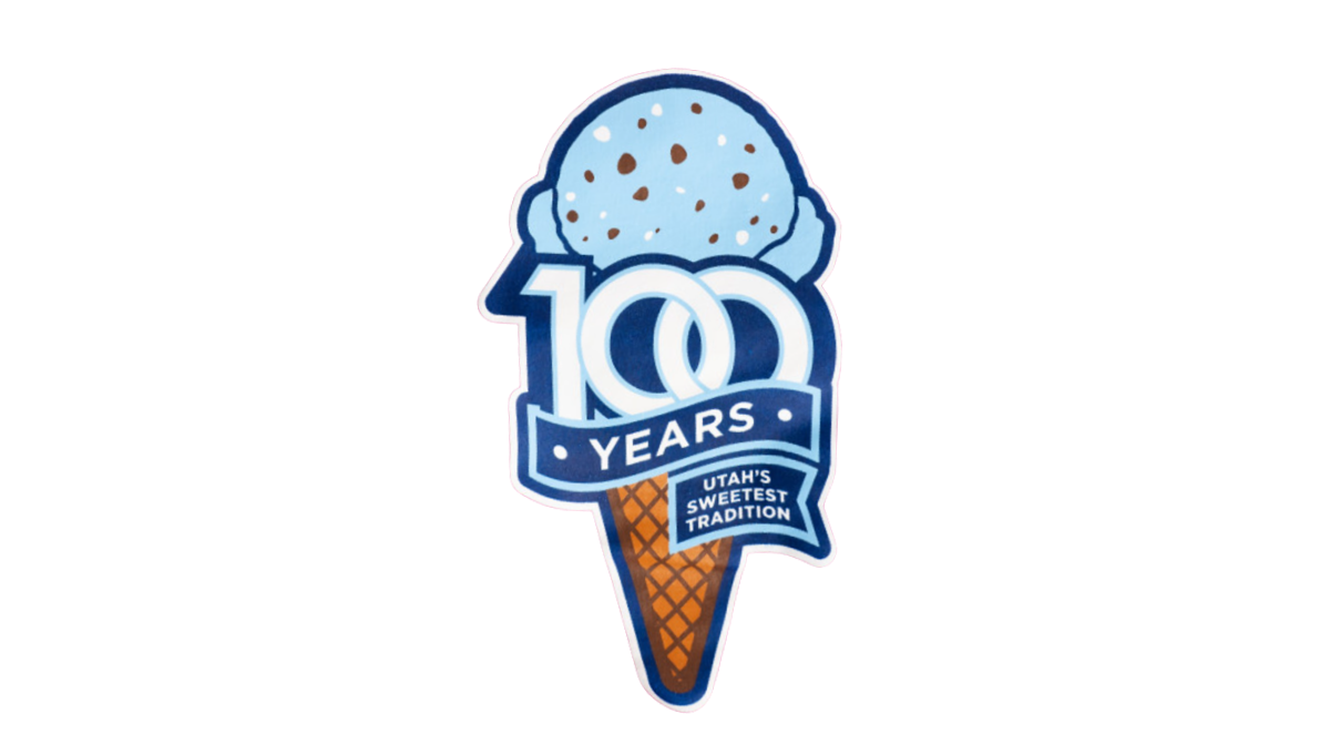
A stable of Utah State University's history, the ice cream shop within this school's campus wanted to celebrate their famous treats with a logo. So they started with an icre cream cone in the classic aggie blue, added a block number 100 in front of that with a ribbon below that wrapped below to contain the words "years" and "Utah's sweetest tradition." The logo was featured in the shop and on logo t-shirts and hats available in the store and online.
More Details →Adams Memorial Hospital 100th Anniversary Logo
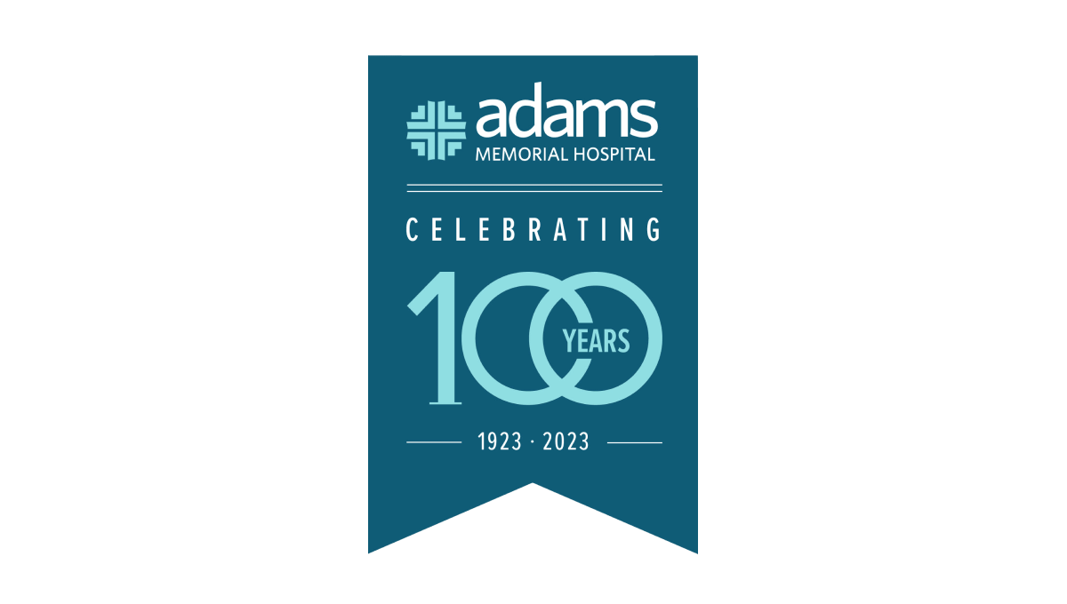
This unique layout for an annversary logo starts with a hanging banner shape in a shade slightly darker than the company's traditional teal color. Then, working downward, they add the primary brand logo followed by a styled "100 years" graphic. The 100 is in the brand color and features overlapping zeros with the word "years" inset within that overlap. Finally, extra text is placed above and below the number to add flow and balance.
More Details →Komori America Corp 100th Anniversary Logo
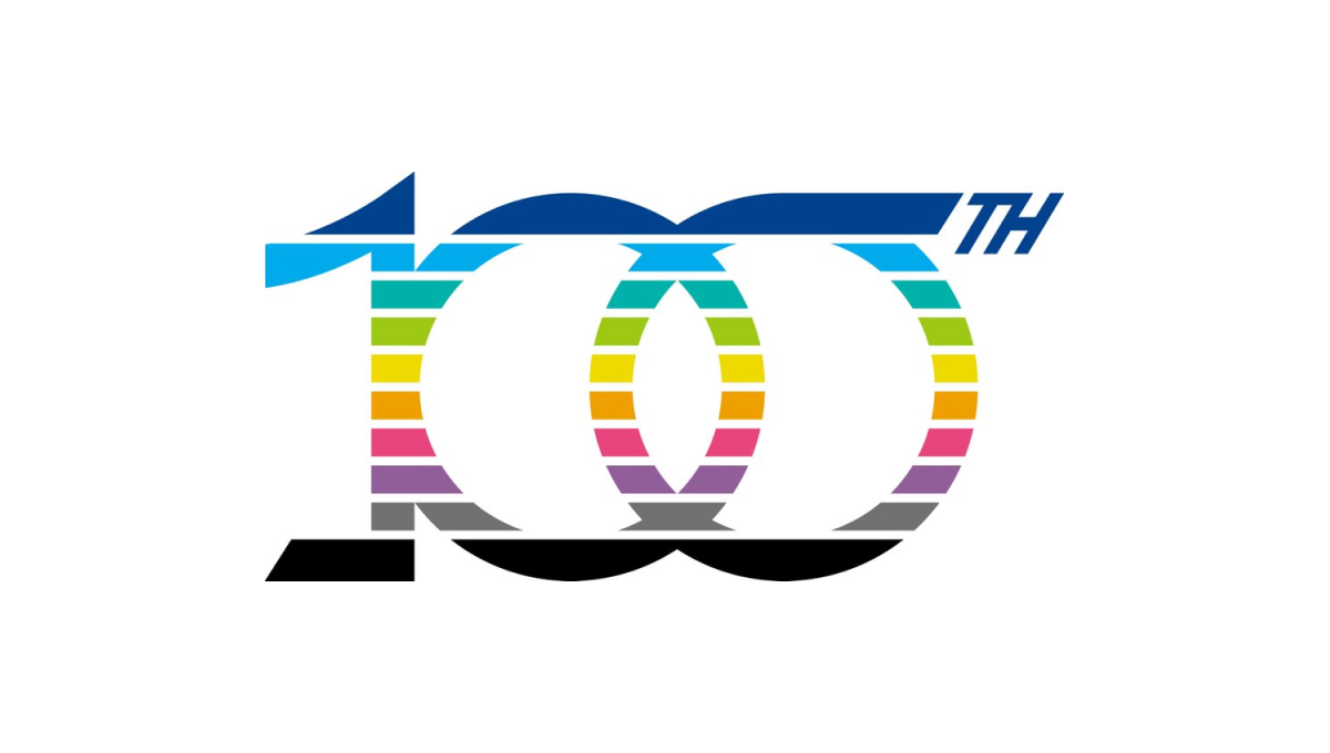
This mark is full of meaning. First, the ten horizontal bars that make up the design represent the 10 decades they've been in business. Next, the color palette points to the industry they work in - printing - and all the possibilities those various colors can represent. Finally, a few upward-turning points symbolize progress and advancement going forward.
More Details →