Black Anniversary Logos
Jackson Hole 60th Anniversary Logo
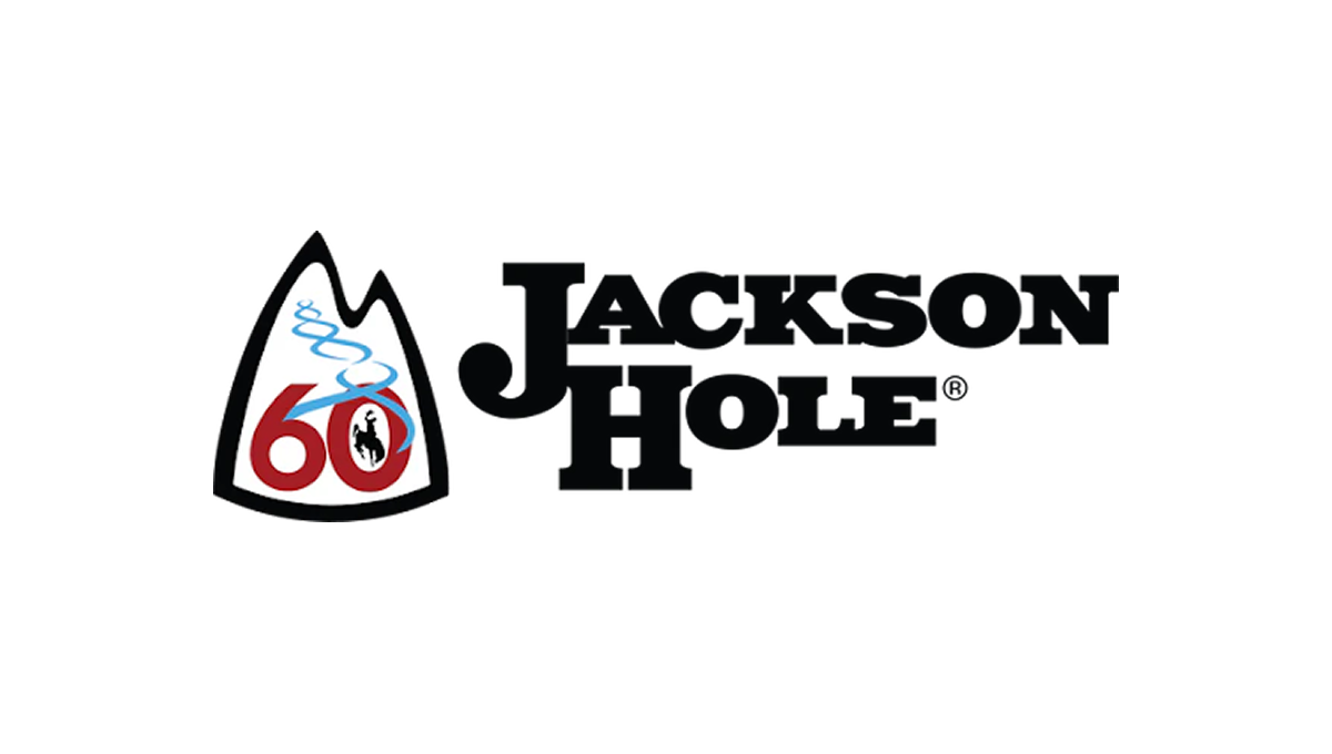
The anniversary logo has a clean, simple look with a strong outdoor feel. It centers on a mountain-shaped badge that suggests nature and adventure. The number 60 stands out, marking a long history. A soft, flowing line represents fresh ski tracks. The colors are bold but calm, and the overall design feels balanced, timeless, and quietly celebratory.
More Details →Whistler Blackcomb 60th Anniversary Logo
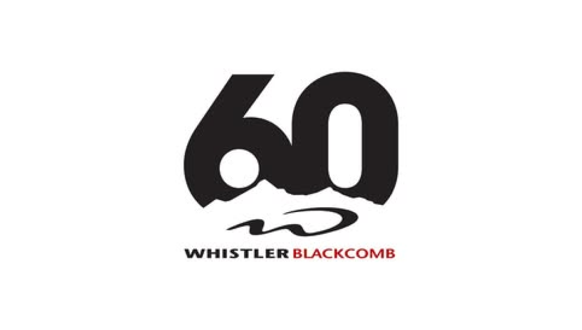
The logo centers on a large, bold 60 in dark lettering, with a rough, uneven edge along the bottom that suggests mountains or natural terrain. Below the number is their logo. The name appears underneath in clean, straightforward text, with a small pop of color for contrast. The overall design feels modern and minimal, marking the anniversary in a strong but understated way.
More Details →X Games 30th Anniversary Logo

The anniversary logo has a clean and modern look, using soft colors and simple shapes. It shows the number 30 in a bold style, with the words “years” and the event name placed nearby. There’s a sense of movement or connection in the way the elements come together. The design feels both respectful of the past and hopeful for the future. Overall, it’s a bold and balanced way to mark an important milestone.
More Details →Reser's 75th Anniversary Logo

The logo celebrates a 75-year milestone with bold colors as the main focus. It uses clean, classic lettering and a smooth layout that feels both modern and respectful of the past. A banner curves across the bottom, mentioning the anniversary, adding a sense of movement. The color choices are warm and timeless, giving it a sense of tradition and pride. Overall, the design feels strong and simple, marking a long and steady journey.
More Details →Golf Digest 75th Anniversary Logo

This 75th anniversary logo has a classic and neat look, with dark and light colors creating a strong contrast. The number “75” is big and placed front and center, with the words “Golf Digest” above it in a clean font. The overall style is simple but firm, with a traditional tone that feels respectful and suited for a lasting milestone.
More Details →Titelist ProV1 25th Anniversary Logo

The 2025 Pro V1 golf ball features a subtle anniversary marking, blending tradition with a nod to its 25-year legacy. The design includes a minimalist 25, with the words 'Pro V1' beneath it. This emblematic detail is positioned near the equator of the ball, maintaining the Pro V1's classic aesthetic. The overall look is clean and refined, honoring its heritage without overt celebration. This design choice reflects a commitment to timeless performance.
More Details →Brock Built 40th Anniversary Logo

This anniversary logo features a clean, modern design with a bold number "40" that stands out clearly. The company name is displayed in a strong, straightforward font underneath, giving it a solid and professional feel. The colors are simple and balanced, creating a calm and confident look. Overall, the design feels respectful and steady, marking the anniversary in a clear and tasteful way.
More Details →Vox 10th Anniversary Logo

Vox is a classic example of a company that cares deeply about brand consistency. And when you care about consistency, it can sometimes be either challenging or uneccessary to create an anniversary logo that adds in a bunch of new elements. So, Vox didn't. They took one of the existing brand fonts, made it nice and bold for a number 10, and placed their logo inside hugging the right line of the number 10. Clean, on-brand, effective.
More Details →Acura Grand Prix of Long Beach 50th Anniversary Logo

You could take away almost all of the context of this logo and still know that it's for an auto race. The thick, parallel lines of the number fifty along with the checkered flag embedded neatly inside mimic the classic track maps and diagrams that are so familiar in both the actual sport and virtually in games. Places beside the word mark you can see how well the designers matched this addition to the original logo.
More Details →The Doors 60th Anniversary Logo

The Doors already has a simple but extremel recognizable logo. So instead of overdesigning some new mark coming from a different direction, they took that original mark, put the silhouettes of the band members poking up from behind, and places a simple ribbon across the middle part of the design to hold an anniversary label. Simple, smart, and effective.
More Details →Trollhaugen Recreation Area 75th Anniversary Logo

When your ski area has a name like Trollhaugen, you've gotta keep things a little bit playful in all of your marketing and they've extended that fun, causal vibe to this anniversary logo. With the common circle shape, they place an illustration of their mascot at the center, their name and anniversary above and below following the curve of the circle, and a blue ribbon holding their years of operation to tie it all together.
More Details →Palisades Tahoe 75th Anniversary Logo

This is an anniversary logo design concept I haven't seen before but I really like. Instead of changing the mark or adding something outside of the logo, this design places a large, block number between the two parts of the original logo. I love the way it keeps the balance of the original logo while adding an easy-to-recognize call to the year they're celebrating.
More Details →Art Directors Club 100th Anniversary Logo

The concept for this logo is describeed by Bruce Chao. In his words from the source linked below this logo, "ADC100 branding plays on the existing ADC letterform, as well as the rich legacy of archival imagery that foregrounds the people and work at the heart of the organization and awards program. The branding also references the original ADC geometric pattern that echoes the Art Deco design style from the era in which the club was founded."
More Details →Matchbox 70th Anniversary Logo
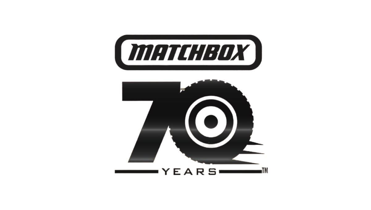
This simple logo from Matchbox starts with the classic logo at the top and a block number 70 below that. With a theme around cars, the clever design concept of using the number zero as a wheel and a few streaks coming off the right side to convey motion created a strong mark that was easy to tie back to the original shape. The square-ish shape also made it easy to use on social media.
More Details →Utah Jazz 50th Anniversary Logo
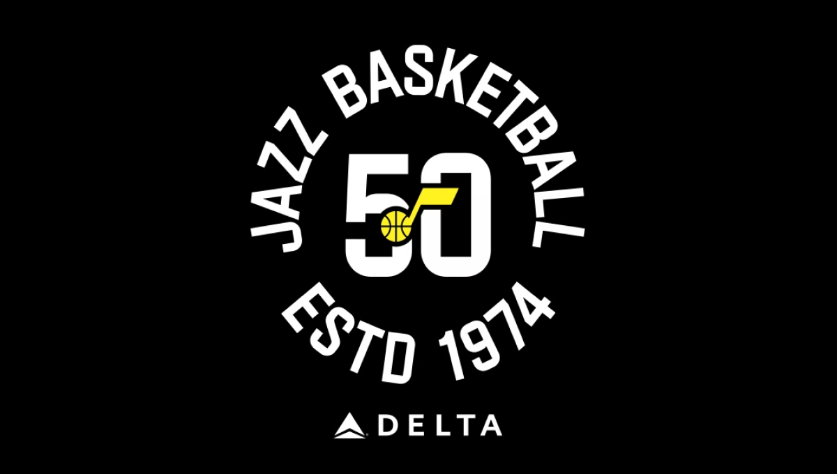
The team has embraced a number of colors over the years, but the black background of this logo and yellow mark in the center were a nice tie to one of their more popular and recent combinations. With a large number 50 in the center and the note mark laid above, this created a clean, but recognizable brand they could use in a variety of situations. In this case, wrapping the name of the team and the year it was established (along with their stadium sponsor) for a nice lockup for use online and in print.
More Details →Snowbasin 75th Anniversary Logo
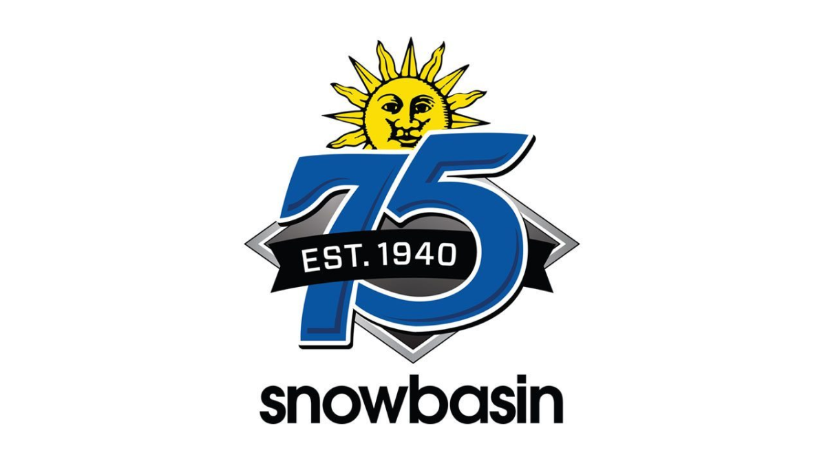
Featuring a large number 75 in the brand's usual blue, this logo adds a few simple elements in and around these digits. First, the brand's traditional mark peeks up from behind the 75. Next, a black ribbon holding the years of operation weave in and out of the main number mark. Finally, the traditional work mark for the resort sits at the bottom to make a fun, but recognizable design.
More Details →Zions Bank 150th Anniversary Logo
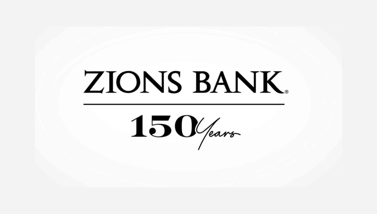
The traditional brand for this bank features the dark, serifed typeface you see at the top, so this logo build on that professional look. instead of placing a vertical line with the anniversary mark to the left or right, this logo places a horizontal line below the existing logo and then adds a simple number mark a similar font and color as the original logo. Given how wide their existing mark is, this was a great move to provide a little bit of balance and avoid further stretching the logo horizontally.
More Details →Stone Brewing 25th Anniversary Logo
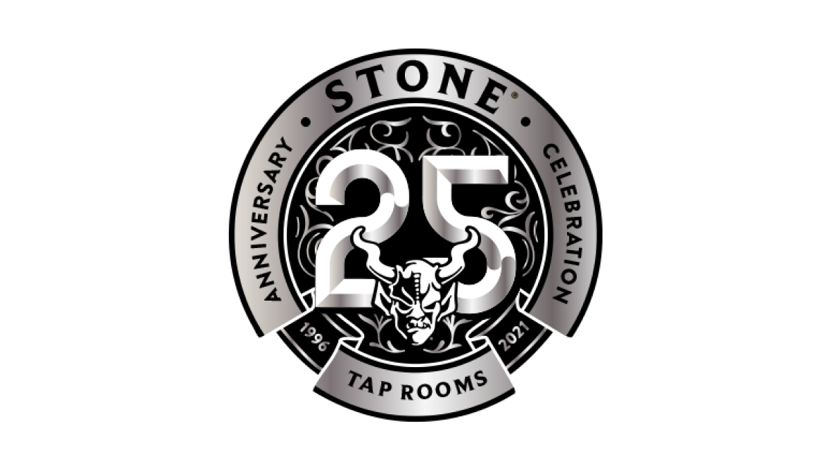
Similar to earlier anniversary logos for Stone Mountain Brewing, this logo starts with the brand's traditional mark set in the bottom center and then adds layers of graphics behind. In this case, a large, 3D number 25 held in a circle with the name of the brewery and illustrations to create texture within this monochromatic design.
More Details →Nike 50th Anniversary Logo
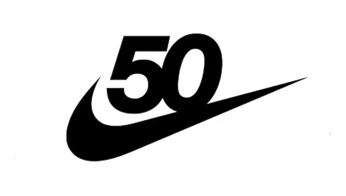
Nike has one of the most powerful brands in the world. Even more, it's incredibly recognizable on a few levels. Take the number 50 in this design, for example. Even if it were just that text, there's a good chance millions of people would still recognize it. With the swoosh below this logo is as powerful as it is simple.
More Details →United Nations 70th Anniversary Logo
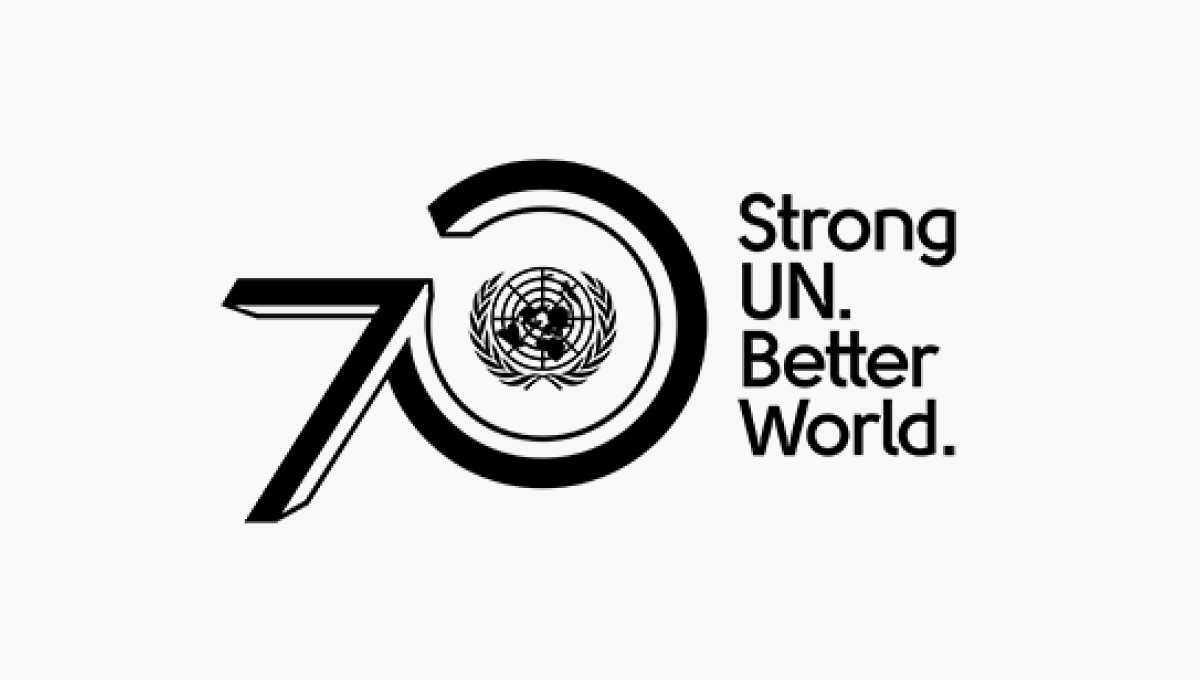
The United Nations logo is one of the most recognizable in the world, so placing this near the visual center of their design was a great move. By placing the number zero around that mark and the number zero ahead of it using a similar style to the logo, they create a strong lockup that's clean and on brand. A tagline to the right rounds out this design and adds a little bit of visual balance.
More Details →Star Wars 40th Anniversary Logo
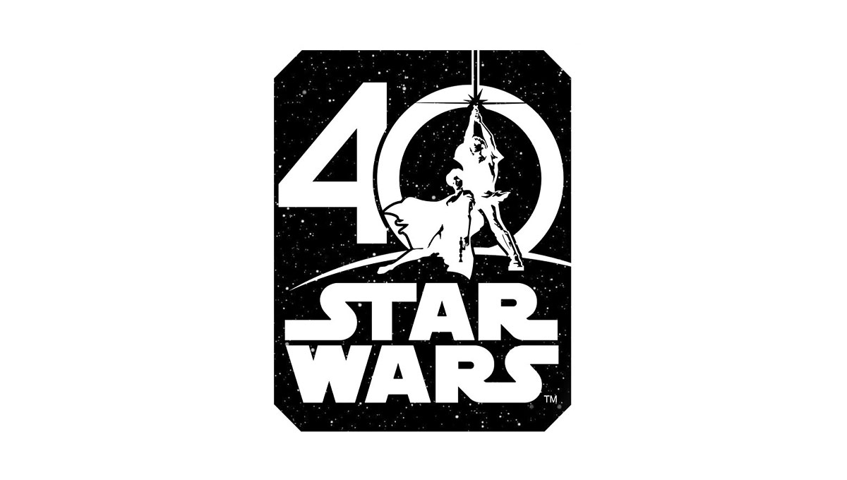
Using the classic image from the cover of the original movie, this logo places this iconic imagery in the center of a zero for the number 40. Below that, the traditional logo is stacked to create a foundation for this logo. Around the logo is a square, black shape to create the dark, space theme of the movie series.
More Details →Hankook 80th Anniversary Logo
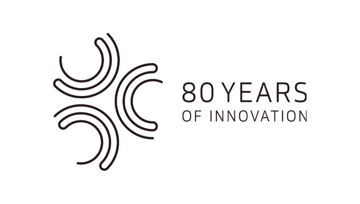
This logo starts with a large number 80 made using three concentric circles for each loop of the number but then places all three into another circle that hides some of the edges. The loose ends of the circles are then connected to make a classy mark that still makes it easy to see the original number. An anniversary tag line sits just to the right. While not recognizable on it's own, this mark is a great asset for Hankook's marketing materials.
More Details →Folsom Field 100th Anniversary Logo
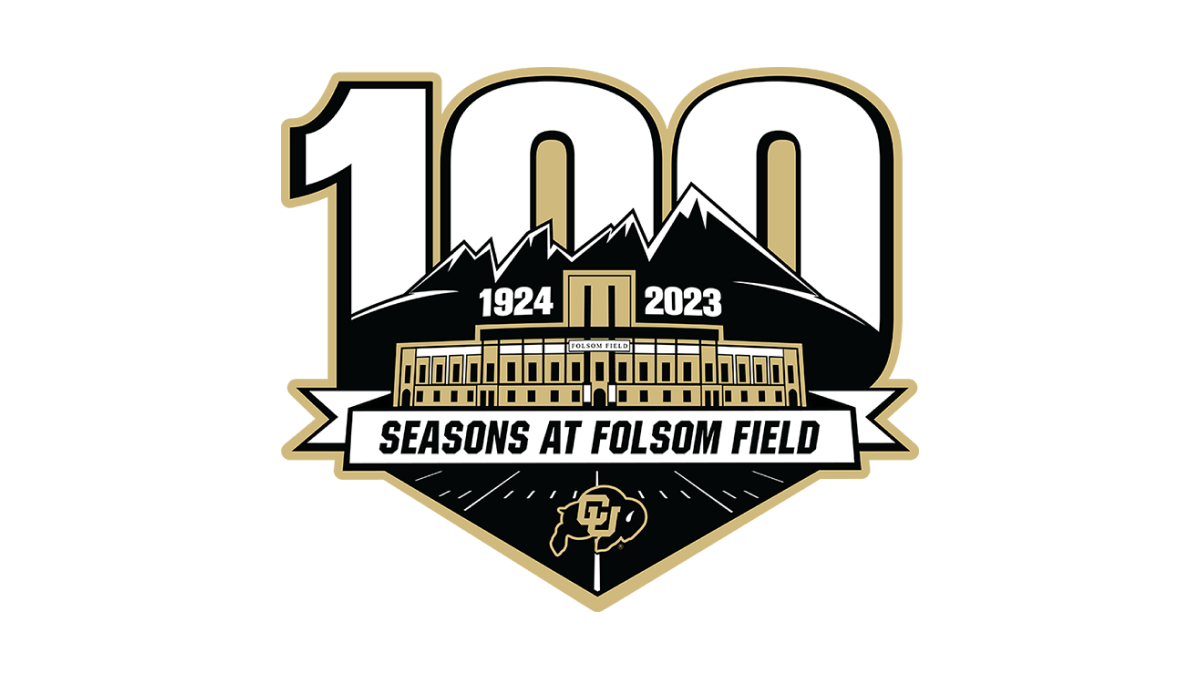
It's a big year for Colorado football for many reasons, but one of them is the anniversary celebration for their famous Folsom Field. This mark combines their mountain skyline, yard lines from the field, and a beautifully line-art illustration of the stadium's exterior to set the stage for this anniversary logo. Behind the mark sits a large, block number 100 rising up from behind the mountains.
More Details →Northern Illinois University 125th Anniversary Logo
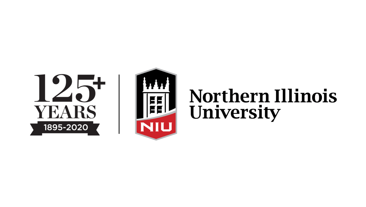
With the popular vertical-line style as the foudnation, this university placed their traditional logo on the right side of the line and a stylized number to higlight the anniversary they're celebrating on the lft. By using the same typefaces alongside the original logo, this mark makes no mistake about which brand is celebrating and creates a clean, well-designed package that can be used easily in marketing collateral.
More Details →Bridgestone 90th Anniversary Logo
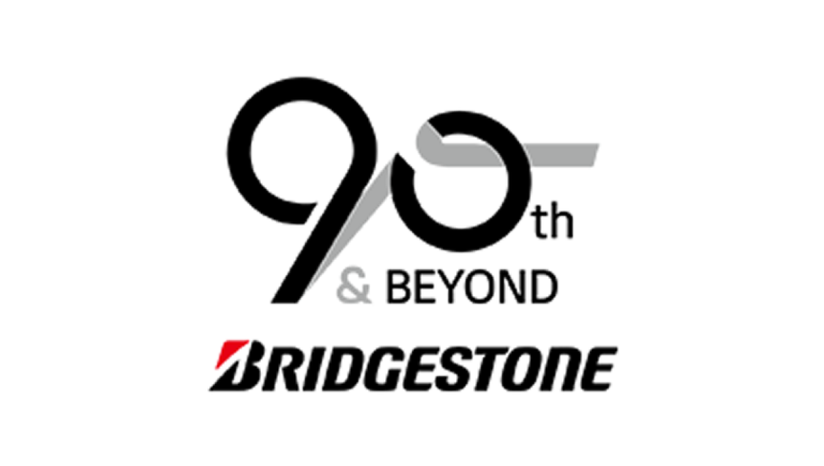
Starting with the original logo along the bottom, this logo uses a clever number mark made to look like tire burn-out marks representing the main product the company sells. Rather than just leave the mark as is, they also added the words "and beyond" to reprsent that this is a milestone on their journey rather than the end.
More Details →Paramount Pictures 90th Anniversary Logo
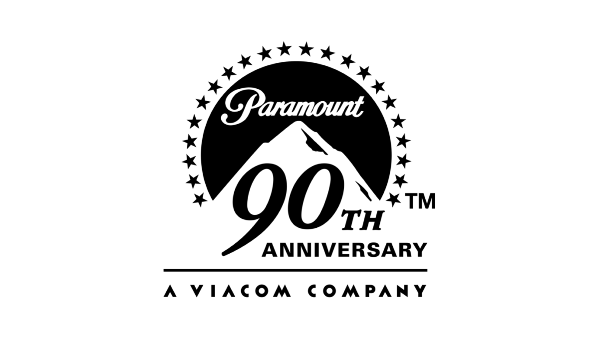
The original logo left a gap where the mountain sits and this anniversary variation kept it simple and simply moved that mark up slightly to create space for a large number 90 and the word anniversary offset below and to the right of the logo. This makes the new logo extremely easy to tie back to the original mark, especially with the traditional, all-black lockup.
More Details →Anaheim Ducks 30th Anniversary Logo
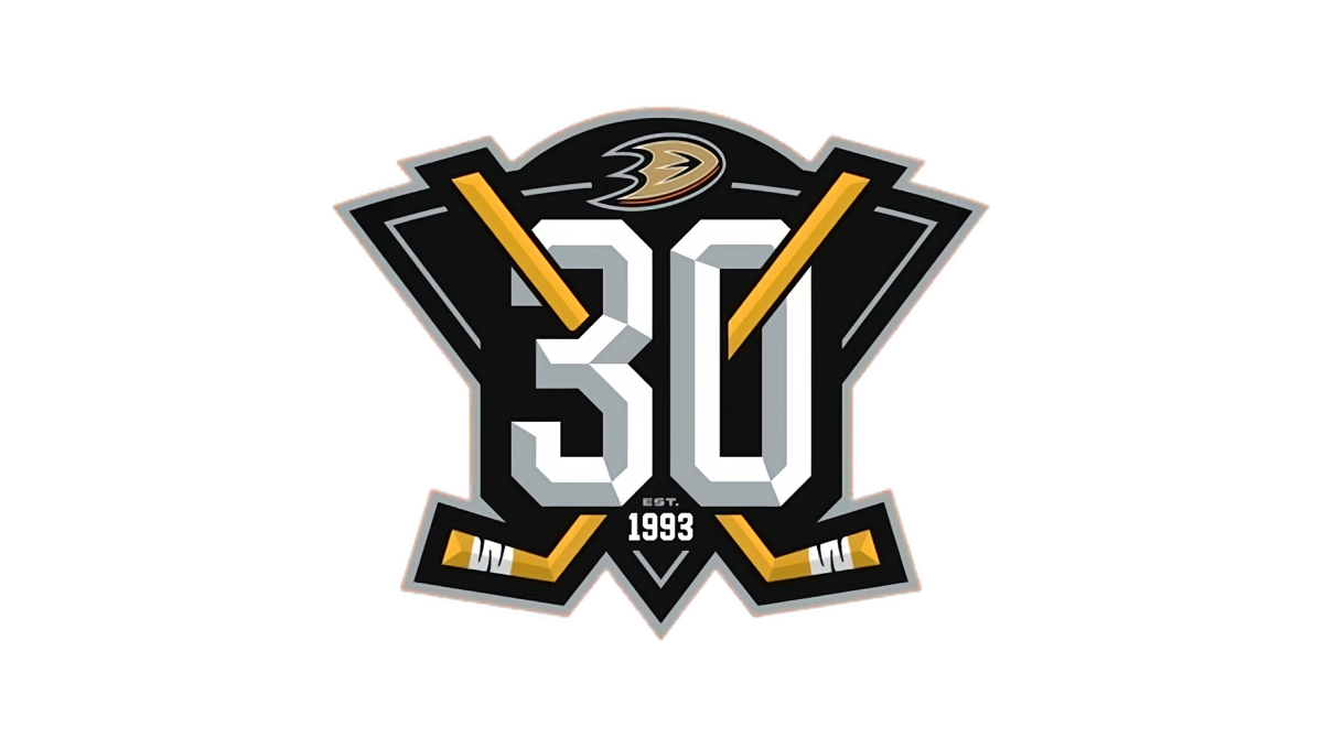
With a stylized triangle (point down) as the base, this logo starts with a three dimensional, block number 30 in the center as the visual foundation. Next, two hockey sticks weave in and out of the number 30, cross in the center, and extend just beyond the triable to make the shape a bit more dynamic. Finally, a small curved area is extended above the top of the triangle to hold the team's original logo.
More Details →Miami Heat 35th Anniversary Logo
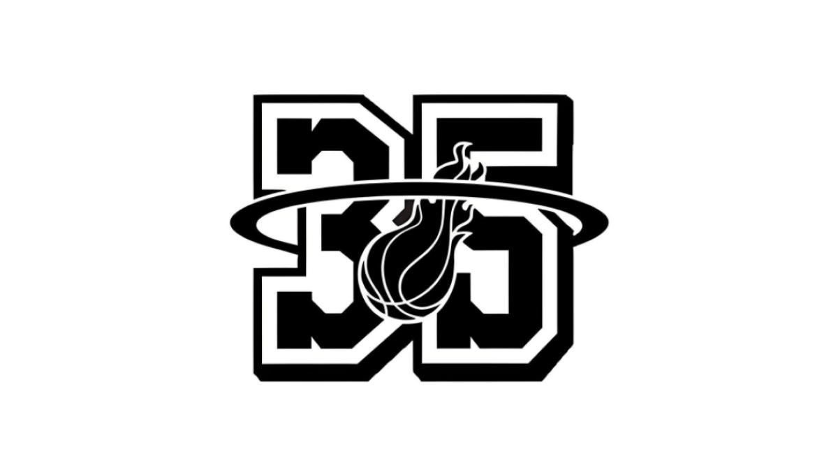
With their 35th anniversary in store, the Miami head started with block, jersey-style number 35 as the shape, this logo extends the traditional logo's famous rim shape to surround the entire number 35 and placing the other element element of the original logo, a flaming basketball, in the center to make a recognizable logo with a clear sports vibe.
More Details →United Reformed Church 50th Anniversary Logo
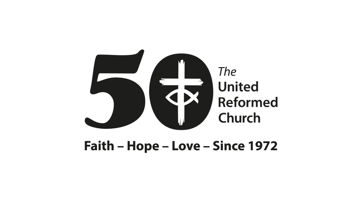
By placing a large, block number 50 to the side of the traditional logo, the church was able to simply invert the color of their mark and place it inside the zero to create a simple but effective mark that kept the familiarity of the original logo while celebrating their milestone with a unique separate brand.
More Details →Callie (My Daughter) 10th Anniversary Logo
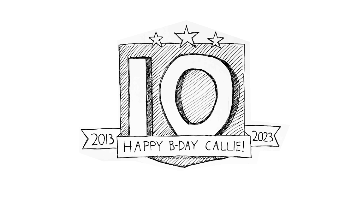
When you're the father of a girl turning 10 and you happen to be just starting a side project of gathering anniversary logos, what do you think comes to mind when working on a birthday poster for the aforementioned 10 year old? You guessed it, all the block numbers and ribbons and years of operation you've been looking at in recent weeks. And, as you might have guessed, that's exactly the direction this poster took.
More Details →Atari 50th Anniversary Logo
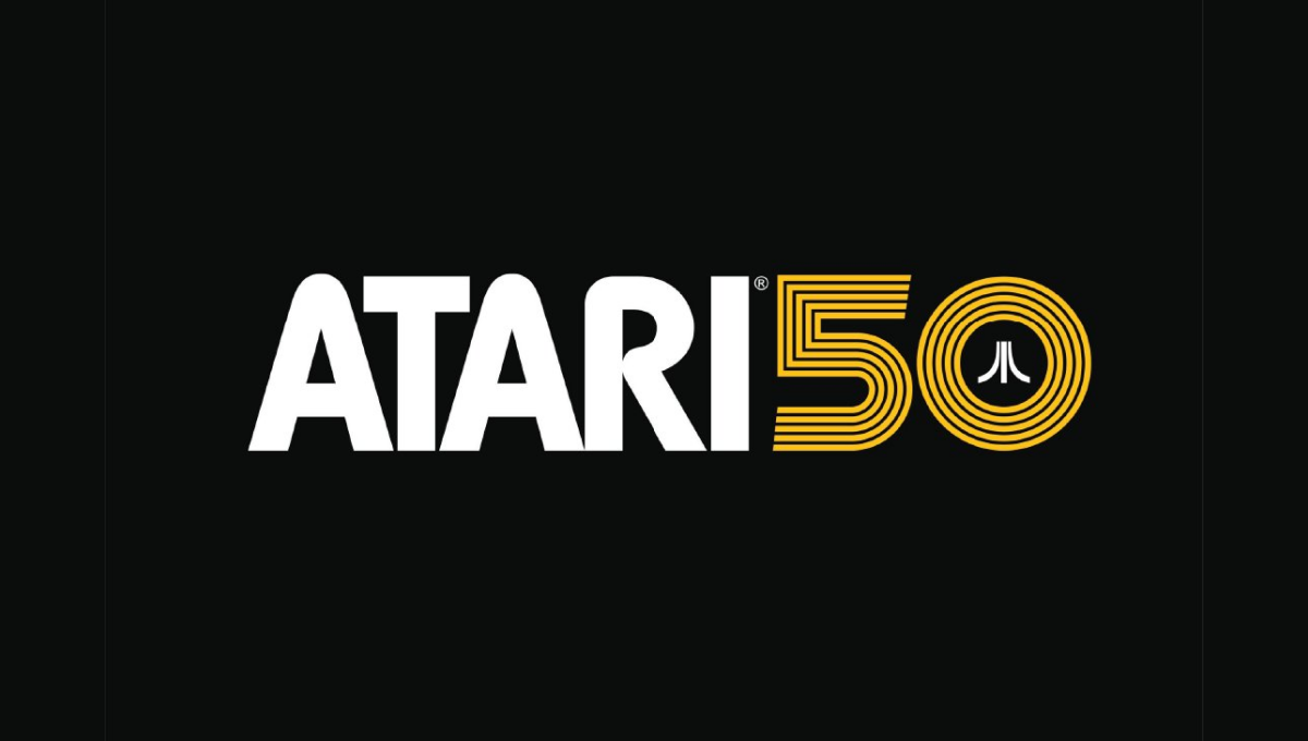
As one of the truly classic brands of early gaming and technology, Atari combined their classic word mark with the three diverging lines in this lockup that's designed for a dark, black background. A line-art version of the number 50 holds the mark in the 0 with a clean gold color providing both contrast with the white but easy readability on the black.
More Details →Lego Star Wars 20th Anniversary Logo

Lego Star Wars created an anniversary logo that featured mini figure versions of popular characters with a round, badge-style design. A reflective silver color and a bit of addition for light sabers to extend above the circle and a box to hold the dates below create a great design that unique and features both a recognizable number and characters.
More Details →Steamboat 60th Anniversary Logo
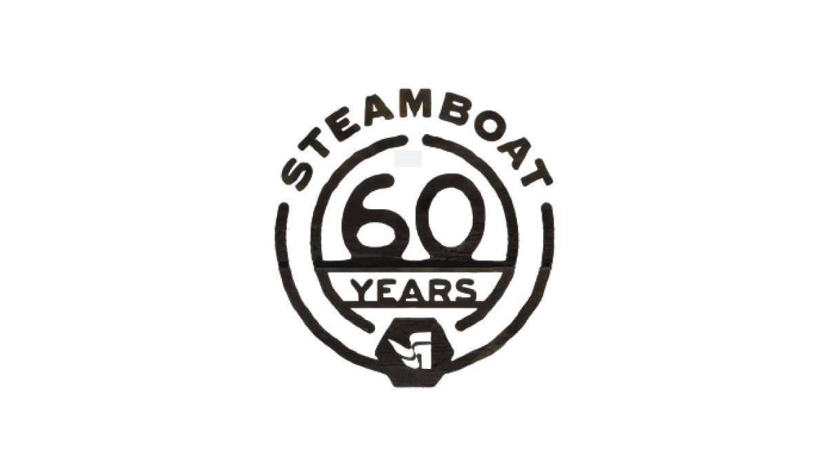
Steamboat used a really sharp bit of line art for their 60th anniversary. With the resort name arched across teh top, the number 60 set in the middle, and the word "years" set just below with a partial center ring to hold it all together, the resort's famous flag mark sits as an achor at the bottom to create mark that was easy to use and adapt to many situations during their anniversary season.
More Details →Loveland Ski Area 75th Anniversary Logo
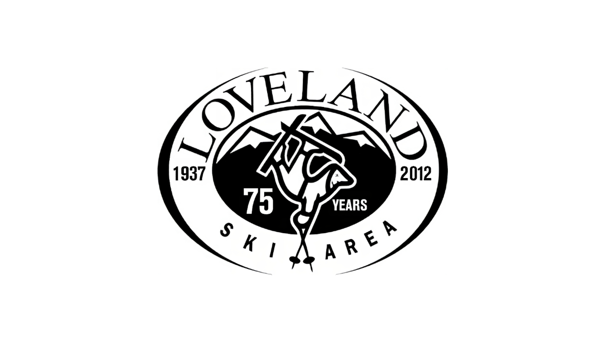
Loveland changed very little with their traditional logo when they celebrated their anniversary. By adding the number 75 and the word "years" to dark space on either side of their center mark, the resort was able to have something unique to use for their anniversary but also something that was seamless to swap in and out with their existing logo.
More Details →Lakeshore Chinooks 10th Anniversary Logo
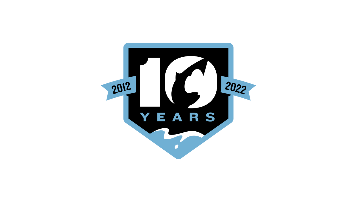
This logo combines a few clever elements within this baseball team's brand. First, it sets the base of the logo with a homeplate hape. Second, a fish jumping in reference to the Chinook Salmon featured in their original logo. Third, a blue lake at the bottom that wraps the homeplate shape as a border and extends to a ribbon holding the years this team has existed to create a clean, meaningful design.
More Details →Kelly Canyon 60th Anniversary Logo
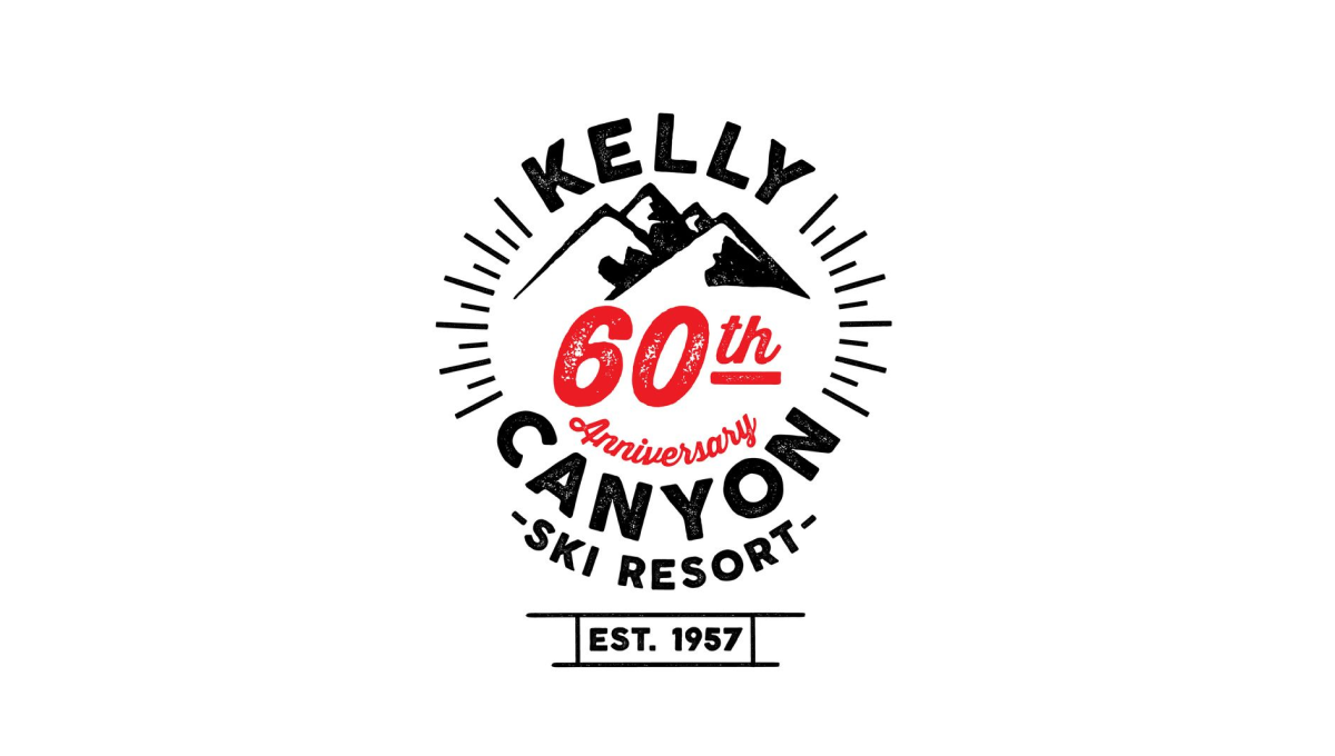
Kelly Canyon gave their designed lots of creative freedom and focused on a mark that was fun and recognizable rather than one that has strong, visual ties back to their original brand. The clean line-art design that they came up with works great in many situations - web, print, etc. - and creates a separate brand for their annversary.
More Details →Jackson Hole 50th Anniversary Logo
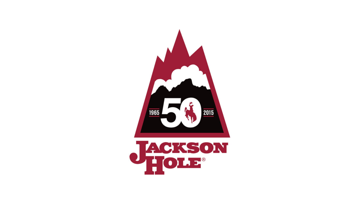
Jackson Hole Mountain Resort combined a shape found in one of their original logos with the layered red, white, and black colors found in their current logo to create a lockup that nearly merges the past with the present. They then the number 50 in the center of the large, black portion at the bottom of this mark to wrap up this strong, meaningful mark.
More Details →Elite 11 25th Anniversary Logo
The nationals premier elite quarterback competition, Elite 11 drew inspiration from the strong, bold themes associated with sports logos and the large, blocky numbers that sit behind many major bowl game logos, to create a mark that places their original logo in the center and uses the strong, dark colors of that brand to build a great looking anniversary logo.
More Details →Blacktail Mountain 25th Anniversary Logo
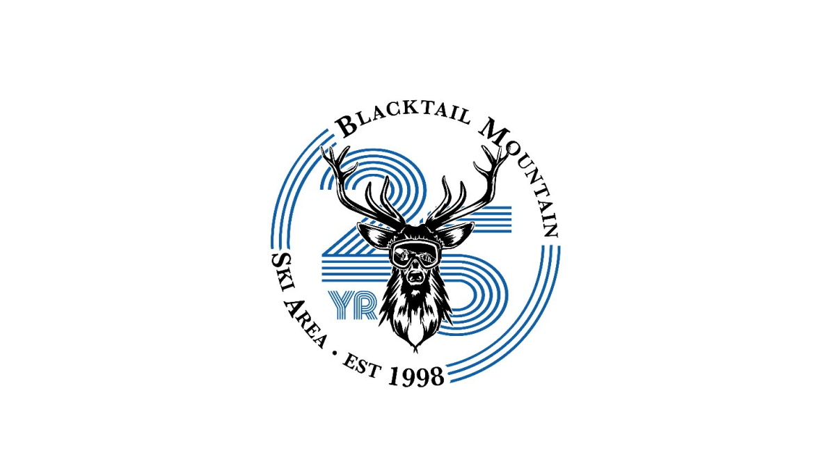
Blacktail Mountain went away from their primary logo with this mark and used a retro, line-art style number with a classic circular bar of text around and deer graphic to tie it all together and back to the core brand. It's a nice, clear, simple design and the retro feel of the number gives it a unique feel that's easy to recognize and remember.
More Details →Big White 60th Anniversary Logo
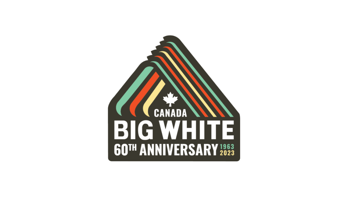
With a throwback to one of Big White Mountain Resort's original logos, this adaptation brings in a modern, sticker-style badge and extra line of text to hold the anniversary label, with a three-color design that's also a little bit retro. A simple combination of past and present, this is a great use of original logos with modern design needs.
More Details →