30th Anniversary Logos
Scott & Company 30th Anniversary Logo
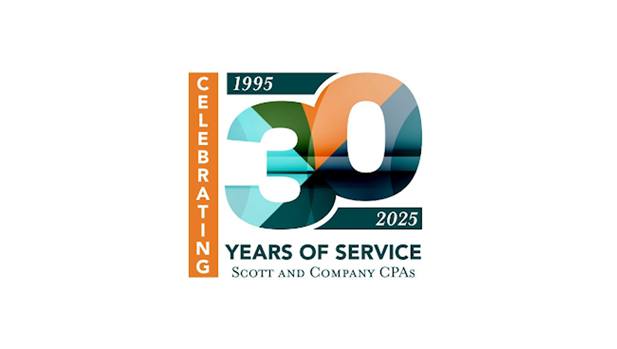
This anniversary logo features a bold “30” design with layered geometric shapes and soft gradient colors that create a modern and professional appearance. The mix of teal, orange, and dark blue tones gives the logo a balanced and polished feel. Simple date details and clean typography help highlight the milestone while keeping the design easy to read. Overall, the logo has a corporate yet celebratory style that feels contemporary, recognizable, and suitable for long-term brand recognition.
More Details →X Games 30th Anniversary Logo

The anniversary logo has a clean and modern look, using soft colors and simple shapes. It shows the number 30 in a bold style, with the words “years” and the event name placed nearby. There’s a sense of movement or connection in the way the elements come together. The design feels both respectful of the past and hopeful for the future. Overall, it’s a bold and balanced way to mark an important milestone.
More Details →Rimouski Oceanic 30th Anniversary Logo

While it's not clear that this logo is for a hockey team at first glanace, we have no problem with them leaning into their community and past given the awareness of this logo is likely fairly concentrated geographically. The circles represent the St. Lawrence river and the porthole of a boat, while an illustration of the well-known Pointe-au-Pere lighthouse shines on the team's past and future.
More Details →Jacksonville Jaguars 30th Anniversary Logo
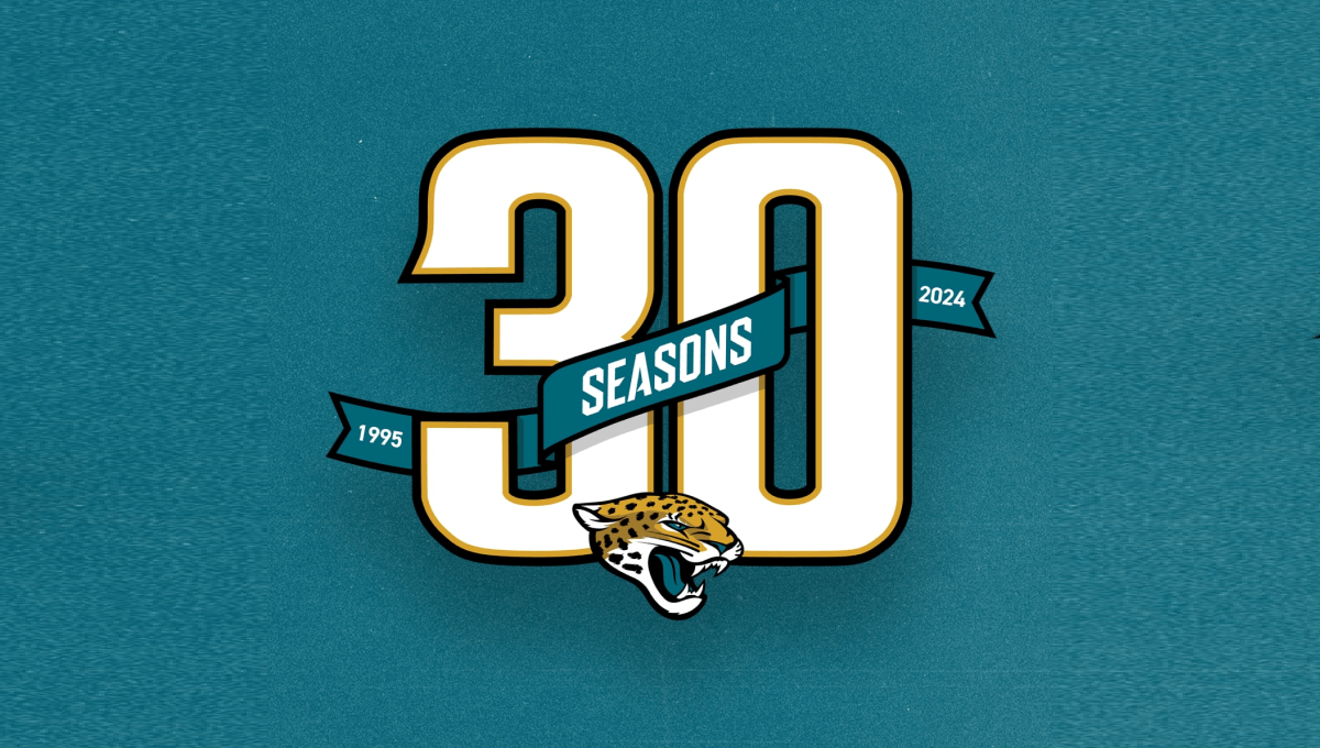
Using classic sports number styling with a textured background in the team's famous green color, this mark sports a large number 30 with a ribbon weaving in-and-out of the number showing the years the organization has been around and the word seasons. At the bottom center is the team's well-known mark to make a clean design that ties neatly back to the original brand.
More Details →European Distance & E-Learning Network 30th Anniversary Logo

This brand found themselves in a unique position when designing an anniversary logo because their existing logo already resembed the shape of a number. By placing the number 3 above the "ED" with a similar width as those to letters combined and doing the same with the 0 and "EN", the acronym and number mark created a unique, balanced shape that incorportated their existing logo.
More Details →American Gymnastics Academy 30th Anniversary Logo
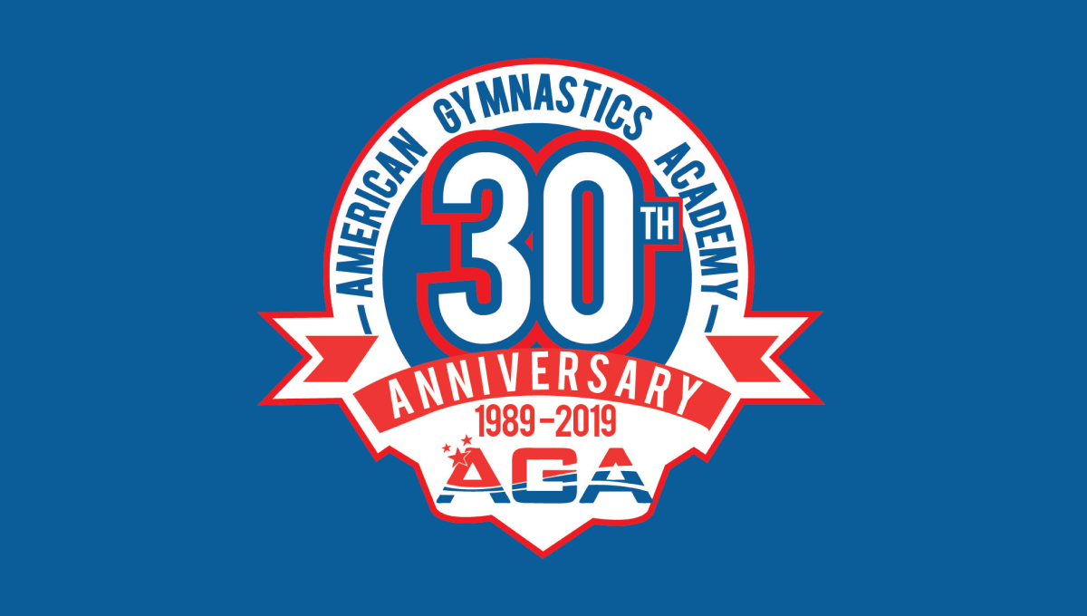
This classic logo combines a few common elements into a really tidy package. First, the logo uses a circle for the base with a large number 30 set in the upper middle of that circle. Next, a ribbon comming across the lower part of the circle holds the reason for the celebration. Finally, the organization's traditional logo sits below the ribbon with their name arching around the edge.
More Details →Boulevard Brewing Company 30th Anniversary Logo
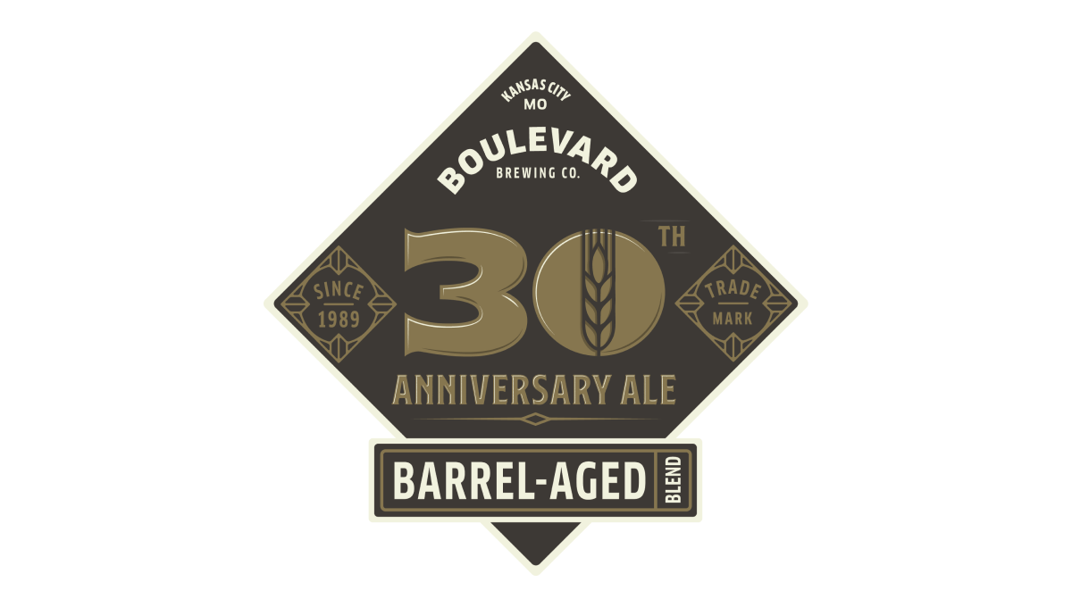
Breaking a bit from the style of other beer-themed anniversary logos, this logo adds a little bit more sophistication to with the style of beer they produce. In the center sits a large number 30 with the words "trade mark" and "barrel aged" in the classic script-designs that are part of the main brand that Boulevard is built around.
More Details →Brown's Gym 30th Anniversary Logo
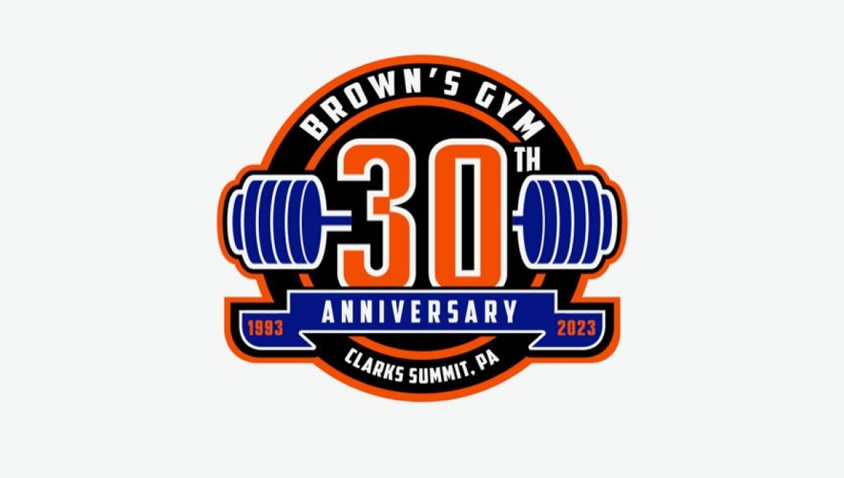
Using a classic sports logo style of a round circle with a ribbon across the lwer section, this logo places a large number 30 in the center with a clever barbell placed behind to tie back to the original brand and industry. Along the top sits the gym's name with the city and state in which the gym is located spelled out across the bottom to complete the logo.
More Details →Jurassic Park 30th Anniversary Logo
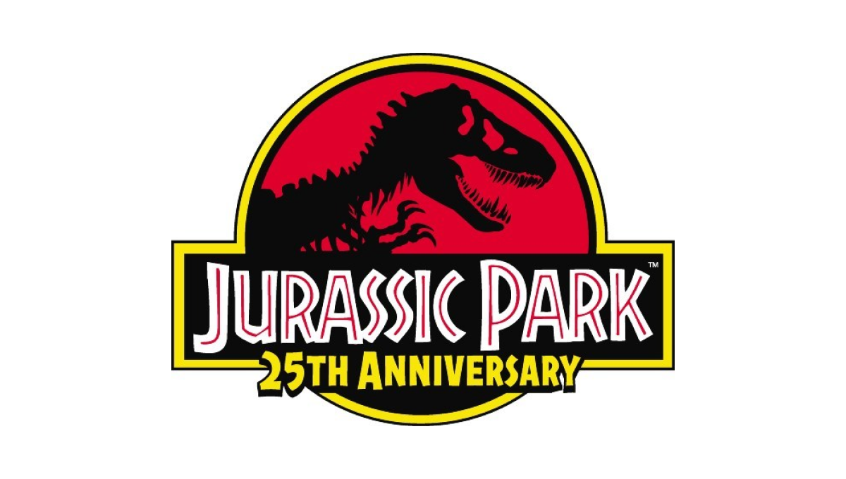
This famous first installment of what is now a multi-part video series already had an iconic logo that was not only the logo for the movie, but the fictional park inside the movie. So instead of starting from scratch, they added the words "25th anniversary" below the words in the traditional logo and called it good.
More Details →City of Burien 30th Anniversary Logo
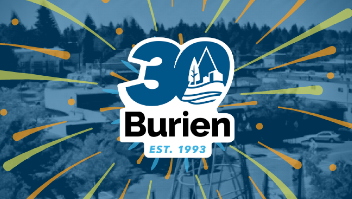
This clean, sticker-style logo starts with a large number 30 with a slight ilatic style in the city's traditional blue color. Inside the zero is place a white, line-art version of the city's main logo. Below that is the name of the city with the year it was established at the bottom. And by locking up this design with white padding, they were able to place it on any color including a fireworks-like design used on their website.
More Details →Dr. Fred G. Blum 30th Anniversary Logo
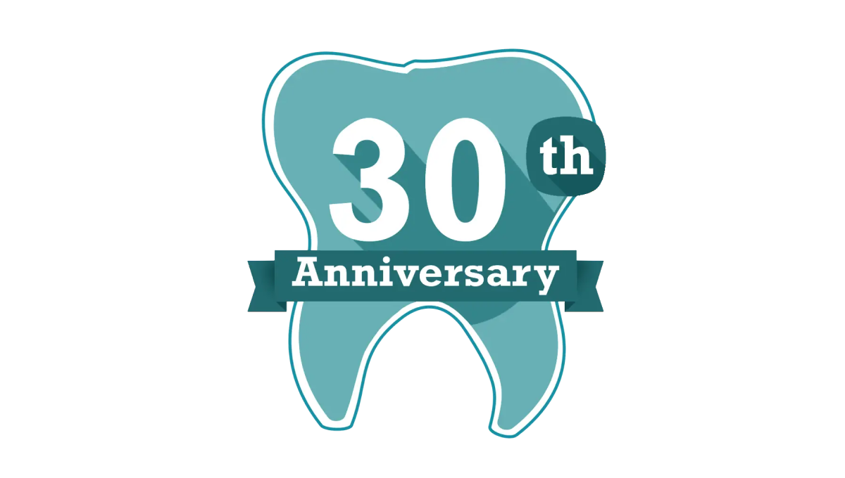
Another mark that celebrates the anniversary in a fun, on-brand way but doesn't try too hard to start fresh with an adaptation of the original logo, this tooth shape creates a simple backdrop for the anniversary in question. With the dental practices traditional teal color in place and used nearby the original logo and practice name, it was a fun way to celebrate without having to change the usual mark.
More Details →Anaheim Ducks 30th Anniversary Logo
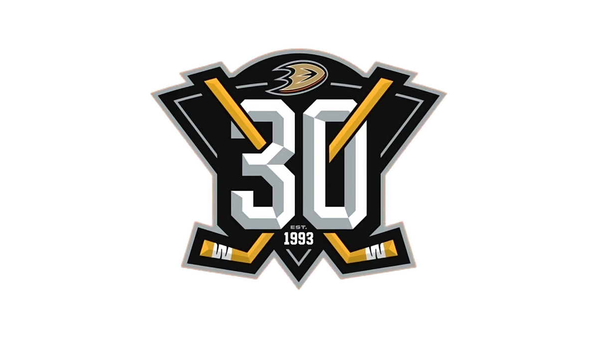
With a stylized triangle (point down) as the base, this logo starts with a three dimensional, block number 30 in the center as the visual foundation. Next, two hockey sticks weave in and out of the number 30, cross in the center, and extend just beyond the triable to make the shape a bit more dynamic. Finally, a small curved area is extended above the top of the triangle to hold the team's original logo.
More Details →Sonic the Hedgehog 30th Anniversary Logo
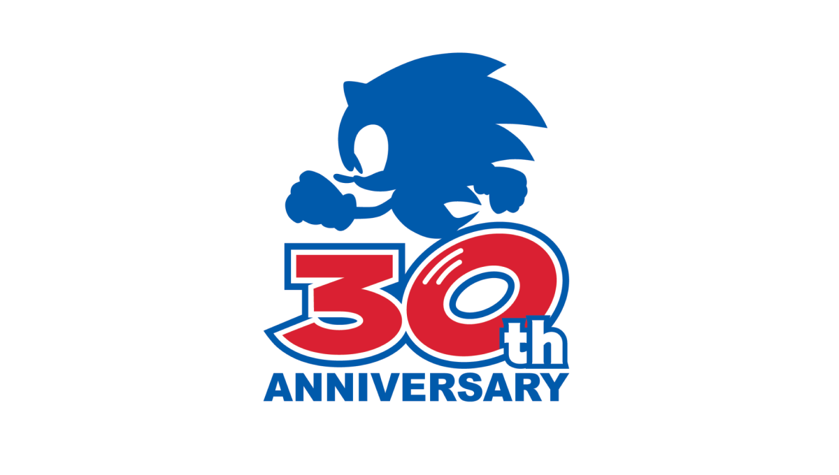
Sonic the Hedgehog's 30th anniversary logo starts with a large number 30 in red. With a white outline on that number followed by a blue outline, they gave the number added weight and a color that could blend neatly into a blue silhouette of their famous character above. At the bottom, the word "anniversary" in that same blue clarifies the meaning of the number and balances the red with blue above and below.
More Details →1st Choice Mortgage 30th Anniversary Logo
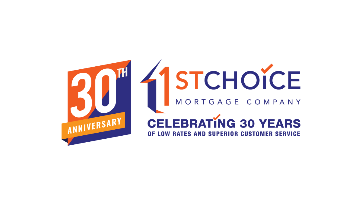
This adaptation of their original logo adds a two-color badge to the left side of their traditional logo that leans into the two primary colors of the brand as well as a third color to add contrast. With a word-heavy original logo, more text below that, and a new shape introduced with the badge, there's a lot going on with this logo but it all ties together nicely.
More Details →