Brand Anniversary Logos
Smokey Bear 80th Anniversary Logo

This anniversary logo has a warm and friendly feel, with a playful yet respectful tone. It features a familiar face at the center, reminding viewers of a long-standing message. The number 80 is clearly shown, along with simple text to mark the milestone. The colors and style give it a classic, outdoorsy look, fitting for the subject. Overall, the design feels both nostalgic and celebratory, honoring many years of a well-known figure and what they stand for.
More Details →Delta Airlines 100th Anniversary Logo

Delta Airlines kept it simple and classy with this anniversary logo. A large number 100 in their classic purple sits in the center with a silver Delta logo coming out and out of the last zero in the number. Above that sits the full logo with the word years below. It's a simple package but an effective one that gives logo a clean mark that is already being used in a variety of contexts.
More Details →The North Face 50th Anniversary Logo

Anniversary logos often have an offset second digit to add a little bit creativity to an otherwise normal number, but I love how The North Face did this with a little bit more purpose. The number zero uses a horizontal line to mimic the set cresting the horizon, an image common in the visuals that accompany the adventures their customers embark on. It's a clean, simple mark and beautiful design.
More Details →Disneyland 70th Anniversary Logo

With a brand like Disneyland, you know they're going to deliver a great anniversary logo and this version did not disappoint. The classic word mark starts it off with a two-tone purple number seventy crowned with the traditional castle silhouette in pink to make a clean, tidy package that will likely make it easy to use given the similar dimensions to the original logo.
More Details →Tempo Curacao 15th Anniversary Logo

This logo goes ultra simple with a large, block number fifteen in the brand's light gray color. Inside the circle of the number five they've placed their round, original logo in their usual red. Just to add another tiny bit of clarity they've placed the word "years" below the number inline with the red of the logo. It relies heavily on their market being able to recognize their mark, but it does a great job of building on that brand awareness in a simple, clean package.
More Details →Love's Travel Stops 60th Anniversary Logo

A place that's supposed to be a friendly place to stop during your travels, this logo for loves starts with a big, friendly number that adds a little bit of shading to suggest a soft, rounded feel. A classic ribbon holds the word years with the years of operation at the bottom. All of this is held in a crest-like shape that keeps that friendly, rounded style around the corners and leaves just enough room for Love's original logo at the top.
More Details →Boilermakers Local 154 130th Anniversary Logo

This is a classic logo design that borrows some sports-style shapes, colors, and depth to create a really nice mark. Building around a large number 130 with a welder's mask below and their union's name and number above, some arcing laurel leaves and a ribbon to hold the word anniversary are layered to create a nice, cohesive design that's as easy to understand as it is bold.
More Details →Warren Miller 75th Anniversary Logo

When you make ski movies and are also celebrating an anniversary, why not merge the concept of cover art with the classic anniversary logo angle with art that includes a skier image behind but a large number 75 in front that bleeds into the edges. The original word mark sits inside the square to add a little balance a reminder about which company this design is tied to.
More Details →Art Directors Club 100th Anniversary Logo

The concept for this logo is describeed by Bruce Chao. In his words from the source linked below this logo, "ADC100 branding plays on the existing ADC letterform, as well as the rich legacy of archival imagery that foregrounds the people and work at the heart of the organization and awards program. The branding also references the original ADC geometric pattern that echoes the Art Deco design style from the era in which the club was founded."
More Details →Trillion Creative 10th Anniversary Logo

Trillion Creative's logo is just as simple, clean, and well-designed as you'd expect from an agency. They already had the letters I and O within their work mark, so they simply swapped those out for a number 1 and 0 with the word years inside the latter. The result looks really sharp, is extremely easy to swap with their traditional logo during and after the anniversary, but is also easy to notice and understand the meaning of.
More Details →Encyclopaedia Britannica 250th Anniversary Logo

One of the most well-known brands in the world, Encyclopaedia Britannica's 250th anniversary logo features their classic thistle mark spread across three vertical book-spine rectangular shapes. In each of those shapes is a digit of their anniversary. Their name at the top and the word anniversary at the bottom lock up and balance this simple, clean design.
More Details →D Magazine 50th Anniversary Logo
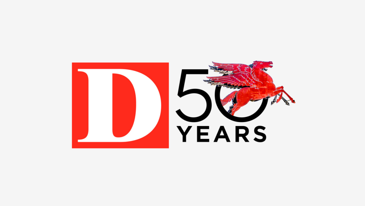
Rather than describe this logo ourselves, we'll just quote the team on this one. "Our in-house designers and art directors wrestled for months about what D’s 50th anniversary logo should be. What would feel like ‘D’? What would be bold and design-forward but not conflict with our existing (already iconic) logo? What have other brands done? Do we even have to do one at all? After dozens of versions and rounds of meetings, we ultimately returned to the original concept presented by our digital product director Ricky Ferrer. When we all first saw it, it felt like ‘us’. It also felt like Dallas: always in motion, full of iconic people and places."
More Details →Marek 75th Anniversary Logo
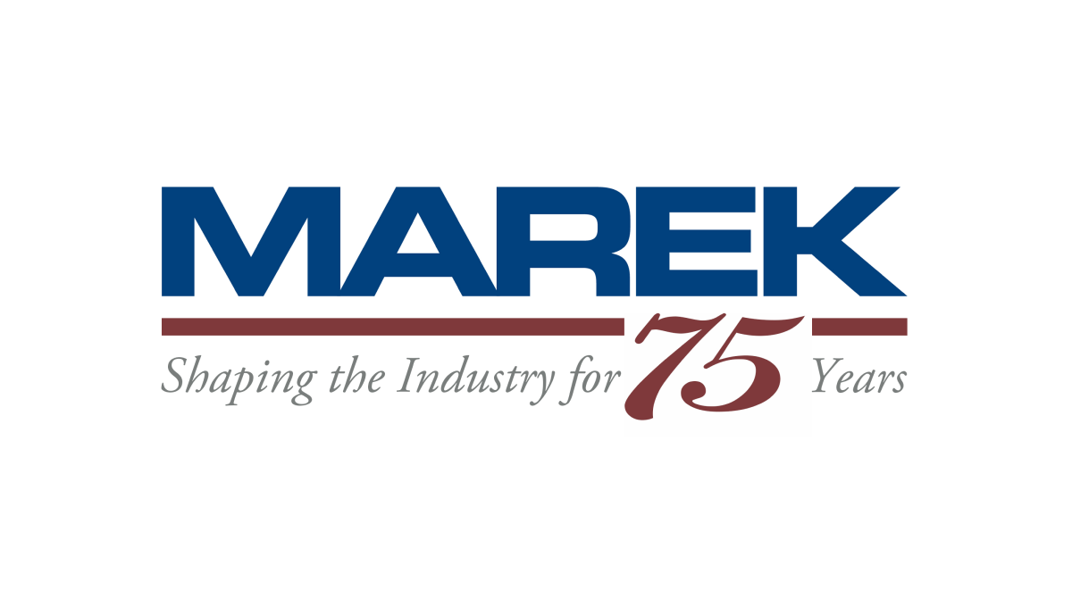
This mark always had a red line below a blue word, so this logo design simply worked with the existing horizontal elements in their traditional logo with the horizontal parts of the number 75. The result is a neatly integrated number that celebrates the occasion with a design that will be easily recognizable to their audience.
More Details →Apple France 40th Anniversary Logo
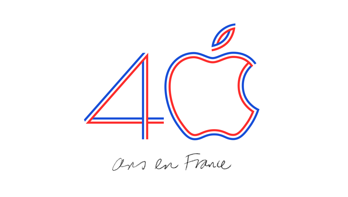
Using the classic Apple logo for the zero in the number 40, this logo uses the three colors of the French flag to create a line-art style logo that neatly combines both the traditional mark for this computer company and the colors that represent the branch of the company they were hoping to celebrate with this special design.
More Details →United States Aircraft Insurance Group 90th Anniversary Logo
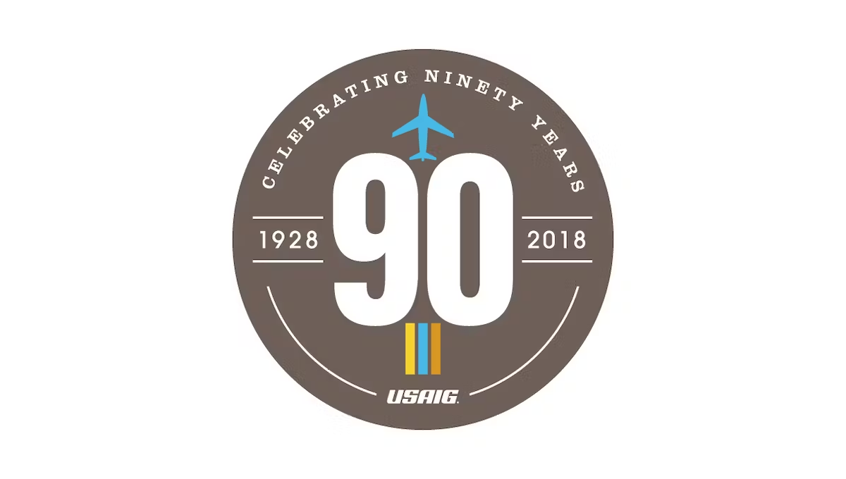
This logo starts with a clean, tan-ish brown circle and a large number 90 in the center. Along the top is the celebration reason written out in words, along the bottom is the name of the organization. Above and below the 90 sit simple illustrations associated with the industry they work in. The result is clean and looks really nice.
More Details →Netflix 25th Anniversary Logo
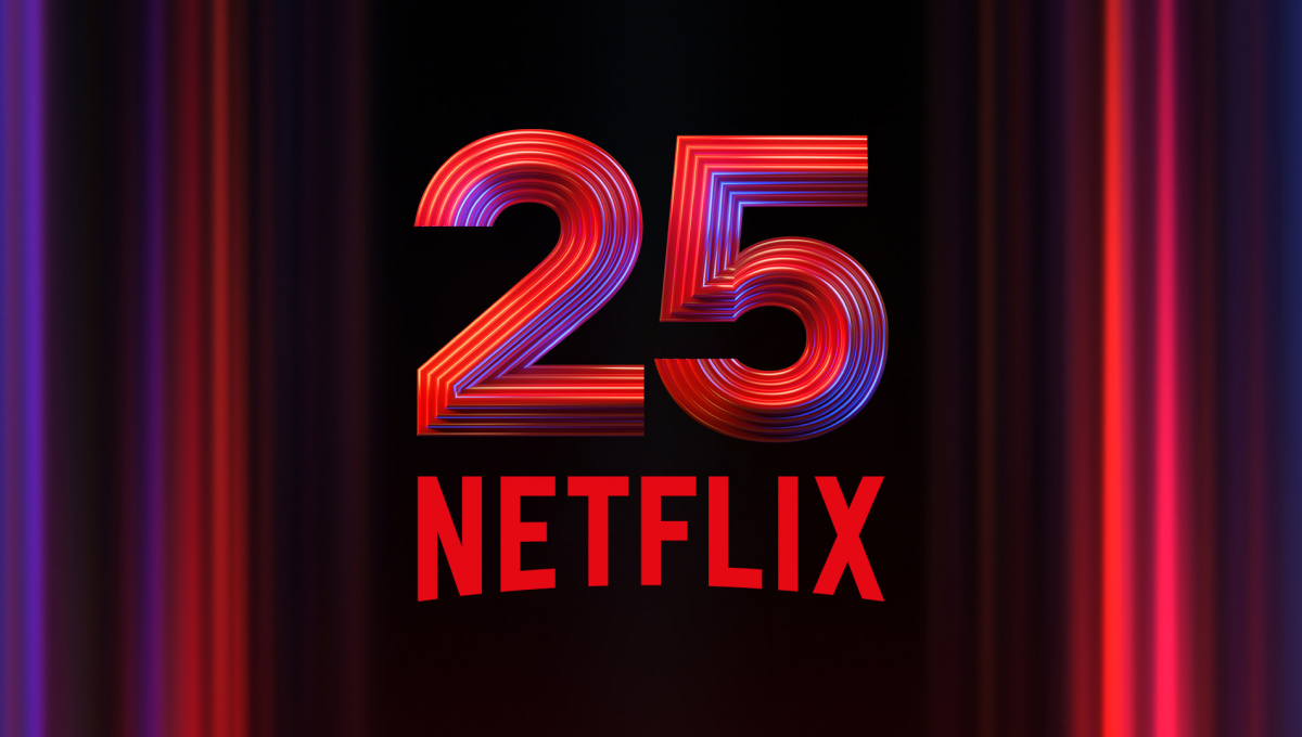
Netflix is famous for many things, but one of their most famous is the opening animation that precedes each video in their library. So when celebrating their 25th anniversary, they used a similar style - almost a still image from that sequence - as the backdrop to easily tie this design back visually to that part of their brand. In the center is placed a multi-faceted number 25 with their traditional logo below.
More Details →Hankook 80th Anniversary Logo
This logo starts with a large number 80 made using three concentric circles for each loop of the number but then places all three into another circle that hides some of the edges. The loose ends of the circles are then connected to make a classy mark that still makes it easy to see the original number. An anniversary tag line sits just to the right. While not recognizable on it's own, this mark is a great asset for Hankook's marketing materials.
More Details →Ruskin 65th Anniversary Logo
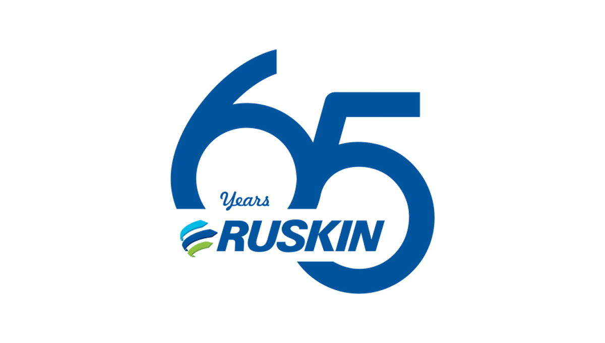
Ruskin's 65th anniversary logo starts with a large number to mark the reason for celebration with a slight offset and overlap. This number, in the brand's traditional blue color, creates the backdrop for the brand's primary logo to be placed across the bottom of the six and into the gap of the five. This creates a clean mark that's easily recognizable as relating to the normal brand.
More Details →Dialight 80th Anniversary Logo
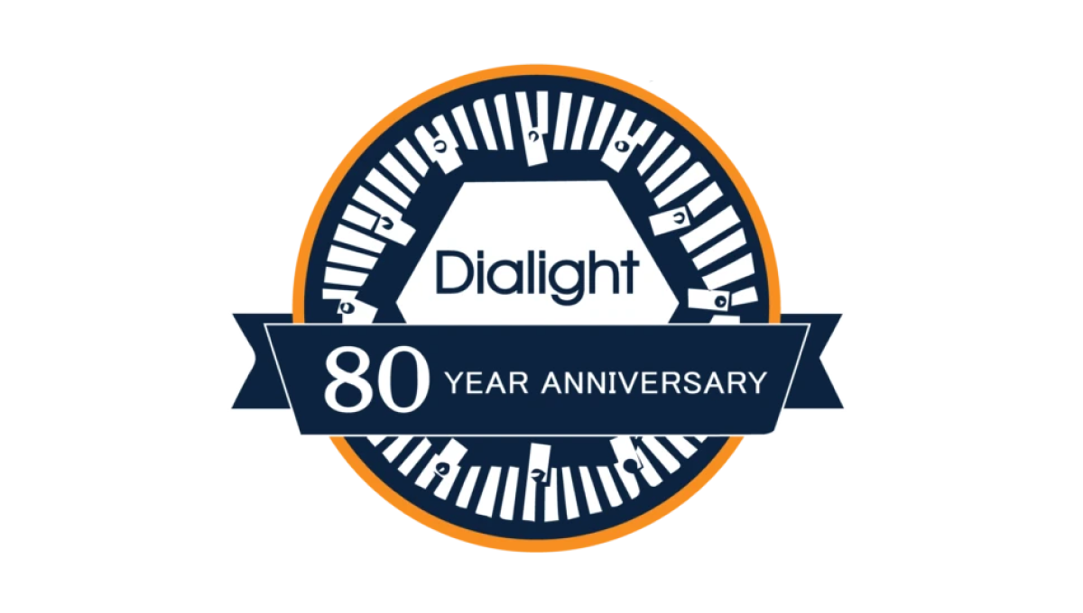
Starting with a classic circle shape, this mark doesn't use as many colors as the brand's traditional mark, but uses both a prominant, center placement of the usual logo with an illustration around the edges of the circle that adds visual cues back to their primary product which, in this case, is LED lighting. A ribbon across the bottom third holds the reason for celebration and creates a little bit of depth for this design.
More Details →Google 25th Anniversary Logo
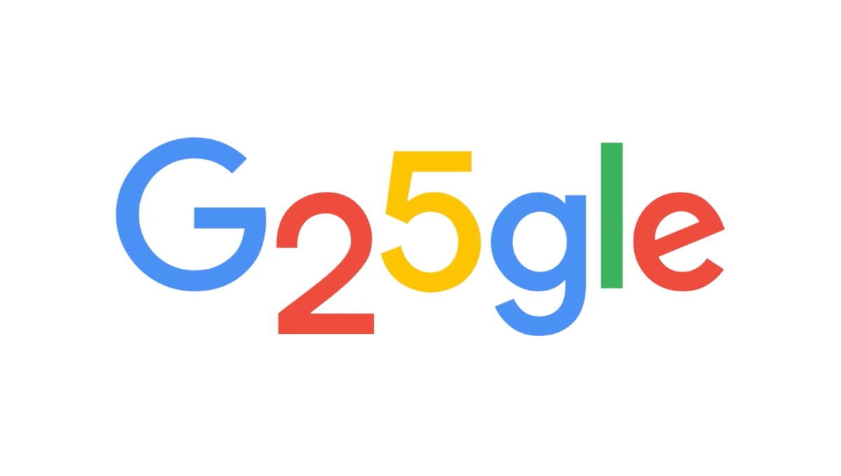
Google is famous for adapting their logos through the popular Google Doodle program, so it wasn't hard for this talented team to come up with a simple, well-executed design for their 25th anniversary. In this case, they used the rounded areas on the numbers 2 and 5 to make the two letter o's they frequently adapt as part of these logos. The result is a perfect, on-brand celebration of the brand's 25th anniversary.
More Details →Hobart 125th Anniversary Logo
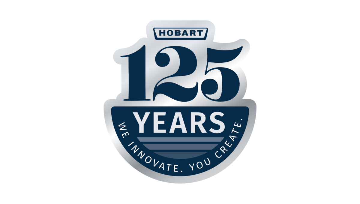
Using a look of the classic stainless steel material that many of their products are created from combined with the brand's traditional blue color, this clean mark places a large 125 and the main logo above a semicircle holding the word "years" and a tagline to celebrate the occasion and reinforce the company's main message, mission, and values.
More Details →NASCAR 75th Anniversary Logo
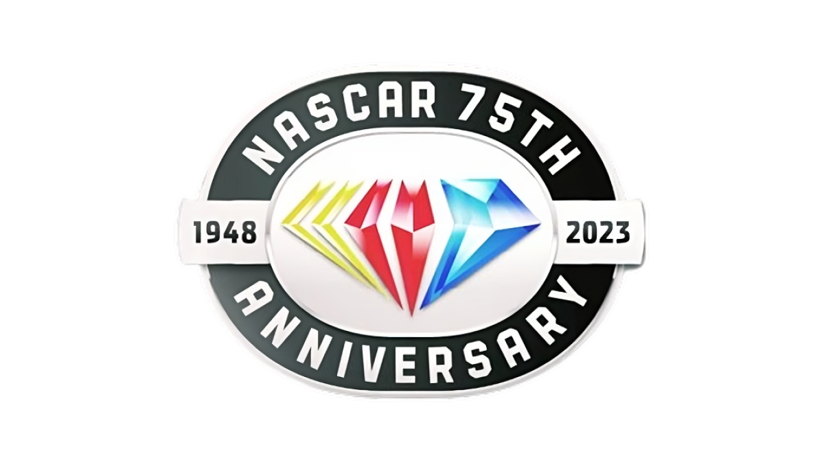
While other anniversaries use the diamond as the traditional shape, the 75th is absolutely one of them and NASCAR leaned into this with their design. A black oval representing the track their cars race around holds the name of the organization and recognition of the anniversary while a yellow, red, and blue diamond in the brand's traditional colors sits inside. A small ribbon then extends to either side of the diamond holding the years of operation.
More Details →Bridgestone 90th Anniversary Logo
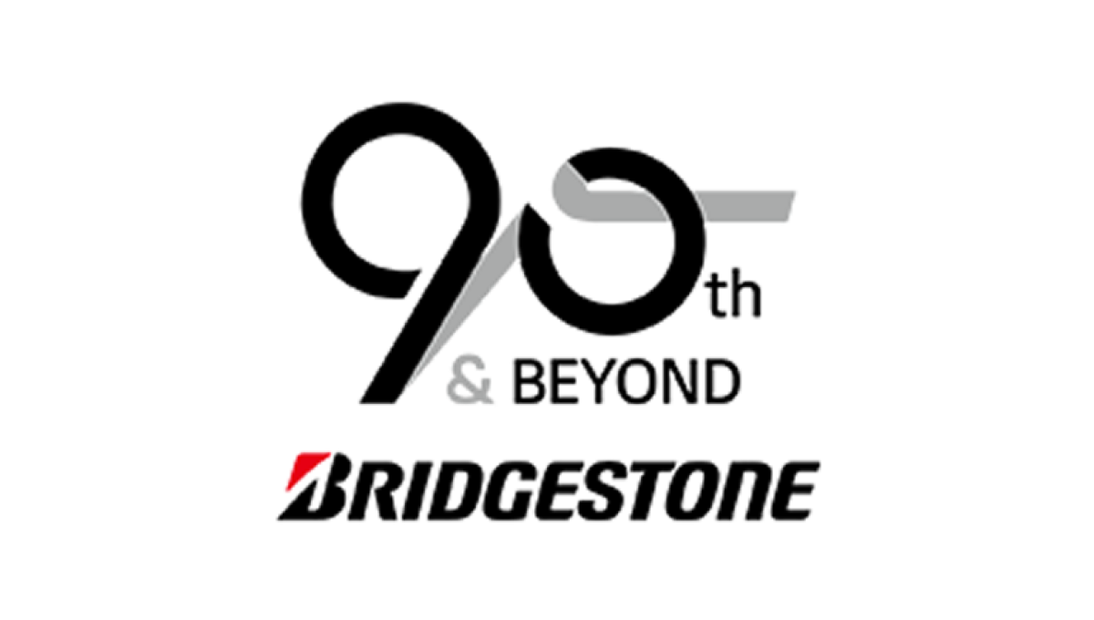
Starting with the original logo along the bottom, this logo uses a clever number mark made to look like tire burn-out marks representing the main product the company sells. Rather than just leave the mark as is, they also added the words "and beyond" to reprsent that this is a milestone on their journey rather than the end.
More Details →Paramount Pictures 90th Anniversary Logo
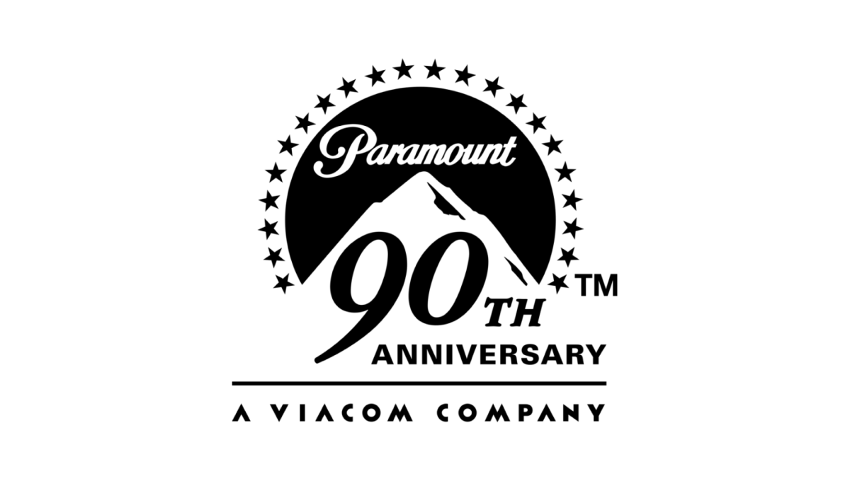
The original logo left a gap where the mountain sits and this anniversary variation kept it simple and simply moved that mark up slightly to create space for a large number 90 and the word anniversary offset below and to the right of the logo. This makes the new logo extremely easy to tie back to the original mark, especially with the traditional, all-black lockup.
More Details →