250th Anniversary Logos
Salem Academy & College 250th Anniversary Logo
In a classic style, this logo takes advantage of the three digits in their anniversary number to connect and overlap each number to create a creative, unique number mark that also creates space along the top right for a shortened name of the university. Around the number 5 sits the years of operation with the full name sitting below to create a simple, balanced logo that would work great in many contexts.
More Details →America 250 250th Anniversary Logo
You could take an anniversary logo for an idea as large as the United States in many directions, but the America 250 folks kept it simple and clean. A capitalized word in black sits above a number 250 made ot of a single, continuous red, white, and blue ribben with just a bit of rounding extension above and below the top and bottom of the normal number sizing. The result is really clean, balanced, and effective.
More Details →National Parks Service + America 250 250th Anniversary Logo
With the 250th anniversary of the United States coming up, the America 250 organization is not only doing their own anniversary logos for the country as a whole but also the groups that make up key parts of the American brand. The National Parks Service is one of those and this clean logo featuring a large 250 behind the Statue of Liberty and the word America is a clean, retro image seen on many NPS marketing assets.
More Details →Encyclopaedia Britannica 250th Anniversary Logo
One of the most well-known brands in the world, Encyclopaedia Britannica's 250th anniversary logo features their classic thistle mark spread across three vertical book-spine rectangular shapes. In each of those shapes is a digit of their anniversary. Their name at the top and the word anniversary at the bottom lock up and balance this simple, clean design.
More Details →Battes of Saratoga 250th Anniversary Logo
Starting with a large number 250 in the center in the classic, handwritten style of the era it represents, this logo builds around it using a seal-style round shape that features the name and a small cannon icon. Wrapping around the bottom is a red ribbon with the tagline of this famous moment in United States history.
More Details →St Gabriel Catholic Church 250th Anniversary Logo
This clean logo features a three dimensional silhouette of this church's bell tower placed above a large number 250 below. Using only the traditional blue color of the church and their name at the bottom, this logo is as simple as it is effective and creates an elegant design that would look great in many different applications.
More Details →Lexington Kentucky 250th Anniversary Logo
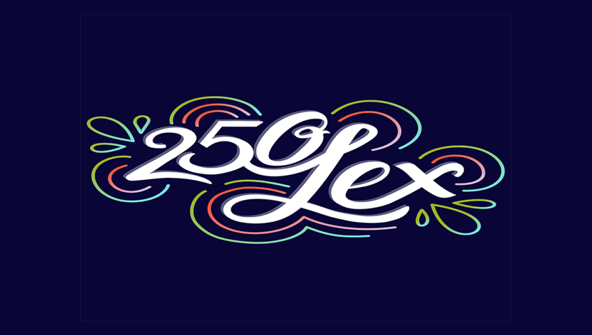
This design is fairly unique among anniversary logos. It features a scripted number 250 nestled up against the word Lex in white centered on the designs. Around the design are concentric rings in the city's colors that also feature leaf-like shapes on either end. The design is clean, unique, but also puts the name and year front and center for easy recognition.
More Details →


