Dentist Anniversary Logos
Dr. Fred G. Blum 30th Anniversary Logo
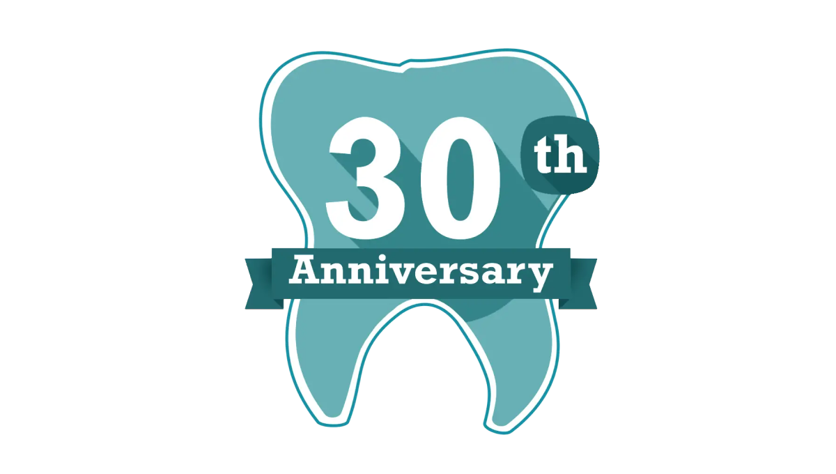
Another mark that celebrates the anniversary in a fun, on-brand way but doesn't try too hard to start fresh with an adaptation of the original logo, this tooth shape creates a simple backdrop for the anniversary in question. With the dental practices traditional teal color in place and used nearby the original logo and practice name, it was a fun way to celebrate without having to change the usual mark.
More Details →South Coast Pediatric Dentistry 10th Anniversary Logo
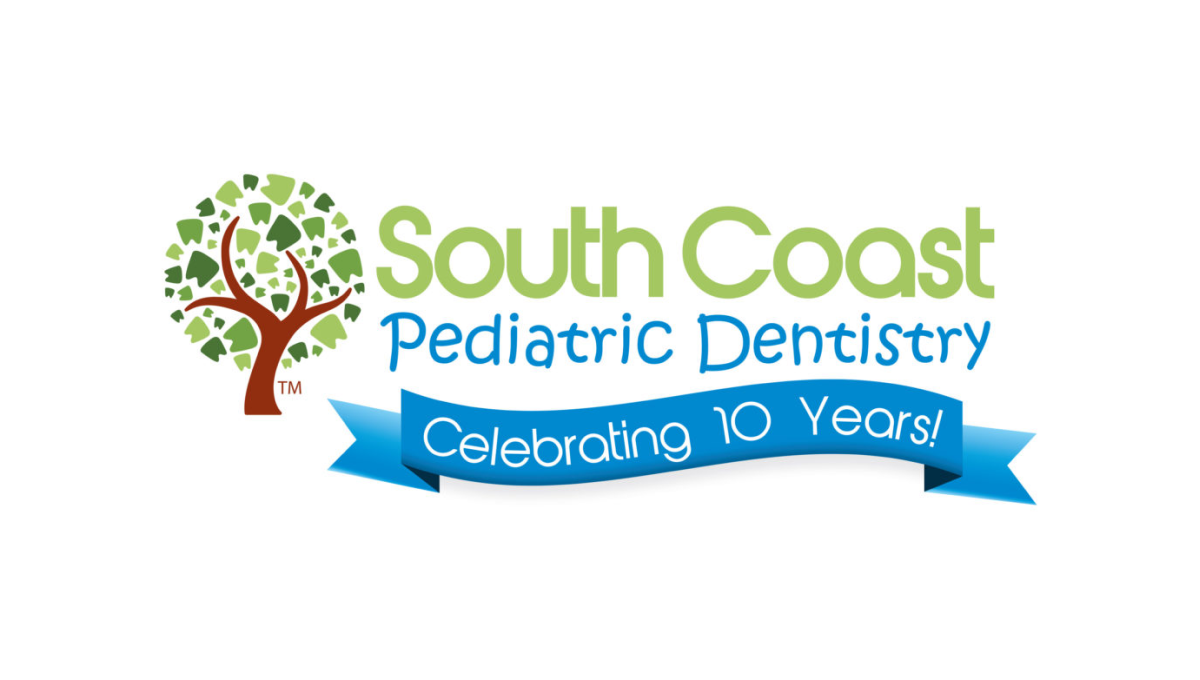
Instead of reinventing the wheel for their anniversary logo, this dentistry office simply added a clean blue banner below the words in their traditional mark. The banner is designed in a way to match the colorful, playful tone of the original mark and doesn't extend too far below the traditional logo's dimensions to make it easy to swap in and out of marketing collateral during and after the anniversary.
More Details →Perfect Teeth 20th Anniversary Logo
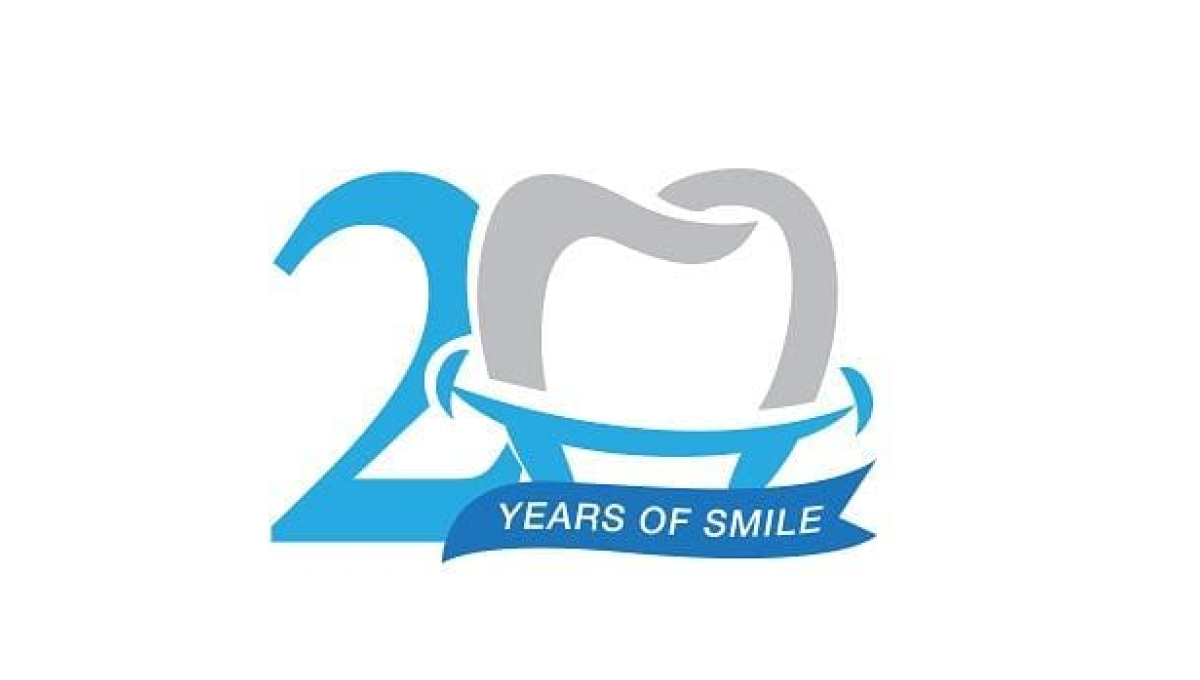
While this mark doesn't contain the name of the company celebrating their arrinversary, the clever use of the tooth shape as the number 0 is the 20th anniversary mark makes it clear what type of business is in question. And used only in places their original log would sit makes it easy to use this on-brand, playful mark without losing the tie to the original brand.
More Details →Valley Oral Surgery 40th Anniversary Logo
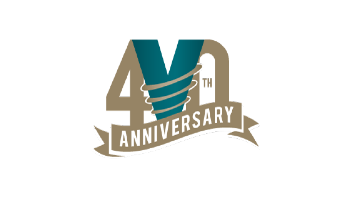
This logo combines the original V the brand has already been using in their original green color with two elements that stand out and compliment the design. First, a number 40 flanks the original mark while maintaining balance. Then, a ribbon holds the word anniversary below and in front to frame the upper part of the design. Good spacing and balance gives this logo a nice feel.
More Details →