Line Art Anniversary Logos
Goldenwest Credit Union 90th Anniversary Logo
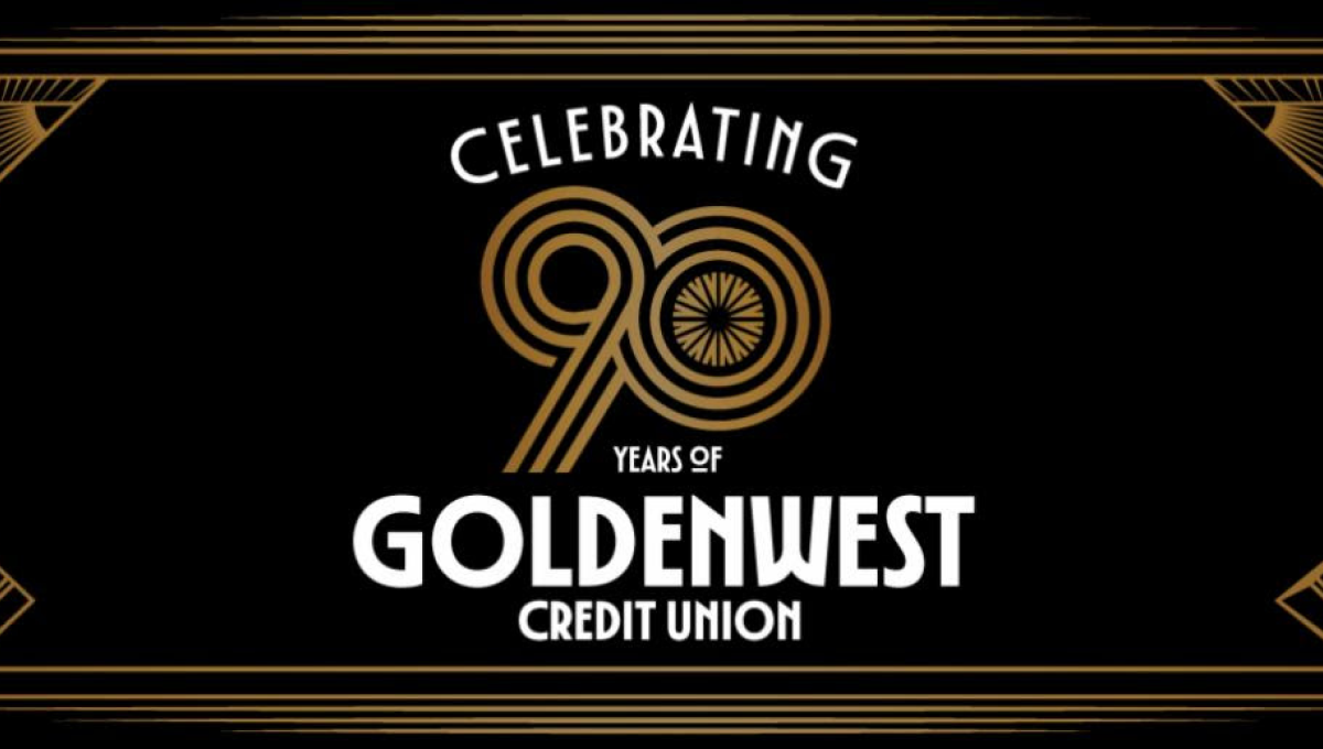
This anniversary logo has a refined, vintage-inspired style with a balanced and decorative layout. Thin geometric lines frame the design, creating a formal and elegant appearance, while the anniversary number is placed prominently in the center as the main focal point. A black, gold, and white color palette gives the logo a timeless and celebratory feel. Overall, the design combines classic decorative elements with clean typography to highlight a long-standing milestone in a polished, memorable way.
More Details →Trimac 80th Anniversary Logo

Trimac’s 80th anniversary logo combines retro and modern styling to reflect the company’s 80-year legacy and how far it has come. The overall design was inspired by a road (it’s a trucking company after all) to symbolize continuous movement and the “road” ahead, with the three lines representing the company’s founders: J.R. “Bud” McCaig, Roger McCaig and Maurice McCaig. Central to the design is a bold “80,” shaped like an infinity to reflect limitless potential, unity and the collective strength of its people, customers and communities. The logo uses Trimac’s primary brand colours, maroon and red, and is anchored by the company’s original logo for use across various applications, like truck fleet branding, merchandise, print media and digital platforms.
More Details →Art Directors Club 100th Anniversary Logo

The concept for this logo is describeed by Bruce Chao. In his words from the source linked below this logo, "ADC100 branding plays on the existing ADC letterform, as well as the rich legacy of archival imagery that foregrounds the people and work at the heart of the organization and awards program. The branding also references the original ADC geometric pattern that echoes the Art Deco design style from the era in which the club was founded."
More Details →Deer Valley Music Festival 20th Anniversary Logo

This creative logo uses a large number 20 in the center as the main focal point of the design. With a silhouette of the mountains that surround the venue at the bottom and line art of the night time sky above, the result is a really compelling, creative mark and shape. Around three sides of that shape sit the various names and groups affiliated with the program.
More Details →New Gregory Gym 25th Anniversary Logo
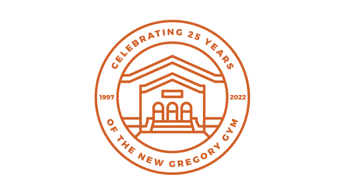
This beautifully simple line-art style logo combines a seal-style shape with two rings to hold the name of the organization and the anniversary details. In the center is a clean illustration of the front side of the building. Together, the design is not only a beautiful blend of a recognizable element of the brand with a unique design that elegently marks the anniversary.
More Details →Stone Brewing 20th Anniversary Logo
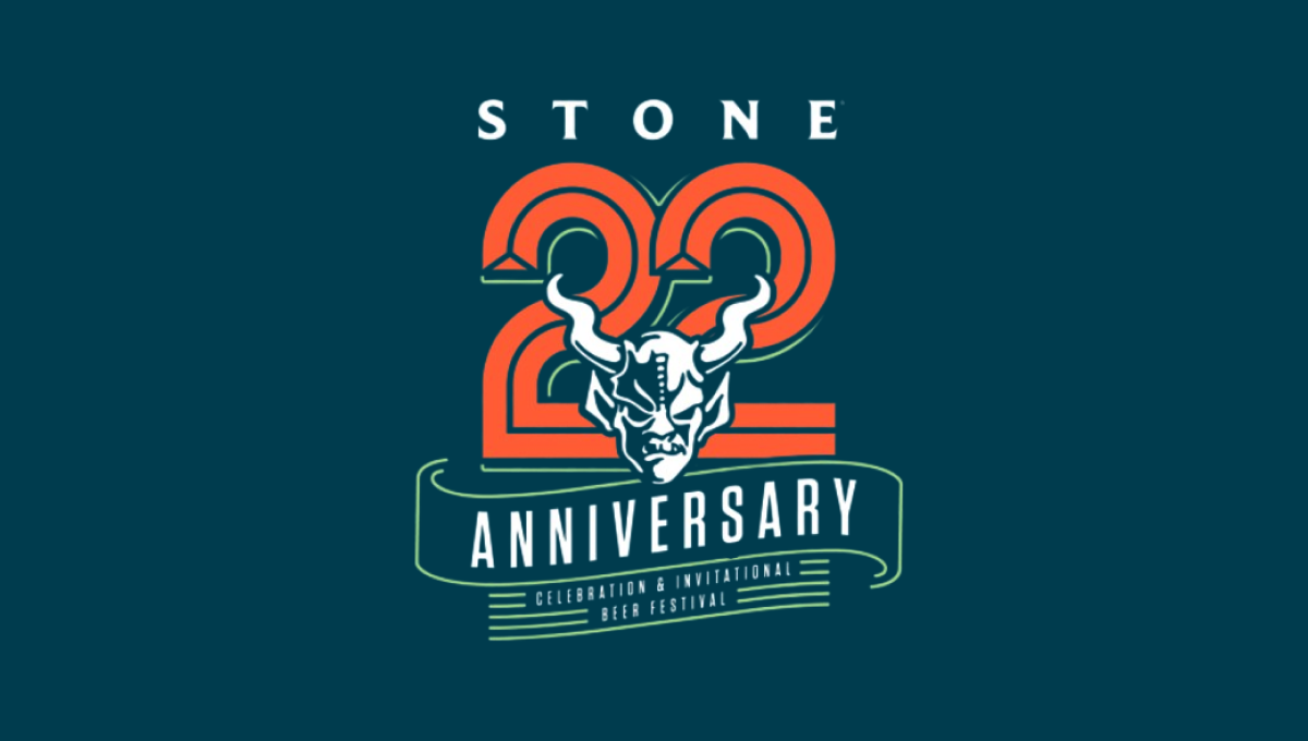
This logo starts with the brewery's traditional mark in the center and then builds layers behind to create a really sharp design. The first layer is a large, line-style number 2 with ribbon-style bit of line art below that signifying the meaning of the number. Above is the name of the brewery to create balance. The result is a beautiful design that tied nicely back to the original logo.
More Details →Apple France 40th Anniversary Logo
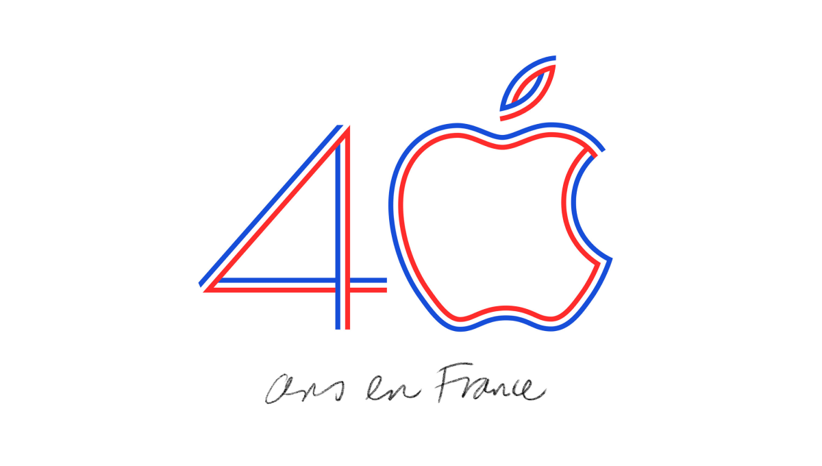
Using the classic Apple logo for the zero in the number 40, this logo uses the three colors of the French flag to create a line-art style logo that neatly combines both the traditional mark for this computer company and the colors that represent the branch of the company they were hoping to celebrate with this special design.
More Details →Adidas 60th Anniversary Logo
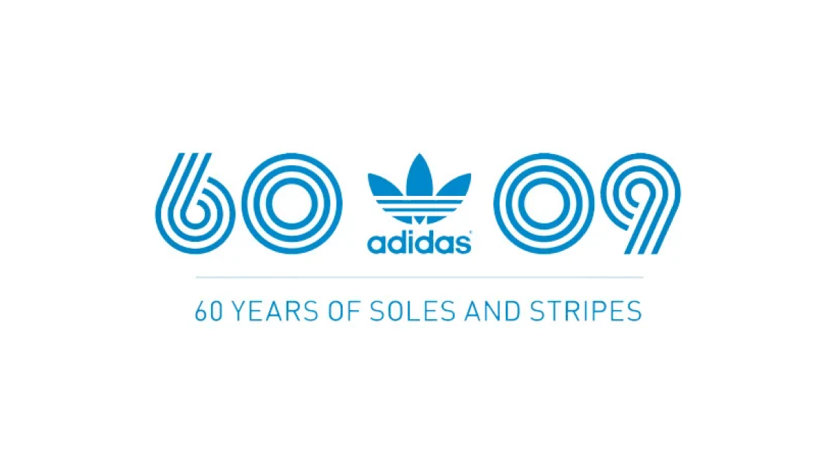
Three strips, classic blue color; that's about all Adidas needed to set the tone for a recognizable mark and they did exactly that. Three lines to form the anniversary they're celebrating and a 09 to mark the year of celebration. With the traditional mark placed in the middle, this logo is as simple as it is effective.
More Details →SESLOC Federal Credit Union 80th Anniversary Logo
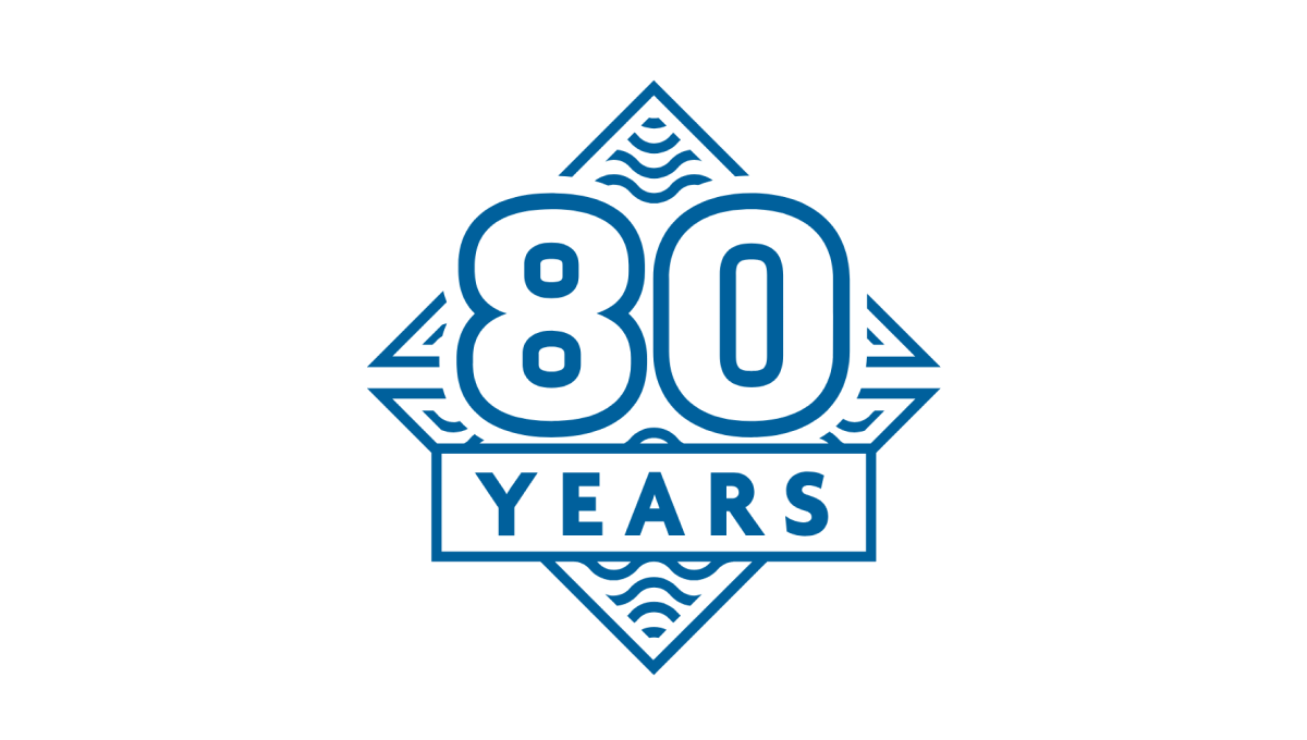
This mark was rarely used on its own, but because they stuck to the same blue color, shape, and style as the company's original logo, this design was a nice campanion to traditionally branded materials. The difference in this mark was a large number 80, unique line art behind, and a large word "YEARS" below the number. The design looked great and was used really well by this credit union during their anniversary.
More Details →Hankook 80th Anniversary Logo
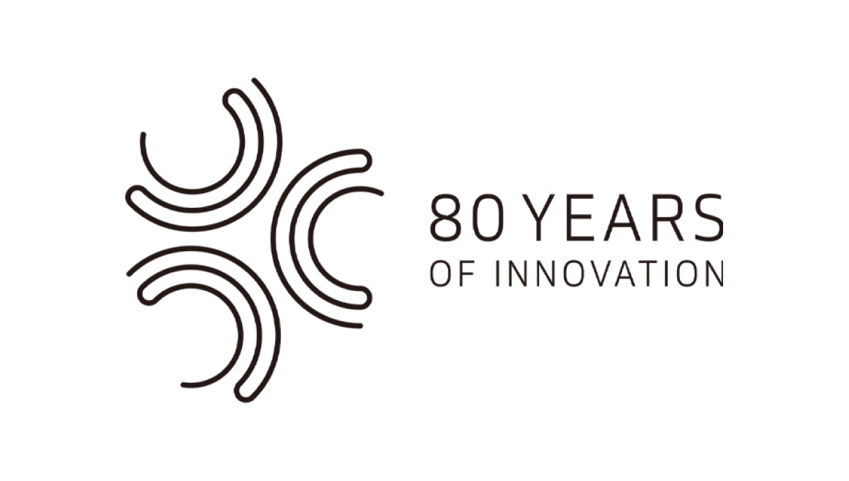
This logo starts with a large number 80 made using three concentric circles for each loop of the number but then places all three into another circle that hides some of the edges. The loose ends of the circles are then connected to make a classy mark that still makes it easy to see the original number. An anniversary tag line sits just to the right. While not recognizable on it's own, this mark is a great asset for Hankook's marketing materials.
More Details →City of Thunder Bay 50th Anniversary Logo
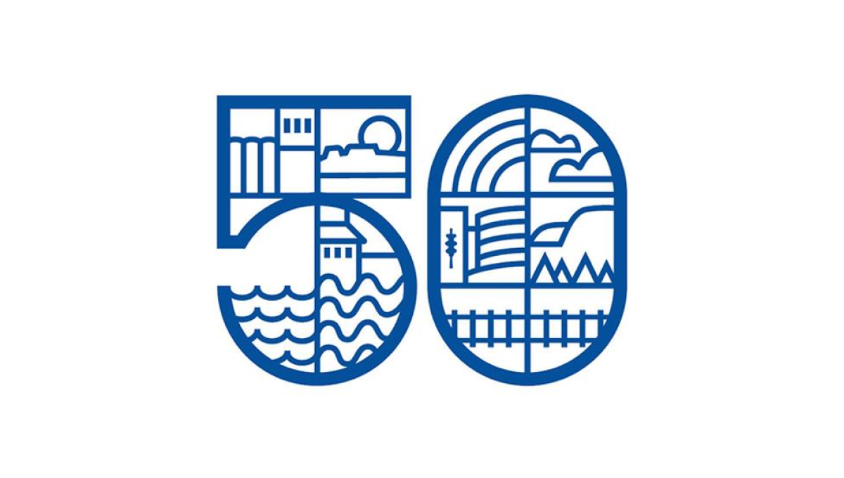
By dividing this number into a series of sections, this logo gave the designer lots of areas to work with as they highlighted many of the most popular, prominent landmarks in the city including the grain elevators, city hall, and the waterfront. By using a slightly thicker line for the number and thinner line for the line art in and around the number, it's easy to recognize the anniversary without the accompanying art distracting from that message.
More Details →DePaul University 125th Anniversary Logo
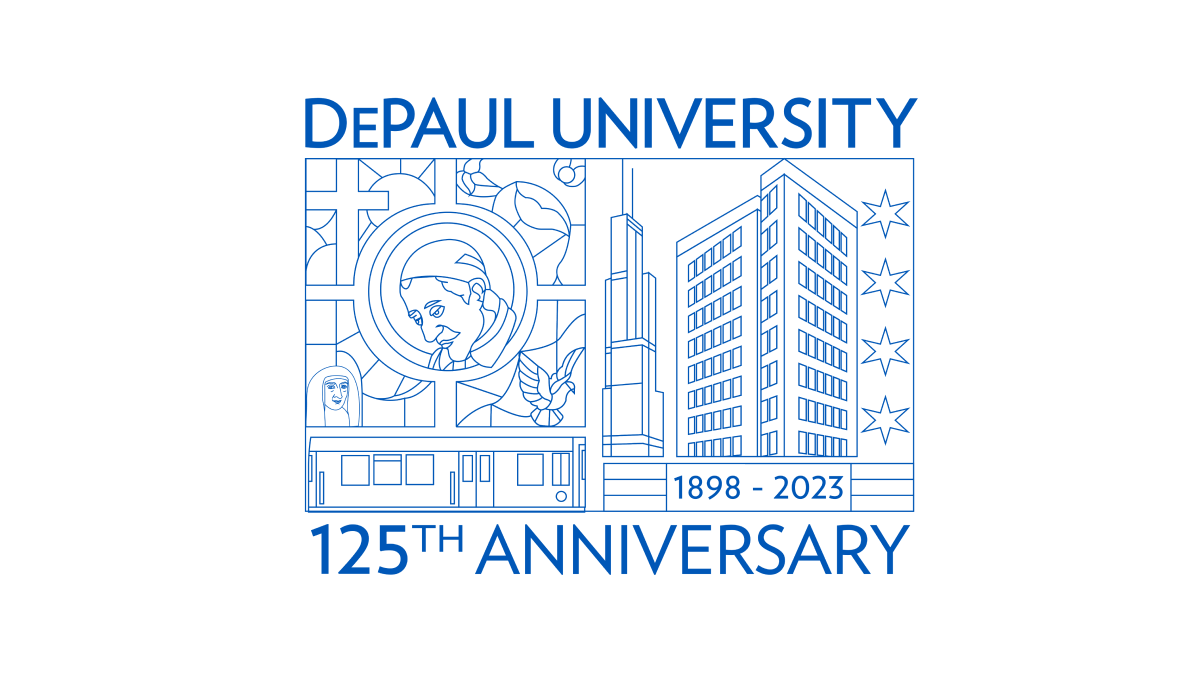
Using beautiful line art of the city in which this university is location and famous figures from their story and history, this annivesary logo is an incredible design that stands out from traditional annivesary logos. With this art at the center, playing the name of the school and the year that is being celebrated above and below in the same brand blue is all that was needed to balance out this design.
More Details →Gateway Church 15th Anniversary Logo
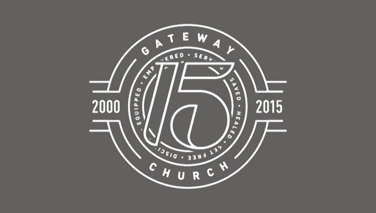
The clean, line-art logo starts with a series of white circles to create two rings where they place the name of the church and a list of the church's values. In front of that sits a large, stylized number 15. On either side are placed the years of operations with more lines connecting the horizontal years to the circular shape of the rest of the logo.
More Details →Wordpress 20th Anniversary Logo
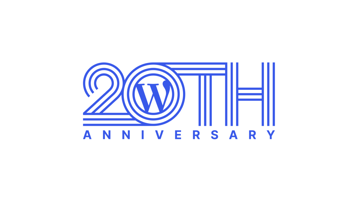
Wordpress learned into their classic brand color and well-known "W" mark for this anniversary logo. Line art style characters forming "20th" created a distinctive shape that could then hold their traditional mark inside the 0. Below that, the word anniversary in sans serif, capital letters go edge to edge for a simple, but effective, design.
More Details →