Ski Resort Anniversary Logos
Mountain Creek 60th Anniversary Logo
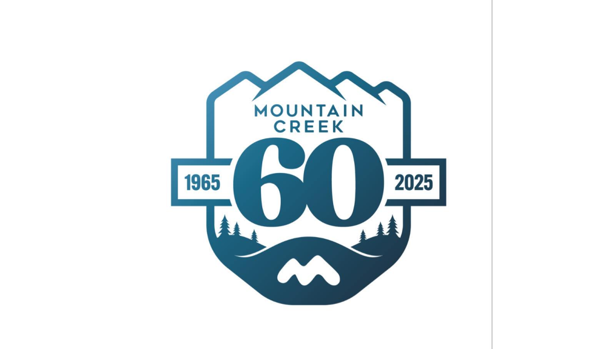
This anniversary logo has a calm, outdoors style with a badge-like shape. Mountains sit at the top, suggesting nature and strength. The large number “60” stands in the center, making the milestone clear. Small trees and flowing lines add a peaceful, grounded feeling. Soft blue tones give it a steady, trustworthy look. Overall, the design feels reflective and proud, marking many years of growth and connection to place.
More Details →Sun Valley 90th Anniversary Logo
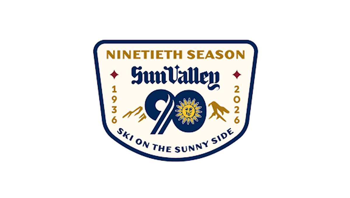
This anniversary logo has a classic, welcoming look that feels tied to tradition and place. The badge shape gives it a sturdy, established feel. A large number marks the milestone season, while mountain shapes and a bright sun suggest outdoor fun and warmth. The lettering feels timeless and confident. The colors are rich but friendly, and the overall design feels proud, cheerful, and quietly celebratory without being too bold.
More Details →Jackson Hole 60th Anniversary Logo
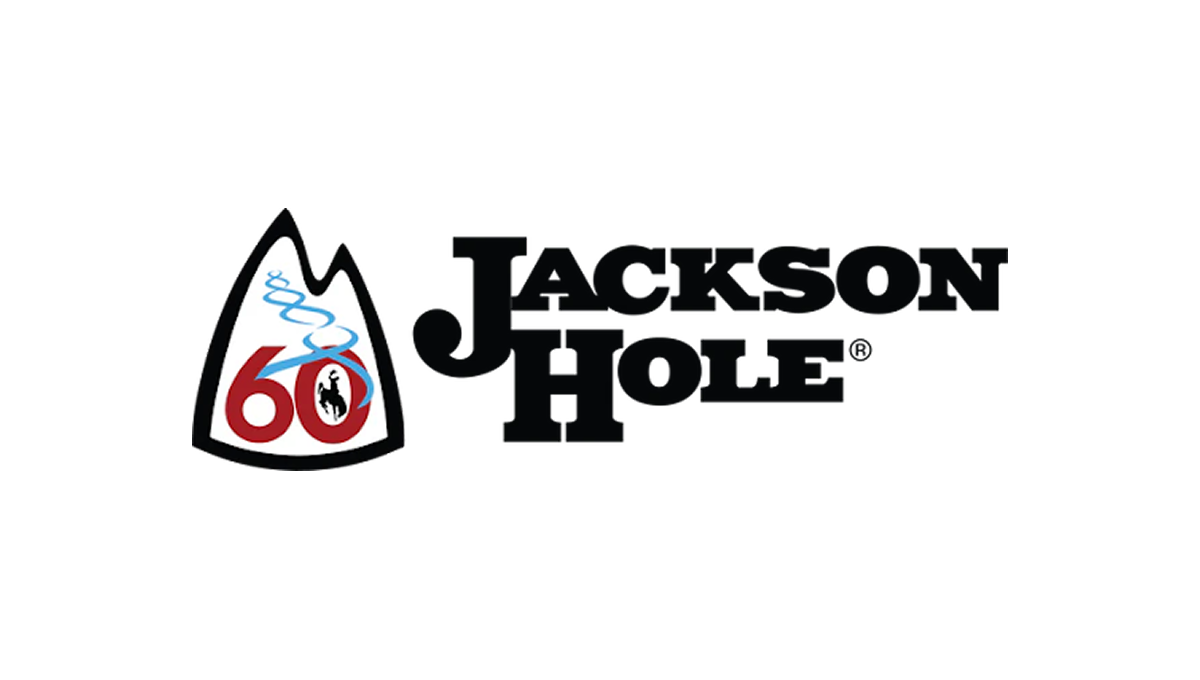
The anniversary logo has a clean, simple look with a strong outdoor feel. It centers on a mountain-shaped badge that suggests nature and adventure. The number 60 stands out, marking a long history. A soft, flowing line represents fresh ski tracks. The colors are bold but calm, and the overall design feels balanced, timeless, and quietly celebratory.
More Details →Ski Utah 50th Anniversary Logo
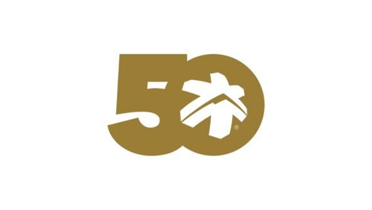
This anniversary logo highlights the number 50 in a bold, smooth shape that feels strong and unified. The design uses simple curves and solid forms that fit together naturally. A small graphic element inside the zero adds a hint of character and meaning without being too specific. The gold color gives it a warm, classic look that suggests celebration and longevity. Overall, the logo feels clean, confident, and respectful of an important milestone.
More Details →Brundage 65th Anniversary Logo
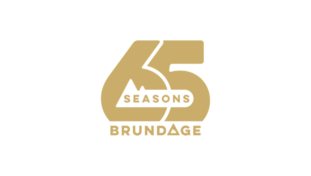
This anniversary logo features the number 65 in a bold, rounded style that feels solid and confident. The design is simple but carefully balanced, with the word “Seasons” placed across the center and “Brundage” below. A small mountain shape adds a subtle natural element without drawing too much attention. The gold color gives the logo a warm, celebratory feel, marking an important milestone.
More Details →Sugarloaf Mountain 75th Anniversary Logo
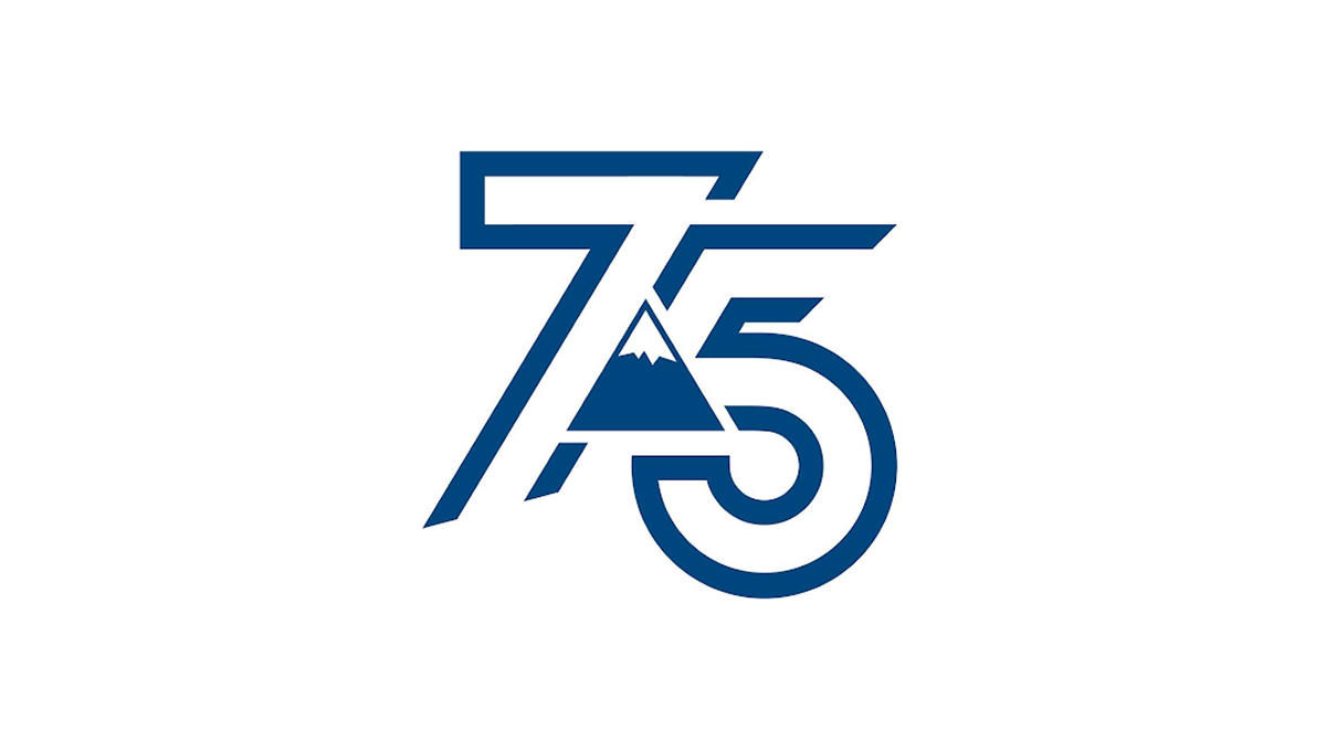
This anniversary logo shows the number 75 in a bold, clean style. The numbers are shaped with smooth, modern lines that feel strong and balanced. A simple mountain shape appears in the center, adding a quiet sense of place, history, or growth. The blue color gives it a calm and trustworthy feeling. Overall, the design feels modern but respectful, marking an important milestone without being too detailed or busy.
More Details →Heavenly Mountain Resort 70th Anniversary Logo
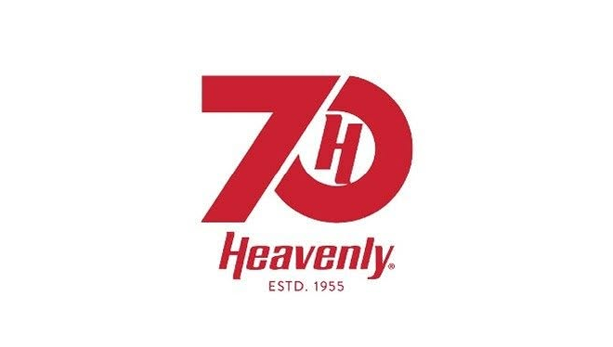
The anniversary logo has a clean and balanced look that feels modern but also familiar. Simple shapes and smooth lines come together in a calm, thoughtful way. The design suggests a sense of time passing and shared history without showing too much detail. The colors feel steady and respectful, giving the logo a warm but professional tone. Overall, it quietly marks an important milestone while staying clear, flexible, and easy to recognize.
More Details →Whistler Blackcomb 60th Anniversary Logo
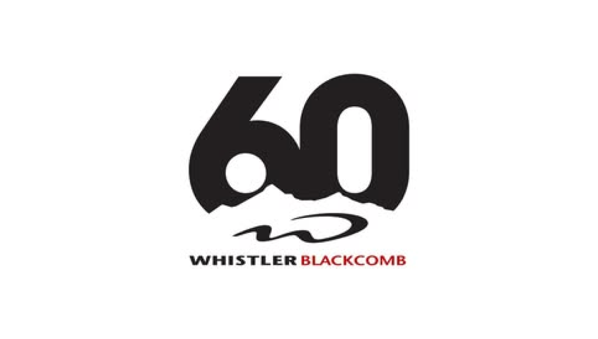
The logo centers on a large, bold 60 in dark lettering, with a rough, uneven edge along the bottom that suggests mountains or natural terrain. Below the number is their logo. The name appears underneath in clean, straightforward text, with a small pop of color for contrast. The overall design feels modern and minimal, marking the anniversary in a strong but understated way.
More Details →Martock 60th Anniversary Logo
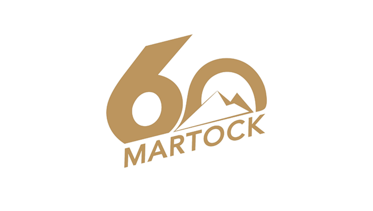
The logo features a large, bold 60 as the main focus, using smooth, rounded shapes. Inside the zero is a simple mountain outline that hints at an outdoor setting. Below, the name appears in clean, angled lettering that feels modern but grounded. The single warm color gives the design a calm, unified look. Overall, it feels straightforward and confident, marking an important anniversary without too many extra details or decoration.
More Details →Diamond Peak 60th Anniversary Logo
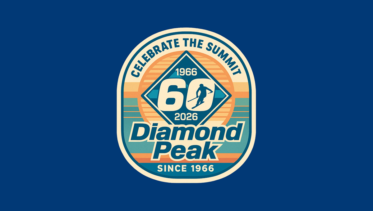
The anniversary logo has a rounded badge shape with layered colors and a vintage feel. In the center is a large 60, framed by a diamond shape, with dates above and below to mark the milestone. A small skier figure adds a sense of motion and outdoor spirit. The background uses soft stripes and warm tones, while the text curves around the design, giving it a balanced, classic look that feels celebratory and familiar.
More Details →Castle Mountain Resort 60th Anniversary Logo
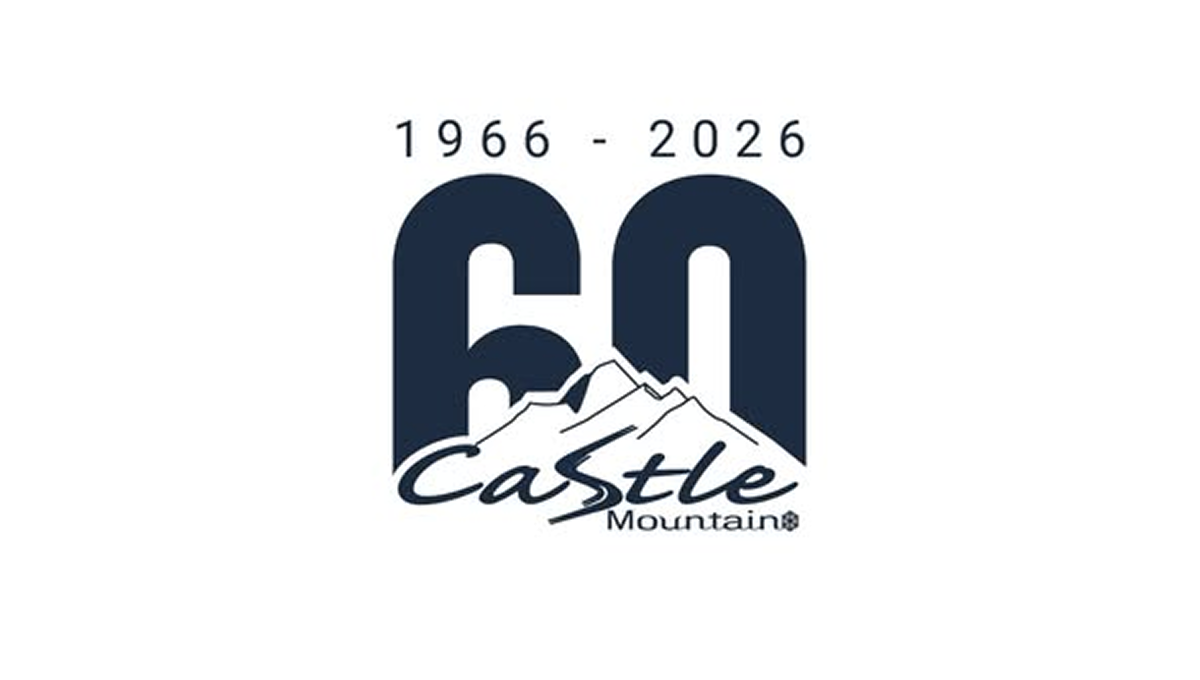
The anniversary logo shows a big 60 in dark block numbers with the years “1966 – 2026” above it, marking six decades. Below the numbers is a simple mountain shape and the name of the resort in a casual, flowing script. The style feels calm and grounded, with smooth edges and easy contrast between the bold numerals and the softer text and graphic, giving a clean and clear sense of time passing and celebration.
More Details →Trollhaugen Recreation Area 75th Anniversary Logo

When your ski area has a name like Trollhaugen, you've gotta keep things a little bit playful in all of your marketing and they've extended that fun, causal vibe to this anniversary logo. With the common circle shape, they place an illustration of their mascot at the center, their name and anniversary above and below following the curve of the circle, and a blue ribbon holding their years of operation to tie it all together.
More Details →Wintergreen Resort 50th Anniversary Logo

While the resort does have other lockups of this mark they're using, the simplicity of this design is worth showcasing alone because it's a great reminder that anniversary logos don't have to be complicated. That doesn't mean this logo isn't beautifully designed - the block number 50 with offset numbers is neatly balanced with the resort's original logo placed inside - but it does mean that they didn't overthink it. The result is both effective and really sharp looking.
More Details →Palisades Tahoe 75th Anniversary Logo

This is an anniversary logo design concept I haven't seen before but I really like. Instead of changing the mark or adding something outside of the logo, this design places a large, block number between the two parts of the original logo. I love the way it keeps the balance of the original logo while adding an easy-to-recognize call to the year they're celebrating.
More Details →Mt Buller 100th Anniversary Logo
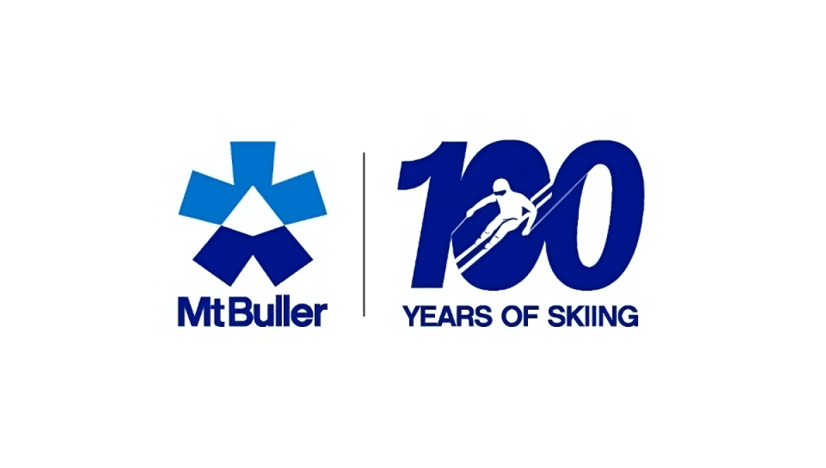
One of the smartest design trends in anniversary logos has been the simple, side-by-side concept that draws a vertical line in the middle, places the original logo on one side, and a simple number mark on the other. Mt Buller did this really wel with a nice "100 years of skiing" mark that makes for a nice, visual balance to the brand both visually and with the meaning they're aiming for.
More Details →Park City Resort 60th Anniversary Logo
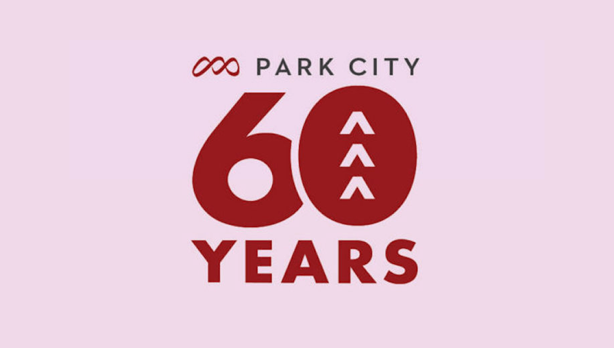
Park City Resort's 60th anniversary celebration needed a simple logo and this design combined the resort's original logo at the top, a large number 60 with shapes to tie the number back to the mountains the resort is famous for, and the word years at the bottom all on the brand's original brick red color.
More Details →Boyne Mountain 70th Anniversary Logo
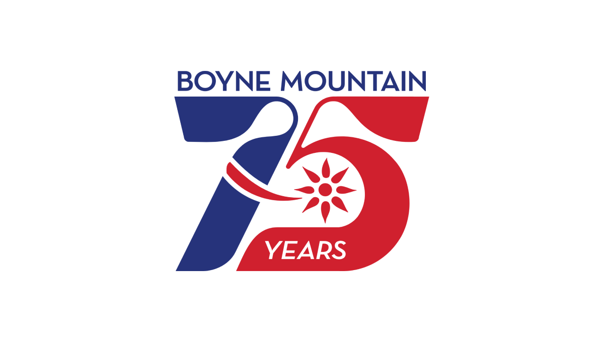
Retro was the name of the game as Boyne Mountain pulled visuals and colors from the early days of their history to create a number mark that was both easy to read but also neatly tied back to the original brand from all those years ago. Above that number mark is the name of the resort to complete the design. This logo as looked fantastic in all white on dark backgrounds and the shape lended itself well to use as social media avatars.
More Details →Massanutten 50th Anniversary Logo
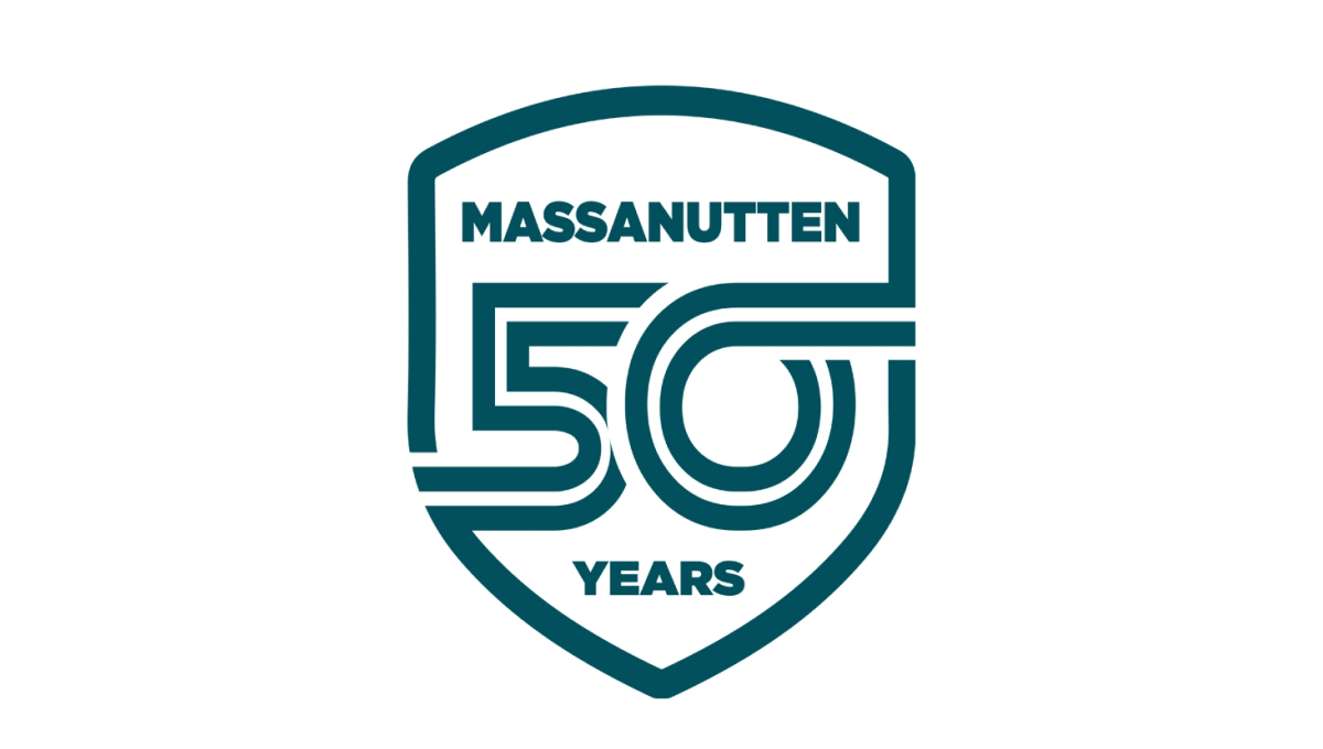
Massanutten went retro for this clean, badge-style logo by starting with a crest shape. Inside that crest is a double-line number fifty with the bottom part of the five connecting with the left edge and the top part of the zero extending to connect with the right. The name of the resort sits above the number with the word years below to complete this clean, effective logo design.
More Details →Snowbasin 75th Anniversary Logo
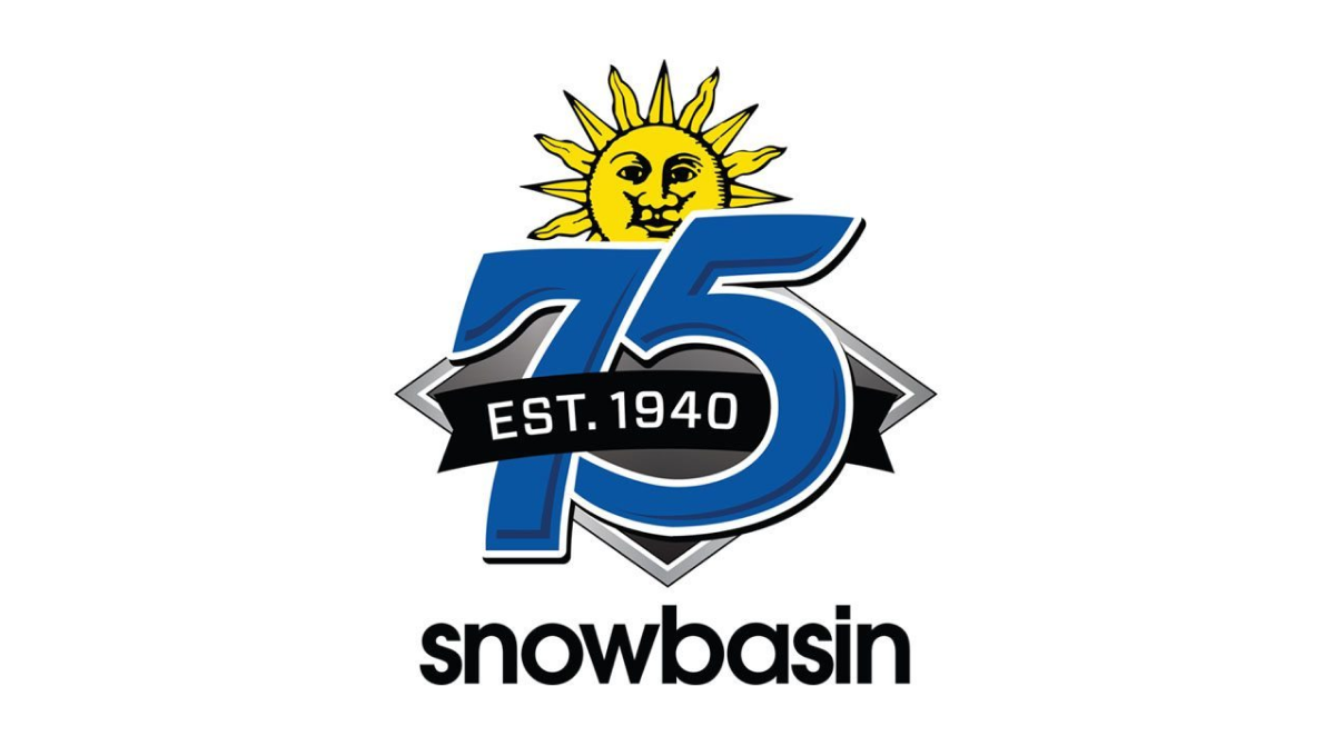
Featuring a large number 75 in the brand's usual blue, this logo adds a few simple elements in and around these digits. First, the brand's traditional mark peeks up from behind the 75. Next, a black ribbon holding the years of operation weave in and out of the main number mark. Finally, the traditional work mark for the resort sits at the bottom to make a fun, but recognizable design.
More Details →Big Sky Resort 50th Anniversary Logo
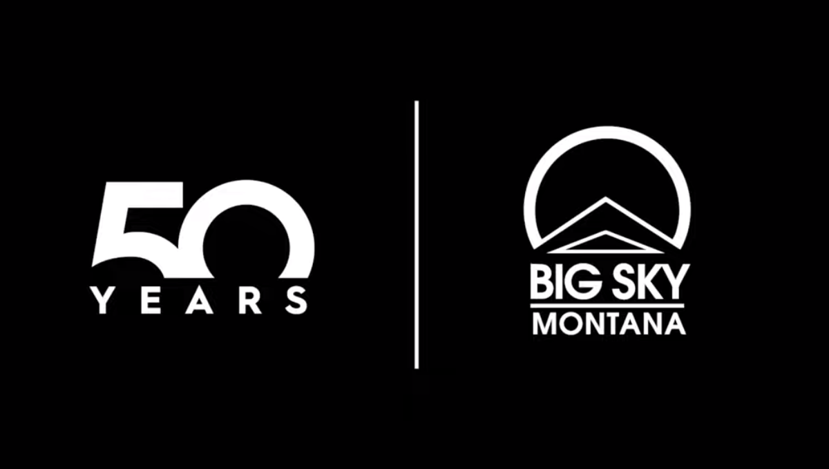
This well known mountain resort used a popular method of separating their traditional logo from a number mark with a vertical line. With a large block number 50 rising from behind a wide, all caps word "YEARS" they created a unique mark that can simply be paired with their original logo during the celebratory season without much work or effort to switch back and forth.
More Details →Swain Resort 75th Anniversary Logo
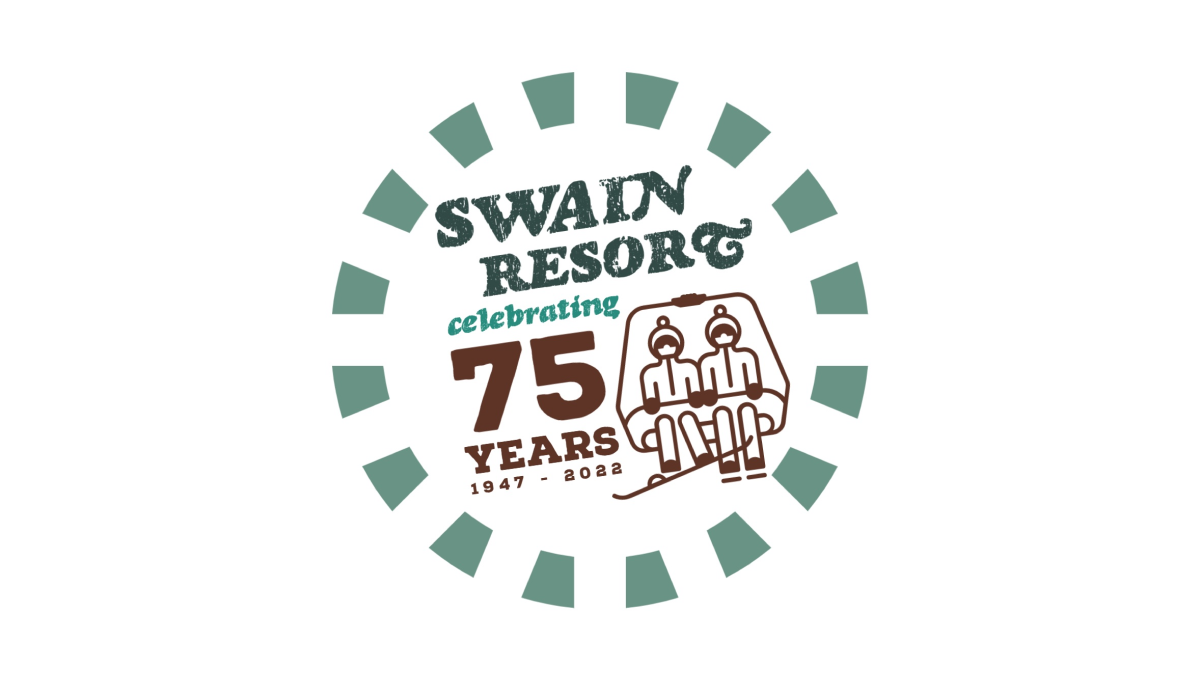
Swain Resort's anniversary logo start's with the brand's traditional green color and creates a shape using a dashed line circle. Inside sits the resort's name with maroon text highlighting the reason for the celebration. Finally, to the right of the years, sits an illustration of a ski chair in the same maroon color to add a playful tie back to the resort's primary activity.
More Details →Sundown Ski Area 50th Anniversary Logo
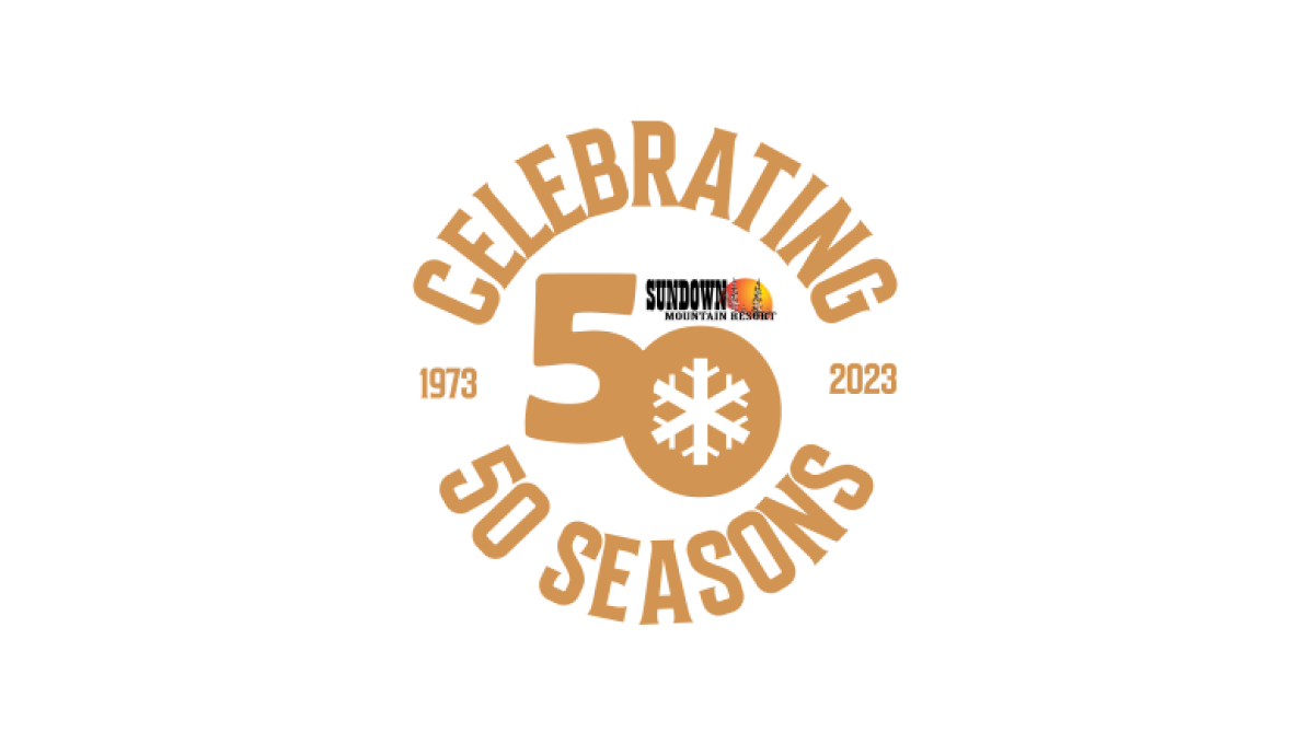
Sundown gave their designer a lot of creative freedom to create a mark that was unique to their anniversary. The result were the words "celebrating 50 seasons" forming a circle around a large number 50 and the years sitting to either side to break up the circle. The 0 in the large fifty contained a snowflake icon to tie it back to the skiing message and made room for the resort's original logo above.
More Details →Stowe 85th Anniversary Logo
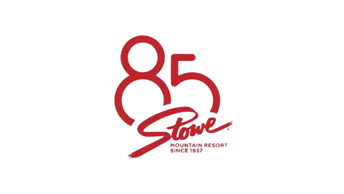
Stowe is a classic logo that hasn't changed since the early days of the resort and town. So rather than mess with something so clean and recognizable, they simply added a stylized number 85 peeking up and from behind the original mark. The result fit neatly on social media icons and marketing materials alike and kept things nice and simple.
More Details →Steamboat 60th Anniversary Logo
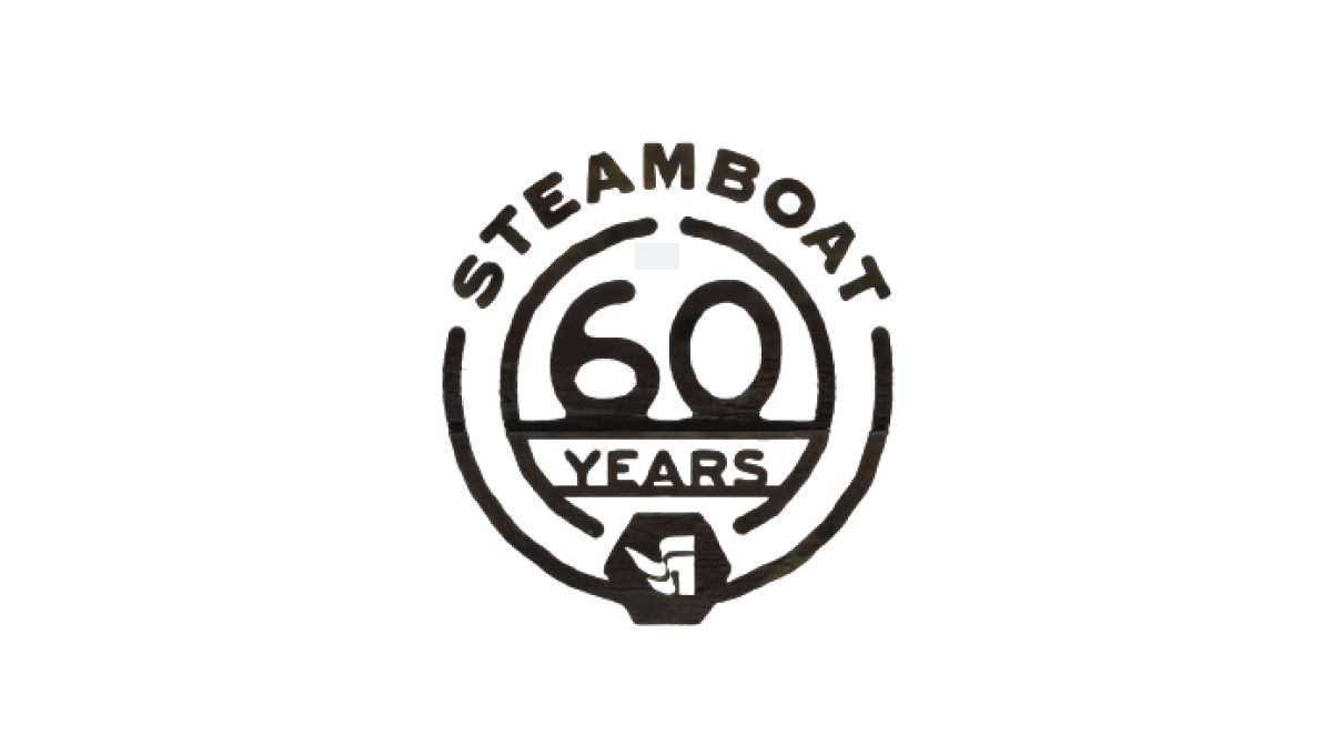
Steamboat used a really sharp bit of line art for their 60th anniversary. With the resort name arched across teh top, the number 60 set in the middle, and the word "years" set just below with a partial center ring to hold it all together, the resort's famous flag mark sits as an achor at the bottom to create mark that was easy to use and adapt to many situations during their anniversary season.
More Details →Snow Trails 60th Anniversary Logo
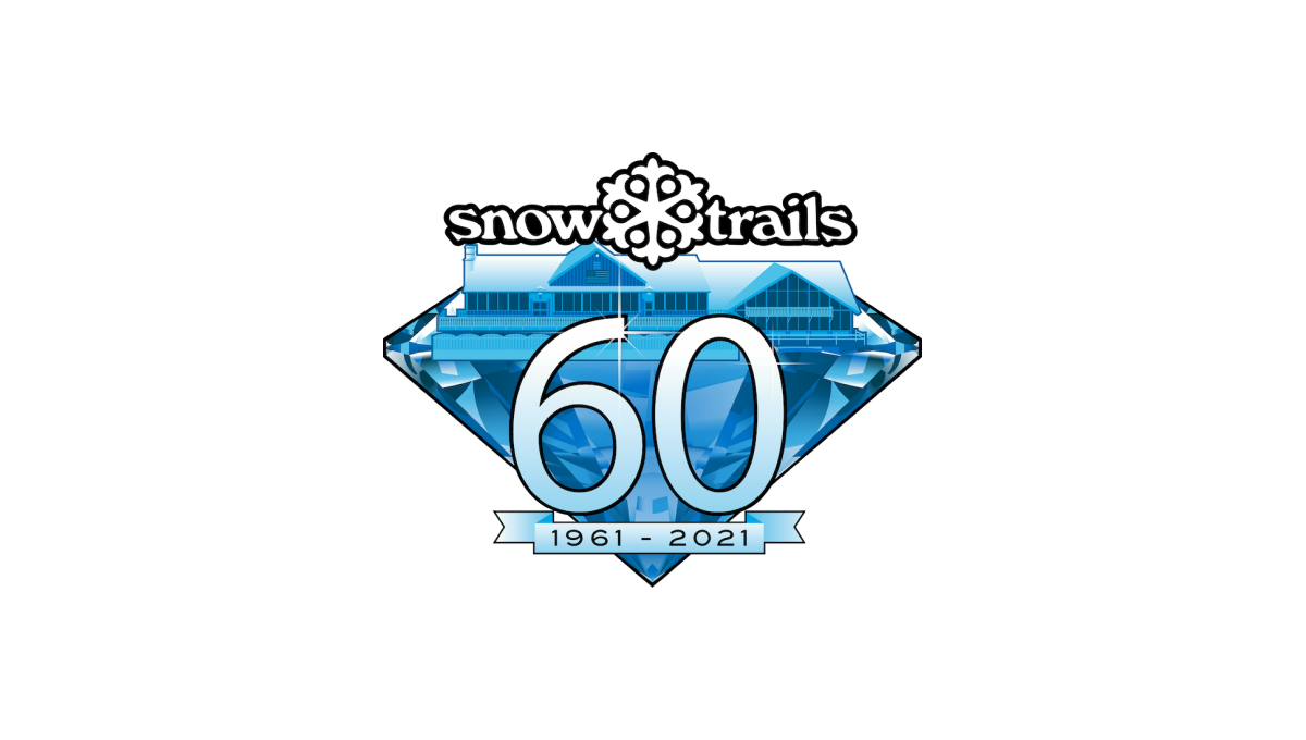
With a diamond anniversary on the calendar, Snow Trails began their design with that exact shape as a backdrop. Building on their brand blue color and adding in a stylized version of their base lodge inside the diamond, a large number 60 sits above the diamond with a small ribbon containing the years below that. Finally, the brand's original logo sits at the top to make the mark easy to recognize.
More Details →Snowbird 50th Anniversary Logo
Snowbird's classic wings mark is one of the most well-known logos in the ski industry. To celebrate their 50th anniversary, the used a block number 50 in the brand's iconic red color with the wings inset in the number 0. The mark was clean, bold, and easy to recognize for anyone familiar with the snowbird brand.
More Details →Park City Mountain Resort 50th Anniversary Logo
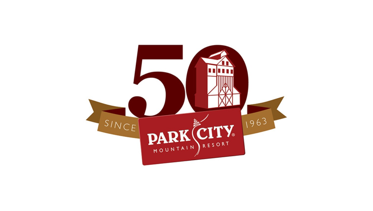
With a logo that was already set in a rectangle, Park City Mountain Resort simply turned that mark into a ribbon to contain the rest of the elements. Gold sections of the ribbon hold the words "since 1963" and the number 0 contains some clean line art depicting the mountain's well-known mining history and buildings still found at the resort.
More Details →Mt Hood Meadows 50th Anniversary Logo
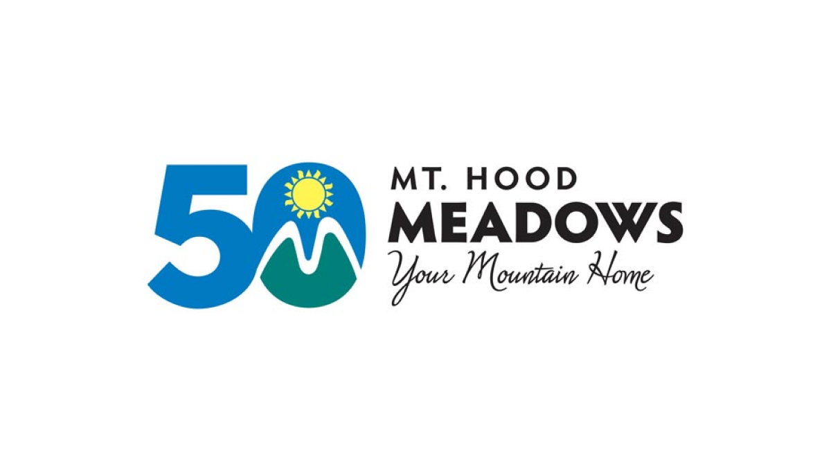
The resort's green, blue, and yellow mark normally sits in a crest-style shape to the left of the word mark. To transition to the anniversary design, the resort simply placed that mark inside the 0 of the number 50 similarly to the left of the word mark. This made their logo both unique to the celebration but also easy to recognize by their audience.
More Details →Loveland Ski Area 75th Anniversary Logo
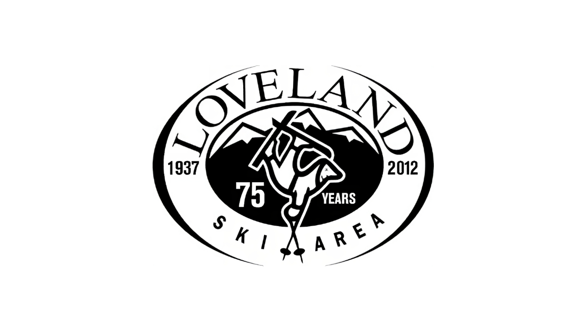
Loveland changed very little with their traditional logo when they celebrated their anniversary. By adding the number 75 and the word "years" to dark space on either side of their center mark, the resort was able to have something unique to use for their anniversary but also something that was seamless to swap in and out with their existing logo.
More Details →King Pine 60th Anniversary Logo
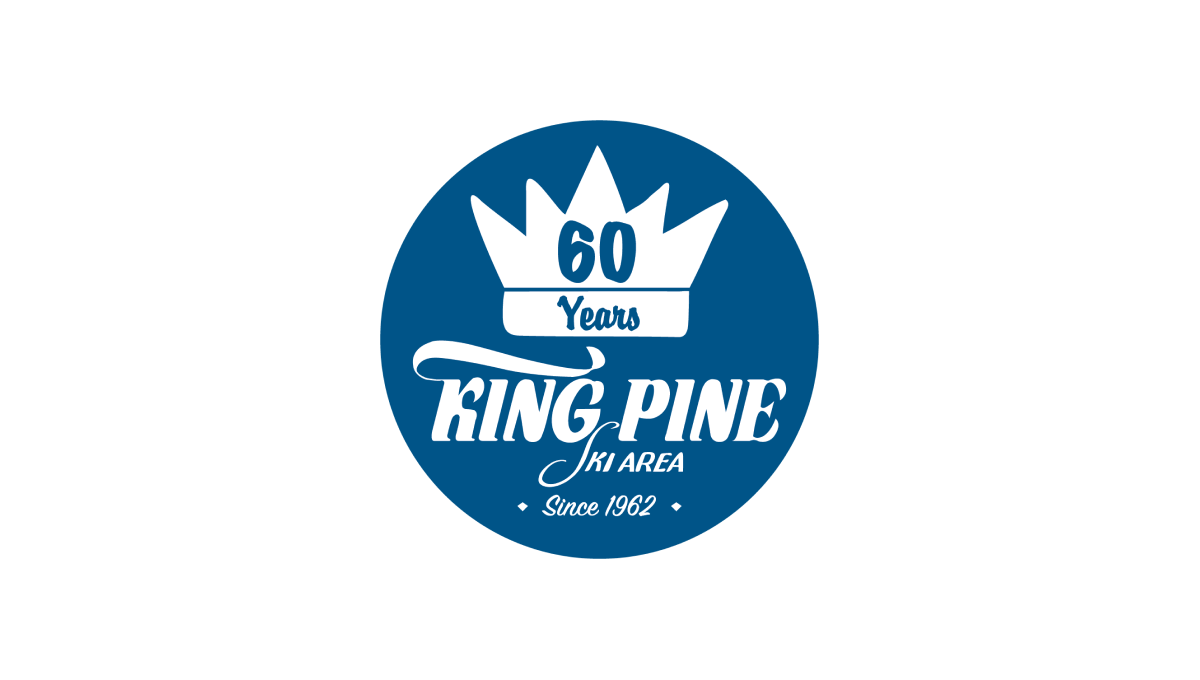
King Pine started with a filled circle in their brand blue color and placed a white version of their logo / word mark in the bottom center to tie back to their original brand and anchor the rest of the design. Above that a crown - referencing back to the "King" portion of the name - with the annversary number in the center balances to the top, with a "since" label at the bottom creates clean balance for the rest.
More Details →Kelly Canyon 60th Anniversary Logo
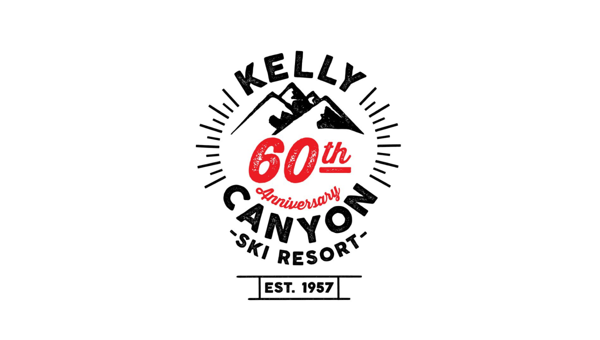
Kelly Canyon gave their designed lots of creative freedom and focused on a mark that was fun and recognizable rather than one that has strong, visual ties back to their original brand. The clean line-art design that they came up with works great in many situations - web, print, etc. - and creates a separate brand for their annversary.
More Details →Jackson Hole 50th Anniversary Logo
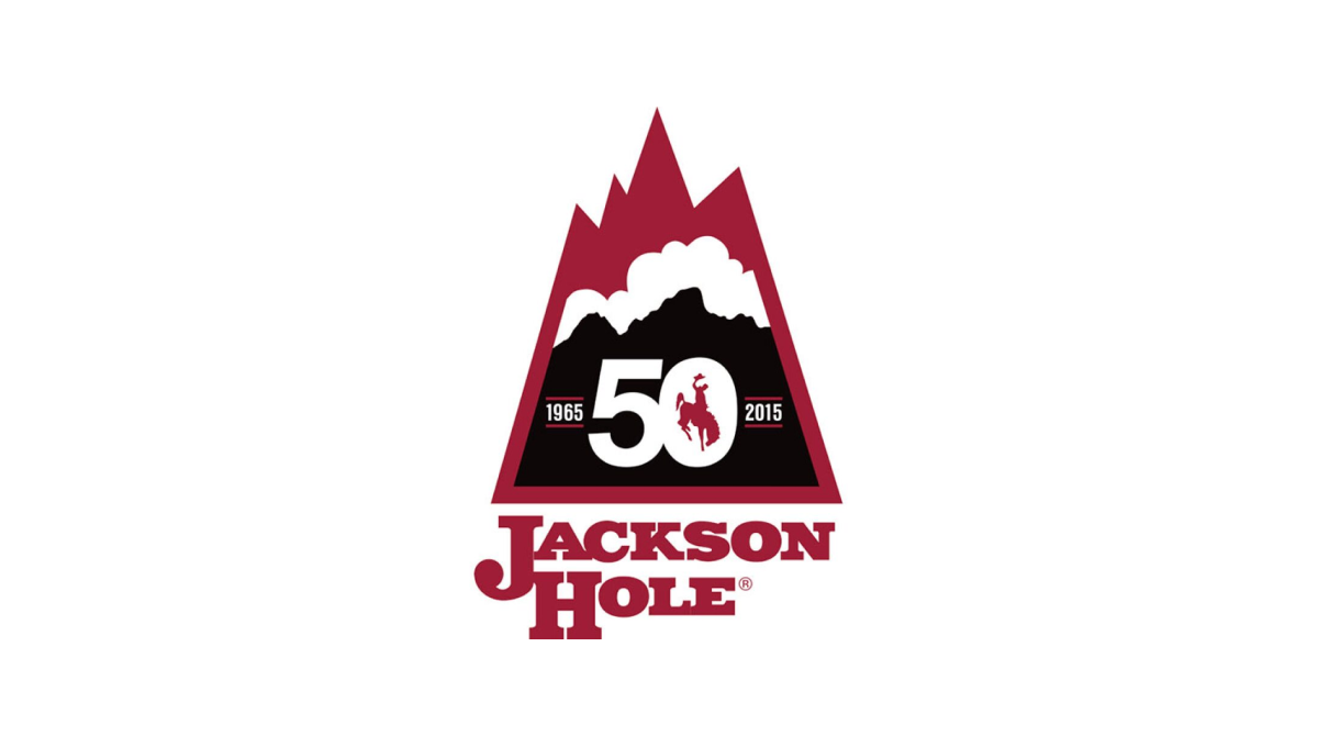
Jackson Hole Mountain Resort combined a shape found in one of their original logos with the layered red, white, and black colors found in their current logo to create a lockup that nearly merges the past with the present. They then the number 50 in the center of the large, black portion at the bottom of this mark to wrap up this strong, meaningful mark.
More Details →Hidden Valley 40th Anniversary Logo
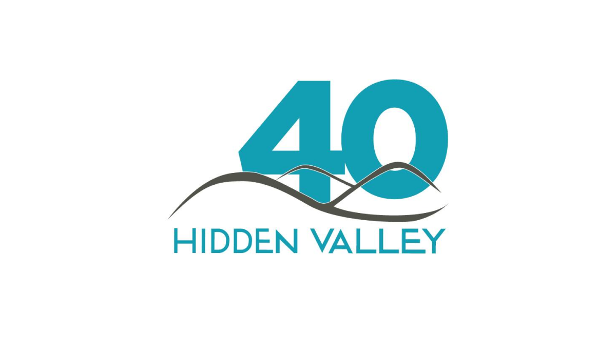
Hidden Valley's 40th anniversary logo keeps a very simple concept with a large number 40 in their brand blue / teal color peeking up from behind their original logo. While simple, the weight, size, and placement of the number give this logo extra weight and a clear reference to the milestone that is missing in some logos that add more diminutive references to their anniversary.
More Details →Greek Peak 65th Anniversary Logo
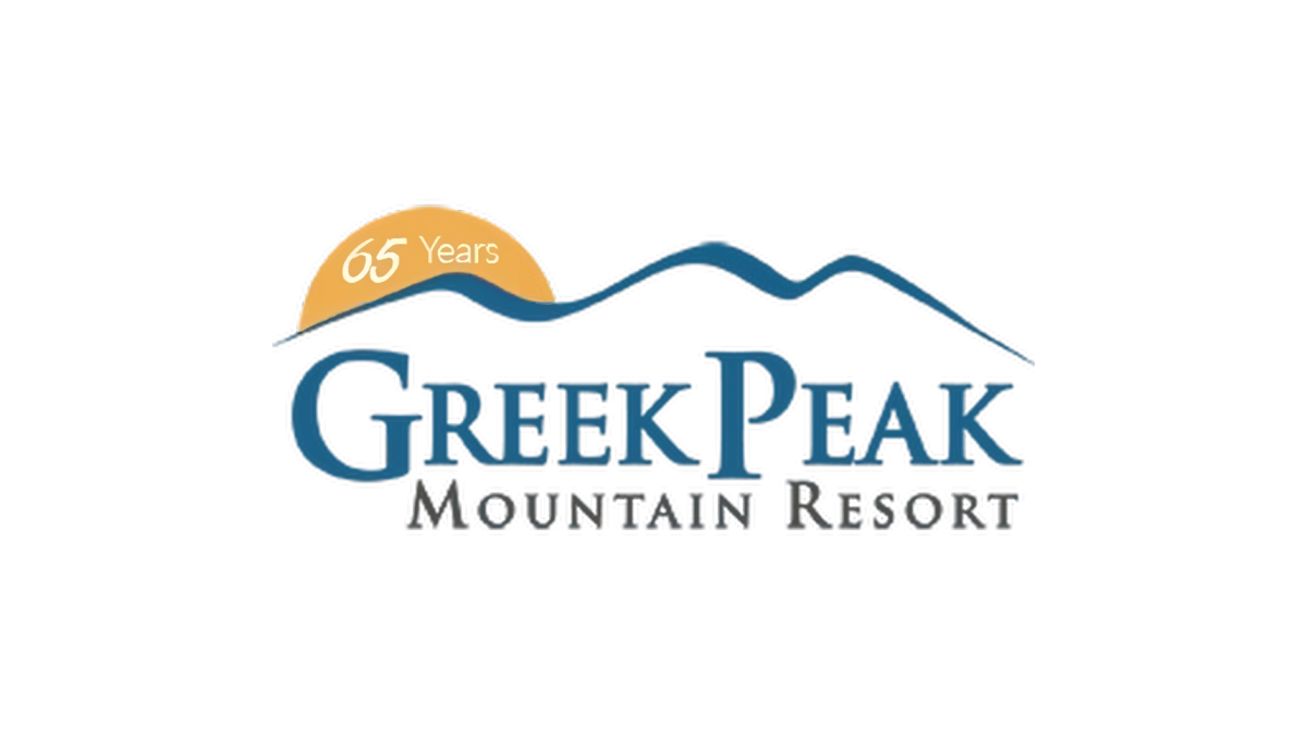
Greek Peak kept their annversary logo simple and clean when they recently reached their 65th anniversary. A simple orange circle peeking up from behind the ridgeline of mountains that make up the original mark hold the number 65 and marks the only chance to this brand. This simplicity made this logo extremely easy to swap with their existing logo during its year of use.
More Details →Blacktail Mountain 25th Anniversary Logo
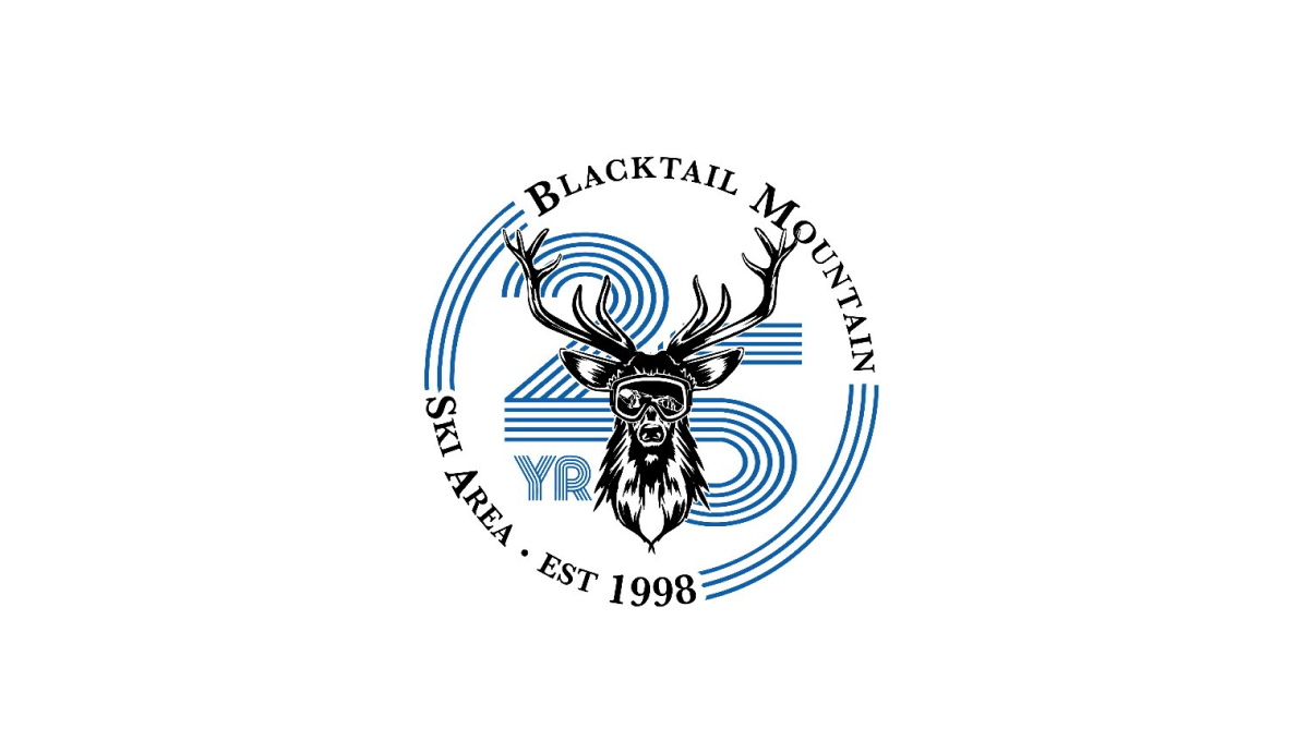
Blacktail Mountain went away from their primary logo with this mark and used a retro, line-art style number with a classic circular bar of text around and deer graphic to tie it all together and back to the core brand. It's a nice, clear, simple design and the retro feel of the number gives it a unique feel that's easy to recognize and remember.
More Details →Big White 60th Anniversary Logo
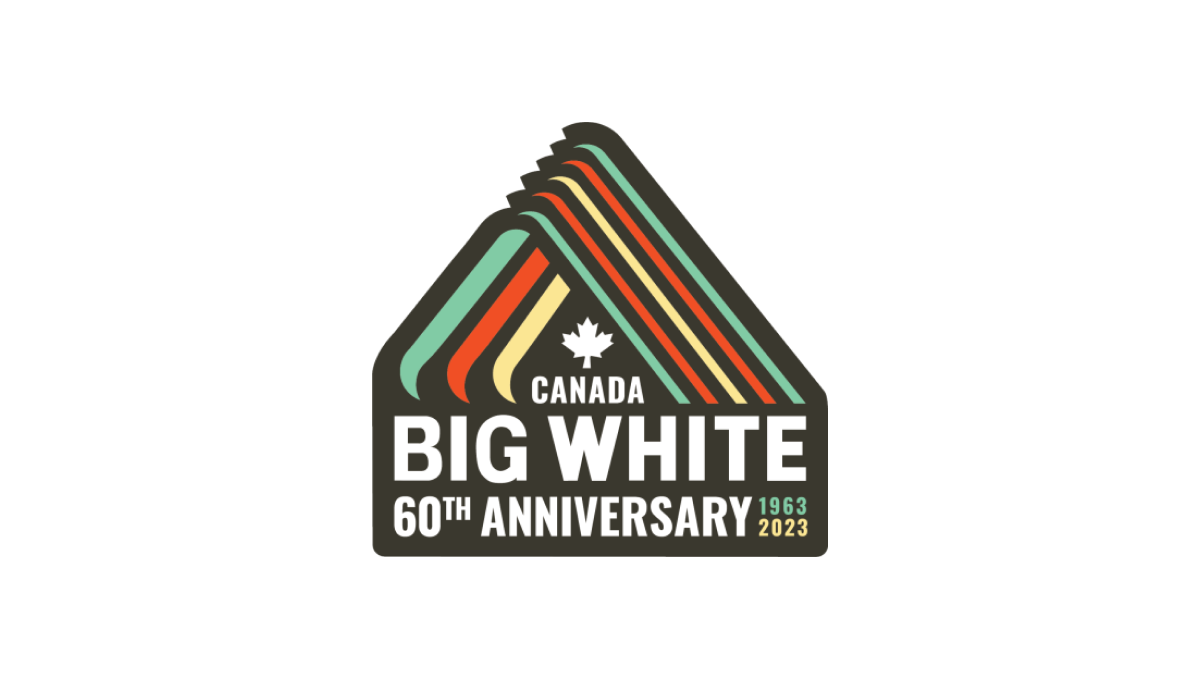
With a throwback to one of Big White Mountain Resort's original logos, this adaptation brings in a modern, sticker-style badge and extra line of text to hold the anniversary label, with a three-color design that's also a little bit retro. A simple combination of past and present, this is a great use of original logos with modern design needs.
More Details →