National Park Anniversary Logos
Big Cypress National Preserve 50th Anniversary Logo

The National Park Service has done a number of anniversary logos over the years and I love how they let the colors and styles of the area influence each one instead of a more copy and paste approach. This is another examples of that with unique fonts, bright colors, and imagery that have a different vibe than other logos but come together to create yet another tidy design that can be used in many situations.
More Details →Joshua Tree National Park 75th Anniversary Logo
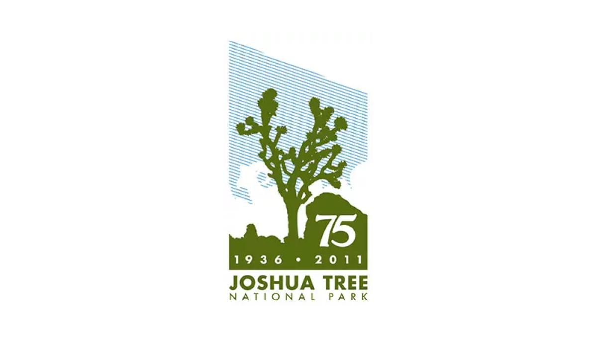
Joshue Tree is a unique national park and this logo carries that feeling with a unique shape and design. First, a vertical rectangle holds a line-hard depiction of blue sky, white clouds, and a green silhouette of the famous trees found in the park. Below that sits the name of the park and inside the green area is placed the milestone and years of celebration. However, by adding a downward angle across the top of the rectangle, the designers gave this logo a sharp, striking look that stands apart from other anniversary designs.
More Details →National Park Service Volunteer 50th Anniversary Logo
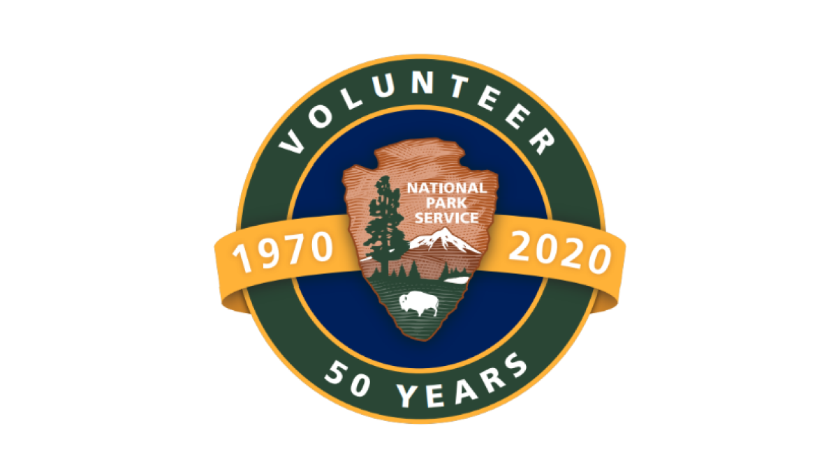
Building on the National Park Service's original logo in the center, this mark adds a circle behind to form a seal and hold wording that specifies this logo is for their volunteer program and the year they're celebrating. Behind the original log and in front of the circle sits an orange ribbon holding the years this program has been in place.
More Details →Acadia National Park 100th Anniversary Logo
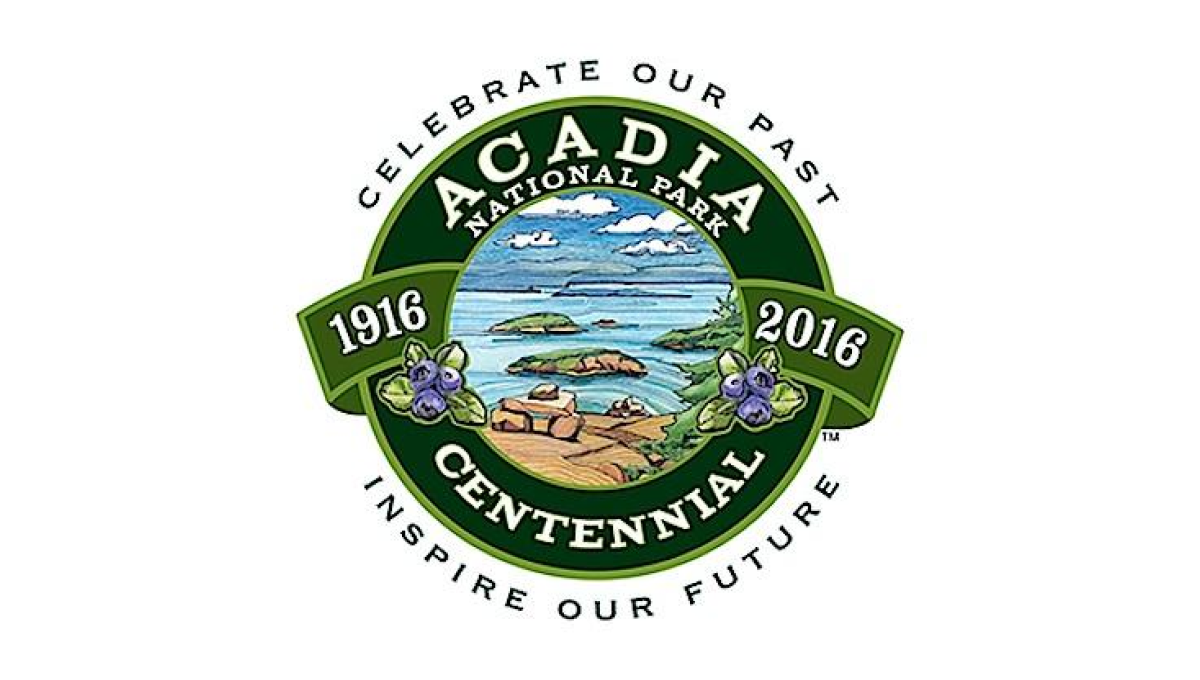
This seal-style logo uses a number of details to create a clean, balanced whole. First, a green circle with wide rim holds the name of the park and the word "centennial". Next, the inner circle is filled with an illustration depicting to beautiful shores and plants found in the park. A ribbon then holds the years of operation with arcing words above and below the seal holding the motto.
More Details →Yosemite Grant 150th Anniversary Logo
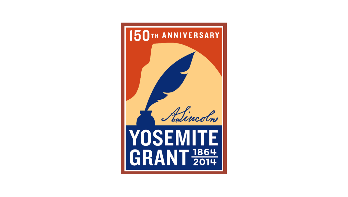
Along with Yosemite National Park's anniversary is the anniversary of the grant that made it possible. This vertical rectangle logo holds the name of the moment in blue at the bottom and features a silhouette of a feather pen extending up from that block. Behind the pen is a rusty orange color that holds the year of celebration just below the top edge of the rectangle.
More Details →Harpers Ferry National Historical Park 75th Anniversary Logo

Starting with a circle shape, this logo fills the bulk of the center area with a clean illustration of Harpers Ferry in green, blue, and yellow. In the yellow sky, lettering specifying the anniversary fills the space and adds balance. Around the rim of the circle is the name of the park with a small rectangle at the bottom holding the years of operation.
More Details →Yosemite National Park 125th Anniversary Logo
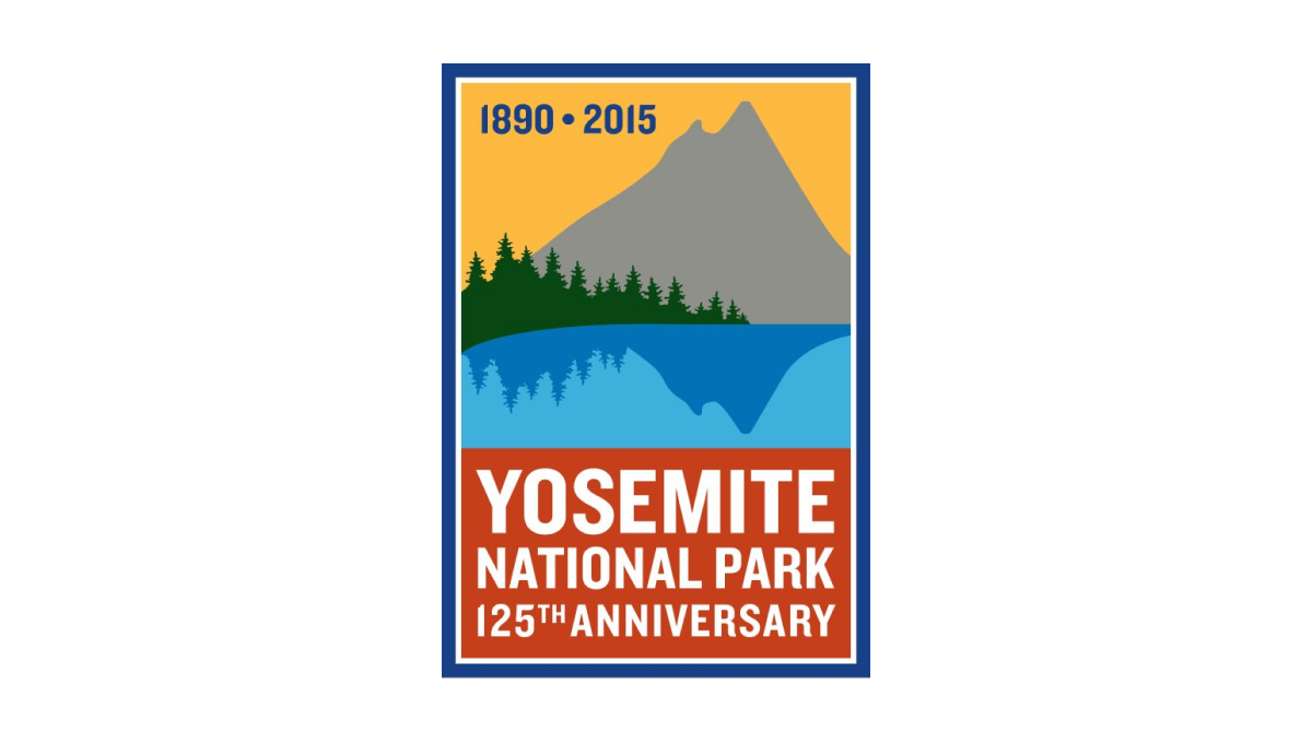
While other logos that include illustrations contain detailed depictions of well-known features, this vertical rectangle logo goes simple with a silhouette of a mountain and trees reflecting in a lake. Behind the mountain sits a yellow sky that contains the years of operation with a block of red at the bottom to hold the name of reason for celebration. A blue border surrounds the rectange to hold the elements together and neatly frame the design.
More Details →Glen Canyon National Recreation Area 50th Anniversary Logo
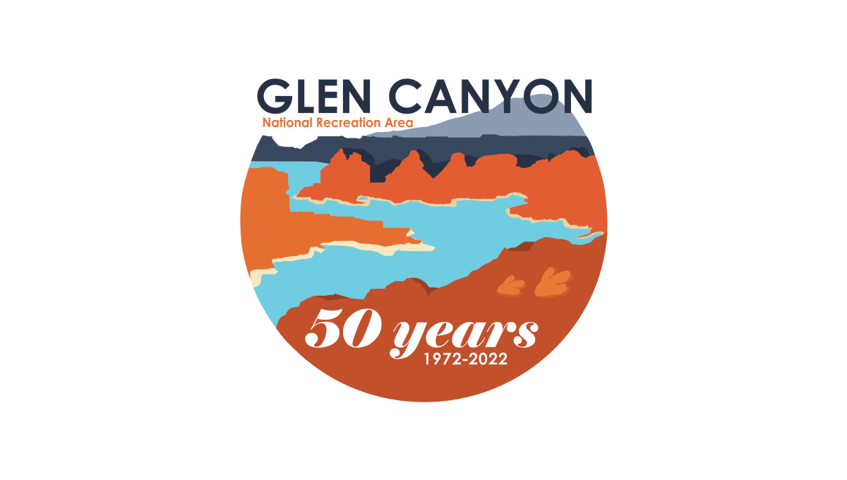
This logo starts with a circle holding the classic blue water and red rocks of the reservoir and landscape that creates it. Instead of completing the circle, however, the mark ends at the horizon line and the name of the area fills this space. At the bottom in a solid block of red color is "50 years" and a smaller line of text containing the years of operation.
More Details →National Park Service 100th Anniversary Logo
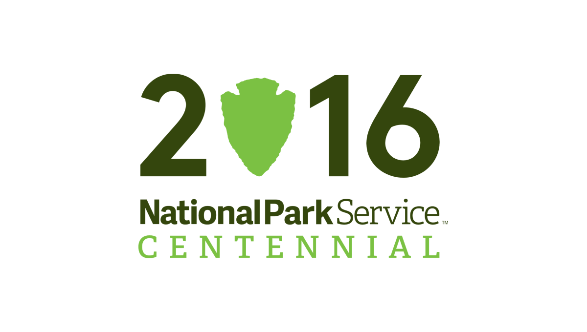
Starting with a large, block number 2016 to signify the year of the annivesary, this logo takes a recognizable shape that holds the National Park Serivice's primary logo - a downward pointing arrowhead - and swaps that for the number zero in a slightly lighter green. Below the number sits a word mark with the name of the organization and the word "Centennial" below in the same green as the arrowhead.
More Details →Grand Canyon National Park 100th Anniversary Logo
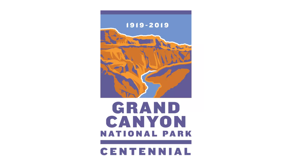
This logo sits within a vertical rectangle shape. The top two thirds holds an illustration of the famous canyon in a classic WPA poster style. In the blue sky area at the top sits the years of operation. Below sits the name of the park and the word "Centennial" to clarify the reason for this special design.
More Details →Rocky Mountain National Park 100th Anniversary Logo
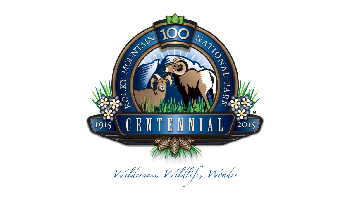
This detailed anniversary logo uses a seal-style design to hold many unique elements related to the park. In the rim sits the name with a keystone shape holding the number 100 at the top. Across the front sits a ribbon holding the word "centennial" and the years of operation. Inside the seal are illustrations of wildlife with flowers and plants below and to the sides of the seal.
More Details →Hot Springs National Park 100th Anniversary Logo
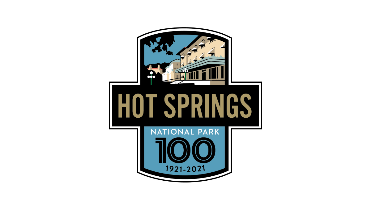
This logo starts with two overlapping rectangles, one placed vertically and the other horizontally. The horizontal rectangle is filled with black and gold letters of the park's name sit inside. In the vertiacl rectangle, the part sticking up from behind the name of the park holds a depiction of the park's famous architecture with the bottom holding a large number 100, the years of operation, and the words national park with blue behind.
More Details →Yellowstone National Park 100th Anniversary Logo
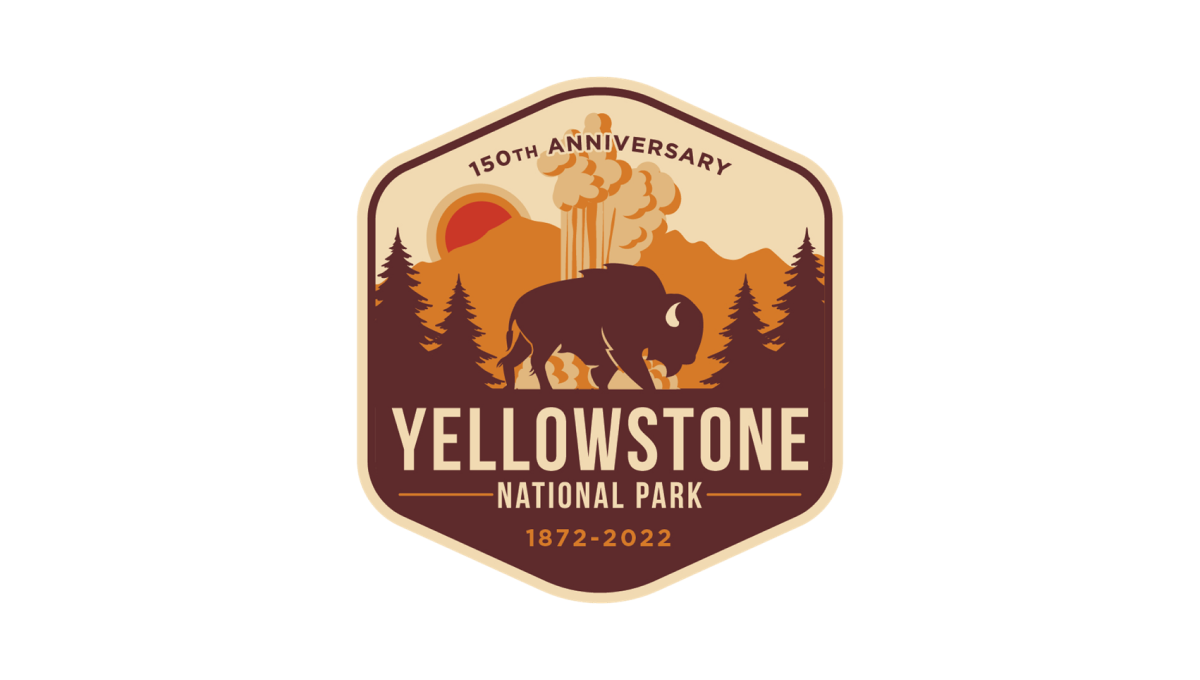
Yellowstone's 150th anniversary logo starts with a hexagonal shape in an orange and brown color that's reminiscent of many colors throughout the park. Inside, layers of monochrome silhouette's depict the park's famous geysers and wildlife. In the bottom half, the name of the park sits just above the years of operation with a callout of the anniversary arching across the upper part of the design.
More Details →Bryce Canyon National Park 100th Anniversary Logo
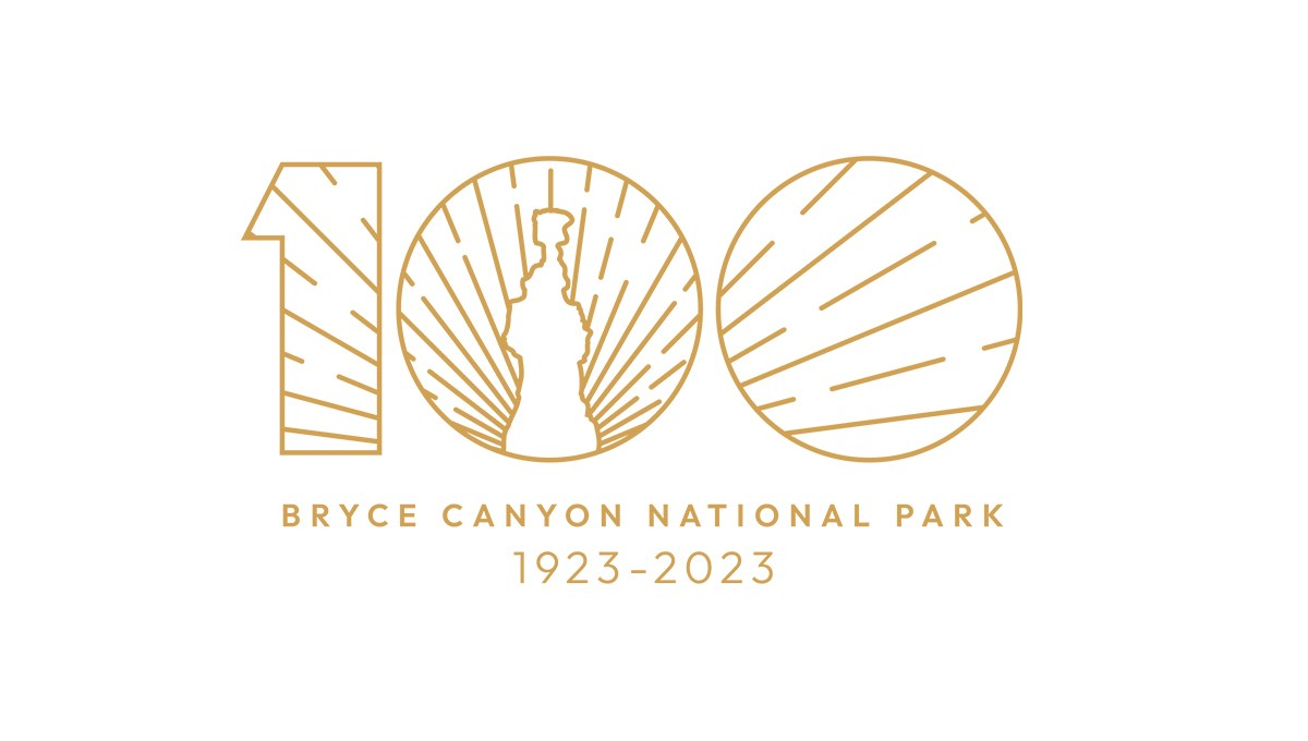
Bryce Canyon's centennial logo uses gold line art for the vibe in this design. A large number 100 contains a clean line-art depiction of the park's famous hoodoo formations with sunset-style lines emerging from behind and filling only the area with the number. Below, the name of the park and the dates of operation are placed in the same color as the mark above for a clean, balanced design.
More Details →